One of the great pleasures of being a book designer is getting to work on books by my friends. There’s a unique form of collaboration that happens when I work with someone I know well, and the book usually shows the result of this process.
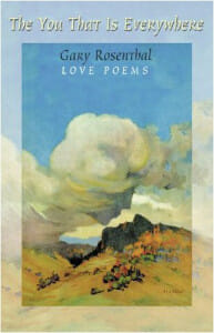
In 1999 I had the pleasure of helping my friend Gary Rosenthal publish his remarkable book of love poetry in the troubador tradition. The You That is Everywhere (affiliate) was called “A remarkable literary achievement” by poet David Whyte.
But since that time I haven’t had the occasion to design any poetry books. Recently I produced a series of page ideas for a proposed book of poetry, and it reminded me of how powerful typography can be when it comes to the forefront.
Poetry on the Page
In designing poetry pages, I’m usually too conservative. As a writer, I want the words to sing, the voice of the author to be heard, not the artistry of the type designer or typographer.
But there’s no denying that in these pages, mostly empty, the white space raises our consciousness of the type forms to a very high level. In no other form that I can think of do we see, and interact, with the typefaces chosen by the designer, simply because they are so prominent.
So it was pretty interesting to put together these part opening pages. Openers are the most decorative pages in a book, aside from the title page. It’s the one place we get to add a flourish or somehow indicate graphically a mood or theme in the book.
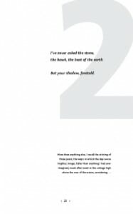
In these part openers, I had to show the part number, a poem that introduced that part of the book, as well as a short text reflecting on the era in which the poems were written, a kind of impressionistic comment on the work of the past. Having all this harmonize and still make a statement was the challenge.
In each, the choice of typefaces has a tremendous effect.
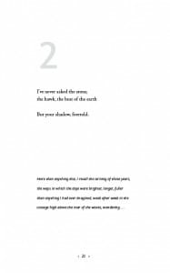
In the first example, the large numeral as well as the text at the bottom of the page are in Fontin Sans, the poetry in Adobe Jenson Pro. This is a dynamic combination, the very modern Fontin playing off the really ancient oldstyle strokes of the Jenson.
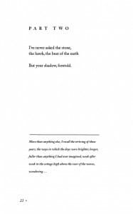
In the second example, I went in the opposite direction, using only Adobe Caslon for all the elements, achieving a kind of internal harmony between the different styles and weights of the one type face.
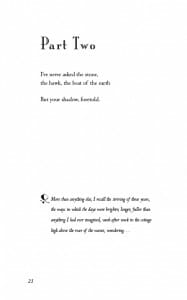
In the third example, I tried Mona Lisa Recut for the titling and the pretty and delicate Centaur for the poetry and the text. For some reason this also inspired me to add one of the lovely floral ornaments from the Zapfino font. Although I liked a lot of these elements, they ended up a bit of a train wreck taken together.
There was still a statement missing, something unexpected that wanted to happen. In creative work of all kinds there comes a time when you have to stop what you are doing and take stock.
The Persistence of Memory
Often we design from images we have floating around in the dim recesses of memory. Often I’ve been patting myself on the back for some original design, only to find it in the magazine I had been reading last week. The fertilization of creative ideas happens pretty much outside our sight, somewhere in the unconscious.
Whether you’re working on a story, trying to create a typographic design, caught in the moment of photography, painting in a studio, writing a poem, it doesn’t really matter. The raw material that the artist works with is partly in the world, partly a reflection of the artist’s psyche.
Now, I don’t claim this kind of typography is an art form of the same caliber of Gary’s poems, or many other works I could mention. What I am saying is that the process of creativity, the sources it draws on, is the same.
One way we’ve all learned to spark something new is to reverse course and go in a completely new direction, even if it’s just to test the waters, to stretch our idea of what’s possible. So I went back for a fourth try.
I hauled out the Fontin Sans from sample number 1 again. There was something modern and energetic in it that I liked with these short poems. I reached for the Futura, and spilled a humongous number all over the page. Oops, it ran right off the edge. What have I done? Did I just make a big mess? I didn’t think so, I liked the boldness of it.
In the end, I knew the project remained unfinished. There was no one solution that emerged from the exercise. But this last one was close, it had everything I wanted, and although there was no way I would have predicted feeling so comfortable with this modern typeface, it was the one that seemed to communicate the poetry better than all the others. Maybe it was a bit of a mess, maybe not.
What do you think?


