We haven’t seen much of the Apple iPad yet, and the screen shots we have seen show that the fonts for the Apple iPad are perhaps not all they might be.
What do we know? Apple, as far as I know, has issued only the one press release on the day of the product’s announcement, January 27. I wrote to the media center asking for more detail on the iBook application and the fonts that might be part of the iBook reader software. I was advised to continue to read the press release until the product is available.
Let’s Take a Look
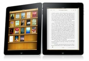
As you can see in the photo (Courtesy of Apple) the iBookstore looks pretty much like every other eReader portal. The metaphor of the bookshelf is apparently too strong for any designer to resist. And that makes sense, because every user will recognize it and know what it represents.
The bookshelf also helps to display the book covers, which make us feel as if we’re reading actual books. We know the iBooks will look more like printed books than they do on any other eReader out there, complete with a great animation of a page turning over.
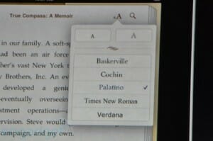
Obvious care has gone into rendering the shelves, the covers, the virtual book itself, giving it a real sense of a physical dimension. The page you see in this photo is attractive as well. I’m guessing this is the Baskerville font seen on the snap of the iPad’s reading software. It’s clearly the best font for actually reading books on the list.
Although the paragraph indents are pretty deep, they’re in balance with the line length, so there’s nothing troubling the eye. You can also see, as in other photos, that the lack of any hyphenation has left the page with large gaps between words. That’s pretty unattractive.
The Fonts. What About the Fonts?
This is the list of fonts that seem likely to be available in the iBook reader app:

- Baskerville
- Cochin
- Palatino
- Times New Roman
- Verdana
Here’s my idea: Let’s pretend we’ve been given the power to pick the fonts for this software. Each of us will have to come to a meeting with a list of three fonts, and the ones selected will be the fonts that get the most “votes” by appearing on the most lists. Game?
First I’m going to throw Cochin, Palatino, Times and Verdana off the list. If we are going to be reading books here, I think we can agree we won’t be needing these fonts at all.
Here are the three I’m going to put on my list, and why:
- Janson text—this oldstyle face is great for long documents. It’s a favorite of book designers for a good reason. Although it has plenty of eccentricity in its details, the page it produces is smooth and easy to read. A real winner.
- Garamond—pretty much a no-brainer, I like the Adobe version, but Garamonds of many varieties have been among the most used book typefaces for several hundred years. The roundness and harmony of the letterforms make it perfect for books.
- Bodoni—another more modern face, and a complement to the Baskerville we left on the list. As opposed to the two oldstyle typefaces nominated above, these modern typefaces give a completely different color and a more vertical emphasis to the page due to their contrasting strokes. Beautiful reading for the right book.
I could have certainly selected from many other worthwhile and beautiful examples of typefaces from centuries of book design. Perhaps on my personal iPad I’d like to have Bembo as well, although I think the other oldstyles, Janson and Garamond, might display better on screens.
What I’m trying to get at here is that there are many, many better choices for fonts for the iPad’s new iBook application than the ones we’ve seen so far.
Well, I’m interested in your lists. Are you coming to my iPad type font selection meeting? What’s on your list?
Takeaway: Fonts on the upcoming Apple iPad’s new iBook reader application desperately need improvement. Better fonts will enhance the display and reading enjoyment of the new iBooks.


