Let me tell you a story. One day long ago a couple of engineers sat around putting together the first piece of software that would help people lay out documents and do the work of graphic designers, right from their own desktop computer.
Do you think these engineers knew what the word “leading” meant? People who specify type know that leading is the space between the lines of type, measured from the baseline of one line (the imaginary line that the letters rest on) to the baseline of the next line.
No, wait, do you think they knew where the word “leading” came from? When type was set by hand, individual letters were picked up and placed in a little tray called a composing stick. You could stack the lines right on top of each other if you liked.
In typographic language, this is called “set solid.” It means, for instance, that you have 12 point type with one line every 12 points. If we were writing instructions for a typesetter we would write it like this: 12/12.
But suppose you wanted a little more space between the lines. You can’t change the little metal letters, so instead you cut thin pieces of lead to the length of the line of type line and slipped them between the lines. This also adds some structural stability to the page you’re typesetting. Instead of line after line of little bits of metal type stacked on top of each other, you have individual rows of type separated by thin sheets of lead.
If the leads you use are 1 point thick, (about 1/72 of an inch), then you now have “1 point leading,” or 12/13.
If you use two of those leads, or you get the compositor to cut you up a bunch of thicker leads, you would have 2 point leading, or 12/14.
Further Complications Arise
Okay, back to more recent history. What our engineers decided way back in the dawn of computer typesetting was this: since they couldn’t know what typeface you would be using, and they wanted to make sure your text was at least minimally readable, they would set the program so that at least you wouldn’t fail.
When you picked the size of your font in the software, the program itself would automatically add 20% of your font size to the leading.
For example, if you said you wanted 10 point Verdana, the software would give you 10 point Verdana with 12 points of leading (10/12).
Here’s the problem: 20% is okay for some type designs, at some sizes, but it’s an approximation at a median figure, which is likely to suit few actual examples.
Suppose, for instance, you had to rush to Macy’s to get some clothes for two cousins you’ve never met. You know that one is six feet tall and the other is five feet tall. When you get to the store, do you buy two sets of clothes, both for people who are five and a half feet tall? After all, that’s your cousins’ average height, isn’t it?
The Problem with Robots
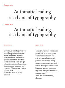
This is the problem with automatic routines and robotic programs: they aim for some middle ground that’s likely to be only somewhat satisfying to the majority of users. Although they’re usually wrong. they aren’t all that wrong.Let’s look at two real examples. In the accompanying graphic, you’ll see two sets of comparisons. In the larger type at the top, (Chaparral) the headline is set in 30 point. Adobe InDesign (which I used to typeset these samples) has inserted the usual 20% leading, resulting in type that is 30/36. The problem is the lines at this size are literally floating away from each other.
The second version has been set to solid leading, 30/30 and the whole thing hangs together much better. At least it looks a heck of a lot better to me.
In the smaller samples at the bottom of the page you can see two text-sized narrow columns. The first, in 11 point Janson, has received the usual 20% leading, which yields 11/13.2. It looks okay.
In the second sample the leading has been opened up to 11/15. One of the easiest ways to improve the readability of text is to slightly increase the amount of space between the lines. You can see the result here, the second sample looks a lot more readable to me. Imagine if this was a book page, where the line would be twice as long or longer.
Recommendations
If you want your typesetting to look more professional, don’t settle for the assumptions of the software engineers. Use the guidelines here when setting your type:
- For headlines, tighten the leading until it’s too tight, then loosen it just enough to look good.
- For body text, increase the leading a bit at a time to see where you get the most readable copy that still fits the parameters of your design.
Takeaway: Automatic leading is about as satisfying as a robot dog. Increase or decrease leading to make your document look more professional.


