I’m fascinated watching how large media companies are trying to exploit the amazing potential of the Apple iPad for digital publication design. In June we looked at the way Wired Magazine failed to provide much of a reader experience in trying to translate a print publication directly to digital.
I knew there had to be people working on better solutions, and I was curious to see what Martha Stewart would do with the launch of their flagship product, Martha Stewart Living. This decorating, cooking and lifestyle magazine is popular in print. But Martha and her organization also have deep experience in book publishing and video. On top of that, they practice a restrained, elegant, but eminently practical style of typography. I gladly paid my $3.99 and downloaded the app to my iPad.
Get Ready for Multimedia

It seems like the folks at Martha Stewart Living Omnimedia (MSLO) learned from other attempts at publication design for the iPad. Everything that disappointed me about Wired Magazine’s iPad version seemed to be solved in MSL.
It’s easy to use, has clear navigation, makes intelligent use of the screen for reading. This isn’t just a PDF of a magazine. It’s a magazine that’s been rethought with readers’ enjoyment and utility in mind.
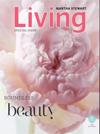
After a load time of about 5 seconds, I was amazed at my first look at the magazine. I sat and watched in wonder as the screen filled with an animation of a huge pink peony opening. It was a simple and artful way to introduce a new reading experience.

The issue is called “Boundless Beauty” and this theme is borne out over and over throughout the publication. I noticed a little toggle button that actually said “toggle” on it in the corner of the screen. Below the button was the legend “Tap for more.” A tap froze the cover image and put the rest of the magazine’s type on the cover.
Reader Friendly, Even Amusing
Throughout the design of this digital publication, you get the feeling of being well cared-for, like the designers really thought about the people who would be using the app. The first thing you come upon is a “How-To Guide” that explains how to use the interface, and the kinds of fun you can have with it.

And there’s a sense of playfulness in a lot of what’s been done with animations and page layout. You move from story to story by going left and right, and you read a story, or drill down for more detail by going down from the beginning. In one case an article descended for 22 screens full of story before you reach the end. The How-To Guide itself is a good example:
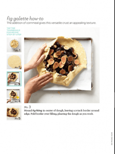
At each step you get help from the design, like arrows showing that more lies outside the screen you are looking at, or explicit statements like “tap any picture to go to that story” or “tap the thumbnails for recipe step-by-step.” All this adds to a fun and playful experience because you never have to wonder what to do next.
When there are multiple illustrations for a story, instead of just swapping the photos in a viewing window, they change animated with a slow fade that’s elegant. When there’s an audio to listen to, a legend lets you know it’s “44 sec.” up front. That’s friendly.
Publication Design
The design of the app follows closely the design of the magazine. It’s mostly set in a square-serif typeface and combines elegant typography with luscious photography. Page after page shows just what can be done with the iPad’s great display.
The problem is, the magazine looks better on the iPad than it does in print. In almost every way, Martha Stewart Living is a better, more interesting, more entertaining and ultimately more satisfying experience in its digital form than it is in print.
You lose the ability to write on the pages, to toss it across the counter, or to use it to start your next fire. But that doesn’t seem like a lot to give up to get this beautiful, interactive digital product.
Of course, publications like this are clearly outside the province of self-publishers, and a magazine is not a book anyway. But seeing some of the possibilities of the iPad begin to emerge in publications is going to change our idea of what a digital text should be.
After all, what exactly is the difference between reading the Martha Stewart Living app, derived from a magazine, and Lee Foster’s GPS-enabled San Francisco Photography Guide app, derived from a book? Or an O’Reilly book app? Or a “book” from the iBookstore? Each one is simply a different icon on the touchscreen.
The iPad, a convergent techology weighted toward content consumption, may well help along the convergence of digital text from many sources into new forms we’re only beginning to see.
Data
Martha Stewart Living (iTunes link)
$3.99
Category: Lifestyle
Released: Nov 10, 2010
573 MB
© 2010 Martha Stewart Living Omnimedia, Inc.


