Welcome to this edition of the e-Book Cover Design Awards. This edition is for submissions during July, 2012.
Here’s what we received:
109 covers in the Fiction category
27 covers in the Nonfiction category
Award Winners and Listing
Guest judge this month is Tamara Dever and her crew at TLC Graphics. They have added comments (TLC: ) to many of the entries, but not all. Thanks to everyone who participated. I hope you enjoy these as much as I did. Please leave a comment to let me know what you think, too.
Now, without any further ado, here are the winners of this month’s e-Book Cover Design Award.
e-Book Cover Design Award Winner for July 2012 in Fiction
Eric Edstrom submitted Afterlife designed by Melvin De Voor.

TLC: This month’s winner is “Afterlife.” It’s simply stunning, full of depth, great use of typography, and very unique. The use of color, type, texture, and imagery are all very well done. The design would work well if this were a series, too. Close runners-up are “Crash” and “Relatively Famous.” This was a difficult decision and we’d be proud to put our names on any of these covers.
e-Book Cover Design Award Winner for July 2012 in Nonfiction
Damonza submitted A Father’s Angels designed by Damonza.
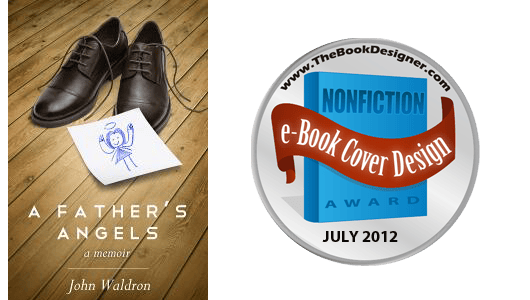
TLC: The non-fiction winner is “A Father’s Angels.” We wouldn’t change a thing! Nice, clean cover. Simple type treatments and intriguing imagery work well to attract readers without giving away the whole story within. Beautiful. Our other favorites are “In My Enemy’s Service,” “The Wild Merchant,” and “Out of Sync.”
Fiction Covers
Steven Ramirez submitted A Bone in the Throat designed by Tugboat Design.

PJ Garland submitted A Brave Pause designed by PJ Garland.

TLC: I like the silhouette of barbed wire on this cover. The colors are also nice. It looks a little crammed at the top. The title needs to be moved down into the open space and author’s name at the bottom, perhaps even in the black, if more black were added to the bottom.
Abby Matisse submitted A Deal with the Devil designed by Pish Posh Design.

TLC: Nice, clean layout, unique graphic, good use of white space. To avoid using two different script fonts, the author name should either be the same as the title or perhaps a sans serif.
Tim Vicary submitted A Fatal Verdict designed by Cathy Helms – Avalon Graphics.

Sean O’Mordha submitted A Pirate’s Legacy III: CIC (Canary Island Commandos) designed by Bill H. Moore. “White works well for a print copy, but not at all for displays with a white background, therefore a small, black border was added to set it apart.”

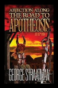
George Straatman submitted Abjection along the Road to Apotheosis designed by Steven Efondo (Sefdesign). “I believe that every cover should be a depiction of a pivotal thematic concept from the novel it represents. This image is grim and stark and is derviced from a key juncture in the plot near the end of the story.”
oliver Bayldon submitted ACTS OF DEFIANCE designed by Jules T Smith.

KS “Kaz” Augustin submitted Balance of Terror designed by Derek Murphy. “This is the first time I used Derek as the artist and he had the tough job of coming up with a cover for a sequel. He did a tremendous job!”

Denise Gaskins submitted Banished designed by . “This is for my 13-year-old daughter’s first book. Because we don’t expect a book by a teen author to earn a profit, we budgeted $0 for design. I’ve read all the Monthly e-Book Cover Design posts, however, and I tried to implement what I’ve learned from your blog to create a simple, uncluttered design. The cave silhouette photo is by Neils Photography on flickr.”

TLC: This is a nice cover! Great photo with simple, professional looking type. Well done.
Shafinaaz Hassim submitted Belly of Fire designed by Nielfa Cassiem-Carelse.

TLC: Beautiful type treatment with a lovely graphic. The rest of the cover seems unfinished, however. The subtitle and author’s name seem like afterthoughts. A more purposeful treatment for each along with some of the orange “mist” coming up from the bottom would give it a more finished look.
Catherine Czerkawska submitted Bird of Passage designed by Matt Zanetti. “Cover designed by excellent young digital artist Matt Zanetti, currently working with video game start-up Guerilla Tea.”

TLC: Nicely reminiscent of an earlier era in design.
TW Gallier submitted Black Heart designed by A.D. Cooper.

Scott Alexander submitted Blood On The Moon designed by Scott Alexander.

Ray Flynt submitted Blood Porn designed by Ray Flynt.

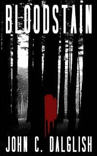
John Dalglish submitted Bloodstain designed by Beverly Dalglish.
Rodney Walther submitted Broken Laces designed by Laura Wilhelm. “Since the book deals with a strained father-son relationship, I wanted the cover to be emotionally evocative. I think my designer successfully captured the emotion of the story without being too on-the-nose. The cover seems to hold up well when viewed multiple times. ~~~ And Joel, it’s interesting to see the cover with others of its genre (https://www.rodneywalther.com/covers.htm) for commonality in the use of people staring into the distance and the use of water.”

Kristin King submitted Cain’s Coven designed by Stephanie Mooney. “For my paranormal romance, Stephanie did a great job at of capturing the genre with this couple and the vampire’s glowing eyes while indicating the shadow of menace to come.”

D.L.Johnstone submitted CHALK VALLEY designed by Jeroen Ten Berge. “Jeroen truly evoked the essence of CHALK VALLEY. I was stunned with the final result. The killer stands between the trees, looking at us from the distance. Elemental fear. For the typeface he added chalky lines that affect the image but also the title, like the slashes of a knife, but raw, serrated. It combines clean and unblemished with maimed and disfigured. The woods are cold, unforgiving, turning from their natural colour to blood red.”

TLC: Intriguing. Fits right in with its genre. Nice use of a typical thriller color palette.
Maya Lassiter submitted Children of the Fallen designed by book design by Maya Lassiter, cover art by Ida Mary Walker Larsen. “Thank you for these interesting posts!”

TLC: Gorgeous image. Nice choice of fonts, however if “of the” were smaller and in the same font as the author, the title would be more readable. Moving the image down a little bit so it isn’t competing with the author’s name would provide better balance.
Rita Toews submitted Clearwater Journal designed by Rita Toews.

TLC: This cover has a really interesting image, but the typography isn’t right for the genre. This rounded, sans serif face has a very friendly, happy-go-lucky feeling that doesn’t match the ominous feeling of the image. A serif would be more appropriate here. Maybe something with some extra swirly flourishes to go along with the “watery” theme.
Jazmyn Douillard submitted Corporeal Daughters: Memories designed by Jazmyn Douillard. “I am a graphic designer with ten years experience and am delighted to use my own photos and skills for my e-books.”

TLC: Nice colors, dynamics, and title treatment, though its placement allows it to get a bit lost. It can be difficult to cover up such a great image, but I think this cover would be even better if you worked to incorporate the text into the graphic. Move the title down, let the author line cover over the knife tip a little bit. Maybe weave the smoke in and out of the letters.
Craig Terlson submitted Correction Line designed by Craig Terlson. “My day job is graphic design and illustration, but it sure didn’t make the process of designing a cover for my debut novel any easier. Well, maybe a bit – because I knew what didn’t work. This image and typography best captured the mood of the novel.”

TLC: Nice colors, great filter effect on this cover. The typeface is appropriate, but all of the type crowds the side and bottom margins more than it should.
Damonza submitted CRASH designed by Damonza.
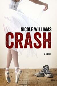
TLC: Beautiful cover. Lovely use of type, photography, and color. Easy-to-read title, great photo! Nice organization of elements.
Gardner Brooks submitted Dangerous Affairs designed by C. H. Humphrey.

Maria Grace submitted Darcy’s Decision designed by myself. “I am not a graphic designer, but I have been studying your recommendations carefully. Not cluttered, genre graphic, simple color palette, type that can be read even at thumbnail sizes. I redid this cover, the first of the series, to create try and line up better with those guidelines. I also tried to create a ‘brand’ feel for the series. Thanks so much for all the coaching you provide on this site!”

TLC: The imagery is nice, but the typography is lacking. The author’s name and title compete, making it hard to tell if it’s all one title or actually two lines with different purposes. Unless you’re well-known, your name should generally be below the title and smaller. You should also use a wider border or none at all. This one seems to be almost there. Keep learning!
Cynthia Vespia submitted Demon Hunter: Saga designed by Original Cyn Advertising.

TLC: This text is very hard to read and shoved to the nether regions of the cover instead of being integrated into the graphics. The word “SAGA” is an afterthought and the author’s name would do well in a more simple, sans serif font.
Zelah Meyer submitted Dimension Jumpers: Wanted designed by Zelah Meyer. “This is my first published title – and my first attempt at cover design!”

TLC: Nice first attempt! This is a nice photo, your title is easily read and the cover elements are organized well. However, fonts are crazy things that go in and out of fashion…just like clothes. The font you’ve used here is definitely out of fashion at the moment. You also want to be careful about using fonts that come with your computer when you buy it. Those are usually ones to avoid as well. Next time, go online, find some covers you really like, and use a font similar to those. (Kind of like checking out the fashion mags to see what to wear. It may not matter to you, but it does matter to buyers.)
Nancy E. Shaffer submitted Dis/inhibition designed by Illustrator: Marisa Roberts-Hauptman, cover design: Lulu Premium Cover Service.

Elisa Nuckle submitted Dominant Race designed by kuroi-kisin on deviantART. “Kuroi drew the design but two artist friends of mine helped me with the font and colors.”

NP Statham submitted Drawn in Blood designed by NP Statham.
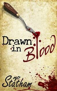
TLC: The graphics and text draw your eye nicely around the cover. The author’s name is artistic and the title works well with the graphics. Well done, if not a little trite.
Grace Brannigan submitted Echoes from the Past designed by Julie McClen – Oak Grove Graphics.
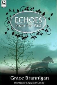
TLC: Very nice images and title treatment, although the title needs a little more oomph to stand out better. Perhaps a darker color or darker drop shadow would work.
Yunnuen Gonzalez submitted El Despertar designed by Yunnuen Gonzalez.

Lorraine Pearl submitted Erotic Escapades designed by Lorraine Pearl/GEI Designs. “I designed this cover using the same picture our authors use for their blog, but switched out the background to make it pop then added the contrasting colors for an extra eye-catching factor. I prefer simplistic designs like this, and hope others do too.”

J. A. Paul submitted Gladius and the Bartlett Trial designed by Dan Waltz. “Tha artist, Dan Waltz, is an award winning cover artist and writing of childrens books.”

TLC: Wow! Great illustration. I love how you’ve incorporated the title into the illustration by putting the eagle’s shadow over the letters. Very clever. The only idea I have for you is to choose a font with a little more style. Nothing really crazy, just something a little more exciting than just a straight “Helvetica-like” font. There is a lot going on in the illustration, so it was wise to choose a simple font, I think it just needs a little something more. There are a lot of sans serif fonts out there that are still simple, but have just a little extra curve to the lines that might bring something a little more to the cover. Another thing that might look nice is adding a black border to the whole cover that fades into the illustration. That would give it more intrigue than the illustration bleeding out to the edges of the cover.
Michael Kingswood submitted Glimmer Vale designed by James Beveridge. “James Beveridge, contracted through Lucky Bat Books (www.luckybatbooks.com), created the art and cover design for both the ebook and print versions. Beautiful work. I’m quite pleased with it.”

TLC: Great illustration! Beautiful color choices and nice typography in the title. The one tweak I would try is changing the font in the author’s name (just a simple serif font would work well…nothing fancy) and moving it a little closer to the bottom. Just had an idea…I’m a book designer…I can’t help myself! What if you blew up the size of the illustration just a little bit (or moved it up a little bit) so that the peak of the mountain could come up and cover the bottom of the “E” in Vale? It would tie the title and the illustration together even better. It really is fine the way it is, but might be fun to try if you haven’t gone to press yet.
Barbara Brooke submitted Glimmers designed by Glendon Haddix at Streetlight Graphics. “Cover artist, Glendon Haddix, created this image for Glimmers’ second edition. I had entered the original cover to you and am curious to hear what you think. Thank you.”

P.A. Wilson submitted Greed, Book 2 of the Charity Deacon Investigations designed by Raynfall Agency.
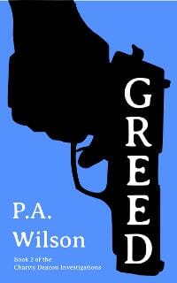
Marcia submitted his Call

Richard Wright submitted His Work To See designed by Self/Malcolm McClinton. “The artwork was commissioned for the project, from artist Malcolm McClinton. The layout and design is by myself.”

Alda Sigmundsdóttir submitted Icelandic Folk Legends designed by Erlingur Páll Ingvarsson.

Bill Moran submitted In Another Life designed by Debbi Moran. “The car used in the photo is the author’s 1976 Ford Maverick. The story’s main character restores Mavericks and the genesis of the story is an incident involving the car and a dark road.”

Tracie Banister submitted In Need of Therapy designed by Jeff Okerstrom. “I decided to splurge on some original cover art for my second novel and hired Jeff on a rec from an author friend. The two important elements in the cover design for me were that the heroine was seen in her role as a therapist and that the Miami setting was conveyed through the color scheme. Jeff came up with the great idea of the big picture window looking out on the Art Deco buildings and palm trees. I was insistent on the dominant color in the cover being yellow to convey sunshine, so Jeff worked with different shades until he found the perfect one that complemented the turquoise (a very Miami-ish color.) I was thrilled with the final result!”

TLC: Fun type, nice colors, and illustration, but the title doesn’t stand out quite enough to beg to be read. Using the dark blue from the man’s pants would help. The author’s name would work better in a sans serif font.
A.R. Williams submitted It Walks Among Men designed by A.R. Williams.

Diane Capri submitted Jack and Kill designed by Jeroen ten Berge.

TLC: Great action, drawing the reader right into this cover. The title is OK in red, but might stand out better if it were a bit darker.
Tim McGregor submitted Killing Down the Roman Line designed by Tim McGregor. “Thanks for letting me submit this. The cover photo was taken by a talented photog named Max Janicke.”
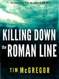
TLC: Well-designed cover, good, restrained color palette, and simple but interesting typography. Belongs in the bookstore!
Sandra Livingston submitted Kings of Providence designed by S.D. Livingston. “This is the third cover version I’ve created for this book, and I’m amazed at how much the original vision has changed. The palette started out as white with pale blue buildings dominated by a clear blue sky. This darker palette definitely reflects the plot’s mood much better.”

TLC: It’s rare for a novel to have a subtitle, so I’m immediately wondering what type of book this is. The two lines of the title could stand to be closer together for more unity. Overall a nice design, though.
Laura V. Baugh submitted Kitsune-Tsuki designed by RH Potter (art) & Jess Jonsson (design). ” Kitsune are multi-tailed fox spirits in Japanese folklore. I discovered RH Potter’s art while my manuscript was in contract limbo (3 years) and bookmarked, just in case…. When contract expired and I decided to self-publish the piece, I licensed one of Potter’s designs. Jess Jonsson then completed it and gave it a fluid, ethereal feel perfect to the story.”

TLC: Nice cover, good homage to Japanese art. Love the fox and background texture! The author’s name needs to be either more simple (sans serif) or hand-lettered as well. Try giving the title a little more space on either side to let it breathe.
Patty Wallace submitted Laid To Rest designed by Patty Wallace, MonkeyPAWCreative. “This was a very fun book cover I had the privilege to work on. The story is set in the 1950s and is the 2nd book in her Down Home Humor series. It needed to be quirky, fun & Southern just like the characters in the book. I designed the type to not only stand out but to have that nostalgic feel. I didn’t even mean to, but to me, the book actually feels like it’s from the 50s. I love it when that happens. Hope you like it too.”
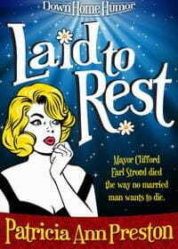
TLC: FUN! Graphics work well with the art, nice movement throughout and appropriate for the genre.
Scott Alexander submitted Laughter In Hell designed by Scott Alexander.

Pandora Richardson submitted Lost: Amelia Jones Private Detective Series designed by Pandora Richardson.

TLC: Really nice professional-looking cover!
Rebecca Salas submitted Lullaby designed by Rebecca Salas. “The book is YA fiction and the octopus was an image I found in the public domain. I think it will be easy to establish a similar feel for the second book in the series.”

TLC: This is a nice cover! Love the background, LOVE the octopus, font choice is nice, color choices are good. Because I’m a book designer and can’t ever leave anything alone, I would just be curious to see what it would look like if the octopus were slightly smaller, author name a little smaller and title a little smaller—not so squished up next to the octopus. Try it and see what you think! Great job!
Molly Greene submitted Mark of the Loon designed by Jan Marshall.

TLC: Love the collage of art and type placement as well as the color palette! My only complaint is that the title is quite difficult to read and the author’s name is large enough that it competes with the title.
Jonathan Winn submitted Martuk … The Holy designed by A.M. Schultz. “Book published in early-March 2012. Cover redesigned in June 2012 by A.M. Schultz.”

J.L. Williams submitted Monster Dreams The Liars Tongue designed by J.L. Williams.

Andrea Stein submitted Never Go Back designed by Kristin Bryant -. “I ran a 99designs contest and had a hard time picking a winner – but I loved the sense of mystery/spookiness this evoked -”

TLC: This is a nice cover. I like the photo and the typography. However, I think you need to swap the title and author line. At first, I thought the title was “Andrea Stein.” People (and buyers) are used to seeing the author’s name either at the bottom or at the very top…not usually right in the middle. Your subtitle is getting lost too. I would put that under the title instead and reverse it out so it is more easily read.
Becca Mills submitted Nolander designed by Marion Sipe.

TLC: Very nice and elegant, but the title doesn’t work well bleeding off the edges. Bringing the title down a little and giving it a little space on either side would work wonders for this cover!
Julie K. Rose submitted Oleanna designed by Julie K. Rose. “Designed both print and ebook covers for my historical fiction novel, Oleanna. The book is set in Norway in 1905, and the landscape is practically a character in the book, so I wanted to focus on the beautiful scenery of the country. I found and purchased rights to an amazing painting by Norwegian artist Adelsteen Norman, painted at around the same time as the book’s action. Title font is LHF Brien.”

TLC: Lovely feel to this cover. Great use of “white” or “open” space as well. Watch the kerning, though. (This is the space between each letter.) There’s too much space between the middle “A” and the first “N”. Close that up and be proud. :)
Anya Kelleye submitted Ooze designed by Anya Kelleye. “This is the cover I designed for JJ Toner’s sci-fi eBook about a collective entity that lives on a planet discovered by a science team looking for a new planet to inhabit.”

Scott S. Phillips submitted Pete, Drinker of Blood

TLC: I’m intrigued. Is the goat’s name Pete and does he drink blood or is this poor little goat going to be someone’s snack? Hmmm… The image of the goat on the plain black background is OK, but the typography could use help. Using a graduated white to red fill when referring to blood has been done so much that it makes the cover look unprofessional. Using a different color for the bottom text would make it much easier to read. It also needs more space so it isn’t running into the goat’s foot. (Boy, I hope he doesn’t get eaten!)
Sharon Reamer submitted Primary Fault designed by Createspace. “Thank you!”

Amy Durrant submitted Prisms designed by Amy Durrant.

TLC: Nice, simple graphic cover. Good typography and use of color, here.
Maciej Gorywoda submitted Red Will Be My Colour designed by Nina Garncarczyk. “The designer’s gallery: https://leafofsteel.deviantart.com/”

Damonza submitted Relatively Famous designed by Damonza.

TLC: LOVELY! One of my favorite styles of covers. Interesting, great balance of type and imagery, pleasing color palette. Well done!
Richard Capwell submitted Santa Claus in Oz designed by Richard Capwell.

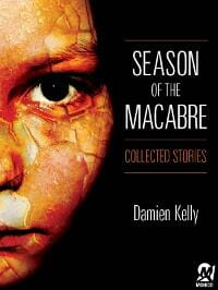
Colin Tate submitted Season of the Macabre designed by Jeff Sheinkopf.
Donna Burgess submitted Solstice designed by Nathalia Suellen. “Thanks.”

TLC: Great illustration! Love it! If you move the title down a bit and make the color a little lighter it would be easier to read from a distance and when small. You might also consider moving the author line to the bottom. I like it the way it is now, but am curious to see what it would look like the other way, too. Love this cover!!
Eden Baylee submitted Spring into Summer designed by JB Graphics.

TLC: Love the colors. Nicely organized and easily read.
Joe Revitte submitted Supernaut designed by Joe Revitte. “A bolt out of the blue over a desert highway tempts the curious reader to this superluminal adventure.”

TLC: I like this cover! Great color choices, nice imagery. Easy to read and I like how you’ve incorporated the title into the illustration. Nice job!
Ian Truman submitted Tales of Lust, Hate and Despair designed by Olivier Carpentier. “The designer’s contact can be found here : https://www.olisketchbook.com/_/Design.html”

Mary Maddox submitted Talion designed by Duncan Long. “This cover is for the second edition of TALION. The first cover received so much criticism that I finally reissued the novel with a professionally designed cover. This blog post has the details. https://www.ancientchildren.com/?p=324”

Jens Hildebrand submitted TEAM 002: Die Entführung der Queen designed by Juan F. Garcia.

TLC: Well-designed cover for a graphic novel. Perfect for its genre, fun illustration and colors.
David Bishop submitted The Blackmail Club, a Jack McCall Mystery designed by David Bishop/Lorraine Hansen.

A. Yamina Collins submitted The Blueberry Miller Files designed by Rebecca Swift. “This is a collection of dark, quirky and humorous short stories. I chose the cover of the bench in the snow because it signified this idea of loneliness and being alone. Nearly all of the characters in my book have either done something wrong and found themselves literally alienated from other people, or still have plenty of people around them but don’t realize how detached they have become in an emotional and spiritual sense.”

Todd Ohl submitted The Book of 21 designed by . “The book is a mystery/suspense novel, so I wanted to use the bold type and colors associated with that type of book: Helvetica Neue Condensed Black type with a bold red that was close to a Pantone 186C, which would be used on the print cover. The cover also includes a symbol from a scene late in the book that posed a mystery for the reader on the cover, but something they would recognize easily when they had completed the book (like an inside joke.) The aim was to keep it simple and recognizable at low resolutions, but also create a “graphical system” that could be used for future books. By swapping out the red for another color, updating the background symbol, and changing out the “grunge” text effects, a new cover could be created for the next book. This would give all my books a simple and recognizable look and feel.”

A. D. Cooper submitted The Boyfriend Experience designed by A. D. Cooper. “This gay romance novella was inspired by the Soderbergh movie “The Girlfriend Experience” so I thought it’d be interesting to try and capture the movie poster feel to the cover, using the same font as the movie’s poster.”

I.G. Frederick submitted The Cougar and the College Boys

Kit Foster submitted The Dangerous Kind designed by Kit Foster.

TLC: Very nice layout and color palette. Good use of space, intriguing design, love how the imagery and type work together.
Bailey Bristol submitted The Devil’s Dime designed by Mary Schwaner. “Thank you!”

TLC: This is a really nice cover! Great image, nice typography, organized really well. The cover is very monotone and that’s OK, but lightening the text will make it pop a little more.
Kristen Stieffel submitted The Feast of Stevens designed by Kristen Stieffel. “I used to be a newspaper page designer — a totally different species of design. This is my first attempt at a book cover, e- or otherwise.”

J Smith submitted The Fire Gem designed by J Smith. “Does it seem as if the book is in swords & sorcery genre? Font and text placement are themed with two other books in this series. Bolder image color but a flatter photograph angle than the previous two books in the series seems to help on tiny thumbnails. Hand-made chain mail used in the image, the fire is via ‘Gimp’ software. Maybe I should add fire to my other covers … hopefully not just burn them.”

Maria Grace submitted The Future Mrs. Darcy designed by myself. “I am not a graphic designer, but I have been studying your recommendations carefully. Not cluttered, genre graphic, simple color palette, type that can be read even at thumbnail sizes. I also redid the cover of the first of the series to create a ‘brand’ feel for them. Thanks so much for all the coaching you provide on this site!”

Gardner Brooks submitted The Genesis Project designed by C. H. Humphrey.

TLC: This is a cool image with great colors! A different serif font and placement would go a long way to augment what you already have.
Angela Oltmann submitted The Grave Blogger designed by Angie-O Creations.

Karl El-Koura submitted The Lost Stories: A Series of Cosmic Adventures designed by Karl El-Koura.

TLC: Nice color choices. I also like the font you’ve used here. It’s fun and inviting. I would move your illustration up and move the author name to the bottom of the cover and make it much smaller. Unless your name is Stephen King, your name shouldn’t be at the top and larger than the title. Then I would make your title larger and move it up closer to the top.
Sylia McDaniel submitted The Marshal Takes A Bride designed by Katherine Baldwin.

TLC: Nice romance cover, though the title could stand out a bit more. Perhaps a slight glow around it or subtle light gray outline.
Beverly Akerman submitted The Meaning of Children designed by Alison Hall.

TLC: The photograph is beautiful, but the design makes this look like a non-fiction title.
Felipe Adan Lerma submitted The Old American Artist, a Love Story designed by Felipe Adan Lerma. “This is a re-do re-entry of the same cover I submitted earlier this month, with small changes that I think make a big difference, thanks!”

TLC: Felipe…are you ready for a few more tweaks? Your photo is very soft and is fading into the background too much. A dark background would really make it pop. The font needs to be updated, as Zapf Chancery has seen better days. Take a look at some books in this genre that are put out by the big publishers and choose something similar to ones they are using. Your potential buyers will appreciate that! At the bottom, the white text blends with the pink background. If you go with a darker background, you could leave it white. I would also adjust the kerning on all your text…this is the space between letters…they are spread out too much right now, especially for the font you are using. The tiny border around the outside is unnecessary. Hope this helps! Good luck with the book!!
Judythe Morgan submitted The Pendant’s Promise designed by Stephanie Kennedy.

Rachel Elizabeth Cole submitted The Perfect Ring: A Short Story designed by Rachel Elizabeth Cole. “Hi Joel, This is the first ebook cover I’ve ever made. I think it’s pretty good, but it’s probably got a dozen things wrong with it. I’m still learning good book cover design! Thanks so much for hosting this great resource! Rachel”

TLC: Actually, Rachel, this is a fairly nice cover. Everything is centered and balanced. The colors work well together as a sort of modified primary palette. You could italicize “a short story” for more interest and put a little less leading (space) between the two lines of your name.
Agnes Black submitted The Prince’s Knight

Georgina Gibson submitted The Sail Weaver designed by Georgina Gibson. “I’ve been designing book covers for just over a year now and have been lucky to be working closely with Three Ravens Books. I have done several covers for books(including this latest) by author Muffy Morrigan. :)”

TLC: Very nice title treatment and intriguing art. Even though the author’s name is on top, it’s small, thus not suggesting overimportance.
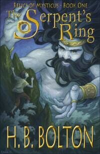
H.B. Bolton submitted The Serpent’s Ring designed by Elisabeth Alba. “After reading my novel, Elisabeth Alba designed and illustrated this cover. It demonstrates that even a young boy can muster enough courage to stand up to a Norse god.”
Gabriel Rheaume submitted The Shores We Walk designed by Gabriel Rheaume (author).

Jan Bloom submitted The Sockmonster designed by Jan Bloom. “I wrote ‘The Sockmonster’ years ago after a discussion I had with my then seven-year-old daughter about the disappearance of her socks. The Sockmonster relates the tale of four sock friends who go on a journey of No Return to find the mate to one of the sock friends.”

TLC: This title and rest of the text are nearly impossible to read and the art is very muddy. I have no idea what this book is or is about.
J.E. Pendleton submitted The Special designed by Bob Johnson @ Inkwell Graphics. “Cover design by Bob Johnson of Inkwell Graphics www.wipcache.com”

TLC: Nice use of typography and art, though the woman’s figure at the top is little more than empty space, lacking depth. The only criticism is the graduated tone in the title. It lends an amateur feel to an otherwise nicely-done cover.
Janet Allison Brown submitted The Walker’s Daughter designed by Gary Bonn & William Sauer. “Illustration by Gary and typography and design by Bill. My main protagonist is a spirit-walker and, for the cover, I wanted an illustration that would show my heroine straddling two dimensions, the physical and the spiritual. I also wanted to indicate that she was in some way confined; again, this reflects a theme of the story. Gary tried lots of ideas for me. In the end we came up with da Vinci’s Vitruvian man. It’s been done before, but the very familiarity of the image, and the casual attire of the girl, help to normalise the fantasy elements of the novel. I also love the way Gary suggests the dreamy, cosmic aspects of spirit-walking with that starry backscape and those blues. Bill then gave me a distinctive look for my name, and the banner title which, for me, ties it all together. I’m really happy with what they’ve achieved; the cover feels like my story.”

Logan McHenry submitted The Wharf designed by Jesse Bull.

TLC: I really like the graphics and typography you’ve used in this cover. The background could use a subtle texture to add interest. I don’t know what this book is about, but red implies danger, murder, blood, anger, tension. If this isn’t what you were going for, you might want to pick a different color. Running a nice decorative line along the top and bottom may be a nice touch. I think the graphics just need to be anchored to the page a bit, as they seem to be floating right now. But great job on the typography!
Ryan Dunlap submitted The Wind Merchant designed by Phil Earnest. “It’s a steampunk adventure tale where mankind took to the skies one-hundred years ago, but the cities are now faltering. I wanted my designer to capture the idea of an idyllic, classy design that has worn down. Artwork is by Grant Cooley.”
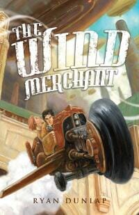
TLC: Very fun and well done! It’s refreshing to see good illustration. Love the title treatment, but it could use more pop in the form of a darker drop shadow. Texture, perspective, and colors are all quite nice.
Jonathan Winn submitted The Wounded King designed by A.M. Schultz. “Published in June 2012. Original cover design by A.M. Schultz. :)”

Daron Fraley submitted Thirty-Six designed by James Curwen.

TLC: This image is very muddy and the title is almost impossible to read. Using a lot less shadow on the type and perhaps finding a new image would greatly improve this cover. I do like the color palette, though.
John Xero submitted This is the New Plan designed by John Xero.

TLC: Nice typography on an otherwise uninteresting cover.
James Calbraith submitted Transmission designed by Flying Squid.

TLC: Simple and interesting. Good use of silhouette imagery.
Karla Locke submitted West of the Moon designed by Tony Locke.

Wynne Channing submitted What Kills Me designed by Liliana Sanches Davis. “Liliana’s cover reflects the inner turmoil and tumultuous journey that the heroine faces. It’s also just gorgeous.”

TLC: This cover has a well-done, intriguing illustration, but the typography needs help. This font is one that screams, “SELF-PUBLISHED!” With a better font, this cover will be really nice!
John Dalglish submitted Where’s my son? designed by Kristian Dalglish/Beverly Dalglish.

TLC: I’m immediately alarmed, intrigued and drawn-in by this cover design! Nice, limited use of red and the black and white treatment is perfect. The shadow of the title is a good touch. There is a lack of balance between the type and image due to the lack of a focal point, however. The reader’s eye doesn’t know where to go first and the title actually gets lost at the top of the page.
Dominique Goodall submitted Wolf Rock: How It Began designed by Water-You-Waiting-For Graphic Design.

Kirsty Greenwood submitted Yours Truly designed by Kirsty Greenwood. “I run a chick lit website so see a lot of chick lit covers! I used a free program called GIMP to design something that I hoped would stand out as a funny, romantic book. I wrote about the desgn process on my blog here. https://www.novelicious.com/2012/06/yours-truly-by-kirsty-greenwood-anatomy-of-a-book-cover.html”

TLC: Fun title and art. The subtitle and testimonials would be better if a bit smaller. Love the color scheme, silhouette images, and light in the little windows. This cover has a great movie poster quality.
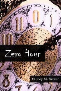
Stoney M. Setzer submitted Zero Hour – Stories of Spiritual Suspense designed by Michael Jarrell. “Michael Jarrell designed the cover of Zero Hour to give it the Twilight Zone-like feel of my collection of 15 short stories.”
Nonfiction Covers
Jason Harvey submitted Achieve Anything In Just One Year designed by Stefan Chinof.

TLC: While the concept is really cool, it doesn’t quite work, here. The cover is too busy to read. Perhaps using a different color for the title would help it stand out — or reversing it from black. The circled words may add interest, but detract from the title and subtitle.
Tiffany Dow submitted Becoming a Vegetarian Against Your Will designed by Rich Pargeter. “I asked Rich at QuickSiteStudio.com for a cover that would reflect someone who wasn’t real enthused about turning vegetarian. I love the graphic and the red. Would love your insight because I agree with your evaluations.”

TLC: The bold red and odd photo actually do more to scare readers away than attract them. She looks like an angry fighter than an unwilling eater. Red is a very strong color that needs to be used wisely. Instead of thinking I could get something out of this book, I see anger and attack and run away.
Tiffany dow submitted Becoming an Entrepreneur designed by Rich Pargeter. “Used Rich from QuickSiteStudios.com again for a different genre of Non Fiction. I’m a fan of covers like 7 habits of highly effective____ so I wanted it clean and to have good name branding for me. Appreciate your $0.02! I’m doing a series where each cover maintains the top red stripe but the other main color changes out.”

TLC: This simple layout fits within the business book genre very well. As an entrepreneur, you don’t want to be “in the red,” so you might want to go with a cool color instead. Otherwise, very well organized, nice typography!
Daniel Kohan submitted Big Butts, Fat Thighs, and Other Secrets to Success designed by Daniel Kohan. “This self-help book for professional women is self-published by the author. She gave us a fairly specific brief for the cover: use strong, solid type; use black and red; and emphasize the title, which of course is fairly long. We didn’t want to do anything too obvious or tacky, like showing a photo of a woman’s behind, but still wanted to bring out the humor inherent in the title.”

TLC: Quite creative in the use of typography and easy to read. The clever shape makes you want to stick around and read the whole title. Perhaps adding some stylized hair to the figure would aid in more instant recognition of the figure. My critique is in the use of color, as red is alarming instead of being empowering. If this book is offered on a black and white Kindle, the red will become gray, making the black much more difficult to read.
Rosie McGee submitted Dancing with the Dead–A Photographic Memoir: My Good Old Days with the Grateful Dead & the San Francisco Music Scene 1964-1974 designed by BookBaby design team. “To me, this is a good example of why to use a professional designer even if you have a fairly complete design in mind. The designers used my desired cover image and general idea, but their skill turned it into a cover.”

Lars Pedersen submitted Darwin designed by Moorland eBooks. “Darwin biography written by Dr. Guido J. Braem”

TLC: A little dry, but fits in its genre well. Looks very academic. Title is easy to read. Cover is clean and uncluttered.
jules older submitted Death by Tartar Sauce—A Travel Writer Encounters Gargantuan Gators, Irksome Offspring, Murderous Mayonnaise & True Love designed by Anastasia Shepherd. “Because I write about crime fiction, and because the title starts with Death, I wanted the cover to connote two things: humor and travel. So: palm trees and a bloody dagger plunged into a bowl of tartar sauce. I did a rough mockup and sent it to the young and gifted Anastasia Shepherd. She had a cover ready to roll one week later. — jules”

TLC: I love the colors you’ve chosen. However, I don’t love the image. I love to read books in this genre and what makes me grab a book off the shelf is a photo of a place I want to visit, a funny scene, etc. The title “Death by Tartar Sauce” is funny, but this very literal image turns me off. The bloody knife in a bowl of tartar sauce resembles a cookbook—in a murder mystery kind of way. I don’t feel travel and true love, here! As far as typography, it’s pretty hard to read and the title is squished at the top. The font choices don’t work well with the subject matter, especially the title. The author’s name feels like an after thought and is shoved nearly to the bottom edge of the book.
Steven Saus submitted Eighth Day Genesis: A Worldbuilding Codex designed by Ashley Cummins. “Eighth Day Genesis is a non-fiction anthology of 20 authors all giving their best advice on building a fictional world. The book is designed for writers and other creatives; the editor and I (I’m the publisher) wanted something clean, but demonstrating the large scale of the work. Ashley was a pleasure to work with and whipped up this eyecatching design for us. ”

TLC: This immediately tells me it’s a book about construction — or destruction. Until I get to the subtitle (or if I get there), I have no idea it’s a book for writers. In addition, there is so much unused space in the photo, yet the title and subtitle are relegated to one line each way at the top. My eye goes first to the digger, then to the blue space and stops.
Marie Sarantakis submitted Essentially Raw

Damonza submitted Everything you need to know about Online Dating designed by Damonza.

TLC: Clever concept and nice balanced text, but could use a better color palette. Black and red are most often associated with mysteries and murder, which is not what you want your readers to associate with dating! Choosing a better background and accent color could go a long way in improving a nice cover. Let’s encourage your readers!
David Slenk submitted From The Grand Canyon To The Great Wall: Travelers’ Best, Worst And Most Ridiculous Stories From The Road designed by David Slenk & Andrea Brazell. “Hello, I hope you enjoy our book cover! Thanks for running this contest – it’s always an interesting read to see who wins each month!”

TLC: The unbalanced combination of type and photo, along with the choice of photo, do nothing to ask me to read this book. I see no humor or excitement here, only a desolate place I never want to see. Let’s show a crazy scene or at least one of those from the book’s title to entice readers to open the book.
Karen Mueller Bryson submitted Hell on Wheels designed by Tony Bryson.

TLC: This cover could really benefit from full color. Using a combination of Cindy’s face and some old-fashioned roller skates would give the viewer an idea of the book’s topic. Right now, the imagery and words don’t match and all potential interest is lost.
Rebecca Helm-Ropelato submitted How to Live in Italy: Essays on the charms and complications of living in paradise designed by Lorenzo De Tomasi (Isotype.org).

TLC: This book should make me want to be in Italy right now! Instead, it looks dreary and the bottom half is so dark I can’t make out the details. My eye goes to what seems like a farm house and gets stuck, so it’s a huge effort to get back up to the text to find out what it’s all about. The use of text, images, and the way they’re used together need to bring a reader’s eye into the book and move him through it in a dynamic and interesting way.
Joanna Penn submitted How To Love Your Job Or Find A New One designed by Derek Murphy. “This is the book of my heart! I wrote the first edition back in 2008 when I was a miserable IT consultant, desperate to change my life. This is the rewritten, rebooted version with how I became a full-time author-entrepreneur as well as the roadmap for others to follow in the career change path. ”

TLC: Love the fish with a briefcase and tie but the cover is so busy that the fun concept gets lost. I don’t think the cubicle image is necessary, therefore the whole photo could be moved down giving more room for a title that can be tightened up a bit. The period in the middle of the title isn’t necessary. Because the title is centered, the author’s name should be centered as well.
Kimberly Dalferes submitted I Was In Love With A Short Man Once designed by Colin Parks.

TLC: Love this—too funny! It’s clever, nice illustration style, and simple title treatment. I’m not crazy about the subtitle’s font or size, but it’s not horrible, either. I’m short but I feel for this tall lady.
Damonza submitted In My Enemy’s Service designed by Damonza.

TLC: The title and imagery immediately get my attention. I want to know more and that’s what a cover is all about. My only tweaks would be to move title up a bit, move the apostrophe away from the “Y,” and to make the bottom text bolder, as it’s almost getting lost. Very nice!
Lars Pedersen submitted Leyendas del Amazonas designed by Ecuadorian artist Israel Pardo and Abya-Yala. “Vinicios book about legends told among indigeous people in the Ecuadorian Amazon.”

TLC: Beautiful imagery. With a better type treatment, this could be a lovely cover.
Belinda Nicoll submitted Out of Sync designed by Yi Kim.
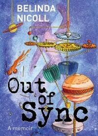
TLC: Great cover! Love the color scheme and texture of the illustrations. I like the title treatment and the type works well within the illustration. The cover has a lot of depth. Nice job!
Kerry Given submitted P is for Princess: The Extraordinary Lives of 26 Real-Life Princesses

Kendall Whitney submitted Pick-Up Dogs: How Two Rescue Dogs Save the West From Being Won designed by Kathleen Weisel. “Here are some tips for dog photography: https://pickupdogs.com/?p=223”

TLC: Are there dogs on this cover? I can’t tell at this size. The colors, layout, type, and vague imagery make this less than inviting.
Pilar Orti submitted The A to Z of Spanish Culture designed by Kevin Koekkoek. “I think Kevin captured the feel of the book very well. The girl in the picture is uncomfortable with the stereotype she’s been given to represent, just as the book aims to give an insight into the life in Spain which has nothing to do with bullfighting and flamenco dancing.”

TLC: This cover gives me no idea what Spanish culture is like, therefore I lose confidence in the author being able to teach me about it. The subtitle is disconnected and floating in a sea of graduated color. The girl does look uncomfortable and the quality of the photo is that of a snapshot. I want to see aspects of the culture on the cover, drawing me in, showing me snippets of what I’ll learn by reading the book. Using type treatments that better reflect the culture (without getting too crazy) and integrating the type with the images would greatly improve this design.
Rita Toews submitted The Cyclist designed by Rita Toews.

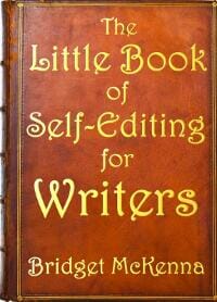
Bridget McKenna submitted The Little Book of Self-Editing for Writers designed by Bridget McKenna.
Shannon Young submitted The Olympics Beat: A Spectator’s Memoir of Beijing designed by Joanna Suen. “I wanted something modern and energetic that would look great in a thumbnail size. The designer used a paper-cutting technique to create this vibrant image.”

TLC: I love this cover. You really hit the modern and energetic look you were going for! The illustration is edgy and cool. The information on the cover is well organized. Here is one tiny piece of advice: The word “Olympics” gets lost a little bit on top of the white figure. I think changing that word to the same gold as the stars in the background would make it “pop” a little more and make that title easier to read, especially from a distance. Well done!
David J. Chernobylsky submitted The Perspective: A Medical Volunteer Experience designed by David J. Chernobylsky.

Steve Radlauer submitted Townie Planet designed by Arlast Evenrude.

TLC: This looks like a frightening novel. A nonfiction cover needs to tell the reader something about the topic inside. While this cover is alarming, it doesn’t provide enough information to cause action.
Well, that’s it for this month. I hope you found it interesting, and let other people interested in self-publishing know about the Awards. —Use the share buttons below to Tweet it, Share it on Facebook, Plus-1 it on Google+, Link to it! The next issue is September 16, 2012 and the deadline for submissions will be August 31, 2012. Don’t miss it! Here are all the links you’ll need:
The original announcement post
E-book Cover Design Awards web page
Submit your e-book cover here
Follow @JFBookman on Twitter for news about the E-book Cover Design Awards
Subscribe to The Book Designer Blog


