Welcome to this edition of the e-Book Cover Design Awards. This edition is for submissions during August, 2012.
Here’s what we received:
98 covers in the Fiction category
24 covers in the Nonfiction category
Award Winners and Listing
I’ve added comments (JF: ) to many of the entries, but not all. Thanks to everyone who participated. I hope you enjoy these as much as I did. Please leave a comment to let me know what you think, too.
Now, without any further ado, here are the winners of this month’s e-Book Cover Design Award.
e-Book Cover Design Award Winner for August 2012 in Fiction
Damonza submitted Beasts of the Walking City designed by Damonza.

JF: Once again the talented Damonza, a previous winner for nonfiction, shows how to combine all the elements of a cover into a cohesive and striking whole. We get intimations of the story, atmospherics, a good deal of menace and some customized typography that helps to bring the whole thing together.
e-Book Cover Design Award Winner for August 2012 in Nonfiction
Alicia Morga submitted Create iPhone Apps That Rock: A Guide for Non-Technical Folks designed by Kyle T. Webster.

JF: Man oh man, when it all comes together it really works. Here the talented illustrator and designer Kyle T. Webster hits it out of the park by really capturing the fun and excitement and hypnotic attachment we have with our smartphones. Powerful graphics and a constant focus on the task of the book cover clearly set this one apart.
Fiction Covers
R J Heald submitted 27: Six Friends, One Year designed by Becky Chilcott.

JF: A memorable cover from a very talented designer.
Justin Elliott submitted A Dark Future designed by Kura Carpenter.

JF: Has possibilites, but the cover is destabilized by the awkward placement of the type, particularly the title.
C. David Murphy submitted A Diary’s House: Where True Love Endures designed by Claudia McKinney.

JF: I love this atmospheric cover with its careful typography. It seems just right for its genre.
Katherine Duprey submitted A Night to Remember

Matthew Iden submitted A Reason to Live designed by Matthew Iden. “A short note: the protagonist is a homicide detective who has elected to retire after being diagnosed with cancer. I wanted the single, stark image to integrate the impact of a crime fiction/thriller with the idea of persevering through his personal issues. “Walking into the light” isn’t the most original concept, in this case, but I think the stock photo simply worked too well with the plot to pass up.”

JF: Nice job, Matthew, but the cover might have been even stronger without the interior shadow effect on the title.
Peter (Len) Harper submitted A Song for Nemesis designed by Author. “The cover is an abstract I did a couple of years ago – that I’d decided had gone horribly wrong! I shoved the canvass in a gap between the wall and the fridge and forgot about it. When I decided I should have the MS copy-edited before downloading onto Kindle, I reckoned to put my money there and save on the cover by making one myself – so out came the canvass!”

JF: I think you were right the first time.
Markus Muth submitted arcanum occultum – Aufstieg und Niedergang einer mysteriösen Geheimgesellschaft designed by Markus Muth. “eBook and cover by Markus Muth. In English the title would read “arcanum occultum – rise and fall of a mysterious secret society”.”

Simon J Townley submitted Ball Machine – the Inside Story of the Lies, Seductions and Sporting Triumphs of the Android Vitas Rodriguez
designed by Simon Townley. “The main challenge here was a very long title! Visually there was a choice between androids, tennis and football (soccer) – all important elements. Getting all three on the cover without making things messy was beyond my skills.”

JF: Yes, the challenge is clearly beyond the layout and typography. The typeface of the long subtitle isn’t helping, nor is the lack of contrast with the background. Even the title is getting a bit lost.
Cynthia Morris submitted Chasing Sylvia Beach designed by the Book Designers, Alan Hebel & Ian Shimkoviak. “I love what Ian and Alan did for the cover of Chasing Sylvia Beach. It looks great on the paperback edition of the book, too, and I think it looks good as a thumbnail, postcard and business card image.”

JF: A gorgeous print cover from the uber-talented Ian Shimkoviak which, unfortunately, is not surviving too well what looks like a straight reduction to ebook size.
Angela Oltmann submitted Cheer designed by Angie-O Creations. “Women’s fiction”

JF: A good example of why you have to be careful with colors on your cover. The visual confusion created works against you.
Angelo Tsanatelis submitted Directive 3.1 (Final Colony 1) designed by Blackveil.

Angelo Tsanatelis submitted Contact (Final Colony 2) designed by Blackveil. “that is the cover of the 2nd volume”

T. Neal Tarver submitted Dark Eyes, Deep Eyes designed by WestBow Press.

JF: Simple yet effective, with solid typography.
Richard Levesque submitted Dead Man’s Hand designed by Mark Walsh. “My cover designer, Mark Walsh, worked to bring the book’s noirish, pulp fiction feel to life in the cover image.”

JF: Fun and effective. But there are 6 hands on this cover, a bit of confusion that seems extraneous.
Dannie Hill submitted Death’s Door designed by Amanda Matthews. “Amanda Matthews was able to take my written thoughts about a cover and bring to a perfect visual!”

JF: It’s challenging to get these composite images to work well, as they do here.
Tonya Cannariato submitted Dementional designed by Gayla Drummond. “This cover image was challenging because the main character is not always human, having been dislocated from his originating space-time by a lost Higgs boson. We had to work to marry that abstraction with the romance interest that also drives him.”

JF: Solid SciFi cover, really nice.
SL Dwyer submitted DIRT designed by Joleene Naylor. “I wanted a cover that was white in order to stand out from the more elaborate covers and to show the title more than a picture. The title tells the story of the Dust Bowl in Oklahoma 1933. Dirt being blown away.”

C L Raven submitted Disenchanted designed by Lizzie Rose.

Warren Caterson submitted Dive and Fly designed by Thomas Broughton. “I wanted a cover that matched the genre and Thomas captured the spirit
of my romantic-comedy-adventure and I hope to use him for the sequel. Have been enjoying and learning a lot from your site, Joel. Keep up the great work!”

JF: Thanks Warren. I like the whimsical illustration, but the type is very weak and consequently not doing it’s job. It either needs to be larger, lighter, or bolder, or all three.
Damonza submitted Dream Chaser designed by Damonza.

Karen Inglis submitted Eeek! The Runaway Alien designed by Me (with touch-up from my illustrator). “I am no illustrator but I had such a clear picture in my head of how I wanted Eeek to look that I played around in Microsoft Paint one day (using my right hand with the mouse even though I am left-handed!). The person who became the illustrator for the rest of the book added shadows and helped make the fingers and toes look more alien like :) We worked closely together to work out the text design.”

JF: Cute!
Anne Mendel submitted Etiquette for an Apocalypse designed by Wil Amato.

JF: Elegant, with a nice touch of surrealism, but I worry about the type which has gotten even finer when reduced from the paperback original.
Laura Rae Amos submitted Exactly Where They’d Fall designed by Laura Rae Amos. “For Exactly Where They’d Fall, I wanted an image that captured the book’s quirky romantic-comedy side, and also its stark literary side. The cover art was made using photography, paper craft, and watercolor. The design was done with lots of feedback from my friends, and of course, tips I learned here on this website. Thank you!”

JF: Very creative, would like to see a little more pop in the colors, even if it’s simply lightening the white bits, because the palette doesn’t have enough contrast.
Kit Foster submitted Fall of the Citizens designed by Kit Foster.

JF: Kit Foster is right in his element here, powerful, evocative and an effective cover.
Michele Brenton submitted Fifty Shades of Blue – the trilogy designed by Michele Brenton. “I hand drew the image and filled with pastels to create a deliberately home-made feel as this is a parody and the cover was intended to subtly poke fun at the way so many ‘knock-offs’ of the Fifty Shades books were rushed out overnight to cash in as quickly as possible. I also wanted to differentiate from the ‘slick’ covers of other parodies to suggest this was something rather different from the rest of the pack. The choice of blue suede shoe springs from the content of the first poem in my trilogy – but I also wanted to have a strong female image on the cover – a ‘foot being put down’ as a subliminal reaction against the very masculine cover of the ‘original’ Fifty Shades book which inspired the parody and which was echoed by all the other parodies except mine. The (genuine) quotes were overdone and exaggerated in size to parody the hype surrounding the original Fifty Shades – which is in itself a fan-fiction of the Twilight series of books. I felt it was important to be pushy with the cover as poetry tends to be the poor-relation as a genre so this little eBook needed to shout about itself to be heard above the crowd. My eBook went in at #13 (July 3rd) for UK paid poetry Kindle bestsellers and #1 for Hot New Releases for US Parodies on and kept climbing until it got to #1 UK bestselling poetry Kindle (paid) – it is currently still in the top ten.”
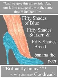
JF: Great result, thanks for the detail.
Roxanne Crouse submitted Fortune designed by Roxanne Crouse.
JF: Oh, there it is: this month’s entry in the “don’t put dark red type on a black background” category.

G Tyler Mills submitted Gather Sticks Along the Way designed by G Tyler Mills. “The story involves an average man as he goes through a terrible ordeal. I wanted the artwork to convey a sense of ordinary. Something ubiquitous so each person can image what they would do in the character’s situation.”

JF: Do you see how it needs a border? I like the simplicity of this cover, though.
Brian Platt submitted George Barrington Hunter designed by Brian Platt.

Joan Rylen submitted Getaway Girlz designed by Lea Rogers, AIA. “Lea Rogers is a good friend of the authors and an architect by trade. This is her first book cover.”

Damonza submitted Head of an Apostle designed by Damonza.

JF: It’s amazing how some designers can create atmosphere like this and make it look easy. Another winner.
J. Aleksandr Wootton submitted Her Unwelcome Inheritance designed by Jill. “This is a great contest idea. Thanks for running it!”

CS Morgan submitted Holiday designed by CS Morgan. “Hi Joel, I’ve been a fan of your blog for a while, and love the helpful comments you make. This cover was the second attempt for my first series of books. I’m about to start my next series, a romance set, so would love to get feedback of what worked or didn’t so I can make improvements for these ones. Many thanks, C”

JF: Great first try. Check out Death’s Door above for an example of how images can be combined in an artful way to end up with one image. Also, this cover has a somewhat “vanilla” look and I suspect that’s in part due to the type. Maybe look through these posts for the best covers and see how they treat the titles.
Richard Sutton submitted Home designed by Me. “Space-travelers turned cave-dwellers. This novella is all about finding redemption wherever and whenever you can. The stock photo image was manipulated and the open cave mouth with its fire burning inside was added. I chose rough, brush-style typography to give it an almost Paleolithic style.”

SL Dwyer submitted If Truth Be Known designed by Jim Dwyer.

Mike Iverson submitted In a Flash designed by Mike Iverson.

JF: This appears to be one of three versions of this cover. But let me tell you something. If you could see me right now, I’m standing up and applauding Mike Iverson, because he actually thought about different covers for his different editions. So in addition to a strong and evocative cover that really exploits its limited palette, it’s also ideally suited to the ebook world, and isn’t just an automatic “let’s shrink this down” version of the paperback cover.
Laurel L. Russwurm submitted Inconstant Moon designed by laurelrusswurm. “What worked well for the print edition was far too understated for an eBook cover, so I redesigned it to give the individual elements more authority. Since writing the book, I’ve been taking every opportunity to photograph the moon, and I am extremely proud of how well my hand held portrait of the moon came out.”
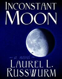
JF: Nice job, Laurel, and see my comments above.
Dixiane Hallaj submitted It’s Just Lola designed by Merrill Worthington. “I chose the picture and downloaded a simple frame. Merrill, a professional photographer, added a photo of an antique frame he owns. He also chose the fonts.”

Patrick Menegaz submitted Japanese Dream designed by Marcos Monteiro.

JF: Well done, although I have to admit the designer in me wants to nudge that mountain over so it’s centered on the round stone in the center.
D. R. Martin submitted Johnny Graphic and the Etheric Bomb designed by Steve Thomas. “My middle-grade ghost yarn is set in the 1930s, the era of dauntless pulp adventures. I think that Steve Thomas did a fine job capturing the spirit of Johnny Graphic’s story in his design, art, and typography.”

JF: Love the typography.
Jennifer Selzer submitted Legend of the Chosen designed by Derek Murphy. “Hi Joel, Please accept this submission of our sci-fi/fantasy novel, Legend of the Chosen, cover designed by Derek Murphy. As this is the first in a series of books that blend the two genres, we wanted the first cover to focus a bit more on the fantasy elements and have immediate eye-appeal and beauty, and we really think Derek captured that with the blue tones and the starburst across the front. Jennifer Selzer & Daniel Huber”

JF: You have chosen well. Beautiful and distinctive.
Peter Pollak submitted Making the Grade designed by Kelly Mullen of inVision Studios. “Illustration by Michael Bagnardi.”

JF: Interesting use of Copperplate, a typeface originally designed for social stationary.
Renata F. Barcelos submitted Mean: a psychological thriller novelette designed by Ágata Maria C. Barcelos.

Isabella Amaris submitted Mesmer, Book 2: Favoured (A Three Towers Fantasy) designed by Isabella Amaris.

Matt Hinrichs submitted Moonlight Dancer designed by Matt Hinrichs.

JF: Very artful blending of illustration and lettering, this cover stands out.
Steven O’Connor submitted MotherCraft – A Short Story designed by Kathryn Junor Design. “Artwork: Dexy O’Connor Design: Kathryn Junor Author: Steven O’Connor ”

Barnabas Smith submitted Movement & Repose designed by Barnabas Smith.

Polly Iyer submitted Murder Deja Vu designed by Polly Iyer.

JF: There’s a bit too much recurrence, and with all these competing drop shadows the effect has abandoned all visual logic.
Noel Chidwick submitted New Myths and Legends of Edinburgh – The Great Al Fresco! designed by Noel Chidwick. “I love the fiery colours of this image, coupling the great Edinburgh skyline at twilight with the excitement of a fire juggling street performer.”

JF: Nice concept and a strong photo but the light band at the bottom is killing the effect and the title type needs to be much stronger.
Brent Green submitted Noble Chaos designed by Terra Brown.

J. C. Kelly submitted Oil Slave designed by Kit Foster. “Apart from being arresting, I felt the image of the Statue of Liberty dripping with oil would evoke the themes of lost liberty and dependence on oil (and how they intersect) in my dystopian novel. I was worried my concept couldn’t be realized affordably until I found Kit, and he brought it to life perfectly! Thanks for this great resource, Joel.”

Patrick LeClerc submitted Out of Nowhere designed by Rebecca Kemp. “Out of Nowhere, an urban fantasy thriller from Patrick LeClerc Pacy”

Glenn Myers submitted Paradise – A divine comedy designed by Sam Richardson. “Sam created for me a backwards, fantasy world, interrupted by another trapped soul. Thanks for this competition, also your tweets which keep me thinking and learning.”

JF: Clever concept, but the whole effect is very muted, and I don’t that’s what you were going for.
Branli Caidryn submitted Phoenix Splinter designed by Jeroen Ten Berge.

Stephanie Fowers submitted Prank Wars designed by Jacqueline Fowers. “This book cover was a joint effort. My friends (Alex Nitz and Hilary Hornberger) posed. A photographer friend (Kristi Linton) snapped the shot. My sister (Jacqueline Fowers) did the graphic design. Although, yes, the author’s name is bigger than the title. Oops. It was an attempt to make it match my first two books of the same genre that were published by a traditional publisher. My next self-published books will definitely have a smaller font for my name. However, I’d love to hear your comments and learn from them.”

JF: The collaboration sounds awesome and good fun, but I don’t think this cover will compare well to the best in this genre, and that’s principally because of the typography. Have a good look at some of the other covers in these posts and see what they are doing differently.
Ana submitted Pulchritude designed by Clarissa Filice.

James submitted Railroad Man designed by Jimmy DelToro.

Brian Cotton submitted Rebels & Lies designed by Greg Dejaynes. “Cover design by Gregory Dejaynes for my debut novel “REBELS & LIES””

JF: Underwhelming. Isn’t there anything about this book you wanted to communicate on the cover? If so, we don’t see it.
Tom Keller submitted Return of the High Fae designed by Cory Clubb – Go Bold Designs. “Cory did a great job and gave me exactly what I was looking for. I’ve received some great comments about the cover.”

JF: There’s a lot to like about this cover with it’s careful typography and interesting artwork, but it seems to all be thrown way off base by the huge red “branding” seal that only distracts from the excitement and mystery the cover was creating. Notice how the main graphic elements—the tree trunk and the man’s focus—are both aimed right at the red seal.
Stephanie Sun submitted Rootless designed by Stephanie Sun.
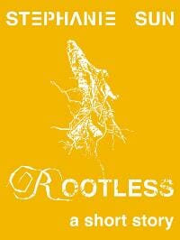
JF: Stephanie, if you darken the background color this will work much better.
Adan Lerma submitted Rosetta designed by Felipe Adan Lerma.

Kathryn C. Lang submitted RUN designed by Kathryn C. Lang. “Thank you for the opportunity to enter RUN in your cover contest. I look forward to hearing from you.”

JF: Thank you, Kathryn, for sending along a square cover. It works, but I’d bet it would work better if the title was 150% larger.
Ben Zackheim submitted Shirley Link & The Safe Case designed by Robin Hoffman.

JF: Cute, very nice. Needs a border.
Deb Schwalm submitted Snake Oil Volume One designed by Deb Schwalm. “Please contact me with any questions. I am the designer for both from and back cover for this book.”

JF: I really like the out-of-the-rectangular-box background you used here, it does make the cover stand out from the crowd, and that’s half the job done. I’m sure more designers will be going in similar directions as ebook cover design matures.
Damonza submitted Soach designed by Damonza.

JF: One of the great lessons to learn from Damonza’s covers is how texture can play a huge role in the overall effect of your cover. This one stopped me to figure out what was happening in the illustration, and drew me in.
Damonza submitted Song of the Fairy Queen designed by Damonza.

Brynna submitted Starkissed designed by Brynna Gabrielson. “This is my first stab at cover design, for my debut ebook Starkissed.”

JF: You’re off to a great start, Brynna, this hits just the right note.
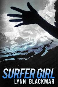
Lynn Blackmar submitted Surfer Girl designed by Lynn Blackmar. “Black and white photograph by Ron Chapple Studios.”
Damonza submitted Sweetness designed by Damonza.

JF: I wouldn’t ordinarily associate a bold slab-serif typeface like this one with the idea of “sweetness” but overall it works. The strong symmetry of this cover gives it a stillness, and the designer has used the intersection of receding lines of the boardwalk and the horizon to focus our attention right where he wants it.
R. Janvier del Valle submitted Sword from the Sky designed by Myself. “Photo was purchased from Shutterstock. Everything else was done in GIMP.”

Wilette Youkey submitted Taking Heart designed by Wilette Youkey. “I wanted to take the ubiquitous illustrated covers for chick lit and change it up without veering too far from the look. So I decided to illustrate the cover by mimicking the papercut technique. This cover was really fun to design.”

JF: Absolutely lovely, totally charming, and very effective for your genre. One of the nicest covers of its kind I’ve seen in a while.
Brooke Johnson submitted The Clockwork Giant designed by Brooke Johnson. “This is my second cover for this book. While I liked the original, I felt it had a self-published look to it, where this one seems more professional, and it captures the steampunk feel without having to plaster gears all over it. I used sumo.fm to create the cover.”

JF: Keeping it simple really helps, as you can see here.
Jack Night submitted The Dead of Winter designed by Jack Night.

Marsha Canham submitted The Dragon Tree designed by Marsha Canham. “I always try to convey what the book is about in a single image. Hopefully no one is left guessing about this one *smile*”

JF: You’ve hit all the notes, but you need to differentiate the title and the author more so they are distinct.
Cathy Helms submitted The Eagle Has Fallen designed by Cathy Helms – Avalon Graphics.

JF: Beautiful, love the colors in this cover.
Tiffany Dow submitted The Feast designed by Rich Pargeter.

JF: It looks good, but is it really telling me anything about the book?
C.M.Gray submitted The Flight of the Griffin designed by C.M.Gray.

E. C. Brierfield submitted The Magnolias of Sutherland Creek designed by eduardo Cervino.

Vincent Eaton submitted The Nice Guy designed by Fontana design & identity. “Book occurs in the summer in a beach town in Southern California in the mid-1970s, thus the grainy, shimming, distancing effect…”

JF: And the type is right in character too, but I wish the cover had more contrast, something that really stands out.
Travis Luedke submitted The Nightlife: New York designed by Joshua M. Allen. “This is the first of a series of urban fantasy novels that will travel from New York to Vegas, Paris, London, and Moscow. Each cover is symbolic of the city title. This design is representative of the “Big Apple” of New York, with a splash of goth and blood.”

Greg Hamerton submitted The Riddler’s Gift designed by Greg Hamerton / theDURRRRIAN. “I supplied a pose and creative brief to the talented https://thedurrrrian.deviantart.com/ who created the amazing commissioned artwork. I just finished it off with titles – credit due to theDURRRRIAN!”

JF: Great job, it really came together well.
Amber Polo submitted The Shapeshifters Library Book 1: Released designed by Connie Lee Fisher https://www.connieleemarie.com/graphics/print.html. “The top logo and bottom author’s name will stay the same for the series.”

Andy Fielding submitted the silver phoenix and other tales by nigel anderton designed by Andy Fielding.

JF: A lovely concept somewhat undone by the title disappearing into the background design. Perhaps just changing the color of the title might help.
Sariah Wilson submitted The Ugly Stepsister Strikes Back designed by Kevin Wilson. “My husband illustrated and designed the cover himself – it’s his first attempt at something like this! It’s a fun, chick lit YA book, and I thought his cover captured that vibe.”

Gwen Perkins submitted The Universal Mirror designed by artist Enggar Adirasa, layout Frank Hall.

Kit Foster submitted The Will of Man designed by Kit Foster. “This is the second book in the ‘Keri’s Chronicle’ Trilogy by Mike Canino. Sequel to ‘The Will of the Gods’, which I submitted the cover for a couple of months ago.”

Katie Jennings submitted When Empires Fall designed by Katie Jennings.

JF: Great job with the illustration, Katie, but your title typography needs help.
K. A. Stevens submitted When Innocence Dies designed by The Art of Sandra Dee. “The cover of “When Innocence Dies” is a rendition of an orginal piece of artwork completed by The Art of Sandra Dee and is noted in one of the pictures below the cover on amazon. The rendition was completed by createspace.”

Matilda Wren submitted When Ravens Fall designed by Matilda Wren.

Fabio Bueno submitted Wicked Sense designed by Martina Elise Dalton. “Martina Elise Dalton designed the cover for my YA paranormal/urban fantasy. We strived for an elegant design that would follow the standards of the genre but stand out. And it works for large files and small thumbnails.”

Tahlia Newland submitted You Can’t Shatter Me designed by Centrepiece Productions Design Studio. “This is a young adult novel.”

JF: Wow, this one really eludes me. What’s all the electricity about? And in the center, that’s either a butterfly or the chambers of the heart, right? I’m afraid I just don’t get it.
Nonfiction Covers
Vanessa Maynard submitted 52 Things you Should Know about Geophysics designed by Vanessa No Heart.

JF: Very clean and appropriate design, but the title is disappearing at this size.
Rebekah Michel submitted A Redhead’s Journey through Madness A Memoir designed by Rebekah Michel.

Chariti Canny submitted A Spiritual Evolution: Coming to Recognize god in All That Lives designed by Chariti Canny. “Author had a very specific idea about how her story should be represented on the cover. We worked together to get this into the appropriate layout, with online clarity and story insight, as well.”

Tucker Elliot submitted Atlanta Braves: An Interactive Guide to the World of Sports (Sports by the Numbers / History & Trivia) designed by Holly Walden Ross. “This is a book from the Sports by the Numbers series on Sports Trivia and Facts. The original SBTN logo file was created by an earlier designer but was lost due to a hard drive crash, so Holly Walden Ross had the challenge of recreating that logo to coordinate with previous book designs in the series.”

JF: Branding is a strong part of book series like this, and this cover carries the branding well, but it needs a stronger title treatment to really shine.
Catherine Ryan Howard submitted Backpacked: A Reluctant Trip Across Central America designed by Andrew Brown, Design for Writers. “The original cover for Backpacked matched my first book, Mousetrapped, but I’ve always felt it looked a little too self-published when compared with other books in its category. I asked Andrew to do a redesign from scratch and this is what he came up with. I really think it captures the fun and humor of the book—or at least, I hope it does! It’s more eye-catching at least.”

JF: Delightful. What I love about this cover is the way it suggests the subject matter, the locale and the author’s tone without getting fussy.
Elizabeth Winthrop Alsop submitted DON’T KNOCK UNLESS YOU’RE BLEEDING designed by Rebecca Swift. “This is the cover of my new memoir piece up on all the ebook platforms. I’m the author (under Elizabeth Winthrop) of over sixty traditionally published works of fiction for readers of all ages. This is my second ebook.”

JF: A really strong and focused cover that would be much better if you just got rid of the gratuitous text “effects” on the title, which are only a distraction from a great design.
Derek Padula submitted Dragon Ball Z “It’s Over 9,000!” When Worldviews Collide “The goal was to focus on the legendary rivalry between Goku and Vegeta, the main characters of the Dragon Ball Z series of anime and manga. The design guidelines were simplicity, readability and power, with a special emphasis on the eyes. I think the cover successfully captures the character’s personalities and draws you in to learn more. The cover art illustrations were done by Javier Secano, and the typography and layout were done by myself. The e-book is available now on Amazon Kindle and launches worldwide September 9, 2012 on Apple iBooks, BN.com and Kobo, while a physical book will be available in late September.”

JF: It works well, relying on the skillful and recognizable drawings from this popular series. It’s not immediately apparent whether “Dragon Ball Z” is part of the title or not.
Andrea Lewis submitted Dramaville is not a place; it’s a state of mind designed by Robin Ludwig Design Inc..

JF: Very cool, very distinctive.
Jeff Cook submitted Everything New: One Philosopher’s Search for a God Worth Believing In designed by Mary Emily Brink.

Kathleen Gamble submitted Expat Alien designed by Roberto Marelli.

C. L. Frey submitted Freelance Hacks: How to create systems to organize your freelance life designed by Foxtail Studio. “Wanted something clean, legible, professional looking and a bit quirky.”

JF: The perspective makes the title stand out, but also makes the rest of the type a bit hard to read. But a good cover nonetheless.
Author: Michael Ryan James (Submitted by Tugboat Design) submitted How To Make Money From Writing Online designed by Tugboat Design. “How To Make Money From Writing Online by Michael Ryan James is a practical, effective guide for people looking to break into the world of writing online.”

JF: A nice cover well matched to its content. Love the illustration.
Vanessa Maynard submitted Looking Up designed by Vanessa No Heart.

JF: An interesting attempt to combine elements that in the ends leaves the cover without one dominant focus.
Heather Marie Wessel submitted My Journal: A True, Simple, Real-Life Backpacking Adventure, Europe: 2 Months, 15 Countries, October – December 1997 designed by Heather Marie Wessel.

JF: Interesting to compare this cover with Backpacked, above. I like the simplicity and directness of the cover even though the small photos are getting a bit lost.
Lisa Giles submitted My Kin designed by Lisa and Reggie Giles.

Jeni Starr submitted Plus Size Confidence designed by Rich Pargeter @ QuickSiteStudio.com.

JF: And a very professional, confident cover with an adept use of color.
J C Edwards submitted Poems of Living, Loving & Lore designed by Selena Howard. “Poetry book; cover artwork from a painting by Selena Howard. I wanted an old-fashioned feel that would complement the poetry, much of which is in traditional, classical formats.”

JF: It succeeds in some ways but the fatal flaw here is allowing the design to overwhelm the book by cutting it in half. The title, which could have saved it, has also fallen victim to the split.
Stephen Lean submitted Proper Spanish Tapas designed by Stephen Lean.

JF: I just love the colors and outstanding readability of this ebook cover. There’s no question what you’re going to get.
Donna M. George submitted Starfish: A Memoir designed by Abbott Press & Donna George.

JF: What a great photo, and nicely handled on this cover.
DJ Hazard submitted The Grumpy But Lovable New Yorker Guide To Enjoying Life Even Though You Are Broke… And Grumpy designed by DJ Hazard.

JF: Easily wins the “title of the month” award.
Damonza submitted When the Sky is Falling designed by Damonza.

JF: Once again Damonza shows atmosphere, texture, sensitive typography and a command of the sight path. Lovely.
Keenan Wilde submitted Wild Times Ahead! designed by Tsukasa.

“
Well, that’s it for this month. I hope you found it interesting, and let other people interested in self-publishing know about the Awards. —Use the share buttons below to Tweet it, Share it on Facebook, Plus-1 it on Google+, Link to it! The next issue is October 15, 2012 and the deadline for submissions will be September 30, 2012. Don’t miss it! Here are all the links you’ll need:
The original announcement post
E-book Cover Design Awards web page
Submit your e-book cover here
Follow @JFBookman on Twitter for news about the E-book Cover Design Awards
Subscribe to The Book Designer Blog


