Welcome to this edition of the e-Book Cover Design Awards. This edition is for submissions received during September, 2012.
Here’s what we received:
86 covers in the Fiction category
15 covers in the Nonfiction category
Award Winners and Listing
I’ve added comments (JF: ) to many of the entries, but not all. Thanks to everyone who participated. I hope you enjoy these as much as I did. Please leave a comment to let me know what you think, too.
Now, without any further ado, here are the winners of this month’s e-Book Cover Design Award.
e-Book Cover Design Award Winner for September 2012 in Fiction
Christopher Geoffrey McPherson submitted Sarah & Gerald designed by Matt Hinrichs. “”Sarah & Gerald” is a novel about a different kind of romance in Paris in the 1920s. It sports another fantastic cover by designer Matt Hinrichs who did the illustrations and design work.”

JF: I love the designer’s audacity in putting together these patterns and somehow creating an effect in which it all make sense. Both the illustrations and the typography allude to the period in which the book is set, and just for fun notice the “curvature” of the book at the “spine,” alluding to a physical book. Charming and adept.
e-Book Cover Design Award Winner for September 2012 in Nonfiction
Kit Foster submitted The Tao of Dating designed by Kit Foster.

JF: Here Kit Foster brings some of the same elements of design from fiction covers to this dynamic nonfiction book. Strong typography, interesting textures, outstanding legibility and active colors make this a real winner.
Fiction Covers
Matthew Thayer submitted 30,000 B.C. Chronicles: Bordeaux designed by Darko Tomic. “I was looking for a graphic artist who could create original artwork for my book series set in 30,000 B.C., and found the perfect person in Darko Tomic. I challenged Tomic to place readers back in time, to make them ask “What happens next?” It was a process of less is more as we started with something complicated and pared it down to a single mammoth reflected in a swamp at sunset. Is the beast dangerous? Is it contemplating a charge? The cover leaves it up to the reader to find out. Since it is the first book in the 30,000 B.C. Chronicles, it was important to establish the fonts and style to be used throughout the series. Tomic was instrumental in creating an overall design that is not only marketable, but will carry over well from book to book. Tomic also did a back cover painting of a Neanderthal clan gathered around a fire, as well as pen and ink drawings for each of the book’s chapter headings.”

JF: A beautiful job too, and I like the careful and distinctive typography, although it looks like you might want to bump up the size on the type at the bottom of the cover a bit.
Libby Young submitted A Backward Blessing designed by . “The book is about an adoption scam with children disappearing in Cape Town.”

JF: I’ve never been a fan of running type in different directions on a cover when there’s no clear design reason to do so, and it weakens this cover.
Jim Martin submitted A Madman’s Song designed by Jim Martin.

JF: Nice job, just the right tone for this genre, despite the dark red author’s name against a black background. Well conceived and executed.
Lizbeth Wright submitted A Sense of Light or Darkness designed by Lizbeth Wright. “This is my first attempt at a book cover. Thanks!”

JF: An interesting concept, but the typography is much too weak to connect the two halves of this cover design.
Clayton Smith submitted Acceptance designed by Clayton Smith. “”Acceptance” is by Constance Daley. Form submitted by designer.”

JF: I got a little vertigo here until I realized the model was actually lying on the floor when this shot was taken, and the almost unreadable type doesn’t help.
Anne E. Johnson submitted Aliens & Weird Stuff 2 designed by Anne E. Johnson.

Elizabeth McCoy submitted All That Glitters designed by Elizabeth McCoy/Sarah Cloutier. “For the cover of the third in this world (hopefully fairly stand-alone from the original duology), I went back to the same artist as the first and second — and I tried to blow the title up as big as I could without drowning the image. (I was going to go with a frame and cropping — but I’m just too in love with how well the artist portrays the world.) While it doesn’t work perfectly at Amazon “Also Bought” thumbnail size, it does well at the next size up.”
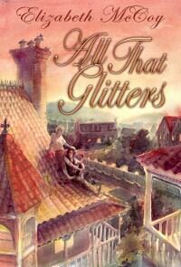
JF: That “Also Bought…” size is very important, since it’s Amazon’s way of introducing you to new readers, so I would put a lot of weight on it. Here, what’s creating problems is the title typography which, on a complex drawing like this is way too fussy and really lacks contrast with the background.
Lise McClendon submitted All Your Pretty Dreams designed by Lise McC. “Approximately my 4th cover, pre-release. I asked my blog readers for advice for the first three, and got varying opinions. Still not sure it conveys the right stuff…?”

JF: Well, everything here is focusing attention on the hand at the center of the cover. If that’s what you intended, it’s working.
Pennie E. Pyle submitted Angel of Vengeance designed by Pennie E.. Pyle. “This was done in Photoshop with elements all of which I own. The girl is actually my daughter.”

Sarah Billington submitted Ba(n)d Romance designed by Billington Media.

JF: Nice, high-energy photo combined with very weak typography that’s hard to “get” and with distracting and unnecessary effects.
Carl Grimsman submitted Barbara Reilly designed by Cover concept by the author, illustration by Alexy Aparin, typography by Ron Eddy. “I wanted something magical with a bit of a Disney effect. I worked up some sketches and a hand-drawn typeface. The pros rendered it, surpassing my vision.”

JF: Well done, and the “magical” element is quite strong.
Glen Cadigan submitted Bedlam & Belfry, Intergalactic Attorneys at Law designed by Glen Cadigan. “Easy to read from a mile off. Design is consistent for each book in the series, differing only in color.”

JF: Unfortunately, this cover defies the number one rule of cover design because it looks nothing like what you expect a hilarious sci fi novel to look and gives no indication of what kind of book is inside.
J Smith submitted Behold This Night designed by J Smith. “Vampire Romance genre trilogy – Book 3. Orange/Red Fire background and lion statue as the plot rises but with a slim rainbow of hope for the romance. High contrast statue image carried with other covers to project starkness purpose good/evil, love/hate, life/death. Common author font and layout used in the series.”

JF: Consistent, genre-appropriate and readable designs (see the 2 following also) make these covers stand out.
J Smith submitted One Night Burns designed by J Smith. “Vampire Romance genre trilogy. Green, tree, sunlight used as background as this is the series beginning (before all the running and madness starts). Statue of a girl used as reference to main character POV. High contrast statue image used to project starkness. Common author font and layout used for the rest of the series. Book title font went through many revisions, crowd sourcing votes, and debating still. Swirly script styles are more genre targeted but difficult to read. Any suggestions?”

J Smith submitted The Night Discovered designed by J Smith. “Vampire Romance genre trilogy – Book 2. Stormy Blue background as the fickle plot seems against the protagonists. Flying statue for motion, rising action. High contrast statue image used to project starkness and match other series books. Common author font and layout used in the series.”

Clare Harris submitted Blood Kind: An ESL Easy Read designed by Cory Clubb (Go Bold Designs).

Rob Vitaro submitted By the Light of the Moons designed by Rob Vitaro. “When I knew I would be indie publishing, I also knew I wanted to make the cover myself. I had a very specific image in mind, an enormous and unusual tree in the deep blue moonlight of 3 moons. Thanks to Ben Earwicker’s original photo “NZ Trees 2″ (https://www.garrisonphoto.org) and an online tutorial (https://vimeo.com/2893492), I was able to create exactly what I was looking for.”

JF: Nice job, Rob, and it shows how limiting your palette can be a big help in focusing the reader’s attention.
Joanne Phillips submitted Can’t Live Without designed by Chris Howard.

Kit Foster submitted Comrade Fox designed by Kit Foster. “This is a redesign I did for Scottish author Stewart Hennessey for Comrade Fox, his epic comedy about the Russian revolution.”

JF: Fantastic job, Kit, a really fun cover that’s almost irresistible.
Molly Adams submitted Country Living designed by Erin Kelly.

Nicola Marsh submitted Crazy Love designed by Heather Howland.

JF: Cute and genre-specific, this really works.
elizabeth cage submitted Crimson Kisses designed by Klaus Hartleben. “This is our first project together and first ever kindle cover design for Klaus. A learning experience for both of us!”

JF: Beware the dark red type against the black background. (Sound familiar?)
Tony McFadden submitted Daly Battles: The Fall of Pyongyang designed by Tony McFadden.

Rita Toews submitted Dire Straits: A Trooper’s Tale designed by Rita Toews.

JF: Another cover that doesn’t communicate the fast-paced thriller it appears to be.
J.D. Hallowell submitted Dragon Fate designed by Craig R. Smith.
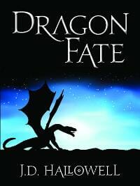
JF: The simplicity of this design combined with careful typography really help its impact.
Ron A. Miles submitted Dreams of Life designed by Rosamond Grupp.

Craig Terlson submitted Dunked designed by Craig Terlson. “Wanted to capture the essence of this story without a picture of a person. The crabapple shows up in the story, and exists on the cover as a metaphor to what the young boy struggles with. The story is quirky and dark.”

JF: You may be asking quite a bit from a casual browser who will have no idea how these 2 elements—title and apple—connect.
Steven O’Connor submitted EleMental: A First-person Shooter designed by Kathryn Junor Design; Artist: Aaron Pocock. “I initially intended to submit only the main cover for my new young adult novel, but at the last moment I have decided to submit the four others as well – as I have also published each of the four parts of my novel separately. Just submitting the one cover felt incomplete, as if I was not properly showing the whole story.”

JF: The series design shows promise, but its effect is supressed by the lack of contrast on most of these covers. They are retreating away from the reader despite the clever illustration. They need more punch.
Steven O’Connor submitted EleMental: A First-person Shooter (Level 1) designed by Kathryn Junor Design; Artist: Aaron Pocock. “Level 1 of E-FPS.”

Steven O’Connor submitted EleMental: A First-person Shooter (Level 2) designed by Kathryn Junor Design; Artist: Aaron Pocock. “Level 2 of E-FPS.”

Steven O’Connor submitted EleMental: A First-person Shooter (Level 3) designed by Kathryn Junor Design; Artist: Aaron Pocock. “Level 3 of E-FPS”

Steven O’Connor submitted EleMental: A First-person Shooter (Level 4) designed by Kathryn Junor Design; Artist: Aaron Pocock. “Level 4 of E-FPS.”

Diane Capri submitted Fatal Enemy designed by Jeroen ten Berge. “We’re redesigning all of my covers for a better branded look and feel. Fatal Enemy is a new release and the first of the new designs. Jeroen outdid himself on this one, don’t you think?”

JF: I’m a fan. The cover is very strong and dynamic, with the designer pointing our attention right at… the crotch. I’m wondering if there wasn’t a different solution to all the blue taglines floating around the cover but, overall, very impressive.
Jacob LaCivita submitted Fester designed by Jacob LaCivita. “Tickets forming the “F” were photographed on a lawn in a park; remaining letters were added later via Gimp. “Fester” is a comedic short story set at a music festival, so I wanted the cover to convey this was not a monster/alien thriller…”

Natasha Brown submitted Fledgling designed by Natasha Brown. “Thank you for your time and consideration :)”

JF: A nice, clean design, Natasha.
Cate Rowan submitted Flirting with the Fireman designed by Cate Rowan. “To match this romantic short story, I wanted to make a cover that was cute, light, and fun.”

JF: Very cute, I love it.
Darnell Dickerson submitted Flowers: A Short Story of Love and Death designed by Karri Klawiter.

JF: Lovely, but the title could use more contrast and the subtitle is all but unreadable.
Stephanie K. Deal submitted Game of Hearts designed by Stephanie K. Deal. “Thank you!”

Damonza submitted Ghostwriter designed by Damonza.

JF: One of the things I admire about Damonza’s covers is his ability to express a concept through simple but evocative visuals, like with this “ghosted” figure.
Yasmin Selena Butt submitted Gunshot Glitter designed by Celene Petrulak. “I came across Celene Petrulak on MySpace several years ago and knew I wanted her to illustrate the cover of my novel. I just fell in love with her art! I think she is amazing. Working together was tricky at times, especially being based in different countries. I made a radical change at the very end, splitting the image in half, luckily Celene could see the merit! I wanted there to be enough space for the words to be showcased properly and the cover quote to fit on. I wanted a cover that looked striking and enticing and feel together we achieved that. I am really proud of our combined effort.”

JF: I can see why you love her illustration, and that’s one of the reasons this cover really deserves better typography.
Mark Sekela submitted Hidden designed by Mark Sekela. “I designed the cover myself and then had a professional at Angel Editing complete the layout for me. It is the first book in a series that have the same “cover theme”.”

JF: Your method has worked well, but leaving all the type in white is perhaps oversimplified, and an adjustment would make this cover even better than it is.
Robin Lythgoe submitted In the Mirror designed by Robin Lythgoe. “Design by Robin Lythgoe; line-drawing by MarshaLee Champagne; artwork by Robin Lythgoe.”

JF: A very beautiful cover in which texture, typography, illustration and concept unite into one, cohesive whole.
Jaimie Admans submitted Kismetology designed by Jaimie Admans. “My first published book and this was my first attempt at cover design – I know it is very simple but it took weeks of tweaking and changing bits! I would love to know what you think!”

JF: Jaimie, I think you’ve done a marvelous job. Fun and just right!
Christopher Wills submitted Lulu Love Teenage Ghost designed by self. “I drew the character and scanned her in to my pc then used Manga Studio Ex 4.0 and a graphic pad to draw the church and gravestones, and to colour the lot in. The book is a YA fantasy about a ghost on a dangerous quest to find her father (also a ghost).”

JF: Nice job, Christopher, and a very creative color combination.
Jo Michaels submitted Mystic ~ Bronya designed by Jo Michaels. “This cover was produced using a wacom intuos 4 tablet and Photoshop CS5. I’m interested in all comments. Publication date was 8/19/2012. Thank you for the opportunity!”

Paula Howell submitted No Mother of Mine designed by eBook Prep.

Dave Malone submitted Not Forgiven, Not Forgotten designed by Jenni Wichern.

Douglas Grant Johnson submitted Out of Kilter designed by Douglas Grant Johnson, author. “Cover image and design by the author; for the woman’s photo, an old family snapshot was used for the hairstyle, but with the addition of a new face mostly created in Photoshop.”

JF: Excellent job, Douglas, a very strong ebook cover with nice atmospherics and solid, readable typography.
Toni Kenyon submitted Private Love in a Public Place designed by Kevin Findlater.

Karen Anderson submitted ReCovery designed by Liza Williams.

JF: See “dark red type on black background”.
Phillip Winberry submitted Reno Splits: Mystery on a Nevada Divorce Ranch designed by BookBaby.

JF: Top quality job, energetic and visually interesting. I just wish BookBaby (and other companies) would credit the designer by name, because if they had, it would have been a strong contender for this month’s award.
111Publishing submitted Schattenfrau designed by Doris-Maria Heilmann. “… Waiting for the Lover, who never arrives. Schattenfrau is a German word for Mistress”

Merrie P Wycoff submitted Shadow of the Sun designed by Marty Petersen.

JF: Beautiful.
Laura A. H. Elliott submitted Shadow Slayer (Shadow Series #2) designed by Laura A. H. Elliott.

Damonza submitted Solomon’s Keepers designed by Damonza.

A.J. Stewart submitted Stiff Arm Steal designed by Damon Freeman.

JF: Another strong cover from Damon Freeman, a previous winner here.
Richard Levesque submitted Strictly Analog designed by Mark Walsh.

Sylvia Volk submitted Sungoddess designed by Sylvia Volk.

JF: I had trouble with this cover, although the type is strong and the colors attractive, I just couldn’t make out the illustration for a while. But it does jump off the page.
Debra Davis Hinkle submitted Tears to Laughter designed by Sarah Danielle Campeau. “The cover showcases lost pets and family members of the authors.”

Jennifer Holmes Harborth submitted The Eight Pointed Star designed by Jennifer Harborth.

K. L. Kerr submitted The Genesis designed by K. L. Kerr.

Karl Fields submitted The Go-To Guy designed by Karl Fields.

Karla Darcy submitted The Marriage Wager designed by Tara O’Shea.

Karla Darcy submitted The Masked Heart designed by Tara O’Shea.

JF: These three covers by Tara O’Shea are beautiful examples for a historical romance series. I particular like this one and the way the background pattern repeats in this cover and the one previous. However, also see my notes on The Queen of Diamonds, below.
Karla Darcy submitted The Scandalous Ward designed by Tara O’Shea.

Beverly Akerman submitted The Meaning of Children designed by Alison Hall.

JF: Beautiful and self-assured, a cover that does everything it needs to do.
Roxanne Crouse submitted The Monster designed by Roxanne Crouse.

Jane George submitted The Mumbo Jumbo Circus designed by Jane George.

JF: Fun and distinctive.
Damonza submitted The Queen of Diamonds designed by Damonza.

JF: Another great cover from Damonza, compare the way the type is handled here to the series of Karla Darcy books just above. Knowing how to isolate the type without doing violence to the image makes for a much more powerful effect that never confuses the reader.
Aron Joice submitted The Rising(The Lost Children of Managrail) designed by Richard K Green. “Richard K Green from www.Greenalienart.com provided the cover design for The Rising”

JF: Nice and spooky!
Lisa Bouchard submitted The Shattered Door designed by Zoe Storm via 99Designs.com. “Zoe became the front-runner during a surprisingly intense competition. Her design is slick, clean, and professional.”

Cassandra submitted The Stars Fell Sideways designed by Myself. “Thank you!”

JF: Very clever and nicely executed.
Colin F. Barnes submitted The Techxorcist Part 0.5: Rebirth designed by Colin F. Barnes (Eric Belisle for illustration).

JF: Very cool, I would definitely pick this one up.
Scarlett Rugers submitted The Water Thief designed by Scarlett Rugers. “This design was for a dystopian novel. Portraying the main character disconnected from his world, not only by the fence inside the image but by his separation via standing outside the box.”

JF: I particularly like the classic feel to this cover.
Ruth O’Brien submitted The Widow Darcy Journals, First Kiss designed by Rajesh Maurya.

Riley Banks submitted The William S Club designed by Ray Bull from Bull Art.

Tom Evans submitted This We Know designed by Me with stock image. “Hi Joel – I can’t claim this is ‘designed’ this per se, more assembled from stock imagery – simplicity, speed and low cost were my aims. Started writing book 3rd Sept, published in print and Kindle by 21st Sept.”

JF: No problem, keeping it simple has paid dividends.
Adam Connell submitted Total Secession designed by Miguel Ibarra. “Total Secession was written by Adam Connell, but the cover was designed by Miguel Ibarra. His email is [email protected]. He knows that I have submitted his cover for this contest.”

Evelyne Holingue submitted Trapped in Paris

Jordan Castillo Price submitted Turbulence 4: Connecting Flight designed by Jordan Castillo Price. “The emphasis on greens and orange-golds in this cover coordinate it with the previous covers in the series. The typography is consistent throughout all the covers as well. I’m more interested in marketing the series as a whole than any individual title in it, so it must be apparent that the covers are “a set” from even a quick glance.”

JF: Excellent, really draws us in, and I like the “slick” finish for this series. Quite good for an author-designed cover, Jordan.
Jeff Bennington submitted Twisted Vengeance designed by Jeff Bennington. “This cover is the 5th cover for Twisted Vengeance, and thankfully the last. Sometimes you have to test the waters in the market to see how a book cover is received. If it doesn’t work, change it.”

JF: Very interesting, would love to know more about the feedback from readers. This one clearly meets the “creepy” test and the type is well integrated.
K.M. del Mara submitted Whitebeam designed by K.M. del Mara. “UK photographer Chris MacLean very generously lent his image to me,a total stranger. I removed the parts that did not harmonize with my 14th century Scottish adventure tale.”

Rhonda McCormack submitted Wildflowers designed by R McCormack/Firehed.

Diana Savastano submitted WINDS OF POOD (Book 1: Under the Puddle) designed by Chris Ladwig.

JF: Okay, this will be our “title of the month” winner. I like the idea of the drawing on this cover, but the palette seems wrong, like it should be much brighter, lighter and more fun. And if you can kill all the modeling on the title, I’m sure it would look better, it’s out of sync with the illustration and adds a lot of graphic “noise”.
Nonfiction Covers
Doris-Maria Heilmann submitted 111 Tips to Create Your Book Trailer designed by Doris-Maria Heilmann.

Augusto Pinaud submitted 25 Tips for Productivity designed by Kenn Rudolph.

JF: A cute idea and a good way to save money but, unfortunately, it needs to be executed a whole lot better.
Brian Wernham submitted Agile Project Management for Government – Part I designed by David Roberts. “Cover Designer was David Roberts: https://www.davidpaulroberts.com”

JF: Chaotic and ineffective.
Phil Steer submitted As a Child: God’s Call to Littleness designed by Phil Steer (self).

JF: A lovely image crying out for decent typography.
Sylvia Morice submitted Confessions From My Blog designed by Sylvia Morice.

JF: What’s interesting here is the author’s decision to use a cover design that looks like it should be on a story or a novel. Yet the book is a collection of autobiographical blog posts. That’s a little too confusing for me.
Kelly Langston, Designer / Author, Tamara Brooks submitted Daily Discoveries of God in Life: A Devotional designed by Kelly Langston: Langston Marketing Services.

Marilyn Clark submitted Feed Sacks and Bobby Sox: A Hoosier Girl Comes of Age during the Great Depression designed by Publish America. “Photo provided by author and designed by Publish America.”

Keith Lee submitted Programming for Everyone designed by Keith Lee. “I reviewed the ebook covers from many previous months’ submissions, the recommendations published at this site, and ebook covers from other designers. This is my third ebook, and I’m looking forward to your comments!”

JF: Keith, the first thing you need to decide is which element—the image or the title—is going to dominate. Here, they are at war with each other and consequently the cover never quite comes together. Keep going, you’re on the right track.
Fourat Janabi submitted Random Rationality: A Rational Guide to an Irrational World designed by Myself.

Erin Kelly submitted So, You Want to Live in a Yurt? designed by Erin Kelly.

JF: I like most everything about this cover, but switching the color of the type in the title the way it’s been done here makes it hard to read and confusing for no good reason.
Karen Anderson submitted Temples of Praise designed by Serena Barnett.

JF: You see, a cover like this raises the inevitable question: What’s the book about? Why should I be interested?
Steven Ward submitted The Coffeeist Manifesto designed by Jake Clark. “This design was the product of a contest run through 99Designs. I had low expectations for it because I had just too many elements in mind to make the design I had in my head look right for an ebook cover thumbnail. Even though I didn’t mention most of my ideas and kept my suggestions very mild, somehow Jake’s design included everything I’d been thinking. It was a very competitive contest with a lot of good designs, but Jake’s design came out way ahead of the others.”

JF: The end result is terrific. This cover shows how strong graphics combined with an equally strong concept can create a cover that’s emblematic of book itself. Well done.
Monica Lee submitted The Percussionist’s Wife: A Memoir of Sex, Crime & Betrayal designed by Monica Lee. “The image itself is an oil painting by artist Peggy Schumm based on photos from the author. Type is in Garamond with the ampersand in Informal Roman.”

111Publishing submitted Wo bleibt denn der Pilot? designed by Doris-Maria Heilmann. “Took this image years ago in the Swiss Alps. Looks like an orphaned airplane, open doors, the pilot nowhere seen…”

Michelle Snyder submitted World of Symbols designed by Jay R Snyder.

Well, that’s it for this month. I hope you found it interesting, and let other people interested in self-publishing know about the Awards. —Use the share buttons below to Tweet it, Share it on Facebook, Plus-1 it on Google+, Link to it! The next issue is November 12, 2012 and the deadline for submissions will be October 31, 2012. Don’t miss it! Here are all the links you’ll need:
The original announcement post
E-book Cover Design Awards web page
Submit your e-book cover here
Follow @JFBookman on Twitter for news about the E-book Cover Design Awards
Subscribe to The Book Designer Blog


