Welcome to this edition of the e-Book Cover Design Awards. This edition is for submissions during October, 2012.
Here’s what we received:
101 covers in the Fiction category
14 covers in the Nonfiction category
Award Winners and Listing
I’ve added comments (JF: ) to many of the entries, but not all. Thanks to everyone who participated. I hope you enjoy these as much as I did. Please leave a comment to let me know what you think, too.
Now, without any further ado, here are the winners of this month’s e-Book Cover Design Award.
e-Book Cover Design Award Winner for October 2012 in Fiction
Julie Gerstenblatt submitted Lauren Takes Leave designed by Gary Tooth and Brett Gerstenblatt (designers) and Liz Starin (illustrator). “Hi! Thanks for running this award each month!”

JF: Beautiful and perfectly appropriate for this comic novel. Outstanding typography and illustration deftly combined by a skilled designer. A great solution for using images to evoke elements from the book, this cover is one of the most successful I’ve seen at bridging the print/ebook worlds.
e-Book Cover Design Award Winner for October 2012 in Nonfiction
Miles Anthony Smith submitted Why Leadership Sucks designed by Moxie Creative Studio. “Mr. Friedlander, Thank you for your consideration of my ebook cover art for your Design Award. Best regards, Miles”

JF: This strong cover uses color and composition to illustrate the book’s thesis. Confident and direct, it does a great job of matching the tone of the provocative title.
Fiction Covers
James, Numblenations.com submitted A Dundee Detective designed by James, Humblenations.com. “The author didn’t pull any punches when it came to naming their novel. It was stark and simple. So I reflected this in the design of the cover; going for the simple. The only allowance for flare I gave myself were the depth marks on the side, which tried to get across a subliminal feeling of the girl dragging the story and the detective deeper and deeper.”

JF: James, nice job but it appears you have a typo in the title, and I’m not a fan of the “depth marks” which are competing with the title typography and not adding much.
Stephanie submitted Abandon designed by Stephanie.

JF: Stephanie, nice job but you need a rule around the cover to keep it from “bleeding” into the white background, and it sure would be nice to be able to read your name.
sl vail submitted Act Locally designed by Kit Foster.

JF: Some nice things about this cover and the illustration style, but I’m not a big fan of gray gradients, you could easily add a bit of color or texture so it isn’t so “raw.”
M. W. Rowe submitted Alphawing designed by . “This is my quirky fantasy fly spy novel and I love the cover as it incorporates fun into the espionage theme”

JF: Cute idea, but the composition and colors make it a bit confusing at first glance.
Shannon McRoberts submitted Athine Verses: The Blood Sisters designed by Shannon McRoberts. “I finally redid all my cover art for all my published books. This was the last in the series published. I tried to make all the ones in the series have similar coloring and placement. If you need to know more about the design please do not hesitate to contact me.”

Damonza submitted Becoming Katelyn designed by Damonza.

JF: Snow plays a role in this story, and this cover shows again how much a talented designer can do with a minimum of ingredients. Very effective.
Leslie Lee Sanders submitted Before the Darkness designed by Mina Carter.

Laura Markowitz submitted BOOK OF THE SKY GOD designed by To-Ree-Nee Wolf McArdle and Michael Leclair. “Illustrated by To-Ree-Nee Wold McArdle and designed by Michael Leclair”

JF: Confused and illegible. Way too much going on, this cover would be much better if it was radically simplified.
Damonza submitted Boys for Sale designed by Kate from Damonza.

JF: Another great example from Damonza of how to communicate the essence of a book’s appeal with simple, strong graphics and type. A winner.
D.C. McGannon & C. Michael McGannon submitted Charlie Sullivan and the Monster Hunters: The Varcolac’s Diary designed by Matthew D. Smith.

David E. Manuel submitted Clean Coal Killers designed by David E. Manuel.

JF: A bit of confusion about whether the gun is the killer, or the smoke from coal burning. Weak typography.
Kelly Walker submitted Cornerstone designed by Kelly Walker. “I wanted to create a heavy brand on the titles for the rest of the trilogy, and the typography with the crown will carry over to the rest of the books. I felt that my name would garner no attention at this point since I am a brand new author, so I left the focus on the artwork itself, as well as the branded title.”

JF: Kelly, the title is working fine, but it would be better if we could read the author name, too.
Pamela DuMond submitted Cupcakes, Pies, and Hot Guys designed by Michael James Canales. “This is the third book in the Annie Graceland Mystery series. We are branding the series with covers that have similar elements.”

Michele Drier submitted DANUBE: A Tale of Murder designed by Karen Phillips. “Karen has done several covers for me and I love how she can translate ideas into visuals.”

JF: Simple and effective. Another example of how restraining your palette can yield good results.
R. A. Lee submitted Desert Town Angels designed by Autumn Angel.

JF: Maybe it’s just me, but having shadows going in 2 opposite directions (on the title and author name) isn’t the best idea.
Frank Hughes submitted Devil’s Run designed by Frank Hughes. “Compiled from purchased royalty free and personal photographs.”

JF: A good example of why just tossing various images onto a cover ends up in a visual cacophony.
Frank Hughes submitted The Vodka Murders designed by Frank Hughes. “Compiled from royalty free stock photographs”

J. R. Wagner submitted Exiled designed by J.R. Wagner.

JF: I quite like the atmospheric illustration, good job.
Cecilia Pego submitted Exilia: The Invisible Path designed by Cecilia Pego.

Rachel Elizabeth Cole submitted Fallen Leaves: A Short Story designed by Littera Book Designs.

Shawn Williams submitted Five Pounds & Screaming designed by Shawn Williams. “142 page, black and white, graphic novel about becoming a parent.”
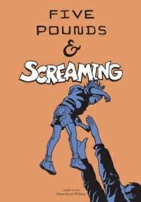
JF: Good illustration looking for some decent typography.
Rachel Elizabeth Cole submitted For Good or For Bad: A Short Story designed by Littera Book Designs.

Jackie Trippier Holt submitted Freaks Like Us designed by Karl Firth. “Karl Firth is a young designer and this is his first e-book cover.”

JF: He shows promise, but trips a bit here with a graphic that’s difficult to “read” and title typography that’s way too small, almost like an afterthought.
Frog Jones submitted Grace Under Fire designed by Nathan Reed and Mitchell Davidson Bentley.

JF: This is a future-based sci-fi fantasy book with a magical theme. The colors are really well done and the unusual illustration style and composition really help this cover stand out.
Celia Stander submitted Guardians of the Akasha designed by Stephanie Mooney. “I had no idea what I wanted, but Stephanie from Mooney Designs got it right anyway. The cover captures my novel perfectly, I couldn’t be happier.”

JF: And you should be happy, Stephanie has done a terrific job. Another example of clean elegant typography and carefully controlled colors.
Brian K. Carr submitted Hired To Kill designed by Brian K. Carr. “I really wanted to get an “old school” crime novel feel. This is my first book and I wanted it simple and effective.”

Janet Wellington submitted HOMECOMING designed by Author. “This is my first ebook cover, the final after several “practice covers.” I did my best to pay attention to Joel’s comments and info (thanks for what you share!). Designed using very basic Photoshop techniques and stock photos.”

Rachel Elizabeth Cole submitted How to Cook a Turkey designed by Littera Book Designs.

JF: Well done, with just the right touch for this genre. Love it.
Clayton Smith submitted I am He as You are Me designed by Clayton Smith. “For a story about the feminization of a young man by his girlfriend I juxtaposed the cool skin/warm background of the male half of the image with the warm skin/cool background of the female half.”

JF: Yeah. No. Whoa. No. Uh-uh, nope. Huh?
Jeffrey Miller submitted Ice Cream Headache designed by Anna Takahashi.

Ruth Donald submitted Ice on the Grapevine designed by Hunter|Johnsen. “Cover for a book in a mystery series featuring a long-haul truck driver (former detective) as the protaganist.”

Damonza submitted I’m Yours designed by Damonza.

Jordan Castillo Price submitted Jackpot: Channeling Morpheus Short designed by Jordan Castillo Price. “This pieces is from a series of twelve covers unified by processing the photos as high contrast B&W shots. Some original photos had been manipulated this way by the photographer, while other shots were full color.”

JF: Jordan, your covers just keep getting better. Great photo and effective typography. Nice.
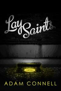
Adam Connell submitted Lay Saints designed by Miguel Ibarra. “My name is Adam Connell and I’m the author of Lay Saints. Miguel Ibarra designed/created the cover. His web address is miguelibarra.com. He knows that I have submitted the cover for Lay Saints on his behalf.”
Tahlia Newland submitted Lethal Inheritance designed by Centrepiece Productions Design Studio.

Andy Fielding submitted Lost River designed by Andy Fielding.

JF: A good concept that seems to be repressed by the drab palette.
Jane Ayres submitted Matty and the Moonlight Horse designed by Klaus Hartleben. “This is the first title in a trilogy for children and teens. I wanted all 3 titles to be linked and connected by use of typography and images, and for the image to convey the atmosphere of the story. I credited the designer in my book description on Amazon and don’t know any other writers who do that but I feel the design of the cover is so important to the book’s success. I chose the stock photo which the designer has modified to my brief.”

JF: The branding is strong, as well as the way the covers connect. However, if these are really intended for children, the black silhouettes and overall darkness of the covers seem wrong to me, as if they are crying out for some bright colors and lightness instead.
Jane Ayres submitted Matty and the Problem Ponies designed by Klaus Hartleben. “The 2nd title in the Matty trilogy, for which the designer says, “I think I’ve got about 40 layers in Photoshop where I’ve merged water and ripples and shadows and highlights and girl and hair and so on because the stock photo I chose needed a lot of changes. I like the colours and bold simplicity and love working with a professional designer who is so imaginative and passionate.”

Jane Ayres submitted Matty and the Racehorse Rescue designed by Klaus Hartleben. “This is the 3rd title in the Matty trilogy and my favourite design. I love the dark blue background combined with the lightning by the jumping horse, and the subtle rain beating down, which really creates the perfect atmosphere for the story. The designer had to find an image of someone and trace round freehand in Photoshop and fill with colour to make silhouette. I’m really pleased with the way all 3 titles work together and we would both love your feedback. Thank you!”

Amy Gamet submitted Meant for Her designed by Amy Gamet. “My first attempt at cover design. Done with Gimp.”

Greg Simanson submitted Memoirs Aren’t Fairytales designed by Greg Simanson.

Carla R. Herrera submitted MentaChip designed by Carla R. Herrera. “I went through several covers for this story, but finally settled on this, as I wanted to keep the covers consistent throughout the series and wanted to depict realistically what a “chip” was. I’ve learned for me, simpler is better.”

JF: It works here, Carla.
Damonza submitted Mirror Mirror designed by Kate from Damonza.com.

J.A. Howell submitted Mistaken designed by J.A. Howell.

JF: The image is arresting, and that’s half the battle.
zanesh catkin submitted Pangamonium designed by Polly Leddar.

Diana Kimpton submitted Perfectly Pony designed by Steve and Diana Kimpton.

Scott S. Phillips submitted Pete, Drinker of Blood Artist: Sam Carr, Designer: Richard Mueller.

JF: With an illustration this dramatic and engaging, you really don’t want to take attention away from it. You want to focus all attention on the interaction of the two figures, and the excessive and unnecessary type effects on the title are competing for our attention while adding nothing to the overall effect.
James, Numblenations.com submitted Presumed Dead designed by James, Humblenations.com. “Like faces, reader always look for certain item when it comes to genre fiction. In a thriller people will look for the weapon. How can we get away from the visual cliché as a designer? A good way is to subvert it. This was a cover for a detective story which had a cast of colourful characters and had a certain, humour and feel good factor. The writer was subverting the genre to a certain extent and I did the same with my cover design.”

JF: Very clever and effective, nice job.
Chad Huskins submitted Psycho Save Us designed by Axel Torvenius. “This cover was commissioned by Swedish designer Axel Torvenius, known for his dark and intense style. The book is about two girls with a gift for telepathy that are abducted by vicious human traffickers, and only Spencer Pelletier, a career criminal recently escaped from Leavenworth Penitentiary, is able to help them. The girls’ telepathic link mysteriously connects them to Spencer, which is why Axel chose to put the circles on the girls’ heads and around Spencer’s, indicating their mental link.”

JF: A fantastic piece of artwork, I just wish we didn’t have the familiar dark red type disappearing against the black background, and you could just lose that period, you don’t need it.
Ginger Duran submitted Raven’s Nest designed by https://graphiczxdesigns.zenfolio.com. “This cover illustrates a scene from the book.”

Francis Luxford submitted Raven’s Realm designed by Francis Luxford.

Laura Roberts submitted Rebels of the 512 designed by PixelStudio.

JF: Another arresting image in need of better typography to really sing.
Damonza submitted Revenge of a Band Geek Gone Bad designed by Kate from Damonza.com.

JF: Here we see again how effectively designers can “tell the story” of the book with a minimum of elements, and the bloody notes are a nice touch.
Sarahana Shrestha submitted Scotty Boy’s Blood designed by Sarahana Shrestha. “I designed 10 new covers for Brooklyn-based Dollar Stories, which sells a single story book for dollar each. Hope you like them, thank you.”
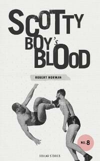
JF: Very nice, I hope we get to see some of the others, Sarahana.
Loretta Matson submitted Sex and Death in the American Novel designed by Loretta Matson. “Sex and Death in the American Novel is an erotic romance novel. It was important in this design to indicate the explicit nature of the story and writing, both to attract fans of the genre and to warn away readers who would be offended by the content.”

JF: You’ve done that well, but succumbed to the old dark red type on black background problem. (There’s a famous book of literary criticism called Love and Death in the American Novel.)
Pavarti K Tyler submitted Shadow on the Wall designed by Damon Za.

carol phillips submitted Shara and the Haunted Village designed by carol phillips.
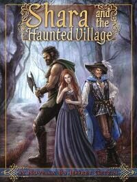
JF: Nice version of the “tell a story” kind of cover.
Pat Harris submitted Sheep Tales designed by David Harris. “This is David’s first cover. Your comments are appreciated. Thanks!”

JF: Excellent for a first cover. Everything works except for the very compressed type, which generally it’s good to avoid, but this cover really works.
Damonza submitted Skin designed by Kate from Damonza.com.

Damonza submitted Snowed Over designed by Damonza.

JF: Great genre match with fun colors and concepts, just right.
James Rollo submitted Sons of Thunder designed by Adam Geen.

Skye Genaro submitted Supernatural Summer designed by Skye Genaro/Simona Moon. “For your October contest. My goal was to find an existing piece of artwork online, and create the rest of the cover (fonts, placement, etc.) myself. I fell in love with this manipulated photo because it captured the feel of the story so well and, in my opinion, is gorgeous. But tracking down the artist to seek permission wasn’t easy. I had to wade through outdated blogs and various screen names before I found photographer Simona Moon in Romania. Simona originally posted this piece on a community art site five years ago, and had forgotten about it. A word to all artists out there: include your updated contact info with your work!!”

JF: Very cool photo and worth the hunt, but it needs stronger typography.
DJ Hazard submitted The (not yet) Complete Works designed by DJ Hazard. “This is my first anthology. Like the title implies, I hope it’s not my last… although that would up the value.”

JF: I quite like this quirky and idiosyncratic cover for a humor collection.
SJ Hailey submitted The 5th Amulet designed by SJ and LE Hailey. “This cover contains all original photographs. If I have made an error, let me know. Thanks”

Scot Bayless submitted The 7th Tear designed by Scot Bayless. “I went a little bit out of the box on this composition, deliberately bending a couple of my normal rules. Here’s hoping I didn’t completely break them!”

JF: No, you’re doing fine.
James J Parsons submitted The Ancestor and Other Stories designed by James J Parsons, Natalie Semmens. “Image by Natalie Semmens, design by James J Parsons”

JF: An example of how a lack of contrast can diminish an otherwise fine cover.
Aishah Macgill submitted The Bone Thrower Dreams of a Past Life Book 1 designed by Aishah Macgill. “The moment my friend posted the b/w image of herself as a child on facebook, I knew she was a perfect fit for Roxana, one of the main characters in my book. She has the wistful, faraway look of a child who is wise beyond her years, pondering her future.”

Jeff Wassmann submitted The Buzzard designed by Jeff Wassmann. “While I work primarily as a visual artist and writer, I’ve been designing jazz albums for musicians here in Australia for years, most of which only ever get seen as thumbnails on iTunes, so I saw the challenge of an e-book in similar terms. THE BUZZARD takes aim at Western notions of time, place and history, arguing that the world-view now offered by contemporary physicists—one of a universal space-time–is surprisingly in close agreement with the Aboriginal world-view. The book is intended to turn the current, often dismissive, Western impression of Aboriginal culture on its head, letting the reader see that the Aboriginal world-view as a far more accurate representation of reality than our own outmoded Newtonian views. I love these images of an English engraver’s impression of Australian Aboriginals barely 10 years after Captain Cook’s discovery of Australia’s east coast (I bought them in a mixed lot of prints years ago), but I worried any traditional use of the images would feel “ethnographic”. They’re copper engravings by Goodnight, published in the Reverend Thomas Bankes’s NEW SYSTEM OF GEOGRAPHY, 1785, which itself was an effort to re-write the West’s view of “primitive” cultures. By turning the image itself on its side, leaving the long title on the left looking something like a binding edge, I felt it would jar the senses of the reader—even in a thumbnail–into realizing this was a powerful reappraisal of history. What I love is that even on its side, while she looks at him, he still stares back toward us. The type seemed to want to sit naturally down the middle, but I staggered it to again suggest to the reader they should expect something out of kilter here. Thanks for having a look, love your blog. Cheers, Jeff Wassmann”

JF: Love this cover, Jeff, although I admit I would have been tempted to crop off the type along the left margin because it doesn’t seem to add anything at this small size and takes away from the impact of these amazing engravings. Really good.
Andrew Claymore submitted The Dark Defiance designed by Andrew Claymore. “Part of a redesign intended to provide a sense of unity across several titles in a series. Done using Blender. Font is a modified Arial Bold Round. Sections have been removed from the letters to get a SciFi feel. CL Smith helped me with the composition and typology of the first book (this is the second) on a KDP thread. CL deserves some credit, and it illustrates that, despite all the drama on KDP, you can still find folks who are willing to help each other.”

JF: Good cover and an excellent font choice for this genre, although it’s going rather dark at the bottom and might be improved by lightening the title a bit.
Matthew S Wilson submitted The Devil’s in the Detail designed by Digital Ian. “I posted a project for the design of my cover on CrowdSpring.com and received a massive response. The winning entry, by Digital Ian, conveys the playful tone of this satire, while also portraying the job of the protagonist (cab driver). The Ten Commandments, scrawled across London’s landscape, are central to the novel’s plot. I was thrilled with the design and have had a really positive response since launching the novel in October 2012.”

JF: Love it, really effective, it has everything you want in a cover because it draws us in while hinting at the storyline.
Emily Craven submitted The Grand Adventures of Madeline Cain Photographer Extraordinaire designed by Kit Foster. “I hired Kit for a tough challenge, I needed two book covers done that were of a similar style. When a potential reader look at both of them they needed to recognise several things a) this novel is set/written in Facebook (A Facebook novel if you will) and b) these two e-books were by the same author (author branding). I needed the design to be recognisable as Facebook without using the Facebook trademark (I’d like NOT to be sued thanks). The problem was how to make two great e-book covers with these features, but which were clearly two different genres: The Grand Adventures of Madeline Cain is a Chick Lit Comedy with a female rotagonist, where as Jake’s Page is a short story/play combination with a Male protagonist and aimed at the YA market. I think Kit really hit the mark with this one, using recognisable Facebook features/colouring and typography without using the trademark and a clear Chick Lit NYC vibe. It was though the Book Designer e-book cover awards that I found Kit and I can’t thank you enough for putting these awards on Joel, it has been an education.”
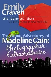
JF: Not sure you’ve ended up with a great result. There is just so much happening in this space that it ends up in a significant amount of visual confusion.
Jane Steen submitted The House of Closed Doors designed by Wayne Kijanowski. “I would also like to give credit to Jill Battaglia for the photography.”

JF: Beautiful and evocative. Just right.
Rita Toews submitted The Land of the Emmen Sea designed by Rita Toews.

Todd Keisling submitted THE LIMINAL MAN designed by Erica Keisling.

JF: Well done.
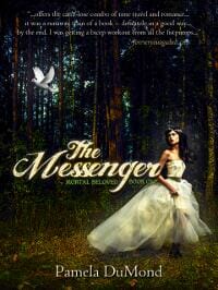
Pamela DuMond submitted The Messenger (Mortal Beloved, Book One) designed by Michael James Canales. “We are re-booting this YA romantic time travel thriller with a cover that better captures the romantic element. It was difficult finding an image where the teenage girl was not passive!”
Shannon Phillips submitted The Millennial Sword designed by Jessie Bennett. “Jessie went to a natural history museum and took photographs of those butterflies, then placed them each individually on the image! The face and body are painted in Photoshop; she photographed a model for the images of the hands and arms.”

JF: Fantastic illustration, I really like this cover for its graphic appeal and storytelling power.
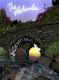
Cristina Ciurli submitted The Molecules designed by Cristina Ciurli and Pablo Donato (3D artist).
Aimee Duffy submitted The Monster of Fame designed by Fantasia Frog.

Will Overby submitted The Movie House Mystery designed by Will Overby.

Damonza submitted The ‘Naturals designed by Damonza.

JF: Looks like an ad for a TV show, doesn’t it?
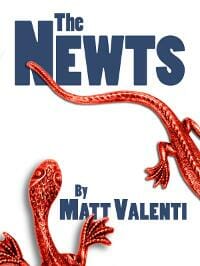
Matt Valenti submitted The Newts designed by Michael Campbell.
G W Eccles submitted The Oligarch: A Thriller designed by Tabitha Eccles. “The book was published in 2012. Website: https://www.theoligarchthriller.com Designer: Tabitha Eccles (my daughter)”

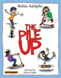
Robin Adolphs submitted The Pile Up designed by Book Cover Cafe. “Children’s book Anthony at Book Cover Cafe designed my book cover for The Pile Up. The design was done with flair and imagination. He has such enthusiasm and energy. The result surpassed every expectation and evidence has shown it has been a key ingredient to garner the attention of schools, libraries and press. I could never have expected the doors to open so much from the cover alone.”
Zelah Meyer submitted The Scholar and Her Escort designed by Zelah Meyer. “This is my second cover design. It’s a fairy tale romance so I wanted to create a historical feel to the cover. My husband remarked that the stock of the girl looked like a painting, and I decided to work with that when I paired her with the background. I used three different textures at low opacity to help blend it together and added some additional shading in the bottom left to help the title stand out more.”

JF: Beautiful job, Zelah. The restraint you’ve shown and the excellent type really help this cover.
G.L. Tysk submitted The Sea-God at Sunrise designed by G.L. Tysk.

Amanda DeWees submitted The Shadow and the Rose designed by Design by the Bookish Brunette; art by Claudia McKinney (Phatpuppy Art). “”The Shadow and the Rose” is a young adult paranormal romance. I wanted the cover to convey mystery and the possibility of magic while setting the book apart from the gritty, urban YA paranormals that seem to dominate now.”
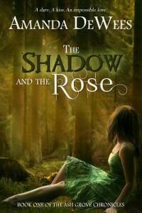
JF: You’ve achieved your aims, although the title looks a bit fussy to me. Love the art.
Christopher Shields submitted The Steward designed by Derek McCumber. “My cover shows a gold necklace with a gold bird. The necklace was given to the protagonist by her love interest in a gesture symbolizing a touching story in the book, and the breakage of the necklace in the cover symbolizes the attempts by the antagonist to destroy that love.”

JF: Well done. A good example of how keeping it simple and creating a single focus can yield great results.
Ruthanne Reid submitted The Sundered designed by Ruthanne Reid. “I had a ton of fun designing this cover, studying “professional” designers’ work for inspiration. I hope you enjoy!”

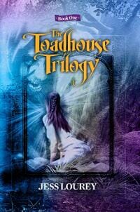
Jess Lourey submitted The Toadhouse Trilogy: Book One designed by Leonardo Perez.
Martin Turnbull submitted The Trouble with Scarlett designed by Daniel Yeager at Nu-Image Design. “This is the 2nd in my series. You liked the cover for the 1st one but felt that the title didn’t stand out clearly enough. I’ve tried to remedy that with this new book. This book is set against the casting of Scarlett O’Hara in “Gone with the Wind” in LA of the late 1930s so I wanted a cover that evoked the movie’s most famous image – that of Scarlett silhouetted against a Sunset over Tara.”

JF: It works, and part of the reason is the confident title typography.
Walter Lazo submitted The True Story of Jonathan Vera (Vampiros Nocturnos Malefactus) designed by William Lazo.

JF: Rule 1 of cover design: if you can’t read it, it doesn’t work.
F.W. Adams submitted The Unfortunate Tale of Little Mary Jenkins designed by Self.

JF: Great illustration, and the typeface is well chosen, but I would have liked to see the title maybe 50% larger which would make it much more readable.
Riley Banks submitted The William S Club designed by Ray Bull from Bullart.

Matt Hinrichs submitted Through a Chamber Door designed by Matt Hinrichs. “A continuation of the authors’ earlier mystery, Through A Chamber Door follows two women as they follow a time travel portal from modern-day Jerome, Arizona to the time of Edgar Allen Poe.”

JF: Strong composition that creates dramatic interest, combined with careful custom title treatment.
I.G. Frederick submitted Tribal Fusion

Gord Rollo submitted Valley of the Scarecrow designed by Adam Geen. “The author’s homage to slasher films of the 80s and the B-movie.”

Steven Ramirez submitted Walker designed by Tugboat Design.

JF: If you’re going for spooky, you hit a home run.
Kristene Perron submitted Warpworld designed by Miguel S. Kilantang Jr.. “This cover was produced on a very slim budget and we couldn’t have been happier with the work our designer did for us. Miguel does not have a website at this time but can be contacted at [email protected]”

Jane George submitted X-It designed by Jane George. “This novel is set in New York City circa 1980, and the cover design reflects both the era and specific elements from the book.”

Nonfiction Covers
Lawrence Winkler submitted Between the Cartwheels designed by Lawrence Winkler.

Capn Fatty Goodlander submitted Buy, Outfit, and Sail designed by Gary and Carolyn Goodlander. “Your comments about the covers are very informative. We usually fight our way through the design process, but come out with a nice finished cover.”

JF: Thanks, Fatty. The artwork behind the title is creating too much confusion for me.
OM Books submitted CONVICTION WITHOUT COMPROMISE designed by Vinay Kumar.

JF: Earlier editions of this book featured a cross, so this version represents something of a rebranding. Very effective with an interesting type treatment.
Pete Densmore submitted DADspirations: The 1st 100 Days of Fatherhood designed by Terry Lawrence.

Emily Craven submitted E-Book Revolution: The Ultimate Guide To E-Book Success designed by Neil Williams. “I really wanted the theme of Revolution to come through hence why the designer went for a Russian Revolution feel. I also asked him to keep it to basic colours that stood out and I could possibly use to brand my blog site. There is one thing I am tossing over at the moment. The e-book is available as both a single e-book and as a multimedia package. Someone suggested it might be prudent to distinguish the covers of the two versions by adding an image of CD’s etc to the multimedia cover, I’m worried that it would be too cliche and upset the design of the cover. Your thought on this matter are appreciated Joel.”

JF: Em, I think you had all the right ideas but the cover that you ended up with doesn’t seem to work for me. All the shapes are visually confusing and don’t seem to add anything to the cover. I’d love to see you take the same elements and do a new design that’s much simpler, I think it would be more effective.
Belinda Pollard submitted HELP! I CAN’T FORGIVE THAT PERSON Using the Forgiveness Tool to release the power of forgiveness in your life designed by Belinda Pollard. “I worked with Wesley Leake on this book, which is the first of his “Business Blessings: Breaking Free” series. We needed a cover design that 1. accommodated the “lots of text” style of business books, 2. provided a visual element that would appeal to readers from the “Christian lifestyle” section without cluttering the space too much, 3. kept at least the main title and author name readable in thumbnail size and 4. could be quickly adapted for future books in the series. The image was photoshopped to give us sufficient height and width (the sky-grass theme also wraps right around the back cover on the print edition). Future books in the series will change only the white text. It was an awkward brief with so many complications, but the cover has generated some surprisingly strong (positive) reactions already from readers (Day 3 of release). ”

JF: I think you’ve done a great job and hit all the points you wanted to make. The only thing I might change is the typeface of the title, which is the same font as the rest of the type, similar in size to a couple of elements and the same color as the “subtitle.” It might work better if it stood out a bit more.
James, Numblenations.com submitted Higgs Boson for Bozos designed by James, Humblenations.com. “There is very little you can do with something that scientist have not even scene yet. How can you put that on a cover, and also get a sense of the colourful description of something we’ve not seen. Also as a designer I was not a fan of the Bozo part of the title – so it was played down in the typography. Whilst the subtitle was wrapped in parenthesis of sorts, to make it feel inclusive.”

JF: Terrific job, James, you’ve captured some of the mystery surrounding this subject but given it a light touch.
KS ‘Kaz’ Augustin submitted It’s 10am, Why Am I Still Sober? designed by KS Augustin. “This is a replacement cover (isn’t it great that we can do that?) that owes its existence entirely to this group! I’ve learnt so much from each month’s entries, so many thanks to everyone and I hope mine looks halfway decent! :)”

JF: Nice job, Kaz, but I’d love to see a more emphatic title, which is getting a bit lost.
Kate Kaiser submitted Letters to my Mother (but really for my father) designed by Wendy Weber Eaton.

Ronnie Rush submitted Life of a Roadie, the Gypsy in me designed by Ronnie Rush. “Book title concept:Ronnie Rush, Cover concept:(Stage)Ronnie Rush, Cover font: Brian Schwartz”

JF: Good use of a script typeface.
Nancy Roe submitted Organize The Nancy Way designed by JJgraphics. “This design was the product of a contest run through 99Designs. The puzzle pieces capture that the book is about organizing all aspects of your life.”

JF: A very effective nonfiction cover with great author branding.
James, Humblenations.com submitted The Eulogy Handbook designed by James, Humblenations.com. “Sometimes a client comes through with a title which doesn’t work … it’s too wordy and does not scan. The unfortunate title of the book was to be “Rest In Peace: 10 Steps to Delivering a Meaningful and Lasting Eulogy” … it seemed to be a mis-step. It was showy and salesman like. Completely the wrong tone. Good clients listen. Good designers know the right tone. It needed to be authoritative whilst retaining a small humble feel. ‘Handbook’ was the right word. The design tried to reflect this mood. Using soft colour but powerful colours and sans font which solid but had slightly friendly tone.”

JF: And a great result from the process. Beautifully done.
Benoit Papineau submitted The Mosquito and the Sign of the Cross designed by Caroline Trudeau.

Damonza submitted Will I Ever Sleep Again designed by Damonza.

JF: Damonza shows once again that the lessons learned designing covers for fiction work just as well when intelligently applied to nonfiction. Engaging and apropos, a real winner.
Well, that’s it for this month. I hope you found it interesting, and let other people interested in self-publishing know about the Awards. —Use the share buttons below to Tweet it, Share it on Facebook, Plus-1 it on Google+, Link to it! The next issue is December 17, 2012 and the deadline for submissions will be November 30, 2012. Don’t miss it! Here are all the links you’ll need:
The original announcement post
E-book Cover Design Awards web page
Submit your e-book cover here
Follow @JFBookman on Twitter for news about the E-book Cover Design Awards
Subscribe to The Book Designer Blog


