Welcome to this edition of the e-Book Cover Design Awards. This edition is for submissions during December, 2012.
Here’s what we received:
103 covers in the Fiction category
18 covers in the Nonfiction category
Guest Judge: Damon Za
 I’m pleased to welcome cover designer Damon Za (aka Damonza) as a guest judge this month. Damon Za is an award-winning specialist cover designer and creative director with 15 years experience in advertising and design. He has designed hundreds of book covers as well as creatively managed multi-million dollar advertising and creative campaigns. Recently he left the advertising world to focus exclusively on cover design and currently manages a team of cover designers as well as creates the occasional cover himself. He is also a two-time winner of these awards.
Damonza’s comments are prefaced (DZ: ).
Award Winners and Listing
Thanks to everyone who participated. I hope you enjoy these as much as I did. Please leave a comment to let me know what you think, too.
Now, without any further ado, here are the winners of this month’s e-Book Cover Design Award.
e-Book Cover Design Award Winner for December 2012 in Fiction
Brian LeTendre submitted Courting the King in Yellow designed by Brian LeTendre / Jeff Rodgers. “I wrote a blog post about the design concept for this cover and its influences at https://www.seebrianwrite.com/2012/10/covering-courting-king-in-yellow.html ”

DZ: Great cover! Interesting and it draws me in. The colour contrasts here are excellent.
e-Book Cover Design Award Winner for December 2012 in Nonfiction
Åsmund Seip submitted 100 Days of Love designed by Åsmund Seip.

DZ: Love it. Contemporary design with unusual and interesting title treatment. Great job.
Fiction Covers
Adam Bodendieck submitted Memoirs Aren’t Fairytales (Young Adult Edition) designed by Greg Simanson.

DZ: Nice colors, interesting font, although it looks like it’s designed with the print cover in mind, rather than the ebook version, as the author name is a bit too small. Overall, it’s a good-looking cover.
Amelia C. Gormley submitted Acceleration designed by Kerry Chin and Michael Hart.

DZ: The title is legible and the image is relatively clear, which is good for an ebook cover at thumbnail size, however the brown coloring may be a bit dull.
Amelia C. Gormley submitted Inertia designed by Kerry Chin and Michael Hart.

DZ: Same comments as the previous cover. That dirty water brown color is a bit off-putting, in my opinion.
Angela Oltmann submitted Knight & Play designed by Angie-O Creations.

DZ: Easy to read. Looks similar to many covers in this genre.
Ann Philipp submitted Grand Theft Death designed by Ann Philipp. “The photo is a still shot taken from a movie I filmed for my book trailer.”

DZ: Great font size and clarity for an ebook. The movement in the title also works well.
Anthony Camber submitted The Pink and the Grey designed by blogshank.com.

DZ: Not sure what this is about. Seems like the title is describing the cover. Easy to read at thumbnail size.
April White submitted Marking Time designed by Edward Gorsuch. “This cover was designed on a nine-hour skype call using screen share, a creative commons background image by Zyllan, and free textures by Skeletalmess.”

DZ: Seriously? This took 9 hours? Looks like the author had too much input. The text at the top and bottom is very difficult to read. It also looks like the title font was stretched vertically, which hurts the overall appeal.
Ardin Lalui submitted There is No Otherwise designed by Ardin Lalui. “Hi there, thanks for letting me submit this cover for your great competition. Ardin”

DZ: Very nice. Clear and legible. Lovely texture and great detail.
Bernard M. Cox submitted The Space Within These Lines Is Not Dedicated designed by Sabine Krauss. “This is the second cover by Sabine Krauss for Bernard M. Cox’s short story series The Space Within These Lines Is Not Dedicated. This is the title story but there are four other stories to come. Each story stands on its own, but is linked thematically. As such, the goal of each cover is to provide a unique portrait of the individual story while maintaining the look and field across the set of stories.”

DZ: Clear and easy to read, if a bit dull. It has a non-fiction look about it.
Blair MacGregor submitted Sword and Chant designed by https://blairmacgregorbooks.com/2012/11/16/sword-and-chant-is-here/.

DZ: The visual is pretty good, although the title font is a bit flat.
Blake Hausladen submitted Ghosts in the Yew designed by Blake Hauslden.

DZ: The green and brown area in the middle isn’t very clear, which makes it difficult for a potential reader to see what’s going on with this cover.
Brian Panhuyzen submitted Night is a Shadow Cast By the World designed by Brian Panhuyzen. “Fonts used: SuperGroteskC, Adobe Jensen Pro; images from iStockPhoto; designed in Adobe InDesign CS5.5 for OS X.”

DZ: Way too much going on here. There is no focus which makes the cover look disorganized.
Bryce Beattie submitted Oasis designed by . “Adam Masterman (https://www.adammasterman.com) painted the cover, and then I used the Gimp to add in the title & my name.”

DZ: Nice work. Clean simple and effective.
Charlene Newcomb submitted Keeping the Family Peace designed by Travis at ProBookCovers.com.

Chris Ryser submitted “The” Stories designed by Chris Ryser.

DZ: This cover is somewhat dull, although it’s easy to read in thumbnail size. The images are too small to have any impact.
Christy Olesen submitted Her Scottish CEO designed by Christy Olesen. “There are so many historical romances set in Scotland I wanted the reader to know that this is a contemporary sweet romance set in Scotland.”

DZ: Not bad, although the bottom section is too busy. It may have been better to have the title much bigger and the symbol far smaller.
Clark G. Vanderpool submitted Killer Odds

DZ: Nice. Great font selections here. Clean and professional.
Colin F. Barnes submitted Curse of the Jade Amulet designed by Illustrator: Thomas Boatwright Layout/Design: Colin F. Barnes. “The first of a regular series of modern pulp stories.”
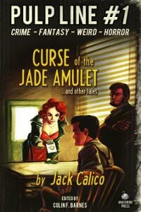
DZ: Excellent cover. Suits the genre perfectly. Really good job here.
Colin F. Barnes submitted The Harker Legacy designed by Illustration: Thomas Boatwright, Designer/Layout: Colin F. Barnes. “The third modern pulp story in a series.”

Colleen Ruttan submitted The Last Falcon (Book 1 of the Cael Stone) designed by Colleen Ruttan. “YA Fantasy Novel”
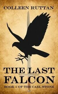
DZ: This is good. The sword in the background is a bit distracting though. Perhaps if it was in black and white and slightly lighter?
D. R. Martin submitted The Karma of King Harald designed by Jesse Pelkey. “I wanted my canine cozy mystery’s cover to avoid the “picturesque tea shop” look that many cozies have. I guided Jesse’s design in the direction of some of Carl Hiaasen’s early paperback covers, instead. And I think he nailed it.”

DZ: Interesting and unusual. Easy to read at thumbnail size.
D.L.Johnstone submitted FURIES designed by Jeroen ten Berge. “Beautiful composition, ominous, clearly indicates it as an historic thriller. Subtly ties in with the visual equity of the author’s other thriller title, CHALK VALLEY.”

DZ: Great cover. Lovely unusual title treatment. One of my favorites.
Daniel Patterson submitted One Chance designed by Kenneth Gorden.

DZ: Easy to read. Perhaps the headlights and road could have been slightly brighter. It’s difficult to see the image here, and when a potential reader is skimming over cover and only glances for a second or two, they may miss it.
Dave Bricker submitted The Dance designed by Dave Bricker.

DZ: Interesting cover. Works quite well, but could perhaps have a border to make it stand out more on a white background.
Diana Kimpton submitted There Must Be Horses designed by Steve and Diana Kimpton. “Although this book was written for older children (9+), it appeals strongly to teens and adults so I wanted to avoid a cover that made it look too young.”

Erick Burgess submitted Under Abnormal Conditions designed by Rena Burgess. “A rerelease of my debut novel with a new cover. ”

DZ: This is quite good. Strong font and easy to read.
F.J. Bergmann submitted Same Old Quest designed by F.J. Bergmann. “Fantasy novel.”

DZ: This looks like the negative of a photo. I’m not sure if that’s intentional but it doesn’t work for me. The yellow and orange gradient on the font also looks like it was done in Word Art.
F.J. Bergmann submitted The Holman Files: Not a Bit of Blarney designed by F.J. Bergmann. “Fantasy: leprechauns/detective/dragons quest.”

DZ: There’s something happening under that rainbow, but I’m not sure what it is.
Frank Malinoski submitted In His Stead (A Father’s War) designed by George Foster.

DZ: This cover has potential, although the silhouette of a two full people inside the silhouette of another full person clashes. In general, when combining images in this way, they should be different types of images, so they contrast with each other rather than compete with each other.
H.A.L. Wagner submitted Blood Oranges: A Chamberlain Cotton Novel designed by Tom Wolfe.

DZ: Interesting and contemporary. Good work.
Heather McCorkle submitted Rise of a Rector designed by CP Design. “Designer’s URL: https://cpdesignandcompasspress.blogspot.com/”

DZ: This cover is let down by the fonts used. Too frilly, too common.
Helen J Beal submitted Half a Dozen Star Jumps designed by Nick Thacker.

DZ: This says nothing to me other than “this is a book called Half a Dozen Star Jumps.” Why would I click on it?
Helen J Beal submitted Thirty Seconds Before Midnight designed by Nick Thacker.

DZ: Same comment as before.
Holloway McCandless submitted Princess Diamond and the Baseball Toad designed by Holloway McCandless. “This book cover was created with iBooks Author 1.0 by me. I had limited access to fonts and had to work with what was available in the App. The borders with baseballs, roses, and slugs refer to themes in the kids’ story. Thank you for all the information on your site.”

DZ: Unfortunately this just looks like the author took a photo of his daughter and put it on the cover. That’s fine, but it has a very amateur look about it.
Ioana Visan submitted Blue Moon Cafe Series: Where Shifters Meet for Drinks designed by Ioana Visan. “The story collection features scenes from the life of shapeshifters (mainly werewolves and were-eagles) living in a modern city, so instead of going for the current fantasy art trend, I felt like the cartoonish look fit much better the content of the stories.”

DZ: The mixture of overused fonts lets this cover down. It has a very amateur look about it.
J. Lee Coulter submitted Tarnished Honor designed by J. Lee Coulter.

DZ: Title text is difficult to read. Author name is impossible to read. The image is off-centre which makes the cover look unbalanced.
J. Lee Coulter submitted The Reckoning designed by J. Lee Coulter.

DZ: The red font is far too difficult to read.
J.D. Dawson submitted Broken Trust: Muslim Feint designed by J.D. Dawson.

DZ: There’s too much going on here, too many words. Looks like the title and author name and “book 1” are running away from the cover. Why are they so close to the edge?
J.M. Ney-Grimm submitted Sarvet’s Wanderyar designed by J.M. Ney-Grimm. “Sarvet’s world was inspired by the folk tales in East of the Sun and West of the Moon. Kay Nielsen’s 1914 illustrations in that volume capture the eery beauty of the landscape. One depicting a lassie wandering through mountainous terrain could easily be Sarvet herself.”

J.M. Porup submitted The Second Bat Guano War designed by Derek Murphy.

DZ: Quite nice. Good texture.
James submitted Nine Inch Bride

DZ: Interesting, took me a while to “See it”. Don’t know if that’s a good thing when a potential reader is just skimming along. This needs a border when on a white background.
Jan Bear submitted A Thousand Times designed by Jan Bear. “It’s a book about addiction and the road to recovery.”

DZ: Is the illustrated man floating next to the building? The angles don’t quite match up.
Jane Ayres submitted Coming Home designed by Klaus Hartleben. “This design used several different images that were customised to create a unified whole. I love the colours and the mood it creates and have had positive feedback from readers.”

DZ: This is sweet. The author name could be bigger.
Jena Leigh submitted Revival (The Variant Series, Book 1) designed by Jena Leigh.

DZ: Not bad. The author name could be bigger. Good font choice.
Jill B Zimmerman submitted Sparkly Retail Death designed by Neil Wells. “My main request from Neil with this cover was that he incorporate Santa because this was integral to the plot. I believe my exact words were, “Blood and Santa,” and the result was a cover that blew me away! He always has a way of expanding upon the story and my ideas while creating something all his own.”

DZ: I’m not sure on the relevance of the lines in the background, but they don’t work here. The font is very overused.
JILL TEITELMAN submitted SAVING GRACIE designed by HARRY TEITELMAN.
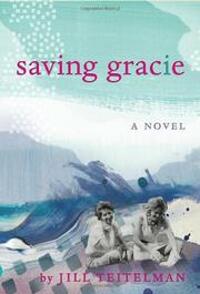
DZ: Nice cover. Good mix of texture and photography.
Jo Michaels submitted Yassa designed by Jo Michaels. “This cover was created using a wacom intuos 4 and Photoshop’s watercolor brushes on various layers. It’s a historical fiction novel that’s the coming of age tale of Genghis Khan and his deep love of his wife, Borte. I love simple design and lovely type. Thanks for the opportunity!”

DZ: The illustration is great. The title is great. The placement between the two clashes slightly.
Joan Druett submitted The Beckoning Ice designed by Ron Druett.

DZ: Nice image. The spacing on the title doesn’t look quite right, and it seems strange that all the text is centred except for one small line.
Jonathan Joseph submitted Willows designed by BoyandSheep.
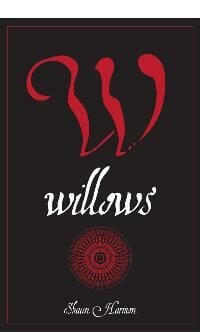
DZ: Nicely done. Author name could be bigger.
Jonathon Burgess submitted Chasing the Lantern designed by Vladimir Verano, Third Place Press. “Novel by Jonathon Burgess. Cover art by Ksenia Mamaeva. Cover design by Vladimir Verano, Third Place Press.”

DZ: Very nice. Love the font. Good job.
Joss Landry submitted Mirror Deep designed by Richard Sutton. “Richard and I worked hard on the design of the book, and felt that my
main two characters were well represented on the cover.”

DZ: Nice imagery, although the title is tough to read in that color.
Joyce Burns submitted Life in the Pond designed by Joyce Burns.

Judy Goodwin submitted Heart of the Witch designed by Lucas Pandolfelli. “Artwork by Lucas Pandolfelli, graphics by Judy Goodwin”

DZ: Nice cover art, although it may be too overpowering for the title.
JustinS wapp submitted Mayan Blood designed by Justin Swapp.

DZ: This cover lacks definition and is a bit bland.
K.M. Weiland submitted Dreamlander designed by Dominick Finelle.

Katie W. Stewart submitted Mark of the Dragon Queen designed by Katie W. Stewart.

Kaz Augustin submitted The Check Your Luck Agency designed by Sandal Press. “This is another re-do of an old cover that didn’t quite work in terms of legibility. Quite a few readers commented that they didn’t know that this book was the first in a series, so I had to come up with a way to make it obvious that, not only is it in a series, but it’s part of a closely entwined series (no standalones), hence the use of “Part” instead of “Book”. The other four books follow/will follow the same design elements to provide consistency.”

DZ: Unusual edges on this cover. Nice idea.
L.C. Chase submitted A Limited Engagement designed by L.C. Chase. “This cover was done for a re-release of the author’s short story. I went a little off page from what he had previously. The image is a play on the characters who are both involved in theater, and whose fight becomes a dance.”

DZ: Clever and interesting.
L.C. Chase submitted Country Mouse designed by Jordan Taylor. “Artist Jordan Taylor, for Riptide Publishing.”

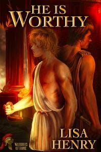
L.C. Chase submitted He Is Worthy designed by Petite-Madame VonApple. “The third of four titles for the Warriors of Rome collection, He Is Worthy. Digital painting by artist Petite-Madame VonApple, typography by L.C. Chase.”
L.C. Chase submitted Mark of the Gladiator designed by Petite-Madame VonApple. “Artist Petite-Madame VonApple did a series of digital paintings for our Warriors of Rome collection. Once the artwork was complete I took over and did the typography.”

DZ: Nice title treatment.
L.C. Chase submitted The City War designed by Petite-Madame VonApple. “The fourth of four titles for the Warriors of Rome collection, The City War. Digital painting by artist Petite-Madame VonApple, typography by L.C. Chase.”

DZ: Looks more like a farmer than a warrior.
L.C. Chase submitted The Left Hand of Calvus designed by Petite-Madame VonApple. “Artist Petite-Madame VonApple digitally painted all the covers for Riptide Publishing’s “Warriors of Rome” historical collection. Four books in total I’ve already submitted Mark of the Gladiator and figured I should show off her work on the other three titles as well. As with Mark of the Gladiator, once the paintings were completed I did the typography to finish off the covers.”

L.W. Patricks submitted Shadow of Wrath designed by Kehanne Lo.

DZ: The author name in red is tough to read.
Laura Wright LaRoche submitted Black Woods designed by LLPix.com. “There’s no mistaking what genre this one is.”

DZ: Nice cover. Easy to read and create its own “mood.”
Liana Mir submitted Crossing the Barrier designed by Liana Mir. “This was a redesign to give a more polished, professional look to the series and give them all cohesiveness.”

Liana Mir submitted Gone Hunting designed by Liana Mir.

Liana Mir submitted Portrait of a Butterfly designed by Liana Mir.

DZ: Nice colors, although the author name is very difficult to read.
Lisa Buie-Collard submitted Evangeline’s Miracle designed by Lisa Buie-Collard. 
DZ: Tough to read the title and author name here.
Lj McEvoy submitted Gemini Rain designed by Teddi Black. “First Book in Romance Genre, available on Amazon Kindle and CreateSpace. Thanks”

DZ: Nice visual, although the title looks like it was just added on as an afterthought.
Louis Tridico submitted Fort St. Jesus Bait & Tackle designed by Chad Vander Lugt.

DZ: Excellent texture and font choices. Love it!
Marcelo Martinez submitted Ana Maria Machado :: Contos :: Foglio Series designed by Marcelo Martinez | Laboratório Secreto Design Studio. “”Great names of Brazilian literature in a book series designed only for the epub environment. The book cover design explores RGB colors, shadows and volumes “impossibles on paper”.”

DZ: Well executed contemporary design for this whole series.
Marcelo Martinez submitted e-Quintana :: Foglio Series designed by Marcelo Martinez | Laboratório Secreto Design Studio. ”

Marcelo Martinez submitted Verissimo :: Jazz :: Foglio Series designed by Marcelo Martinez | Laboratório Secreto Design Studio. 
Mary Ann Cook submitted The White Rose designed by Aleta Rafton. “A fictional wartime love story based on the life of Lieutanant Lilya Litvyak, the world’s first woman fighter pilot ace and Captain Alexei Salomaten.”

DZ: Nice visual but fonts let this cover down. Very unusual to see the cover design attribution on the front cover.
Matt Rubinstein submitted Solstice designed by Matt Rubinstein. “Most of my books are in different genres so I wanted the covers to unify around a common design that can adapt to each book while still being recognisably one of mine I liked the idea of using physical printers’ type to decorate a purely digital emanation. In the same spirit I’ve called my digital imprint “Ligature”, and chosen Mrs Eaves for the author and subtitle, as it’s a font famous for its extensive ligatures. ”

DZ: Yes, well done. The title is part of the creative rather than just added on as an afterthought.
JF: Sorry to butt in here, guys. Cover is beautiful but anyone who has printed with actual type will see instantly that this is “imaginary” type since it would have to read in reverse to print properly. Okay, back to what you were doing.
Meghan Ciana Doidge submitted Time Walker designed by Irene Langholm. “This is the fourth book cover that Irene has designed for me. I send her a pitch sheet which describes the story, setting, main character, and highlights a few of my favourite scenes. She hones in on an idea that intrigues her, asks a bunch of questions, and then gets to work. I always wait with bated breath for the reveal, and always end up loving the cover even more than I imaged I would. The cover for Time Walker is no exception. In a single image, Irene has captured the genre and the main character in an utterly magical moment full of tension, loneliness, and a tinge of hope in the dawn. All four of Irene’s cover can be found on my blog, www.madebymeghan.ca Thanks in advance for your consideration, Meghan ”

DZ: Good work.
Michael Sloane submitted Insidious designed by Michael Sloane. “I would appreciate an honest critique of this cover. My intent was to visually convey the genre and mood of the book, and at the same time drop a few subtle details to hopefully pique the potential reader’s curiosity.”

DZ: Nicely done. Images are well combined here.
Michele Hauf submitted Malakai designed by Michele Hauf. “I like to design my own covers, and the only Photoshop experience I have is ‘try this and see if it works’. I like this cover, and think it’s the best I’ve done so far.”

DZ: This is pretty good. The yellow text could be placed better.
Nils Hodyas submitted and Santa Claus met Dasher designed by Nils Hodyas.

DZ: Cute, could do with a border.
Patricia Burroughs submitted Scandalous designed by Mj Butler, Twisted Mojo. “This is a digital release of a book originally published by Bantam Loveswept. I gave an idea or two to Mj Butler who put together this design, which I adore. It captures to romantic tone of the story as well as the heroine’s quirky character. ”

Pauline Creeden submitted Winter Fae designed by Marcy Rachel Designs.

Philip Benjamin submitted The Geneva Project – Truth designed by Philip Benjamin.

DZ: Very nice. One of the best. Perhaps the text at the top could be slightly brighter.
Phillip Grizzell submitted For Catherine designed by Phillip Grizzell.

Phillip Grizzell submitted Milwaukee Deep designed by Phillip Grizzell.

DZ: DEEP is almost illegible
Phillip Grizzell submitted PANDORA designed by Phillip Grizzell.

DZ: Nice!
Phillip Grizzell submitted SHADOWSCAPE The Stevie Vegas Chronicles designed by Phillip Grizzell.

Phillip Grizzell submitted The Lincoln Letter designed by Phillip Grizzell.

DZ: There’s too much drop shadow on the text, which makes it much more difficult to read.
R.J. Spears submitted Shutterbug designed by R.J. Spears.

DZ: This has an amateur clip-art look to it.
Rebecca Berto submitted Precise designed by Silviya Yordanova. “The cover was designed by Silviya with the dark subject matter in mind to show the narrator’s voice and the type of story through the feel and look.”

Rene Folsom submitted Noble Lies designed by Rene Folsom. “Author, Stephanie Andrassy, came to me with a very specific idea of what she wanted her heroine to look like on the cover of her book. The author was very pleased with the result.”

DZ: Good coloring and easy to read.
Richard Sutton submitted Troll designed by Richard Sutton. “I wanted a cover to suggest an unlikely pairing — the softness of a field flower and the rugged image of the Neanderthal man. The flower also connects to a key portion of the book, and the use of typography in a heavy, jarring face like impact, with a rugged lichen fill, hopefully sets up the tension for the reader.”

Ripley Patton submitted Ghost Hand designed by Kura Carpenter Designs. “My first book and I love the cover. The designer really captured the dark fantasy mood of a YA paranormal thriller.”

Rita Toews submitted Virtuous Bondage designed by Rita Toews.

Ros Clarke submitted Twelve Days designed by Ros Clarke. “I’ve recently begun papercutting and I loved the idea of using it to create a wholly unique book cover.”

DZ: Clever.
Ryan Redmond submitted The Adventures of an Imagination designed by Javelynn Tyler.

Shawne Workman submitted The Webs of Varok designed by Penscript Publishing House (done in-house). “The author of this young-adult science fiction novel paints in acrylics. Our aim for the cover was to incorporate her whimsical painting of the book’s setting, and to choose a title font to complement the alien figure on the front cover.”

Suzanna Williams submitted ShockWaves designed by PlainSight VFX. “ShockWaves is a YA action-adventure.”

Tasha Harrison submitted Package Deal designed by Chris Harrison.

DZ: Nicely done.
Theresa Couchman submitted The Unmapped Lands designed by Myself.

Thomas Kimpel submitted Johnny Monbeam in Cyberspace designed by Thomas Kimpel.

Ty Justice submitted Soul Bonded designed by Ty Justice. “The book really show the clashing of the two different worlds of the two main characters.”

DZ: Interesting cover with colors that work well together.
Nonfiction Covers
Alexander submitted How is THAT working? designed by Alexander von Ness. 
DZ: Very nice. Well done.
Charlie Plunkett submitted 100 Little Words on Parenthood designed by eKindled.co.uk. “Simple yet descriptive design.”

DZ: The image is good, but the title treatment is dull.
David Bergsland submitted How to Teach Prophecy designed by David Bergsland. “”How to Teach the Bible” sold well, so this is the second in the series, “How to Teach Scripture” The image is a photo of my two favorite Bible study tools.”

Donald Griffin submitted Let’s Buy A House designed by Denise Reiffenstein.

Dumitru Sandru submitted Escape from Communism designed by Dumitru Sandru.

Ed Ditto submitted How to Format Your Novel for Kindle, Nook, the iBookstore, Smashwords, and CreateSpace…in One Afternoon (for Mac) designed by Kevin Sipe.

DZ: Easy to read. Gets the point across.
Eldon Sarte submitted eBook Ideas (Zoom In: Wordpreneur Reloaded series) designed by Eldon Sarte. “This is the cover design for the series of smaller ebooks based on Wordpreneur Reloaded content.”

Eldon Sarte submitted Wordpreneur Reloaded designed by Eldon Sarte.

Jackie Cummings Koski submitted Money Letters 2 my Daughter designed by Jackie Cummings Koski. “I designed this cover with the young reader in mind (age 16-30) so it would get their attention. The use of the number “2” in place of the word “to” is indicative of the way many young people write when they are texting. I wanted to keep it very simple and clean. ”

JP Jones submitted 31 Days of Marketing designed by JP Jones. “The cover of my new books makes a bold statement with the large 31. To re-enforce the idea of a month, you’ll notice that within the 31 there is a subtle calendar grid.”

DZ: Nice font and layout but needs a border on a white background.
Lawrence Winkler submitted Hind Cartwheel designed by Lawrence Winkler.

Lucy Tobias submitted 10 Florida Great Walks Around Gainesville and Ocala designed by Lucy Tobias. “I’ve been following the book awards, noting what stands out – this is the first of a series – the title and photo will change but the “look” will be consistant”

Mistress Magick submitted Male Service: Holly-Days (Winter Solstice / Yule / Christmas): Crossdressing: Seasonal Panties or Holiday Helper? designed by Mistress Magick. “This is one in a series of monthly assignments. The cover of each one has a design with black bars at the top and bottom, behind the title and subtitle, in order to reflect that it is part of the same series.”

DZ: Red text on a black background is always very difficult to read.
Nancy Hendrickson submitted WordPress Your Way designed by Robin Ludwig.

DZ: Easy to read. Nice work.
Rita Toews submitted The Way of the Rosary designed by Rita Toews.

Sandra Bornstein submitted May This Be the Best Year of Your Life: A Memoir designed by CreateSpace.

Wahido Marata submitted Beyond the Western Mind – You Are Called To Change designed by Wahido Marata.

Well, that’s it for this month. I hope you found it interesting, and let other people interested in self-publishing know about the Awards. —Use the share buttons below to Tweet it, Share it on Facebook, Plus-1 it on Google+, Link to it! The next issue is February 11, 2013 and the deadline for submissions will be January 31, 2013. Don’t miss it! Here are all the links you’ll need:
The original announcement post
E-book Cover Design Awards web page
Submit your e-book cover here
Follow @JFBookman on Twitter for news about the E-book Cover Design Awards
Subscribe to The Book Designer Blog


