
Welcome to the e-Book Cover Design Awards. This edition is for submissions during February, 2014.
This month we received:
75 covers in the Fiction category
18 covers in the Nonfiction category
Comments, Award Winners, and Gold Stars
I’ve added comments (JF: ) to many of the entries, but not all. Remember that the aim of these posts is educational, and by submitting you are inviting comments, commendations, and constructive criticism.
Thanks to everyone who participated. I hope you enjoy these as much as I did. Please leave a comment to let me know which are your favorites or, if you disagree, let me know why.
Although there is only winner in each category, other covers that were considered for the award or which stood out in some exemplary way, are indicated with a gold star: ★
Award winners and Gold-Starred covers also win the right to display our badges on their websites, so don’t forget to get your badge to get a little more attention for the work you’ve put into your book.
Also please note that we are now linking winning covers to their sales page on Amazon or Smashwords.
Now, without any further ado, here are the winners of this month’s e-Book Cover Design Awards.
e-Book Cover Design Award Winner for February 2014 in Fiction
Shannon Selin submitted Napoleon in America designed by Matt Dawson. “For this alternate history adventure, UK illustrator Matt Dawson came up with an instantly recognizable Napoleon in a clearly American landscape (Texas), and — based on historic examples — “forged” Napoleon’s illegible signature into something readable but clearly identifiable for Napoleon fans.”
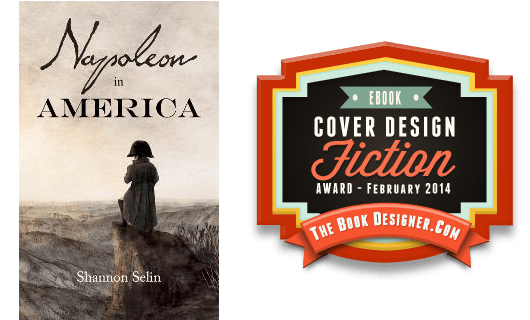
JF: What a great concept, and the resurrection of Napoleon’s own handwriting makes it all the more believable.
e-Book Cover Design Award Winner for February 2014 in Nonfiction
Christopher Lascelles submitted The Strange Case of Dr Terry and Mr Chimes designed by Milan Jovanovic. “This is fantastic and eye-catching cover for a non-fiction book. It’s the autobiography of Terry Chimes, the original drummer of The Clash and shows how he turned from drummer to doctor! It’s a very different cover for an autobiography which expresses the rock and roll nature of the author!”
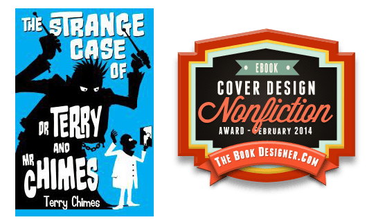
JF: Yes, this strong and idiosyncratic cover plays comically with the Dr. Jekyll and Mr. Hyde formula to great effect.
Fiction Covers
A.R. Williams submitted Sword & Sorcery Sampler designed by A.R. Williams.

JF: Although this cover has some good things going for it, I’m mystified why you would want to completely obscure part of the title to the point that it’s unreadable.
Aaron Sikes submitted Gods of Chicago designed by Colin F Barnes. “The image of the man, shrouded in tobacco smoke, represents the protagonist and the story’s noir quality. The dark skyline with the red background gives the image of a city dripping with blood, hinting at the trail of murders in the tale. The font captures the haunting quality of the supernatural.”

JF: I like the typography and noir-ish palette, although I was confused by the perhaps too obscure shapes in the foreground.
Alan Larson submitted The Last Gypsy Princess designed by Alan Larson & Erika Cook. “A suspense-thriller about the fight for control of the lucrative Roma fortune telling business. Several of the characters believe in witchcraft.”

JF: The weak typography isn’t helping this cover.
Alec Rojas submitted Foreign Waters designed by Cory Schmitz. “Hi Joel, This was the cover design made by the amazing and so very talented Cory Schmitz. He’s a fantastic designer and, after providing him some simple suggestions, he came up with this magnificent cover. Foreign Waters is a mysterious tale in the near future, and he nailed it.”

JF: I love these notes that authors write, extolling the virtues of their chosen cover designer. I mean, what am I supposed to say in the face of such devotion? If I point out what seem to me to be weaknesses, I’ll come across as petty, or in opposition to the prevailing opinion (that of the author). Usually I read, then ignore, the comment. For instance, this cover, while solid, doesn’t convey a mysterious future to me, and I wouldn’t call it “magnificent” either.
Allen Taylor submitted Garden of Eden Anthology designed by Alexandre Rico. “In the speculative fiction genre, this e-book cover depicts an array of creatures that appear in the stories, submitted by multiple authors, contained herein. Anthology contains flash fiction, short stories, one poem, and an essay addressing the question, “Who was in the garden with Adam and Eve?””

JF: An Intriguing and well executed design.
Allison Rushby submitted Being Hartley designed by Georgina Gibson. “I stumbled across Georgina’s cover design work on DesignCrowd and was amazed at some of her gorgeous covers. Apart from her being super-talented, I also really like supporting an Australian cover designer as I’m an Australian author.”

JF: Lots of hooks here that will communicate to its intended audience.
Allison Rushby submitted Blondtourage designed by Georgina Gibson. “I’m self-publishing my backlist and this book had one of my favourite covers ever. I really wanted to try for the same feel and think my cover designer did a great job with the brief.”

JF: I usually object to overwrought type effects, but this designer knows exactly who her audience is and delivers.
Amanda DeWees submitted With This Curse designed by Kim Killion of The Killion Group. “I asked Kim for a dramatic cover in the tradition of the classic “woman running from castle” gothic romance covers, and I’m thrilled with what she came up with. The font choices and ornamentation also link it visually to my previous gothic title.”

JF: A tough job putting those images together, but I love the lacy texture the designer added at the bottom of the cover.
Amita Murray submitted Confessions of a Reluctant Embalmer designed by Stephanie Tkach.

JF: Love the title, but the type is extremely weak and out of balance with the illustration.
Andy Fielding submitted Magic Lantern: Part 3 of the Triskell Story designed by Andy Fielding. “To come across someone who, through some strange alchemy, can take your verbal ideas, translate them into a totally different medium and make them sing and dance in line and colour is extraordinary. I was lucky to find Andy. – Des Sheridan”

JF: I agree, and I like the simplicity and strength of this cover, despite the title, emblem and illustration having a bit of a competition for preeminence.
Andy Fielding submitted The Three Ferrets designed by Andy Fielding. “The Three Ferrets is a children’s book. For the cover we concentrated on introducing the ferrets themselves attempting something playful, bold and timeless which gives an idea of their characters.”

Annabelle Costa submitted The Time Traveler’s Boyfriend designed by Libby Wight. “We are so impressed with the work of our cover designer, Libby Wight, and we wanted to showcase her beautiful work!”

JF: Lovely. Nice use of a script font, and the illustration is a great hook.
Anne Rouen submitted Master of Illusion – Book One designed by Felicity Matthews. “Master of Illusion’s cover represents the key protagonists in the novel: the Master (Angel) and Elise (the prima ballerina). Elise is famous for her en pointe work, and the mask represents Angel literally and figuratively. He uses a mask to hide his disfigurement and conceals his true identity.”

Annie Harrower-Gray submitted Midgie MacAlpin and the Stone of Destiny designed by Annie Harrower-Gray. “Midgie MacAlpin is a story for young adults. It’s about a girl who is chosen to make the stone of destiny talk again so that it can advise Scotland on gaining its independence. It’s a very Celtic tale so I wanted a Celtic and enigmatic cover with typography that had a hint of the medieval about it.”

JF: Please compare the size of the titles on most of the better books in this post to your own. And it’s hard to see anything particularly “celtic” about the illustration.
Barbara Boyle submitted Timesnatched designed by Rebecca Moorhouse. “The element of the timesnatcher himself comes out perfectly in the cover design. He is at ease stepping in and out of the world of time travel in the story and, even though a silhouette, his confident nature shines through.”

JF: Nice job. Simple and effective, with drama and a bit of mystery. ★
C M Carter submitted Underneath designed by CM Carter.

JF: I’m riveted looking at this, in exactly the same way when I saw a car upside down next to a crowded road.
Carol Cram submitted The Towers of Tuscany designed by John Dowler. “The Towers of Tuscany is about a woman painter in 14thC Italy. The cover design combines a photograph of the towers of San Gimignano in Tuscany with a detail from a medieval wall fresco. The creation & destruction of fresco play a central role in the choices made by the heroine in the novel.”

JF: A very artful image composite just crying out for a decent title treatment.
Christine Jordan submitted Indigo and the Strange Animal Menagerie designed by Christine Jordan.

JF: Interesting ghosted images, but I really can’t see any design advantage to making the typography read from the side. Why?
Claire Genevieve submitted Girl Mystery designed by Claire Genevieve.

JF: Sigh. A cover that communicates neither “girl” nor “mystery.” Better to start again, I’m afraid.
Colin Dodds submitted The Last Bad Job designed by Adam Lewin.

JF: A cover with lots of elements on it that actually works! Might be improved with more contrast for the title so it stands out a bit more.
Cora Graphics submitted The Capable Man designed by Cora Graphics.

JF: Exciting, draws us in. A well executed sci fi cover unmistakable in what it’s offering. ★
Danita Cahill submitted Mist designed by Christy Keerins – Covered by Keerins. “We started out with just the dog on the cover, but several other authors convinced me I needed to add people since the book contains romantic elements.”

JF: I have to say, I would be pretty confused about this book from the cover.
David Kudler submitted Laura English designed by David Kudler. “The author found this evocative art; the book’s about an emotionally complex woman who’s a movie star (and a redhead). She’s pulled between being very warm and available and very cool and British, which the art seemed to capture perfectly – so I tried to tie the type in to that as well.”

JF: A beautiful and apt piece of artwork that needs the title to be just a bit stronger for balance. Nicely done.
Ebony McKenna submitted The Winter of Magic designed by The Masked Maven. “The book has a darker edge as the main character’s world becomes crazier. But it’s a ‘funny crazy’ so it’s not completely dark. I love the typographyconnection with the first two novels, and a different pic of the same model from book one. Thanks for the opportunity to show it off.”

JF: Another well-put-together cover in this series.
Eric Jones submitted The silent invasion designed by Eric Jones.

JF: Love the illustration, although the map is completely disposable, and the cover would be stronger without it. I find the choice of font much too sedate for this genre.
Eva Caye submitted Royalty designed by Eva Caye. “Science fiction romance is a unique niche to convey with a cover, as is royalty since a prince does not wear his crown every day. This book deals with a child’s listlessness, an attack requiring hospitalization, and the prince’s grueling responsibilities, hence the tagline.”

Heidi Willard submitted The Unwilling Adventurer (The Unwilling #1) designed by Heidi Willard. “A YA fantasy cover that was four months in the making, and it shows. Slightly unstructured, busy background, horrible shadowing, and I couldn’t love it more. A gentle blue coloring scheme, a great font, and a touch of strangeness that exemplifies the series.”

JF: I think it’s lovely and interesting, it would definitely make me pick up the book.
Helen Maryles Shankman submitted The Color of Light designed by Helen Maryles Shankman. “Since much of the action takes place in an art school, I painted an oil painting for the cover art. I scanned it and played with it in Pixlr. Then I searched for a font that said “magic.” I had to teach myself how to style and skew type in Photoshop to design the book title and my name.”

Intisar Khanani submitted Sunbolt designed by Jenny Zemanek. “Sunbolt is a multicultural YA fantasy novella.Jenny has just launched her cover design business. Thanks so much for your consideration!”

JF: The title treatment is terrific, and combines perfectly with the simple layout and rich textures of this cover. It stands out.
J. M. Varner submitted Digital Me (A Squirrel Hill High Novel) designed by D. V. Varner & J. M. Varner. “In our design, we sought to emphasize the central conflict with the main character, Sara. The three-dimensional perspective of the receding hallway is positioned to draw attention to the title of the book.”

JF: What I’m paying attention to is the pasted together look, awkward typography and weak colors.
J.M. Ney-Grimm submitted Devouring Light designed by J.M. Ney-Grimm. “The story is fantasy set in a mythic version of our solar system. Visually combining a goddess with outer space, without implying sci-fi, was tricky. Not sure I succeeded!”

JF: Yeah, no, not sure this works. And why is she so unmoved by that gigantic ball of flame descending into her hair?
James Bailey submitted Nine Bucks a Pound designed by Valerie Holbert. “Bobblehead graphic was created by Rey Flores. Overall cover was designed by Valerie Holbert.”

JF: Great imagery for this novel about steroid use in baseball.
James Egan submitted Man of Action designed by James T. Egan of Bookfly Design. “For this thriller centered around the world’s most valuable comic book, I adapted public domain images of vintage comic panels to form the backdrop.”

JF: Beautiful textural work, but I’m a bit mystified by the typeface you’ve chosen for the title since it has such a strong historical implication.
Jefferson Smith submitted Oath Keeper designed by Jefferson Smith. “I was hoping to find a striking character image that would draw readers into the world of this strong female fantasy character, but I was blown away when a high school student who had read my earlier work contributed this image. With that in place, the rest of the design fell into place around it.”

JF: Love the way this cover captures our attention and won’t let go. The careful palette helps, too.
Jeramy Goble submitted Souls of Astraeus designed by Jeramy Goble. “Please note: only the background art for the SOULS OF ASTRAEUS cover was created by Jonathan Powell, the credited illustrator for the novel. The overall cover design for the hard cover, paperback and ebook was created by Jeramy Goble.”

JF: A strong cover but the type at the bottom really ought to be more readable.
Jes Simon submitted Beautiful Zurt designed by Jes Simon. “Beautiful Zurt is a science fiction novella about a traveler who finds herself trapped on a long abandoned planet. The cover was designed to show the derelict nature of the planet, but with the character as a bright spot. At the heart of the story is the strange city where she finds herself.”

JF: I like it, but stronger title type and deleting that Christmas tree ornament would probably help.
Jessica Keller submitted Saving Yesterday designed by Steven Novak.

JF: Wild and appealing, despite the red-on-black conundrum.
Joy Sikorski submitted Tamar of the Terebinths designed by Rona Liu. “On a tight deadline our artist created an unusual image for a Biblical fiction story with 4 elements: earrings/moon/cave/tree for a Middle East woman who seduces her father-in-law (Genesis 38). We didn’t want the typical sexy Western woman from a royalty-free site with a scarf over her face”

JF: The whole thing, from the illustration to the typography, gives the feeling of a cartoon. If that’s what you were going for, it’s a success.
Julia Samwer submitted Ich und andere uncoole Dinge in New York/Me and other uncool things in New York designed by Julia Samwer. “The book design uses a photograph by Aleksandar Nakic.”

JF: Some things don’t change from one culture to another, like the source of this cover’s appeal. Type looks a bit like a scholarly work.
Karri Klawiter submitted Turn or Burn designed by Karri Klawiter.

Kate Abbott submitted Disneylanders designed by Orchard Hill Press. “Orchard Hill Press recently bought out the rights for “Disneylanders” and felt it needed a new cover to appeal to an older audience. This cover was designed with a travel diary/scrapbook theme in mind, and is meant to be “hipper” than the previous cover.”

JF: Nailed the “scrapbook” look, would have liked to see a stronger title treatment.
Kori Miller submitted Deadly Sins: A Dezeray Jackson Mini-Series designed by Christopher Brown.

JF: If type could talk: “Torturer!” Like the jazzy drawing though, and the energy of this cover.
L Harcroft submitted The Darkness Abides designed by L. Harcroft. “In writing this book, I was inspired by an engraving (now in Public Domain) by Gustave Dore, made originally for Dante’s Inferno. I felt it appropriate to re-utilize the image. I made adaptations, mostly in color and false depth-of-field, to help give it a push toward the styling of my own book.”

JF: Despite all that the cover is murky and difficult to decipher.
Leslee Horner submitted SUMMER OF STARS designed by Glenn Miller. “In the book, the main character, Lola, flashes back to a past life in the Holocaust. A few of her flashbacks take place on the train to Auschwitz. I chose this picture of the girl on the railroad tracks as the focal point of the cover for that reason.”

JF: Although this cover is nicely balanced, doesn’t that seem a bit lighthearted for a holocaust survivor? Just asking.
Marianne Sciucco submitted Blue Hydrangeas designed by Marianne Sciucco. “At a street fair I had a blow up of the cover on display and people literally crossed the street to look at it. Crazy, I know. The colors work well together. I particularly like how the flower in the background is blurred; after all, it’s a book about Alzheimer’s.”

JF: Well, the image is very strong. Maybe they were wondering what it was about, since you haven’t communicated any information about the subject of the book.
Marsha Canham submitted The Blood of Roses designed by Marsha Canham. “Second book in the Scotland Trilogy, hoping the branding works and the color pops.”

JF: I think they all work. I like the careful typography, the rich borders, and the combo volume works perfectly.
Marsha Canham submitted The Pride of Lions designed by Marsha Canham. “This is the third attempt to get the right *look* and it was actually the cover model I had used on the first two attempts who told me me no, no, no, don’t put a romance cover on it if you’re trying to appeal to a wider audience…which I am. Thank you Jimmy Thomas”

Marsha Canham submitted The Pride of Lions, The Blood of Roses designed by Marsha Canham. “Two books in one volume, again hoping the branding works and the color pops.”

Matt Howerter submitted Dark Fate The Gathering designed by Matt Howerter. “Hi Joel, I’ve enjoyed viewing your contests for the past year or so. Finally, I have a published book to participate with, lol. Thought I’d give it a go. Thanks for doing this, Matt”

JF: The focus of this cover really should be the diabolical face of the central figure, who can balance the other portraits behind him, but it’s overwhelmed by that big shape below him which, even enlarged, is completely indecipherable.
Matthew Johnson submitted The Sacrifice designed by Farah Evers. “Girl used as bait to draw out a dragon.”
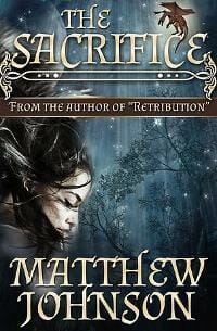
JF: Confused with no central focus.
Mauricio Diaz submitted Wrinkles designed by Mauricio Diaz. “New cover design for the Ebook version of Wrinkles by Charles Simmons.”

JF: This book has had several covers, of which this must certainly be the best. Great composition and concept. My only complaint is that the central figure really ought to be a bit more visible for an ebook cover, but that’s a quibble. ★
Michael Harrington submitted In God We Trust designed by Michael Harrington. “I wanted to get the essential elements of the story into the cover: money, politics, and religion. The God text and fonts lifted from the dollar bill, the red, white and blue colors of the flag, and the recognizable icon of the Capitol building all worked toward that goal.”

JF: Overwrought and ineffective, with all the elements at war with each other.
Michelle Abbott submitted In Chains (In Chains #1) designed by Deranged Doctor Designs. “I recently had this cover re-designed by Deranged Doctor Designs.”

JF: Uniquely and admirably creepy.
Mina Khan submitted Wildfire: A Paranormal Mystery with Cowboys & Dragons designed by Ana Grigoriu. “Ana did a great job in giving the ideas in my head the most fantastic visual representations so that I had the perfect cover for my story. She went the extra mile and took a picture of herself (since I insisted the heroine wore clothes that most ordinary women would wear) & used it in the design.”

JF: So let’s see: Paranormal? Check. Mystery? Check. Western? Check. Fantasy? Check. Dragons? Check. That’s a tall order for any book, let alone a cover designer. I think this one is to be commended for keeping it all together, and for the lovely treatment of the title, which is doing part of the job.
Narcisse Navarre submitted The Olive Grove designed by Narcisse Navarre. “This is the second cover I designed for The Olive Grove. I wanted it to feel dark and mysterious. The eyes sees the bare chest first, and the fur-covered legs last. For typography I went with something classic and bold that conveyed the ancient Roman setting of the story.”
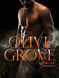
JF: Nicely done, classy beefcake with a twist. ★
Oli Jacobs submitted Filmic Cuts 1: Sunshine & Lollipops designed by CM Carter. “CM Carter has produced a design for my first collection of short stories that hopes to reflect the tone of some of the tales inside. By showing an almost transparently skinned individual, it is showing what lurks underneath all of us.”

JF: Sunshine & Lollipops? Really? Fantastic illustration but no attempt and composition and type that’s pretty much a failure.
Philip Hemplow submitted Fair Trade designed by Jordan Saia. “Cover art by Jordan Saia, who also did my previous two books. This is slightly different in style though. Jordan also provided invaluable feedback on the lettering etc. once I’d settled on a title. I’m really pleased with it! :-)”

JF: An effective genre cover with a custom title type treatment.
R. Simon Anderson submitted Frontiers designed by CreateSpace & I. “I chose the cover photo as a logos for what the main character, and indeed the novel’s title, is about: seeing (and wanting to break) frontiers.”

JF: Weak typography and no hook whatsoever. Why would anyone be interested?
Renee Barratt submitted The Breaker Boys designed by Renee Barratt – The Cover Counts.

JF: Although I don’t think you need all those effects on the type, this is story telling at its best, and its immediacy draws us right in. ★
Rick Febre submitted Reconquest: Mother Earth designed by Rick Febre. “Cover design: Rick Febre, Illustrator: Jeremy Rathbone, Managing Director: Charlie Franco”

Rick Febre submitted Stinger Stars designed by Rick Febre. “Cover design: Rick Febre, Illustrator: Jason Mowry, Managing director: Charlie Franco”

JF: By far the better of these two (see immediately above), the focus and simplicity really serve this cover well.
RK Moore submitted PASCO – Episode 1 designed by RK Moore. “My previous self-made cover didn’t ‘pop’ enough so I went back to the drawing board and came up with this. The subsequent covers for the serial are the same image but with different colouring.”

JF: Nice job, it works. Genre readers will respond.
Robin Wiesneth submitted Tails of Imagination: Ordinary Pets, Extraordinary Adventures designed by Robin Wiesneth. “This cover is for a Children’s Picture Book. The same cover will be used for the hardback version. The cover is from an original, award winning painting by the author and artist Robin Wiesneth.”

JF: The illustration alone will sell this book, I suspect. Maybe next time partner with a graphic artist to help with the title treatment.
Ruth Nestvold submitted Chameleon in a Mirror designed by Britta Mack. “A time travel to the seventeenth century and the identity games that ensue. The title is based on the question “What color is a chameleon in a mirror?””

sarah semark submitted When Werewolves Attack: A Guide to Dispatching Ravenous Flesh-Ripping Beasts designed by Triggers & Sparks. “A pseudo-non-fiction “field guide” to werewolves. The book is rather tongue-in-cheek, with a satirical feel to it. I decided to model its cover after vintage field guides, with some blood spatter to make it a bit more gruesome.”

JF: A strong design that really appeals. Wonder why you didn’t run the bloodstains right past the border and off the edge though? ★
Sean Black submitted Post designed by Nick Castle.

Sharon Cook Love Cook submitted A Deadly Christmas Carol designed by Donnie Light. “Greetings: I illustrated the cover of my mystery, A Deadly Christmas Carol, while Donnie Light of did the design and lettering. An art school grad, I also illustrated the cover of my first mystery: A Nose for Hanky Panky.”

JF: Interesting illustration, I find the type choices baffling.
Shelia Chapman submitted Choice and Change designed by Steve De La Mere. “The cover image is taken from ‘Protected’ by artist Steve De La Mere. Steve not only gave us permission to use his image but also modified it to show the red eyes on the wolf.”

Stacy Claflin submitted Ascension designed by Bryan Hufalar.

Sydney Strand submitted His Favorite Regret: A Romantic Comedy designed by treat books. “This is part of a series that actually started off another way–with petulant-looking women in well-Photoshopped photographs. But the problem was that while the books screamed “Contemporary Romance Meets Women’s Fiction,” they didn’t scream “These Books are Funny!” So illustrations it was!”

JF: I love the illustration and composition of this cover, and the treatment of the author name is quite lovely. It would have been one of my favorites this month, but that “regret” at the bottom, split off from the rest of the title, is really irksome and a clear defect in my opinion.
Tatlin submitted Codename-Chimera designed by tatlin. “Reusimg a well known piece of art is a challange to give it a new life in a different context.”

JF: The cover is quite well composed, but I don’t like the hard-to-read title, otherwise this cover is quite appealing.
Thomas Mays submitted A Sword Into Darkness designed by Thomas A. Mays. “As I wrote, I needed to visualize the ship, as a key setting/character. This is scientifically and militarily accurate SF, or as close as a good tale can get. I did the art myself as an aid, and it took off from there. I decided to use it as the cover, since an outsider would not have my vision.”

JF: The art is quite good and well suited to this book, of course. Overall an effective cover.
Wendy Chartier submitted Evanescent designed by Beetiful Graphic Designs. “The cover is a beautiful one and leaves the characters face hidden so people can build their own image of Sarenah. It fits the story and series very well.”

JF: I’ll take your word for it, because it seems a wildly incongruent collection of elements that don’t really go together.
Zoya Tessi submitted Perfect Opposite designed by Deranged Doctor Design. “I asked Deranged Doctor Design for something different, not an ordinary YA book cover ( couple in embrace/ photo based). Also, I wanted my characters present ( especially Hero & his mohawk) , but not faces clearly visible. And, to have opposites attract feel. I was blown away when I saw their design”

JF: Maybe the doctor is deranged, but he knows how to check the boxes and deliver a cover aimed at your audience.
Nonfiction Covers
Amare Zhinni submitted 101 Tweets designed by Amare Zhinni. “This is tricky, and maybe makes the book seem more crass than it actually is. It’s a fine line–to draw readers to this title without repulsing them. Of course, it’s a very niche market either way.”

JF: My problem is with a nonfiction book that doesn’t really tell us what it’s about? What tweets? Why should we be interested?
Bridget McKenna submitted Resilience: A Journey From Fear to Freedom designed by Bridget McKenna for Zone 1 Design. “For this Holocaust memoir, I used a snapshot of the author and his father, a postcard from his father in Thereisenstadt, and two shots from later in his life. I chose type reminiscent of the pre-war era, then created a custom effect on the title type to pop it out from the midtones of the photos.”

JF: I like most everything about this cover, particularly the title and the overall color scheme. I would have liked to see the bottom images in more of a montage to defeat the strong left-right, binary, 2-column look the cover has taken on. ★
Dawn Taarud-Martinez submitted Aspen, Snow, Blow, and Bo designed by Dawn Taarud-Martinez. “It is what it is….”

Filip Palda submitted The Apprentice Economist: Seven Steps to Mastery designed by Filip Palda.

JF: Difficult to decipher, and that’s not helped by the vertical type.
J Washburn submitted HIGH ADVENTURE designed by J Washburn. “This photo shows a U.S. Marine in civilian clothes, carrying an AK-47. With the right retouching, the colors really came to life.”

JF: A very novelistic look for an autobiographical essay.
Kim Cresswell Cresswell submitted Real Life Evil – A True Crime Quickie (Book One) designed by Adrijus Guscia – Rocking Book Covers. “I was looking for something a bit different than your usual true crime book cover for this collection of short stories.”

JF: Interesting image and strong composition somewhat undone by type that’s obscured by extraneous effects.
Kimberly Schimmel submitted Four-House Unity Cowl designed by Kimberly Schimmel. “This design naturally used a photo of the finished project from the pattern booklet. It was done in Microsoft PowerPoint.”

JF: With a craft book like this one, showing the craft is the only real requirement. In this case, it would show far better with a neutral background.
Kimberly Schimmel submitted Haiku from the Left Brain designed by Kimberly Schimmel. “Haiku poetry is most often about nature, so I designed this green cover around a royalty-free image of a leaf. This was my first cover done outside the Kindle Cover Creator.”

Linda Zercoe submitted A Kick-Ass Fairy designed by Kimberly Glyder Designs. “I wanted a cover image that was bold and visually ‘kicked ass”. The book cover had to appeal to men and women. Simplicity in design, denoting strength was needed to compensate for the word ‘fairy’ in the title. I thought boots, fashionably and suitably bold red, complemented by turquoise was bold.”

JF: A solid and effective cover that creates interest with its tough/gentle title and imagery. ★
Mallory Rock submitted Indie Authors Naked designed by Mallory Rock. “The clients asked very specifically for a pulp fiction style cover for this book and this is what I ended up with for them and they really love it.”

JF: Me too, love the pulp look and illustration, just wish I never had to see that dark red type on a black background once more. ★
Mark Masek submitted Calvary Cemetery: The Unauthorized Guide designed by Mark Masek. “This e-book is one of a series of e-books I’ve written as separate guides to cemeteries in the Los Angeles area. Each book features a brief history of the cemetery, and is written as a walking tour of the property, providing specific directions to the final resting places of notable people.”

JF: Appropriately staid.
Paula Casill submitted My Brother’s Keeper: Redefining Relationships in the Body of Christ designed by Rashada Nunez. “The book is about finding ways to relate to one another without the interpersonal conflicts and resentments that are so common in today’s society. I chose this image for the cover because I loved the feeling of hope that’s suggested by the light shining through the window.”

JF: Of course, “relationships” usually denote two or more people. Despite the light streaming in, I find it a bit alienating, and the title could stand out more.
Russell Phillips submitted A Damn Close-Run Thing: A Brief History of the Falklands Conflict designed by Kit Foster. “I’m really pleased with this design by Kit. At my request, he also mocked up an alternative, with the Argentinian flag on Argentina, and the Union Jack on the Falkland Islands, but that didn’t work anything like as well.”

JF: Another great collaboration from this author/designer pair, this one relying on great imagery and a deft hand with type. ★
Ruth Finnegan submitted Love Enpictured designed by RuthF. “New to designing. Not everyone will like the simplicity, but I love the way the portulacca flowers (scan by me from nature, not photo or from web) glow against the black background, sparse discreet text, as in interior. Slight mistiness of image matches the subject matter. Designed for lovers…”

JF: What you see is not what we see. Indistinct, inscrutable, without a serious attempt to communicate the nature or content of the book it’s supposed to represent.
Shiela Miller submitted Memoirs of a Miracle Baby: A Testimony of God’s Love designed by Michelle Calloway. “Photo credits to Mike Bedford. Graphic designer Michelle Calloway finished the cover and added AR (augmented reality).”

JF: Now that beam of light shows hope, optimism, joy even. Aimed squarely at its intended readers.
Steven Wong submitted The Yellow Banana designed by Li Leng Wong. “The cover brings out the genre of this non-fiction set in the mid 70s. It portrays an innocent Asian teenager’s epic journey to the big Western world to pursue an education.”

JF: I like the concept and the type, but the whole effect seems somewhat muted.
Vicki Lesage submitted Confessions of a Paris Party Girl designed by Clara Vidal. “I wanted to convey the charm of Paris with a bit of sass to reflect the tone of my punchy memoir. I created the basic design, then turned it over to my French graphic designer colleague who polished it with a French touch.”

JF: I love this lighthearted cover that accomplishes a fun and sophisticated look. I would have been tempted to make the title larger within its frame, but a great job overall. ★
Well, that’s it for this month. I hope you found it interesting, and that you’ll share with other people interested in self-publishing.
Use the share buttons below to Tweet it, Share it on Facebook, Plus-1 it on Google+, Link to it!
Our next awards post will be on April 14, 2014. Deadline for submissions will be March 31, 2014. Don’t miss it! Here are all the links you’ll need:
The original announcement post
E-book Cover Design Awards web page
Click here to submit your e-book cover
Follow @JFBookman on Twitter for news about the E-book Cover Design Awards
Subscribe to The Book Designer Blog
Badge design by Derek Murphy


