Welcome to the e-Book Cover Design Awards. This edition is for submissions during April, 2014.
This month we received:
77 covers in the Fiction category
17 covers in the Nonfiction category
Comments, Award Winners, and Gold Stars
I’ve added comments (JF: ) to many of the entries, but not all. Remember that the aim of these posts is educational, and by submitting you are inviting comments, commendations, and constructive criticism.
Thanks to everyone who participated. I hope you enjoy these as much as I did. Please leave a comment to let me know which are your favorites or, if you disagree, let me know why.
Although there is only winner in each category, other covers that were considered for the award or which stood out in some exemplary way, are indicated with a gold star: ★
Award winners and Gold-Starred covers also win the right to display our badges on their websites, so don’t forget to get your badge to get a little more attention for the work you’ve put into your book.
Also please note that we are now linking winning covers to their sales page on Amazon or Smashwords.
Now, without any further ado, here are the winners of this month’s e-Book Cover Design Awards.
e-Book Cover Design Award Winner for April 2014 in Fiction
Nancy Kimball submitted Chasing the Lion designed by Alexandre Rito. “Alexandre did a beautiful job at capturing the genre and tone of my novel, while staying true to my requested color palate and tone. It was a pleasure to work with him and he is a very gifted book designer.”
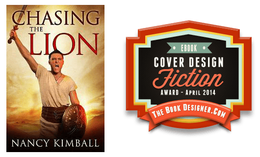
JF: Wow, now that’s a strong, confident ebook cover from a designer in complete control of his ingredients. No need for confusion, glitzy type effects, or anything else that will distract from the impact this cover makes.
e-Book Cover Design Award Winner for April 2014 in Nonfiction
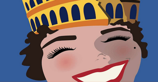
Belinda Darcey submitted The Princess Guide To Rome designed by Belinda Darcey. “A travel guide book for a niche market. First book in a series, each one covering a different city. Layout will stay the same, but the crown/hat will feature a different icon for each city. (e.g. Eiffel tower for Paris, gondola prow for Venice, Opera House for Sydney). Colors will change too.”
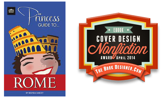
JF: What a great approach for this “cheeky, fun” guide to Rome. I love the simplicity and economy of the illustration style, as well as the tongue-in-cheek series logo. Just great.
Fiction Covers
Aldrea Alien submitted The Rogue King designed by Ros Kovac & Myself. “Roz did the image for this based on an older version I’d done.”

JF: An interesting and strong illustration that completely overpowers the weak typography of the title.
Alexei Auld submitted The Things I Prefer To Be Forgotten designed by Rose Powhatan. “Since this is a prequel to Tonto Canto Pocahontas, the cover designer retained similar elements for branding purposes (buckskin/font), but adapted her tribe’s traditional pictographs to reflect new characters (an African American & stripper) in one of many embarrassing scenes from the book.”

JF: I’m completely charmed by the primitive art treatment of a stripper on a pole, and the whole cover has a light and attractive look to it, partly from a smart font choice for the title.
Barbara Barth submitted Danger In Her Words designed by pd king designs. “I wanted a cover that would stand out as a thumbnail and let the reader know there was an element of suspense in the book. I prefer illustrations to photos, so the reader can use their imagination with the characters. In this illustration I think the eyes say it all. The word Danger grabs attention.”

JF: Nice illustration, but overall an awkward cover that doesn’t use space very well.
Becky Doughty submitted Waters Fall designed by Bryan Stifle. “This is women’s fiction from a Christian worldview, so we needed to tone down the nudity aspect, yet keep the vulnerability of a fallen woman. Wanted a contemporary edgy feel, too. The water is a key element throughout the book.”

JF: Carefully put together, it looks like the hair is intended to morph into falling water, not sure that really comes across at a glance.
Bret Norwood submitted Triple Play (A Jake Hines Mystery) designed by Bret Norwood. “This book begins Elizabeth Gunn’s self-published re-release of her Jake Hines series of mysteries, originally published by Walker & Co. At first she was only interested in releasing Triple Play in ebook format, so we sought simplicity and high contrast for legibility in thumbnail.”

JF: The strong photo could have generated an equally strong cover but is undone by the artless and ineffective typography.
Brett Henley submitted The Little Girl and The Hill designed by Amber Morgan. “My wife, Amber, designed all illustrations in this children’s e-book – each hand drawn on black paper using colored pencil (incl. cover). The type was added after the fact. The silhouette is of the Little Girl holding a book in hand as she stares up at her “perfect spot” on the hill.”
JF: Trouble is, you have to get this cover to almost full-screen size to actually see or appreciate the lovely art. At this size, it’s a dark and easily skipped muddle.
C. J. Darlington submitted Unseen designed by C. J. Darlington. “Unseen is the first inspirational thriller for our company, Mountainview Books, LLC, and we were striving to give it a design that would allow it to stand proudly beside any large press thriller. Hopefully we succeeded!”
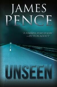
JF: You’ve made a great start with this atmospheric cover, although it seems that the parts could be integrated a little more tightly.
Cherie Burbach submitted My Soul Is From a Different Place: Poems designed by Cherie Burbach. “I designed the cover by starting with my own artwork. I created a mixed media background and then used design software to enhance the color and add a cohesive look.”

Chris Lunda submitted The Voodoo Prophecies and the Original Sinner designed by Kip Ayers.

JF: Not sure why the subtitle has to be so difficult to read, but the illustration does make an impact.
Christopher P. Simmons submitted Immaculate Inception (Book I of the Judas Christ series) designed by Christopher P. Simmons.

JF: A strong and resonant cover that’s perfect for its genre, although the type effects on the title may be extraneous.
Dane Low submitted The Bennington Mysteries designed by Dane at Ebook Launch. “I opted to use powerful, simple imagery to evoke emotion from readers. This cover introduces the part of the plot that involves camping. It’s terrifying to think of something lurking outside your tent, so I think it has a great sense of vulnerability.”

JF: Very powerful and appropriately scary, although the bottom image is bit difficult to make out, and the added imagery inside the title type only seems to be adding a bit of “noise.”
Dane Low submitted The Dead of Winter designed by Dane at Ebook Launch. “This cover depicts an eery scene of a large farmhouse, isolated and surrounded by fog in the middle of winter. There are subtle footprints fading toward the house. I chose to set the scene at night to make it feel more mysterious. The moon and the font communicate the mystery/romance genre.”

JF: Beautiful and chillingly effective. ★
David Edward Wagner submitted Marvelous Things designed by David Edward Wagner/Calvin Lai. “The idea was to convey the disheveled fatigue and paranoia of a long isolated deep space mission. The blue tint and slight distortion represent the artificial intelligence unit he sits before. In effect, we are the AI looking at him.”

JF: Good example of a font that’s both too quiet, too small, and really wrong for the sci-fi genre.
DJ Colwell submitted Song of the Storm Eagles designed by Sandra Mehus. “Song of the Storm Eagles is a fantasy adventure story aimed at Middle Grade readers. The cover depicts one of the main characters, Bern, using special pipes to call and control the great storm eagle. The title font is Beyond Wonderland designed by Christopher Hansen.”

JF: Love the title treatment and the overall composition, but I wish the figure of the child stood out more.
Domino Finn submitted The Seventh Sons of Sycamore designed by Shardel. “This novel has werewolves in it but is a crime thriller first. I wanted to nail the genre and show that this is a gritty police prodedural while hinting at the supernatural elements. As it is, the cover is suggestive of a key flashback scene that is heavily featured in the opening chapter.”
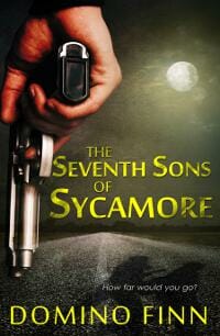
JF: Although this is a pretty effective cover, I wonder if a less generic subtitle could have been used to imply the vampire element, otherwise missing?
Elizabeth Cole submitted A Reckless Soul designed by Renu Sharma (digital art), JR Blackwell (photography), and Nicholas Tulach (typography/layout). “This cover is meant to portray the suspense elements in the story plus still convey a healthy bit of romanceyness. This was also the first book cover we worked with a photographer on for custom photography. I think it turned out amazing.”
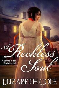
JF: Romanceyness plus suspensiness? A tall order, looks like it’s working.
Elizabeth DiPalma submitted The Baxter Trust designed by Elizabeth DiPalma. “This cover is part of a series. The author is well-established and has several other series, so we wanted to feature his name but make these Steve Winslow books have a distinct identity. They also had to look just as good small as they do large.”

JF: A flexible approach to series branding has left the designer plenty of latitude to design the individual covers. Of the four (see the three covers below) this one is my favorite for its deft combination of design, typography, and allusion to the underlying story. Nice! ★
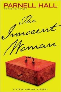
Elizabeth DiPalma submitted The Innocent woman designed by Elizabeth DiPalma. “Part of the Parnell Hall Steve Winslow series”
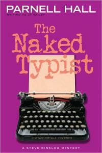
Elizabeth DiPalma submitted The Naked Typist designed by Elizabeth DiPalma. “Part of the Parnell Hall Steve Winslow series.”
Elizabeth DiPalma submitted The Underground Man designed by Elizabeth DiPalma.

Erick Galindo submitted So Go On and Live designed by Erick Galindo.

JF: Something’s missing, and it might be meaning, or it might be interest, but you’re not giving us much to go on here.
Geza Tatrallyay submitted Arctic Meltdown designed by Geza Tatrallyay. “Arctic Meltdown is a thriller set against the backdrop of the melting polar icecap and the ensuing jostling for jurisdiction over seabed resources.”

JF: Your typeface doesn’t work well for a thriller, but overall this is a good example of a cover with no “hook” to it at all.
Holly Bush submitted Charming the Duke designed by Jenny Quinlan at Historical Editorial. “Charming the Duke is doing very well and I believe that some percentage of the sales are due entirely to the gorgeous cover that Jenny designed. Whether we admit it or not, we’re all drawn to good covers, and make some conclusions about the book based on that first look.”

JF: Nice air of mystery, too.
Horton Prather submitted The Honduran Plot designed by Horton Prather. “The novel is a suspense with a Christian viewpoint entitled “The Honduran Plot.” The cover uses the photograph of a unique cross on a hilltop in Honduras as the “t” in the title word Plot. This provides visual interest and hints at the Christian viewpoint.”

JF: Everything has been sacrificed to the device of the cross as “T”. Also, watch out for cutting off the bottom of the cover with a white panel like this one, it’s disconcerting.
Ian V Ward submitted Jagannath designed by Ian Ward. “This historical novel turns on the belief that when the enormous Cullinan diamond was found at a mine in Pretoria, South Africa in 1905, an even larger part of the stone did not come to light. The cover image simply reflects the fabulous uncut diamond lying undiscovered in the red African murrum.”

JF: A strong visual, but for this book title on this cover, I can’t help but think that a compressed (narrow) font would have been much more emphatic.
Intisar Khanani submitted Thorn designed by Jenny Zemanek. “Thorn is a retelling of the Grimms’ fairy tale, “The Goose Girl.” Unlike the original, the country the main character travels to has a North African influence, so I wanted a hint of the multicultural aspect of this book in the cover.”
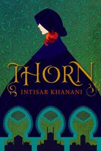
JF: A beautifully-drawn cover with distinctive typography.
James Egan submitted Curse & Fate designed by James T. Egan of Bookfly Design.
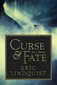
JF: Despite the obvious care the designer has put into the typography of the title panel, the illustration is completely indecipherable to me, and I never find that a good solution to the challenge of communicating a book’s offer to the reader.
James Egan submitted I, Jequon designed by James T. Egan of Bookfly Design.
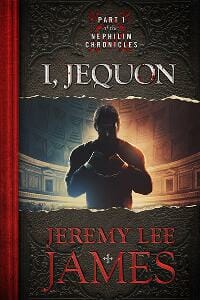
JF: Very interesting approach to depict the ebook cover as a quarter-bound hardcover book. Some of the lovely texture of this cover is lost at a small size, and I’m not sure I agree with the decision to cast the figure in shadow.
James Egan submitted The Long Way Down designed by James T. Egan of Bookfly Design.

JF: A terrific and evocative cover for this urban fantasy, it draws us into the story while also letting us know the kind of noir-esque environment we’ll be delving into.
Jane Harvey-Berrick submitted The Education of Sebastian & The Education of Caroline (combined edition) designed by Hang Le. “A tricky commission because this is the re-release of an established series. It needed to show the setting of both books, yet the first was set on the beach in San Diego, and the second, ten years later, on the killling fields of Afghanistan. The designer, Hang Le, had to combine those elements.”

JF: Yes, quite a challenge, and while I admire the artistry of the designer pulling this all together, it still seems like there’s just too much going on here to make a strong, clear impression.
Jason Lewis submitted Paradise designed by Milo. “I worked with Milo and Kim at Deranged Doctor Design to come up with this cover for my dystopian science fiction mystery/thriller ‘Paradise’. I wanted the cover to convey the fact that the book was science fiction whilst also capturing the human side of the story. It also had to be quirky.”

JF: There’s lots to like about this cover, including the confident layout and adept typography. But I had to look it up on Amazon to find out what the subtitle said, and the illustration might be just a bit overexposed.
Jess C Scott submitted Playmates (Book 1, Wilde Twins) designed by Jess C Scott. “Using stark tones, a readable font and an image to depict the two young siblings in the story, I did my best to convey the nature of this dark psychological thriller. It was important to me that the image be eye-catching in thumbnail size.”

JF: I love what you’ve done with the palette and the title, but the bottom half of this cover simply doesn’t work.
JF Garrard submitted The Undead Sorceress designed by JF Garrard. “The illustration was done by a fantasy artist, Eumir Carlos Fernandez, who lives in the Philippines. The cover graphic design is by the author, JF Garrard, who spent many months studying book covers before finishing the graphics in Photoshop.”

JF: That huge sword-axe thingy in the middle is odd and really doesn’t “read” well to me at all. Dividing a cover about in half doesn’t help either.
Jill Domschot submitted Anna and the Dragon designed by JartStar.

JF: An attractive cover that appeals because of its simplicity, which I find admirable. Lots of story without lots of fuss.
Joanne Huspek submitted Finding Cadence designed by Author guided CreateSpace. “I took the background shot of San Francisco’s Richmond District from Ocean Beach many years ago, and wanted to include it on the cover as my character, Cadence, finds her new life there. (Actually, I started writing the book there.) CreateSpace was somewhat limiting but easy to work with.”

JF: When I say a book cover lacks a “hook” what I mean is: Why would anyone pick it up? What’s the attraction, interest, what’s beguiling, intriguing? That’s what you have to ask yourelf.
K.D. Harp submitted CODE PRODIGAL Cast Your Cares designed by K.D. Harp. “Doug Kubel’s sunrise street scape captured the feel of the town of Spencer, and the light of hope we can see even while we still stand in darkness, a major theme of the story. Some PS wizardry to blend it into the lower half, 10 fonts, faux road texture and glass effect subtitling to complete it.”

JF: Busy, busy, busy, and for what? 5 or 6 different type treatments adds to the confusion.
Karri Klawiter submitted The Second Diary designed by Karri Klawiter.

JF: Lovely, and the artwork is spot-on.
Karyn Lawrence submitted Stay designed by Karyn Lawrence. “I stumbled across this photo on Google and thought it was the perfect fit for my romantic suspense novel. Equipped with a Spanish-speaking cousin and some Google Translate, I was able to negotiate the rights with the photographer who lives in Spain.”

Katharine Giles submitted A Perilous Quest, An Archer Adventure designed by Katharine Giles/Telemachus Press LLC. “This cover illustrates one of the aquatic dragons prominent in this fantasy adventure series for young readers. The author’s vision for her covers is to capture the reader’s attention from across a room.”

JF: Unfortunately, there’s absolutely nothing here that will help her reach that goal.
Niki Danforth submitted Stunner: A Ronnie Lake Mystery designed by KT Design.

JF: Very strong, from the focus on the woman’s hands to the draw of the light couch in the background, this cover is a great advertisement for the story it gives us a glimpse of.
Kjetil Hestvedt submitted Portrait in Smoke designed by Risa Rodil.

JF: Although I love the distinctive graphic style of the designer, in this case it has clearly overpowered the type.
Kjetil Hestvedt submitted You’ll Die Next! designed by Risa Rodil.

JF: On this cover, the same designer has struck a much better balance where the image and type work effortlessly together.
Laura Newman submitted NACHTSONNE – Flucht ins Feuerland designed by Laura Newman. “My dystopic Novel tells the story about a girl, living in a huge Brig, called HUB. She is one of the last survivers of a climate catastrophe. Finally, she has to flee. She has to go out of the HUB, out into the Fireland. The cover shows the alarming width of the destroyed world, she has to conquer.”

JF: A fantastic ebook cover that really communicates. I’m getting hot just looking at it. ★
Laurie Boris submitted The Picture of Cool designed by Paul Blumstein. “When I saw this design out of the batch of comps Paul sent me, my brain just clicked to YES. So perfect for the story. The photo fits the setting and the mood, and the red blocks really pop.”

JF: Love it, very cool.
Louis Tridico submitted Redcoat designed by Cory Say. “The plot revolves around a mysterious killer dressed as a British Redcoat, who murders his victims with a sword. Hence, the inspiration for the cover.”

JF: Shows how a talented designer can meld illustration, concept, and typography into one cohesive whole, and when you do that it really communicates to readers. Nicely done.
Madeleine Farrell submitted Looks Like Peace designed by Jeanine Hennings. “The blue juxtaposes with the beautiful strong female image to create the perfect appeal to both sexes in this introspective journey which is depicted by floating the words in the headshot. The main character is a teacher an an artist; thus the cover shows creativity.”

JF: What it shows to me is a weak concept, poorly executed. And why divide the whole thing down the middle?
Maree Anderson submitted Opal’s Wish (Book 4 of The Crystal Warriors Series) designed by Rob Anderson. “We moved away from depicting solely the hero on this cover, and I think it still works well for the series as a whole. However, imagine our dismay after purchasing the licence for the stock photo when we realized the female model’s dress was made entirely of coffee beans! Oops. TG4 PhotoShop :)”

JF: The latest in a series of strong, coherent covers.
Mary Lewellyn submitted The Lost Souls of Draco designed by Mary Lewellyn.

JF: Very weak, needs a professional’s touch.
Masha du Toit submitted Crooks and Straights designed by Masha du Toit. “Crooks and Straights is an illustrated novel, so I had to match the style of the cover with the illustrations. I also had to make it clear through the look of the cover that it was not a sequel to my other books, but the start of a new series.”

JF: Once again, the artist/author goes straight for the reader with a distinctive style that really makes her designs stand out. A previous winner here.
McKellon Meyer submitted The Phoenix Queen designed by Tugboat Designs. “Deborah at Tugboat Designs did this cover for me. I am most thrilled by the abstract look she gave for the phoenix and the red and gold color scheme.”

Michael Patrick Hicks submitted Convergence designed by Glendon Haddix Streetlight Graphics. “Glendon did the design work, and I think it captures the sci-fi elements of the book quite well. I wanted to see some interplay on the “convergence” of man and technology, which plays a crucial role in this story.”

JF: Delivers a strong appeal to sci-fi lovers, expertly handled.
Michelle Browne submitted Sophisticated Swingers – Book 1 designed by Deborah at Tugboat Designs. “Simple, youthful, sexy and full of promise.”

JF: Easy to see the appeal, but the title doesn’t seem right, it could have added a lot more to this cover.
Miranda Stork submitted Vigilante of Shadows designed by Miranda Stork. “I wanted something different for my covers, as paranormal covers usually tend to have the same set-up. No people, instead using the keyhole focussing in on an important element of each book in the series. The curling designs are a representation of some twisting elements in the story.”

Misa Buckley submitted REBOOT designed by Scorched Flower.

JF: We have many good sci-fi covers this month, and this is certainly one of them. A clever design that’s carried off well, and sure to pull in fans.
Monique McDonell submitted A Fair Exchange designed by Lisa Kelly. “This is the fifth book I have had designed by Lisa Kelly. We have worked closely together to create clear brand for my novels that reflects both their content and style.”

JF: A nice, light touch and a recognizable illustration style help these books stand out.
Nowick Gray submitted PsyBot designed by David Dees. “The cover conveys the essence of this sci-fi novel with aspects of both psychological and technological thriller (“Psy” + “Bot”; red + blue). From the disorienting depths of the computer (the tunneling pattern of binary digits) comes the rogue virus (the tentacled “bot”) to infect the unwary user.”

JF: Somewhat overwrought (only you know the red/blue symbolism, right?) but still gets the job done.
Paul Allen submitted Mr. Black And white designed by Jeroen ten Berge.

JF: Another winner from this author/designer combo. Graphically strong with enough story and intrigue to make us want to know more.
Rajdeep Paulus submitted Swimming Through Clouds designed by Angela Llamas of Blackhole Designs. “What I love about the cover is that it was a collaboration. Angela really valued my ideas and created a moment right out of the story.”

JF: Nice clouds, but it works better with the “Playlist” logo rectangle in the top left corner. Here, it really interrupts the story told by the illustration.
Rick Taubold submitted Murphy’s Second Death designed by Rick and Rose Taubold. “The author gave us the cover concept, something that intrigued the reader and captured the spirit of his novel. He provided the inspiration, and my wife and I brought his vision to life.”

Rick Veal submitted Dale’s Descent designed by DCA Graphics. “Dale is an original ‘Lost Boy’ who was attacked, turned and kidnapped on his sixteenth birthday. This cover is meant to depict his life as a nomad and vagabond wandering through the darkness with a gateway to light and redemption in the background.”

JF: The overall effect is confusion, not clarity, and I don’t think that’s what you want. Also suffering a bit from the “pasted-on” look.
Ryan Poore submitted Infliction designed by Ryan Poore.

JF: Nice job, good font choices, and you really let us know what kind of suffering this story will inflict on its main character.
S.W. Lothian submitted TIME SQUARE | THE SHIFT designed by S.W. Lothian. “TIME SQUARE | THE SHIFT is an upper middle grade/teen time-travel adventure story. It’s crammed full of adventure, humour and quirky characters. My aim was to create a cover with bright colours & cool characters that would be attractive to the target audience, plus their parents/teachers/librarians.”
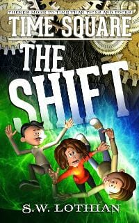
JF: It’s bright and fun, wish some of the type was easier to read.
Sarah Stegall submitted Farside designed by Sarah Stegall. “Farside is a young adult science fiction novel. When disaster traps the adults of LunaBase without air, only young Kaho and his friends are left to rescue them, using the ancient Apollo 17 Moon Rover. I took the Rover image directly from NASA’s own website (public domain).”

JF: Lacks any real drama, although the story sounds like it has plenty.
Steven Carman submitted Battery Brothers designed by Kirk DouPonce. “Kirk DouPonce served as the photographer and designer on this project. His local high school baseball coach loaned him the baseball uniforms and equipment. He got two volunteers from his local church who fit the characters’ description to serve as models in a photo shoot at a local baseball field.”

JF: The work shows, and this cinematic cover is impossible to ignore. Beautifully done, from the careful type to the engagement of the two figures, a real winner. ★
Steven Whibley submitted DISRUPTION designed by PINTADO. “This is the first book in a YA series. I asked the designer to make the kids look like they weren’t to be messed with, but without overdoing it. -Thanks for this opportunity.”

JF: Simple, with nice touches on the title type. It works.
Stuart Handley submitted BioKill designed by Damonza. “The brief was to incorporate the terrorist organization in question, bring in the links to America and the East, display a suggestion of a biological virus and combine that with the format of my name, book name and gun sight cross-hairs that I use. Hey presto.”

JF: Oh sure, Damon makes it look easy, but there’s a lot going on in this cover even though it never lets go of the central premise. Great stuff.
Susan Illene submitted Darkness Divides designed by Claudia at Phat Puppy Art. “I coordinated with Teresa Yeh for a custom photo shoot to get the right model and look. That included purchasing a wardrobe to fit a scene from the book and borrowing real guns. The background is stock, but for the sky we got permission to use a National Geographic photographer’s work.”

JF: Well done, and she’s one tough cookie. I love the head’s on approach this cover takes. ★
Tamian Wood submitted Love Abideth Still designed by Tamian Wood @ Beyond Design International. “The story is an Historical Romance that involves letters received posthumously from a union soldier to his beloved wife. Submitting for my author Scott R. Rezer”

JF: Sensitive and apropos, if a bit overcrowded with detail for my taste.
tatlin submitted A forgotten man designed by tatlin.
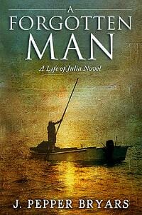
JF: I have no idea how this image relates to the book, about the influence of government on the individual, but the typography is quite good.
tatlin submitted Esposo irresistible designed by tatlin. “A light, ironic vision of all women dream.”

JF: And a good cover for a light, ironic, tale, the designer once again shows his ability with type and a strong concept.
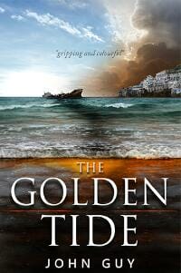
tatlin submitted The Golden Tide designed by tatlin. “The client needs an impactfull, colored cover without being messy, for a story that take place in south of Italy.”
Tom Bradley Jr. submitted The Hilo Hustle designed by Deborah Bradseth at Tugboat Design. “Playing off the branding she established with the cover of my first novel, THE KONA SHUFFLE, Deborah’s use of a pint of beer plays off the novel’s central plot theme, while the word “Aloha” etched on the glass is an ironic allusion to the murder(s) and mayhem prevalent in the story. I love it.”

JF: I love it to, and particularly the vibrant color choices and everything else here that tells us about the Hawaiian setting.
Travis Ward submitted Come Find Me designed by Danielle Maait. “With this cover, Danielle created an illustration that includes a wide range of light, from the darker rolling hills full of vibrant color in green and blue tones, to the brilliant yellow-orange sunset. In addition, she had a prominent photo of people, so their skin tones had to look great.”

JF: The designer, a genre cover specialist, knows exactly who she is aiming at with this cover, and hits the mark. Bot the romantic element and the setting of the story find their way onto the cover with good effect.
Valerie Comer submitted Wild Mint Tea designed by Hanna Sandvig.

JF: What a charming illustration, I only wish the typography had kept in balance with it. I wonder what this would look like with the title 50% larger?
Yelle Hughes submitted Triton the Aegean Chronicles designed by Yelle Hughes. “My full-length, romance novel involves my take on what the mythological gods of Greece would be like today. My cover features, Triton the god of the sea. Most interpretations have him with a dolphin tail and as a child.”

JF: There’s so much going on in this cover, so many shapes and lights and symbols and images for the brain to process all at once, I think it’s detracting from the principal message it’s trying to convey.
Yelle Hughes submitted Tritonium (Greek Gods in Space) designed by Yelle Hughes. “When I shopped for books, I looked at the cover first. That’s what I kept in mind for my own work. A dark background, eye-popping colors, pleasing images and a title that makes the reader stop and say, “What’s that?””

JF: The title looks much too weak to balance the other elements on the cover.
Nonfiction Covers
Alicia Mayer submitted Hollywood Essays designed by Alicia Mayer. “Thanks for the opportunity to enter this competition. Hollywood Essays is currently only available as an iBook and was created with iBook Author, as was the cover. The cover photo shows my grandmother Mitzi, a Photoplay columnist, with Jean Harlow and is from our family photo collection, around which I write each essay.”

JF: Shows why cover design is a whole lot more than putting type on top of a photo. With these same elements a talented designer could really do them justice, not the case here.
Alison Gillespie submitted Hives in the City: Keeping Honey Bees Alive in an Urban World designed by Denise Reiffenstein. “It was great to work with some one as creative and responsive as Denise. I am really pleased with the way she took my verbal synopsis and created a strong visual that works both on screen and on the paperback.”

JF: Positions the book well for its intended audience by blending the hive with the city.
Dane Low submitted Corporate Recruiter Reveals: Who Gets Hired and Why designed by Dane at Ebook Launch. “The title of the book is clear and prominent. I chose blue because of the corporate connotation and because blue is fresh and light. I also wanted a subtle way to communicate a reveal. The ripped paper works in two ways: it has a resume feel and it implies that secrets are hidden within.”

JF: A solid ebook cover perfectly pitched at the business audience.
Dane Low submitted How I met the Love of my Life Abroad: How You Can Too designed by Dane at Ebook Launch. “I wanted this cover to have a romantic, non-fiction feel to it. The colours are soft and the font is part serious, part dreamy. Since this is a man’s romantic quest around the world, I thought it fitting to feature a man who could be the author (which is why his face his hidden).”

JF: A charming cover for this memoir, with a title that really stands out and a nice touch of humor, too. ★
Filip Palda submitted Pareto’s Republic and The New Science of Peace designed by Filip Palda. “The hammer-man is based on a photograph of a sculpture on the grounds of the United Nations in New York. I have received written permission from the UN legal department to use the derived image on my cover. Many thanks for considering it for the contest Filip Palda”

JF: Strong graphically, with strong colors and a clear message, it was a great idea to license this image because it suits your book so well.
Jennifer-Crystal Johnson submitted The Ten Pillars of a Happy Relationship designed by Jennifer-Crystal Johnson. “The book cover design was meant to portray joy in the little things, which is part of the theme for the book itself. It all begins with the self; the book is a coaching-style guide to happy relationships with yourself and others. I really just need some professional feedback =). Thanks!”

JF: A book on relationships needs a much stronger connection to the subject than some flowers, and the typography is a sure sign this cover was done by an amateur.
Jonathan Heatt submitted Teaching Snapping Turtles How To Chew Bubblegum designed by Al Hildago.

JF: A clever concept (needs a border to keep it from bleeding onto the page, as it does here) but the title is too small to read.
Mallory Rock submitted The Diminishment of Purpose designed by Mallory Rock.

JF: I think it’s difficult to design a cover for a book about overcoming depression and finding meaning, but this one makes a good attempt, even if it’s somewhat monotone.
Matt Hinrichs submitted Falling in Love with ME: A Personal Journey and a Guide to Falling in Love with You designed by Matt Hinrichs. “This design was done in a “Fairy Tale” style to go along with the author’s role as self-help guru Tinkerangel. I also did the illustration.”

JF: Tinkerangel? How can you not like that? Cute illustration, not sure about the font choice.
Matt Hinrichs submitted The Girl Behind the Door: A Father’s Journey into the Mysteries of Attachment designed by Matt Hinrichs. “I wanted to come up with a design that seemed mysterious and intriguing while honoring the sensitive subject matter (man writing on his adopted daughter’s suicide). The author was happy with the final result.”

JF: A beautiful and evocative cover that handles its subject matter with grace while still attracting readers. And the title typography really sets it apart, very strong. ★
Merri Melde submitted Soul Deep in Horses: Memoir of an Equestrian Vagabond designed by Merri Melde. “As an equine photographer, I wanted to use one of my own photographs on the cover. I had a contest asking my readers to vote on their choice, and this is the photo they chose by a large majority.”

JF: A fantastic and atmospheric photo, but the cover would be more suited to a book of photos of horses, not a memoir. The photo has been treated with such reverence that it’s pushed the more narrative parts of the cover to the edges.
Paul Green submitted Am I There Yet? The Memoirs of a Very Nearly Man designed by Pete Bradbury. “Using bold, primary colours and a strong graphical element, designer Pete Bradbury brilliantly encapsulates the book’s humorous tone. I love the fact that he leaves the E on the word ‘There’ dangling in mid-air. It’s a perfect visual metaphor for the book’s self-deprecating theme of heroic failure.”

JF: Needs a border to prevent it bleeding onto the white page, as it does here.
Phil Bolsta submitted Through God’s Eyes: Finding Peace and Purpose in a Troubled World designed by Jay Monroe of James Monroe Design, LLC. “The Helix Nebula is a large planetary nebula (the gaseous envelope ejected by a dying, sun-like star) located in the constellation Aquarius. This image was produced from data generated by the Space Telescope Science Institute. Given that the nebula looks like a giant eye, it was the perfect image.”

JF: Nicely done, a marriage of image and meaning that should appeal to fans of this subject.
RJ Licata submitted Lessons for Joey: 100 Things I Can’t Wait to Teach My Son designed by RJ Licata. “The photograph is an actual picture of my son at the zoo, and I chose it because I thought it does a great job depicting the natural curiosity and love of adventure that all boys possess. I chose black and white in hopes that it would help the title, subtitle and author text pop a bit more.”

JF: Another example of an image that’s been allowed to squeeze all the other elements to the edges of the cover, making the title seem almost an afterthought. Although the individual elements are all carefully worked out, the cover as a whole suffers.
Rob Robideau submitted Incognito Toolkit designed by Bogdan Oprisan. “I asked the designer for 3 concepts. I gave him ideas for 2 of them(masks or toolboxes), but told him to be creative and put his best foot forward for the third concept. He knocked it out of the park. When I saw the concepts, I knew right off that his was the one I wanted.”

JF: A strong concept for this book about staying anonymous online, although I would have made the subtitle—the real selling points of the book—much more prominent. There’s certainly plenty of space available.
Trish Diggins submitted Ladybug Love: 100 Chinese Adoption Match Day Stories designed by Trish Diggins. “Photo by Jim Moore. The model is a child adopted from China. The ladybugs on the cover carry through as chapter headers. Thanks!”

JF: A perfect visual and a lovely title work to your advantage, but I don’t see why the subtitle—again, the real selling point of the book—is buried to the point of being unreadable.
Well, that’s it for this month. I hope you found it interesting, and that you’ll share with other people interested in self-publishing.
Use the share buttons below to Tweet it, Share it on Facebook, Plus-1 it on Google+, Link to it!
Our next awards post will be on June 16, 2014. Deadline for submissions will be May 31, 2014. Don’t miss it! Here are all the links you’ll need:
The original announcement post
E-book Cover Design Awards web page
Click here to submit your e-book cover
Follow @JFBookman on Twitter for news about the E-book Cover Design Awards
Subscribe to The Book Designer Blog
Badge design by Derek Murphy


