I write today in praise of the humble indent. Not just any indent, like the kind you find at the beginning of paragraphs in a book.
No, this is the opposite of a first line indent: it’s the hanging indent, which reverses the normal order. In a hanging indent the first line is not indented, but all subsequent lines in the paragraph are.
Hanging indents can be useful in many places, and especially for many kinds of lists, and it’s that quality that makes them such a good typographic device in the back matter of books, where most sections are lists of one kind or another.
(Back matter are all those sections of additional information that follow the text of the book itself.)
Glossaries Add Value
For instance, consider the glossary, found in the back matter..
Glossaries can add real value to your book, whether it’s fiction or nonfiction. Although they are sometimes seen as a brief look into the terms of art used by another profession or area of study, glossaries have lots of other uses too.
Here’s an example of a glossary in a blog post, something that could easily become part of a book manuscript since it’s “evergreen” content.
“A glossary, also known as a vocabulary, or clavis, is an alphabetical list of terms in a particular domain of knowledge with the definitions for those terms.”—Wikipedia
Many readers enjoy these extra elements, and if you’re introducing any kind of new topic to people who may not understand the terms used, an alphabetical list of difficult, technical, or foreign words along with explanations of their meanings is really helpful to newcomers. Although most often associated with nonfiction books, they find their way into fiction, too.
For instance, if you’re writing a sci-fi adventure in the Star Trek universe, you could include a glossary with terms like oaxial drive, Dilithium, and the Vulcan nerve pinch and your own explanations.
Or use a glossary to explain the world that you’ve created. You can even create a Glossary of Characters.
Whatever you use a glossary for, you’ll want to format it smartly, making it easy for your readers to use.
Hang That Indent
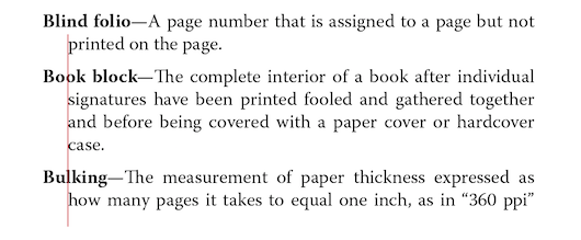
Here’s an example of a glossary, and the way I usually format them.

By using this hanging indent, along with bold for the terms being defined, the reader has no trouble picking out the term they want to look up. Each term is distinct and readily identifiable, yet they all stick together to form a cohesive book page.
The red line shows the amount of the indent, and as a rule I use the same value that was used for the first-line indent in the paragraph formatting.
The type size is the same as the body text of the book, and the same font. The leading (space between the lines) has been reduced by 1 point to make the items hang together, and space has been
added below each entry, to make them distinct.
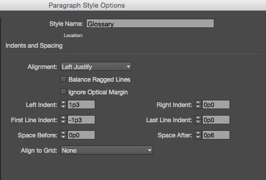
Here are the Indent and Spacing settings from InDesign’s Paragraph Styles dialog:

Hanging Indents Find More Uses
This ability of the hanging indent to create an easy-to-decipher list is useful in other sections of your book’s back matter. For instance, an index is formatted with a fairly complex scheme of indents to keep the various levels of entries distinct:

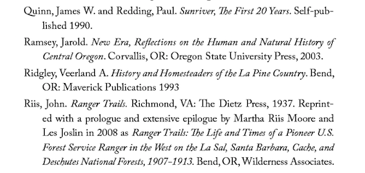
Bibliographies also benefit from the hanging indent treatment:

Even parts of your front matter might benefit from a hanging indent. Here’s an example of a Contents page that lists the subheads within each chapter along with the chapter titles themselves. This can be very handy for readers looking for specific information:

When you do your own formatting, it’s good to know when to use a tool like the hanging indent. It will make your book look more professional, and it will help readers get the material that’s important to them.


