Last month I discussed how to clean up your manuscript to prepare it for ebook conversion. This time I’m going to be looking at how to do the same thing with images. [1]
There’s one big difference, however: where the advice that I gave you about getting your text squeaky clean was equally valid for preparing to convert your words to either print or ebook format, these suggestions are ebook-only.
What’s the difference?
Well, in either case, you’re going to start by finding the perfect picture to go with your words. You’re going to crop the picture (cutting out any extraneous bits) and enhance it (or get someone who knows how to do so) so that it looks beautiful.
However, there are two enormous differences between the image files you want to use in an ebook and ones you’re going to get printed on paper:
- In a print book, color is expensive, while in an ebook beautiful color costs (essentially) the same as black and white.
- On the other hand, in print, you want the image file that goes off to the printer to be as high quality (that is to say, large) as possible, while in an ebook, every kilobyte costs you (I’ll explain how below).
Use color — please!
As someone who’s been around the publishing industry for a long time, this conundrum was one of the hardest things for me to wrap my head around when I first started creating ebooks: that using color wasn’t verboten.
As you probably know, printing a book using even a single color image often more than doubles the production cost of the book. Why? Well, you know that your desktop printer has four colors of ink: cyan, magenta, yellow, and black (CYMK). And unless you tell it not to, it will print every page — even one with only black letters — using all four inks.
A professional offset printing press is essentially the same, though with the ability to use many more colors if needed. [2] A commercial print-on-demand press is exactly like your inkjet — except it’s built to work with much higher volume and with much more consistency.
So unless you do something really special (and expensive) like getting the printer to insert a single plate by hand into each book before it is bound, you’re going to be printing the entire book in full CYMK+ color. Ouch!
With ebooks, none of that is an issue at all! Many dedicated ereaders and all ereader apps used on computers, tablets, or smart phones display in three colors (red, green, and blue — RGB). There is no black pixel! And if you remember your high school science, white light is made up by shining all three colors at once. So color is (in most cases) the default. Why not take advantage of that?
Okay, so some Kindles and other ereader devices use an eInk screen that’s not in living color. These devices’ screens use much less energy, and many people find them easier to read, so there will be folks who will be viewing your beautiful, fully saturated snapshot as if it were being displayed on a 1984 Macintosh. As with those trailblazing computers, the eInk devices are still capable of displaying your picture beautifully — just not in color.[3]
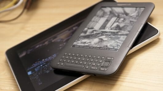
So one word of warning: do make sure that you look at every image in both color and grayscale before you convert it. A picture that looks crisp and clear in brilliant color can lose its contrast when seen in black and white.
Stepping on the scale
What ebooks give us in color, they take away in file size. When you send an image off to a printer or print designer, the idea is to send it at the highest possible quality, in a lossless format like TIFF (Tagged Image File Format, if you care). The files for my 36-page illustrated children’s book The Seven Gods of Luck weigh in at a healthy 128 megabytes (MB).
Many ebook retailers won’t even allow you to upload a file larger than 20MB. And even with those that do, such as Apple, you need to consider how many of your readers will be accessing your masterpiece: on a wireless device, where download speeds are slow, and empty space is taken up by cat videos and audio recordings of a niece’s singing recital. Nothing frustrates a reader more than buying your book — but not being able to download it.
On top of that, our favorite elephant in the room, Amazon, deducts fifteen cents per megabyte from every royalty payment as a “transport fee.” [4] (I always imagine a group of burly truckers carrying floppy disks with your ebook on them from a storage locker to the download bay on the other side of Jeff Bezos’s kingdom.)
So for a 20MB book, that would be $3.00. If you’re charging $9.99 (a high price by indie-published ebook standards), you’ve just lowered your royalty from 70% to 40%. If you’re charging less, the damage is even worse.
What can we do to avoid this catastrophe? What is the cause of all of this bloat?
Well, you’ll need to trust me on this: it isn’t your words. If you don’t believe me, look at this picture of the innards of an ebook:
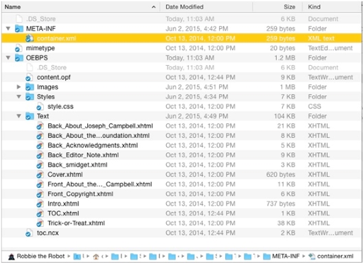
These are the files that make up the text portion of an average-sized book (Joseph Campbell’s Myths to Live By; my paperback copy is 288 pages). See those numbers in the third column, the column headed size? They range from under a kilobyte, to 21KB — the total, including the front and back matter, is 104KB, or just over a tenth of a megabyte.
If you were to buy the ePub file of this ebook, you’d see that the file is actually somewhere around 4.2MB.
So where did the other 4.1MB come from?
A few kilobytes of it can be found in the stylesheets, navigation files, and such. But most of it came from the ninety-odd lovely pictures that I added when I was creating the ebook edition. [5]
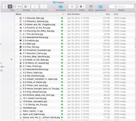
Ouch. That’s sixty cents off the top of every Amazon sale. But the images were integral to the new edition, the first put out by the Joseph Campbell Foundation. So in they stayed.
So what’s a body supposed to do?
Taking a byte out of file size
Before we start our pictures on their weight-loss program, I need to explain something about images in ebook files: they have to be either JPEG or PNG (portable network graphics) files. No bitmap (.bmp) files, no vector (.eps or .ai) files,[6] no Photoshop (.psd) files, no raw camera (RAW or Exif) files. Just .jpg and .png files.
This turns out to be a good thing, because these two formats allow the most control over the final size of your image file.
We’re almost ready to start working with the images — but remember: never work with the original file. Always work with a copy, so that if something goes horribly wrong, all you’ve lost is a little time. Rename your working files. Put them in a different folder. On a different computer. In a different city. (And make sure that there’s a backup of the…. Oh, you know the drill.)
One of the most important, most technical jobs involved in designing an ebook is massaging the images so that they don’t take up too much space, but at the same time still display beautifully.
There are three parts to making that happen:
- Sizing (making sure that the height and width of the image are in the right range of pixels)
- Compression (using software to make the file as small as possible without losing quality)
- Optimization (getting rid of some unnecessary bloat that your image carries around with it needlessly)
Sizing
The easiest way to decrease the file size of your image is to decrease the number of pixels — in other words, simply making the picture smaller.
At this point most phones (let alone dedicated cameras) are capable of taking pictures over 10 megapixels — that is, ten million little collections of red, green, and blue dots. The native dimensions of a picture taken on an iPhone 5s like mine is 3264×2448 pixels.
Guess what?
Even a high-resolution Retina iPad can’t squeeze that many pixels onto its screen. Neither can a Retina MacBook 15”.
So, I ask, why include pixels that will never actually be seen by anyone not reading your ebook on a super-high-definition 30” computer monitor?
I’m going to assume that you’re used to working with a basic image editing program like PhotoScape, GIMP, or Apple Preview — if you can find your way around Adobe Photoshop (even an old version), this should be easy.
So. Open the file.
Wait — you aren’t going to work with the original image, are you? Good. Just checking.
In your app, find the menu item to resize the picture. In Photoshop, it’s under the Image menu: Image Size… In Preview, it’s under the Tools menu. In PhotoScape, click the Resize Photo button at the bottom of the window.
You’ll be shown a box that looks something like this (from PhotoScape):
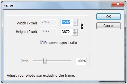
You’ll see the existing width and height (in pixels, inches, centimeters, or whatever), with a box next to it to fill in a new measurement. Somewhere there will be something like that little check box in the picture above that reads “Preserve aspect ratio”; this will keep the height and width of the image proportional. Which is, usually, a good thing.
So what size should you set your image to?
It depends on a number of criteria:
- How important is the fine detail of the image?
- How many total images are there in the book?
- Are the pictures primary, or are they secondary to the text?
- How sharp is the image to begin with?
- Is the image a photograph, a painting, or line art?
If the ebook is a picture book or a collection of photographs that you expect readers to examine closely, then by all means, keep the image as close to full-sized as you can. Still, there’s no point in making the image bigger than can be viewed on the device.
The short side on the largest current tablet screens (including the iPad and Kindle Fire HDX) is around 1600 pixels.
If you’re trying to keep your image as large as possible, then set the short side of your image to that size.
If, on the other hand, your picture is more decorative or illustrative than central, you might consider setting that short-side size to something closer to a standard smart phone or ereader width — between 600 and 800 pixels.
Click the “OK” button.
Suddenly, your picture will look tiny on screen. Don’t worry — you can zoom in to see it as it really is. Make sure that you don’t see any “jaggies” (ragged, pixelated lines instead of smooth, flowing ones), and that the important detail is all still visible. If you aren’t happy with the size you chose, go up to the Edit menu and select Undo — then try it again, until you’re happy.
Compression
Once you’re happy, you’re going to save the file, and when you do, you’re going to apply software compression — basically squeezing out the unneeded detail from the image, with the emphasis on unneeded.
At this point, I almost always save files in the JPEG format, since it is very, very good at compressing images.
We’re going to go up to the File menu and select Save As… (in Mac OS X Yosemite, they changed the label to “duplicate” for some reason). You’ll be confronted with a dialog box that looks something like this :
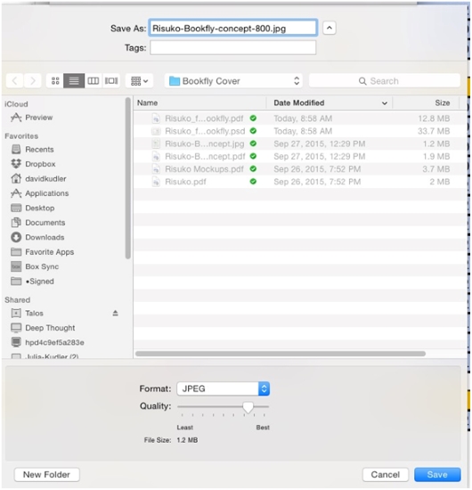
See that slider labeled “Quality”? That’s going to do the magic for us.
How much should you compress the image? As much as you can without compromising the quality of the image. Unfortunately, that scale isn’t calibrated uniformly — different software uses different compression algorithms at different settings. So you’re going to need to play it by ear.
I started out being very conservative in compressing images — close to the right-hand, “Best” side of the slider. At this point, I am often extremely aggressive, around the second tick mark from the left. If I’ve got multiple images in the book, I aim for each to be under 50KB, if I can help it. If this is the only, or one of the few images, I shoot for a file size in the 100–150KB range.
I then type in a new name — so that I still have the previous version, if I want to go back. Generally, I take the width that I choose in step 1 and add that at the end of the file name (that’s the -800 in the file name above) — oh, and I take out any spaces and replace them with hyphens or dashes, since ePub doesn’t like spaces in file names.
Then open the new photo — if it isn’t opened automatically — and see what the compression gods have wrought. Look for lines of gradation in smooth color bands (posterization), or jaggies. See if the detail in the image is still acceptable.
If not, or if the file is still too big, go back to the previous version (this is why you saved it!) and start again. [7]
Optimization
Now we get into some real black magic. Sort of.
Each image carries in it a bunch of metadata — information about when and how the picture was taken, the camera, the date and time, maybe the geolocation. If you’re trying to put together a slide show, this sort of information can be invaluable.
Locked inside of an ebook, it’s useless. And it can add as much as 20KB to an image.
There are several ways to strip this last bit of dead weight away. I use an open source (aka freeware) utility app called ImageOptim that gets rid of the metadata, as well as some other crud, without further compressing the file — Mac only, I’m afraid. In Windows, however, you can simply right click on the image file in Windows Explorer, click on the Properties tab, and then select the link at the bottom of the tab that reads “Remove Properties and Personal Information.” That should help — and it ought to slim down the file at least a bit. If you’re a Linux user, you can use the command line utility JPEGRescan (one of the ones on which ImageOptim is based).
Once you’ve gone through the whole process with each of your images (including the cover art), you’ll be ready to start making your ebook!
[1]Note that I’m not going to be talking about choosing images to accompany the text. I’m going to assume that you’ve spent a lot of time finding the perfect pictures to illustrate what you’re saying — and that you’ve made absolutely sure that you have the right to include them in your book.
[2]Okay. There are many more differences between a home printer and a large web press. Work with me here.
[3]Kindle vs. iPad by Zhao ! (@flickr.com) used through a Creative Commons license.
[4]This $0.15/MB fee applies only if you’re using the Kindle Direct Publishing 70% royalty rate, which you can choose for ebooks priced between $2.99 and $9.99. Go with the other option and you can charge whatever you’d like, and you won’t get charged a fee — but you’ll only make 35%. And that’s 4.1MB after I did all of the things I’m about to tell you to do. When I first converted the book, the Images folder was originally a bit under 14MB.
[5]And that’s not including another 15MB of lovely but ultimately unusable video. By the way, the 1MB that shows up attached to the Images folder? I forgot when I took this screenshot that I’d partially emptied the folder.
[6]You can, in theory, use Scalable Vector Graphics (SVG) files to do all sorts of nifty things in ebooks — but it’s a very difficult format to work in, and the format isn’t fully supported in all ereaders. Likewise, you can, in theory, use Graphics Interchange Format (GIF) files — even animated ones. However, Apple is the only retailer that will accept them.
[7]Be careful not to compress the same image too many times — if you open a JPEG and then select Save As…, you’re going to apply a whole new round of compression. Do that often enough, and your beautiful photo will start to look awful.
 David Kudler is a Contributing Writer for TheBookDesigner.com. He is also an author, an editor, an ebook designer and a writer for the Huffington Post.
You can learn more about David here.
Photo: bigstockphoto.com


