Welcome to the e-Book Cover Design Awards. This edition is for submissions during December, 2015.
This month we received:
85 covers in the Fiction category
21 covers in the Nonfiction category
Comments, Award Winners, and Gold Stars
I’ve added comments (JF: ) to many of the entries, but not all. Remember that the aim of these posts is educational, and by submitting you are inviting comments, commendations, and constructive criticism.
Thanks to everyone who participated. I hope you enjoy these as much as I did. Please leave a comment to let me know which are your favorites or, if you disagree, let me know why.
Although there is only winner in each category, other covers that were considered for the award or which stood out in some exemplary way, are indicated with a gold star: ★
Award winners and Gold-Starred covers also win the right to display our badges on their websites, so don’t forget to get your badge to get a little more attention for the work you’ve put into your book.
Also please note that we are now linking winning covers to their sales page on Amazon or Smashwords.
Now, without any further ado, here are the winners of this month’s e-Book Cover Design Awards.
e-Book Cover Design Award Winner for December 2015 in Fiction
Vikki Kestell submitted Tabitha designed by Kirk DouPonce, DogEared Design. “My model (Beth-Grace) made WW1 British volunteer aid detachment uniform and posed for shoot. (Photography by Damon Jasso.) My designer modified Tabitha’s face/hair to match book’s description of her & designed other cover elements.”


JF: Beautifully realized and completely integrated. The subtle border creates a frame for the composition, with the girl’s posture creating drama and the distant signs of conflict providing context. And the elegant type treatment perfectly completes this classic cover.
e-Book Cover Design Award Winner for December 2015 in Nonfiction
Sandra Smith submitted Trading Places: Becoming My Mother’s Mother designed by Fiona Jayde. “This eBook cover captured the essence of the story. It’s a masterful application of graphic design that tells the story and the emotions in the book at a glance.”


JF: I agree, and it’s well balanced too, and everything tends to focus us on the heart and the hands at the center. Along with the many playful touches, the designer has kept us right where she wants us, focused on the central theme of the book.
Fiction Covers
Adina Senft submitted Pocketful of Pearls designed by Jenny at Seedlings Design Studio. “This book is women’s fiction set in a faith community similar to the Amish, the first in a trilogy. I asked Jenny for “mist” and “a girl” and “slightly ominous” and she knocked it out of the park. She always delivers far beyond anything I ever thought of!”
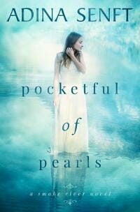
JF: A quiet but pleasant cover.
Allen Taylor submitted Deluge: Stories of Survival & Tragedy in the Great Flood designed by Alexandre Rito. “The third book in the Biblical Legends Anthology Series, a weird speculative fiction series where multiple authors submitted flash fiction, short stories, and novellas depicting stories of people caught in the Biblical great flood or a similar catastrophe. Stories could not be of Noah and his family”

JF: That might account for the wild diversity of images on this cover, way too many I’m afraid to make sense of. And what’s that stick-figure fellow doing on the mountain?
Andrew Leon Hudson submitted Ecotones designed by Andrew Leon Hudson. “The cover was created in Photoshop using photographer-gifted or Creative Commons licensed images. The intent was to reflect the anthology’s theme of environmental meeting points, and (particularly with the cover-star credits) to echo the general style of movie posters.”

JF: It definitely has the movie poster vibe and the big circle helps to focus the eye.
Angeles M. Pomata submitted Malrust designed by Angeles M. Pomata. “The cover is an original oil painting.”

JF: And it’s a beautiful painting that really deserves better typography. Consider partnering with a designer, with you supplying the artwork.
Antonio Urias submitted The Alchemist in the Attic designed by Antonio Urias. “The Alchemist in the Attic is a historical mystery with occult and dark science undertones. The emphasis is more strongly on the historical and the mystery, but I tried to add hints of the fantastical without overcrowding the cover.”

JF: Nice job, and by keeping it simple it makes a good impact. However, I would not have used the same font from the title on the author’s name, would have preferred something a bit quieter.
Azzurra Nox submitted Doll Parts designed by James/Humble Nations.

JF: Here you can see the problem with using stock images, since this is the exact same piece of art that Rachel Thompson used—to better effect—for her bestselling *Broken Pieces* memoir.
Becky Doughty submitted A Light in the Dark designed by Marya Heiman. “This is the second book in The Fallout Series, and I feel Marya Heiman did such a wonderful job of capturing the very different vibe for a very different storyline in this second book, while still maintaining continuity in the series’ covers.”

JF: Very nicely composed, with lovely title type and a welcomingly warm palette. ★
Colleen Kelley submitted Some Rise by Sin designed by Colleen Kelley.

JF: Rather underwhelming. Not enough, by itself, to “hook” the browser.
Damon Freeman submitted A Devil Whispers Softly designed by Damonza.com.

JF: Clean and clearly focused (notice the angle of the roof leading us right to the central figure) that communicates really well. ★
Damon Freeman submitted Naming The Bits Between designed by Damonza.com.
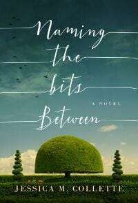
JF: The creative type treatment of the title is the perfect complement for the slightly surrealistic art. Lovely.
Damon Freeman submitted Sinarth designed by Damonza.com.

JF: I like the way the designer expertly combined these images, and the way they both add to what the cover is communicating.
Damon Freeman submitted Loss of Reason designed by Damonza.com.

Damon Freeman submitted Santa Took Them designed by Damonza.com.

JF: Another cover that seems to effortlessly evoke its (bloody) genre, although I’m not comfortable with the way the author’s name and title, in such different fonts, bang up against each other.
David Peralty submitted Second Class Supers designed by Leo Black. “Leo Black created the image behind the text based on a character description and quick summary of the book. David Peralty did the type treatment with direction from his wife.”

JF: Art is fine, type really need help.
Diane Tibert submitted Twistmas – The Season for Love designed by Diane Tibert. “I write using the pen name Diane Lynn McGyver. My goal with the cover was to keep it simple, bright and clean.”

JF: Wildly incongruous combination of a (too small) detail of a medieval knight with whatever that clothesline thing is at the top. They look like they’re from different books, and that’s not a good outcome.
Dora Furlong submitted One of Our Own designed by Dora Furlong.

JF: Looks like a bunch of disembodied and unconnected shapes floating on a blue background.
Elaine Ann Monahan submitted Rattlesnakes, Ghosts and Murderers: Vol-2, The Curse Continues designed by Elaine Ann Monahan. “This picture was designed and conceptualized by artist Elaine Ann Monahan for the Rattlesnakes, Ghosts and Murderers action-adventure series. A photo was taken in the Sierra Nevada Mountains with all design elements of the picture (rattlesnakes, etc.) created by Ms. Monahan.”

JF: Unmistakably self-published, and I don’t mean that as a compliment.
Fiona van Dahl submitted Eden Green designed by Istebrak.

JF: Highly stylized, but a bit stark without telling us much about what kind of book this is.
Georgia VanDruff submitted Escape Clause designed by GA VanDruff. “This is Book One of four in a series. The the filmstrip with the images is meant to stand as the branding and the strip and font will carry over to all in the series. The girl, dog and gecko will appear in silhouette on 3 of the four covers since they all play their parts in the stories.”

JF: The series brand is interesting, but the green bands aren’t adding anything, and the film strip is a bit off-base since I’ve never seen a film strip that’s green, and the art looks a bit amateurish.
Gordon A. Long submitted Storm over Savournon designed by Gordon A. Long. “I posted a contest to see which of my readers could find the most information in the cover about genre, conflict, characters, etc. I was pleased at how close many of them came to the story. It was also a great way to introduce the cover. However, I come to you for comment on the artistic quality.”

JF: The background image is good, but I’m having trouble understanding why the woman is in a frame but the man is not? Also, the title could be a bit stronger.
Hannah Rae Meeson submitted Just Whistle designed by Hannah & Curtis Meeson. “The cardinal, the music notes, the fact that the music notes are formed from 8s, and the “sparks” coming off the bird are all pertinent to the story. The words that appear in the background are taken directly from the book and the title is crucial to the novel’s ending.”
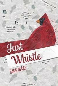
JF: I love the bird and the way the type is used, but the background is too distracting, and no one else will know what all this implies because they haven’t read the book yet, right?
Hazel Butler submitted Bleizgeist designed by Hazel Butler. “I wanted a really stunning and evocative cover for my new Dark Fantasy novella, Bleizgeist, and after hunting around for a while found Nathan Park, a Fantasy artist who painted the cover image. He’s really captured the essence of the book.”

JF: The image is indeed stunning, but it has obliterated the already pretty weak typography.
J. H. Bardwell submitted Appalachian Monster designed by J. H. Bardwell. “This is a cover redesign for my coming-of-age novel which hopefully better incorporates typography than previous efforts. I’m attempting to lure new readers with a hint of eeriness and excitement. I obtained a model release after emailing the pixabay photographer, who is also the boy’s mother.”

JF: I think the sweetness of the boy is working against any eeriness and I don’t really find anything here exciting. In fact, using a very realistic photo like this one doesn’t work for this genre, in my opinion.
Jackie Dana submitted By Moonrise designed by James T. Egan. “While I provided James with information about the story, I left the design of my historical fantasy book By Moonrise completely in his hands. I’m thrilled to death with the design, as it’s so eye-catching and it perfectly captured the spirit of my book.”
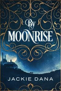
JF: It certainly is eye-catching, and one of the best and most integrated uses of filagree I’ve seen.
Jaine Diamond submitted DEEP designed by DreamWarp. “DEEP is an erotic romance novel with military and sci-fi elements. Thank you for considering this cover in the e-Book Cover Design Awards!”

JF: Your designer has done a credible job of incorporating a bunch of disparate genres into one cover.
James Egan submitted Dead Man designed by James T. Egan of Bookfly Design.

JF: Exciting and well composed.
James Egan submitted Lady in Sapphire designed by James T. Egan of Bookfly Design.
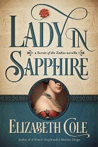
JF: A beautiful cover with expert typography, a controlled color palette, and curiosity aroused by the peek-a-book frame at the bottom. ★
James Egan submitted Blood of Others designed by James T. Egan of Bookfly Design.
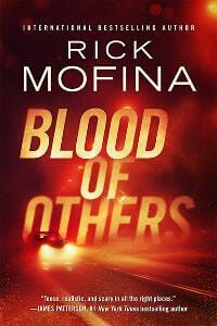
JF: Another great thriller cover that tells us exactly the kind of book we’ll find inside.
James Sawyer submitted Huntingdon Manor designed by Alisha – Damonza. “I asked Alisha for a cover that would communicate both the mystery and thriller elements of the book. I also mentioned the loneliness of the protagonist, and how the story is told through his eyes, which I think comes through in the cover. I’m really pleased with the final result!”

JF: Simplicity of concept and great image combinations really make this work.
Jan Thompson submitted CHERISH YOU SO (Savannah Sweethearts Book 4) designed by Jan Thompson. “This book cover continues the sweet and wholesome theme of the Savannah Sweethearts series of 8 multiethnic Christian romance celebrating faith, hope, and love. Hopefully, the cover invites the readers to Savannah, where the winter is mild and the ocean calls your name year round…”

JF: Just right for its genre, although I’d like to see the word “Cherish” stand off the background a bit more.
Jennifer Gadd submitted Cat Moon designed by Vanessa Hull.

JF: Love the moon peeking through the “O”! Nice atmosphere, but then I’m a cat lover.
Jennifer Tubbiolo submitted Protector (The Narthex Academy Series, Book 3) designed by Betts Keating Designs. “The model on the cover of the book is the same used on the covers of the first two books in the series as well as the trailer made for Speaker, Book 2.”

JF: Very little impact, type that’s hard to read, and a photo that looks pasted on top of the background.
Jim Mulcey submitted Warphan designed by Gonzalo Kenny. “I did the final composition myself, but it was all to show off Gonzalo Kenny’s amazing artwork. I did some branding with the top black band and emblem, but Gonzalo’s work is the centerpiece. The book is fantasy with Native American influences and I think his artwork really hit the mark.”

JF: It’s effective, and you were right to highlight the artwork.
K.M. Weiland submitted Storming designed by Damonza.

JF: A great looking dieselpunk cover with lots of allure, mainly through the appealing characters and the attention to detail, with the promise of epic adventure. ★
Karl Gallagher submitted Torchship designed by Stephanie G. Folse. “Design loosely based on a scene in the book. Background of image is based actual NASA imagery. Spaceship design is from 3D model provided by author (who’s an aerospace engineer).”

JF: An engaging sci-fi cover with artwork that draws you into the story.
KD Rose submitted Erasing Shadows designed by Fiona Jayde. “This was designed by Fiona Jayde who is a wonderful designer.”
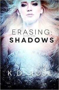
JF: Attractive, magnetic.
Kim DDD submitted Dark Divinity designed by Milo from DDD. “Cover design for Urban Fantasy, Cursed Series Book 2”

JF: Okay for what it is, but a bit murky.
Kim DDD submitted The Truth Spell designed by Marushka from DDD. “Cover design for Paranormal Young Adult, Werewolf High Series, book 1”

JF: An assertive cover with strong branding, I love the way the woman (and her attitude) pop off the background.
Kim DDD submitted The Magician’s Horses designed by Marushka from DDD. “Cover design for Science Fiction and Fantasy book”

JF: Gives me vertigo.
Kim DDD submitted Exodus in Confluence designed by Milo from DDD. “Cover design for Post-Apocalyptic Zombies book”

JF: Zombies in the snow? Why not. A very solid cover.
Kim DDD submitted Too Many Rock Stars designed by Marushka from DDD. “Cover design for New Adult Romance, Access All Areas Series, book 1”

JF: The type looks too “hot” to me, and the background image is hard to make out.
Kim DDD submitted Yseult and the Dire Wolf designed by Marushka from DDD. “Cover design for New Adult Romance, Access All Areas Series, book 2”

Kim DDD submitted Danika the Destroyer designed by Marushka from DDD. “Cover design for New Adult Romance, Access All Areas Series, book 3”

Kim DDD submitted The Rise of the Queen designed by Marushka from DDD. “Cover design for Epic Fantasy Viking, The Coming of Darkness Series, book 1”
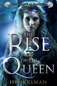
JF: All three of these series covers communicate with style and mystery, but I think this one combines all the elements the best.
Kim DDD submitted Origin Exposed designed by Kitten from DDD. “Cover design for Fantasy Adventure Young Adult book”

Kim DDD submitted Not Suspicious in Hollywood designed by Kitten from DDD. “Cover design for Chick Lit Romance, Not in Hollywood Series, book 5”

JF: Looks just right.
Kim DDD submitted Troubled in Paradise designed by Kitten from DDD. “Cover design for YA Paranormal book”

JF: The assemblage of distinctive fonts confuses the message somewhat.
L. Donsky-Levine submitted The Bad Girl designed by Ebooklaunch.com and Joshua Jadon. “The finished design was a three-month long joint project between myself, and two separate designers. Additionally, I ran several Facebook polls to gather additional feedback related specifically to color. And eyeing the fruits of all that labor, I couldn’t be more proud.”
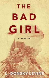
JF: More cooks don’t always make a better stew, but glad you’re happy. I particularly liked the title treatment and the interesting color choices.
Lars Hedbor submitted The Wind: Tales From a Revolution – West-Florida designed by Lars D. H. Hedbor. “For this cover, we used a cropped image from a nearly-contemporary 1772 painting, “The Shipwreck,” by Claude Joseph Vernet. The title font and ribbon at the bottom of the design provide consistency with the rest of the series, as well as evoking the Revolutionary era in which they are set.”

JF: You picked a great font that helps bring exactly the right note to the cover, and with the dramatic painting, a lovely cover.
Laurie Boris submitted A Sudden Gust of Gravity designed by Paul Blumstein. “We were trying to strike a balance between an eye-catching design and one that fit the tone of the story.”

JF: Definitely striking, and a bit of a comic tone?
Lincoln Cole submitted Graveyard of Empires designed by M.N. Arzu.

JF: Well designed, but an unmelodious combination of fonts in the three word title.
Lincoln Cole submitted Ripples Through Time designed by M.N. Arzu. “Was designed and created for this book specifically.”

JF: Looks more assembled than designed.
Lincoln Cole submitted Second Chances designed by Lincoln Cole.

JF: Simple but effective, with real anticipation.
Lincoln Cole submitted UAV designed by Lincoln Cole.

JF: Serviceable if a bit heavy-handed.
Lisa Carr submitted Dark Intentions designed by Spineless Design.

JF: Looks oddly like a paperback cover, which it isn’t.
Lorna Reid submitted Rise of the Reaper designed by Mark Reid. “For my YA fantasy novel, I had asked for a cover that represented the start of a journey or quest – the transition from our world into a magical one. I wanted a sense of wonder, and to stay on theme with a mysterious and magical feel.”
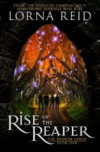
JF: Lots of magical atmosphere and a focus on the story through the figures.
Maggie Larche submitted Charlie Bingham Gets Clocked designed by Bojan Radovanovic. “This is the first in a funny kids chapter book series. Thanks for your feedback!”

JF: I love both these covers and the whole concept for the series, and particularly this one because the colors are so vivid and the drawings delightful.
Maggie Larche submitted Charlie Bingham Gets Serious designed by Bojan Radovanovic.

Mallory Rock submitted Brink of Dawn designed by Mallory Rock.

JF: Solid genre cover.
Mavric Webb submitted The Art of Poeyrt designed by Mavric Webb. “The book; The Art of Poetry, Was created to tell the story of a Future Black leader, Pan-Africanist & Father’s struggles, ambitions, and success. Earthly colors, family, and rally photos were used on the cover depict this”

JF: I think it’s a good concept, but it would take a professional to make it into an effective book cover.
Meghan Ciana Doidge submitted I See You (Oracle 2) designed by Irene Langholm and Elizabeth Mackey. “This is the second book in the Oracle Series. The cover for the first book is equally great and the two covers are designed to compliment each other.”

JF: Who doesn’t like a tiger? Although it’s odd that, unlike the title, he’s looking away.
Micah Hansen submitted Braving The Storms (Strengthen What Remains Book 3) designed by Micah Hansen. “This is the third book in a post-apocalyptic series by Kyle Pratt. The design posed a notable challenge as the protagonist had to be composited from five separate images (clothes, face, mask, etc.).”

JF: Strong, with great texture in the background and the figure of the man, and a real hook into the story.
Michael Miyoshi submitted Snakes and The Scribbler designed by Michael T. Miyoshi and Michael A. Ruhland. “My artist friend, Michael A. Ruhland, sketched the cover design for my book. Since the book is geared toward middle grade fiction, I vectored the image and gave it a little color. The picture illustrates some of the plot points of the book without being too much of a spoiler.”

JF: Would be a cute idea with some decent typography. It needs to stand out more. Look at similar books, you’ll see what I mean.
Mike Butcher submitted Echoes designed by Mike Butcher Design.

JF: “The Matrix” lives on, here in a pretty cool cover.
Olivia WILDENSTEIN submitted Ghostboy, Chameleon & the Duke of Graffiti designed by Paperwhite Studio.

JF: An intriguing, literary look.
P.S. Broaddus submitted A Hero’s Curse designed by Rebecca Frank (Weaver). “A Hero’s Curse is the story about a young blind girl and her talking cat and their fantastical journey to find their kingdom’s lost king. Rebecca has captured the feel of the story in an image, using brightly contrasting colors that grab they eye and the imagination.”
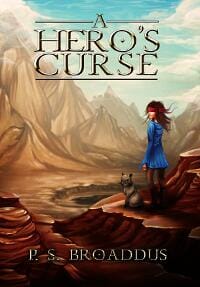
JF: It works, and we want to take part in the adventure.
Reed Moore submitted Piggy Sense! designed by Reed Abbitt Moore. “A young boy tosses a penny into his piggy bank knowing he is safe from the rains that could come and wash him away as long as he saves.”

JF: Pigs are always a good bet.
Rena Hoberman submitted Dark Season designed by Rena Hoberman.

JF: Appropriate, and I like the way the type helps frame the central figure, and the subtle layering on the title.
Rhett Bruno submitted This Long Vigil designed by Anna Khlystova.

JF: Every sci-fi fan will recognize this beautifully drawn image instantly, and that’s half the battle.
Russell Phillips submitted Tessa the Tank and the Classic Vehicle Show designed by Kit Foster. “My wife wrote a children’s book (I’m hoping she’ll make it into a series), so naturally I asked Kit Foster to design a cover for it.”

JF: Cute, might have been better to have one vehicle predominate.
S.K. Randolph submitted The DiMensioner’s Revenge – The Unfolding Trilogy – Book 1 designed by S.K. Randolph. “I removed “The Unfolding Trilogy 1” from the ebook cover vs. paperback to provide a cleaner view of the image, an antagonist in his shifted form. I feel that the text at the sales site and the ebook interior sufficently conveys where the book falls in the trilogy.”

JF: You’ve done a good job of keeping within a theme yet providing variety at the same time. The Master’s Reach is the most appealing to me, with more dramatic contrast.
S.K. Randolph submitted The ConDra’s Fire – The Unfolding Trilogy – Book 2 designed by S.K.Randolph. “I removed “The Unfolding Trilogy 2” from the ebook cover vs. paperback to provide a cleaner view of the image, a dangerous creature. I feel that the text at the sales site and the ebook interior sufficently conveys where the book falls in the trilogy.”

S.K. Randolph submitted The MasTer’s Reach – The Unfolding Trilogy – Book 3 designed by S.K. Randolph. “I removed “The Unfolding Trilogy 3” from the ebook cover vs. paperback to provide a cleaner view of the image, another antagonist in his shifted form. I feel that the text at the sales site and the ebook interior sufficently conveys where the book falls in the trilogy.”

Sarah Potter submitted Desiccation designed by Jamie Noble Frier. “A reviewer has described this cover as paying “homage to the golden era of 1960’s sci-fi art”. Jamie Noble Frier’s brief was to produce a cover in the style of the ones you would have found on Amazing Stories Magazine during that decade. The story is set in 1967 and aimed at an audience aged 15+.”

Scot Bayless submitted Deadly Remains designed by Daniel Comerci. “We recently commissioned the talented Italian graphic artist and illustrator, Daniel Comerci, to create illustrations and a line look for A Clairvoyant’s Complicated Life. Deadly Remains is the first book in the series and we’re thrilled with Daniel’s interpretation of the principle character.”

JF: Another strong series design, this one with dramatic artwork. My fave is Deadly Remains, with its eerie color scheme and tight composition.
Scot Bayless submitted Deceiver’s Bond designed by Daniel Comerci. “This is Deadly Remains, the second book in A Clairvoyant’s Complicated Life.”

Scot Bayless submitted Reluctant Adept designed by Daniel Comerci. “This is Reluctant Adept, the third book in A Clairvoyant’s Complicated Life.”

Scotty Godfrey submitted Tau Meserie designed by Scotty Godfrey.
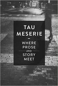
JF: Kind of a European literary look, and that’s probably on target for your readers.
Shean Pao submitted Elah’s Pearl designed by Shean Pao. “My story is about a race of aquatic humanoids. I wanted to give the feel of being underwater, and the poetry of their surroundings.”

JF: I like most everything except the awkward combination of lettering styles in the title. Why not just pick one?
Stephen Knight submitted Charges designed by Jeroen ten Berge. “Jeroen ten Berge’s cover for the post-apocalypse novel CHARGES, about a self-serving cynic who suddenly has to deliver two young children to their waiting mother.”

JF: Well, Jeroen is a master at using just the right elements to pull us into the story, and here he’s done that again.
Tammy Seidick submitted The Diva designed by Tammy Seidick. “Thanks for reviewing!”

JF: Love it, and the quote on the cover applies to this design as well: “Sweet, Sexy, Fun.” ★
Tracy Tomkowiak submitted Effervescent Elixirol designed by Tracy Tomkowiak. “I round out my series, “American Flim-Flam,” by putting a fat guy on the cover. Why not?”

JF: Why not indeed. These covers are so idiosyncratic they really stand out. And how about the look on that guy’s face, just daring you to pick it up.
Victor Yates submitted A Love Like Blood designed by Ranilo Cabo.

JF: Sensitive typography and a subtle image work well together.
Z. R. Southcombe submitted Lucy’s Story: The End of the World designed by Deanne Simon. “A children’s fantasy / adventure story, popular with ages 9-13, and adults.”

JF: A nice concept, but everything looks too far away to grab our attention.
Nonfiction Covers
Allen Klein submitted You Can’t Ruin My Day designed by Scott Idleman.

JF: I like the brightness and casual typography, although with a lot of small type, it looks more like a paperback. ★
Athena Shack submitted Grace for the Journey designed by Athena C. Shack. “I created a minimalist cover with one central image of a journey motif that evokes hope through trouble times. The design shows the journey through mud which represents the hardships of life, in this case tragedy, trauma or loss and the grace steps that occurs. The butterfly represents new life.”

JF: Simple but effective.
BANU KHAN submitted Monk Who Drinks Coffee designed by Banu Ganitri Khan.

JF: A perfectly apt illustration, but it needs a stronger type treatment.
Belinda Pollard submitted Dogged Optimism: Lessons in Joy from a Disaster-Prone Dog designed by Belinda Pollard. “Once I found this photo in the archives, I knew it was the one for the cover. The biggest challenge was removing the cluttered background and making the dog “pop”.”

JF: Awww. Despite the odd background color, this little guy scores, and the combination of a slab serif font with the word “Dogged” is appealing. ★
Cathy Rosenbaum submitted Don’t Sweep It Under the Drug! Integrating Evidence-Based Body Mind & Spiritual Practices into Your Health & Wellness Tool Kit designed by Create Space. “This book cover creates visual analogies among cleaning house, cleaning out the medicine chest, and cleaning up our lifestyle in body mind and spirit. The retro cover with 60’s woman implies ridding the problem of poly pharmacy via evidence-based integrative practices creates a better path 2 healing”

Chris Backe submitted Offbeat Korea designed by Chris Backe.

JF: Made me laugh, and it’s a perfect photo for an “offbeat” guide.
Deidre Madsen submitted Happily Inner After: A Guide to Getting and Keeping Your Knight in Shining Amour designed by Deidre Madsen and Kotkoa. “Hope you like my book cover art. It’s simple but so far it’s also eye-catching. And depicts my self-help book perfectly. Thank you!!! Deidre :)”

JF: The artwork is lovely, but so much space has been given to the floral design that the title looks like it’s been reduced to 75% of its original size.
Erica Barker submitted How to Make Any Size Move Simple and Stress Free designed by Bookdesign.

JF: Simple and to the point, and the delightful picture adds to the effect. ★
Erik Peterson submitted Putting Tech in Its Place designed by Damonza.com. “The book cover had two jobs: show that this book is Bible-based, and give an idea of what kind of “place” I’m talking about. The cross in the power button does the former, while the diminishing text in the title takes care of the latter. And Alisha was great to work with.”

JF: Beautifully designed, with cool and warm elements and modern, elegant typography. ★
Hazel Butler submitted The Mini Uber Author Planner designed by Hazel Butler. “For this cover I wanted to capture the creative and quirky mind of a writer, and the numerous stories and pieces they have to juggle, by evoking Alice in Wonderland and a ‘down the rabbit hole’ feel.”

JF: The visual chaos and unfinished looking type hold this cover back.
Hazel Katherine Larkin submitted Gullible Travels designed by Andrew Browne. “The shadow puppet is evocative of South East Asia (where the author lived), yet at the same time of India (where she also lived, and where all shadow puppet plays are set). The face is the author’s own – a nod to Jung and the shadow self. The colours refer to the chakras of creativity & passion.”
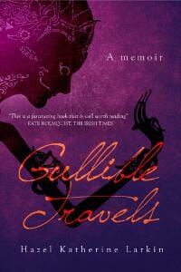
JF: I admire the background texture and artful forms, a solid job.
Jan Sikes submitted Flowers and Stone designed by Donna Osborn Clark. “This cover design was made from an actual photograph taken outside of Mason, Texas where eons ago, rock formations were pushed up through the earth. The Martin D-35 guitar belonged to musician, Rick Sikes, the main character of the book. The roses are symbolic of true love.”

Katherine Hayton submitted One Hundred Days of Noise designed by Katherine Hayton.
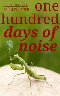
JF: A cigarette smoking mantis? Seems to work for this collection of articles from the blog of a fantasy author. It does grab your attention.
Mallory Rock submitted Introvert to Sales Goddess designed by Mallory Rock.

JF: The strips cut the cover up for no good reason, and the woman looks like she just discovered shehas a skin disease.
Marco D’Anna submitted Breaking the Chains of Capitalism designed by Marco D’Anna. “The front cover of this book is a symbolic representation of our capitalistic society and how we the people must unite to break free of our social economic dysfunctions.”

JF: Give it to a professional designer as a concept sketch and see what they come up with, because this cover isn’t doing you any favors.
Matt Hinrichs submitted Fifty Shades of Grammar: Scintillating and Saucy Sentences, Syntax, and Semantics from The Grammar Diva designed by Matt Hinrichs. “A design for a collection of blog posts on the correct use of grammar. The author’s only stipulation was that there had to be exactly fifty squares on the cover, so I came up with this colorful, retro-’50s design.”

JF: A refreshing solution, lively and organized at the same time.
Patrick Moeller submitted Lwów – A City Lost: Memories oft a cherished childhood designed by Patrick Moeller. “Living and growing up in the city of Lwów while it was taken over by various connected countries, lead to various special moments of life. Some of them are shown in photos others are written down. The cover should give hints at this.”

JF: Yes, it does, and a subtitle would give readers more information on what the book is about, where it’s set, and why it’s of interest to others.
Phil Buckley submitted My Best 80 Years: The Lifetime Recollections of Donald Charles Buckley designed by Krishan Jayatunge. “Since the author, my dad, had passed away a year before his memoirs were published, I, as editor, wanted to capture his enthusiastic personality (and writing style) and youthful adventures thru the cover design. I also wanted to reflect the eras (1920s-1940s) he writes about via color and typeface.”

JF: Thanks for publishing his book. I would have liked to see more weight given to the man and less to the large numbers which are, after all, only a design element.
Ralph Mayhew submitted The Anonymous Leader designed by Craig Hindman.

JF: Great concept but the cover lacks impact and is almost disappearing.
Tony Hastie submitted Bolivia tried to kill us- A year trekking and travelling in South America designed by Iris Maertens. “I asked Iris to come up with a cover that would inform readers that Bolivia tried to kill us was more tongue in cheek than brushes with actual danger. I sent her an exert of the book describing the worlds most dangerous toilet and she hit the nail on the head with the illustration!”

JF: It’s clever and funny, which makes me wonder why so much blue, when you might have made the outhouse more prominent.
Well, that’s it for this month. I hope you found it interesting, and that you’ll share with other people interested in self-publishing.
Use the share buttons below to Tweet it, Share it on Facebook, Plus-1 it on Google+, Link to it!
Our next awards post will be on February 22, 2016. Deadline for submissions will be January 31, 2016. Don’t miss it! Here are all the links you’ll need:
- The original announcement post
- E-book Cover Design Awards web page
- Click here to submit your e-book cover
- Follow @JFBookman on Twitter for news about the E-book Cover Design Awards
- Check out past e-Book Cover Design award winners on Pinterest
- Subscribe to The Book Designer Blog
- Badge design by Derek Murphy


