Welcome to the e-Book Cover Design Awards. This edition is for submissions during February, 2016.
This month we received:
103 covers in the Fiction category
20 covers in the Nonfiction category
Comments, Award Winners, and Gold Stars
I’ve added comments (JF: ) to many of the entries, but not all. Remember that the aim of these posts is educational, and by submitting you are inviting comments, commendations, and constructive criticism.
Thanks to everyone who participated. I hope you enjoy these as much as I did. Please leave a comment to let me know which are your favorites or, if you disagree, let me know why.
Although there is only winner in each category, other covers that were considered for the award or which stood out in some exemplary way, are indicated with a gold star: ★
Award winners and Gold-Starred covers also win the right to display our badges on their websites, so don’t forget to get your badge to get a little more attention for the work you’ve put into your book.
Also please note that we are now linking winning covers to their sales page on Amazon or Smashwords.
Now, without any further ado, here are the winners of this month’s e-Book Cover Design Awards.
e-Book Cover Design Award Winner for February 2016 in Fiction
Veronica Dale submitted Blood Seed designed by Christa Holland. “This is the first book of a four-part series, and Christa has incorporated the same frame for all of them. She has creatively used several symbols which play an important part in the series: open hands, leaf and flame, the dark circle, and the triangular star pattern.”
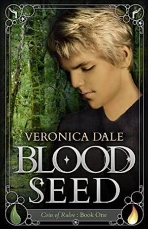

JF: A great contemporary look for this genre, with lots of careful details, hints of magic, and a poignant figure to draw our attention.
e-Book Cover Design Award Winner for February 2016 in Nonfiction
Damon Freeman submitted Robot Coconut Trees designed by Momir at Damonza.com.

JF: A delightful, fun, and energetic cover that perfectly matches the “Wait… what?” title and premise of the book—to release your own creativity.
Fiction Covers
Anand J submitted The Bluff designed by Sathya Ramachandran. “The bluff is a thriller weaved around the card game of bluff. It is a historical scifi that links a King who lived in 17th century to a powerful person of today, through DNA bioencryption. Hence the cover is depicted by an old and new King of spade with DNA sequences subtly running in background.”

JF: Not even a hint of sci-fi in this cover that also suffers from weak typography.
Anma Natsu submitted Deviations designed by Hynds Studio. “For this YA LGBT romance that also tackles abuse, mental illness, and polyamory, a regular model cover didn’t seem appropriate. I felt Kerry’s design plays to both the heavy nature of the story and the concept of the trio being drawn to each other “like moths to a flame”.”

JF: Delicate and sinister at the same time, very artful.
Anne Rouen submitted Angel of Song designed by Felicity Matthews. “The cover of Angel of Song demonstrates the war fiction theme with a World War One British Soldier, along with the protagonist, the Angel of Song, whose job it is to inspire troops on the Western Front in France through the magic of her voice.”

JF: Visually confusing, with little impact.
Araya Evermore submitted Night Goddess designed by Jessica Allain. “Issa, chosen by the goddess, holds the great dragon sword of binding. Asaph, exiled king and last of the mighty Dragon Lord shape-shifters, flies in the background. Ehka the raven saved Issa from undead hordes. The dark moon of prophecy rises. Photo of model taken by me, artwork by digital artist.”
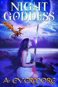
JF: You’ve handled all those visual story clues well, but the title is getting a bit lost against the active bright background.
Ben Trebilcook submitted My name is not Jacob Ramsay designed by Ant Gardner. “The author and illustrator discussed significant aspects of the book which brought various images to mind. A teacher, firearms, masked identities and a particular country which has a desert. Designs resulted with the final image. Simple one-colour representing the desert with silhouette & white text”

JF: Perfect style for an ebook cover, bright and evocative, a winner.
Bran Gustafson submitted Coyote: A Novel from the Untamed State designed by Ben Rebant.

JF: I like the wild coyote breaking into the cover from somewhere to the right.
Breeana Puttroff submitted Canes of Divergence designed by Mallory Rock.

JF: Delicate, with an interesting color scheme.
C. M. Lance submitted Atomic Sea designed by C. M. Lance. “It’s for a nuclear suspense ebook set on a boat in an idyllic location, and I wanted a sense of something ominous, with ‘wrong’ shocking colors. I like the flat abstract lines of the image and the movement of text across it. As an ebook cover it’s legible and eye-catching in thumbnails.”

JF: Awkward but very legible.
Carrie Rubin submitted Eating Bull designed by Lance Buckley. “I wanted something that captured both the food industry and serial killer elements of the story, and something that leaned toward a clean, minimalist look. Lance Buckley nailed it on his first submission.”

JF: Terrific image grabs your attention, nicely done. ★
cheryl mackey submitted The Immortals Part One: Shadows & Starstone designed by Wlop. “Image Licensed from Wlop, but typography and special effects done by designer Victoria Faye.”

JF: Just wish the type was easier to read, the style matches the stylish illustration beautifully.
cheryl mackey submitted The Immortals Part Two: Allies & Enemies designed by Daniel Schofield. “Image licensed from Daniel Schofield, text and special effects done by designer Victoria Faye”

JF: Another great fantasy cover, and here the type contrasts nicely with the background.
Chris Lowry submitted The Black Badge: Confessions of Corruption designed by Strickly Graphics. “Each image on the cover represent a chapter in the book.”

JF: Luckily your designer has focused the cover on the central policeman, rendering the rest secondary.
Christina E. Pilz submitted Oliver & Jack: Out
In The World designed by Bookfly Design. “This is the fourth book in the Oliver & Jack series, and James visually linked it to the previous three books, adapting the layout of the previous covers with the lighter, more romantic tones of book four.”

JF: Just as beautiful and poetic, from art to design to typography, as the other covers in this series.
Cindy Marsch submitted Rosette: A Novel of Pioneer Michigan designed by Betsy Marsch. “This novel is based on the real journal of a young woman in the 1850s, and the cover suggests both her hopes and her disappointments. “Why did she edit her wedding day journal?””

JF: Elegant and intriguing.
Connie Kuykendall submitted Love Ain’t No Soap Opera designed by Alisha. “Mirrors, including a compact, pop up in my novel about beauty and body image. Even the character’s name (Selah) means a reflection. Alisha at Damonza picked up on that, creating a cover with a compact reflecting the images of the hero and heroine with New York City in the background.”

JF: The device of the compact works beautifully, and with the confident typography creates a solid cover.
Cooper Beckett submitted My Life on the Swingset designed by Cooper S. Beckett. “This is the cover for the 2nd edition of my book.”

JF: The illustration style works, but the lettering is pretty hard to read.
Cortez Law III submitted S.Y.P.H.E.N. designed by Page Weaving Cover Designs.

JF: An odd combination of images, and the title could be stronger.
Cyci Cade submitted Dragon´s Curse designed by Cyci Cade. “The Great Dragon curses two princes, Liu and Wei, transforming them in dragons because they failed in their duties.”

JF: A talented artist, but you’ve stuck her head in deep shadow, and minimized the type to the point of irrelevance.
Damon Freeman submitted Husk designed by Giovanni at Damonza.com.

JF: Hypnotic. The ghostly image focuses us on the figure and story elements below. ★
Damon Freeman submitted The Outcasts: Simon’s Gift designed by Giovanni at Damonza.com.
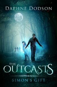
JF: The style of the type seems to match the art quite well.
Damon Freeman submitted Code Name Camelot designed by Momir at Damonza.com.

JF: Solid genre covers with lots of atmosphere and stylish type. And the “target” branding tells you all you need to know.
Damon Freeman submitted The Way of the Wolf designed by Momir at Damonza.com.

Damon Freeman submitted Sanctuary designed by Roy at Damonza.com.

JF: Love the atmosphere, you want to follow those figures into the story.
Damon Freeman submitted Highland Blood designed by Giovanni.

JF: Rich with an artful composite. Ordinarily I’d expect the woman to be facing the opening (right) edge.
David Burton submitted Down Home designed by David Burton. “I wanted to get the feeling that Earth was close, but not easy to get to. The red in the bottom corner is supposed to show the bad stuff going on Down Home. I had a different version with a large Earth looming over the space station. Most who looked at the two versions liked this one better.”

JF: It works really well.
David Burton submitted Mapping the Glades designed by David Burton. “This cover is for a thriller that takes place around the Everglades. The nautical chart is of part of that area and goes with the Mapping in the title. I thought the gun would help remind the reader that this is a thriller.”

JF: Although you assembled this with care, it disregards the conventions of thrillers in its color palette, font choice, and lack of any strong impact.
Debra Kristi submitted The Moorigad Dragon designed by Adara Rosalie. “Adara worked tirelessly to create a cover that captured the whimsy of the setting and the fire of the dragon. She took a plain-Jane model and turned her into a fantastical carnival act. She created the dress, jewels, and hair, as well as curled up the font.”

JF: Is she the dragon? The visual busyness is a distraction.
Derek Murphy submitted Orpheum designed by Derek Murphy. “This is a young adult dark fantasy romance based on Eastern European history and the myths of Orpheus and Pythagoras.”

JF: A careful and evocative design with hints of magic, and the woman is a powerful inducement to dive into the story.
Diomira Rose D’Agostino submitted The Forest Speaks: Book 1 Awakening the Rose designed by Tom Bird Publish Now. “I had submitted some key ideas to the cover creation formatting team – a service that is part of the Tom Bird Publish Now program. They captivated the look and feel almost immediately and quite beautifully if I might add. Cover has main characters (girl, raven, frog, mushroom, faeries, etc.)”
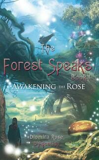
JF: Interesting choice of shape, since this is a taller rectangle than we usually see for ebook covers. The title really should stand out more against the lovely artwork.
DJ Edwardson submitted Ascent of the Nebula designed by DJ Edwardson. “This is the third in a series. I’ve not seen many science fiction covers in green so I thought this design might help the book stand out a little better.”

JF: Keeping it simple and using a strong font have worked to your advantage. Don’t see why the green won’t work.
Gaz jackson submitted Of The Shadows Own Accord designed by Gaz Jackson. “Created this image to relate closely to the main character of the book and to tie in with the dark theme of it.”

JF: It looks pasted together, and the title needs help.
Gregory Zschomler submitted Hell, Heaven and Back designed by Gregory Zschomler.

JF: The image is a bit mystifying, but it looks painful.
J Caleb Clark submitted False Prophet designed by J Caleb Clark. “I had to create a cover that would compete with the common thriller covers. The city skyline and a silhouette were specifically requested. Combining them in way that was unique was the challenge. An inverted cross with the main character silhouette inside was my solution.”

JF: And it’s a great solution, focusing on the main point of interest, and the strong typography and controlled colors really help this cover succeed.
J.L. Weil submitted White Raven designed by J.L. Weil.

JF: A transformation scene that draws us into the story. Maybe overdid it with the flourishes under the title, and this seems to be a good month for women with their backs to us.
James Egan submitted The Paradise Twin designed by James T. Egan of Bookfly Design.
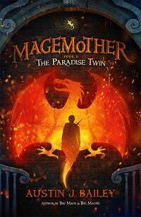
JF: A terrific fantasy illustration in a solid composition, but perhaps the title needed to be larger to balance the other elements.
James Egan submitted Honor & Roses designed by James T. Egan of Bookfly Design.

JF: A cover that seems almost perfect, from the warm tones to the careful and evocative typography to the allure of the woman standing at the fence contemplating… what? Also note the extremely subtle series branding, and yet another cover featuring a woman with her back to us. ★
Jefferson Smith submitted All These Shiny Worlds designed by Jefferson Smith. “Challenges: 1) Depict both fantasy and science fiction short stories, and 2) Keep the budget tight because the book is free.”

JF: A strong concept for your topic, but the “squared up” design with type in every corner depletes the visual drama.
Jennifer Kibble submitted Phoenix Element: Mages of Vane designed by Eric White.

JF: Looks like a manga cover, but it’s not an illustrated book.
Jill Beene submitted Kill Girl designed by Kari Joy Hodgen. “For my first novel, I wanted a cover that would intrigue the reader. I knew that I wanted custom lettering and different illustrations that hinted at the subject matter of the book. The cover designer, Kari Joy Hodgen, happens to be my sister, and she did an amazing job!”

JF: But all those little elements floating around are really quite distracting.
Johan Dahlgren submitted Under a Dark Sky designed by Johan M. Dahlgren. “The fists symbolize the main conflict between the protagonist and his nemesis. The falling stars are a reflection on the fallen nature of the antagonist, as well as being a direct representation of an actual event in the novel. Epic and gritty, just like the subject matter of the novel.”

JF: Okay.
John Biggs submitted Welcome to Hell Damini designed by Oscar Arcuri. “The cover captures one of the story themes; Hell is not just magma as often imagined, but can be the simple daily frustrations like standing in line to get some bureaucratic papers stamped.”

JF: Although the illustrator is talented, this does not work or look like a book cover to me.
John Gibson submitted They All Fall Down designed by John Gibson.

JF: Not sure what’s going on here, are you? The woman is holding a piece of wood, but it looks a lot like a gallows that’s on fire, yet the hanging man seems to be swinging from a tree? And why was the title made so hard to read? (For those keeping score, this is woman-with-her-back-to-us number 4 by my count.)
Juhi Larkin submitted ECHOES OF ANGELS designed by Juhi Larkin. “This was a cover for a space opera set in the far future, on a hellish planet. The woman pictured represents the main character, Rachel. The cover is intended to convey a character-driven sci-fi story.”

JF: Focusing on the woman’s face gives us a lot to go on, although the title is the weakest part of the cover.
Karri Klawiter submitted Mind Secrets designed by Karri Klawiter. “First in a series. The author had hired her own model and photographer for the characters, which is always fun.”

JF: Great job, very engaging, and a deft touch with the illustration to give the suggestion of the mental power of telepathy. ★
Karri Klawiter submitted Provex City designed by Karri Klawiter. “The first book in a Young Adult Urban Sci Fi/Fantasy series.”

JF: I find the distorted lettering awkward, and it’s always a challenge to put dark lettering on a mostly dark background.
Karri Klawiter submitted Unearthed designed by Karri Klawiter. “The fourth book in the Southern Watch Series, an Urban Dark Fantasy.”

JF: Looks more like a western to me.
Kasi Blake submitted Bait designed by Author Branding Essentials.

JF: Pretty basic, but it does have appeal.
Kate Lowell submitted Nuts About You designed by Ana J Phoenix. “This is the first book of three, all following the same character. Nathan is a weresquirrel, with a crush on one of his customers at the Bulk Mart. What I like best about this cover is how it catches Nathan’s cheerful, slightly innocent personality.”

JF: Probably better with illustration and pro typography would help too.
Kathy Cyr submitted Max Hamby and the Blood Diamond designed by Kathy Cyr. “The first book in a middle grade fantasy series. I wanted to convey that the magic comes from the main character’s surroundings, but also from within.”

JF: Nice job, looks right for your audience.
Kealan Burke submitted Sour Candy designed by Elderlemon Design.

JF: Haunting and very effective for a horror novel, the overall sense of foreboding is palpable.
Kendra Groesbeck submitted Storm in the Valley designed by Kendra Groesbeck/Elayne Griffith.

JF: Lots of care went into the title treatment, but maybe a detail of the flintlock rifle would have been better than trying to squeeze the whole thing in.
Kim DDD submitted Demorn Blade of Exile designed by Kitten from DDD. “Cover design for Fantasy book, The Asanti Series, book 1”
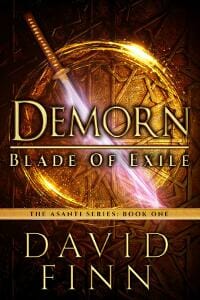
JF: Another strong fantasy series using color and the changing weapons to distinguish individual books.
Kim DDD submitted Demorn City of Innocents designed by Kitten from DDD. “Cover design for Fantasy book, The Asanti Series, book 2”

Kim DDD submitted Storm Bride designed by Milo from DDD. “Cover design for Fantasy book”
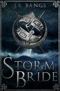
JF: The cool colors and classic type of this cover contrast with the roiling sea.
Kim DDD submitted United designed by Marushka from DDD. “Cover design for Young Adult, Dystopia book, United Trilogy, book 1”

JF: I like the emblematic title and the overall mood this cover projects.
Kim DDD submitted The Club designed by Marushka from DDD. “Cover design for Mystery book, An Anna Denning Mystery series”

JF: Another in cool tones to match the snowy scene, and here the title is nicely integrated into the art with good effect.
Kim DDD submitted Soulblade designed by Marushka from DDD. “Cover design for High Fantasy, Sword and Sorcery book”

JF: Solid genre cover.
Kim DDD submitted Frog Hollow designed by Marushka from DDD. “Cover design for Paranormal Fantasy book”

Kim DDD submitted Burned By The Soul designed by Milo from DDD. “Cover design for Fantasy book, Struck from the Heavens series, book 1”

JF: This fantasy series relies entirely on a change in color from one cover to the next. Nicely put together.
Kim DDD submitted Eyes Of The Assassins designed by Milo from DDD. “Cover design for Fantasy book, Struck from the Heavens series, book 2”

KRISTIAN MICHAEL submitted The Harvester designed by Kathryn Errey. “The photograph is of Old Adelaide Gaol, the most haunted prison in Australia…”

JF: It’s an evocative image, not sure how much the design has made of it, it looks unfinished.
L.E. Thomas submitted Star Runners designed by Andrei Bat. “This was the first book of the Star Runners series and my first time working with Andrei Bat. He knocked my socks off. Other than some minor changes, this was essentially the first cover design he submitted. I thought he perfectly captured the essence of the book.”

JF: A great balance between the personal (the man at the window) and the cosmic (the scene outside).
Lara Cosio submitted Playing At Love: A Rogue Series Novel designed by Dane & Brittany at EbookLaunch.com. “This novel is the first in a series and focuses on a rock guitarist. I asked Dane and Bbook Launch to develop something that looked more “women’s fiction” than “rock star romance” but still alluded to the main character’s music connection. I also wanted something that could be a brand for the series”

JF: It definitely has a feminine appeal, and it’s clean with a bit of cleverness.
Lee Davidson submitted Satellite designed by Lee Davidson. “Thank you for considering my e-book cover! Sincerely, Lee Davidson”

JF: You would think a feather would imply lightness, but this cover is overwhelmingly dark. And I’m not sure it says “paranormal fantasy” either.
Lesley Smith submitted The Parting of the Waters designed by Jason Gurley. “This is the second in a science fiction/fantasy trilogy and the major focus is the rising of two full moons which triggers a key event in the book, the Rising of an alien creature from the ocean.”

JF: A lovely cover. The type treatment, very classical and symmetrical, is not something I would associate right away with sci-fi fantasy, but it works.
Lindsay Jones submitted The Vortex Effect designed by Alan Pranke, Mill City Press.

JF: Workable.
Lori R. Lopez submitted HEARTBEAT designed by Lori R. Lopez. “This is a heart with partial decay and a heart-monitor line presenting a contrast between life and death. It represents the title as well as a significant statement in the story; also, the paradox of zombies falling to ruin yet appearing to be animated.”

JF: Is the book about zombies? Really? All these covers (see the 2 below) have elements that, in the hands of a professional designer, could make excellent covers. Unfortunately, these are not them.
Lori R. Lopez submitted SPOOKED designed by Lori R. Lopez. “A black cat plays a prominent role in SPOOKED, along with a cellar. This cover design presents the title’s double meaning of a scared cat and being haunted by ghosts . . . in particular, the aged specter on the left side.”

Lori R. Lopez submitted THE FAIRY FLY designed by Lori R. Lopez. “The FAIRY FLY cover presents the main character as a large central figure, his expression revealing personality in a realistic yet artistic style. The mysterious title character appears much smaller with a golden aura. The villainous Queen Mave, a Black Widow, lurks upside down.”

M.T. Magee submitted The Treasure of Gwenlais designed by Tyler Donnelly. “This is a fantasy series based on Gaelic history and legend. It is an actual scene from the book. Wanted to give the readers the idea of looking into the world I created.”

JF: Nice. The type fits perfectly and the framing of the central scene directs our attention there.
Mannah Pierce submitted Cast Adrift designed by Mannah Pierce (image by Curtis Hamilton, lettering by Authoright). “Cast Adrift is a sci-fi novel. The image shows the inner and outer personalities of one of the characters, a hybrid called Rae. Black is for the darkness of space and white for bright light of stars. The idea was to be striking, memorable and evoke memories of classic 1950s sci-fi books and comics.”

JF: An interesting concept that would take a lot more skill to reach its potential.
marco maldera submitted Static Cling designed by Marco Maldera.

JF: You don’t even have to know what this book is about to get a smile at the cover. And the illustration style and lettering help it stand out among all the photographic covers.
Mark Isaacs submitted The Greatest Blessings designed by Mark Isaacs.

JF: An ebook cover is like a very small billboard, designed to be taken in at a glance while communicating lots of information. By giving us lots of information to process visually, covers like this one end up communicating almost nothing.
Melissa Wong submitted Copycat designed by Melissa Wong. “The background of the cover was inspired by nail art, since fashion blogging is the backdrop of this short story.”

JF: Nail art is great, but the cover is so light it lacks any contrast, making it hard to decipher.
Michael Amon submitted Blinders designed by Michael Amon. “High stakes gambling on wine tasting, mysterious characters, sex and drugs . . . what’s not to like?”

JF: Nothing! But I’d rather see the title larger and not look so subservient to the illustration.
Michael Garza submitted Tribes of Decay designed by Severed Press.

JF: Powerful.
Monica Haynes submitted 1931: Book Six designed by Monica Haynes of The Thatchery.

JF: I love the atmosphere of these covers, and the way they evoke the era of the 1930s.
Nathan Smith submitted As the Sun Rises designed by Jennifer Allen.

JF: Why is the title shoved up against the top edge?
Nirupama Francis submitted It Happened Like This designed by Nirupama Francis. “Hand drawn, digitally coloured illustration depicting an important spot/location often mentioned and revisited in the story.”

JF: The illustration is lovely and perfectly apt, but the title is weak, the font is suspect, and titles don’t usually have a period at the end.
Oz Monroe submitted Soil-Man designed by Damonza.
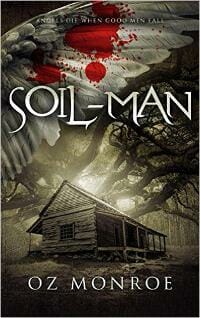
JF: It’s amazing how a good designer can make even a monotone illustration like this into a dramatic and exciting cover.
Patricia M Jackson submitted Henrietta: Book #1 in the House of Donato Series designed by C5 Designs.

JF: I found the combination of images confusing at first.
Pauline Wiles submitted Secrets in the Sky designed by Darius James. “This is lightweight women’s fiction. Thank you!”

JF: Nicely suited to its genre.
Rafael Lopez submitted Opon-Hul designed by Rafael L. Lopez. “I designed my cover using a 3D graphics program, keeping it simple and mysterious as are the words “Opon-Hul” throughout much of the story. The dragon is depicted as an ominous shadow approaching the characters and the reader.”

JF: Unfortunately it doesn’t come together, there’s no real excitement.
Randall Hahn submitted GIDEON designed by Joseph Wraith. “The black and white stripes of the Zebra Swallowtail butterfly captures the theme of racism in the novel. The red and blue on the wings represent the two main protagonists. This butterfly speaks to how racism is in direct opposition to the beauty of nature.”

JF: I think that’s really a stretch, and I doubt most readers will make the connections that seem so obvious to you.
Rena Hoberman submitted Return to the Dirt designed by Rena Hoberman of Cover Quill.

JF: The looming sky and lonely car give this cover an air of menace.
Rich DiSilvio submitted The Maker of Gargoyles designed by Rich DiSilvio. “I truly enjoyed designing this cover for this Clark Ashton Smith collection. I had actually drawn only the head of this creature years ago, but when the publisher needed a cover for The Maker of Gargoyles, I knew this nasty fella would be the ideal candidate once I added a body, wings & background.”

JF: The type fits just right, and that snarling gargoyle is delicious.
Richard Giddings submitted Urban Witch designed by Christine Giddings. “Mix of old city magic with edgy, new, modern looking witch- Bronte Fellows. Simple effective colours and fonts for easy access.Young adult fantasy.”

JF: Yes, but the type looks like an afterthought.
Ritesh Gupta submitted The Blazing Trident designed by Ritesh Gupta & Siddhanta Agrawal. “Designed with the help of myecovermaker.com website”

JF: You smell something burning? Visually, a train wreck.
Ron Sacdalan submitted Planets Above & Below: Grues & Kirns designed by Ron Sacdalan. “The author, Will Schmitz, wanted a Toltec-looking character grasping planets in his hands to symbolize the conflict between the technologically distinct civilizations represented in Planets Above & Below. Also, I was interested in conveying a painterly look to give it the feel of old Sci-Fi.”

JF: Well, that would be quite a challenge, but it doesn’t explain what happened to that poor title type.
Russ Linton submitted Pilgrim of the Storm designed by Jeff Brown. “Cover art was done by Jeff Brown, typography was done by myself. Jeff did a great job capturing the scene which I initially described at a completely different angle. His take on a scene of pure fantasy added drama and more detail than even I’d originally envisioned.”
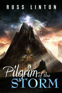
JF: The great artwork and imposing perspective draw us into the story.
Shannon Avangeline submitted Incandescent designed by Shannon Avangeline. “This cover is the first if a trilogy. This cover in particular is meant to show the loneliness of the MC. The lettering in the title and scrollwork is to add a whimsical element. Genre is YA paranormal. Specifically a young witch.”

JF: One reason it doesn’t work is because it’s so hard to see, and unfortunately it really doesn’t look like a professional book cover.
Shauna Roberts submitted Ice Magic, Fire Magic designed by Thomas Vandenberg.

Shelley Schanfield submitted The Tigress and the Yogi designed by Glendon Haddix at Streetlight Graphics. “I loved how Glendon found such a riveting image for the blue-eyed tigress of the title and superimposed it on the forest where she and the heroine meet. The trace of filigree is beautiful, and will be a good element to link covers and future website design to the next two books in the series.”

JF: Riveting, exerts a strong pull, exactly what you want in a cover. ★
Shreyans Zaveri submitted The Fuehrer’s Blood designed by Bismark Fernandes. “We were hoping to keep the cover minimal and to-the-point when we started out. Me and my designer came up with many ideas, few were extremely minimal and few were over the top. We finally froze on the current cover because it creates enough intrigue to pick up the book and read through.”

JF: I like minimal, but your cover can’t overcome the weak type treatment and disjointed imagery.
Solomon Deep submitted Oedipussy designed by Keith Aloysious Soertsz. “Oedipussy is about a grunge band that experiences a traumatic experience that transforms the life of the lead singer. He goes on to live a life of service to a group of young artists. The cover depicts a groupie’s tattoo of the band’s name, and a hasty, rock star signature marks the author’s name.”

JF: A cover with abundant charms, saucy and irresistible. ★
Styna Lane submitted Yesterwary designed by Styna Lane.

JF: Lack of contrast dooms this cover. No contrast = no drama = no interest = why should I care?
suzanne dillon submitted Loving Lily designed by Stephanie Clarke. “Hello, I know that the cover is not extravagant or complex, but the simplicity is what is striking. The single stock of delicate white flowers contrasted on the black background spoke to me as soon as I saw it. To me it portrayed the main characters loneliness, gentle strength, and inner beauty.”

JF: Very oversimplified. It means a lot to you, but tells us nothing about the book.
Tabatha Stirling submitted Gifts From The Dark – A Miscellany of Dread designed by Tabatha Stirling. “This design was for an Anthology (by the Cake and Quill Collective) of dark and dreadful stories released for Haloween 2015. It took a week to collect and collate the single images, adding effects as I went and another to design the actual cover.”
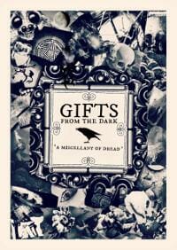
JF: A crazy collection of images within an antique British frame of reference create a delightful cover.
Todd Caldwell submitted Discovered Mate designed by Keri Knutson. “I provided Keri with a stock photo and told her the story was “an erotic, romantic comedy about chess players”. She did the rest.”

JF: She knows what attracts.
Tolar Miles submitted Delta designed by Timothy Robinson. “I told the designer I would like a simple design that screamed “Southern” and he delivered. The character Delta is an artist from Savannah, Georgia. She refuses to paint any magnolias because she has painted them for almost every household in the city. I feel this cover fits the story perfectly.”

JF: I’m not a big fan of white backgrounds on novels, but this design says “Southern” loud and clear.
Tracey Ward submitted Sleepless (Bird of Stone designed by Tracey Ward. “With the cover for Sleepless I tried to reflect the hard science element of the story along with the softer, dreamlike quality of many of the scenes by making the dock monochromatic while the emblem in the sky is bursting with color.”

JF: Very effective.
Vickilynn Brunskill submitted Waving Backwards designed by Vickilynn Brunskill.
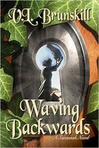
JF: Here the black and white-to-color contrast works against the viewer, because the brighter color distracts us from the grey area we’re meant to focus on.
Nonfiction Covers
Anjanette Barr submitted Dinner at Home: Advice and Encouragement for the Untrained Home Cook designed by Anjanette Barr. “I wanted my book cover to be clean and a bit humorous to convey the message that while my book is full of reference material, it’s also heavily anecdotal and fun.”

JF: A good idea, and the drawings can be charming, but I think you need to upgrade the typography to make it work.
Chris Lascelles submitted Spies, Sadists and Sorcerers designed by Maurizio Marotta.

JF: Terrific and humorous composition with type that complements perfectly. The promise of the subtitle closes the sale. ★
Dane Low submitted Fun with Patents designed by EbookLaunch.com.

JF: Fun with nonfiction book covers.
Daphine Jack submitted The Other Side of the Story designed by Daphine Jack. “The cover represents the character in the book who was wrongfully accused.”

JF: I like the drama of this “novelistic” cover.
Fawn Moran submitted Only This designed by Fawn Moran. “The title ‘Only This’ and the book’s subject matter implies a simplicity that comes from great depth. The cover has been designed to capture this feeling and take the reader there even before they read the first page.”

JF: Suited to a book of philosophy or poetry intended for a narrow audience of followers.
George Sugard submitted DEBT destroy eliminate bury terminate it designed by George Zach. “The reader should feel at ease ongoing solving a serious problem like this, that is why the design approach was to give a game like character to Debt (it). The Book Cover illustrates different ways of deal and get rid of your debt. Debt try’s to escape his death”

JF: Yes. I understand perfectly.
Ileana Bascuas submitted Getting Older, Being Here designed by James for, GoOnWrite.com. “Thanks for all your helpful information as I wrote and prepared this self-published book.”

JF: You’re very welcome. Your cover is lovely and so well suited to its subject matter and market. ★
James Egan submitted Every Body’s Guide to Everyday Pain designed by James T. Egan of Bookfly Design.

JF: A terrific cover for this book that likely looks best on the paperback edition.
Jodi Orgill Brown submitted The Sun Still Shines designed by Mike Rivera, i4 Solutions. “Loved the collaborative process of working with a fantastic designer to capture the essence of surviving dark storms (in this case, a brain stem tumor) and still seeing the light in life!”

JF: Sensitive and uplifting.
Karen Guest submitted Barefoot to Boeings – Memoirs of a jet jockey designed by Genevieve Carter. “Genevieve is a talented graphic designer. I gave her some photos and said I don’t know what I want, but this is what my book is about and I want a photo of Brian on the front. The rest is history!”

JF: I love the designer’s deft touch in combining the images yet still emerging with a single focus for the cover.
M.J. Milner submitted Risk Literacy designed by M.J. Milner. “Risk Literacy is complicated. i creatively used oriental chess pieces, Risk tokens, a 1905 stock market certificate, mahjong tiles, dice from Monopoly,Backgammon and others, a JFK half dollar piece, European coins, Scrabble tiles, a Rin Tin Tin WondaScope,a Tinker Bell ball and other items.”

JF: Unfortunately, including all this stuff accomplishes the opposite by delivering less clarity about the book and its subject.
Michele Orwin submitted Letting Go: An Anthology of Attempts designed by Al Pranke. “Even though many of the essays in this book are fairly serious, the editor of the anthology wanted a cover with an illustration that didn’t take itself too seriously. She had something definite in mind and Al Pranke was able to capture it.”

JF: I think I would expect something pretty humorous with this cover on it.
Nicholl McGuire submitted She’s Crazy designed by Nicholl McGuire. “I used two images and adjusted the size on both. By connecting them together and adjusting the ph”

Rachel Gregory submitted Thoughts on Life and Advertising designed by our in-house team. “You’ll see from the associated link that the paperback version of this cover featured much smaller text. Our designers felt it was vital to tweak the typography for the ebook so that it would display clearly as a thumbnail. The colour of the cover tied in with the author’s existing brand.”

JF: A cover with no visual appeal (unless you like casual script fonts). Wasn’t there any way to connect more viscerally to such a colorful subject?
Skye Blaine submitted Bound to Love: a memoir of grit and gratitude designed by Skye Blaine. “I took this photo of my son when he was three and a half, over thirty-seven years ago. The same cover was used for the paperback addition.”

JF: Nicely balanced.
Stacey Gustafson submitted Are You Kidding Me? My Life With an Extremely Loud Family, Bathroom Calamities, and Crazy Relatives designed by Luminare Press. “I heard you speak at the TVW meeting on 2/20. I believe I’ve used most of the techniques you showed us and would be interested to know if you agree. I am working on a second novel in a different genre and appreciated the information. Offering a free booklet to gain new subscribers, genius!”

JF: I love the image for this book but the type needs work to be more of a balance and also be easier to read at this size.
Susan Heslup submitted Life’s Transitions: Invitations to Wholeness designed by Susan Heslup. “This is a collection of stories by 3 authors that tell of survival of life’s transitions.”

JF: I like everything about this cover, from its sensitive imagery to the fonts used, but the title really needs to be stronger.
Tessa Rose Jackson submitted A Month with Starfish designed by TRJ Illustration. “The book is about volunteering with refugees on the Greek island of Lesbos. The orange life jacket stands both for the refugees who wear them and for the volunteers helping them to survive. The background waves have Corinthian curls that evoke Greece and their shape mimics the island’s coastline.”
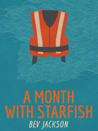
JF: A delightful cover that uses graphics perfectly. If the title was brighter, with more contrast with the background, it would be stellar.
Tracy Kimball-Smith submitted Is He Worth It? How to Spot the Hidden Traits of Good Men designed by Tracy Kimball-Smith. “The author wanted a clean, bold design for his book that incorporated the use of metaphor. Many possible meanings related to the book content can be construed from the design such as: “put your heart on the line”, “cast your line in the water”, “there are many fish in the sea”, “he’s a catch”, etc.”

JF: What it says to me is, “Look at me!” and that’s crucial. Well aligned with its intended audience and with excellent visibility at all sizes. ★
Well, that’s it for this month. I hope you found it interesting, and that you’ll share with other people interested in self-publishing.
Use the share buttons below to Tweet it, Share it on Facebook, Plus-1 it on Google+, Link to it!
Our next awards post will be on April 18, 2016. Deadline for submissions will be March 31, 2016. Don’t miss it! Here are all the links you’ll need:
- The original announcement post
- E-book Cover Design Awards web page
- Click here to submit your e-book cover
- Follow @JFBookman on Twitter for news about the E-book Cover Design Awards
- Check out past e-Book Cover Design award winners on Pinterest
- Subscribe to The Book Designer Blog
- Badge design by Derek Murphy


