A great book cover makes the reader feel something before they read the first line of the story. It moves them to begin thinking about the book’s possibilities and whether or not they want to strap in for the ride.
The sci-fi genre is all about alternative realities and future possibilities—the what-ifs of our best dreams and worst nightmares. For sci-fi book covers to represent this category well, they must stretch the boundaries of our every day and shift our perspective. A few standout features of sci-fi book covers include:
- Theme representation—how well is the book’s overall theme represented?
- Alluding to something that’s a bit off —it looks or “feels” familiar but not quite.
- Selected colors that create a mood or feeling.
- The start of a great story— piques curiosity about how the story will unfold.
- Fonts that represent the genre— fonts can make or break a cover no matter the genre (think futuristic and technological.).
If you’re looking for inspiration, you’ll find 10 of the bestselling sci-fi books and their covers listed below. We’ll take a close look at what makes each cover design unique and a good fit for the genre.
So what makes sci-fi book covers great? We’ll look at some examples below:
Sci-Fi Book Covers: Examples
1. Jurassic Park
Book Synopsis: “An astonishing technique for recovering and cloning dinosaur DNA has been discovered. Creatures once extinct now roam Jurassic Park, soon-to-be opened as a theme park. Until something goes wrong…” Source: Author website
Why the cover works: The big, scary T-rex, of course! They’re mysterious, ferocious (so we’re told), and oh, so iconic. Who hasn’t wondered what it was like when the “Tyrant Lizard King” roamed the earth terrorizing his neighbors and leaving extra-large footprints in their yards? Why go with just any prehistoric beast for a cover’s design when you can use the most familiar and imposing? The use of the T-Rex skeleton profile over the live one in the book is brilliant. It’s instantly recognizable—a museum nightmare comes to life.

2. How It Unfolds
Book Synopsis: “An astronaut’s interstellar mission is a personal journey of a thousand second chances in an exhilarating short story by James S. A. Corey, the New York Times bestselling author of The Expanse series. Roy Court and his crew are taking the trip of a lifetime—several lifetimes in fact—duplicated and dispatched across the galaxies searching for Earthlike planets. Many possibilities for the future. Yet for Roy, no matter how many of him there are, there’s still just one painful, unchangeable past. In what world can a broken relationship be reborn? The universe is so vast, there’s always room for hope.” Source: Goodreads
Why the cover works: It’s not easy to create a mood with just colors, fonts, and abstract graphic design, but this cover is a great example of how it’s the little details that matter. Notice how the “W” leans awkwardly to the left or how the title is woven between the lines of the diamond shape, unlike the author’s name that sits on top. It’s a bit unsettling, not unlike the shift crystals of a kaleidoscope.

3. The Midnight Library
Book Description (partial): “Somewhere out beyond the edge of the universe there is a library that contains an infinite number of books, each one the story of another reality. One tells the story of your life as it is, along with another book for the other life you could have lived if you had made a different choice at any point in your life. While we all wonder how our lives might have been, what if you had the chance to go to the library and see for yourself? Would any of these other lives truly be better?” Source: Author website
Why the cover works: It works because it almost doesn’t work. At first glance, the cover’s colors and fonts are more reminiscent of a cozy mystery or contemporary romance novel, but on closer inspection, things shift. Airplanes, sharks, and seemingly unrelated characters flow in and out of what appear to be portals shaped like airplane windows. What? This juxtaposition between genre expectations and the unexpected sparks builds interest, which is what all great book covers should do.

4. Red Mars, Green Mars, Blue Mars
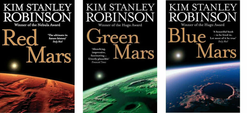
Book Synopsis: “The Mars trilogy is a series of science fiction novels by Kim Stanley Robinson that chronicles the settlement and terraforming of the planet Mars through the personal and detailed viewpoints of a wide variety of characters spanning almost two centuries. Ultimately more utopian than dystopian, the story focuses on egalitarian, sociological, and scientific advances made on Mars, while Earth suffers from overpopulation and ecological disaster.” Source
Why the covers work: This sci-fi trilogy’s first book was published over 30 years ago and has seen a resurgence in popularity, including a new cover design. Both sets of covers are shown below for comparison. The earlier version is followed by the most recent. They both fit the sci-fi genre well. The first set is more traditional with literal translations while the updated covers are abstract with color taking the lead. The iteration shows that covers can be interpreted differently but still remain true to the genre.


5. Artemis
Book Synopsis: “The bestselling author of The Martian returns with an irresistible new near-future thriller—a heist story set on the moon…
Propelled by its heroine’s wisecracking voice, set in a city that’s at once stunningly imagined and intimately familiar, and brimming over with clever problem-solving and heist-y fun, Artemis is another irresistible brew of science, suspense, and humor from #1 bestselling author Andy Weir.” Learn More
Why the cover works: The typography, color scheme, and imagery contain all of the right ingredients for a successful sci-fi book cover. This cover was designed by Will Staehle whose impressive portfolio is worth a glance.

6. Taken to the Stars
Book Synopsis: “Abducted by aliens. Frozen for decades.
Charlie Travers figures his life can’t get much worse. He lives over a pizza restaurant, he’s lost his girlfriend, and has no prospects for a career.
Then he’s abducted by an alien robot and taken across the galaxy. When he wakes up, he finds himself stranded thousands of light-years away and about to be killed by space pirates.
Charlie’s only hope of getting through this is learning to work with his fellow abductees: a green-skinned warrior woman, a feathered con man who is just as likely to steal their starship as he is to save them, and a cyborg insectoid pilot who could rip a man apart with ease… if he wasn’t a strict pacifist.
To make matters worse, they were abducted for a reason—one that aims to change the course of the Galaxy forever.” Source: Author website
Why the cover works: Based on the title and the cover image, you don’t have to read the synopsis to guess what the story is about. This has the quintessential elements of a sci-fi cover: a spaceship, a connection to the current reality, and drama. The question floating up to the spaceship with the victim is “What happens next?”

7. Eve14
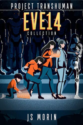
Book Synopsis: “Earth…Population: 1
Her name is Eve14.
She is the result of a 1000-year project by the robots of Earth to restore the planet after all life was wiped out in 2065.
27 robotic minds, copied from Earth’s great scientists, carried on after the species died. They mixed and matched those minds in endless combinations, producing a whole race of machines with human personalities. Immortal, but with memories of sensations they can no longer experience, some renegade robots now have a daring agenda.
They want human bodies.
As the only viable human host on Earth, Eve14 is on everyone’s most wanted list.” Source: Author website
Why the cover works: This comic-book-esc cover touches on the expected tropes of a great sci-fi cover: futuristic, technology-focused with a hero/antagonist highlighted and positioned front and center. It has a familiar ring to The March of Progress. “Do humans turn into robots in the book?” you wonder. A great cover makes a buyer curious and starts a conversation.

8. Fahrenheit 451
Book Synopsis: “Guy Montag is a fireman. His job is to destroy the most illegal of commodities, the printed book, along with the houses in which they are hidden. Montag never questions the destruction and ruin his actions produce, returning each day to his bland life and wife, Mildred, who spends all day with her television “family.” But when he meets an eccentric young neighbor, Clarisse, who introduces him to a past where people didn’t live in fear and to a present where one sees the world through the ideas in books instead of the mindless chatter of television, Montag begins to question everything he has ever known.” Source
Why the cover works: Just like most classic novels, Fahrenheit 451 by Ray Bradbury has gone through a number of cover changes. The updated 60th-anniversary edition’s simple 3-color design plays up the theme well, like the matchbook that looks like a real book. The minimal style checks off many of the sci-fi cover expectation boxes.

9. The Blighted Stars
Book Synopsis: “Stranded on a dead planet with her mortal enemy, a spy must survive and uncover a conspiracy in the first book of an epic space opera trilogy by an award‑winning author.” More Information
Why the cover works: The retro feel of the cover illustration (reminds me of 70s Hardy Boys Mysteries covers), pairs well with the modern fonts. The muted colors give off a dark and foreboding vibe, which works well with the story’s theme of conspiracies and deception.

10. All Systems Red
Book Synopsis: “‘As a heartless killing machine, I was a complete failure.‘
In a corporate-dominated spacefaring future, planetary missions must be approved and supplied by the Company. Exploratory teams are accompanied by Company-supplied security androids, for their own safety.
But in a society where contracts are awarded to the lowest bidder, safety isn’t a primary concern.
On a distant planet, a team of scientists are conducting surface tests, shadowed by their Company-supplied ‘droid — a self-aware SecUnit that has hacked its own governor module, and refers to itself (though never out loud) as “Murderbot.” Scornful of humans, all it really wants is to be left alone long enough to figure out who it is.
But when a neighboring mission goes dark, it’s up to the scientists and their Murderbot to get to the truth.” Source
Why the cover works: If you had to guess what type of novel this is based on the cover, it would likely be sci-fi. It’s futuristic, otherworldly, and has an eery-looking robot staring at you on the cover, not to mention the single line of text in red against a backdrop of muted grays. Nicely executed.

Final Thoughts
Great sci-fi book covers are created like any other well-designed cover. They start with genre and audience expectations as the foundation and the book’s theme as the central design focus. From there, the sky’s the limit.
Like the fantasy genre, when designing sci-fi covers, you have a lot of latitude and can lean into the fringes of your imagination without the concern of being too over the top; however, leaving something for the reader’s imagination allows them to fill in some of the blanks and partner with you on the adventure.
The key is to remember that all of the pieces of your book’s cover design story should be woven into your written story seamlessly. No gaps because your book’s story always begins with the cover.
Ask yourself, “If I could take a picture of my story, what would it look like?”, and use your response as a starting point for your design. When someone sees your book cover, what do you want them to remember?
The best experiences evoke a feeling. If you can create this in your cover, you’re on the right track.


