Welcome to the e-Book Cover Design Awards. This edition is for submissions during February, 2017.
This month we received:
90 covers in the Fiction category
10 covers in the Nonfiction category
Comments, Award Winners, and Gold Stars
I’ve added comments (JF: ) to many of the entries, but not all. Remember that the aim of these posts is educational, and by submitting you are inviting comments, commendations, and constructive criticism.
Thanks to everyone who participated. I hope you enjoy these as much as I did. Please leave a comment to let me know which are your favorites or, if you disagree, let me know why.
Although there is only winner in each category, other covers that were considered for the award or which stood out in some exemplary way, are indicated with a gold star: ★
Award winners and Gold-Starred covers also win the right to display our badges on their websites, so don’t forget to get your badge to get a little more attention for the work you’ve put into your book.
Also please note that we are now linking winning covers to their sales page on Amazon or Smashwords.
Now, without any further ado, here are the winners of this month’s e-Book Cover Design Awards.
e-Book Cover Design Award Winner for February 2017 in Fiction
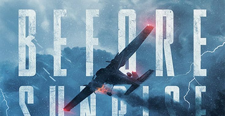
James Egan submitted Before Sunrise designed by James T. Egan of Bookfly Design.
JF: Exciting, dimensional, this fully-integrated thriller cover also controls the colors so that the red lights and flaming engine on the plane catch our eye and direct our attention. Irresistible.
e-Book Cover Design Award Winner for February 2017 in Nonfiction
Tim McConnehey submitted Prophecy and Modern Times designed by Izzard Ink Book Designs-Christian Fuenfhausen. “This book is religious book about the last days before Jesus Christ comes again.”


JF: Looks just about perfect for this audience and genre. The coloration gives it an air of mystery and suspense about what is coming. Well done.
Fiction Covers
Adrienne Kim Bird submitted Tiger Pelt designed by Kostis Pavlou. “Tiger Pelt is a story of rebirth, set in Korea during the Japanese occupation of WWII followed by the Korean War. Like a metaphor for the odyssey of the novel’s protagonists, order and meaning coalesce from a chaos of paint splatters in army fatigue green and the bold colors of the Korean flag”

JF: I like the colorful look of this cover, but I kept trying to find a “tiger” shape amid the chaos.
Alicia Wright submitted Crushed Velvet designed by Alicia Wright. “Silke Black is my pen name for the Erotica Genre. All of my other publications are under A L Wright. I own Noble Blood Books and NBBCovers.”

JF: I’d like to get to the bottom of why that title looks rather weak, probably from being compressed way too much.
April Paterson submitted Cast designed by April Paterson. “The book is about Nephilim, half- human, half-angel hybrids. The image is from a scene in the book. The rose is called a morning star (fictitious) and can only survive around nephilim, hence the feathers that are falling from it.”
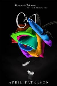
JF: Again, attractive colors but overall a rather confusing image.
Brenda Felber submitted Haunted Hills, A Pameroy Mystery designed by Design for the View. “There are currently three books in the Pameroy Mystery series for middle-grade readers, with the fourth to be published later this year. Each book is set in a different state and features the use a different base color in the cover design. All three covers are being submitted today.”

JF: A charming idea for a series design, and this one seems the most successful to me. This cover, with its integrated title and great atmosphere, really connects. The second (below) matches beautifully, although the third seems out of step and much “hotter” than the first two.
Brenda Felber submitted Unsettled Things designed by Design for the View. “Each book is set in a different state and features the use a different base color in the cover design.”

Brenda Felber submitted Watched Places, A Pameroy Mystery designed by Design for the View. “Each book is set in a different state and features the use a different base color in the cover design.”

JF: A lovely fantasy series anchored by the highlighted woman at the center of each cover. Notice how the overall color them shifts from book to book and is reflected in the ornaments used in the title. Solid.
Catherine Richmond submitted Third Strand of the Cord designed by Kim Killion. “Finding a photo of a boy with Down syndrome, his mother, and a hunky karate instructor, proved impossible, so we went with a silhouette.”

JF: Not a bad result, it does the job.
Charles Long submitted A Thin Line Between Love and Lust designed by C. E. Long. “Ive tried maybe 4 different cover designs before settling on this one. I really wanted to try something unique not defined by the genre but I finally gave up and gave in.”

JF: I think you had a good concept, but the execution is a disaster.
Clare Dugmore submitted The Outs designed by Eugene Teplitsky.

JF: Nice design, but more effective as a paperback cover. Here, with all the details and textures, it’s a bit hard to “read.”
Clare Dugmore submitted Prelude to Mayhem designed by Eugene Teplitsky.

JF: Lots of energy, despite the fact it’s difficult to see exactly what’s going on.
Clare Dugmore submitted Curiosity Quills: Darkscapes designed by Eugene Teplitsky. “As this is an anthology, I only listed the first two authors.”

JF: Interesting image, title could use more contrast.
Clare Dugmore submitted Emma and the Silk Thieves designed by Eugene Teplitsky.

JF: A good composition with lots of texture, but the effects used for the paperback have rendered the title somewhat “blurry.”
Damon Freeman submitted Bound in Blood designed by Damonza.com.

JF: Terrific thriller cover based around a very creative image composite where seemingly inconsistent images are combine to great effect, giving us an insight into the story.
Damon Freeman submitted The First Shot designed by Damonza.com.

JF: Powerful covers for this series of police procedurals that makes a huge impact mostly through the emphatic typography.
Damon Freeman submitted The Ninth Life designed by Damonza.com.

Damon Freeman submitted The Fireproof Girl designed by Damonza.com.

JF: A beautiful and carefully handled cover that uses color to emphasize the message of the title. Sensitive typography and masterful composition, a real winner. ★
Damon Freeman submitted Mage Strike designed by Damonza.com.
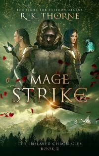
JF: An effective fantasy cover centered around the great illustrations.
Damon Freeman submitted Contract: Wolf Den designed by Damonza.com.

JF: Pow! Great concept that really “grabs” you when you see it.
Dan Van Oss submitted Sins Of The Past designed by Dan Van Oss.

JF: Solid thriller cover that uses a controlled palette and directed eye path to make its impact.
Darja DDD submitted Born of Earth designed by Milo from Deranged Doctor Design. “Science Fiction & Fantasy, Teen & Young Adult cover design by Milo, Deranged Doctor Design”

Darja DDD submitted Born of Fire designed by Milo from Deranged Doctor Design. “Science Fiction & Fantasy, Teen & Young Adult cover design by Milo, Deranged Doctor Design”

Darja DDD submitted Born of Water designed by Milo from Deranged Doctor Design. “Science Fiction & Fantasy, Teen & Young Adult cover design by Milo, Deranged Doctor Design”

Darja DDD submitted Degrees Of Distortion designed by Marushka from Deranged Doctor Design. “Romantic Suspense cover design, Distortion Series Book 1”

JF: Another strong series design, this one for romantic suspense. The black and white format makes the highlighted words really stand out. The titles are interesting too, since all three words, “Distortion,” “Exposure,” and “Resolution” all relate to photography, and there’s an echo of that in the way that part of each photo is pixelating and flying apart.
Darja DDD submitted Levels Of Exposure designed by Marushka from Deranged Doctor Design. “Romantic Suspense cover design, Distortion Series Book 2”

Darja DDD submitted Shades Of Resolution designed by Marushka from Deranged Doctor Design. “Romantic Suspense cover design, Distortion Series Book 3”

Darja DDD submitted Firehurler designed by Milo from Deranged Doctor Design. “Fiction, Fantasy, Epic, Sword & Sorcery cover design, Twinborn Trilogy Book 1”
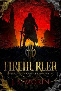
JF: A strong fantasy series design, again using color to differentiate individual titles. Here, silhouettes are used adroitly to highlight the figure at the center of focus. Beautiful textures and embellishments to the titles also help these covers stand out.
Darja DDD submitted Aethersmith designed by Milo from Deranged Doctor Design. “Fiction, Fantasy, Epic, Sword & Sorcery cover design, Twinborn Trilogy Book 2”
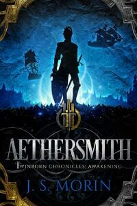
Darja DDD submitted Sourcethief designed by Milo from Deranged Doctor Design. “Fiction, Fantasy, Epic, Sword & Sorcery cover design, Twinborn Trilogy Book 3”

Darja DDD submitted The Colony designed by Milo from Deranged Doctor Design. “Post-Apocalyptic, Dystopian cover design by Milo, Deranged Doctor Design”

JF: Strong cover, and the ‘back to us’ theme draws us into the scene.
Darja DDD submitted Comorbid designed by Kitten from Deranged Doctor Design. “Thriller, Suspense, Mystery cover design by Kitten, Deranged Doctor Design”

JF: Clever use of images and simple but strong colors make an impact.
Darja DDD submitted The Stones Cry Out designed by Kitten from Deranged Doctor Design. “Thriller Mystery cover design by Kitten, Deranged Doctor Design”

JF: Great thriller cover with another “back to us” figure. The strong, hot colors and artful layout work beautifully.
Darja DDD submitted Shards of a Broken Sword designed by Milo from Deranged Doctor Design. “Fiction, Fantasy, Epic, Sword & Sorcery cover design by Milo, Deranged Doctor Design”

JF: Great detail and texture, exactly the look you want for this genre.
Dennis Winkleblack submitted Basically Good People designed by Christa Holland. “Although a book about quirky people, we decided readers would be better served if they weren’t provided preconceived notions of the main characters’ appearances. Their hound dog and pickup, however, would suggest the fun inside.”

JF: Love the illustration style and layout of this cover, and the odd font and type treatment emphasize the quirky nature of the book.
Don DeBon submitted The Husband designed by Don DeBon.

JF: No. Just no.
E. M. Youman submitted The Prince’s Plan designed by Duong Covers. “I hired Julie from Duong Covers to design a romance cover for ebook and paperback. This was my first time commissioning a cover, so I struggled with conveying what I wanted. But it was if she could read my mind. She created two mockups and this was the one I chose.”

JF: A lovely cover that establishes an environment and introduces us (with another “back to you” image) to the protagonist. Sharp-eyed readers will note the second image below the railing.
Edie Keith submitted 300 Miles designed by Edie Keith. “LGBT (m/m) romance novel set in Oregon between a mechanic and a schoolteacher on vacation.”

JF: Good image for this book, but I wonder what others think of the unusual title placement. Author name looks like an afterthought.
Edward Gehlert submitted Parables of Lucas Fosterman designed by Ray Falvey.

JF: A weak cover that could have been much better with stronger typography and a different treatment of the image. Why was the hand highlighted, is that really the most compelling part of the image?
Erik Carter submitted Stone Groove designed by Erik Carter. “I was going for a simple but haunting design. When I found the photo, I knew it would work for my idea. In addition to the composition of the shot, I also loved that the positioning of the woman’s body and the bubbles both gave an ambiguity between life and death.”

JF: Good job.
Fabi Ghittoni submitted The Elven Tales designed by Mirella Santana. “The cover of The Elven Tales has had a wonderful reception among readers.”
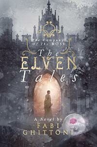
JF: Looks like a wonderful paperback cover that didn’t translate very well to ebook use. At this size, the amount of detail, texture, and embellishment makes the whole thing hard to make out, draning it of impact.
Gabrielle Prendergast submitted A Beautiful Stranger designed by Gabrielle Prendergast. “The author wanted a strong category romance brand for this new series. All the books are about children and parenthood so I went for a baby shower feel to the design.”

JF: It’s all very professional, but the incongruity of the three images is hard to resolve.
Gary Gautier submitted Hippies designed by Gary Gautier and Emily Brown.

JF: You kind of think that “psychedelic drugs, sexual openness, the freedom of the commune” would have inspired a more colorful, energetic, or at least interesting cover. This isn’t it.
Glenn Jenner submitted The Creatures of the Loch designed by Glenn Jenner. “This is the third ebook I have designed and the cover gives a subtle introduction to two of the main characters without showing to much of them. It also sets the scene for the story which is based around the Scottish Lochs.”
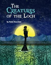
JF: Might make the title larger.
Hannah Stahlhut submitted Wanderling designed by Hannah England. “Hannah England has been designing my covers for years, and I could not be more pleased with her work! She takes extra care to accurately depict scenes in a way that draws the eye immediately.”

JF: Love the way the “spirit” is rising from the fire, and the child silhouetted against the fire. Very effective.
Heidi Fischer submitted Swallow designed by Heidi Fischer. “Swallow is about a female Luftwaffe fighter pilot in WWII. She dreams of flying like a swallow and becomes the only female to fly the Me-262 fighter jet (also known as ‘Schwalbe’ which is German for swallow), all represented by the bold red\black\white palette, swallow silhouette and balkenkreuz.”

JF: (Balkenkreuz is the cross shape.) Yet this cover has no sense of lift, or flying, or lightness. Instead, it is static and heavy.
Jade Jez submitted The Stationmaster’s Cottage designed by Jade from Steam Power Studios.

JF: Beautifully conceived and rendered. Notice how the almost monochrome palette emphasizes the red ribbon, which in turn guides us to the telling details. ★
James D McCallister submitted LET THE GLORY PASS AWAY designed by Marc Cardwell. “Since the book’s about an ego-bruised writer looking for midlife validation, I instructed the cover designer that the title should be BIG, yet seem as though coming out of “the world’s smallest typewriter.” Newsprint in the background is from a post-Civil War paper, the Columbia Phoenix.”

JF: The typography would also place it in that time period. It’s emphatic!
James Egan submitted A Fistful of Honey designed by James T. Egan of Bookfly Design.

JF: Mesmerizing. Fully textured with expert typography and a backlit woman full of mystery and allure.
Jasmine Thapa submitted We are Alphabet ! designed by Jasmine Thapa.

JF: Charming.
Jennifer Amriss submitted Race Against the Dark designed by Yuriko Matsuoka. “Yuri painted the image, I did the font work. I really love how she took my insane rambling and turned it into a captivating image.”

JF: It has a great air of mystery and magic, well done.
Jennifer Lynn submitted Being Here designed by Dawn Leslie Lenz. “Being Here introduces Bree MacLeod, a modern-day shaman and Bean feasa raised in and walking the Mystic’s path. The cover reflects her seamless experience of This World and the Otherworld while honoring her Raven Ally and the opalescent light that flows through her world.”

JF: Unfortunately it’s very static and doesn’t give us much to snag our interest.
Jeremiah Cross submitted Clash of Angels designed by Catherine Langwagen.

JF: Hot art, would like to see the title stronger.
Jeremiah Cross submitted Sanguine Rose designed by Catherine Langwagen.

JF: I find it odd that this cover has an almost identical style to the one above, but appears to be a completely different genre. Here the type looks at odds with the modern feel of the illustration.
John Penteros submitted Twelve Feet Down designed by Christian Fuenfhausen. “We tried to keep it simple yet intriguing, and give a truthful indication of what’s inside. Good collaborative effort with Christian. He was not put off by my requests to nitpick on details.”

JF: The illustration is both funny and gruesome, but what really makes the cover is the great typography and layout.
Josip Romac submitted Bud by the Grace of God designed by Romacdesigns.
“This is the second book of the science fiction series by author S. E. Sasaki. Ms. Sasaki wanted an engaging cover that would resonate with her potential readers while remaining consistent with the first book in the series (done by another artist).”

Kadin Seton submitted Rim War: Subversion designed by Atrtink Covers.
JF: Great job, the intriguing illustration telegraphs the book’s genre, and the typography emphasizes it.

JF: Solid sci-fi cover, and I love the pink/purple colors, they really stand out.
Katie Smolkovich submitted Acropolis designed by Katie Smolkovich. “The image was created using layering in Photoshop, watercolors, and vector in Illustrator.”

JF: But the result completely lacks interest, impact, or even basic communication.
Ken Doggett submitted To Summon The Blackbird designed by Ken Doggett.

JF: Serviceable, but it looks heavy and I don’t see the point.
Kevin Sivils submitted The Predator and The Prey designed by Robin Ludwig. “The Predator and The Prey is a cross-genre story combining classic crime noir style and science fiction. Designer Robin Ludwig, I believe captured the feel of a gritty noir detective story yet managed to introduce the idea of a futuristic setting with the two moons visible in the sky.”

JF: Hey, that’s a great mash-up, and the designer has hit it on the head. There’s drama from the low viewpoint, an air of mystery and lots of intimations of the story. ★
Kyla Stone submitted Beneath The Skin designed by Clarissa Yeo. “This is a gritty contemporary YA novel about a girl overcoming an abusive past. We wanted something that would convey some of that emotion without going too dark.”

JF: It’s certainly a lovely and well designed cover, but I have to say it shows no signs of the “gritty” or “abusive” elements in the story.
Kyla Stone submitted Who We Are Instead designed by Clarissa Yeo. “This is a YA/Women’s Fiction crossover about the estranged relationship between two sisters as they both grapple with a difficult past. I asked the designer for something that evoked the genre and was lovely to look at.”

JF: This cover nails the theme perfectly, has some lovely details and a title that sings. ★
Lance Charnes submitted The Collection designed by Damonza. “I wanted to go with a Saul Bass-inspired 1960s movie poster look. It’s distinctive and not too serious. The concept will also be easy to extend to subsequent books in the DeWitt Agency Files series.”

JF: And a nice touch of humor, too.
Laura VanArendonk Baugh submitted The Songweaver’s Vow designed by Damonza. “I wanted a cover that suggested setting, but hinted at fantasy or myth over historical and with a strong sense of drama. I love that Jörmungandr letter O. I’ve waited years for a Damonza cover and it was well worth it! Thanks for all your service to the community!”

JF: Jörmungandr as ouroboros, perhaps? A very dramatic, story-filled cover (with the familiar-by-now “back turned” look that aims to draw us into the scene. And it succeeds! ★
Laurie Finkelstein submitted Next Therapist Please designed by Patrick Knowles. “The illustration was done by illustrator Lucy Truman.”

JF: A beautiful and well balanced cover with lots of energy and lightness, just right for this genre. You can see the designer’s expertise in the way the title is perfectly matched to the illustration style. ★
Libby Kirsch submitted The Big Lead designed by Andrew Brown, Design for Writers. “I gave Andrew a vague idea of what I thought I wanted. He came up with a design that’s perfect for the chick-lit/mystery book inside.”

JF: A strong and attractive cover that was well conceived and carried out, with an interesting bokeh background.
Lori Robinett submitted Fatal Obsession designed by Daniela. “Daniela created the book cover for the first in this series, Fatal Impulse. I wanted to continue the ring theme, but add something to express the content of this book, which is about a scientist who experiments on his unborn child. My goal was something polished, but a bit creepy.”

JF: Mission accomplished.
M Pepper Langlinais submitted Brynnde designed by Lila Mijailovic.

JF: Solid genre cover with nicely combined images.
M. B. Robbins submitted Wide Horizons designed by Marie Robinson. “I like the simplicity and contrasting colors, and the figures of a person and camel tie well into the desert setting of the novel.”

JF: Underwhelming.
Mark Gamble submitted Willow Down designed by Jana Rade. “Jana Rade was able to take hints of my original art (15 paintings within the book) and include them in the cover art.”
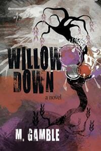
JF: I think she included a few too many. “Less is more.”
Marsha Canham submitted The Far Horizon designed by Marsha Canham. “I wanted a simple cover that reflected the title and fit the romance genre.”

JF: Nicely done.
Marti Childs submitted Little Shadow designed by Marti Childs. “The book describes ominous Midwestern weather, and angel sightings.”

Michael Giusti submitted A Catered Christmas designed by K.M. Claude. “The book is a mystery about a man, who has a striking resemblance to Santa Clause, who is being hunted by an underworld gang. The house in the background is a reference to a gingerbread house that plays prominently in the plot.”

JF: Although this appears to be a children’s book, it’s actually a thriller.
NA Studio Design submitted Rebirth designed by NA Studio Design.

JF: Good cover for the sci-fi genre.
Nate Allen submitted The Counterfeit designed by Nate Allen. “My book cover is meant to clue the reader in on the afterlife aspect while leaving plenty of mystery as to what he’s actually entering into. Nothing is random; it all has a purpose, from the color schemes of the title/author, to the black and white becoming color.”

JF: An interesting and engaging concept, but i wonder what the ‘purpose’ is to the hard to read part of the title?
Pradeep Bahirwani submitted The Youngest Daughter: A Mystical Passage through Duality designed by Pradeep Bahirwani. “The cover depicts a young man’s passage to unity (enlightenment) through the path of love.”

JF: Enchanting, and a very high level of quality for an author-designed cover.
Rebecca Vickers submitted Beauty’s Songbook designed by Maduranga. “I provided the image for the designer (image by the extremely talented Elena Dudina), and Maduranga made this cover what it is. It’s a fairy tale, and the atmosphere created by the cover was just right.”

JF: Lovely and on-target, despite the difficulties it seems the woman will face.
Rena Hoberman submitted Many a Dark Night designed by Rena Hoberman of Cover Quill.
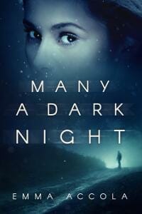
JF: Sophisticated type and atmospheric images make this cover stand out.
Rena Hoberman submitted Under Wicked Sky designed by Rena Hoberman of Cover Quill.
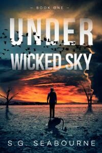
JF: Nice design (love those birds) but don’t you think it should be “Under a Wicked Sky” or “Under the Wicked Sky”?
Rick Moss submitted Tellers designed by Rick Moss. “I was a designer long before becoming an author, so one might think designing my own e-book cover would be like falling off a log but, being so close to the work, I found it hard at first. I posted my final designs in a Facebook poll and went with the top pick.”

JF: It has a strange appeal.
RUBÉN BALLESTEROS submitted Doña Juana, Juanita y Juanón designed by digikampradesh and lidia de pedro. “”Doña Juana, Juanita y Juanón” is an erotic Spanish pulp from the 1920’s. We added some colour to the original black and white illustration and used the same type as the paper cover. We wanted to modernize it a bit, but keeping the original retro feeling of it.”

JF: Fantastic illustration style, full of humor and eroticism, particularly the look on her face, and don’t miss the rather phallic chair arms, too.
Russell Atchison submitted The Fantasy Effect designed by Jeremy Taylor.

JF: Solid illustration for a pharmaceutical thriller, but the type chosen doesn’t seem to fit.
Sheila Cronin submitted The Gift Counselor designed by Katherine Kuszmaul. “Cover design was done by createspace artist.”

JF: Weak and visually confusing.
SM Playle submitted The Hours of Creeping Night designed by SM Playle.
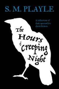
JF: Good idea, and the bird carries the cover, but that blue type is hard to read against the black background.
SOPHY BOYLE submitted WYVERN AND STAR designed by MARK ECOB.

JF: Interesting combination of illustration styles.
stephen david hurley submitted Cease & Desist designed by greg stadnyk. “I’ve gotten a lot of compliments on Greg’s design. I hope my prose measures up to his design skills. Stephen David Hurley”

JF: The woman’s face inside a glass is an arresting image, and the typography complements it.
Tamara Rogers submitted Grind Spark designed by Tamara Rogers. “I wanted a striking cover to go with this near future dystopian fiction novel, with a female protagonist and a recurring image of a music box ballerina throughout the book.”

Tammy Seidick submitted The Art of Breathing designed by Tammy Seidick. “Thanks for reviewing!”

JF: Delicate and atmospheric, the aspirational posture of the woman matches the mood beautifully.
Tim McConnehey submitted Angelina’s Secret designed by Izzard Ink Book Designs-Christian Fuenfhausen.

JF: Good genre cover that ‘gets to the point.’
Timothy Maschler submitted Nebuchadnezzar King of Babylon designed by John Davidheiser.

JF: Although I’m not a fan of vertical type, note how this illustration uses the same “props’ as the one above, but is much more active and dynamic, implying lots of action. One isn’t better than the other because it depends on the effect you are trying to generate.
Tyler Sehn submitted Daughter of Shadow designed by Danny Jose.

JF: Nicely textured, interesting details, and well-rendered type. What’s not to like?
Ann B. Keller submitted Talisman designed by Annoula. “This cover design beautifully mingles the magic and mystery of this story, along with the enticing element of time travel. I believe this is a key component in the book’s outstanding track record thus far. The designer is professional, prompt, and very easy to work with.”

JF: Looks like an awkward combination of disparate images with poor color choices.
Nonfiction Covers
Brother Simeon Davis submitted The Gospel of Thomas for Awakening designed by Brother Simeon Davis. “On a background of parchment with the Greek text of the Gospel of Thomas, a stylized Saint Thomas cross common in India, of which Saint Thomas was the apostle, is superimposed.”

JF: Simple but attractive and entirely appropriate for its intended audience.
Cathi Stevenson submitted What’s Really Eating You? designed by Cathi Stevenson. “I tried to use both images on the cover in ways that provided multiple levels of meaning, hoping that in doing so the cover would provoke a personal message to whoever looked at it.”

JF: Clever imagery bring home the point of the book, although it would have been better at this size with stronger type treatment. looks more like a paperback cover. ★
Christopher Lascelles submitted The Pharmacist of Auschwitz designed by Miroslav Smiljanic. “This is an eye-grabbing cover of a book about a man who committed atrocities at Auschwitz but then escaped justice into the 1960s, and even then was set free after a short prison sentence.”

JF: The design places it perfectly in its time period of World War II, but perhaps some additional descriptive text would help those unfamiliar with the subject.
Damon Freeman submitted Lessons from the Road: USA designed by Damonza.com.

JF: An amusing cover that emphasizes the ‘road’ element, but I don’t really take to the odd shape created by the blue background.
Damon Freeman submitted Letters to Mitch designed by Damonza.com.

JF: A cover that says what it is, at ever level. ★
James Egan submitted How to Fail at Hiking Mt. Whitney designed by James T. Egan of Bookfly Design.

JF: How to succeed by not failing is the ingenious premise of this book devoted to hikers. The cover emphasizes this by highlighting the key word ‘Fail.’ A very good style for a guidebook.
Mike Kowis submitted 14 Steps to Self-Publishing a Book designed by OctagonLab.

JF: An okay cover, but also shows how stock photos and art can dilute your message, since this is a very generic illustration that contains a whole lot more than 14 steps. Or am i being too literal?
Rodney Lacroix submitted The Vasectomy Diaries designed by Rodney Lacroix.

JF: I’m not a fan of the double bands as this cover uses them because they seem claustrophobic, but that doesn’t stop this cover from standing out. The scissors are just perfect to invoke the subject, and if we had an award for best subtitle, it would win in a rout.
Well, that’s it for this month. I hope you found it interesting, and that you’ll share with other people interested in self-publishing.
Use the share buttons below to Tweet it, Share it on Facebook, Plus-1 it on Google+, Link to it!
Our next awards post will be on April 24, 2017. Deadline for submissions will be March 31, 2017. Don’t miss it! Here are all the links you’ll need:
- The original announcement post
- E-book Cover Design Awards web page
- Click here to submit your e-book cover
- Follow @JFBookman on Twitter for news about the E-book Cover Design Awards
- Check out past e-Book Cover Design award winners on Pinterest
- Subscribe to The Book Designer Blog
- Badge design by Derek Murphy


