Welcome to the e-Book Cover Design Awards. This edition is for submissions during April, 2017.
This month we received:
88 covers in the Fiction category
14 covers in the Nonfiction category
Comments, Award Winners, and Gold Stars
I’ve added comments (JF: ) to many of the entries, but not all. Remember that the aim of these posts is educational, and by submitting you are inviting comments, commendations, and constructive criticism.
Thanks to everyone who participated. I hope you enjoy these as much as I did. Please leave a comment to let me know which are your favorites or, if you disagree, let me know why.
Although there is only winner in each category, other covers that were considered for the award or which stood out in some exemplary way, are indicated with a gold star: ★
Award winners and Gold-Starred covers also win the right to display our badges on their websites, so don’t forget to get your badge to get a little more attention for the work you’ve put into your book.
Also please note that we are now linking winning covers to their sales page on Amazon or Smashwords.
Now, without any further ado, here are the winners of this month’s e-Book Cover Design Awards.
e-Book Cover Design Award Winner for April 2017 in Fiction
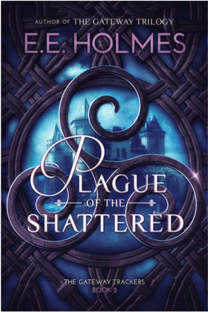
James Egan submitted Plague of the Shattered designed by James T. Egan of Bookfly Design.

JF: Deliriously well done. It’s not easy to create three levels of focus—the castle, the stonework “window,” and the title type—and have them actually work. This cover does that while it establishes a strong identity for the book and its series.
e-Book Cover Design Award Winner for April 2017 in Nonfiction
Tim McConnehey submitted HopeFULL: Creating and Maintaining Positive Momentum in the Real World designed by Christian Fuenfhausen. “This is a business book for Positive IQ. Positive IQ is a unique approach to tapping into the power of being HopeFULL.”

JF: Beautifully combines the promise of the title and the purpose of the program in one, memorable, graphic design with a completely appropriate color palette.
Fiction Covers
Aimee Coveney submitted Marching on Together designed by Aimee Coveney. “I loved designing this cover! The book centres around a group of Leeds United fans, and the publisher was keen to include the team colours whilst keeping the design attractive for the literary fiction market, with a serious tone for the books travel/war grave subject.”

JF: Graphically effective, it hits all the bases while supplying some “human scale” at the same time. ★
AK Lakelett submitted Remember Me? designed by James.
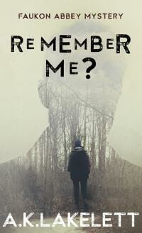
JF: A clever and atmospheric cover but I’m not sure it’s helped by the unusual title treatment. You?
Alessio Cala submitted Forgotten Liberty designed by Alessio Cala.
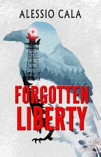
JF: I like the idea, but in this version it doesn’t work because the type is weak and the images don’t combine well.
Allison Bruning submitted Damaged designed by Krystal George. “The cover was designed to depict the suffering the main character in this short story goes through. It is very eye catching.”

JF: Sadly, I disagree. The overall effect is so ghostly and static it will be easy to miss.
Angelo Marcos submitted The Artist designed by The Cover Collection. “I originally designed my own cover but decided I needed a professionally-designed one. As the book is a psychological thriller, I wanted a cover with a hint of menace and intrigue. The murders all occur in a dingy basement, which is why I loved this design.”

JF: Good decision. This cover has a nice air of mystery and menace, and will appeal to thriller readers.
Beth Martin submitted The End of Refuge designed by Beth Martin. “The inhabitants of the shelter called Refuge have been trapped underground for over 20 years. The image on the cover is a photograph of a marker for an abandoned bunker in Ukraine. Distressed concrete sets the tone for the novel, but the bright colors keep it from being too dreary.”

JF: A pretty effective cover, except for the subtitle which is completely illegible.
Bev Stout submitted My Name is Nissa designed by Joshua Etteldorf.

JF: Seems to cover the “fantasy” part while ignoring the “urban” part, and overall it looks quite a bit too timid.
Brian Converse submitted Rajani Chronicles I: Stone Soldiers designed by Lawrence Mann.
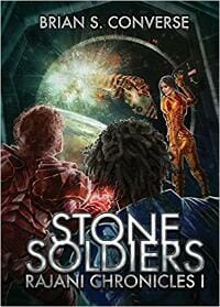
JF: A few too many people populating the “back turned to the audience” on this cover, muddying the effect.
Carrie D. Miller submitted The White Raven designed by Helen Lloyd. “I knew from the beginning that I wanted a white raven prominently on the cover, so I began searching the internet for images. I wanted something slightly ghostly and abstract. I came across an amazing pencil drawing of a black crow from artist Helen Lloyd, who specializes in animal portraits.”

JF: Simplicity works well here, but shouldn’t the Raven/Crow be flying higher up on the cover?
Chris Ledbetter submitted The Sky Throne designed by Najla Qamber Designs.

JF: Good, and the medallion at the center works as a focusing device.
Chris Norbury submitted Castle Danger designed by Todd Engel. “My suspense novel is set on the rugged north shore of Lake Superior. The cover captures the essence of the story: danger from man (cabin fire), from nature (brutal winter, unforgiving lake), and the fact that the small town of Castle Danger is isolated, which affects the outcome of the story.”

JF: Much of what you describe doesn’t come across, perhaps because you’re trying to squeeze too many things into the cover. The type also needs an upgrade because it’s contributing nothing to the overall effect.
Christina Quinn submitted A Kiss of Crimson designed by Christina Quinn. “I haven’t been dabbling in cover design for long (2 years) but I thought it would be neat to attempt a paranormal romance cover without a half naked guy, and while emphasizing the color red without shoving it in your face and up your butt simultaneously.”

JF: Thank you! This would be stronger if the title was enlarged at least 20%.
Christopher McPherson submitted 22 designed by Matt Hinrichs. “”22″ is a novel that shows how the “butterfly effect” can change the universe — in this case, it is the appearance of a gun that shatters the fragile lives of 22 people. Cover designed by Matt Hinrichs.”

JF: Artful and intriguing. The drawing style will help it stand out.
Cora Graphics submitted Di Ghiaccio e Oro designed by Cora Graphics.

JF: The beautiful heroine helps to sell this carefully constructed cover.
Cora Graphics submitted Prime designed by Cora Graphics.

JF: The “looking through the porthole” meme is powerful, but in this case with so much going on in the scene beyond, the double planets create visual confusion that doesn’t help the cover, which is otherwise very professional.
Cora Graphics submitted Dating the iit Guy designed by Cora Graphics.

JF: A lovely cover (love those stars) that isn’t helped at all by the arbitrary horizontal while lines emanating from the title. Why cut the image that way?
Cora Graphics submitted Born designed by Cora Graphics.

JF: I like the saucy woman, but it looks like she’s dwarfed by the chair. Zooming in on her might have made it a stronger cover.
D. G. Speirs submitted Triangle: False Mirror designed by Ricky Gunawan. “First in a series of action/adventure novels, the concept was a throwback to adventure film posters from the 1980s and 90s – five to six strong, identifiable images that will relate to the story, including the character images down center. I held an online design contest to find this designer.”

JF: A cover that really suffers from the attempt to cram too many images and ideas into it, and the very weak typography that’s only marginally readable.
D. L. Armillei submitted Shock of Fate designed by D. L. Armillei. “Thank you!”

JF: Many good things here, but putting the highlight into the person’s eye makes it compete with the strong highlight on the gold seal/coin thingy. Likely better without it.
Dan Green submitted The Spark: A Meridia Falls Fantasy Thriller designed by Dan Green. “I wanted a cover that would pop off the page. The eyes and the door are both strong elements from the story. The eyes work really well in drawing you in to the mysterious white door.”

JF: Attractive and interesting, with very careful typography. But once again, nothing whatsoever on this cover indicates “urban,” quite the opposite.
Darja DDD submitted Written In Blood designed by Kitten from Deranged Doctor Design. “Mystery & Crime cover design.”

JF: Expert design hits all the bases with a cover designed to attract thriller readers. ★
Darja DDD submitted Catling’s Bane designed by Milo from Deranged Doctor Design. “Science Fiction & Fantasy cover design. The Rose Shield Book 1.”

JF: Here’s a great design for a sci-fi/fantasy series. Although they are all good, Catlina’s Bane is the one I like best. Dramatic lighting, evocative textures, careful type, and that central rose ensure all these covers will delight fans. ★
Darja DDD submitted Oathbreakers’ Guild designed by Milo from Deranged Doctor Design
. “Science Fiction & Fantasy cover design. The Rose Shield Book 2”

Darja DDD submitted Farlanders’ Law designed by Milo from Deranged Doctor Design. “Science Fiction & Fantasy cover design. The Rose Shield Book 3”

Darja DDD submitted Kari’s Reckoning designed by Milo from Deranged Doctor Design. “Science Fiction & Fantasy cover design. The Rose Shield Book 4”

Darja DDD submitted Crow Vector designed by Milo from Deranged Doctor Design. “Science Fiction, Action cover design”

JF: A solid genre design that highlights the protagonist.
Darja DDD submitted The Dangers of Secrets designed by Marushka from Deranged Doctor Design. “Mystery, Historical cover. Hearts in Hazard Book 4”

JF: Another strong series design, this one for historical mysteries. Note that in addition to the usual changes of color and titles from one book to the next, here the designer has also used three different poses for the woman at the center of the cover; one from the back, one from the side, and one from the front.
Darja DDD submitted The Dangers for Spies designed by Marushka from Deranged Doctor Design. “Mystery, Thriller & Suspense design. Hearts in Hazard Book 5”

Darja DDD submitted The Dangers to Hearts designed by Marushka from Deranged Doctor Design. “Mystery, Thriller & Suspense. Hearts in Hazard Book 6”

Darja DDD submitted The Road to Kalbakar designed by Milo from Deranged Doctor Design. “Fantasy Magic Sword Sorcery cover. Wyrms of Pasandir book one”

JF: Exciting covers for this sword and sorcery series. Here the illustrations tell us about the story and its setting, and the familiar backlighted, back-to-you figures at the center draw us in. I particularly liked this one for the strong contrast of the title. ★
Darja DDD submitted The Pirates of Brisa designed by Milo from Deranged Doctor Design. “Fantasy Magic Sword Sorcery cover design. Wyrms of Pasandir book 2”

david byrne submitted Shady Place designed by Jason Fragale. “Many of the elements featured on the cover are related directly to plot points and things mentioned in the novel. Thanks for the consideration!”

Don Foxe submitted Confrontation designed by Don Foxe. “All images used taken from pixabay.com. Graphic enhancements done with I-Mac Preview.”

JF: I suggest hiring one of the terrific cover designers whose work you see in this post.
Donna Malacina submitted HELP ME! designed by Travis Miles. “A friend of my daughter’s who was having troubles dealing with life issues, social media, and bullying at school. He would cut his arms to help deal with life. Base on real events.”
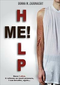
JF: Brutal but effective. Although I’m not a fan of the “crossword” style title, this cover honestly reflects the content.
Earl Mathis submitted Table Fables – Bukosi, King of the Ants designed by Misa Jovanovic. “Table Fables is a collection of original stories told around the kitchen table by the author to his two young daughters to import life lessons, values, and to inspire their imagination. The cover depicts animal characters that come together to tell these stories.”

JF: A charming cover, but I think it would be even better if you changed the color of the rule from black to something softer.
Erik Carter submitted Stone Groove designed by Erik Carter. “I noted that protagonist-running/walking-away-from-the-viewer covers were doing extremely well in my genre, so that’s how I approached my redesign. When searching for images, I ran across this fantastic photo of a decrepit, rotting dock, perfect for my story and for the thriller genre in general.”

JF: Well done.
Flavio Verna Santonocito submitted Pnaramakhia designed by Nicoleta Stavarache. “Pnaramakhia is a psychological steampunk/thriller. The three main characters are linked together in their strive to emerge from the claustrophobic maze they are trapped in, fleeing from the claustrophobic horrors hiding in the dark around them.”

JF: A dark and nightmarish cover, but I wonder if people will be attracted by the depersonalized figures representing the characters? Definitely claustrophobic.
J.D. Martin submitted The War-Bringer designed by Maurojaurenart. “The cover illustrates an arrow that is composed of blue energy that is formed when the bowstring is pulled.”
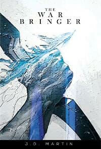
JF: A dynamic illustration that doesn’t need the black band at the bottom, and although it’s great, it shouldn’t be allowed to push the title into insignificance.
Jacob Stull submitted The King’s Locket designed by Irene González Frizzera. “Irene drew the illustration by hand, then used ink and watercolor to beautifully finish the unique piece of art. She then used photoshop to design the final e-book cover.”

JF: The illustration style is interesting, but there are way too many elements, characters, ornaments, lines, and so on on this cover to present one, unified offer to the reader.
Jade Zivanovic submitted The Bus Blogger designed by Steam Power Studios.

JF: I like everything about this very hip cover… except that white box. Maybe it’s just me?
James Egan submitted Pursuit designed by James T. Egan of Bookfly Design.

James Egan submitted Dark Descent designed by James T. Egan of Bookfly Design.
JF: A solid action/thriller cover with the one detail—the figure in the lenses of the binoculars—that brings it all together.

JF: Another winner, with distinctive type and interesting contrast between the girl in “cool” colors and the inflamed surroundings.
Julia Byrd submitted Gray Places designed by Elle J Rossi.

JF: Way too much going on, causes visual “noise.”
Ken L Gould submitted Death’s Grip designed by Ken L Gould.

JF: Doesn’t actually look like a book cover to me.
Kevin Flanders submitted Burn Do Not Read designed by Kevin Flanders & Brandi Doane McCann. “Thank you for your consideration. Kevin Flanders”

JF: Some nice touches, but all the texture etc on the clock face makes it even harder to see the far scene.
Kevin Flanders submitted Gridlocked designed by Kevin Flanders & Brandi Doane McCann. “Thank you for your consideration. Kevin Flanders”

JF: Does the American flag motif mean this is an American problem?
Kim Rutter submitted The Banker’s Wives designed by Kim Rutter.

JF: Could be a strong photo, but the designer has no idea what to do with it.
Kimberley O’Malley submitted Coming Home designed by Rebecca Pau. “Rebecca did a phenomenal job on this cover! I hope you enjoy it!! Kimberley”

Kirsten McKenzie submitted Fifteen Postcards designed by Katie Waller. “‘Fifteen Postcards’ traverses three continents and two centuries, with one of the key pillars of the story being an Indian Katar – a tiger knife. The title of the book is reflected in the cover – with the aged postcards the story revolves around shown in the background.”

JF: The typography is good, and so is the postcard background, but the 2 other visuals are very uncomfortable (i.e. the juxtaposition of sharp objects and eyeballs) and just seem to be floating in space.
L.J. Kane submitted Snatch Girl designed by SelfPubBookCovers/INeedABookCover. “I wanted a cover that conveyed a dark, suspenseful kidnap thriller set on Dartmoor in the UK and this cover from SelfPubBookCovers just leapt out at me. I chose a stylish font in white to contrast with the dark atmosphere behind it, and I believe it works well.”

JF: Perfectly adequate.
Lacey Dailey submitted Extraordinary You designed by Tristan Shimmons.

JF: Lovely artwork, but the title should stand out more.
Loretta Renouf submitted Her Winter’s Kiss designed by Lorie-Lynn Renouf. “Cover design for this was created with using a background photo given to me by my sister, and i added everything else to it myself.”

JF: Unmistakably self-published, and not in a good way. I suggest hiring one of the great designers who show their work here, it really does make a difference to your sales.
Loretta Renouf submitted Hybrid Wars Book 1 designed by Lorie-Lynn Renouf. “This cover was created by me using photographs that i had taken myself, and added the other elements into it.”

JF: See comment above.
Loretta Renouf submitted Summer’s Heat designed by Lorie-Lynn Renouf. “As with the previous two entries, the background photo came from myself, and added the rest to it afterwards.”

JF: See comment above.
Marisa Shor submitted Garden Of Goodbyes designed by Cover Me Darling.

JF: The motif is interesting, but the title is hard to read.
Marisa Shor submitted Missed Connection designed by Cover Me Darling.
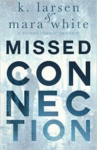
JF: A solid cover in which the title treatment mirrors the idea of the title itself.
Marisa Shor submitted Lucky 13 designed by Cover Me Darling.

JF: A good layout, attractive image and imaginative typography, but all is being washed out by the low contrast.
Marisa Shor submitted Bound designed by Cover Me Darling.

JF: Well composed, and I love the tension between the title and the flowers “holding” it. ★
Mark Dame submitted Dark Ties designed by Damonza.
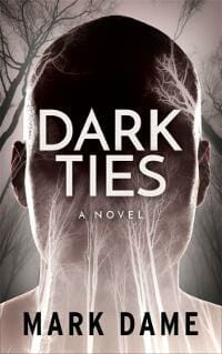
JF: A strong cover with menace and many interesting touches. Notice how the branches change from positive images to negative ones.
Marshalee Patterson submitted Predestined Love designed by Yanique Hamilton.

JF: Awkward and ineffective, and the type is tortured.
Marshalee Patterson submitted The path of the chosen Warriors designed by Yanique Hamilton.

JF: See my comment above, ditto.
Michelle Meraki submitted Twilight of the Empire designed by Michelle Meraki. “Black crystal magic is one of the most dangerous and feared orders of magic in the Empire of Ertera. Sorcerers practising this order of magic can channel their incantations through any object carved from black crystal and have enslaved many to their service by giving them black crystal jewellery.”

JF: Considering your colorful and interesting description, I wonder why the cover is so static and uninteresting. And the combination of the black and white with color graphics is jarring.
Mike Crowl submitted The Disenchanted Wizard designed by Regan Nicholls.

JF: Clever, with a load of story implication in the three faces.
Natasha Snow submitted The Gaia Protocol designed by Natasha Snow.

JF: A lovely composition although I wonder about the font choice for the title, which also appears to be blending a bit too much with the background.
Natasha Snow submitted Peter Darling designed by Natasha Snow.
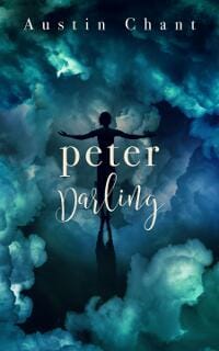
JF: Another good idea, although I wonder if the figure of the boy and the type in the center aren’t both too small, since they seem to be very subservient to the clouds.
Natasha Snow submitted The House Next Door designed by Natasha Snow.

JF: Solid genre cover, and the “doubled” image of the woman is very effective. Type design helps to emphasize the genre, too.
Natasha Snow submitted The Island designed by Natasha Snow.

JF: Adding the sand dollar was a great idea, helping, along with the type that’s integrated with the scene, to set the stage for an interesting read.
Natasha Snow submitted The Gift of Gravity designed by Natasha Snow.

JF: Here the designer has created an evocative tension between the idea of gravity—pulling down—with the upward gaze of the protagonist. Well done. ★
Nicole Fitton submitted Forbidden Colours designed by James at GoOnWrite. “A striking black and white image unlike anything else out there at the moment.”

JF: I agree the image is arresting, but when combined with the title’s emphasis on color, it becomes ironic.
Rena Hoberman submitted Remnants of the Erased designed by Rena Hoberman of Cover Quill.

JF: A well-focused cover, although the type looks a bit attenuated.
Richard Burke submitted Decimation: The Girl Who Survived designed by Michelle N. Arzu. “Decimation is a near future Science Fiction Thriller.”

JF: Some good ideas and interesting type treatment, but the combination of the images has made the large symbol appear to be the woman’s mouth.
Roger B. Burt submitted Gaia’s Majesty-Mission Called: Women in Power designed by Laura Ambler. “A core theme is the importance of the movement to empower women. And, of course, central is our Earth Mother Gaia. The cover is to evoke her presence and prominence.”

JF: A strong image that needs much better typography.
Scott Wilcox submitted BARDS OF FANTASIA: A Poem for Britain designed by Magdalena Adic. “For this sci-fi/fantasy story, I made the logo a bit futuristic for the time-travel setup, then added the shield for a hint of the medieval. The painting is by Magdalena Adic, a magical shipwreck scene from about midpoint in the saga. I studied Joel’s past comments closely for font & detail choice.”

JF: Thanks for being an attentive reader, Scott, but it appears to me that if this cover really communicated its genre you wouldn’t need that big sans serif header up there proclaiming it and you would have cleaned up a busy cover that really needs it.
SE Swapp submitted Clevenger Gold: The True Story of Murder and Unfound Treasure designed by Rob Price. “Thank you for the opportunity to submit my book cover!”

JF: I’m surprised you felt you had to add another noose to the image.
Stacey Coverstone submitted Curse of the Montagues designed by Sheri L. McGathy. “The font and spiraling ribbon used in the title stand out against the otherwise monotone background, complementing each other to beautifully capture the genre and point toward the supernatural story that waits inside.”
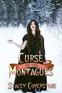
JF: Well, okay.
Stacey Coverstone submitted Lake Tavadora (The Trilogy) designed by Sheri L. McGathy. “The eye is drawn to the lighthouse, seaplane, and boat in this atmospheric cover, causing you to wonder how all of them are related. The shadowed man staring across the lake with his dog on a rickety dock further capture the mystery that lies within the pages.”

JF: I can’t see any connection between the almost fluorescent blue type and the background image.
Stephen Parolini submitted Stolen Things designed by Stephen Parolini. “I commissioned a photo shoot with a gifted professional photographer, Kelly Sauer, who provided me with dozens of great cover options. The final image best depicted the tone of the sweet, sad, slightly creepy story.”

JF: I agree the image is very affecting and could make a great cover, but you would need to hire a designer to put it all together with a type design that actually makes sense.
Sue Copsey submitted The Ghosts of Moonlight Creek designed by James Copsey.

JF: Some nice creepiness here, I think I would have gone much larger with the title.
Susan Wisnewski submitted Road Trip Revenge designed by Jessica Bell.

JF: Good mystery cover that promises lots of thrills. Love that raven, too.
T.G. Ayer submitted Blood Magic designed by Eduardo Daniel Priego.
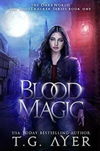
JF: A well thought out cover that will appeal to fantasy fans. Notice how the top of the cover has both blue and red areas that seem to compete with each other, but as you go lower, the color turns to purple—a combination of the two.
Tamsin Ley submitted The Merman’s Kiss designed by Tamsin Ley. “Finding affordable images of mythical characters can be quite a challenge. I purchased this image from Pickyme.”

JF: Seems pretty lucky to find this image of a merman. The type needs an upgrade, it’s not helping the cover much.
Tim McConnehey submitted Bassam and the Seven Secret Scrolls designed by christian fuenfhausen. “Bassam is an epic adventure across the silk route.”

JF: A lovely design that shows us the kind of environment you’ll find in the book. Well constructed, with expert type, the only thing I find unusual is the prominence and sheer amount of space given to the series branding ribbon.
Tony Moyle submitted The Limpet Syndrome designed by Lucas Media. “The artwork process was a collaborative one between author and designer. We started off by discussing the themes of the book and general feel that I wanted. The themes of personality and an analysis of how the main character changes through the book gave us the idea of a mosaic broken glass effect.”

JF: An intriguing cover that makes you want to look at it more closely, like a visual puzzle. It probably works better as a paperback, because at this size it’s just about impossible to make sense of some of the image pieces or how they relate to the whole.
Towfic Kassis submitted Confessions of a Caped Crusader designed by Towfic Kassis.
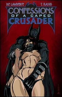
JF: A strong and arresting image, but the type seems to have received much less emphasis, and the overall lack of contrast makes the effect of the title etc. at the top very muted.
Travon Toussiant submitted The Unexpected designed by Travon Toussiant. “Publshished from CreateSpace.”

Victoria M. Patton submitted Innocence Taken – Pray He Kills You Quickly designed by Victoria M. Patton. “I don’t like busy covers or crammed covers. I prefer simple and clean. For me, I think the cover should portray the essence of the book. All my covers for this series utilize the same text and colors.”

JF: Victoria, I tend to agree with you, but in this case the title/subtitle element is very weak and isn’t enhancing the effect of the cover, it’s diminishing it.
viel nast submitted SAVAGE SWORDS designed by ANDERSON1974.

JF: Looks more like a sketch for a cover than a cover itself, and the way all that type is squeezed into a narrow black band at the top is, frankly, painful.
Nonfiction Covers
Al Levi submitted The 7-Power Contractor: Run Your Contracting Business With Less Stress and More Success designed by Dane Low at Ebook Launch. “We were looking for a clean, punchy cover with imagery our service contractor audience could quickly connect with. This cover not only has resonated well with readers it also has provided the foundation/inspiration for a new brand identity, including logo, stationery, apparel, website, and more.”

JF: A simple but sophisticated cover in which the imagery helps to communicate both the promise of the book and its intended audience. ★
Andy Brown submitted Warnings Unheeded: Twin Tragedies at Fairchild Air Force Base designed by Andy Brown. “The background is a Medical Record Clinical Resume of a former airman who committed mass murder at an Air Force hospital after his discharg from the military due to mental health reasons. Highlighted in red “We consider this patient dangerous.” is one of several early warnings that went unheeded.”

JF: But you’re not going to expect us to read that, are you? All that busy-ness in the background does not help communicate, and I’d be surprised if this wasn’t a more effective cover if you just deleted it entirely, or just showed it as a stack of papers.
Cathi Stevenson submitted Leave That Behind designed by Cathi Stevenson. “A simple design on a white background (which I once avoided, but now embrace for its freshness). I don’t use heavy fonts for many of the genres I work with, opting instead to focus on size and contrast for readability.”

JF: A very effective cover, and the white background really fits here. The restrained type helps to emphasize the image. Now if you would just move the author’s name up a bit, it would be even better. ★
donna Stewart submitted Yoga Mama’s Buddha Sandals: Mayans, Zapatistas and Silly Little White Girls designed by donna Stewart.

Jay Perdue submitted Mary not an American woman designed by Jay Perdue.

JF: Got some issues left over from the marriage? This is the kind of cover that the phrase “Over the top” was invented for. And I don’t mean that in a good way.
Lance Pototschnik submitted The Shell of a Person designed by Lance Pototschnik. “This is a memoir about self-discovery, set in the remote, dangerous, and occasionally disgusting environment of a Costa Rican sea turtle conservancy.”

JF: The image is so complex it lacks much impact, and I can’t read the type at the top, so all in all, not so good.
Mercedes Samudio submitted Shame-Proof Parenting: Find your unique parenting voice, feel empowered, and raise whole, healthy children designed by GusTyk (99designs Designer). “Thanks so much for considering my book as a contestant for this award.”

JF: Attractive, with good typography. Needs a border to display properly on white backgrounds like web pages.
Michael N. Marcus submitted Love For & From My 4-Legged Son: How an ordinary golden retriever became an extraordinary dog designed by Michael N. Marcus. “My dog conveniently had a color-matched tower. Title text, dog’s name and author’s name are in Alegreya, a playful face. The y’s descender looks like dog’s tail. Margins of top lines mimic slant of tower roof—needed lots of adjusting. Most text is set in either of 2 colors matched to sky colors.”

JF: The strong type on this cover really helps, but the image creates a lot of visual confusion, starting with the question why most of it is a picture of a tower? A close up or “portrait” of the dog might have worked better and been a more cohesive overall design. Still, a lovely tribute to a beloved companion.
Nikos Dimitriou submitted traveliving | a romantic & practical guide designed by Nikos Dimitriou.

JF: Type-on-photo cover, and as usual with these covers, the image is much stronger than the type.
Paula Johnson submitted Shake Up Your Thinking, Shape Up Your Business: 68 SharpInsights to Attract Customers and Boost Sales designed by Paula Johnson. “Competitive intelligence expert Seena Sharp sent occasional “SharpInsights” to her email list and often got requests for “all of them.” This book is the result. My goal was to show readers that solving marketing problems is a process.”

JF: The clean look and crumpled paper “light bulbs” help to sell this title. Not so sure about the red band, and it needs a border to help when on white backgrounds like this one.
Sally Goodenough submitted Hemorrhoids: A Wife’s Story designed by Sally Goodenough. “A lighthearted look at a painful but not too serious illness. My starting point was a brightly coloured cactus image, but it was too in-your-face, so I created this more muted abstract version, although the cactus is still there. I used a spiky informal font (Kefa) for the author and subtitle.”

JF: I admire the courage to take on a tough subject, and an abstract approach is probably the right one, but I object to the palette, since everything associated with the disorder is hot, itchy red, and painful.
Tina Birkhoff submitted Married to Fibro designed by Tina Marie Birkhoff. “Fibromyalgia is a painful disorder for over 5 million Americans. Family and friends are often lost helping or relating to one with this debilitating pain. The cover reflects the feeling of water, looking gentle it can invoke feelings of drowning, dark fear within and helplessness.”

JF: In this case the typography is good, because it stands out and expresses the pain of this disease, but I fail to see any connection with the placid water.
Tom Pappalardo submitted One More Cup Of Coffee designed by Standard Design. “A jolt of caffeine on a regional coffee tour.”

JF: A really interesting, amusing, and apt graphic approach makes this cover stand out. Too bad the designer didn’t adjust it for ebook use (paperback original) so we could read the subtitle which has totally disappeared at this size. ★
Well, that’s it for this month. I hope you found it interesting, and that you’ll share with other people interested in self-publishing.
Use the share buttons below to Tweet it, Share it on Facebook, Plus-1 it on Google+, Link to it!
Our next awards post will be on June 19, 2017. Deadline for submissions will be May 31, 2017. Don’t miss it! Here are all the links you’ll need:
- The original announcement post
- E-book Cover Design Awards web page
- Click here to submit your e-book cover
- Follow @JFBookman on Twitter for news about the E-book Cover Design Awards
- Check out past e-Book Cover Design award winners on Pinterest
- Subscribe to The Book Designer Blog
- Badge design by Derek Murphy


