I have to confess that my favorite part of book design is creating the chapter opening pages.
Ideally the display typography and any other pictorial or decorative elements you use on the chapter opening pages will reflect the type used in the rest of the book, including the title page. In indie books we have the chance to coordinate the design of all interior elements with the cover design, too.
Here’s what you need to know about chapter openers and part openers:
What’s Included on the Chapter Opening Page?
At a minimum, chapter openers have a chapter number. This minimalist approach is widely used in the design of fiction, where uninterrupted reading is the goal.
This type of break lets the reader know there’s a change in location, a change in time, a change in viewpoint, or some other major change in the storyline.
In nonfiction, chapters indicate shifts in subject matter, as each section of a nonfiction book tackles one specific area of the overall subject. This is true in histories, too, and chapters can be divided in any number of ways.
Besides a chapter number, here are other elements you might find on chapter opening pages, and which you can use in your book, too.
- Chapter title, used by both fiction and nonfiction authors to alert readers to the change that has occurred in the narrative or topic area.
- Epigraph, which is a brief quotation at the beginning of the chapter that represents, in some way, the material in the chapter.
- Ornamentation, hopefully appropriate to the subject and type of the book, but these can include printers’ ornaments, drawings and illustrations, typographic rules, or ghosted-out background elements.
- Chapter contents can be useful in histories or any book with long chapters that cover a variety of people or topics. This is like a mini Table of Contents specific to each chapter.
Emblematic Pages
What attracts me so much to the spirited design of chapter opening pages is the integrative role they plan in the design of the book.
Book covers are in many ways the opposite of book interiors: designed to attract attention and basically say, “Look at me! Look at me!” in the way that readers of such books recognize.
Text pages, on the other hand, seek to get out of the way of the communication between author and reader. Interior book design is self-effacing by its nature.
But there’s a place where both of these aspirations meet, and that’s on the chapter opening pages.
Here we have the opportunity to echo the typography of the cover, if we decide it’s to our advantage. At the same time, each chapter opener also has pure text on it, as the new chapter begins.
When readers hit the end of one chapter, they look forward to the pause and the openness of a chapter open. Each is filled with the promise of more of the story that will be revealed, and the white space on chapter openers gives us a moment to contemplate where the story has been, and where it might be going next.
Chapter Opener Decisions
There are two separate decisions you need to make when you set up your chapter opening pages, and these can radically affect how your book paginates and, therefore, how much it will cost to print.
The first has to do with single page versus double page (spread) chapter openers. Most books use only one page to delineate a new chapter, but there are times when authors or designers want to use a pair of pages in a two-page spread for every chapter.
Usually this means there will be a graphic of some kind on the left-hand (verso) page, and the text of the chapter opener on the right-hand page (recto).
There’s no problem doing this if you have the space in your book, since it will require an additional page for each chapter opening, and if you have a lot of chapters in your book, that will add up.
The other situation this will create is that about half your chapters will end up with a blank right-hand page just before the two-page spread. This is not a good thing, and it’s important that you put something on that page, even if it’s an ornament, or the heading “Notes” at the top. Just don’t leave it blank.
The second question you’ll need to solve is whether to start each new chapter on a right-hand page. This is standard in nonfiction books, but that’s just a convention. If you look at the books in your own collection, I’m sure you’ll find the majority of nonfiction books start their chapters on a right-hand page.
In fiction, it’s much more common to start the new chapter on the next available page, whether it’s a right or a left. The reasoning here is that we are most concerned with keeping the reader reading, so creating less of an interruption works toward that aim.
Whichever scheme you pick for your book, just make sure you do the same thing throughout so your book stays consistent.
On a side note, there are also books where new chapters start on the same page on which the last chapter ended. But I find that most books use one of the two plans detailed above.
A Word About Part Opening Pages
When books have parts as well as chapters, it makes sense to design the chapter opening pages first. In most cases part openers are simplified versions of the chapter opener, but usually without any text, just a part number and a part title. If the chapter openers are ornamented, the part openers should also be ornamented in a similar, if simpler, style.
Examples of Chapter Openers
The best way to see the amazing variety of designs and style we can incorporate on our chapter opening pages is to have a look. Here are a few samples. You can see a lot more in the template gallery at Book Design Templates, where the chapter opening pages, more than anything else, work to define the various designs.

This chapter opener uses a chapter number, title, epigraph, and individual sections of a large map that follows the author’s travels on a sailing journey around the world. (The Boy Behind the Gate, Larry Jacobson)

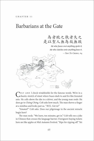
Here’s another chapter opener that uses maps to track the author’s travel around China and includes, in addition to an epigraph, a saying in Chinese. (Double Happiness, Tony Brasunas)

This design, for a book of travel stories, uses art from the region to add a dramatic element to the chapter opening pages. (Exotic Life, Lisa Alpine)

Here’s an example from a history book of a chapter contents page. This page was followed by a more typical chapter opening page, so each chapter required 3 pages for the entire chapter opening sequence. (The Sea Captain’s Odyssey, Marvin Shepherd)

This is an example of a spread (or two-page) chapter open. About half the chapters will create a blank right for the page immediately preceding this spread, so if you use a design like this create an illustration, ornament, quotation, or something else to go on those otherwise blank right hand pages. (50 Shades of Talmud, Maggie Anton)

This chapter opener uses custom illustrations to exemplify each functional section of the book, like the hands here. They were repeated, much smaller, in the running heads. (The Ultimate Guide to Singing, Gregory Barker, TC-Helicon)

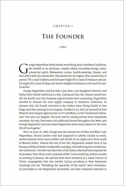
This is a part opener for a large history of a West coast university. Photos from the campus were enlarged and ghosted to create a graphic background for each part of the book. Below is the chapter opening page, using the same typography but emphasizing the text. (Quest for Distinction: Pepperdine University in the 20th Century, W. David Baird)

As you can see, as long as your design approach and graphics are appropriate to the content of the book, you can create all kinds of designs for these display pages. Decorative fonts, extra content, and interesting and useful graphics all make title pages that your readers will love.


