Regardless of how long you’ve been writing or publishing books, I’ll bet you’re making at least three of the Top 10 author website mistakes I see often.
These missteps are so prevalent that I now do a quick review of every website when authors hire me for consulting—even if they don’t ask for my opinion. What good are my book marketing recommendations if the website falls short of the minimum standards a journalist or visitor will expect?
Fortunately, most of these mistakes have a quick, easy fix. Use this checklist as you review your own site.
Here are the top author website mistakes commonly seen:
Mistake #1: You don’t own your domain name.
If a web designer built your site, don’t assume you own the domain name. They might have used their own credit card to buy it, and added the fee to your invoice. If they die or disappear, you might have to incur mountains of paperwork to get the ownership transferred to you.
Here’s the worst part. Get on their bad side, and they can close down your website in an instant.
Find out who owns your site by going to WhoIs.Icann.org and typing your domain name into the box. Make sure it says that you are the owner or registrant. You can designate anyone else as administrator, billing, or technical contact.
Mistake #2: Your website gives no clue about what you write or do.
On my homepage, it says, “If you need free publicity for a product, service, cause, or issue, you’re in the right place.”
My author client, Dr. Kevin Haselhorst, is an expert in palliative care, a difficult topic to explain quickly. Here’s how his homepage explains what he does and how he helps people. Notice he mentions the target market, which I’ve highlighted in yellow. His explanation of palliative care is in green.

Mistake #3: Your author photo is buried at the bottom of the homepage, on an internal page, or it’s missing entirely.
Promote yourself as if you’re already a celebrity. That means your photo should be everywhere, especially on the top half of the homepage so visitors can see it immediately. And please, smile! In Dr. Kevin Haselhorst’s photo above, notice the stethoscope draped around his neck—an appropriate prop.
Mistake #4: No opt-in box for capturing email addresses.
If you aren’t collecting email addresses from people who visit your website, you’re leaving leads and money on the table. Consider offering an enticing freebie that’s more than just the standard sample chapter, or a free ebook.
For nonfiction fiction authors, consider:
- A video series that explains how to solve a problem that’s tied to your book.
- A cheat sheet or checklist.
- A valuable list of free resources whether they’re from you or from others.
- An infographic that gives step-by-step directions.
For fiction authors:
- Fun, quirky facts about your novel’s locale.
- A missing chapter from a book you’ve already published, especially if the book has sold well.
- Instructions on how to do something that’s tied to the topic of your book. For example, a children’s author might offer a handy PDF that explains how to make a Halloween costume so children can dress up as the book’s main character.
Mistake #5: Hidden or missing contact information.
Every page of your website should include some way for readers to get in touch with you.
If you don’t want email messages to come into your primary email account because they might get lost, create a secondary account and check it daily. You may also want to create dedicated professional social media accounts instead of connecting with readers on your personal accounts.
If you use a contact form, that’s fine. But give visitors the option of emailing you from their own email account.
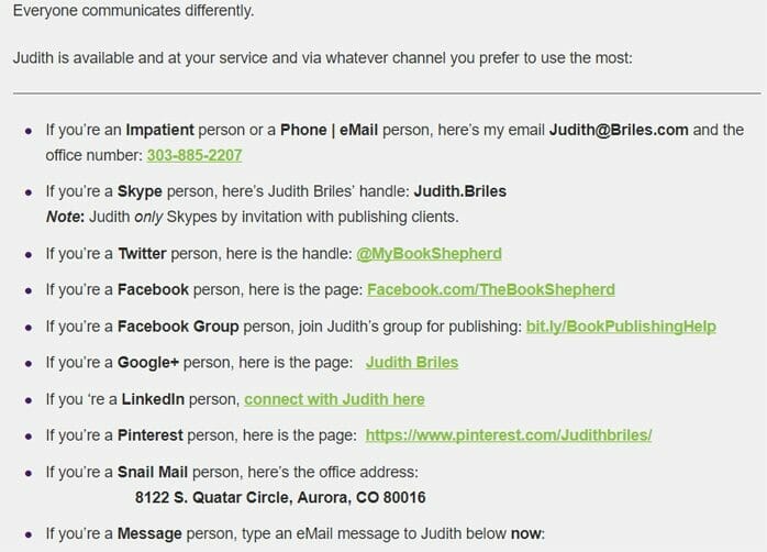
Book Shepherd Judith Briles, whose guest posts appear on this blog, has the best contact page I’ve seen. She gives visitors more than a dozen ways to reach her. I love the short video in which she encourages people to contact her.

Mistake #6: Your email address doesn’t include your domain name.
Sad but true: 9 out of 10 author email addresses I see don’t include the author’s domain name. Instead, the email addresses are from AOL, Hotmail, Yahoo, Gmail, or the author’s Internet service provider. Example: [email protected]. This screams, “I’m an amateur and I don’t know how to market myself.” It also screams, “I’m cheap.”
If you don’t have a website yet, buy a domain name for less than $10 a year, and make that part of your email address. Then build a simple website, pronto, and expand it as needed.
Mistake #7: Your website doesn’t have a strong sales page for your book.
Give buyers as many options as possible. Some people don’t like Amazon and would rather buy directly from you. That means you need a strong sales page that gives them everything they need to know and explains why they should read the book.
Mistake #8: Navigational buttons that lead to error pages.
When I consulted with an author client several months ago, at least three of the navigational buttons on her homepage had bad links. She was horrified. And she never would have known that had I not reviewed her website without being asked.
Mistake #9: A homepage that fails to mention your expertise.
An author without expertise in one or more topics is just one of millions of authors who are competing for readers’ time and money. But an author who promotes herself as a subject matter expert becomes more credible in the eyes of readers, meeting planners, the media and potential joint venture partners.
Even fiction authors can become experts, especially those who do a lot of research before writing.
A romance author might become an expert in women who marry after age 70. A Civil War novelist can offer valuable expertise on Civil War clothing or weaponry. A mystery writer can become an expert on tools used in crime scene investigations.
You don’t need to know every nugget of information on these topics, just enough to answer questions intelligently and speak extemporaneously on it. Continue to build your expertise after your book is published.
Mistake #10: A website that isn’t mobile-friendly.
Have you called up your website on your mobile phone? Or a tablet?
According to official Google statements, more than half of search queries globally now come from mobile devices. That’s why Google punishes websites that aren’t moble-friendly by lowering their SEO value.
Bonus Mistake #1: Not knowing how to make basic changes to your website.
If you rely solely on a techie to everything for you, you could find yourself in hot water if she gets hit by a truck tomorrow.
Do you know the password for logging into your site?
Do you know how to correct simple errors on pages?
Do you know how to add photos?
WordPress sites are fairly easy to learn and manage, thanks to the thousands of free how-to videos on YouTube. Pay for a few hours of consulting with your web designer who can walk you through some of the simpler tasks.
Bonus Mistake #2: Not knowing how to use your computer.
Know how to clear the cache.
Learn how to store content in the cloud.
Understand your options for sending big files, like videos. I recommend WeTransfer.com. It’s free for files up to 2 GB, and you don’t have to create an account.
Now, go back through this list and tally up how many mistakes you’ve made. Fewer than three? Congratulations. Fix them, and you’re good to go.
If you’ve made more than three, find a reasonably priced techie to help you. The best way is to ask for recommendations in groups like LinkedIn and Facebook.
Photo: BigStockPhoto


