Welcome to the e-Book Cover Design Awards. This edition is for submissions during January, 2018.
This month we received:
47 covers in the Fiction category
26 covers in the Nonfiction category
Guest Judges
 I’m very pleased to welcome the team at Deranged Doctor Design to The Book Designer as guest judges this month. Deranged Doctor Design is a media and graphic design studio that has specialized in book cover creation since 2014. With five senior cover designers (each specialized in a specific genre), three supporting designers (in charge of promo materials) and two project managers (in charge of project management, booking and client communication), they have designed over 2,000 book covers and more than double that number of promo items.
In addition to book cover and promo material design, from 2018 they also provide book cover animation. To read more about the company and what they offer, you can visit them at www.derangeddoctordesign.com, and follow them on Facebook, Twitter or Pinterest.
Comments, Award Winners, and Gold Stars
I’ve added comments (DDD: ) to many of the entries, but not all. Remember that the aim of these posts is educational, and by submitting you are inviting comments, commendations, and constructive criticism.
Thanks to everyone who participated. I hope you enjoy these as much as I did. Please leave a comment to let me know which are your favorites or, if you disagree, let me know why.
Although there is only winner in each category, other covers that were considered for the award or which stood out in some exemplary way, are indicated with a gold star: ★
Award winners and Gold-Starred covers also win the right to display our badges on their websites, so don’t forget to get your badge to get a little more attention for the work you’ve put into your book.
Also please note that we are now linking winning covers to their sales page on Amazon or Smashwords.
Now, without any further ado, here are the winners of this month’s e-Book Cover Design Awards.
e-Book Cover Design Award Winner for January 2018 in Fiction
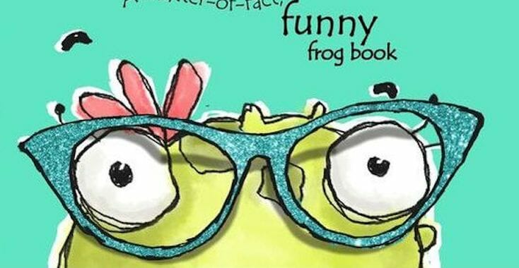
Monique Piscaer Bailey submitted Ed. A matter-of-fact, funny frog book designed by Monique Piscaer Bailey. “I really wanted to keep the cover for Ed super simple, clean and fun. Here it is. ..”


DDD: A wonderful illustration and a fun book cover; I would definitely pick this off the shelf as it transmits such a positive message. Beautiful and unique.
e-Book Cover Design Award Winner for January 2018 in Nonfiction
Chuck Miller submitted Discovering Love Online: Love May Be Closer Than You Think designed by André Jolicoeur. “In the Prologue of the book, I tell the story of Brett and Brianna, two lonely singles seeking love online. In actuality, the tale is about how my wife and I met, and the caricatures on the cover of Brett and Brianna are actually the two of us. They are the Discovering Love Online brand.”

DDD: A positive, eye-catching and captivating cover with top-notch illustration. There is absolute parity between the content and the cover.
Fiction Covers
Adam Bender submitted The Wanderer and the New West designed by Ben McLeod. “I wanted a pulp or graphic-novel style that would tell readers my Dystopian Western would be fun, dark and modern. I found Ben Mcleod through Reedsy, and thought his gritty, epic style was the perfect match.”

DDD: We like the stencil-style art employed here by the designer, but we’re not sure that the composition communicates a dystopian element. While it does represent an adventurous departure within the genre, aiming for an effect so out of the ordinary might not bring the desired result. We feel that readers might not instantly recognise this as a dystopian western.
Alex Bernstein submitted Miserable Adventure Stories designed by Alex Bernstein. “Cover is a montage designed by the author using Photoshop. Wanting a pulpy feel for the cover, we went to the source: public domain pulps from the last century. A special section in the book discusses the pulps and authors referenced, and websites where readers can learn more about the pubs.”

DDD: We love the retro feel here. However, the author’s name should be larger, and without the yellow stripe behind. The way it’s presented makes it look like afterthought.
Alexandra Brandt submitted Exile designed by Alexandra Brandt. “My first time designing a near-future post-apocalyptic disaster thriller cover.”
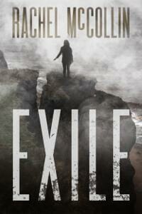
DDD: A very strong genre cover, with great font choices. The impression is highly professional. Perhaps showing more of the ‘disaster’ (ruined buildings and so on) would make it even more recognizable as a post-apocalyptic disaster thriller.
Alexandra Brandt submitted GROND: The Blitzkrieg designed by Alexandra Brandt. “Second in Sci-fi YA adventure series. The author had very specific wants/needs I tried to incorporate into the larger series design.”

DDD: Both the art and the chosen fonts communicate the genre very well. When an author has exacting requirements in terms of composition and wants these followed precisely, it usually doesn’t result in good cover. This is an exception to that rule. Congratulations to the designer who managed to deliver an effective, professional-looking cover in spite of the strict guidelines.
Amanda Jay submitted The Other One designed by Rommel Arumugam.

DDD: A great idea, using vivid, vibrant colours. The two main elements really jump off the page. The author’s name needs to be larger.
Amber Feldkamp submitted Secrets of Winter designed by Amber Feldkamp.

DDD: Another strong genre cover, creating a solidly professional impression on the whole. It might be a little too dark; the aspect overall is rather subdued.
Casey Millette submitted Cursed: The Hunter Inside designed by The Parliament House Press.
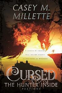
DDD: We love the font choice for the title, and the idea behind the composition is great. With a little more polishing this would make a fantastic cover. The author’s name should have been a little smaller because it appears to compete with the title.
Christina Michaels submitted Caught: A Historical Romance designed by Elena Karoumpali (L1graphics). “The cover matches the plot: the female lead (hat lady) takes revenge by having ships sunk. I asked for bright contrasting colors; the sunset/fire and the sea provide an eye-catching blue/orange. I did not want a visual break between the front and back cover. Note how her shoulder becomes the alley.”

DDD: A charming cover, on which the composition is first rate. Each element stands out incredibly well. ★
Dan Van Oss submitted Watching Glass Shatter designed by Dan Van Oss.

DDD: A confident genre cover, with superb text layout and font choice. The overall effect is quite good, but somehow it lacks a specific focal point (perhaps the red leaves should only appear on the upper part).
Dan Van Oss submitted Endangered designed by Dan Van Oss.

DDD: This cover and the next (Last Word) belong in a series, but apart from the subtitle (and title font) nothing connects the two. The composition as well as the overall feel are entirely different. Consistency, a must in series design, is not in evidence.
Dan Van Oss submitted Last Word designed by Dan Van Oss.

Donna Huston Murray submitted For Better or Worse designed by Alex Albornoz. “The designer lives in Venezuela. She found Eduard Moldoveneau’s photo of Philadelphia’s landmark Boathouse Row online. Luckily, I found him in NJ and was able to purchase the license. My series is set on Philadelphia’s “Main Line.””

DDD: A cosy mystery such as this requires a much lighter cover composition. The sky and the water are too dark. The font choice/treatment for the title looks too plain.
Drew Black submitted Deceased and Residing in Oakland designed by Adrian Doan Kim Carames.

DDD: We really like the retro feel here. Great title font choice. Pops out nicely.
Erin Michelle Sky submitted The Wendy designed by Benjamin P Roque. “This was a 99designs contest, paid for by our writing patrons on Patreon. Our patrons chose B-Ro’s design by a landslide.”

DDD: A disturbing cover. Not sure what’s going on in terms of the action depicted. What’s the second man doing in the girl’s hair? If this was an attempt at the ‘double exposure’ technique, then it wasn’t executed successfully. Having just the girl on the cover would be a much better option. That said, the title design is good.
francheska fifield submitted Kemp designed by Lola Kyle. “It is part of a series so the font was an important decision since it had to work for every book in the series, each with a new plot and added characters. The cover was to represent one of the characters most important in this particular book in the series and the explosive changes that take place.”

DDD: The guy makes for a good focal point, but the two flourishes above/below the subtitle are too strong and draw the eye away from this main feature. The dark inner shadow/glow effect makes the title blurry and less readable, and should be removed.
Ibidun O. submitted Qualiteria High designed by Ibidun. “The eBook cover is composed of flowers. The eBook cover can be considered as a logo.”

DDD: This might work as a logo, but not really as a book cover. The author should consider browsing other titles in the genre, and book covers in general.
Ivy Logan submitted Broken designed by Mario Teodosio. “The cover reflects the fragility and and strength of Talia.In her final fiery confrontation with the dragon her face reflects a myriad of emotions- determination to protect the ones she loves, to avenge the family she lost, her resolve to do the right thing and also a degree of trepidation.”
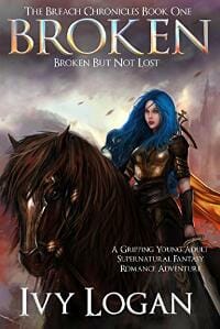
DDD: An exceptional cover with a fantastic illustration. This has the feel of a best-selling work of Epic Fantasy.
J. C. Plummer submitted Robin Hood’s Dawn (The Robin Hood Trilogy Book 1) designed by Damonza.
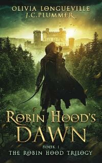
DDD: A remarkable cover. All elements blend together seamlessly, demonstrating particular attention to detail. ★
James Egan submitted Kraken and Canals designed by James T. Egan of Bookfly Design.

DDD: The composition is outstanding, elements merge well, and the font choices suit the genre flawlessly. We expected nothing less from Bookfly. ★
James Egan submitted Sworn to the Night designed by James T. Egan of Bookfly Design.
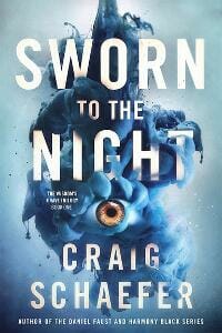
DDD: A disturbing cover, but this is its strength! It draws you in and makes you want to grab the book off the shelf. This is a cover to leave an impression on everyone.
James Egan submitted Rain Dance designed by James T. Egan of Bookfly Design.
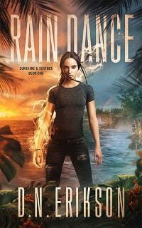
DDD: Wonderful colours and contrasts. There is an action feel, even though the main character’s not in motion. The palm leaves lend depth, and it’s generally evident that a great deal of thought was invested in composition. Outstanding attention to detail.
Jessica Lynch submitted Don’t Trust Me designed by Jessica Lynch.

DDD: This is a good thriller/mystery cover. A simpler title font would make it more readable.
Karen Dillon submitted Immortal Souls designed by Karen M. Dillon. “The image of the girl on the cover was digitally drawn using Photoshop CS5. The image colouration was then altered and a coloured smokey overlay was added to the image for effect.”

DDD: The subtitle is not readable and the cover doesn’t communicate the genre very well, though the illustration itself is good ( but it looks blurred somehow).
Keegan Kozinski submitted The City of Locked Doors designed by Keegan Kozinski.

DDD: An unusual and interesting design which is let down by bizarre text layout and title treatment, making it hard to read.
Larry Feign submitted The Fantastic Flatulent Fart Brothers Save the World! designed by Larry Feign. “With so many words on the cover–heading, title, subtitle, author, illustrator–and needing to represent so much action in the book, it took several tries before the illustrator and I got it just right to achieve a balanced yet wild and funny look.”

DDD: A wonderful illustration. We love the excitement and adventure it conveys. Not sure about black as the colour for the title on a children’s book.
Mallory Rock submitted The Ghost King designed by Mallory Rock.

DDD: A good idea but it could have been executed more effectively. Some kind of texture for the background would work much better than the plain gradient. Concentrating on either the crown or the axe would be better than featuring both.
Martin McConnell submitted Viral Spark designed by J. Austin Dellamano. “Those eyes. We went over the honeycomb pupils and lightning sparks about 60 times before we were happy with the result.”

DDD: The placement of the author’s name is peculiar and unnatural, making it hard to read. However, it does communicate the genre.
Matt Beighton submitted The Spyglass and the Cherry Tree designed by Matt Beighton.

DDD: An astonishing and captivating illustration which makes for a captivating cover. The title could be a little more readable.
Melissa Futrell submitted A Soldier’s Crest: The Dragon Knight Chronicles designed by Melissa M. Futrell. “The author wanted a dragon that also featured a woman warrior that was presented in his prequel to “A Soldier’s Crest”. The cover was created on Adobe Photoshop.”

DDD: The title treatment works well for the genre but the cover itself seems rather flat, in that nothing leaps out. Overall it’s so dark that you really have to look closely in order to discern what’s going on.
Michael Sussman submitted Incognolio designed by Juan Padrón. “I sought a cover that was as unconventional and mysterious as my novel, with several key elements: A book-within-a-book, a human eye to symbolize curiosity, and a mirrored title to emphasize the self-reflexive narrative and through-the-looking-glass absurdity of the tale.”

DDD: The idea behind the cover is great, but from a technical angle it should have been executed better. The text positioning is interesting, and we understand the underlying intention, but the result is that the title is unreadable.
Misty Beller submitted The Rancher Takes a Cook designed by Kirk DouPonce.

DDD: We really like this cover, and the light effect is impressive. Everything is right where it should be.
N.T. Sexton submitted The Saving Race Manuscript designed by Barn Owl Book Designs (N.T. Sexton). “This cover was designed by me (the Author of the book) under a book design company that I started for my own book covers.”

DDD: The overall composition is strange. Font choice and layout are not appealing and the randomly-placed letters lead to confusion. This needs more work.
Pamela Rose Castle submitted The Subjects, Aim designed by Dale Pease. “Twin girls are captives in a lab, although identical in looks & upbringing, the book explores how their choices shape them. The cover shows this as they are making the same gesture, but one reaches out with rage & destruction, the other openness & curiosity.”

DDD: Good font choice. If the blending of the characters into the background had been executed better, the overall impression would be more positive.
Raymond Carroll submitted Only Raising Dust On The Road designed by Raymond Carroll. “Part 1: Buckfast, Lager & Fags – Thailand beach scene with Buddha, bottle of Buckfast, bottle of Chang (Lager), and pack of Marlboro cigarettes (Fags).”

DDD: A very amateurish-looking cover. Despite the many elements combined, it essentially communicates nothing. We would strongly advise hiring a professional cover designer or illustrator.
Robert Banacek submitted A Serene Violence designed by Banacek/goonwrite.

DDD: A good thriller cover, but we would like to sense more danger (perhaps a fiery orange sky would have been a better choice).
Ronil Caine submitted Mr. Franklin’s Secret designed by Ronil Caine.

DDD: An exceptional illustration and a cover that looks professional, but it seems more suited to a fairy tale than a sci-fi mystery book.
Ruben Stelliswolfe submitted Eternity’s War designed by Rebeca Covers.

DDD: A solid genre cover, but a little too dark. The word ‘War’ is not suitably readable.
Stacey Harris submitted Echoes of Darkness designed by Mikio Murakami. “This design by Mikio Murakami of Silent Q Design (https://www.facebook.com/SilentQDesign/) perfectly captured what we wanted to convey: “It’s a collection of horror stories reflecting on the darkness of the human soul. And it’ll scare you.””

DDD: A great idea, but the composition is found lacking. There’s too much empty space around the edges. Also, the main focal point (the reaper) is not distinguishable, especially at thumbnail size. The title design is great, but needs to be bigger.
Stephanie Barnes submitted Dark & Darker Faerie Tales designed by Stephanie Barnes. “The designer created this front cover based on the dark fairies in my e-book. I gave her the idea of having a fairy with specially designed wings but she was responsible for the eerie grin, as soon as I saw it, I loved it!”

DDD: The idea is good, but it’s been poorly executed. The faerie is not recognizable. Overall, the cover suggests that this is a self-published book.
Sudhir Singh submitted INTRIGUE:The Mystery Of Last Wish designed by Sudhir Singh. “Something had flashed in eyes of Priya, “Shanti, my dearest friend, you remember, there is a framed hand -embroidered photo of a roaring lioness done by you many years ago, hanging on the wall of central room?”

DDD: Even though the hand-embroidered tiger is pleasing in and of itself, a photo of this for the book cover seems ill-advised.
Tanni Hernandez submitted Secrets of PEACE designed by T. A. Hernandez. “I wanted to go with a somewhat minimalist cover design and limited color scheme for this book, the first in my new adult dystopian series. It fits the gritty nature of the story and some of the themes it explores.”

DDD: For what is essentially a minimalist approach, this has too many details, and these make it difficult to distinguish between the various elements. In addition, the design is generally ill-suited to a dystopian novel.
Tatiana Vila submitted Servant of the Skull designed by Vila Design. “Entrancing and mysterious.”

DDD: We love the atmosphere here, but more work needs to be done in blending the elements.
Todd Leton submitted A Cold Blooded Rain designed by T. R. Leton. “Each book in series will have same look with different backgrounds and color shadings.”
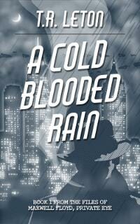
DDD: We love this. It has a strong ‘Sin City’ feel. Introducing a little more colour/contrast would lend it greater depth.
Valerii Titov submitted CORRIDORS part BEFORE thriller romance designed by Germancreative. “‘Corridors’ takes readers along a thriller style road towards Armageddon with three key characters holding the pieces to the puzzle that can save millions of lives.”

DDD: A strong genre cover with great colours. The title design is superb.
Valerii Titov submitted GIFT designed by Valerii Titov. “The story is a fiction about a dog named Shon (named after my own dog), an American Stafford who finds love and happiness with his owner and friend Jerry.”

DDD: From the cover, it looks as though this is a military action novel, and not a book about the dog. The man in the uniform currently serves as the main focal point, and the dog is secondary. Also, the overall effect is too gritty for this type of book, for which pastel shades and reduced contrast would be more fitting. Overall, neither the composition nor the finish are suitable for the genre.
Veronica Dale submitted Time Candle designed by Christa Holland. “This is book three of the four-part series Coin of Rulve. Christa Holland from Paper and Sage has designed the same frame for all four books. It incorporates symbols important to the story arc, such as the open hands, three stars, and the leaf and flame.”

DDD: This features some fine elements (the frame, the small candles and an appropriate choice of fonts) but overall execution is found wanting. The faces appear overly generic.
Nonfiction Covers
Annette Murray submitted Buying Your First Boat designed by Sticky Earth Books. “This cover is very different from the others in this nautical genre. I hope this difference helps it stand out in a sea of blue photographs and that readers will take a chance and click “Buy” on this boat buying guide.”

DDD: Definitely different, and very eye-catching. Not sure how it will compete with other books that have the same theme but more ‘standard’, photo-based covers.
Brigid P. Gallagher submitted Watching the Daisies – Life Lessons on the Importance of Slow designed by Rob Williams. “I am a passionate organic gardener, whose main life lesson has been to slow down and learn to “watch the daisies.””

DDD: Very professional, with a great choice of colours. The largest yellow flower works brilliantly in the way it catches the eye. The cover as a whole will certainly attract readers.
Cathi Stevenson submitted Beyond Cancer designed by Cathi Stevenson / BookCoverExpress.com. “As always, the challenge with this cover was that it look similar to its contemporaries, but still offer something fresh, so it stands out from the crowd. In this case, I used the bright colours of foods mentioned in the book, and chose a font that was not quite traditional.”

DDD: An expertly-executed cover where plenty of attention has been paid to details and font choices. The subtitle would be more readable if a lighter shade had been chosen. ★
Christine Dillon submitted Stories aren’t just for kids: Busting 10 myths about Bible storytelling designed by Joy Lankshear.

DDD: This is too dark. At thumbnail size it appears to be little more than a large black rectangle with some text (the figures are indistinguishable).
David Gaughran submitted Let’s Get Digital: How To Self-Publish, And Why You Should (Third Edition) designed by Alex @ 187Designz. “I think Alex @ 187Designz deserves huge credit for this rebranding project, completely reinvigorating what was a tired-looking series.”

DDD: A cover that’s pleasing to the eye and represents the content effectively, but which might not be striking enough to stand out from the crowd when it comes to other books with the same subject.
DAVID L. HAASE submitted HOTEL CONSTELLATION: Notes from America’s Secret War in Laos designed by Damon Freeman. “I needed the design to address five issues: * 1. Laos and its proximity to Viet-Nam * 2. Viet-Nam War * 3. Secret / hidden nature of the war in Laos* 4. Danger * 5. Coming of age. Damon nailed it. Thank you for your consideration.”

DDD: Everything on this is just right – the choice of font, the colours, and the grungy aspect, as well as the strategically-positioned censor stripes over some sections of the text. An excellent cover that entirely suits the book. ★
Indie Designz submitted How I Became My Father…A Drunk designed by Indie Designz. “Author wanted a simple design that would catch the reader’s eye.”

DDD: The author requested a simple and eye-catching design, and the designer succeeded in providing just that.
Karen Anderson submitted The Amazing Afterlife of Animals, Messages and Signs From Our Pets On The Other Side designed by James Ryan. “I’m really excited about this book and the cover design! Thank you for your consideration”

DDD: A charming photo, and a cover that succeeds in conveying a feeling of warmth. A tremendous match for this work.
Kashonia Carnegie submitted What is Love and the Rise of Feminine-Energy designed by Adapted from the original design by Chris Bull. “The ROUND image of the rising MOON over the WATER (all symbols of the feminine) represents the rising feminine-energy. The border line remind us that the feminine also contains aspects of the masculine-straight lines & sharp corners being symbolic of masculine.”

DDD: Although we love simplicity, too much white space makes it appear that this cover is unfinished. Also, it’s inadvertently reminiscent of a CD case.
Leah Forney submitted Unapologetically Me: Living, Owning, and Walking in my truth designed by Ruth Griffin. “Unapologetically Me is a non-fiction memoir that tells the story of a young woman and her journey from being raised in a broken home, surviving rape, and turning her life around through counseling and her relationship with God.”

DDD: A delightful photograph of the author, through which her positivity shines. That said, the cover concept (a photo cut with a blue space) is not good. With a better approach and a more professional treatment of the text, the author’s photo would work well as a cover. The way that it’s presented here is amateurish in the extreme.
Mar Sanchez submitted Syzygy designed by Pere Ibañez.

DDD: We love this spooky and striking cover. The pink title contrasts brilliantly with the black and white artwork.
Rachel Capps submitted Spades of Determination designed by Rob Munro. “The shoot sprouting from desolation symbolises the starting of my life again after a catastphic stroke. The “RC” design (just small in 2 places) is the tattoo design 4 friends got while I was in hospital. The design also represents a butterfly.”

DDD: The butterfly blends into the background a little too much, but we like the symbolism here. The text needs to be more readable.
Sally Watts submitted Blemished But Not Broken designed by Sally Watts. “My husband did the painting many moons ago. The blemished heart stone was something I picked up in my travels, The title came from a blemish an astrologer saw on my hand.”

DDD: A highly attractive cover on which the text is laid out most effectively.
Tatiana Vila submitted Shots of Wit designed by Tatiana Vila. “Light and fun. Clean and simple. I simply love this cover.”

DDD: Simple and clean, this cover works well given the subject matter.
Thomas Surbaugh submitted Miracle of Hominy Falls designed by Thomas Brian Surbaugh. “The cover depicts a trapped coal miner with a solemn look on his face after being trapped for ten days. The color scheme gives a dark, coal mine feel and I gave it a gold border to symbolize the upcoming golden anniversary of this true event. The shadows give a feeling of a cramped space.”

DDD: An outstanding cover design. The emotions captured in the photo are so strong that one cannot look away.
Well, that’s it for this month. I hope you found it interesting, and that you’ll share with other people interested in self-publishing.
Use the share buttons below to Tweet it, Share it on Facebook, Plus-1 it on Google+, Link to it!
Our next awards post will be on March 26, 2018. Deadline for submissions will be February 28, 2018. Don’t miss it! Here are all the links you’ll need:
- The original announcement post
- E-book Cover Design Awards web page
- Click here to submit your e-book cover (See New Submission limits)
- Follow @JFBookman on Twitter for news about the E-book Cover Design Awards
- Check out past e-Book Cover Design award winners on Pinterest
- Subscribe to The Book Designer Blog
- Badge design by Derek Murphy


