By Joel Friedlander
Welcome to the e-Book Cover Design Awards. This edition is for submissions during July, 2018.
This month we received:
55 covers in the Fiction category
11 covers in the Nonfiction category
Guest Judge
 I’m very pleased to welcome James Egan to The Book Designer as a guest judge this month. James has worked in graphic design for twelve years in the fields of advertising and cover design. For the last five years he’s been designing book covers for independent authors and small presses through Bookfly Design. He’s had the chance to work with everyone from New York Times bestsellers to first-time authors and has won various book cover design awards. He lives with his family and two dogs on the Oregon coast, where he can often be spotted sketching out cover concepts in the sand.
Comments, Award Winners, and Gold Stars
I’ve added comments (JE: ) to many of the entries, but not all. Remember that the aim of these posts is educational, and by submitting you are inviting comments, commendations, and constructive criticism.
Thanks to everyone who participated. I hope you enjoy these as much as I did. Please leave a comment to let me know which are your favorites or, if you disagree, let me know why.
Although there is only winner in each category, other covers that were considered for the award or which stood out in some exemplary way, are indicated with a gold star: ★
Award winners and Gold-Starred covers also win the right to display our badges on their websites, so don’t forget to get your badge to get a little more attention for the work you’ve put into your book.
Also please note that we are now linking winning covers to their sales page on Amazon or Smashwords.
Now, without any further ado, here are the winners of this month’s e-Book Cover Design Awards.
e-Book Cover Design Award Winner for July 2018 in Fiction
Silke Stein submitted Trina Bell’s Humming Summer designed by Silke Stein.
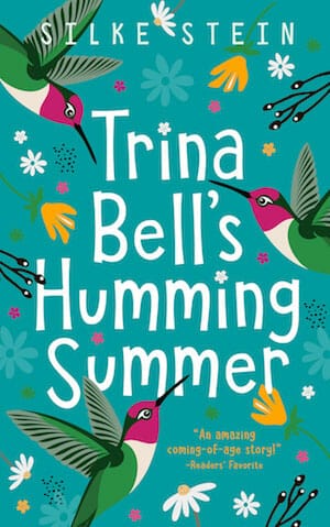
JE: A winner on every level. Takes a simple concept and delivers with close attention to color, composition, balance, and type. Expertly hits genre notes without cheap tricks and looks great at thumbnail and full size. The author has put her graphic design skills to good use.

e-Book Cover Design Award Winner for July 2018 in Nonfiction
Kristen Nichols submitted Work Pray Allow: 21 Days to Uncover Your Buried Dreams and Start Living a Life You Love designed by Mila. “Mila used lighter pinks and purples to subconsciously speak to its target (largely female) audience. The white background also captures the essence of Kundalini Yoga, a style of breath work and meditation used throughout the book.”

JE: A simple concept executed skilfully. Great use of color and blank space to set a relaxed, airy mood. Lots of subtle details that come together to make a cover that is greater than the sum of its parts. Well done!
Fiction Covers
Andrew McGuinness submitted Anatomised designed by John Oakey. “The cover conveys isolation, danger and time running out, as the figure tips backwards over a cliff, reaching for the gull. The image inspired the tag line ‘When you fall, who will catch you?”. The ‘bulls eye’ represents Lyme’s tell-tale bullseye rash.”

JE: I dig the minimalist concept, limited color palette, and paper texture, but the weight and position of the bull’s-eye take away from the human figure and lessen the perceived height of the cliff.
Ben Cass submitted The Lost Tayamu designed by Bobooks. “The cover features the titular character. He is a Tayamu, a person gifted with the power to command Nature itself, which is why you see fire and water around him, and why he’s vanishing into the air.”

JE: Nice color scheme and some well-done magic effects. The vanishing effect is also well done but has the downside of making the character a little hard to see. Could use a more legible type treatment.
Cora Graphics submitted Fire and Blood designed by Cora Graphics.

JE: Love the concept and the restrained color scheme. The barbed wire gives it some nice dimension and conveys a sense of danger. Subtitle is a bit hard to read, but overall a strong cover that conveys the genre well.
Cora Graphics submitted Il profumo delle rose selvatike designed by Cora Graphics.

JE: Strong photo and colors for a historical romance. The type treatment for the author is solid, but the title could call more attention to itself.
Cora Graphics submitted I sogni non svaniscono all’alba designed by Cora Graphics.

JE: Another nice one from Cora Graphics. The saturated colors and off-kilter angle of the background image give it an energetic, lighthearted vibe.
Darja DDD submitted Starting Over designed by Marushka from Deranged Doctor Design. “Contemporary Romance cover design by Marushka from Deranged Doctor Design, Starting Over Series Book 1”

JE: Communicates the genre with ease. Combining a black-and-white photo with the vibrant powder explosion effect gives this cover a crisp, punchy feel.
Darja DDD submitted Second Chances designed by Marushka from Deranged Doctor Design. “Contemporary Romance cover design by Marushka from Deranged Doctor Design, Starting Over Series Book 2”

JE: Does a good job of carrying over the elements of book one while looking different enough to be clearly distinguishable.
Darja DDD submitted Wager’s Price designed by Milo from Deranged Doctor Design. “Science Fiction & Fantasy, cover design by Milo from Deranged Doctor Design, Soulkeepers Reborn book 1”

JE: A strong kickoff for the series. Uses a handful of textures and magic effects in a restrained way so as not to distract from the character and title. ★
Darja DDD submitted Hope’s Promise designed by Milo from Deranged Doctor Design. “Science Fiction & Fantasy, cover design by Milo from Deranged Doctor Design, Soulkeepers Reborn book 2”

JE: Maintains the look of the series with some subtle color shifts to differentiate it from book one.
Darja DDD submitted Lucifer’s Pride designed by Milo from Deranged Doctor Design. “Science Fiction & Fantasy, cover design by Milo from Deranged Doctor Design, Soulkeepers Reborn book 3”

JE: Keeps the train rolling, this time using a cool glyph magic effect and echoing the green from the title bar in the background.
Darja DDD submitted The Tally Master designed by Milo from Deranged Doctor Design. “Epic Fantasy cover design by Milo from Deranged Doctor Design”
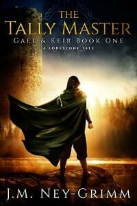
JE: Good use of the silhouetted hero trope, though the title could call more attention to itself. Love the lighting on the rock in the foreground.
Deborah Coonts submitted The Complete Lucky O’Toole Novella Collection designed by Glendon of Streetlight Graphics.

JE: Combining the neon icons from the covers of the contained novellas is a nice approach. It looks kind of cluttered without a dominant symbol as the main point of focus, but still works since the rest of the layout is so uncluttered.
Dionne Abouelela submitted Chasing Eveline designed by Dionne Abouelela.
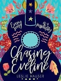
JE: Love the layout and colors of this one. There’s a lot going on here, but the title and tagline don’t get lost in the excitement, thanks to smart use of color. ★
Dupe Olorunjo submitted VOICES designed by Ana Grigoriu. “I wanted a cover that speaks of a young girl handling pressure beyond her years.”

JE: Nice colors and reads well at thumbnail size. Definitely gives off a mysterious, otherworldly vibe.
Elizabeth Kitchens submitted The Rose and the Wand designed by Mi`Enn.

JE: Great color and composition on this one. Also good use of a frame and flying rose petals, complementing a nicely done metallic effect on the title. The author name could be a bigger, but overall it’s striking.
G. S. Jennsen submitted Exin Ex Machina (Asterion Noir Book 1) designed by G. S. Jennsen. “Exin Ex Machina is a far-future cyberpunk novel featuring a hybrid organic/synthetic AI race. With the cover, I wanted to capture the transformational power of a true AI awakening.”

JE: Slick text effect on the title and a good choice of colors for the genre. Looks like the type is meant to be centered, but everything is a bit off to the right. The layout might be more cohesive if the title and author name were closer to the backlit “Book 1” rather than floating around the edges.
Greg Myracle submitted Herbert Butterwinkle and the Sunshine Surprise designed by Agnes Ernoult. “Cover art and cover text/title all hand/custom drawn in studio by Agnes Ernoult – unique blend of colored pencil and watercolor combine to make a very unique and colorful presentation. Thank you for the considerations.”
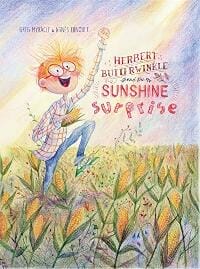
JE: Wow! The art and type are top-notch! Especially love the choice of colors and all the little details in the hand-drawn title. Because of the small size of the type, it loses some oomph at thumbnail size.
Heather Bennett submitted Franken-Fatale designed by Wamberto Nicomedes. “The designer of this cover based his image off a composite design I made as an artist myself. The designer is a comic illustrator from Brazil.”

JE: Love the illustration, especially the chimp. I’m also a fan of the red-black-white color scheme, which gives it a graphic novel vibe. Could use a border or other means to define the edges of the cover against a white background.
HM Clay submitted Garden of Chaos designed by Watch This!. “This is a dystopian science fiction novel that takes place on a college campus (and in the steam tunnels underneath). The setting also has a retro-80s vibe, along with descriptions of brutalist architecture, and orange sunsets.”

JE: Hits a lot of good sci-fi notes and the retro colors do a good job of communicating a ‘80s vibe, though there’s a bit of a disconnect between the top and bottom images.
Hollie Anne Marsh submitted Sweetbriars Leaving The City designed by Hollie Anne Marsh. “I used a professional photographers image and Vision Press turned it into a beautiful cover.”

JE: Does a good job of making it clear that this is a book for young horse lovers. The hot pink may be a little too hot to mix well with the other colors, and it could use a more dynamic type treatment. Other than that, it does the job.
Holly Heisey submitted The Unknown Soldier designed by Holly Heisey.

JE: A solid thriller cover that clearly alludes to the political and financial elements of the story without overdoing it.
Holly Heisey submitted Dante’s Heart designed by Holly Heisey.

JE: There’s a lot to like about the colors and composition of this one. I like the subtlety of the title effect, which gives the cover some depth without hurting legibility.
Jason Taylor submitted End of the Wild designed by Cakamura Studios. “I think the cover design does a great job of conveying the mystery and suspense of my book along with a beautiful but somewhat menacing impression of the natural world.”

JE: Love this one. Uses a sparse layout to convey a mood of loneliness and danger. ★
JayJay Jackson submitted Doing it Wrong designed by JayJay Jackson. “This is a redesign of an earlier cover. The heart bomb is an element that was kept consistent, but the rest of the cover is new.”

JE: Good use of simple, direct symbolism as an attention-getter. Uses some nice textures without overdoing it.
Jed Grant submitted Genesis designed by J.M. Grant. “This cover design is intended to evoke YA and Scifi themes while focusing on the protagonist who goes through a lot of struggles. Layering on the abrasions and creating an evil corporate logo in the background was a lot of fun too.”

JE: Succeeds at communicating the genre, though the disparate elements feel like they’re competing for attention. The review quote from “Mom” would feel more at home on a book in the humor category.
Jerry Divis submitted The Legend of Old Man McKenzie designed by Sanja Gombar. “Sanja Gombar translated my ideas into a provocative and compelling cover.”

JE: I’m generally not a fan of using human faces as the main point of focus on a fiction cover, but grizzly bear faces are A-OK. Does a good job of hitting genre notes, though the title would probably still work without the color effect.
Judith B. Glad submitted The White Horse designed by Judith B. Glad. “Unlike Mr. Levinson’s other mysteries, there is a paranormal element to The White Horse, even though there is no actual horse involved. I wanted to hint at that by showing the horse as a ghostly image against the Denver skyline.”

JE: Blending a horse and a city skyline isn’t a bad concept, but the execution here is clunky. The way the horse’s legs vanish into the city makes it hard to tell what’s going on at first glance.
Katie Stewart submitted Sarah Ann Elliott designed by Katie Stewart. “The author wanted her main character, a young girl, on the cover, but didn’t want the book to look like a children’s book as it is a fairly gritty adult historical novel.”

JE: The colors are well-chosen for a gritty historical novel, the art is well done, and I like the touch of blue in the character’s eye. Still has a children’s-book vibe to it, which is hard to avoid when the main point of focus is a child’s face…
Katie Stewart submitted New York Orphan designed by Katie Stewart.

JE:…but not in this case, where the context of the face peering through a hole in a burlap sack gives it some grit. The desaturated colors help set the tone, though a more historical font may have helped.
LT Anderson submitted Absorbing Lives designed by ebooklaunch. “There are two factions fighting in our book Absorbing Lives, the high-tech Changers and the low-tech Punks. The Changers (antagonists), create high-tech humanoids to attack and eliminate the Punks (protagonists). These humanoids are referred to as “Chybrids” and are a prominent feature.”

JE: Does a nice job of broadcasting the genre without overdoing it with the effects. Keeps the glass shards, glitch textures, and flares subordinate to the title, which helps this cover pack a wallop at small size.
Mariah Sinclair submitted The Art of Lying designed by Mariah Sinclair. “Contemporary Young Adult novel. For the cover concept, I wanted to play off the idea of looking into to someone’s eyes to tell if they are lying. It’s a simple cover, but fits the reader demographic.”

JE: Keeps it simple in a good way and conveys the concept well, but her arms are a bit disruptive.
Mariah Sinclair submitted Death at Glacier Lake designed by Mariah Sinclair. “A make-over for an existing novel. The original cover leaned toward cozy mystery and was a bit campy, not fitting the story. This cover expresses a more traditional mystery novel aesthetic.”

JE: Good use of blank space and I like the subtle overlap of the tree line.
Mariah Sinclair submitted Accidental Wizard designed by Mariah Sinclair.

JE: Well-chosen color scheme for the genre. The character’s expression and the title font give it a quirky, comedic tone.
Mark Reid submitted Tentacles of Destruction designed by Mark from AuthorPackages. “The author approached us looking for a cover for his future dystopia/occult novel and we decided to go with a retro-futuristic feel that avoided some of the more bombastic elements of his novel.”

JE: I’m a sucker for the worn paperback approach, and this cover pulls it off well without going crazy with the textures. Nice font and color choices also.
Mark Reid submitted Future’s Beginning designed by Mark from AuthorPackages. “Having been forced to switch designers mid series, Frank Tayell approached us to design a cover for his latest post apocalyptic zombie series. He wanted something that spoke more to the setting and conditions faced by the survivors without being in your face with the zombie theme.”

JE: Gives off a nice survival feeling with a cinematic touch. Great composition and font choices make for an appealing post-apocalyptic survival cover. My only quibble would be that her white hat blends into the background. ★
Mark Reid submitted The Outcasts designed by Mark from AuthorPackages. “For her YA paranormal/UF novel, Misty wanted a strong cover to convey one of the key elements of her story, rather than a character-led cover. She was very specific about how the dagger should look, and was very happy with the end result.”
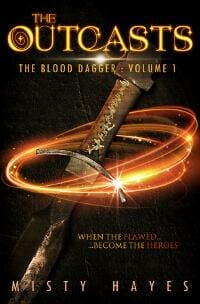
JE: An effective use of the symbolic approach on a fantasy cover, though the blade of the dagger gets lost a bit on the dark background.
Mary Brock Jones submitted Aftermath: Hathe Book Three designed by Fiona Jayde. “This is the third book in a series and includes both new elements (the two main characters) and visual links back to the previous books ( the two moons, the juxtaposition of the figures and the general colour scheme).”

JE: I like the slick, understated color scheme, and the overall layout is refreshing and unconventional. A bit hard to tell what’s going on with the female character at first glance, and the brightness under the man’s arm hurts the readability of the title.
Max Stone submitted One Minute There designed by Max E. Stone.
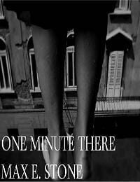
JE: Lack of contrast and general muddiness make for a confusing presentation.
Michal Pawlicki submitted Go-around designed by Piotr Najar. “The cover was inspired by the feel of promotional materials for ’70s airlines that you find over 40 years later in the attic. Other inspirations: the work of Erik Nitsche & the cartoon and toy planes of the ’90s which correspond directly to one of the book’s central themes – childhood nostalgia.”

JE: Kudos on the travel poster vibe and the minimalist approach. There are a lot of nice subtle texture details here. It’s very zen, but it doesn’t offer much insight into what the book’s about. I get why the author name is so small, but it would benefit from better legibility.
Norman Whaler submitted The Tiny Tree designed by Polina Hrytskova.

JE: The colourful hand-done illustration clearly identifies the genre and target audience, though the small type ends up lost in the woods.
Obie Williams submitted The Crimes of Orphans designed by Obie Williams. “My first published novel and first attempt at designing a cover. I know it’s not perfect, but I’m mostly proud of it. I must give credit to the gracious photographers of Unsplash and Pexels who offer their works free under CC or PD licenses. I could not have created this without their generosity.”

JE: Congrats on your first novel and first crack at cover design. I think it conveys the genre well and the highlights on the hair are a nice touch, though the cracked effect on the type is a bit overpowered and the handgun is hard to spot at first glance.
R. Blackerby Wilson submitted Diamonds Are Not Forever designed by R. Blackerby Wilson. “I photographed a porcelain rose and gemstone on a black satin background as a visual pertaining to Diamond Rose, the main character. The wedding ring in the shadows suggests Diamond Rose’s marriage is in trouble.”

JE: Not a bad concept, but the rose overpowers the other elements in the photo so much that it would probably be better just to lose them.
Ryan Felton submitted The Man Who Ran for God designed by Rachel Leigh. “Designer Rachel Leigh, inspired by the likes of Saul Bass, incorporated important visual elements of the book’s plot to subtly hint where the reader’s going.”

JE: A well done Saul Bass-style design. Everything comes together to great effect. Really impressive. ★
sardia Anderson submitted Reflections Of A Tribal Soul designed by Destiny Tudor. “My book is a collection of poems that speaks to the human experience. The cover captures the very essence of afrocentrism and who I am as an artist, and person. Thanks in advance.”

JE: The illustration style blends well with the type treatment, which wraps around the central image without hurting legibility. Genre-appropriate and well done.
Sharon DeNofa submitted Happily Ever NOT designed by Mark Reid.

JE: Whole lot going on here between the letter, the ticket, the rings, and the Polaroids. I’m sure every element hints at the plot, but it might help the overall impact to focus on just one. On the other hand, the colors are nice and the genre is clearly defined.
Sharon Willett submitted Northern Cowboy designed by Basia Tran. “Basia and I started out with different ideas, but she created a work of art.”
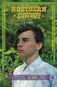
JE: The type elements and border are charming but are overpowered by the greens and yellows of the background. The unstylized look of the photo doesn’t blend with the other elements to give a clear idea of what to expect from the book.
Steven Jordan submitted Defiance of the Concorde designed by Steven Jordan. “This cover is for a sci-fi series which features the foreground starship on all covers. Assembled in Photoshop from edited stock photo elements.”

JE: Nice choice of font, but it’s hard to tell what’s going on.
Susie Murphy submitted A Class Apart designed by Design for Writers.

JE: A tastefully done historical romance. Selective use of brightness and the desaturated background keep the focus on the woman. The swashy title adds a bit of complexity to a layout that’s otherwise uncluttered. Well done.
Thomas Gaffney submitted Stranger Things Have Happened designed by Thomas Gaffney. “Multiple short horror stories centering around an ash tree. Where the ash tree isn’t front and center, there are hints and callbacks to ash trees in other stories in the collection.”
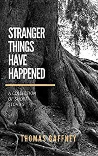
JE: Creepy tree roots can work well for a collection of short horror stories, and if the tree figures into the plots then it’s all the better. Unfortunately, the creepiness is sanitized by the type treatment.
Tracey Ryan submitted Wicked Shadow of the Hunter designed by Melissa Lund. “This book is the 2nd in a murder mystery trilogy.”
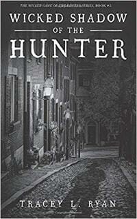
JE: The hand-drawn style of the type works nicely with the black-and-white background to give this cover a sinister feeling, though the shadow could stand out more.
Vijaya Bodach submitted BOUND designed by Derrick Alderman. “We wanted to emphasize how sisters are bound up in each other’s lives. The yellow paint texture evokes fire.”

JE: A nice straightforward approach. I like how the lines of the title font mimic the lines of the illustration.
Yevgeniya Przhebelskaya submitted Ocean:Poems designed by Tracey Dunham. “The depicts an Ocean – beautiful, deep, raging, enchanting.”

JE: I like the colors and general vibe here. The fade to white at the bottom gets a little too white, which obscures the boundaries on a white background.
Zoella Rose submitted Find Me designed by Zoella Rose. “Find Me is a paranormal romance about immortal beings trapped in the sea. The sea and the moon play an important role in the story. The novel has been inspired by twilight”
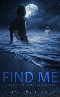
JE: A nice, tranquil paranormal romance cover that signals the genre well. There are a few rough edges around the characters, but the overall effect is nice. I like how the light rays interact with the title, but the gradient on the author name hurts readability.
Nonfiction Covers
Aarti Patel submitted Acne: Just Another Four-Letter Word designed by Pixel Studio. “I wanted the cover to show acne’s mean personality.”

JE: A handsome, clean layout with an accurate personification of acne. The subtitle font undercuts the professionalism a tad, but overall it’s a nice design that gets the point across.
Cathi Stevenson submitted It’s Just Your Imagination designed by Cathi Stevenson. “I had found this barbed wire image image while working on a previous project. I kept it in my files because I was sure the perfect book for it would come along eventually, and it did!”

JE: I like the razor-wire heart concept and the colors seem very genre-appropriate. The swoosh across the bottom creates a little confusion by blending in too closely with the sky.
Dexter Peggins submitted The Garden Experience designed by Shanna Carkhum. “Drawing on the imagery of the Garden of Eden, this book re-imagines what it means to live a life in the “environment” that God created for humanity.”

JE: A well-picked photo to accompany a religious guide to personal growth. The color and style of the title do kind of give the impression that it’s literally about gardening, and the pure whiteness at the top blends into the background.
Dominic Selwood submitted Punctuation Without Tears: Punctuate Confidently – In Minutes! designed by Delia Johnson. “This is a non-technical guide to punctuation for young teenagers upwards.”
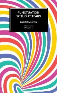
JE: A unique approach to a grammar guide aimed at a young audience. It’s lively and the text is done tastefully, but the swooshy lines don’t really tell me this is a book about grammar.
Jan Hurst-Nicholson submitted Would You Rather Be in the Coffin Than Give the Eulogy? how to take the terror out of public speaking designed by Vanessa Burger. “The selling point is that the book is uniquely geared towards the average person who wants practical advice (don’t drink anything fizzy before a speech). I wanted the tone of the cover to match the blurb and contents and for it to stand out from other books in this genre.”

JE: An effective cover in that it clearly communicates the premise and tone of the book. The solid sans-serif font of the subtitle and author balances out the squiggly lines of the cartoon, though it is a little busy.
Judith Bognar Bean submitted BITTERSWEET FREEDOM designed by JD&J BOOK COVER DESIGN. “1956 Hungarian Freedom fighter family leaving their way of Life in Communist Hungary, during the Revolution against Soviet tyranny; the horse figure displays a great revolutionary hero of the late 1800’s in Hungary, Hungarian flag waves behind him, Stat Lib welcomes family to U.S. with hope and flag”

JE: Nice composition, and the family on the bridge is well done. It’s a bit weighed down with all the symbolism.
Lillian Csernica submitted The Writer’s Spellbook designed by Bridget McKenna.

JE: Seems like an appropriate image for the content. The niche nature of the book makes that explanatory subtitle important, but the glowing red script font hinders legibility.
Lisa Wilson submitted Method Acting for Writers: Learn Deep Point Of View Using Emotional Layers designed by Lisa Hall-Wilson. “Even though this can be an intimidating and confusing writing technique, I wanted the cover to reflect order and simplicity.”

JE: If order and simplicity were the goals, then mission accomplished. Simple black type was a good choice to accompany the layered fruit image. The background is perfectly white, which will cause some trouble on white backgrounds.
MaryDes Designs submitted The Reluctant Messenger designed by MaryDes Designs. “Candice explains in her book that “angels” draw your future path. In this design we wanted to create a general mystic atmosphere and focus on the combination of an angel’s wing in the shape of a feather pen that draws the path of every person. It’s an eye-catching design full of contrast.”

JE: An angel’s wing quill is a clever idea to illustrate the concept behind the book. The quill’s transition into an illustration makes it hard to tell what’s going on at thumbnail size, but it definitely has a mystic feel.
Michael N. Marcus submitted What’s Wrong With Trump? designed by Michael N. Marcus. “Stark black implies power & stands out on white websites. Title text color matches hair. List of faults is in a serif face to imply importance & wraps around face of smug Trump. Final strokes of W’s in title line up & mimic slant at ends of lines. Title is selectively compressed & kerned.”

JE: Solid color choices and has no problem communicating the content. There’s plenty of blank space around the edges, but the text could use a little breathing room.
Teddi Black submitted The Principles of Mental Care designed by Teddi Black.

JE: Good colors for a book on mental resilience in children. The hand-drawn-style fonts and ice cream cone supply a youthful feeling, while the subtitle font, the vertical stripes, and the blue-yellow combo add a feeling of professionalism and trustworthiness. ★
Well, that’s it for this month. I hope you found it interesting, and that you’ll share with other people interested in self-publishing.
Use the share buttons below to Tweet it, Share it on Facebook, Plus-1 it on Google+, Link to it!
Our next awards post will be on September 30, 2018. Deadline for submissions will be August 31, 2018. Don’t miss it! Here are all the links you’ll need:
- The original announcement post
- E-book Cover Design Awards web page
- Click here to submit your e-book cover (See New Submission limits)
- Follow @JFBookman on Twitter for news about the E-book Cover Design Awards
- Check out past e-Book Cover Design award winners on Pinterest
- Subscribe to The Book Designer Blog
- Badge design by Derek Murphy


