By Joel Friedlander
Welcome to the e-Book Cover Design Awards. This edition is for submissions during September, 2018.
This month we received:
69 covers in the Fiction category
10 covers in the Nonfiction category
Comments, Award Winners, and Gold Stars
I’ve added comments (JF: ) to many of the entries, but not all. Remember that the aim of these posts is educational, and by submitting you are inviting comments, commendations, and constructive criticism.
Thanks to everyone who participated. I hope you enjoy these as much as I did. Please leave a comment to let me know which are your favorites or, if you disagree, let me know why.
Although there is only winner in each category, other covers that were considered for the award or which stood out in some exemplary way, are indicated with a gold star: ★
Award winners and Gold-Starred covers also win the right to display our badges on their websites, so don’t forget to get your badge to get a little more attention for the work you’ve put into your book.
Also please note that we are now linking winning covers to their sales page on Amazon or Smashwords.
Now, without any further ado, here are the winners of this month’s e-Book Cover Design Awards.
e-Book Cover Design Award Winner for September 2018 in Fiction
Natasha Snow submitted In This Iron Ground designed by Natasha Snow.

JF: Masterful image compositing, highlighted by simple type that takes nothing from the complex illustration, which focuses us on the deeply felt aspiration of the man at the center of the cover. An evocative and moving piece of design.

e-Book Cover Design Award Winner for September 2018 in Nonfiction
Rohadi Nagassar submitted Thrive. Ideas to lead the church in post-Christendom. designed by Ryan Lee.

JF: A clean and clever design that exemplifies the idea of bringing new light to the church. Note the shape of the filaments in the light bulb.
Fiction Covers
Alex Valentine submitted Zip & Milly: big water designed by Rina Zenyuk.

JF: A fun illustration and, although the font choice seems appropriate for the author’s name, the overall composition could be a lot tighter and more focused.
Alexandra Brandt submitted Clear as Light designed by Alexandra Brandt. “SF story on a space station, where an aging artist watches his husband slowly grow alien after seeing a mysterious light…Wasn’t sure how to depict the tone, which is quiet but tense. I thought this artwork came the closest.”

JF: Does a good job of communicating the book’s theme and a feeling of separation. Nice title treatment, too.
Alexandra Brandt submitted Ellen Double Prime designed by Alexandra Brandt. “YA story: teen girl in a bad alternate reality. Supposed to be both sharp and funny–wanted that to show in the cover.”

JF: While there are elements to like, the juxtaposition of the images is pretty jarring.
Amelia Keldan submitted The Memories of Misty designed by April Twenty Designs. “The protagonist’s innocent face looms large to garner empathy, whilst the profile of the other woman is shown in silhouette. Transparency was used here to show the mystery behind the character. The swirling font was chosen for it’s romanticism and the colour aqua is a nod to the Australian ocean.”

JF: The “other woman” is mostly invisible to the casual observer, and too much of the type is unreadable.
Atlas Ireland submitted The Signs of Sound designed by Anastasia1995. “The cover for this children’s book includes three key locations from the plot – the Victoria and Albert museum in London, a town hall in the Czech Republic and the house on a cliff. Some shadows are visible in the windows – hinting at the characters.”

JF: Very colorful.
C. Attleya submitted The Cool Breeze of Spring – A new beginning designed by C. Attleya. “Cover shows the location of the novel (Hever Castle), set against an impression of a Neteru (visiting alien). The colour reflects the human protagonist’s spheream colour (colour of the cloud surrounding them after being activated by the Neteru).”

JF: That’s all very nice but what I see is a mostly indecipherable graphic combined with an amateurish type treatment.
C. Attleya submitted The Cool Breeze of Spring – Rebecca’s diary designed by C. Attleya. “Cover shows protagonist’s diary, covered in pictures and drawings which reflect her interests and adventures. The starry background reflects the new place of Earth and the protagonist in the Universe.”

JF: Lacks impact, not sure if anyone will get the “meaning” as you describe it.
carole penfield submitted Lucina’s Destiny designed by frina art. “The story centers on a young girl in a 17th century English village, but the coming-of-age theme is timeless, so I wanted a cover design with cheerful colors.”

JF: You did get lots of colors. The type needs help with sizing, positioning, and kerning.
Christine Dillon submitted Grace in the Shadows designed by Joy Lankshear. “Book 2 in a Christian women’s fiction series.”

JF: A gorgeous and perfectly executed cover for this inspirational story. The controlled color palette helps focus attention on the 2 figures, and the graceful tone of the design is emphasized by the careful typography. ★
Christopher Geoffrey McPherson submitted A Cat in Time designed by Matt Hinrichs. “”A Cat in Time” is a fantasy novel about a real cat who lived in 10th-century Japan. I asked the designer for a timeless cover with a hint of an Asian theme. The gems on the cover are an important plot point.”

JF: Charming and appropriate, although the point where the subtitle almost touches the illustration creates a bothersome tension.
Cris Harding submitted Saint Michael’s Sword: Tip of the Blade designed by Sarah Pacetti. “The design was inspired by an illustration from a medieval illuminated manuscript. Ms. Pacetti is a sequential artist. This format’s design reflects her talent. The panes depict themes from the book series: the main character, the raven standard, Viking invasion of Europe, and Saint Michael.”

JF: That’s a lot for a casual browser to take in, and ebook covers with a single visual focal point may fare better in the crowded marketplace where a thumbnail is often the first—or only—representation of the cover that will be seen.
Cyrena Shows submitted This Book Needs a Laugh designed by N/A. “The simple design and sad eyes ink drawing reflects the simple artwork within the book. I chose yellow to convey happiness. The sad eyes image on the outside transforms by the end. I used slanted text and picture to convey the character’s emotional kilter.”

JF: An interesting idea, but the lack of contrast leaves the cover with little impact.
Danielle Novotny submitted Remade designed by Danielle Novotny.

JF: Signals its genre (sci-fi) quite well.
Darja DDD submitted Dancing on a High Wire designed by Marushka from Deranged Doctor Design. “Women’s Fiction, Family Life book cover design, Dancing Through Life Series Book 1”

JF: Well-focused 3-book series design emphasizes the characters and continues the “shoe” motif on all the covers.
Darja DDD submitted A Slow Waltz designed by Marushka from Deranged Doctor Design. “Women’s Fiction, Family Life book cover design, Dancing Through Life Series Book 3”

Darja DDD submitted An Irish Slip Step designed by Marushka from Deranged Doctor Design. “Women’s Fiction, Family Life book cover design, Dancing Through Life Series Book 4”

Darja DDD submitted The Sire Sheaf designed by Milo from Deranged Doctor Design. “Epic fantasy book cover design, The King of Three Bloods, Book 1”

JF: A beautiful series design that uses dramatic lighting effects to highlight the central figure of a warrior. Artful typography completes the look.
Darja DDD submitted The Frightful Dance designed by Milo from Deranged Doctor Design. “Epic fantasy book cover design, The King of Three Bloods, Book 2”

Darja DDD submitted Witan Jewell designed by Milo from Deranged Doctor Design. “Epic fantasy book cover design, The King of Three Bloods, Book 3”

Darja DDD submitted The Curious Tale of Gabrielle designed by Milo from Deranged Doctor Design. “Young adult (YA) fantasy book cover design, Book 1”

JF: Similar to the epic fantasy series above, this seris design also rests on dramatic lighting to highlight a central figure who has her back turned to us, a device used to involve us in the story. And they work just as well for this fantasy series.
Darja DDD submitted Curiosity and The Hounds of Arawn designed by Milo from Deranged Doctor Design. “Young adult (YA) fantasy book cover design, Book 2”

Darja DDD submitted Curiosity and The Sentient’s Oblation designed by Milo from Deranged Doctor Design. “Young adult (YA) fantasy book cover design, Book 3”

Dave Lewis submitted Going Off Grid designed by Dave Lewis. “Design – I used a photograph I took of three red kites in mid-Wales and changed to ‘pencil drawing’ in Photoshop. I wanted a simple, bare design to reflect the nature of the poems contained within. A kind of ‘going back to nature’ theme and cutting everything back to basics.”
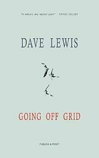
JF: I applaud the drive to cut back to the basics, and the overall look of this cover does that, but it would be much stronger if one element—I’m thinking the kites—was allowed to predominate instead of disappearing into the distance.
Dave Pryor submitted God Makings I: The New Hubris designed by Dave Pryor. “The theme of the book is AI coming to believe in God and desperately trying to prove that they have souls too. A human fossil reaching for the remains of an advanced gun implies that the consequences for humanity are not good.”

JF: Love the style of this cover and its strong graphic appeal, partly due to the limited colors used and the great coordination between the sketch and the loose style of the main font. Not sure the “advanced gun” will have the impact needed, however. ★
David Joray submitted After the Lenses designed by Paula Ibey. “The foreground features the main protagonist, Kala, whose look was inspired by an image from the anime, Kaze no Yojimbo (which is based on Akira Kurosawa’s film, Yojimbo). The background is the skyline of Baltimore, MD, where the story takes place. Thanks!”

JF: Interesting use of an anime-style illustration.
Deborah Coonts submitted The Housewife Assassin Gets Lucky designed by Andy Brown.

JF: Visually way too confusing, and all the conflicting strong colors don’t help.
E A Naidoo submitted Chaos in the Storm designed by Faye Faye. “My book is secrets and cover-ups in a Church.”

JF: The simple composition helps to make the point of the cover, but I’m not sure what is gained by using two different yet similar fonts in a 3 word title.
Ellie Elf submitted Finding Santa: The Adventure of Greedy Elf designed by Ellie Elf. “Some of my favorite Christmas specials as a child were claymation. The cover concept and artwork for the entire book were inspired by that. All of the characters were sculpted from clay and repositioned for the cover and other images in the book.”

JF: If one of the figures was larger we might be able to more easily recognize its claymation origins. Otherwise, the cover strikes exactly the right note.
Emilie Beecher submitted Everything In Its Place designed by Emilie Beecher. “I created my own cover design using good old Microsoft Publisher and a Galaxy S8+. The design of photographs on a wall relates to a scene in the book – the five picture frames reference the five main characters and the lines on the page are a subtle reference to the trajectory of the characters.”

JF: A good effort from an author-designer. The values fo the type and the vertical rules could be manipulated to yield a stronger effect, as it is the outlines of the type conflict with the frame shapes and lines. (Also, covers with white backgrounds need a subtle border to keep them from “bleeding” onto white web pages, although this border does not need to appear on the cover itself.)
Evangeline Oxum submitted Rogue designed by Design Stash. “The synergy between man and machine. The villan’s shoulders are high and defiant, yet the downward angle of her head suggests submission. The haunting red ‘eye’ light against the cold blue backdrop is sinister, as if the machine inside is waiting for the right moment to attack.”

JF: The strong illustration carries this sci-fi cover, although the type is much weaker, particularly the author’s name, which is barely legible.
Faye Hall submitted Heart of Stone designed by Tara HW Fantasia Frog Designs. “Heart of Stone is an Australian historical romance ebook about an Australian slave trader, an Irish slave woman and a missing ruby necklace.”

JF: Expertly combines these three elements to create a unified appeal for this romance. Note also that the figures are facing in opposite directions, which creates an interesting visual dynamic.
Ginger Ring submitted The Pink Rose of the Prairie designed by Kim Killion. “My book is a time travel western. The designer created a beautiful and dreamy cover that is filled with romance. Thank you!”

JF: Overwrought to the point of visual and typographic incoherence.
Hampton Lamoureux submitted Cardboard Castles designed by Hampton Lamoureux. “K.L. Young came to me with a narrative that intertwined a secret fantasy world with the darker, real-world struggles of poverty & mental illness, referencing the main characters living in a ‘cardboard castle,’ as Young describes. The design brings the title to life while peering into both realities.”

JF: The subtle textures and coloring of the foreground provide a perfect foil for the scene revealed in the keyhole, a great “hook.”
Heleen Kist submitted In Servitude designed by JT Lindroos. “Fun to note that the author is Dutch and the flower on the cover is a tulip :-)”

JF: Beautiful and original, although the color of the author’s name is making it blend perhaps a bit too much with the flower.
Holly Heisey submitted Rage designed by Holly Heisey. “This is a new cover for a previously published book.”

JF: Emphatic, exciting, and bold. You know exactly what you’re going to get, and that’s a win. ★
Holly Heisey submitted Heartbeat Braves designed by Holly Heisey. “First in the Crooked Rock series.”

JF: This 3-book series design varies the colors and settings in which the central couple appear. The trees seem to be a more dominant factor in each cover, and that doesn’t make mush sense. Might be better to “zoom in” on the central figures so we can relate to them more easily.
Holly Heisey submitted Lovesick Braves designed by Holly Heisey. “Second in the Crooked Rock series.”

Holly Heisey submitted Sweetheart Braves designed by Holly Heisey. “Third in the Crooked Rock series.”

Ihor Tureha submitted Soul Eyes designed by MiblArt.

JF: The juxtaposition of a bloody knife and that big eye is, as intended, pretty creepy.
Ihor Tureha submitted Fateful Itallian Passion designed by MiblArt.

JF: There’s so much going on in this cover I’m not sure the red ribbon isn’t just a distraction. Also another victim of the “dark red type on a black background” has made part of the title unreadable, and for what purpose?
James Egan submitted Detonation Boulevard designed by James T. Egan of Bookfly Design.

JF: Pow! The amazing artwork literally reaches out and grabs up, demanding attention. The amusing and perfectly adept typography completes the effect. A memorable cover. ★
James Egan submitted Alicia designed by James T. Egan of Bookfly Design.

JF: There’s a lot of story contained in this image, and the strong title treatment continues the theme.
James Egan submitted The Matrimonial Advertisement designed by James T. Egan of Bookfly Design.
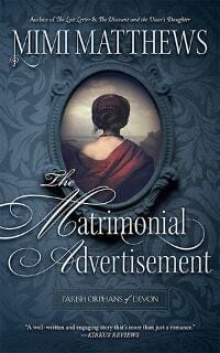
JF: Elegant textures and elegant type treatment with a classical layout. I will say, this “cameo” represents a kind of an ultimate expression of the “back turned toward the audience” theme, if you consider the way cameos like this were used through their histroy—to display a portrait.
Jerry McRae submitted Black Fathers Are Real: We Do Exist designed by Aaron Archie.

JF: This cover makes an admirably clear and direct statement. However, you don’t need a period at the end of the title, just delete it
Joe Flood submitted The Swamp designed by Rachel Torda.

JF: Is it a snow globe? A bit underwhelming. Also, the bottom is bleeding onto the white of the web page.
Joy Maestas submitted The Archagels Light designed by J Joy Maestas. “self designed using free picture from internet. Thank you”

JF: Problem is, it doesn’t look like a book cover, doesn’t tell us anything about the book, and is far too difficult to decipher to make the bother worth it. Maybe hire one of the wonderful designers whose work you see here.
JT Lindroos submitted In Loco Parentis designed by JT Lindroos. “I wanted to come up with a classic look of all those wonderful 70’s photo covers. As this book deals with the harsh realities one teacher has to deal with, the combination of an apple (for the teacher) and a knife (violence) felt right.”

JF: Clean and emphatic, with great contrast. It does remind me of many thrillers I read back in the 1980s. ★
Katharine Wibell submitted Ullr’s Fangs designed by OliviaProDesigns.

JF: Good job of drawing us into the dramatic action, and the type treatment is spot on.
Kathy Servian submitted The Moral Compass designed by Kathy Servian. “I couldn’t find a decent image of a costume from the 1850s for this cover so I made the costume, photographed it, and created the cover on Photoshop.”

JF: Great job, Kathy, although the type is kind of wobbly the cover does what it has to.
Kathy Servian submitted A Pivotal Right designed by Kathy Servian. “I entered this one too as it’s the sequel to The Moral Compass. I don’t claim to be a graphic designer and do my own covers out of necessity.”

JF: This one is much less developed, almost formulaic, and it exposes the weakness of the type treatment even more.
Kaylia Dunstan submitted I, SIREN designed by Elena Lam. “The aim of this design was to marry the feel of literary work covers with the very visceral, compelling and haunting tone of the book.”

JF: The evocative illustration is well served by the simplicity of the fonts used, a strong impression over all.
Kevin Parham submitted Keeper of the East Bluff Light designed by George Foster. “The design for ‘Keeper of the East Bluff Light’ attempts to create feelings of mystery and intrigue, similar to what one might experience on a foggy night by the seashore. The amber light on the cover is not only a focal-point, but it also plays an integral role in this whodunit murder mystery.”

JF: I like the strong lighthouse image with its beam cutting through the fog, but I have admit the fuzzy title adds nothing but a lot of blur to the cover and is more of a distraction. George Foster, by the way, is one of the best nonfiction cover designers I’ve ever come across.
M. B. Gibson submitted Aroon designed by Panagiotis Lampridis.

JF: The very atmospheric visual is perfectly complemented by the unexpected title typography.
M. Naidoo submitted The Pelican designed by M.Naidoo.

JF: I’m really drawn to the simplicity and clarity of this cover, even though I can’t guess what the story is about.
Natasha Snow submitted Daughter of Persephone designed by Natasha Snow.

JF: Hot, in all the best ways, with beautiful color work, textures, and typography. ★
Rose Marie Rose submitted Warped Influences designed by RebecaCovers. “I wanted to portray a sense of isolation and a warped sense of reality with a looming threat for my protagonist, who’s a tennis player and loves the color purple. Rebcacovers captured that in a beautiful and shocking way, which I hope grabs a potential reader’s attention.”

Roy Schwartz submitted The Darkness in Lee’s Closet and the Others Waiting There designed by Patricia Vásquez De Velasco.

JF: Although I’m mystified by the title (what does that mean?) I find the illustration naively charming.
Sandra Bats submitted Persephone’s Curse designed by Nico Bats.

JF: The cover communicates well.
Seán O’Connor submitted The Mongrel designed by Sarah Brophy. “The Mongrel’s cover was painted by Irish artist, Sarah Brophy. I believe she captured the essence of the book’s theme nicely.”
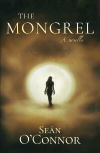
JF: I don’t get the connection between the title and the visual, and the typography is weak.
Shane Drummy submitted Proto designed by Damonza.

JF: Very cool and evocative sci-fi cover.
Shaun Hume submitted Ewan Pendle and the White Wraith designed by Florentyna Nastaj.

JF: I’m a big fan of all kinds of illustration for book covers, but not when they reduce the title to almost an afterthought.
Storied (Lynn) Graphics (Veevers) submitted Think Laugh Love Die! designed by Storied Graphics. “Thank you! This is one of my older custom designs, but I was encouraged to enter it. Thank you for this contest, I am looking forward to the experience and hopefully the chance to learn something! Thank you again.”

JF: The combination of color and black and white images is difficult, and doesn’t work very well here. The indecipherable title and type that’s hard to read don’t help. I’m sure your more recent designs are much stronger.
Teresa Considine submitted Mercury and Music designed by Teresa Considine.

JF: A good illustration, but if we are supposed to read those little rolled up newspapers to know what’s going on, I’m afraid you’ve already lost most people.
Tracey Ryan Tracey Ryan submitted Wicked Shadow of the Hunter designed by Melissa Lund. “This book is the 2nd in a mystery trilogy.”

JF: Good composition, but the tonal range is insufficient to fully make use of the dramatic effect possible with black and white.
William Mitchell submitted Ascension designed by William Mitchell. “A science fiction story culminating in a skydive from orbital altitude – a natural subject for the cover design. Created using “GIMP” with some hand-drawn elements scanned in, some created in the editor.”

JF: Straight sci-fi.
William Mitchell submitted Contact Authority designed by William Mitchell. “This is a science fiction story where the exploration of a newly discovered planetary system forms the basis of the plot. I decided to keep the cover as simple as possible, so a map of this new solar system seemed a good way to go, simple to execute but hopefully still effective.”

JF: The simplicity is what makes it work.
William Mitchell submitted Mind Games designed by William Mitchell. “A science fiction story involving alien first contact on Earth, so that’s the scene I decided to depict on the cover. Created using public domain Earth & star field images, plus photography of a real object (a shiny household ornament!) to depict the mirror-finish alien spacecraft.”

Zoella Rose submitted Guardians of Wundor designed by Zoella Rose. “Guardian’s of Wundor is a portal fantasy. The author wanted to show the best of both worlds. The portal is in the woods and transports her to the world of Wundor which is a land of fairytales and folklore.”

JF: The portal really works, and the “interrupted story” draws us in. The colors are carefully controlled, and type treatment works well.
Nonfiction Covers
A. Jordan Fischette submitted To: The Ambitious, From: The Experienced: 26 Letters on Leadership designed by Kristen Voll. “We wanted a welcoming and warm postal look, as the inside has a postcard letter from contributors.”

JF: Unfortunately, with no clear focus the covers becomes a muddle of images and words.
Carl Peterson submitted Home Front A Memoir from WW II designed by Shelley Lowell Stephen Roth. “The cover beautifully portrays the elegiac and profound message of the book. It is simple, readable and evocative. It get positive comments and supports sales.”

JF: I couldn’t agree more. Simple, elegiac, and readable.
Cathi Stevenson submitted The Reign of the Vedic Gods designed by Cathi Stevenson / Book Cover Express. “The author had the first book in this series designed by someone else several years ago, so I had to create the subsequent covers to reflect and compliment that design. Researching the images is fascinating.”

JF: Love this image and the way the designer has purposed into an ideal graphic for the book cover.
Debjeet Mukherjee submitted VOYAGES Volume I – A Collection of Poetry designed by Notion Press Publishers. “Voyages Volume I is written to break the notion that poetry is an art comprehensible only by the elite. Just like a ship embarks on a voyage, searching and exploring new continents through vast reaches of the ocean; our life too embarks on a journey of adventures which are best described in poetry.”

JF: I think you could make the argument that some lives are best told in prose, but be that as it may, this is a very effective and alluring cover design for a book of poetry, and the distant moon provides all the atmosphere we need. ★
E. P. Mattson submitted The Opulence Of Invention designed by E. P. Mattson. “The cover represents invention as a lofty ideal in a royal setting. The clock motif illustrates that time is a factor in achieving our dreams. The lower icons represent man’s journey through life until we become the lion, which represents ownership of ourselves and our greater destiny and purpose.”

JF: Interesting and creative, but I really object to the title being so subordinate to the rest of the very active cover.
Lance Buckley submitted The Life and Times of Cocaine Charlie designed by Lance Buckley. “The true crime memoir that the author wrote about himself needed to represent the suburban, family neighborhood that the story takes place. I thought having a giant line of cocaine taking up the entire suburban street would be attention-grabbing and give the reader a good sense of the overall tone.”

JF: Looks like Charlie had quite a habit, vacuuming up that street. The cover design communicates exactly what the book is about and uses typography that’s bold and apropos of the subject. ★
Lisa Ferland submitted Knocked Up Abroad designed by Venanzio. “An optimistic surrealistic take on displaying the most intimate parts of a global family’s life.”

JF: A very clean look that graphically communicates the problems and humor of its unusual subject. Great title, too. ★
Mark Lynch submitted The wit and wisdom of Donald J.Trump (The J is for genius) designed by Mark Lynch. “A collection of his most outrageous claims, quotes, mis-quotes, alternative facts and ‘I can’t believe he said that!’ moments.”

JF: Unfortunately, it’s kind of boring and looks self-published.
Rex Vanderwood submitted Man, You Rock! designed by 1106 Design. “I felt inspired to write a book to strengthen young men and their families. The world-famous sculptor Bobbie Carlyle created the perfect image in her creation/sculpture of “The Self Made Man.” Here is the profound image of a man “creating his character and his future.” Everyone loves this cover!”

JF: Professionally put together.
Well, that’s it for this month. I hope you found it interesting, and that you’ll share with other people interested in self-publishing.
Use the share buttons below to Tweet it, Share it on Facebook, Link to it!
Our next awards post will be on November 26, 2018. Deadline for submissions will be October 31, 2018. Don’t miss it! Here are all the links you’ll need:
- The original announcement post
- E-book Cover Design Awards web page
- Click here to submit your e-book cover (See New Submission limits)
- Follow @JFBookman on Twitter for news about the E-book Cover Design Awards
- Check out past e-Book Cover Design award winners on Pinterest
- Subscribe to The Book Designer Blog
- Badge design by Derek Murphy


