Did you ever see the movie “Deception” that came out in 2008? No? It starred Ewan McGregor, Hugh Jackman and Michelle Williams. The cast alone should have made it a hit, but it bombed, critics hated it and audiences ignored it in spectacular numbers.
Despite Hollywood’s addiction to stars and hype over content, the dirty little secret is that—Harry Potter aside—no one knows which movies will be hits and which will flop, until they open. Once actual ticket-buying people start to go to the movie, word quickly spreads about the experience people had, and they always tell their friends. This is what makes or breaks a movie, and everyone knows it.
No one expected “The Blair Witch Project,” shot for under $100,000 to be a hit, but word of mouth sent it to a total box office over $248 million worldwide.
Movies and Books: Not That Different
The same is frequently true of books. It’s the experience people have reading the book that makes them want to share it with friends.
And besides the content itself, the only other influence on the experience of reading a book is exercised by the book designer. There is no make up, no locations, cinematography, special effects, stereo sound systems, none of the bells and whistles that grab attention in a film.
No the work of book design is quiet, always taking a back seat to the communication of what the author has to say, or the story she is telling.
An Example
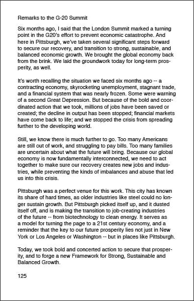
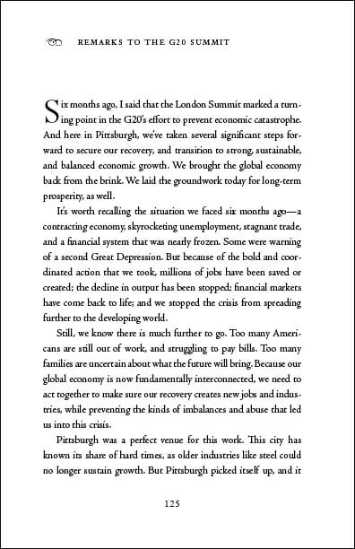
Even though it’s so subtle, or so humble, as to be completely overlooked, book design can be crucial in determining the kind of experience your readers have. Let’s look at an example: (I’ve included these pages at a larger than normal size so you can have the actual experience of reading them.)
This is not untypical of what you might receive from someone who has no idea what a book design is supposed to actually look like. Here is the same text in a different version:
Which version would you rather read? To which one do you think reviewers or buyers will respond more positively? Which one do you think is likely to provide a better experience for the reader, and hence, more likely to be recommended to friends?
In professional publishing circles—and that includes chain bookstore buyers, book reviewers, and other people you are likely soliciting for blurbs, reviews, or purchases—this is common knowledge and widespread. When you are preparing to publish a book, think carefully about whether the cost of a book design is truly a “cost” or whether it’s an “investment” in the book you’ve put so much into, and on which you may have a lot riding. You can only launch your book once—make sure it gets the attention it deserves.
And now for a round-up of opinion from around the web on the importance of interior book design:
if you want positive word-of-mouth, getting the interior right is far more important than the cover.
—Morris Rosenthal, Self-Publishing 2.0
Professionally edited, typeset, & designed are critical for success via POD. (Looks count.)
—Jane Friedman, Publishing Passion, publisher and editorial director of the Writer’s Digest brand community
Unless you have professional graphic design experience, hire someone who does!
—Dummies.com
For most books, you may find that you are ahead of the game by paying a professional to do the layout and typesetting. Yes, it will cost you — usually in the hundreds of dollars (but could easily exceed $1,000). You will have a more professional product (that will enhance the reader’s experience rather than detract from it) and will have saved yourself a lot of time and headaches.
—Walt Shiel, Slipdown Mountain Publications, View from the Publishing Trenches blog
About a quarter of the self-pubbed titles we’ve reviewed have gone on to be republished by big presses, but I’d have to say that all of them are of comparable quality to traditionally published books–otherwise we wouldn’t waste the space on them.
—Lyn Miller-Lachmann, Blogger and Editor, Multicultural Review
After many hours in book stores and libraries, the light bulbs began to pop in my head. Oh, so that’s how a beautiful cook book looks. It should not look like something produced by the church committee on a home computer – it should look like a professional publishing house produced it. Right – now the search for a graphic designer began. Wow!! I could not believe the transformation. I sold over 250,000 copies of “Fit to Cook – Why ‘Waist’ Time in the Kitchen?” It’s a guarantee that the book would not have sold 250 copies in its original format.
—Denise Hamilton, Ink Tree, Ltd.
Self-published doesn’t mean slapdash. Don’t self-publish your book until it’s as good as you’d like it to be had a mainstream publisher put it out there. Self-publishing isn’t a shortcut to print. It’s an alternative business model for aspiring writers. You wouldn’t set up a bakery and sell cakes where the icing was all over the place and the body was sunken in the middle. So don’t think it’s acceptable to put your book out there with a bunch of typos and a cover made from Clip Art.
—Dan Holloway, danholloway.wordpress.com
What’s your opinion? I’d love to hear it.


