The first edition of the eBook Cover Design Awards came out in August, 2011.
Since then we’ve published hundreds of covers and critiques, skewered the covers that seemed wanting, and praised the designers who showed real innovation and skill in this new form.
The ebook cover still has not broken away from the print book tradition, either in the basic strategies designers use to interest and attract readers, or in the way the covers are represented graphically, as clones of their print book cousins.
There’s still a great deal of innovation to explore in ebook covers, and I keep thinking that simplification, using strong and direct visuals and typography, is eventually going to win out.
We’ll see. In the meantime you can see the progress from one year to another quite easily through the entries to this monthly contest.
Last year we collected the first full year of winners for each month here: 2012 eBook Cover Design Winners.
Below, you’ll find this years’ winners, month by month (each is linked to its sales page, too). Having just looked over the 2012 winners, I think this years’ covers are even better. Every one of these covers is just plain good, in all the right ways.
2013 Winners
Drawn from a pool of 1,186 covers submitted (974 fiction, 212 nonfiction), here are the winners in fiction and nonfiction for the year:
January 2013
 Fiction: Tanya Eby, Tunnel Vision and other stories from the edge, Designer: David Kolenda
JF: Oh yes. Yes, yes, yes, love the spooky, textured look of this cover. Demands to be picked up.
 Nonfiction: Meg Akabas: 52 Weeks of Parenting Wisdom: Effective Strategies for Raising Happy, Responsible Kids, Designer: Julie Metz & Heidi North/Julie Metz Ltd.
JF: Outstanding cover from a great designer with an assured mastery of typography, focus, and color choices.
February 2013
 Fiction: Vardan Partamyan: The After/Life, Designer: Vardan Partamyan
JF: Fantastic and unique. I keep looking for designers who are willing to step out of the confines of “book” and this one delivers. Combined with a unique visual approach and tasteful typography, the branding of this cover is so strong it can’t be mistaken for any other.
 Nonfiction: Robert Chazz Chute: Six Seconds, Designer: Kit Foster
JF: Fantastic. What a great combination of illustration and typography, where the two are converging into a unified whole. Kit Foster hits it out of the park with this cover.
March 2013
 Fiction: Rachael Preston: The Fishers of Paradise, Designer: Mark Timmings
JF: Beautiful, evocative, balanced, and with a great use of color. When a cover is this well balanced, you can’t imagine moving or changing anything that would upset it. Makes you want to read the book, about the best thing a cover can do for you.
 Nonfiction: Russell Phillips: Red Steel, Designer: Kit Foster
JF: Just a great cover from Kit Foster, perfectly suited to its subject matter. It could be taken up a notch with some careful adjustment to the photo to rescue it from its rather smudgy tonal range. Overall, beautifully matched to its purpose, and a great title to work with.
April 2013
 Fiction: Simon Jenner: Ethan Justice: Origins, Designer: Ares Jun
JF: Smart move! An excellent ebook cover that touches all the bases. Strong and recognizable imagery, dead center aim on its genre, and a sense of excitement that draws readers in.
 Nonfiction: Sonia Marsh: Freeways to Flip-Flops: A Family’s Year of Gutsy Living on a Tropical Island, Designer: 1106 Design
JF: Just the right kind of cover for a lighthearted family adventure. I love the way the designer has used all the tools at her disposal, from type styles to color to the framing device that focuses us on the message the book has to deliver. A clear bulls-eye for this genre, delightful.
May 2013
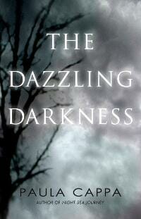
 Fiction: Paula Cappa: The Dazzling Darkness, Designer: Gina Casey
JF: This cover has some of the best title typography of all the covers this month. And somehow the designer has, with just a few elements, used the entire cover to convey both beauty and behind that a haunting and disturbing aura. Economy with impact, just beautiful.
 Nonfiction: Lynn McBride: How to Learn a New Language with a Used Brain, Designer: Damonza
JF: Fantastic. The designer leads us right down the garden path to make his point in a compelling and amusing way.
June 2013
 Fiction: E H Howard: Amara’s Daughter, Designer: Jane Dixon-Smith
JF: This cover is gorgeous, and I love the way the designer combines story elements with mystery, and with a sure-handed control of where we will focus our attention. With the palette of warm colors and textural details in the illustration, this cover really stands out.
 Nonfiction: Deborah J. Martin: Baneful!, Designer: Kit Foster
JF: Kit Foster does it again with this cover. A gorgeous illustration, careful typography, and the smarts to make his point with subtlety and a rich palette. A winner.
July 2013
 Fiction: Janice Graham: Firebird, Designer: Sarah Pearson
JF: Masterful. Beautifully constructed from many elements, yet completely under control. Notice how the story elements are kept in the background, never overwhelming or even changing the tone of the cover. When you can design at this level, with subtlety and storytelling, you don’t need anything that will take away from the whole.
 Nonfiction: William Ash: Futon Daiko: A Japanese Festival, Designer: William Ash
JF: This is a book of photography designed solely for the iPad, and in that context it’s a beautiful and appropriate cover whose image really captures the energy of Shinto festivals.
August 2013
 Fiction: Khanjan Mehta: The Kochia Chronicles: Systemic Challenges and the Foundations of Social Innovation, Designer: Jan Sunday
JF: An outstanding ebook cover for a set of stories with a most unlikely subtitle for a work of fiction. I love the way the designer has combined evocative artwork with strong typography to achieve a very unified look. The simple illustration contrasts perfectly with sophisticated typography, and note how careful the designer was with the colors used throughout.
 Nonfiction: Jason Harvey: Achieve Anything In Just One Year, Designer: Damon Za
JF: Damon, a multiple winner here, knows exactly what this type of book should look like, and delivers exactly the right cover for this book. A great nonfiction cover.
September 2013
 Fiction: Elizabeth Hunter: The Scribe, Designer: Damon Za
JF: Another incredible cover from DamonZa. Here he deploys a powerful hook into the story with the illustration, and combines it with classical type treatments and a strong but limited palette for maximum effect.
 Nonfiction: Chris Stinchfield with Teresa La Vine: The Keys to a Long Distance Relationship: A Couple’s Guide, Designer: Joni McPherson
JF: An outstanding cover from a nonfiction specialist. Confident typography combined with a clever illustration that perfectly expresses the theme of the book.
October 2013
 Fiction: Paul Allen: Apeland, Designer: Jeroen ten Berge
JF: Another demonstration from previous winner Jeroen ten Berge of how a great designer can effortlessly draw us into the story, give a hint of the tone of the book, while keeping the elements and typestyles to a minimum. The air of menace is visceral, a real winner.
 Nonfiction: Jennifer Newcomb Marine, Jenna Korf: Skirts At War, Designer: Damonza
JF: My favorite title of the month, and a designer who knows how to create tension while still keeping it light. The graphic elements of this cover are strong enough to withstand the reduction from a paperback original, even though some of the type is too small to read at this size.
November 2013
 Fiction: Deborah M. Prum: Fatty in the Back Seat, Designer: Siri Weber Feeney
JF: Fantastic, it doesn’t get any better than this. An indelible rendering of the main character could almost become a brand in itself, and the unique lettering adds a hand-crafted feeling to the cover. Leaps off the screen, a real winner.
 Nonfiction: Jesse Gros: Your Wild & Precious Life: Adventures In Conscious Creation, Designer: Alexandria Zech and Matt Hinrichs
JF: The designer really hits it out of the park with this cover that is both inspiring and beautifully realized. An image that perfectly matches the book’s aspiration, combined with confident typography creates a real winner.
December 2013
 Fiction: Alison Archer: Zebras in London, Designer: Littera Designs
JF: Great job. Economical with a strong graphic sense, a design that stands out boldly, yet at the same time contains just enough story to create a powerful allure.
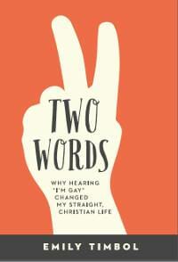
 Nonfiction: Emily Timbol: Two Words: Why Hearing “I’m Gay” Changed My Straight, Christian Life, Designer: Kevin Snow
JF: I love the strong graphic look of this cover, the way it draws us in to find out what “two words” means, and the integration of the title, the illustration, and the meaning they are meant to convey.
So, which are your favorites? Let me know in the comments.
Photo: bigstockphoto.com. Amazon links contain my affiliate code.


