Welcome to the e-Book Cover Design Awards. This edition is for submissions during September, 2015.
This month we received:
115 covers in the Fiction category
14 covers in the Nonfiction category
Guest Judge
 I’m very pleased to welcome Thomas McGee to The Book Designer as a co-judge this month. Thomas McGee is a professional Graphic Designer and WordPress Developer. For over ten years, he’s had the privilege of working on hundreds of book design projects ranging with clients ranging from large-scale traditional publishing houses, to first-time independent authors. You can check out some of his recent work at Writely Designed and feel free to chat with him on Twitter.
Comments, Award Winners, and Gold Stars
We’ve added comments prefixed with either (TM:) or (JF:) to the entries. Remember that the aim of these posts is educational, and by submitting you are inviting comments, commendations, and constructive criticism.
Thanks to everyone who participated. I hope you enjoy these as much as I did. Please leave a comment to let me know which are your favorites or, if you disagree, let me know why.
Although there is only winner in each category, other covers that were considered for the award or which stood out in some exemplary way, are indicated with a gold star: ★ (Gold stars this month were assigned by Joel.)
Award winners and Gold-Starred covers also win the right to display our badges on their websites, so don’t forget to get your badge to get a little more attention for the work you’ve put into your book.
Also please note that we are now linking winning covers to their sales page on Amazon or Smashwords.
Now, without any further ado, here are the winners of this month’s e-Book Cover Design Awards.
e-Book Cover Design Award Winner for September 2015 in Fiction
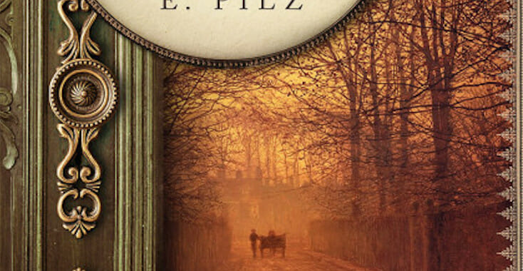
Christina E. Pilz submitted Oliver & Jack: In Axminster Workhouse designed by Bookfly Design. “Christina E. Pilz submitted Oliver & Jack: In Axminster Workhouse designed by James T. Egan of Bookfly Design. “Since this book is the third in a series, James visually linked it to the previous two, adapting the layout of the previous covers with the darker tones of book three.””


TM: The craftsmanship of this design is stunning. Every intricate detail makes this design not only accurate but intriguing as well.
e-Book Cover Design Award Winner for September 2015 in Nonfiction
Dane Low submitted Gentleman of the Press: The Life and Times of an Early Reporter, Julian Ralph of the Sun designed by Dane & Brittany at EbookLaunch.com.
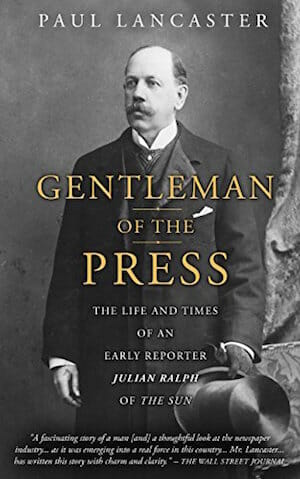
TM: Simple, clean, classical, elegant and excellently implemented. Excellent design.
Fiction Covers
A L Wright submitted Hartman House designed by The Cover Collection. “The premise of the story lies behind a lot of paranormal types living together in a big, spooky house.”

TM: This design seems to capture the mood of this book very well. The title feels like it could be a little more vertically balanced within the bottom half of the design as well as more prominent, but a solid design.
Alicia Rades submitted In My Head designed by Alicia Rades. “In My Head is a short futuristic sci-fi story, though it tackles issues common with modern-day teens. I was aiming for a sci-fi feel that would also appeal to the older end of the young adult audience.”

TM: While going for the sci-fi style, this design lacks a little bit in the implementation. My first impression of the woman’s photo was “skin care” rather than the aimed portrayal that may have come through if the character was in a natural setting within the book. The futuristic design patterns add a nice touch and help it in the “sci-fi” direction.
Amy Strickland submitted Synergeist: The Haunted Cubicle designed by Amy Strickland. “This cover features an oil painting by Terry Strickland with type by Carly Strickland Art.”

TM: An intriguing illustration and type coloration help make this an interesting overall design, however, a more dynamic typography arrangement could take it to the next level.
Ana Spoke submitted Shizzle, Inc designed by Ana Spoke. “Dear Joel, Thank you for the opportunity to submit my self-designed cover. This is for my first ever novel, a comedy about a 20-year old average blond who becomes the protégé of an eccentric billionaire and almost kills his company (Shizzle, Inc) and herself in the process.”

TM: The style and implementation of this style make for a striking design. The color and typography make for a great attention-grabber though the author name appears to be a little bit of an afterthought.
Angela Elliott submitted The Finish designed by Angela Elliott.

TM: Holding a classical, historical overall look and feel, the imagery and typography of this design do an excellent job of defining the mood of the book. A little added contrast to the characters portrayed may make the design even stronger.
Aria Glazki submitted Mortal Musings designed by Coreen Montagna.

TM: The photography, typestyle, and title are all very interesting for a potential reader. The overall message conveyed may, however, be a little confusing without some context or even the possibility of a brief subtitle.
Barbara Boyle submitted Timesnatched: Southern Cross designed by Rebecca Moorhouse. “Silent sparks fly as two girls jump from the whirling vortex of time.”

TM: The grungy look and feel of this design makes for a visually appealing style. The illustration of the girls is a little visually confusing, but overall the design seems to have a consistent mood.
Barbara Lougheed submitted It’s Okay to be Different Thorina-Bina designed by Barbara Lougheed. “This children’s story is about being different, and all the characters are animals. I did a double-take when I first saw this photo, and thought it illustrated the book concept perfectly!”

TM: Clean and simple is always helpful when it comes to a book targeting children. However, a little more fun and interesting type treatment could make this title even more appealing to kids and adults alike. It may also be a good idea to differentiate type sizes between the title and author name to ensure they’re both easily distinguishable from one another.
Bernadette Marson submitted Cyberdelity: Cyber-Infidelity, Uncomforted Trauma and Collaborative Marriage Survival designed by Bernadette Marson, PhD. “The cover depicts a woman in the clouds. This represents the face of the key character, Kerrie a/c Cyberdelity, who is cheating online (cyber-infidelity), hence the clouds. The two hearts signifies the romance between Kerrie, her lovers and her husband.”

TM: The overall composition has an interesting implementation, however, the typography blends a bit throughout. Lighter type and/or a darker background may help increase the all-too-important readability of the typography.
Brian Kowalski submitted The Sand Runner designed by Ben Gerhards. “I’ve been fortunate to work with great cover designers, but Ben knocked this one out of the park. For me, I really like it when someone can take the information I give them and come up with something I couldn’t have imagined, and that’s exactly what happened here.”

TM: The illustration, color style, and type of this overall composition make for a unique and compelling design.
Brian Smith submitted Circumcised at Seventeen: A Previously Uncut Comedy designed by Raman Bhardwaj.

TM: The illustration and overall style of this design help capture the comical feel. Sticking to one to two typefaces may help bring a little unity among the type across the design.
Brian Smith submitted Purified designed by Derek Murphy.

JF: A highly effective and atmospheric thriller cover with some nice type handling too.
Brian Smith submitted Sins of a Priest designed by Rita D’Antonio.

Bruce Bradley submitted HUGH GLASS designed by Bruce Bradley/Robin Ludwig Design Inc.. “This cover was made from original artwork(s) created for me by artist Charles Lee Todd. They consisted of a front and a back cover, each done in brown chalk on French pastel yellow paper. When I decided to publish the book as an e-book, I contacted Robin Ludwig, who combined them for me.”

TM: The illustrations give this design a nice overall feel, however a subtitle or alternate arrangement could help clue the reader into the fact that this is a novel and not a historical account as it currently feels.
Candace Williams submitted The Earthquake Doll. “Historical fiction, post-war Japan. Doll on the cover was given to me by my parents. Its head wobbles during ‘quakes, comes to rest facing a new direction, symbolic of cultural upheaval.”

TM: This design is an excellent execution of “less is more.” Clean, simple, accurate, and striking. Well done.
Caroline Grebbell submitted Go Reassured designed by Caroline Grebbell. “My design was created using Adobe Photoshop and Illustrator. I wanted the image to be ‘clean’ and to include images which offer clues as to what the book is about. Almost like a screen print. The colours used represent popular colours of the moment while still appropriate for the theme of the book.”
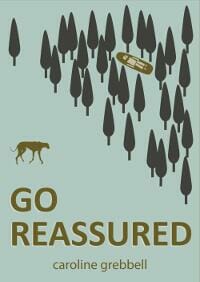
TM: The overall style is interesting and unique, but could leave a potential reader a little confused as to what is trying to be conveyed.
Carrol Fix submitted Visions II: Moons of Saturn designed by Carrol Fix, Art work by Victor Habbick Visions. “Visions II: Moons of Saturn is a science fiction anthology. The largest moon, Titan, shown here, is featured in several stories.”

TM: This design has a visually interesting illustration and adequately fits the genre but the implementation of the title lettering could be a little better executed.
Cathy Helms submitted Summer Moved On designed by Cathy Helms. “The author was looking for a contemporary feel – warm colors and yet Autumn in tone. This is a contemporary romance and the author wanted a clean, feminine title as well.”

TM: The typography and photo of this design were well selected and well placed. Aside from the author name which appear to be a bit of an afterthought, this is an well-crafted overall composition.
Christopher Hanada submitted The Rewind Files designed by Eben Matthews. “We wanted to recreate the pulp paperback feel of the retro sci-fi novels of yesterday. Eben created a great logo for the United States Time Travel Bureau, embossed it as a gold stamp on some leather for texture, and then wrapped the whole thing in our Retrofit Publishing branding.”

TM: This design has a fascinating type treatment as well as the overall aged look of the design. Making the author name a little more readable would be the only immediate adjustment I would recommend to this well-done design. ★
Damon Za submitted A Reaper of Stone designed by Damonza.com.
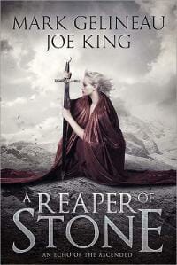
TM: A solid overall design with an interesting arrangement of the lettering within the title.
Damon Za submitted Bad Penny designed by Damonza.com.

TM: This design has the “bestseller” feel. Its bright color and bold typography make it impossible to miss. ★
Damon Za submitted Contract: Snatch designed by Damonza.com.
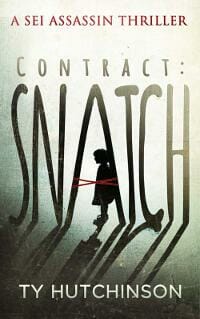
TM: The “in-scene” treatment of the typography as well as the overall lighting of this design make for an interesting overall composition. Utilizing the same typeface for the subtitle and author name could also help bring a little more unity to the type elements.
Damon Za submitted My Bridge To Forever designed by Damonza.com.

TM: This design’s photography and type work together perfectly for a vibrant, balanced design composition. The word “bridge” blends a little, however, it still maintains an ample readability.
Damon Za submitted Shifting Infinity designed by Damonza.com.

TM: The style, illustration, and implementation of this design is well done. Everything from the lighting effects to the type style makes this design as intriguing as it is professional.
Damon Za submitted The Black Spindle designed by Damonza.com.

TM: The cited typography help make for a more interesting overall composition. The silhouetted figure seems to add to the the suspense rather than detract from the meaning as is sometimes the case with a featureless figure.
Damon Za submitted The Chronothon designed by Damonza.com.

TM: The boldness, style, and detail of this composition make it an excellent design. Everything from the unique typography to the stunning photography makes this a memorable and professional book cover. ★
Dane Low submitted A Betrayal of Time designed by Dane & Brittany at EbookLaunch.com.

TM: The idea and concept of this design are good however the implementation of the girl’s face feels a little distracting and could almost be more subtle. ★
Dax Varley submitted Bleed designed by Nathalia Suellen. “YA Horror”

JF: Although the image is striking, it’s a bit hard to make out what exactly is happening, and the subtitle looks too small.
Dionne Abouelela submitted When Life Hands You A Lemon designed by Dionne Abouelela.

TM: This is an interesting design and concept though the script typeface poses some readability issues—especially among the author name.
Dora Badger submitted A Dark and Bloody Business designed by Trevin Wyant. “The story is set in a mining town in Kentucky at the turn of the 20th century, and features a twisted carnival of forgotten gods. The image of the tent springing from raw coal evokes not only the old traveling carnivals but the lush textures of Kentucky coal country.”

TM: This design would do well with either a more prominent illustration or typography. Right now it feels like all the elements are competing and none has yet taken the lead.
Dylan Doose submitted Fire and Sword designed by Spawning Pool Studios. “The helmet was 3D sculpted in ZBrush by Spawning Pool Studios & represents the helmet worn in the story by one of the main characters. The fire represents both the fire wielded by the story’s mage, and the destruction wrought by fire throughout the book. The green color is for the Emerald Witch.”

TM: Utilizing a unique illustration/photo this design definitely stands out from the crowd. The sword running through the type treatment is a nice touch.
Dylan Jones submitted Black Book designed by Dylan Jones.

TM: While keeping it simple has the potential of making a striking design, I’m afraid this is a little too simple. It may leave a potential buyer scratching his head.
E.M. MacCallum submitted The Demon’s Grave designed by Amygdala Designs.

TM: This concept definitely captures the mood effectively.
Ebony McKenna submitted The Spring Revolution designed by The Masked Maven. “The fourth and final in the series. I loved the way this matched the style of the other 3 covers, balancing the uncertainty of a revolution with magic and whimsy.”

TM: It would’ve been great to see this title held up against the others in the series, but as a standalone it still does pretty well. The titling and illustration are all well done. The overall style lends itself to the teen/youth age group a bit—not sure if that was the aim but that’s my first impression.
Edward Odson submitted Care Taker designed by Edward Odson. “Care Taker is the first person account of a man lured into service as the caretaker of a demonic being in human guise. Hence, evil looking old man being pushed in a wheelchair.”

TM: This overall design could use a little better execution as it currently lacks clarity both in the illustration, title, and overall style.
Ellen Ann Callahan submitted No Brakes: On the Wing designed by Catherine J. Crockett. “I asked the designer, Catherine J. Crockett, to design the cover to achieve two goals: (1) letting a prospective reader know that the crime fiction novel was about a female bicycle messenger working in an urban environment and (2) conveying an atmosphere of menace.”

TM: The concept and idea for this design is good, although the implementation is a little lacking. Either going full illustration, or full photo would be great as of right now it seems to ride the middle of the road.
Ellie Firestone submitted The Misadventure of Bolingbroke Manor designed by Ellie Firestone.

TM: The mood and style for this overall design are well established in this particular book cover. I would, however, recommend a little bit more readability in the title and subtitle.
Evy Journey submitted Welcome, Reluctant Stranger designed by Ana Grigoriu. “Cover for book 3 in the series Between Two Worlds, women’s fiction about navigating separate realities.”

TM: A photo can make or break a cover and it definitely makes this one. The typography, however, lack a bit in readability—particularly the subtitle and book number.
Frederick Heimbach submitted The Devil’s Dictum designed by Milan Jovanovic. “I found Milan Jovanovic through the 99 Designs website. My novel tells the tale of an alt-history U.S. founded by Satan-worshiping pirates, and nothing says “pirates on Plymouth Rock” like a U.S. flag with the Jolly Roger in the corner.”

TM: This design is well-done both in implementation and style. The only small improvement this design could benefit from right now is uniformity in the type. Right now, they’re close to the same typeface but not, which gives a bit of an awkward feel. Overall, a well-done design.
G.G. Andrew submitted Crazy, Sexy, Ghoulish: A Halloween Romance designed by G.G. Andrew and Rebecca Barray. “This cover was a joint effort between myself and designer Rebecca Barray for my just-released New Adult romantic comedy.”

TM: The light-hearted feel is captured here, however, the typefaces used (apart from the script) feels as though they don’t quite fit.
Gabrielle Prendergast submitted Anomic designed by Gabrielle Prendergast. “Post-apocalyptic shifter romance? Check! The author wanted something very on trend so we saw eye to eye on this.”

TM: Very well done design, style, and implementation. The subtitle is nicely placed with the tiger helping to create a balanced overall design.
Gabrielle Prendergast submitted Carson’s Story designed by Gabrielle Prendergast. “The client wanted a classic police romance for this MM romance story.”

TM: Everything about this design is well crafted and placed. The only thing that could make this design a little stronger is the choice of color palette. The cover feels like it should be more stark, contrasted, and desaturated as opposed to the bright, heavily-saturated colors used in the type.
Gabrielle Prendergast submitted First Twenty designed by Gabrielle Prendergast. “One of the favorite covers I’ve done for Bold Strokes Books.”
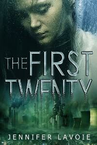
TM: As a whole, this cover does a good job of setting a specific mood. The “Twenty” fading toward the bottom is a nice effect, however, it’s not immediately clear what visual purpose it serves, or what it’s meant to communicate.
Gabrielle Prendergast submitted Group Effort designed by Gabrielle Prendergast. “This was a customized pre-made the client purchased from my new budget service. It’s very naughty gay erotica, but I think the cover has some class.”

JF: No secret what the “hook” is here, and the composition works well, but what’s the point of 2 lines of type you can’t even read?
Gabrielle Prendergast submitted Making a Comeback designed by Gabrielle Prendergast. “This one was close to my heart as I designed it, because I had a piano-player friend who was blind.”

TM: Clean, clear and readable, however, the message it conveys may be a little cryptic to a first-time onlooker.
Gabrielle Prendergast submitted The Renegade designed by Gabrielle Prendergast. “The publisher encouraged me to use more contrast in this one, another post apocalyptic for Bold Strokes Books”

TM: Strong style with striking typography. The style added to the main character is a nice touch.
Gary Bregar submitted Mantle: The Return of the Sha designed by Brandon Hovet. “This book is a fantasy adventure novel set in the world of Mantle. The cover was hand-painted in acrylic on a 14×16 board, then scanned. The characters in the image are specific to the story, and the setting gives a hint of things to come.”

TM: The illustration is quite vibrant and complex—the type treatment feels like it could be stronger.
Gerardo Canova submitted The Twisted Life of Nikolai Isayev designed by Gerardo Canova. “For the Cover I was looking for something that represented the whole plot of the book without giving away too much of it and also for it to entice the future reader to pick it up. And the story in general is dark and the details represent location, mood and tones inside the pages of the book.”

TM: The simplicity and color or eye-catching, however, what is being conveyed with the overall design may be a bit of a mystery.
Guido Henkel submitted Heavens on Fire designed by Lieu Pham. “Lieu has rebranded my entire “Jason Dark” series and keeping with the style, this cover is one of the highlights with its clear suggestion of an apocalypse in the celestial heavens. Notice the angel wing and the horned shadow. Combined with the fiery coloration nothing else needs to be said.”

TM: The typography as a whole makes this design whereas the wings and other side element only seem to subtract or distract.
Guido Henkel submitted Hunted designed by Lieu Pham. “It was crucial to have a cover that oozes with mystery while also conjuring up the streets of Victorian London. I think, designer Lieu Pham did an absolutely tremendous job of capturing both while going even further and creating a cover that instantly stands out among the crowd with a bold title.”

TM: Bold and dark—definitely conveys its theme.
Harry Fox submitted The Stonegate Sword designed by Jay Nathan Jore. “Cover is based on an original painting by Giang Nguyen commissioned specifically for the book. Design elements relate to the novel’s setting, including mountains, walled cities, and medieval-style weapons/armor. The position of the female character follows the narrative arc of the plot.”

TM: The typography has been treated well while the illustration, while well executed, lacks a little as an interesting composition.
Ian Blackport submitted Starwatch designed by Ian Blackport. “Thank you for hosting this contest. I’m excited to be part of it. My novel is a fast-paced heist story in a fantasy setting. I wanted the cover to capture the spirit of a caper with keys and scrolls, while using a cloth map for its backdrop.”

TM: Clean, simple, and interesting design although the imagery overwhelms the title a little.
Ioana Visan submitted Broken Hearts designed by Cristina Birtea. “Cristina illustrated the cover based on what I asked her to draw. The hand belongs to one of the main characters in the novel, a magician, and the images on the cards represent other characters working at the circus, as the back of the card shows.”

TM: Interesting illustration with typography that needs a little help in the readability department.
Jack Dancer submitted Detour Paris designed by Jack Dancer. “Detour Paris represents the “detour” taken by the main characters of the book on an international trip from the United States To Barcelona, Spain.”

TM: Distinguing a bi more between author and title would help, but it’s a strong, readable overall design.
James Mullen submitted Boston Harbors Murder designed by Matt Hinrichs Design & Illustration. “I found Matt Hinrichs in the January e-Book Cover Design awards. I was looking for someone who would suggest elements of the novel’s title in a simple but strong manner. He was a delight to work with and will get, I’m sure, wider attention from writing community.”

TM: Says “the history of” a little more than it does suspense, still, the design is well crafted and implemented.
James Ryan submitted The Mage’s Servant designed by James Ryan.

TM: Very appealing illustration and interesting type treatment. Definitely fits the youth age group if that’s the proper target market.
James Willis submitted A Diamond Boy in the Rough designed by Spiffing Covers. “Dynamic cover for young adults.”

TM: Excellent typography and photography treatment. If this book was designed for the youth age group—it hits the target perfectly.
James Willis submitted Among You Secret Children designed by Spiffing Covers. “Movie-poster style cover for an epic sic-fi romp.”

TM: A powerful illustration with typography that can’t quite seem to make up its mind about what it wants to be.
James Willis submitted Entanglement of Fate designed by Spiffing Covers. “Atmospheric period cover/ mystery.”

TM: Striking, balanced, unique, and readable. A solid overall design.
James Willis submitted Fiamma designed by Spiffing Covers.

TM: A dramatic and intriguing composition. The title could use a little more contrast but is well done as a whole.
James Willis submitted The Unending designed by Spiffing Covers. “Hard hitting fantasy cover.”
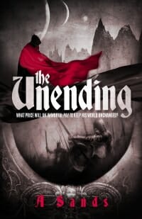
TM: This cover has an interesting illustration and well-implemented mono-chromatic color scheme though the title type somehow doesn’t quite fit.
Jean Gill submitted Bladesong designed by Jessica Bell. “Book 2 in The Troubadours Quartet (see ‘Book 1 Song at Dawn’).

TM: Intriguing design, good choice of typography, and nice touch with the decorative border.
Jean Gill submitted Song at Dawn designed by Jessica Bell. “The designer was asked to create an author brand for a multi-genre author (via the style of the author name); a series identity for The Troubadours Quartet and a cover that suited the story. I’m submitting the other 2 covers so you can make a judgement re the series not just re one cover.”

TM: As with the previous design, the border adds a nice touch and the variation of color would help the two stand alongside as a visual team.
Jeff Altabef submitted Enemies of the State designed by Dale Robert Pease.

TM: A strong, solid design that aptly fits the genre and mood of its target market.
Jim Rudnick submitted Pirates designed by James Smith. “My first SciFi novel was a great thing to have happen and the cover by James is outstanding!”

TM: This design features clear, bold typography with an interesting and unique graphic. I wish the illustrated mass depicted was centered vertically between the title and author—rather than pushed to the bottom. Otherwise, a great design.
John Gibson submitted The Tales I’ve Told designed by John Gibson. “The Tales I’ve Told is a collections of short stories that Ted Fink, an oral storyteller, has been performing for years. His stories are whimsical, funny, uplifting, and sometimes ironic. To convey the nature and variety of the book, I used stage props and different textures.”

TM: An intriguing style and color scheme although the title seems to get lost among the varying elements throughout the design.
John Pearce submitted Treasure of Saint-Lazare designed by Jane Dixon-Smith. “Jane Dixon-Smith designed this dramatic cover to illustrate the essence of Paris, the Eiffel Tower.”

Jon Chaisson submitted A Division of Souls designed by Jon Chaisson. “This is the first book in a trilogy with a theme of supernatural awakening; Book 1 shows nighttime, with Book 2 featuring past-midnight darkness and Book 3 revealing dawn. The city’s night haze here ties in with the events in chapter 1 as well.”

TM: Excellent photography and solid, bold typography. Very well crafted cover design.
K.D. Rose submitted Heavy Bags of Soul designed by Jeremy Parker from ideas submitted by the author.

TM: Simplistic and eye-catching though the typefaces for the author and the title don’t seem to play nice.
Karl Drinkwater submitted 2000 Tunes designed by Karl Drinkwater. “The font is quirky, slightly broken and wobbly like the protagonists. In both cases the woman’s eye represents the love interest; the old technology hints at the past.”

TM: An interesting concept although the author name comes off as an afterthought lost beneath the eye.
Karl Drinkwater submitted Turner designed by Paul Beeley. “A horror novel. The cover has a number of elements from the text: creepy killer in a red hooded coat; bicycle, pub and toilets from the prologue (“Dynion” is Welsh for “men”); stormy weather. It does a good job of telling the reader what they’re in for, helped by the tag line and blood-red colours.”

TM: Definitely depicts the mood—but the author name feels like it’s about to fall out of the design.
Karri Klawiter submitted Interstate Providence designed by Karri Klawiter.

TM: A strong, solid, and interesting design. The author name dominates—which is totally acceptable so long as the author is more of a selling-point to consumers over the title.
Karri Klawiter submitted Masks and Mirrors designed by Karri Klawiter.
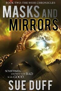
TM: Strong, striking typography with imagery that all seems to blend just a little.
Kat Faitour submitted A Matter of Trust designed by James. “Hi, I’m submitting my contemporary romance cover. I took a risk by not following the genre trend of placing people on my cover (headless and/or shirtless esp.). I’d love to know your opinion on my choice. James (designer) worked w/ me to use London ‘icons’ instead (series set in London). Tx! K”

TM: This design carries a nice uniformity among the color of the telephone booth and title.
Katherine McIntyre submitted Poisoned Apple designed by Cora Graphics. “Goth Snow White in a YA contemporary romance with a darker theme.”

TM: The word “Apple” gets a little lost with the decorative typeface and the effect applied to it—but overall a solid design.
Kim DDD submitted Assure her designed by Marushka from DDD. “Cover design for New Adult Rock Romance ”Assure her””

JF: Strong typography and obvious appeal from the beefcake, but the bottom section is quite confusing and I don’t think it’s adding much to the cover.
Kim DDD submitted Borrowed World designed by Milo from DDD. “Cover (re) design for post apocalyptic adventure.”

TM: Powerful imagery coupled with well-treated typography and a striking overall composition. Well done. ★
Kim DDD submitted Erupt designed by Milo from DDD. “Cover design for Science Fiction Post-Apocalyptic A Disaster Novel series ”Erupt”, book 1″

TM: Typically, vertically stacked type is a no-no on a book design, however it seems to work here as a lighted sign. The overall composition is well balanced with the title to the left and the mountain to the right.
Kim DDD submitted Quake designed by Milo from DDD. “Cover design for Science Fiction Post-Apocalyptic A Disaster Novel series ”Quake”, book 2″

TM: This title serves as an excellent companion to the previous title—especially the change in type color while maintaining the general style of the previous design.
Kim DDD submitted The Antiquity designed by Milo from DDD. “Cover design for Mystery Crime Thriller with some paranormal elements ”The Antiquity””

TM: A solid, striking design, although combining an outline style with a narrow typeface for the title poses a little bit of a readability issue—particularly for the “the.” Otherwise, it’s an effective design.
Kim DDD submitted The Collector designed by Milo from DDD. “Cover design for Post Apocalyptic Science Fiction ”The Collector””

TM: Clean, simple, dramatic, and effective. This design hits the target. ★
Kim DDD submitted The Laws of Attraction designed by Marushka from DDD. “Cover design for Science Fiction Romance ”The Laws of Attraction””

JF: A solid cover with nice touches to signal what kind of book it is, not sure why the designer wanted to make the subtitle so hard to read.
Kim DDD submitted The Magic Necklace designed by Kitten from DDD. “Cover design for Children’s Fantasy ”The Magic Necklace””
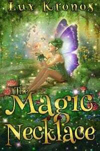
TM: The illustration and typeface selected for this design work well together and have hit the target market, perfectly.
Laura Zats submitted The Last of the Firedrakes designed by Scarlett Rugers.

TM: The pattern, illustration, and typeface all work very well together in this design. Some of the title disappears a little being in such a decorative typeface—especially with the embellishments surrounding on both sides. But overall it works very well.
Leonide Martin submitted The Mayan Red Queen: Tz’aakb’u Ahau of Palenque designed by Manfred Rohrer. “The cover image conveys the Red Queen’s regal presence and destiny to bring forth rulers. The serpent-footed infant she holds is the Maya patron god of royal lineages, whose leg becomes a vision serpent used to communicate with gods/ancestors; one emerges from its jaws giving prophesies.”

TM: An interesting concept, however, it’s common for illustrations to give books a more youth-targeted feel about them as it does with this particular design. Regardless of if this is the intended market, the imagery does clearly depict the subject in question.
Lou Gaglia submitted Poor Advice and Other Stories designed by Carolyn Mansir. “The images are related to events that occur in some of the more prominent stories in the collection. The building on the left bled into the spine and the back cover, along with other images.”
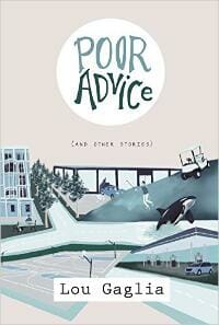
TM: This design sports a more post-modern feel with a teen flare. Overall, the unique way the images have been placed together makes for an interesting design. The second portion of the title could use a little help in regards to readability.
M.E. Neidhardt submitted Abysmal Canyon – Book 1 of the Domina Lumen series designed by M.E. Neidhardt. “I am an artist and wanted to create my own book design using Photoshop. The canyon image is from a photo I took while hiking at Black Canyon, CO, which was the inspiration for the story. The crystal relates to the role crystals play in the story as well as the protagonist who is a dowser.”

TM: While the illustration fits the bill, the mysterious nature of this designs makes it seem like it should be scattered or more dynamic rather than all elements aligned dead center.
Mallory Rock submitted Zia The Teenage Zombie and the Undead Diaries designed by Mallory Rock.

TM: The message is definitely portrayed, although the color-scheme in particular has a little clashing occurring.
Marya Heiman submitted Dreamthief designed by Marya Heiman.

TM: A well-implemented composition with a subtitle that gets a little lost among the mix.
Matt Doyle submitted WICK designed by Matt Doyle. “The aim was to create something simple with the focus on the playing card in the centre of the image and the book title clear on smaller screens.”

TM: This design definitely has simple, however, it lacks a bit in its visual communication. It also stands a bit off-balance with the author name as the lone element shifted right.
Matthew William submitted The Enoch Pill designed by Ari Ahokas.

TM: Interesting, simplistic concept with type that is nearly nonexistent.
Michele Brouder submitted Claire Daly: Reluctant Soul Saver designed by Scarlett Rugers.

TM: Overall, this design has a unique, solid style and design that works well. The subtitle and author name are a bit difficult to read but the general design style works well.
Michelle Johnson submitted Oleah Chronicles: Truth designed by Michelle Johnson. “It was important to showcase the character on the cover to give readers a visual of what an Oleah is. I needed the fonts to be clean but bold, modern and strong enough to stand against the main image.”

TM: An intriguing concept that may give receive some head scratching from those not immediately familiar with the story.
Mindy Shelton submitted All Tucked Inn designed by Mindy M. Shelton. “The female face on my design is the main character. When I found the photo on a stock website, I couldn’t believe my luck. She is Lizzie! And since my main character has experienced a hand over her mouth, and been kidnapped, the photo was exactly right for this book.”

TM: Definitely bold, however, the typography doesn’t really match the sentiment.
Mish D submitted Her Hero designed by Tathagata Mandal. “It’s a may-december love story set in the Indian city of Kolkata. It’s not much about steamy sex, rather follows the story of the protagonists discovering each other as their soul-mates and finding peace in each other’s arms. The background captures the city. Tram & Victoria Memorial at a distance.”

TM: A unique illustration with typography that seems to be playing too-minimal a role.
Naomi Litvin submitted The Masada Faktor designed by Naomi Litvin.

TM: Clean, solid, readable and too the point.
Patty Kunze Tatum submitted Cruising Alaska Tropical Style designed by Karlene Conroy. “Designer Karlene Conroy perfectly captured the fun, relaxed feel of Cruising Alaska Tropical Style. The primary colors grab the attention of young readers, and the central image of the seal is eye catching.”

TM: The fun, light-hearted mood was captured, however, the implementation falls a little short.
Paul Emery submitted From the Mud designed by Don.

TM: A big bold title—but the overall design’s communication is a little conflicting.
Paul Emery submitted Ten designed by Don.

TM: Bold and clear this book cover has—I’m just not sure what it’s trying to say.
Phin Hall submitted No Time To Stand And Stare designed by Jon Wotton.

TM: An interesting but puzzling concept.
Richard Levesque submitted The Girl at the End of the World designed by Duncan Eagleson. “My cover designer, Duncan Eagleson, did a remarkable job of capturing not just a scene from this YA post-apocalyptic novel, but he also managed to capture the mood of the book as well.”

TM: Strong imagery, balanced typography, and an overall solid execution.
Robert L. Slater submitted Straight Into Darkness designed by ROBERT SLATER. “Second in series by this writer/designer combo. You gave the first one, ALL IS SILENCE, a gold star in January 2014. Thanks for all you do for those of fumbling through the indie publishing biz! Rob”

TM: Stunning imagery meets professionally crafted typography. A top-notch design. ★
Rue — submitted Finally My Favorite designed by Damonza. “This cover is for the third book in a series and it was critical that is stand on its own while also connecting to the existing covers in the series.”

TM: The characters feel as though they could have been a little better incorporated into the overall composition, however, the type treatment and placement is well done.
Sarah Sunday submitted How to Stop Wildfire designed by Sarah Sunday. “I was not the one who did the cover image, a close family member did, but I designed basically everything else with some advice. The image represents the sun or a large fire. Fire is a continuous motif in my novel, which you can probably guess based on the title.”

TM: Nice, readable typography with a very interesting illustration. Off the cuff the illustration says “sunflower” a little more than actual flame, but it still makes for a very visually interesting design.
Sheri Fredricks submitted Monica Beggs designed by Dusktil Dawn Designs. “I asked the cover artist to capture the book’s humorous tongue-in-cheek romance between a surfer and a porn star.”

JF: I’m getting the romance part, not so much on the “tongue-in-cheek” part, but it will appeal to its target audience.
simon avery submitted The Brighton Maverick designed by I do book covers.

TM: A solid, lighthearted design that’s well implemented.
Stacy Claflin submitted Seaside Kisses designed by DIY Book Covers.

TM: The subtitle fades a little, however, this design blends type and various images together very well.
Stacy Claflin submitted Transcend designed by DIY Book Covers.

TM: A clean, simple and readable design.
Thomas Pluck submitted Protectors 2: Heroes designed by Suzanne Dell’Orto.

TM: An intriguing and visually interesting book design. It has an overall style, however, that lends it a little more to the non-fiction side of the aisle.
Veronica Purcell submitted I’m Kita Duran designed by Veronica Purcell. “The concept behind the design was an attempt to show a sophisticated feel to a story about teenages. The red is the colour of the student council armband mentioned in the story and the lino-cut theme reminded me of my art classes back in high school.”

TM: Clear and readable but it doesn’t quite seem to fit the market in conveys.
Vivienne Stevenson submitted BLACK BAMBOO designed by Deranged Doctor Design. “The cover design portrays the main character as he faces his mission into remote & hostile extremes…”

TM: A visually appealing illustration with an aptly-chosen typeface.
Wendy Jones submitted Killer’s Countdown designed by Cathy Helms. “This is the first book in a crime series. The cover is part of the branding of the series. The lower half of the image is a scene from Dundee where the book is set. The top half of the image is indicative of part of the story within. Each cover will be a different colour.”

TM: It communicates the message, however, the author name and series tagline appear a little as an afterthought rather than part of the overall design.
Wendy Jones submitted Killer’s Craft designed by Cathy Helms. “This is the second book in the DI Shona McKenzie Mysteries. The cover is part of the overall branding of the series. The lower half of the book is a scene from Dundee, Scotland, where the book is set. The upper half picks up on one aspect from the book. Each book in the series is a different colour.”

TM: As with the previous title, the series tagline and author name could use a little reworking to fit.
Wendy Knuth submitted Moore Zombies: Blood Moon designed by Sudipta Dasgupta. “This cover and book idea was inspired by my son and I watching the blood moon last year. I related the information to my artist, and he came up with this great depiction of the night sky, with my zombie characters observing the blood moon.”

TM: The overall style fits its target market well.
William Miller submitted Noble Man designed by Marian Koster. “The artist works at a local printing shop and has never done anything like this before. When I told her I needed a cheap cover artist because the book was written to raise funds for human trafficking victims, Marian offered to create a cover for free. I think she did a fantastic job!”

TM: This design carries bold, striking typography but leaves me guessing a bit as to the genre, market, and its main message.
Nonfiction Covers
Dane Low submitted The 1-Hour College Admissions Essay: A Simple Path to a Successful Personal Statement designed by Dane & Brittany at EbookLaunch.com.

TM: The imagery and simplistic typography do a great job quickly communicating to onlookers in an effective and stylish way.
Debby Gies submitted Have Bags, Will Travel designed by Yvonne Less. “A short stories book in memoir/humor of my pitfalls of traveling with too much luggage and declaration consequences upon my return trips.”

TM: The overall design here captures the mood well and communicates its message well.
Denise Bossarte submitted Dreams of the Turtle King: Poems Inspired by South Florida Beaches designed by Debi Beauregard. “Thank you for your consideration of my poetry book. Denise”

TM: An interesting illustration in an overall cover design that seems to come up a little short.
Eric Lorenzen submitted Letters over the Wall designed by Eric Lorenzen. “The letters pictured on the cover are some of the actual letters the author received over his 40 years of correspondence with East Germans, while the photo of Brandenburg Gate was taken by him just before the Wall was finally taken down.”

TM: A great concept for what sounds like an intriguing story with a little less-than-great execution.
Jacquelyn Lynn submitted Put Your Website to Work designed by Jerry D Clement. “Conversations is a new series of affordable ebooks based on a focused conversation with a subject matter expert. Our goal was to clearly convey the how-to topic and the sense of a casual, cozy informal chat — we originally considered wine and cheese, then decided tea and cookies would be better.”

TM: Readable and strait forward, however, nothing about the design seems to compliment the book’s message.
Mallory Rock submitted The Best Thing That Could Ever Happen to You designed by Mallory Rock.

TM: When in doubt, depend on trusty typography—which is exactly what this title does and does so well.
Marc Herman submitted Godfathers and Thieves designed by Madeleine Eiche. “This cover was for the seventh title by Deca, a cooperative of international journalists founded last year. The same designer has done all Deca’s covers. This is the first to use a photo, and references the inclusion of black and white photos inside with the text, also a first for us. Thank you.”
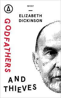
TM: A visually interesting and unique design. The stacked letters for “Godfathers” somehow feels awkward here, but overall a solid design. ★
Martin Tompa submitted Winning Schnapsen designed by Saul Perkes. “In the card game Schnapsen, holding both Queen and King of any suit in your hand is called a “marriage” and is worth extra points. I love the way that Saul enchanted the card images to bring the marriage partners to life, allowing them to escape the confines of their cards.”

TM: It communicates its message, however, to design could do well with a little less cartoony overall feel.
Michele Orwin submitted The Lost Town: Bringing Back Trochenbrod designed by Al Pranke. “The author had a compelling reason for wanting to use a group photograph that really didn’t work well for a cover. Al Pranke found a way to make the photo stand out and keep the cover interesting.”

TM: Simplistic, solid, and clear. Does the job.
simon avery submitted The Levels designed by I do Book Covers.

TM: An excellent concept and well executed. Not sure if this was the intention, but it’s somehow reminiscent of old-school Donkey Kong. ★
Steven DeGregorio submitted The Best Feeling In The World designed by DeGreg. “1st edition was released as hardcover, ebook put up right after delivery of 1st. I labored over 3 different designs, before deciding. It’s got a degree of cliche, admittedly, but it is clean, easy to read as ecover and appropriate (IMHO) for a coming of age memoir from a nobody. Thanks. DeGreg.”

TM: The concept here is good, but could be better with a different typeface and a subtitle giving a little insight as to what the book’s design is meant to communicate.
Tammy Seidick submitted The Best Seat in Baseball, But You Have to Stand! designed by Tammy Seidick. “Thanks for your review!”

TM: This design gets right to the point—an underrated quality lacking in many book designs of the day.
Well, that’s it for this month. I hope you found it interesting, and that you’ll share with other people interested in self-publishing.
Use the share buttons below to Tweet it, Share it on Facebook, Plus-1 it on Google+, Link to it!
Our next awards post will be on November 23, 2015. Deadline for submissions will be October 31, 2015. Don’t miss it! Here are all the links you’ll need:
The original announcement post
E-book Cover Design Awards web page
Click here to submit your e-book cover
Follow @JFBookman on Twitter for news about the E-book Cover Design Awards
Check out past e-Book Cover Design award winners on Pinterest
Subscribe to The Book Designer Blog
Badge design by Derek Murphy


