Welcome to the e-Book Cover Design Awards. This edition is for submissions during January, 2016.
This month we received:
157 covers in the Fiction category
27 covers in the Nonfiction category
Comments, Award Winners, and Gold Stars
I’ve added comments (JF: ) to many of the entries, but not all. Remember that the aim of these posts is educational, and by submitting you are inviting comments, commendations, and constructive criticism.
Thanks to everyone who participated. I hope you enjoy these as much as I did. Please leave a comment to let me know which are your favorites or, if you disagree, let me know why.
Although there is only winner in each category, other covers that were considered for the award or which stood out in some exemplary way, are indicated with a gold star: ★
Award winners and Gold-Starred covers also win the right to display our badges on their websites, so don’t forget to get your badge to get a little more attention for the work you’ve put into your book.
Also please note that we are now linking winning covers to their sales page on Amazon or Smashwords.
Now, without any further ado, here are the winners of this month’s e-Book Cover Design Awards.
e-Book Cover Design Award Winner for January 2016 in Fiction
Yudron Wangmo submitted Excavating Pema Ozer designed by Damonza. “My book has two protagonists, a contemporary Bay Area girl, and her previous incarnation Pema Ozer—from early twentieth-century Tibet. Instead of trying to depict both, I asked the Damonza group for Pema Ozer with a snow mountain. The original photo had lipstick and a seductive naked shoulder. ”


JF: A fantastic piece of image manipulation complemented by evocative typography makes this a winner.
e-Book Cover Design Award Winner for January 2016 in Nonfiction
Aegina Angeliades submitted My Skin Don’t Fit designed by Custom-book-tique.com.


JF: A cover that manages to be funny, sexy, and right on point, well done.
Fiction Covers
Aaron Rosen submitted The Blue Tango Salvage designed by Aaron Rosen. “Clean, simple and intriguing. Somewhat racy but it’s meant to capture attention.”

JF: This is the strongest of these covers (see below) and although some of the shapes are gratuitous to the point of confusing the main image, the tone is attractive.
Aaron Rosen submitted The Dragon Fire Recovery designed by Aaron Rosen. “A C130 with guns blazing. WooHoo Bob!”

JF: Rather ho-hum for such an active battle scene.
Aaron Rosen submitted The Falling Star Recovery designed by Aaron Rosen. “Final book in the series and my final submission.”

JF: Awkward, especially where the black band behind the title is cutting through the artwork.
Aaron Rosen submitted The Rogue Horse Recovery designed by Aaron Rosen. “Minimalist design that conveys the message of the plot in 2 photos and a title.”

Aaron Rosen submitted The Eye of Horus Salvage designed by Aaron Rosen. “The cover has an Indiana Jones and the Temple of Doom feel – but with helicopters.”

AG Liam submitted Dark Incidence designed by Addy Banks. “The cover reflects the journey of Dani, the protagonist, as she descends from the light, and into the darkness. However, there is beauty in the darkness and conflicts in the light.”

JF: Mostly it’s showing the dark side, but in an appealing way.
Al Marsiglia submitted Contract Pending designed by Nick Cayo.

JF: Despite the interesting distressed title, this cover is a demonstration of what not to do because it’s virtually impossible to make out what all the dark shapes are or what they’re supposed to mean.
Alexander Gerasimchuk submitted Parables from Shambhala: The Wisdom of the East for Everyday Life designed by Elena Suster.

JF: A lovely and well-balanced cover with typography that perfectly suits its subject matter. Could use a faint border to keep the white background from “bleeding” onto the page as it does here.
Alexandre Rito submitted Enforcing Home – Survivalist Series – Book 6 designed by Alexandre Rito. “Work commissioned by the Author, A. American.”

JF: One of a series of covers, all of which are equally adept and expertly positioned. Here, I particularly liked the way the designer controls the eyepath, leading right to the figures in the distance, and the “hook” into the story.
Alexandre Rito submitted Hidden Scars designed by Alexandre Rito. “Work commissioned by the Author, Amanda King.”

JF: Nicely composed, with a warming palette.
Alexandre Rito submitted Sovereign Hope designed by Alexandre Rito. “A Young Adult Paranormal Romance.”

JF: Ethereal, with deft image handling and careful typography. ★
Alexandre Rito submitted Gone Feral designed by Alexandre Rito. “Horror, Post Apocalyptic, Military and Urban genre.”

JF: Very effective genre cover, and notice how the composition and lighting direct us right to the figures in the distance, and into the story.
Alexandre Rito submitted Storm in the Mountains – Turning Creek 2 designed by Alexandre Rito. “Fantasy, Period, Series, Young Adult genre.”

JF: Beautiful combination of image and typography, this cover has an elegaic tone. ★
Alexandre Rito submitted The Ember war – Book 1 designed by Alexandre Rito. “Work commissioned by the Audiobook publisher Podium Publishing.”

JF: Everything you want in a sci-fi action cover, with style. ★
Alexandre Rito submitted Azahrú: Wer den Weg verliert designed by Alexandre Rito. “German Edition.”

JF: Both of these are solid fiction covers that communicate with the reader well, giving some idea of the story within.
Alexandre Rito submitted Mein Leben davor designed by Alexandre Rito. “A German Novel.”

Alicia Rades submitted Desire in Frost designed by Clarissa Yeo.

JF: I like the title treatment, but it’s hard not to see the big rose as her mouth.
Allynn Riggs submitted The Blood designed by Nathan Fisher. “Cover image is a combination of digital and hand painting. Upper right corner shows one of the involved worlds with its three moons against a hand painted star field. Title font was created to evoke the image of sword blades. Centers of Os represent crystals important to story.”

JF: I can see a lot of careful work went into this, but the whole title treatment is so big and impressive, and covering so much of the art, that it looks a bit out of balance to me.
Alvie Sarker submitted Witch Trials Crimson Necrosis designed by Alvie Sarker. “The three rings worn by the mysterious enchantress represents the three great plagues mentioned within the book, each are represented with a certain color. The crimson leaves that border around her emphasis and hints the source of one of the plagues.”

Annette Poole submitted Death Goes to the County Fair designed by Elizabeth Mackey. “The original illustration for Death riding the roller coaster is the work of illustrator Karen Kalbacher. Elizabeth redesigned the cover for this first installment in my cozy mystery series.”

JF: It’s altogether charming for your market, but I wonder why such a muted color palette?
Ashley Ruggirello submitted Gambit designed by Ashley Ruggirello.

JF: Lovely art, why make the type compete with it?
Ashley Ruggirello submitted Split the Party designed by Ashley Ruggirello. “Design is based off of a rough sketch from the author of the book world.”

Ashley Ruggirello submitted The Untold Tale designed by Ashley Ruggirello.

JF: Of these two covers (see above) I think this is the most successful. In the first one, readability suffers and it’s too dark to make out. In this one, the title is much more legible (why wasn’t it centered??) and the conceit of an old book is nicely appropriate.
Ashley Ruggirello submitted Golden designed by Ashley Ruggirello.

JF: Pretty but indecipherable.
Basil Opurum submitted A widow’s silhouette designed by Author. “The details that relate my e-book to the cover design are: i.) The narrow path the lady in the veil must travel through. ii) The mystery behind the dark veil covering part of her face.”

JF: But Basil, only you know those things. What you’ve left us with is a claustrophobic peek into a bleak nothingness.
Ben Hammott submitted The Playwright’s Murder designed by Ben Hammott. “I have tried to portray the theater theme of the book’s plot as much as possible in the cover design.”

JF: The theater theme comes across well.
BoB Thompson submitted Wreck of the gossamer (The Puzzle Box Chronicles Book 1) designed by Teodora Chinde. “For this colorful and ominous eBook cover, Teodora accurately captured a pivotal moment in the story, where a strange puzzle box floats free of a sinking ship and bobs toward the surface during a storm. Look closely and you can see the doomed ship below.”

JF: A beautiful and evocative design, and that box is a great “hook” into the story.
Bruce Foot submitted Ned Smelly – Outlaw Stuck in Iron Suit designed by Bruce Foot.

JF: Cute and attractive. No missing the connection between “smelly” and “foot” either.
C.F. Tolwyn submitted The Map Keeper (End Chronicles Book One) designed by Y. Fritzler. “A multi-layered cover where the main feature (the map) was first sketched out in pencil by the author, then digitalized onto the main character’s back by the cover designer.”

JF: Nice idea, might work better (since ebook covers are often seen at small sizes) if the map was more prominent, and the type less busy.
Caroline Cairn submitted Forever Hers designed by Bree Archer. “Thank you.”

JF: Appealing, although the color is surprisingly “hot.”
Cathy Yardley submitted Level Up designed by Cathy Yardley. “This is my first self-published fiction series. I knew I wanted a “cartoon” cover. I was lucky enough to get artwork from Lora Innes, a webcomic artist. I played with fonts to cover the “geek” vibe, with just a touch of effects to mimic NY published books.”

JF: A good effort, but with very little impact, and it won’t compare favorably to professionally produced books.
Celine Meyong Krishack submitted Alexander, What Are You? designed by Xlibris. “The goal was to show children of different backgrounds showcasing their unique characteristics.”

JF: Not sure how much actual diversity was achieved here.
Chana Keefer submitted One Night With a Rock Star: Part Deux designed by Yvonne Parks of Pear Creative. “Yvonne Parks has created thousands of book covers and said this was one of her favorites. Our creation process is always so cool because, generally, I get stuck on concept, my husband has a burst of inspiration to provide direction then Yvonne makes it sing.”

JF: Expertly done, with lots of luscious detail and texture.
Charles Massie submitted The Boy in The Bin designed by Charles W. Massie. “This is a book about a young teen who is forced to live in a storage bin as depicted on the book cover.”

JF: Fine only if this is a “hobby” publication.
Cheryl Mackey submitted The Unknown Sun designed by Victoria Faye.

JF: Attractive, and I like the delicate typography.
Chris Lines submitted I KILL NORMANS designed by Chris Lines. “The cover shows the principal weapon of the protagonist and how he operates, including the oversize arrow. The title gives a good idea of what to expect.”

JF: Not very effective, and the illogical type effects don’t help.
Christopher McPherson submitted The Complete James Murray Mysteries 1931-1939 designed by Matt Hinrichs. ““The Complete James Murray Mysteries 1931-1939” is a collection of all five mystery novels set in 1930s Los Angeles.”

JF: I love the stylish look of this cover, but the yellow background seems an odd choice for the mystery genre.
Cora G raphics submitted Behind a Lady’s Smile designed by Cora Graphics.

JF: Workmanlike.
Cora Graphics submitted Vitalis: Resurrection designed by Cora Graphics.

JF: Same.
Cora Graphics submitted Living in Shadows designed by Cora Graphics.

JF: This one’s more interesting, due to the atmospheric effects.
Cora Graphics submitted The Cauldron Bound designed by Cora Graphics.

JF: The best of this series, with authentic interest, incipient action, and a stylish title treatment.
Cora Graphics submitted Ironheart designed by Cora Graphics.

JF: Very effective cover for an action-oriented fantasy romance, even the title is moving.
Crystin Goodwin submitted Fire Blessed designed by Winter Bayne.

JF: Exciting imagery.
D.P. Prior submitted Carnifex designed by Valmore Daniels. “Cover art by Mike Nash. The font was slected by Alisha of Damonza.com for the three other books in the series, and adopted by Valmore Daniels who put together the design for Carnifex. ”

JF: It’s a real advantage to have such great art to work with. Although I like the energy in Carnifex, the balanced composition of Return of the Dwarf Lords is really appealing.
D.P. Prior submitted Return of the Dwarf Lords designed by Alisha (Damonza.com). “Artwork by Mike Nash.”

Dan Malakin submitted Smiling Exercises, and Other Stories designed by Damonza. “This cover is for my collection of flash fiction called Smiling Exercises, and Other Stories. ”

JF: Delightful, makes me want to smile just looking at it. ★
Danessa Violette submitted Luckiest girl alive designed by Danessa Violette.

JF: Maybe one too many images, because that disembodied eyeball floating around is pretty scary.
Daniel Pieracci submitted Take Your Shot designed by Johannes Widmer. “The four heads that make up the family tree represent the four main characters in the book. Johannes did a great job of integrating the graphic elements and the text – the title is visible from space. :-)”

JF: Intriguing contrast between the massive type and delicate drawings, a bit like a puzzle.
Daniel Quilter submitted A Soul Divided designed by Ben Quilter. “The cover depicts an event that happens in the book, but is also supposed to make the planet look like it’s divided to reflect the title.”

JF: A very beautiful piece of art that, on its own, does not make a very good book cover.
Dawn Witzke submitted Pius Tales designed by Dawn Witzke. “The design is based off the writer’s idea and brings together religious and thriller elements as well as ties in with covers for the previously published trilogy this book goes with.”

JF: Looks like a cool idea, but the execution is awkward.
Derek Murphy submitted Shearwater designed by Derek Murphy. “I’ve been experimenting with animated book covers; this is a gif but should display fine with the link, the effect is very subtle. Thanks! Derek”

JF: A subtle yet dramatic cover with sensitive typography. ★
Devon Michael submitted Hollo designed by Sol Metcalfe. “Original oil on canvas by Sol Metcalfe. Fonts and design by Jordan C Michael.”

JF: Can’t help but think the painting would have had more impact if it wasn’t competing with the “distressed” type.
Diana T. Scott submitted Our demons, best friends designed by Maria Gandolfo. “Our demons, best friends is a love story between two people burdened by their pasts. Their demons are represented by the ghost-like entities.”

JF: Despite the skill of the artist, this cover doesn’t work for me. Most of it is occupied by an amorphous shape, the “heart” is negative space, and the title has been obscured and buried. And what’s the gold “seal” for?
Don Viecelli submitted The Guardians – Book 3 designed by Kerman Rodríguez. “The cover depicts what an antimatter bomb will do to a planet, which happens in my ebook story. I could not have asked for anything better for my book. I am very pleased with the cover design.”

JF: Looks nasty. Solid sci-fi cover though.
Don Viecelli submitted UTOPIAS designed by Kerman Rodríguez. “UTOPIAS is set in a fictional St. Louis, which is also the seat of the new government. I wanted to show the capital on my ebook cover and the designer used the book details to include the Arch with a Star at the top. I was pleased with the design for my ebook cover.”

JF: Although the image is strong, the type looks overworked.
Dorothy Roberts submitted Riverwood designed by Dorothy Roberts. “Riverwood is a children’s story about land on the Suwannee river, showing the magic of nature with life lessons, to four ten year olds with problems. All of the pics in the book and on the cover were taken by the author.”

JF: Proof that even lovely photos don’t automatically turn into book covers. You might want to get a professional to incorporate your photos into a more finished cover for your book.
Emerald Lavere submitted A Wife for the Future designed by April Martinez.

JF: An attractive look for this adult dystopian romance.
Eric Weigner submitted I Am Guardian designed by Eric Weigner. “I designed the cover to capture the nature of swords and sorcery of the fantasy genre (the sword that glows) and the changing seasons (the autumn trees) which reflect the change of a coming of age character. The black backdrop represents the rising darkness over the land of Elexarvia.”

Gabrielle Prendergast submitted Fairy on the Rocks designed by Gabrielle Prendergast. “Magic, martinis and a butterfly tattoo was the order. Done, done and done.”

JF: Effervescent, and the title treatment suits it perfectly. ★
Gabrielle Prendergast submitted Chased by Fame designed by Gabrielle Prendergast. “The author wanted something very Hollywood, very LA and very glamorous. I think we got there.”

JF: Must be the sunglasses.
Gerald Darnell submitted Dead End designed by self. “Former winner in Auhor’sdb contest.”

JF: From what I can see behind the giant gold beetle, it’s weak.
Gerald Darnell submitted Justifiable Homicide designed by self. “Finalist in Authorsdb cover contest”

JF: This one, also attacked by the gold beetles, is a bit better but still struggling with legibility.
Gwen Dandridge submitted The Dragons’ Chosen designed by Carol Heyer (cover art) Siri Weber Feeney (cover design). “carolheyer.com is the artist for the cover”

JF: A beautiful and clever illustration with equally charming typography that’s oddly obscuring the dragons.
Hazel Butler submitted Chasing Azrael designed by Hazel Butler. “I wanted the cover to reflect the dark nature of the MC (a necromancer) & subject (supernatural murder mystery/ghost story), & capture the fantasy and romantic elements. I designed a bespoke photo shoot in order to get the image perfect, and enable me to keep the cover design elements simple ”

JF: The image is very strong, but it needs stronger typography in an integrated design to really shine.
Horton Prather submitted Threat designed by Horton Prather. “The cover design for Threat is meant to portray the feminine antagonist in the suspense genre. The knife with Nazi emblem on the hilt provides some hint of the story.”

JF: It looks more assembled than designed, and the font choices aren’t helping.
Ioana Visan submitted No Port to Land designed by Gil Geolingo. “The first book in the Law and Crucible space opera saga.”

JF: Good genre cover.
Ioana Visan submitted Point of Origin designed by Gil Geolingo. “The second book in the Law and Crucible space opera saga.”

JF: The weakest in this series, with the dreaded “pasted on” look.
Ioana Visan submitted Bonds of Steel designed by Gil Geolingo. “The third book in the Law and Crucible space opera saga.”

JF: Best of the lot with an interesting, active illustration for this sci-fi series.
J. L. Brown submitted Don’t Speak designed by Damonza.

JF: The big gray areas seem to weaken this cover’s impact.
J.D. Hughes submitted Northman designed by Jonathan S. Hughes. “The ‘Northman’ cover was designed by my son, Jonathan, and the amulet featured by Alban Depper. Both of them have my admiration! This is the original cover design. I added a couple of faces (the protagonists}, but the design became cluttered and slightly comic book, so I removed them. ”

JF: Wise move. Simplicity is working because the carvings are mysterious and the whole scene is pregnant with story.
Jade Zivanovic submitted Hardman designed by Steam Power Studios.

JF: Stylish and a little scary.
James Duprie submitted Deeds of the Kind designed by Annoula.

JF: The receding path between trees is pretty much a cliché at this point, but this cover is redeemed by the great atmospherics and careful title typography.
Jamesa Frishkeyh submitted Terminal Convergence designed by Susan Asbill. “Story involves orphaned brothers at the dawn of WWII and the events that bring them to a fateful convergence decades later.”

JF: On one hand I find this cover a disturbing mashup of Michaelangelo and some slit wrists; on the other hand, it’s hard to look away from.
Jennifer Kibble submitted Phoenix Element: Mages of Vane designed by Jennifer Kibble. “Cover for Mages of Vane was drawn by Eric White.”

JF: I think it would be stronger i the central couple was made large enough to be the main element.
Jennifer S. Alderson submitted Down and Out in Kathmandu: adventures in backpacking designed by Philip Derijcke and Jennifer S. Alderson. “I wanted Swayambhunath Temple to feature on the cover of my travel/adventure novel but didn’t want to use a photo; it’s not a guide or memoir and I didn’t want to confuse potential readers. Instead an artist cut the shape out of thick paper and reworked it digitally to create a slightly evil effect. ”

JF: The illustration is amusing and the type is perfectly matched to this carefree cover. You do realize that at most sizes the subtitle is unreadable.
jina Sahm submitted There’s a cat flying around my house! designed by jina Sahm. “This cover was hand sketched and then photoshop enhanced with multiple layers.”

JF: Charming illustration, but you shouldn’t let it push the title into a little corner of the cover.
Joanne Tracey submitted Big Girls Don’t Cry designed by Jacinda May. “Big Girls Don’t Cry is contemporary women’s fiction. That feel needed to come through the cover. Although it’s set between Melbourne and Bali, Bali is almost a supporting cast member, so I wanted that sense of place to come through the cover- without it looking like a travel book. ”

JF: While you did get a sense of place, these images don’t look comfortable together.
Joel Dorr submitted Those Crazy Notions of Otherwise Intelligent People designed by J and J Designs. “Since Those Crazy Notions of Otherwise Intelligent People is a unique story that melds together the genres of Romantic Comedy and Drama, we wanted the cover to be distinctive as well. The cover was inspired by all of us who develop preconceived notions of people but ultimately are proven wrong. ”

JF: An idiosyncratic approach to an unusual cover project, and the combination of chalk drawing with a photograph does grab your attention. Not too crazy about the line of type that completes the title, it looks a bit like an afterthought.
John Barry submitted Wasted designed by John Byrne Barry. “I have been a designer for decades, and have designed covers for annual reports and the like, but never for a novel. This is my first and only book cover design. P.S. Your site has helped me a great deal in getting my two novels self-published.”

JF: John, I’m glad I can be of help. This cover shows your corporate background and, although it’s clean and clear and well designed, it’s not really appropriate for a mystery.
John Pratt Bingham submitted Hangtown designed by Dave Fymbo. “Pictured is Main Street in Hangtown where a good deal of the action takes place. I wanted a visual for the reader with a noose to accentuate the harness of the times. Police cars in Placerville, Hangtown today, had nooses on them until early in this century. ”

JF: An effective cover that could be (slightly) improved by making either the rope or the letter “A” predominate instead of fighting with each other.
John Rafferty submitted Real Tales of Surf Arcana – A Perfect Wave designed by J.B. Rafferty. “The image for this cover was created using Adobe Photoshop.”

JF: Lovely, and strongly focused. Notice how the title echoes the water’s surface, a nice touch.
José Ramón Torres submitted Waves designed by Dariel Llerandi. “This novel deals extensively with Cuban migration to the US. Its cover is based on an original oil painting, a surreal image of a tree composed of oars and an inner tube, suggesting the flimsy rafts used by Cubans in their perilous crossing of the Florida Straits.”

JF: A lot to decipher on the fly.
Juhi Larkin submitted The Mists of Niflheim designed by Juhi Larkin. “This was designed for a Norse-inspired epic fantasy.”

JF: Interesting visual, title ought to be much stronger in my opinion.
Justin Sloan submitted Teddy Bears and the Christmas Pirates designed by Justin Sloan.

JF: Unmistakably self-published, and that’s not usually a good thing.
Karla Locke submitted The Adventures of Peter and Penny at Hudson Bay designed by Tony Locke. “This fun and educational children’s book includes photos from a friend who passed away from cancer. The design of the cover was to show off the area and introduce the cubs (Peter and Penny) in a family portrait with mama P.”

JF: I think if the cubs are the stars, it might have been better to show them larger on the cover, and the type could be a lot easier to read.
Kate Reilly submitted Fast Forward designed by Kathleen M. Reilly. “Thanks so much for the opportunity!”

JF: A captivating image desperately in need of better typography.
Katherine McIntyre submitted An Airship Named Desire designed by Jillian Renee A.. “Genre: steampunk adventure”

JF: Very cool, and the girl looking forward is a great hook into the story.
Kelly Miller submitted Splintered designed by Ida Jansson.

JF: The “looking through the fence” image is pretty well used, but here it gains new life from the intensity of the look and the interesting treatment of the rest of the textures on the cover.
Kim DDD submitted Rock You designed by Marushka from DDD. “Cover design for NA Rock Star Contemporary Romance, Book 1”

JF: Another strong series, and there’s no mistaking what the appeal of these books is, or who they are aimed at. The type treatment of the titles basically amounts to the series “branding” (see the two below).
Kim DDD submitted Cry For You designed by Marushka from DDD. “Cover design for NA Rock Star Contemporary Romance, Book 2”

Kim DDD submitted Be With You designed by Marushka from DDD. “Cover design for NA Rock Star Contemporary Romance, Book 3”

Kim DDD submitted Realm of Shadows designed by Milo from DDD. “Book cover design for Epic Fantasy Adventure, The Shadow Men series, Book 1”

JF: An effective fantasy series design (see the two below).
Kim DDD submitted Council of Shadows designed by Milo from DDD. “Book cover design for Epic Fantasy Adventure, The Shadow Men series, Book 2”

Kim DDD submitted Dance of Shadows designed by Milo from DDD. “Book cover design for Epic Fantasy Adventure, The Shadow Men series, Book 3”

Kim DDD submitted Smoke Rising designed by Milo from DDD. “Cover design for Science Fiction and Fantasy series, The Supernatural Bounty Hunter series, Book 1”

JF: Although there’s a lot to like here with the atmospheric illustration and the threatening monster approaching, but I’m not sure why the series ID is so much stronger than the title, which looks like it has been pushed aside, and the strange effect of the differing angles of the title and series type makes me a bit woozy.
Kim DDD submitted Indestructible designed by Milo from DDD. “Cover design for Dystopian Adventure Post-Apocalyptic series, Indestructuble Trilogy, Book 1”

JF: Great colors, and although a lot of the cover has been given over to the emblem at the top (which we know nothing about) the cityscape at the bottom implies a lot about the story.
Kim DDD submitted Haunt Of The Wilds designed by Marushka from DDD. “Cover design for M/M Paranormal Adventure, The Wilds Duology, Book 1”

JF: I guess a “duology” has to have two related fellows on the cover. These are stylish with a hint of mystery, leaning into their paranormal stories.
Kim DDD submitted Song For The Wilds designed by Marushka from DDD. “Cover design for M/M Paranormal Adventure, The Wilds Duology, Book 2”

Kim DDD submitted The Dark Stuff designed by Milo from DDD. “Book cover design for Horror book, A Supernatural Horror Novel”
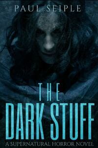
JF: Deadly effective horror cover.
Kim DDD submitted India Gray designed by Kitten from DDD. “Book cover design for Historical fiction book”

JF: Although I admire the lovely illustration and nice handling of the color panel at the bottom, it seems odd to highlight the category of the book so strongly on the cover instead of telling us more about the story inside.
Kris Trudeau submitted TimeShift designed by Kris Trudeau. “I hope you like the cover of my book. I’m an (aspiring) writer by night, graphic/website designer by day, so I was able to do the art as well. It’s been a great project. Thanks ”

JF: Great job, Kris, and you’ve got a solid sci-fi cover that really communicates eeriness, and the type is handled very well too.
Laney McMann submitted CRYSTALLUM designed by Amalia Chitulescu.

JF: A strong cover that makes good use of the “trees leaning into the path” theme, and a sensitive title treatment.
Larry Clark submitted Tawodi: Cherokee of the Blue Mountains Confront Spanish Conquistadors designed by Joe Belt & Jennifer Belt Sizemore. “Searched long and hard for an artist to depict Tawodi (Cherokee for “Hawk”), a sixteenth century Native American. Joe Belt’s gallery depicted what I wanted, a black & white cover, somewhat surreal with an image of the red tail hawk. Now I know what Tawodi looked like as a young man.”

JF: I’m not sure why you decided to go with a black and white cover, considering the color that would have been available to make this illustration really stand out. The title looks more like a nameplate.
Laura Drake submitted Days Made of Glass designed by Bonnie Mutchler. “I chose the photos – Bonnie did the cover.”

JF: Oddly literal, and the title treatment isn’t very strong.
Laura Emery submitted What Remains of the Fair Simonetta designed by Dragan Bilic. “The picture in the gold frame is a section of Botticelli’s painting “Primavera.” Part of the story describes a ball which inspired this painting of the three Graces and Mercury.”

JF: A cover that looks more “assembled” than designed.
Lea Doue submitted The Firethorn Crown designed by Damonza Book Cover Design. “A retelling of 12 Dancing Princesses (lots of ballgowns). The girl is a princess/heir who is unsure of her own strength. Action takes place in/around castle and in a hidden kingdom underneath a hedge maze (a dark setting). Her necklace holds a curse placed by mysterious underground sorcerer prince.”
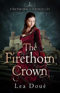
JF: Atmospheric and alluring, a unified design where every element is selling the story.
Lianne Simon submitted A Proper Young Lady designed by Lianne Simon. “APYL crosses genres–Romance, Literary, and New Adult. Yet without jumping into bed. It’s about the struggle to be what everyone else expects. And recapturing lost childhood dreams.”

JF: A lovely cover that invites, but I think the subtitle running across the title was a mistake, because now it’s unreadable.
Lisa Lawmaster Hess submitted Chasing a Second Chance designed by Laurie J. Edwards.

JF: The green background is pretty cold for a “cozy” read, and the title has little impact.
Lou Harper submitted The Fading designed by Lou Harper. “The author wanted something more subtle than the usual creepy kinds, haunted houses, and gore for this collection of horror short stories.”

JF: Creepy in exactly the best way, and here the black and white scheme heightens the scary appeal.
Lucinda Whitney submitted The Secret Life of Daydreams designed by Ravven. “This is a custom cover made with photos manipulated to match the physical characteristics of the main characters. The genre is contemporary romance.”

JF: Not sure all these elements go together very well, and mystified by the ornate title treatment that seems out of place with the image of the couple.
Mallory Rock submitted Seeds of Discovery designed by Mallory Rock.

JF: A captivating cover that looks like it was designed for print.
Marion Ueckermann submitted Love Blossoms designed by Marion Ueckermann. “Originally designed as a 3D box set cover comprising of seven contemporary Christian romances for springtime reading, the cover was adapted into 2D listing authors names to comply to Bookbub cover requirements. Bringing the elements of spring and love to the cover was key.”

JF: The visual strongly reinforces the concept behind the collection, although I would have liked to see the “Love” in the title not pushed to the side and creating odd shape contrasts with the woman’s back. Overprinting might have been a better solution, but overall it really does the job well.
Marion Ueckermann submitted A Match for Magnolia designed by Jessica Sprong. “The visual chosen was perfect for this first book in the Seven Suitors for Seven Sisters series about the Blume sisters as clearly portrays the heroine’s innocent character, as well as showing her floral namesake, the Magnolia flower.”

JF: Yes, she’s lovely and appropriate, but the title is working against the clean simplicity you’re trying to achieve. Lose all those weird type effects, you don’t need them.
Matt Larkin submitted Legacy of Moon and Fire designed by Robin Ludwig. “My designer created this cover for a historical fantasy set in Indonesia. I asked her to remain visually consistent with the first cover, which featured the same temple and a girl in silhouette.”

JF: The temple and the silhouette work fine: it’s the type that’s weak.
Matthew James submitted Only an atheist can help God save the world designed by Amber Feldkamp. “Amber did an incredible job creating a cover that summarises my satirical novel, ‘Only an atheist can help God save the world’, and the cover shows a quite angry looking God, clearly displeased with humanity. The lettering also serves to highlight that this book is a comedy. I love it!”

JF: Well, it’s splendid and original, but with all the space available, I wonder why half your title got pushed almost completely off the cover.
Matthew Stanley submitted The Empty One designed by Matthew Stanley.

JF: This is what people mean when they say, “It looks self-published,” and that’s not the result you want. Try hiring one of the many excellent designers whose work is shown here.
Micah Hansen submitted A Time to Endure (Strengthen What Remains Book 2) designed by Micah Hansen.

JF: Workable.
Michael Colavito submitted Circle of Faith, Light’s Prophecy designed by Michael Colavito. “The book is supposed to be a found object, preserved perfectly for centuries, waiting to be discovered. I thought that the most obvious material would be a leather bound book, with embossing.”

JF: Although the leather reads really well, the stitching around the outside doesn’t really say “book,” and the lettering is much too low-contrast for easy recognition. Don’t sacrifice legibility to an artistic concept.
Michael Kingswood submitted Robbed Blind (Glimmer Vale Chronicles #4) designed by James Beveridge. “I hired Jim via Lucky Bat Books. He made the covers for all my Glimmer Vale books, and I think this is his best one to date.”
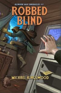
JF: It effectively puts us into an exciting scene in the story, and that’s a great hook. Might move the author’s name down.
Michael Siemsen submitted The Many Lives of Samuel Beauchamp designed by Michael Siemsen. “Aspiring to somehow manifest the book’s fusion of genres (literary, historical, suspense, paranormal), I began with a stock photo of a stack of books, Adobe Photoshop, and a bottle of Visine. Rising from my drool-stained desk the next morning, I discovered this completed design on my screen.”

JF: I hope your eyes are feeling better. Although this has an attractive “bookish” quality to it, no professional designer would have planned this to lead the eye to the bottom left corner. You could have “flipped” the image so it was facing the other way, which would have been a better solution.
Mike Cook submitted Scorpions designed by Mike Cook. “I made the design and illustration after deciding to self publish my book. After teaching high school art for fifteen years I felt kind of obligated to do the work myself, a no-brainer. The drawing was done in graphite pencil and then painted in photo shop”

JF: Nice painting and a good cover, although the scorpions might have contrasted with their background more for greater effect.
Monica Haynes submitted Longshot in Missouri designed by Monica Haynes of The Thatchery.

JF: An excellent cover for this Civil War-era historical novel, with polish and economy. ★
Nancy Moser submitted Bride of the Summerfields designed by Nancy Moser, Mustard Seed Press.

JF: Beautiful image combination that creates a great backdrop for the mansion against the woman’s dress, and here the border with flourishes is appropriate and helps to frame the cover nicely.
Naomi Eccles-Smith submitted Kin Seeker (Book One of Dragon Calling) designed by N. R. Eccles-Smith. “Title summaries protagonist’s quest to search for his missing kind. The dragon is presented as a singularly featured character of clear importance (protagonist), and in a style (animation) that appeals to the target audience (Upper MG). The background is both symbolic and artistic to the story.”

JF: Great job appealing to your readers, especially the appealing dragon.
Naomi Eccles-Smith submitted The Beacon Thrones (Book Two of Dragon Calling) designed by N. R. Eccles-Smith. “Title highlights an important plot element in story. The singularly featured character (as with Book One) follows the chosen pattern of featuring an important character introduced in the book. The background continues the artistic choice of Book One, transitioning from night to dawn.”
![]()
JF: Another good cover, not as strong as the first, and on both the series “branding” could be cleaned up and strengthened.
Phyllis Moorman submitted Whatever Happened to Will designed by Phyllis Moorman. “The cover was designed to reflect the lead character’s battle with polio and the aloofness necessary for his health and career.”

JF: The book description indicates the protagonist is a sociopathic assassin, so I’m a little baffled by this cover.
Rachel Pudsey submitted The Watcher of the Night Sky designed by RACHEL PUDSEY. “When designing this cover, I wanted it to reflect the title as well as give elements of fantasy. I wanted it to appeal to YA fantasy readers and fit in with the style that is common in that genre. I wanted it to appear professional, not scream self-published.”
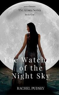
JF: I think you’ve succeeded, and the lyrical image of the woman framed by the circle is a lot of the reason for its success.
Renee Barratt submitted One Foot In The Grave: An Almost Zombie Tale designed by Renee Barratt – The Cover Counts.

JF: An effective design with strong typography, although I wish the image of the woman integrated with the scene better.
Richard Levesque submitted The Devil You Know designed by Duncan Eagleson. “My cover designer, Duncan Eagleson, faced the challenge of creating an image that would fit well within the contemporary paranormal fantasy market while still conveying the sense that the story takes place in 1946. I am very pleased with the results.”

JF: The image is a little confusing, with a lot of elements, and the type is overworked.
Richard Vooght submitted Devolution Cycle designed by Richard Vooght. “Devolution Cycle deals with a certain re-cycling of humanity that has taken place for thousands of years, where mankind has continually become the masters of their own demise. I hope to have intrigued the readers mind enough to have captured this with the image which I have created.”

JF: But the image on which the entire cover rests is confusing and its meaning is hard to decipher.
Rick Holland submitted Travelling designed by Vision Press. “Travelling is the story of a woman’s journey of self-discovery prompted by the most painful loss imaginable. This cover portrays the desolation that comes after losing the one you love most. ”

JF: Are you sure? It looks like a woman waiting for a plane, and that’s not intrinsically very interesting.
Rita Villa submitted It’s All About The Gravy designed by Peter from Bespoke Book Covers.

JF: Okay, wow. But hey, I love dogs!
Rochelle Karina submitted A World Rebuilt designed by Bret Wade. “The cover design was a challenge – to depict a character who needs to look like a “normal” person, but with snow-white hair, pale skin, and eyes that glow green – without making it look cartoonish or overdone. I was thrilled with the design and the incorporation of colors. ”

JF: Lacks impact or interest.
Ron Sacdalan submitted Bots, Come! designed by Ron Sacdalan. “The cover concept is “Robots being all-too human”, which reflects the dark but comical content of the book. I wanted to keep it “clean” while suggesting that a robot has over-dosed (on whatever it is that robots crave) and has passed out on the floor of a public washroom – cigarette still in hand. ”

JF: I think the idea for your book is much stronger than the cover that represents it. The style is right, but not sure the image will communicate what you intended.
Ruth Nestvold submitted Looking Through Lace designed by Lou Harper. “My old cover for this SF novella was home-made and looked it, so I hired Lou Harper to design a completely new cover. I’m very happy with the result.”

JF: Great idea, and you’ve ended up with a strong cover that intrigues.
SA Collins submitted Angels of Mercy – Volume One: Elliot designed by SA Collins. “These are character study works exploring the effects of homophobia and a queer romance in competitive sports – in this case, American football. The intent is to convey the inherent institutionalized violence that can come from within.”

JF: If this is a realistic book exploring serious issues, why does the player have wings? Classy title treatment.
SA Collins submitted Angels of Mercy – Volume Two: Marco designed by SA Collins.

Scott Gordon submitted The Love Seat designed by Scott Gordon. “Thank you!”

JF: Clever and attractive.
Serge Alexandr submitted The Rise of Ares: Mortal Sins designed by Serge Alexandr.

JF: Interesting idea, but I’m not sure reverse imagery (i.e. planets in a sea of light) is working that well, and the cover doesn’t give us much to go on. Needs a border to prevent “bleeding” onto the web page.
Sharon Crosby submitted Abandoned In Time designed by Sharon Crosby.

JF: Every time travel book has to have that image of a clock somewhere, right? The woman doesn’t appear to have been very well integrated with the rest of the artwork. Also, not sure that mimicking the “TIME” logo is a good idea here.
Shawn Daniel submitted The Nicest Guy In Hell designed by Shawn Daniel. “The cover gives a sense of an average guy facing fear of the unknown waiting to devour him. Fire demons in the background and the soul reaching his arm out all signify there’s no escape. Paul is holding on for dear life. If you look closely you’ll notice the shadow has already let go”

JF: That’s funny, it looks to me more like a bunch of random shapes with no reason behind them, and the lettering of the title is (intentionally?) pretty crude.
Sumisha Chandan submitted The Incompetent Tiger designed by Sumisha Chandan. “The ebook is designed by the Author – Sumisha Chandan”

JF: Love that tiger, but the cover looks oversimplified.
Summer-Sage Dionne submitted The Summer of Tsunami, Legacy: Book One designed by S. Campbell Williams. “The cover of my first book is an assortment of soaps crafted by the main character in the story. The covers are specific to the female characters in my saga.”

JF: That very busy background is a challenge, and the typography doesn’t hold up well in comparison.
Susan Jennings submitted The Blue Pendant designed by Telltale Talent (Jordan Mitchell). “The story set in 1913 in a prestigious hotel in a seaside town in England. The lower part of the cover shows the hotel and ambiance of that time period, the town’s promenade. The young woman protagonist wears a blue pendant a gift, that reminds her of her dreams and goals”

JF: Almost everything about this cover is well thought out and beautifully realized, although the flowers in the bottom right do appear a bit incongruously trapped in the cityscape.
Susan Rohrer submitted The Beautiful World: Adapted from Eleanor H. Porter’s Inspirational Novel: Just David designed by Susan Rohrer. “The Beautiful World is a contemporary adaptation of a beloved classic book.”

JF: You have a lovely landscape and typography that suits, so pasting that violin on top seems questionable to me.
T.J. Roberts submitted Fairalon designed by T.J. Roberts. “The cover is actually 1/2 of the image which is continued on the back cover. It can be viewed on the website, but the front image stands alone.”

JF: At a glance, I wonder how many people would know what this book is about? At this size, you can’t even see the little figure of a boy stuck in the bushes below the letter “F.” So a pretty boring picture of a tree and some cartoonish lettering won’t be able to do the work this cover needs to do. (Magical fantasy)
Tammy Seidick submitted Something Borrowed, Something Blue designed by Tammy Seidick. “Thanks for your review!”

JF: The evocative image is well-matched by the thoughtful typography.
Tina Collins submitted Sing The Blues designed by Tina Collins. “Designed cover myself but don’t sell services for covers”

JF: Roger. Nice drawing.
Tobi Doyle submitted Lyn’s Song designed by Tobi Doyle. “Sexy rock god Jason is from Silicon Valley and dealing with his personal demons.”

JF: The problem here is that the background and foreground images haven’t decided who’s boss, so they are competing for our attention. The amateur typography doesn’t help, it adds to the level of confusion.
Tom Davies submitted Space Holiday designed by Tom Davies.

JF: Incomprehensible.
Tony Hernandez submitted Slaughter & Maneuver designed by Rob Ozborne. “Let me know what you guys think even if it doesn’t win. People seem to really love the cover! TH”

JF: It’s bold, and that’s good. Not too sure what’s going on with that plane, but it does grab your attention.
Troy Nooe submitted Five Kinds of Nothing designed by Lauren Henry and Judy Geary. “My first 3 books were released by a small publisher, but when they went belly up, I decided to do it myself, launching my Last Call Press. With the help of local artist, Lauren Henry, I think we captured the spirit of my old time Myrtle Beach mysteries.”
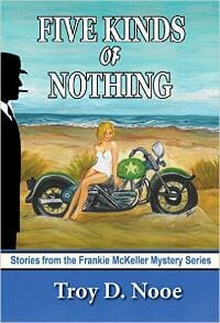
JF: Um, I disagree. Looks like a school project.
Vanessa Riley submitted Unveiling Love designed by Jshan & Vanessa Riley. “I needed a Regency era cover depicting a multi-cultural couple. He is mulatto. She is exotic, half-Egyptian, half-Spanish. So the two are of African descent, but very different. Also, the cover needed to project an air of protection and love, critical themes for the romance and the suspense.”

JF: I think it works, and naming your subgenre on the cover isn’t a bad idea either. The controlled color palette helps to heighten the affect of the illustration.
Vivienne Neal submitted Deception in Plain Sight designed by Vivienne Diane Neal.

JF: Nope. “Fun with Fonts”? What does that have to do with anything?
Yoly Cortez submitted Vampire Miami designed by Cormar Covers.

JF: Spooky and threatening, just right, and the title treatment heightens the effect by playing off it.
Yvonne Less submitted In His Keeping – The Dealer Of Souls – Book 1 designed by Art 4 Artists. “I created this cover for the Australian Author T.J. Adams. It is the first book in a series of dark urban fantasy.”

JF: Solid and serious genre fiction cover with an interesting combination of fantasy signals and beefcake.
Nonfiction Covers
Aimee Tafreshi submitted Letters from Zulu designed by Jerry Reneau. “I wanted a photograph of a woman looking out to sea that called to mind Dali’s work, Figure at a Window. The image is supposed to capture the longing of a newly betrothed Navy wife awaiting her submariner husband’s return. The letter represents a journal entry kept by the young man while deployed. ”

JF: I like your idea but there’s so much going on here that we can’t really get your message. So many radically different fonts, fancy transparency effects, and lots of “copy” on the letter are all distracting.
Alexandre Rito submitted CONUS Battle Drills: A Guide for Combat Veterans to Corporate Life, Parenthood, and Caging the Beast Inside designed by Alexandre Rito. “A Guide for Combat Veterans to Corporate Life, Parenthood, and Caging the Beast Inside.”

JF: An expert cover that represents those returning military and the fractured world they face (since they also likely know that CONUS stands for continental United States).
Andrea Carrera submitted James and Games that are NOT Games designed by Andrea Carrera. “The cover of James and Games that are NOT Games clearly shows that bullying your friends or anyone around you is a bad thing; you are hurting other people. The fox is happy for the pranks he made to his friends but, the sheep, the panda bear, and the pony are shown crying and suffering. ”

JF: I think the style is just right, but I wonder how suffering animals will sell.
Bill Parkinson submitted Lifting the World designed by Tom Crowe. “Lifting the World could mean many things but in my case it describes an international business based on the rental of lifting equipment. I wanted the cover to make this clear and I think that designer Tom Crowe, photographer Tom Repetny and model Pat Clark have achieved this brilliantly. ”

JF: Riggers are an underappreciated part of contemporary life, and I applaud your attempt to show them as heroic, although showing them actually lifting something monumental into place might have been even better.
Chris Lascelles submitted Through the Darkness designed by Maurizio Marotta. “We think this is one of our best covers yet! Many thanks in advance.”

JF: Horrifying (to the modern eye) and effective at grabbing the viewer’s attention.
Christian Keel submitted Divorce – Remarriage and the Innocent Spouse: Counseling for Betrayed Believers designed by Christian Keel.

JF: The flower probably represents innocence, but this is a dark cover for what might be a hopeful guide. The use of at least 3 different type treatments in the 6 word title is bothersome.
Dani Harris submitted Knowledge is Power what everyone should know about the police designed by Ann Wiley. “In light of the increase in police shootings across the Country, there is a body laying on the ground on the cover with police tape. This scene is what police shooting scene would look like. Since I believe that there is a lack of understanding, the title is very fitting to promote information. ”

JF: An interesting idea that needed much more sophisticated execution to reach its potential.
Denise McCormack submitted Don’t Let the Best Man Ruin Your Wedding: A Bride’s Best Guide for the Best Man’s Speech designed by Denise McCormack. “This how-to guide for the bride and members of the wedding entourage emphasizes the relevance of the Best Man’s speech and guides the reader through the process of creating a personal and memorable tribute to the happy couple.”

JF: Let’s see: two cartoons that don’t match; meaningless shapes in the bottom left; a headline that SCREAMS!!!; and an unreadable subtitle.
Douglas Cootey submitted Saying “NO” to Suicide designed by Douglas R. Cootey. “So many books on fighting suicidism had dark covers with despondent people at arms length from the means of their chosen death. I wanted an upbeat cover that reflected the “dawn” theme in my book, which worked both as a thumbnail & full size image. It is meant to empower. ”

JF: I admire your desire to swim against the depression stream, but this cover does not say “uplifting” in any way, although it does have some power.
Gabrielle Prendergast submitted Get Sober Get Free designed by Gabrielle Prendergast. “A redo of an existing set.”

JF: Both good covers, this one has a clear and hopeful message although the bottle is a bit incongruous.
Gabrielle Prendergast submitted Why You Drink and How to Stop designed by Gabrielle Prendergast. “A re-design of an important set of self-help manuals. The author wanted gravitas and hope. I think this and the companion accomplish her goal”

JF: Here the message is delivered creatively, although the big block of small type doesn’t work so well for an ebook cover.
General Hartsfield submitted YUM designed by General Hartsfield.

JF: A “comical” illustration like this has possibilities, but it would need stronger type to make its point: what’s the book about?
James Crabtree submitted Desert Fox 1998 designed by James Crabtree. “In this design I tried to link the black-and-white cartoons in the book to the cover without distracting from the cover. I used the stand-alone “deployment badge” on the front and the “Iron Cross” on the back I used my unpublished photo of a Soviet telex machine from Desert Storm for the front. ”

JF: Would have been far stronger without the black and white drawing pasted onto the cover. There’s no real reason to try to link illustrations in the book to the book’s cover.
James Crabtree submitted Orange Berets designed by Heidi Crabtree. ” The cover uses a photo taken of me while I served as a peacekeeper in the Sinai in 2007. As you can see, the photo is in black and white, except for the orange highlights on the patch and beret added to link the design to the image. The small picture is the MFO commander’s flag. ”

JF: I’m sure a lot of work went into writing these books. I suggest you hire a professional designer so they can really reach their potential.
Janet Roberts submitted From Pit to Park: Sutton Colliery to Brierley Forest Park designed by Antony. “I was really pleased with this striking design as it’s not an easy subject to convey well”

JF: I’m sorry to disagree, but I don’t see much of the story of a coal mine transforming into a park on this cover, and I think it would be better to be more explicit about the story within.
Larry Clark submitted The Last Conquistadors of Southeast North America: Pedro Menendez and the Collapse of La Florida’s Frontier designed by Author. “I wanted the cover to depict the story in the book. This original art for the Santa Elena Museum at Parris Island, SC, by John Berkey of National Geographic was perfect — Captain Juan Pardo meeting with Catawba Indians in the foothills of western North Carolina. (Cover detail with permission.)”

JF: It would have been more productive to combine your “perfect” illustration with good typography. What you have here doesn’t make it.
Lea Ann Garfias submitted Homeschool Made Easy designed by Lea Ann Garfias. “I just wanted to emphasize how simple, how easy learning should be, so I chose a clean, clear design for the cover of my first self-published nonfiction book. Working on this cover was just as enjoyable as writing the book!”

JF: Nice job, clean and easy to understand. In the future, you might want to correct little things like the inadvertent lines at the end of “Homeschool” and “Easy.” ★
Lori Rassas submitted The Perpetual Paycheck: 5 Secrets to Getting a Job, Keeping a Job, and Earning Income for Life in the Loyalty-Free Workplace designed by Rachel Littera.

JF: Makes the point.
Magdalena Adic submitted The solitary journey trough the loss of a child designed by Magdalena Adic. “Hi, I am Magdalena, and I designed this cover for Cristi. I connected to the book content very easy, I haven t loss the child but I am familiar with the pain of loss and the pain of being sick. Working with Cristi was beautiful. I tried to make a cover which will show how she felt, and we did it :)”

JF: What is it? There’s so little contrast that it all appears to be one big grayness, and even the title is too timid to really be seen.
Mayola Welborn submitted Good Morning Love (Everyone)! designed by Dwaine Govan. “Good Morning Love (Everyone)! is 35 Love Letters written to the World at large.”

JF: And yet there’s not a touch of love, or light, or good humor anywhere on this cover that’s very drab and with an inappropriate typeface.
Michele Anstead submitted Fear Is Not An Option designed by Michele Anstead.

JF: A clean and powerful cover that makes me wonder whether just presenting the pain is a better idea than including somewhere the redemptive healing journey.
Mike Bhangu submitted Secrets of Religion designed by Mike Bhangu.

JF: It’s okay to question, but is it okay to design if you’re not a designer? This primitive cover won’t help the book, in my opinion.
Philip Jackson submitted The Circle of Fifths designed by Philip Jackson. “This book is intended to provide some visual and visualization tools for the practicing musician. These tools are based upon an understanding of the ‘circle of fifths’, a concept familiar to most musicians. A drawing of the circle appears on the cover.”

JF: Considering how colorful the world of music is, this cover is underwhelming, more like the cover for a report than a book intended to appeal to buyers.
Susan Andre submitted The Changing Story: digital stories that participate in transforming teaching & learning designed by Susan Andre. “The design of “The Changing Story” underscores the recursive nature of learning – occurring over time and through repeated loops. The image of a door, leaning casually in lush woods, is a symbol of the unexpected, the mystery of learning, and an invitatio”

JF: The door in the forest is an arresting image that perfectly suits your topic, but I’d like to see a stronger title treatment because I’m sure the subtitle, if I could read it, would give me much-needed information.
V.R. Foreman submitted Flowing From My Heart designed by Marketplace Associates, LLC. “The book was inspired by my granddaughter whose photo is displayed on the cover.”

JF: A nice cover for a “personal” book that won’t stand up to the rigors of the marketplace.
Verena Münstermann submitted Mandala and pattern designs to color designed by Verena Münstermann. “My book is a coloring book. It contains 30 Mandala and pattern designs to color for children and adults. The design on the cover is one of the patterns inside the book. The lettering of the title is handmade.”

JF: You know, this is strange. The cover matches the content, which is good. But the description says, “I recommend the use of coloring pencils or markers.” This is for a Kindle book; are you going to color on the screen? Am I missing something here? Any help?
Well, that’s it for this month. I hope you found it interesting, and that you’ll share with other people interested in self-publishing.
Use the share buttons below to Tweet it, Share it on Facebook, Plus-1 it on Google+, Link to it!
Our next awards post will be on March 21, 2016. Deadline for submissions will be February 29, 2016. Don’t miss it! Here are all the links you’ll need:
- The original announcement post
- E-book Cover Design Awards web page
- Click here to submit your e-book cover
- Follow @JFBookman on Twitter for news about the E-book Cover Design Awards
- Check out past e-Book Cover Design award winners on Pinterest
- Subscribe to The Book Designer Blog
- Badge design by Derek Murphy


