Book pages, especially early in the design and construction of your book, are architectural in that they contain basic structural elements that need to be built on strong foundations, allow for ornamentation where appropriate, and pay attention to the execution of the book’s function of transmitting information from author to reader.
Well, that was a mouthful. But this underlying structure is the most important part of page design, and for books, where you will likely have hundreds of pages expressing this architecture, it pays to get it right.
Elements of Book Page Architecture
Whether we’re dealing with trade books that are mostly narrative text, or coffee table books where images will predominate, book pages have common elements that you’ll need to understand as the book designer.
-
- Trim size—How much room you’ll have to use for your book design will depend on the trim size of the book. Obviously, books with big, beautiful images look better with bigger book sizes. Workbooks might demand to be letter-size (8.5” x 11”) to make them easier to write in. Gift or impulse books are often small, creating a more intimate feeling for the reader, but they also demand efficient space handling since the pages can get very small.

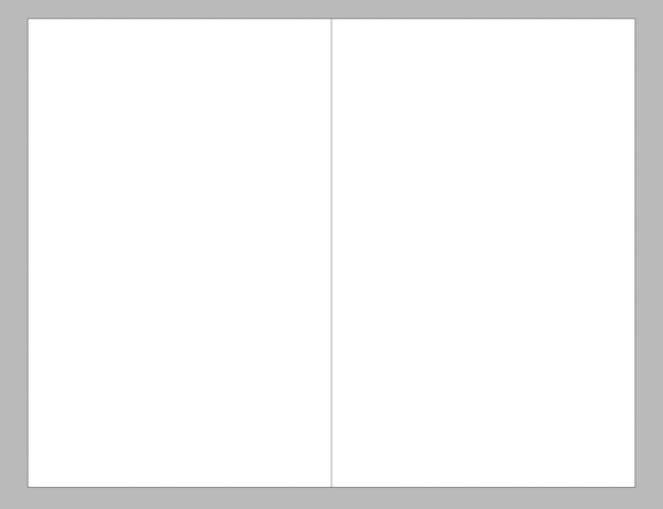
Trim size separates the book from everything else.
- Type area—In trade books, the tall column that the text forms on the page. This is the basic “live” area in your design, and you’ll want to also keep illustrations, photographs, or other non-text elements within the live area unless you specifically want them to bleed off the edge of the page.

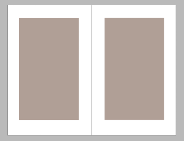
Defining the type area defines the margins at the same time.
- Trim size—How much room you’ll have to use for your book design will depend on the trim size of the book. Obviously, books with big, beautiful images look better with bigger book sizes. Workbooks might demand to be letter-size (8.5” x 11”) to make them easier to write in. Gift or impulse books are often small, creating a more intimate feeling for the reader, but they also demand efficient space handling since the pages can get very small.
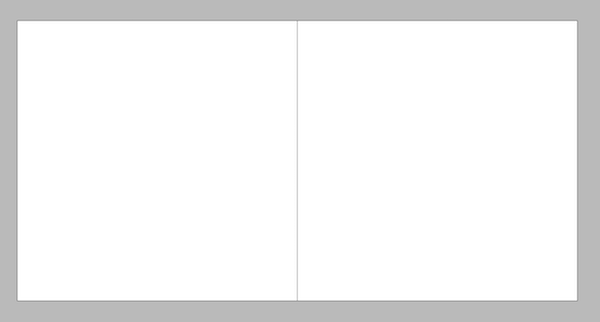
- Page ratio—The most popular trade book size is 6” x 9”, with a proportion of 1:1.5. (9” is 1.5 times larger than 6”.) This creates the familiar upright rectangle that has become an icon for “book.” But not all books maintain this 1:1.5 proportion, nor should they. For instance, many photo books are in square formats (ratio of 1:1) to accommodate both horizontally- and vertically-oriented photographs. Your design will need to take the page ratio into account.

Different ratios of height and width yield pages of different proportions.
- Margins—If you’ve been following along, you can easily guess that our margins—the space between the type area and the edge of the page—results from the difference between the live area and the trim size. But how these margins are deployed can have a significant effect on the overall look and feel of your book pages. And your choices will include mirror margins, equal margins, classic book design margins, too. Where you place your type area on the page, in other words, is something worth your consideration.

Defining the type area defines the margins at the same time.
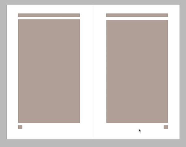
- Navigation—We commonly add navigation aids to the pages of books. At a bare minimum, virtually all books have folios (page numbers) to help readers locate themselves within the book. But most books also use running heads, running feet, tabs or other devices to show readers their place in the book. These elements become an intrinsic part of your book page’s architecture because they repeat throughout the book.

Navigation elements add to the structure and ornament the page
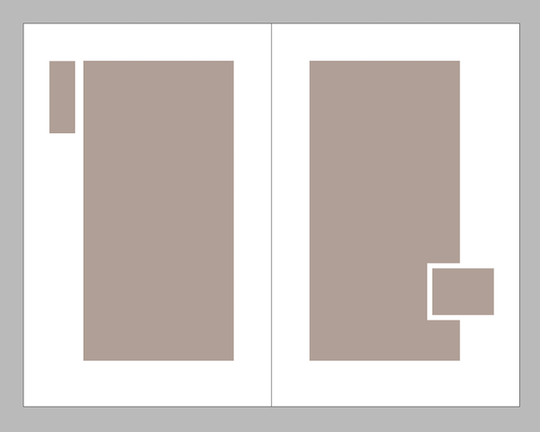
- Sidebars—Although margins dictate where the type can and cannot appear on your page, there are also times we want to intentionally plan non-text elements that break through the margins. Mapping out a space next to the type area on your page creates a sidebar that can be used for quotations, background information, resource links, or anything else that would be helpful to the reader.

Creating a sidebar allows elements to interact with the type column
These six parts and how they are arranged create the basic design of the text pages of your book. They work together to accommodate a specific manuscript, or a certain universe of readers.
For me, this is where book design begins. Once you’ve constructed the foundation of your book pages from these elements, you’ll be ready to move onto the second-most important choice you’ll be making that defines how your pages will look—choosing your fonts.
Resources
Understanding Book Layouts and Page Margins
Book Page Layout for a Long Narrative
Archive of Book Design articles
Getting Started with Fonts and Typography
Book Construction Blueprint


