Welcome to the e-Book Cover Design Awards. This edition is for submissions during July, 2016.
This month we received:
74 covers in the Fiction category
16 covers in the Nonfiction category
Comments, Award Winners, and Gold Stars
I’ve added comments (JF: ) to many of the entries, but not all. Remember that the aim of these posts is educational, and by submitting you are inviting comments, commendations, and constructive criticism.
Thanks to everyone who participated. I hope you enjoy these as much as I did. Please leave a comment to let me know which are your favorites or, if you disagree, let me know why.
Although there is only winner in each category, other covers that were considered for the award or which stood out in some exemplary way, are indicated with a gold star: ★
Award winners and Gold-Starred covers also win the right to display our badges on their websites, so don’t forget to get your badge to get a little more attention for the work you’ve put into your book.
Also please note that we are now linking winning covers to their sales page on Amazon or Smashwords.
Now, without any further ado, here are the winners of this month’s e-Book Cover Design Awards.
e-Book Cover Design Award Winner for July 2016 in Fiction
Jake Parent submitted Cristina designed by Riley James Milhem.


JF: Dark and evocative, this cover exerts an amazing “pull” for this psychological thriller. The background texture is built from a variety of images and other layers that allude to the story and interact with both the image of the woman and other parts of the background. Lighting effects round out this impactful cover.
e-Book Cover Design Award Winner for July 2016 in Nonfiction
Charles Carlini submitted Simply Darwin designed by Scarlett Rugers. “Simply Charly’s Great Lives Series offers brief, but authoritative biographies of the world’s most influential people—scientists, artists, writers, economists, and other historical figures whose contributions have had a meaningful and enduring impact on our society.”

JF: A simply delightful series design highlighting the subjects with amusing portraits. My favorite is the Darwin because of the great man’s doleful look while hosting an equally doleful monkey. Note the very subtle “branding” strip at the bottom that helps give the covers a foundation without distracting. (Quibble: “Simply Charly” doesn’t appear on these covers. See below for others in this series.)
Fiction Covers
A.G. Russo submitted Of Dust and Tides designed by Dane Low. “A short story collection. I wanted a minimalist book cover that was moody/ethereal. The cover character is in the last short story; a futuristic story where the character is the last albino person on earth. She has white skin and hair and pink eyes.”
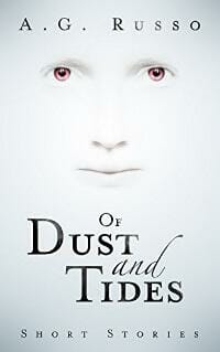
JF: Ethereal and affecting, nicely done. ★
Alexander Blum submitted 21st Century Slave designed by Jackson Blau

JF: Looks like more of a sketch for a cover rather than the final, and the type has a distiurbing relationship to the image.
Ana Spoke submitted Indiot designed by Ana Spoke. “The cover juxtaposes the protagonist (on top) and antagonist (bottom). This theme is carried across the series.”

JF: It made me smile, which seems like half the battle with a book like this, but do note that the title is poorly placed within the red band and ought to be vertically centered.
Andrea Pearson submitted Praxis designed by Andrea Pearson. “This is the sixth cover I’ve put together for this book. :-) (No fault of its own… authors can be so fickle sometimes. Even when that author is me. :-)) The “magic” is composed of around 50 separate layers. Took a very long time to find the right combinations.”

JF: The illustration shows all the work that went into those layers, and is appealing. I think you disadvantaged the title by shading it so heavily.
Angela Carole Brown submitted The Assassination of Gabriel Champion designed by Angela Carole Brown. “This is an existential love story. The theme of the dark alley appears repeatedly throughout the book, referencing not only literal goings-on that happen in the shadows of darkness, but also the exploration of the darkness within the characters.”

JF: Very rough, and it’s pointless to use the principal focus (the spot of light) to highlight “A Novel.”
Ashish Malpani submitted Ten Days in October designed by Saurabh Malpani. “This is a crime fiction cover based in rural India that starts with a body hanging from a tree. The protagonist, Inspector Chavan is fond of drinking chai (Indian masala tea) that is usually served in the small glass. The book cover integrates these elements.”

JF: Interesting idea, needs a bit more polish.
Brandy Vallance submitted Within the Veil designed by Steve Gardner at PixelWorks Studios. “Steve did the photo illustration and the cover design.”

JF: Lovely illustrations, would like the title to be more visible, but the lettering is super.
C.B. Cook submitted Twinepathy (IDIA #1) designed by C.B. Cook. “This book cover was designed to reflect the lightheartedness of this superhero story, and to stand out among a lot of the darker colored young adult covers.”

JF: Strong concept that creatively reinforces the theme of the book. Is it about “Twine-man”?
C.M. Estopare submitted Heartfelt Sounds designed by Renu Sharma. “The cover really reflects the musical aspects of the book.”

JF: It’s lovely, you have an attractive heroine, and the whole thing hangs together well. I particularly liked the way the highlight emphasizes the woman’s ear and, by extension, the whole idea of “music.”
Carol Thomas submitted Operation Red designed by Michelle Reid. “The background image is a macro photo of a mobile phone’s circuitry. It relates to the YA novel’s futuristic setting: a technologically dependent city-state. Red flowers are the tool teenagers use to subvert that dependence.”

JF: Good idea, but the cover is weak. The images never connect, and the type is desperately weak.
Cass Grafton submitted The Particular Charm of Miss Jane Austen designed by Kevin Rylands. “The story is set in Bath, and we wanted that reflected in the design. It’s a mystery-cum-romance with a hint of magic via a charmed necklace. The necklace was essential to the design as well, as was the significance of it being in someone’s hand.”

JF: But resulting is what I would consider an “excess of story” on the cover. By including everything, it’s difficult to focus on anything.
CB Archer submitted Fighters of the Code designed by CB Archer. “I designed the cover for my second Elfrotica novel to match the first in the series – Breakers of the Code. I kept the same general theme going to tie the series together, bright colours, silhouettes, and (of course) naked elfbutt!”

JF: A much more creative use of silhouettes than we usually see, and the background adds some excitement.
Chris Ledbetter submitted Inked designed by Jay Aheer

JF: A strong idea, not sure what’s going on with the “effects” surrounding the faces, but they look odd, as does the distracting “sticker” in the corner.
CW Crowe submitted The World’s End Series Book One: Dymond’s World designed by CW Crowe. “As an end of civilization story, I wanted the cover to be both stark and highly engaging; that’s why the background and type are not prominent. The power pole image draws the eye first, then it moves to the text.”

JF: Strong art, but the type—intentionally or not—is very weak, and lacks any typographic style.
Cyci Cade submitted Tut Reborn designed by Cyci Cade.

JF: Amateur hour. Almost makes me dizzy.
Damian Connolly submitted Shepherds: Awakening designed by Nathalie Lehnert. “The cover summarises one of the main moments in the book, in one of the principal areas. It was designed to catch the eye, and stimulate intrigue the more you looked at it. Thanks”

JF: And it succeeds, with fiery artwork that grabs your attention, as well as our favorite current book cover meme, the person with their back turned to us. But yes, the intense focus on the small figure does draw you into the scene. ★
Deborah Coonts submitted Crushed designed by Andy Brown

JF: Is there an “Oenophile” genre? “Napa style”? Good genre cover again showing how this “back” meme tends to draw you into the scene.
Divine Michelle submitted The Slum Heirs designed by Yonderworldly Design

JF: An interesting, and I think very effective, visual style that tells enough story and implies more, to interest us. ★
Dotti Enderle submitted SINFUL (A Bleed Novel) designed by Steven Novak. “Steven Novak designed the 2nd book in my Bleed series, having to match the theme of the first cover, which was done by a different graphic artist. He went over and beyond my expectations.”

JF: I find the cover exciting fun and well put together, but the choice of title font seems odd for this paranormal suspense.
Duncan Robinson submitted The Christmas Short Stories by Charles Dickens and Anthony Trollope with Wilkie Collins designed by Martyn Couldridge. “The designer has very cleverly used traditional symbols in a very simplistic style redolent of Victorian Christmas cards, yet relevant to today’s audience.”

JF: I think it’s a strong idea, but the execution looks primitive.
Elaine Dodge submitted Harcourt’s Mountain designed by MK McClintock. “The book is set in 1867, in British Columbia. The title relates to the mountain Luke Harcourt won in a poker game. In the story he saves a wolf who later tries to save the woman he loves. I wanted the cover to reflect the rugged, wild and mostly unexplored territory and heart of the book.”

JF: It sounds like an exciting story. Although the painting you’ve used is beautiful, you need to ask yourself if it adequately represents the appeal of the book. The type lacks impact, and I have no idea why you would use the top of the cover to advertise your publishing company, probably the least interesting fact about your book to the average reader.
Erin Kanoa submitted My Story designed by Erin Kanoa. “Capturing the essence of a dogs soul, the main theme of the book, so a feeling eye capture. The star dust captures the dream elements within the book, the font choice was based on one of the locations of the story, Scotland! Told from a the dogs perpective, the layout of headshot mimics biographies!”

JF: The stardust must be very subtle, because I can’t see it. And to be honest, the real problem with this cover is your title. There’s no way this doesn’t look like “My Story by Erin Kanoa,” so who’s that looking at me?
Fiely Matias submitted Short Stories About Long Hair designed by Fiely Matias. “This was the first image I drew for the book. It showcases the the fonts and design of the inner pages of the book.”

JF: Another example of a strong illustration combined with disastrously weak typography.
J. A. Menzies submitted The Case of the Homeless Pup designed by J. A. Menzies. “The goal was to create a cover that would be attractive to readers who like classic-style whodunits.”

JF: Unfortunately, despite the care you put into this, a little puppy and a pasted on skull does not equal “whodunit” or much of anything else.
J.R. Austin Austin submitted Mars The Final Day designed by Keith Tarrier. “This is an image of Mars with ice formations still on the window of the observer craft. The glowing figure is the craft carrying the first Settler to Mars. You can see both of Mar’s moons in the image and the sun coming over the top with an apocalyptic beam in the horizon.”

JF: The problem is that we need you to explain it to us. The white blob isn’t recognizable as a space ship, and without the frame of the window the “ice formations” are just noise. Plus, on this cover the font used for the author name is out of place with the rest of the type.
JA Andrews submitted A Threat of Shadows designed by Dane at Ebook Launch. “A Threat of Shadows is a classic fantasy novel.”

JF: Very detailed and multi-layered, an ideal cover for this genre.
James Egan submitted Mine designed by James T. Egan of Bookfly Design

JF: The cover visually suggests one story above ground and another below. Great teaser line, too.
James Egan submitted Blood Legacy designed by James T. Egan of Bookfly Design

JF: Love the authentic pulp look, and coiled action of the central figures. Makes the book look like fun!
Jeffrey Monaghan submitted Cardiac designed by Jeffrey Monaghan. “Thank you for considering my cover.”

JF: Nice job. It’s focused with a good tone and an interesting graphic title treatment that perfectly reinforces both the title and theme of the book.
Jeramy Goble submitted Fates of Astraeus designed by Jeramy Goble.

JF: Perfectly workable.
Kate Porter submitted Keys to the Mermaid’s Heart designed by Kate Porter. “This is Book Three in the Team Nightly series.”

JF: Unfortunately cover design involves more than identifying a pleasing image and plopping some type on top.
Kate Wars submitted Catalyst: Decay Chains designed by Philip Benjamin. “After a flurry of emails and one lengthy conversation, Philip developed this cover using a shared vision that portrays not only the book’s dystopian mood but also a haunting beauty.”

JF: Creepy and effective. The blurry figures add to the menace.
Katherine Dewar submitted Ruby and the Blue Sky designed by Keel O’Shannessy. “Ruby and the Blue Sky is my debut novel. I self-published, using a Book Designer template for the interior but recognising the importance of cover design to eBook sales commissioned a pro. The design has created a great first impression for readers, media & reviewers.”

JF: Hey, that’s a great combination! The money you save by using one of my interior templates can be used to help pay for the cover. This investment obviously paid off for you in this attractive cover.
Kenn Bivins submitted the Wedding & Disaster of Felona Mabel designed by Kenn Bivins. “The main character has a unique story and features to go along with it. The cover is intended to give the reader a hint of her intrigue, from her freckled face to smeared mascara to the tattoo on her neck.”

JF: The strong illustration anchors this stylish cover, aided by the expert typography.
Kim DDD submitted The League designed by Marushka from DDD. “Cover design for Science Fiction, Fantasy book, Sulan Series, Book 1”

JF: Another strong genre series design, with the young woman, the overall composition, and the distinctive type providing visual links between the books.
Kim DDD submitted Risk Alleviator designed by Marushka from DDD. “Cover design for Science Fiction, Fantasy book, Sulan Series, Book 2”

Kim DDD submitted The Dead Lands designed by Milo from DDD. “Cover design for Post-Apocalyptic, Dystopian book”

JF: A strong genre cover.
Kim DDD submitted The Blue Beast designed by Milo from DDD. “Cover design for Fantasy, Paranormal book, The Aria Fae Series, Book 3”
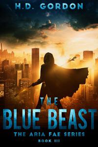
JF: The image heightens the drama and anticipation of action. Exciting.
Kim DDD submitted City Of Hope And Ruin designed by Milo from DDD. “Cover design for Fantasy, Sword&Sorcery book”
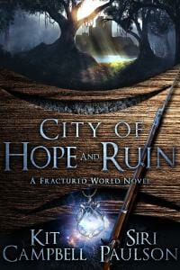
JF: Almost too busy to take in, and the pronounced wood grain can be distracting.
Kim DDD submitted Asymptote designed by Kitten from DDD. “Cover design for Post-Apocalyptic, Time Travel, Fantasy book”

Kim DDD submitted Death Of A Secret designed by Kitten from DDD. “Cover design for Mystery, Thriller, Suspense book, A Barbara O’Grady Mystery Series, Book 1”

JF: If you tried to put together a list of the qualities of a great ebook cover, this series would have it all. Terrific visibility, even at postage-stamp size, a fetching character, a focus on one emblematic bit of story, and a crystal clear idea of who the readers are. ★
Kim DDD submitted Death Of A Threat designed by Kitten from DDD. “Cover design for Mystery, Thriller, Suspense book, A Barbara O’Grady Mystery Series, Book 2”

Kim DDD submitted Death Of A Promise designed by Kitten from DDD. “Cover design for Mystery, Thriller, Suspense book, A Barbara O’Grady Mystery Series, Book 3”

Kim DDD submitted Alive designed by Marushka from DDD. “Cover design for Paranormal, Urban Fantasy book, The Veiled World Series, Book 1”

JF: The designer has used multiple devices to guide us to central portal and the scene beyond, including a full-on “back turned to you” image.
KJ Waters submitted Stealing Time designed by Blondie’s Custom Book Covers. “This book cover was the first in my book cover business. I’ve used it in the series as a base and changed elements to convey the other stories.”

JF: The simplicity of the type and color palette helps communicate the idea behind this book.
Lia Rees submitted Blue Maneuver designed by Lia Rees

JF: I like this cover, although the illustration style used for the woman seems out of place on a sci-fi book, and the title would have been stronger if the subtitle was set at the same angle as the title.
Lincoln Cole submitted Raven’s Peak designed by michellearzu.

JF: Keeping it simple helps this image have maximum impact.
Liz Hedgecock submitted Bitesize designed by Liz Hedgecock. “For this collection of very short stories I wanted a cover which would suggest tempting little morsels; hence the chocolate box theme.”

JF: Love the metaphor, I’ll have a bite! Might be a good idea to include the word “Stories” or something similar on the title to reinforce your idea.
LJ Cohen submitted Pen-Ultimate II: A Speculative Fiction Anthology designed by Chris Howard. “Because this is an anthology that includes both science fiction and fantasy short stories, we wanted a cover that included elements of both – hence the astronaut with the sword, reading a book. The astronaut with the sword was also a feature on the first Pen-Ultimate collection.”

JF: Very amusing. A good idea to put the contributors names on the cover, too.
Mandisa Parnell submitted Hard Ears Junior Learns A Lesson designed by Ilian Georgiev. “One of the illustrations was chosen for the cover to give young readers a snapshot of the story.”

JF: The strong and graphic illustration goes well with the title type’s color and effects. That’s good, because this title will be a challenge for browsers, it took me more than 1 scan to parse what it was saying. ★
Marc Secchia submitted Dragonfriend designed by Joemel Requeza

JF: Very cool and effective, with a great illustration. When is Game of Thrones coming back?
Michelle Diana Lowe submitted UnShatter Me designed by Micah Shipp. “This cover shows diversity and represents young interracial couples.”

JF: That works, but the overall gray and supressed tone of the cover has drained it of contrast.
Michelle Rene Goodhew submitted There’s Something the Matter In Hell designed by Michelle Rene Goodhew. “This book is a riotous adventure that will suck you in until the very end. The cover was designed to encompass the humor of the story while defining where the story takes place.”

JF: Love that drawing and the fun it promises inside, although I wish the word “Hell” stood out more.
Miranda Stork submitted The Suitable Bride designed by Miranda Stork/Moon Rose Covers. “Karen wanted a historical fiction cover that stood out with colour, but created marketability and wouldn’t look out of place amongst the big hitters.”

JF: You hit the mark with all the elements this genre seems to demand.
Natalia Vereshchagina submitted Dating a chance designed by Karen Ronan. “Dating a chance” is a mystery with some elements of science fiction. And I am very grateful to Karen Ronan (coversbykaren.com) for her creativity and artistic intuition she appealed to for designing the cover image that conveys the subject and tone of my book in the most accurate way.”

JF: Well conceived and well executed, this cover combines the genres in the book effectively but doesn’t forget its main mission, although I would eliminate either one or the other of the two sci-fi parts of the image at the top. Using both makes the overall design more static than it ought to be.
Ned Engel submitted Einstein Meadows: The Unspoken Perils & Thrills of Living in a Retirement Community designed by Ned and Nancy Engel. “Just in time for the 47th anniversary of Woodstock, the iconic bus rolls into the Southwestern desert – a perfect climate to do the grow! The spirit of the ’60s is alive and well for these daring seniors who throw caution to the wind and embrace ganjapreneurship.”

JF: Far out.
Oscar Hutson submitted See You in Hell designed by Oscar Hutson

JF: A bit primitive. No idea what’s going on in this picture.
P. J. Lazos submitted Oil and Water designed by Janice Kim/Andrew Goldman.

JF: The image is strong, and I love that moonshine on the water, but why is the type so weak?
Pat Pflieger submitted The House at the Edge of Time designed by Pat Pflieger. “The silhouettes of the mammoth and the running boys are intended to show the themes of time travel and adventure. (And the boys do run from a mammoth.) The background colors mimic the colors on the walls in Pompeii, where the boys visit. The trilobite is a decorative element all through the book.”

JF: Nice job. The restraint shown in the imagery and typesetting really helps create a cover with the promise of an exciting story. In other words, with a good concept you can stand out without a big colorful photo.
Pippa DaCosta submitted Chaos Rises designed by Ravven. “Ravven, the designer, had already completed five books in the Veil series, of which Chaos Rises is a spin-off. We wanted the same look and feel, clearly urban fantasy, but also adding something unique. I love the colors at work here, and the crows add a perfect, apocalyptic feel.”

JF: The designer manages to keep control of (almost way too many) lots of story elements and still keep the focus on the young woman.
Rena Hoberman submitted Everything Inc. designed by Cover Quill

JF: A strong cover for this dystopian novel, overshadowed by the title, which looks completely pasted on. A little effort could have made the title much more integrated into the sign, and I would recommend it.
Rena Hoberman submitted Vault of Dreams designed by Cover Quill

JF: Interesting.
Rena Hoberman submitted Shifters Alliance designed by Cover Quill

JF: A cover with a lot going for it including some careful typography, although I find the spectral highlights behind the title distracting.
Sharolyn Brown submitted The Heaviness of Knowing designed by Dale Pease. “This book is about the weight of knowing something you wish you didn’t. I wanted the cover to show the main character as she, reluctantly, faced the truth she wished she didn’t know.”

JF: A lot of technique went into this cover, and I particularly liked the style of the title, but the background image is so active we’ve lost the focus on the girl’s internal experience.
simon avery submitted The Good Enough Mother designed by I do book covers.

JF: Expertly done and designed to attract a specific audience.
Stephanie Taylor submitted There’s Always a Catch: Christmas Key Book One designed by Natasha Snow. “This is the first book in a women’s fiction series. The same designer has done the cover for book #2 in the series, and I’m just as excited about that one–she always listens to my ideas and manages to take what’s in my head and make it a reality!”

JF: Cute idea, the title needs to have more impact, it’s disappearing.
Susan Thompson submitted A Tea Drinker’s Novel: Chilverton Park designed by Susan Russell Thompson. “This book is a humorous, Victorian light romance. I couldn’t use the victorian era illustration that I wanted because I couldn’t prove it was copyright free, so I grabbed the tea cups off of the publisher’s free photo site. Now I wish I had used a background color since I heard your advice on that.”

JF: Well, tea cups go well with “Tea Drinkers” so theres’ that, and Copperplate is a perfect font to use. Whie backgrounds without a border “bleed” onto the page, as here. Keep going, you’re doing fine.
Tammy Seidick submitted Secret Sister designed by Tammy Seidick. “Thanks for your review!”
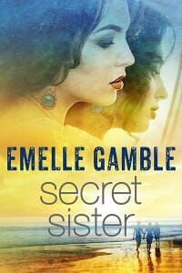
JF: I particularly liked the warm colors of this cover, and I think it strikes just the right note. Counter intuitively, it might have been stronger without the second girl in the background.
Tiana Warner submitted Ice Crypt (Mermaids of Eriana Kwai, Book 2) designed by Slobodan Cedic. “The background texture and font complement the design of Ice Massacre, Book One. The animal head is a custom sketch by the designer.”

JF: Clean and strong.
Valerie Comer submitted Secrets of Sunbeams designed by Hanna Sandvig. “Secrets of Sunbeams kicks off a new series for me, and I’m delighted with Hanna’s work in creating an illustrated cover that is similar to my previous series but is clearly a new venture.”

JF: Well aimed at your intended audience, although the title could have a bit more contrast with the background.
W.D. Clarke submitted White Mythology designed by Dave Bricker. “The designer Dave Bricker inferred connections between the novel’s concerns with the nature of language and similar issues that informed the work of the Dadaist movement, particularly the designer Kurt Schwitters, whose work the cover for White Mythology alludes to.”

JF: Sophisticated in both its concept and typography, this cover may require buyers of equal sophistication to really appreciate it. More suited to print.
Yahya El-Droubie submitted Ritual of the Savage designed by Rian Hughes

JF: Terrific imagery combined with hand lettering creates a unique and evocative cover.
Zagham Karim submitted Town of Dudley Sixth (Sambol Book 1) designed by Zagham Karim. “The cover, relates to the plot of the novella- as it shows a post-apocalyptic planet. The cracks in the planet, come from the collision of a humongous spaceship with the planet. Which is key to the story line. Upon closer inspection, one can see small parts of the planet floating around it.”

JF: This is actually pretty well done, with good focus and appropriate imagery that conveys excitement. However, the two different fonts used for the title really, really, don’t go together, and the clash is quite distracting. On the other hand, easy to fix!
Nonfiction Covers
Alexander Gerasimchuk submitted Leaves of Maitreya’s Garden: The Call of the Heart (The Teaching of the Heart, Book 1) designed by Vanessa Maynard

JF: It looks like the designer has elevated the large image over every other element on the cover. Not sure that will work.
Bryanna Plog submitted Make Sure You Have a Map (and Other Bits of Travel Advice I’m Glad I Ignored) designed by Bryanna Plog. “The cover of this travel book is meant to invoke the ideas of being lost (to go along with the title) and traveling. I hope the cover also helps to relay the fact it is a book with both entertaining narratives about traveling and some actual advice for readers. Photo from Death Valley NP.”

JF: Yes, it does those things and has a charm about it, too. ★
Charles Carlini submitted Simply Dirac designed by Scarlett Rugers.

Charles Carlini submitted Simply Wittgenstein designed by Scarlett Rugers.

Charles Carlini submitted Simply Dickens designed by Scarlett Rugers.

Charles Carlini submitted Simply Faulkner designed by Scarlett Rugers.

Daphne Chen submitted Pause. Breathe. Shift. designed by Daphne Chen. “Through stories of focus, fun & freedom, it illustrates small ways to get one step closer to release emotional struggles in life. Therefore, the barb-wired fence against the blue sky image meant to carry a poetic touch and serves as the perfect analogy to be on the other side. (Pain) vs (Freedom)”

JF: Dividing the cover in half doesn’t work well here, and the type is underwhelming at getting your message across.
HEMANT BAWANKAR submitted The Variegated Life designed by Educreation Publishing (Delhi). “Every time I read my poems, I find scope to add something new. You may also help me to add something new with the variegated life’s experiences.”

J. A. Charnov submitted Caution: Nonprofit Job Ahead designed by J. A. Charnov. “My intent was to design a cover that is eye-catching and clearly communicates the book’s content. Perhaps I succeeded; time will tell.”

JF: Good idea for a cover, but it would take a lot more skill to make it “sing.”
Marcia Washburn submitted Home-Based Eldercare designed by Justin Turley.

JF: Great combination of imagery and design to communicate without any ambiguity the message of this book. The photo sets exactly the right tone, and the title treatment is equally effective. The only knock on this cover is the extraneous band at the bottom and its weak type treatment of the author’s name.
Nancy Sayre submitted The House in Prague designed by Michael Sayre. “This eBook includes gorgeous pictures of the 88-year-old author’s childhood home in Prague. The top half of the book cover is their music room, the center picture is the author herself as a young girl, and the Nazis and Statue of Liberty speak for themselves. Title font is Kalenderblatt Grotesk.”

JF: A lovely cover that does a good job of integrating the historical photos on a cover that clearly alludes to the era being depicted. ★
Pamela Alexander submitted Psyche’s Poetry: Beauty to Awaken the Soul designed by CreateSpace.

Uri Bram submitted Thinking Musically designed by Natalie Harney

JF: A clever idea for this stylish cover that doesn’t seem to need quite this much black. And in 2016 I wonder just how many people will no longer recognize that plastic rectangle, let alone “tape.”
Yahya El-Droubie submitted Naked as Nature Intended: The Epic Tale of a Nudist Picture designed by Yahya El-Droubie

JF: I can’t criticize the solid typography or composition but wouldn’t it have been more effective to use the title block to accomplish the same thing, even if it meant a different crop on the photo instead of virtual pasties? ★
Yahya El-Droubie submitted The Adventures of Thomas Pellow: Three and twenty years in captivity among the Moors designed by Yahya El-droubie

JF: Here the main question we’re left with looking at this competent cover is whether the naked woman a gratuitous attraction, or whether it’s intrinsic to the story.
Well, that’s it for this month. I hope you found it interesting, and that you’ll share with other people interested in self-publishing.
Use the share buttons below to Tweet it, Share it on Facebook, Plus-1 it on Google+, Link to it!
Our next awards post will be on September 19, 2016. Deadline for submissions will be August 31, 2016. Don’t miss it! Here are all the links you’ll need:
- The original announcement post
- E-book Cover Design Awards web page
- Click here to submit your e-book cover
- Follow @JFBookman on Twitter for news about the E-book Cover Design Awards
- Check out past e-Book Cover Design award winners on Pinterest
- Subscribe to The Book Designer Blog
- Badge design by Derek Murphy


