By Joel Friedlander
Welcome to the e-Book Cover Design Awards. This edition is for submissions during October, 2018.
This month we received:
62 covers in the Fiction category
16 covers in the Nonfiction category
Comments, Award Winners, and Gold Stars
I’ve added comments (JF: ) to many of the entries, but not all. Remember that the aim of these posts is educational, and by submitting you are inviting comments, commendations, and constructive criticism.
Thanks to everyone who participated. I hope you enjoy these as much as I did. Please leave a comment to let me know which are your favorites or, if you disagree, let me know why.
Although there is only winner in each category, other covers that were considered for the award or which stood out in some exemplary way, are indicated with a gold star: ★
Award winners and Gold-Starred covers also win the right to display our badges on their websites, so don’t forget to get your badge to get a little more attention for the work you’ve put into your book.
Also please note that we are now linking winning covers to their sales page on Amazon or Smashwords.
Now, without any further ado, here are the winners of this month’s e-Book Cover Design Awards.
e-Book Cover Design Award Winner for October 2018 in Fiction
Ebook Launch submitted The Book of Chaos designed by Ebook Launch.


JF: Beautifully captures both the mystery and the subversive nature of reading.
e-Book Cover Design Award Winner for October 2018 in Nonfiction
Lyss Em submitted M/M Romance Tropes designed by Lyss Em.


JF: I love the direct, visual appeal of this cover and the clarity with which it presents its “offer” to readers. Needs a subtle border to prevent it “bleeding” onto white web pages.
Fiction Covers
Allison Garcia submitted Finding Amor designed by Julio Cesar Garcia de Alba. “I write my books and my husband hand-paints the covers. Then I scan and upload them onto my computer then use Canva and design the rest of the text and other details for the covers.”

JF: You two are a great team, and this cover is completely charming and unique. I do find the type running right up to the left and right edges a bit jarring.
ANA CHABRAND submitted Sky View designed by ANA CHABRAND DESIGN HOUSE.

JF: Pretty basic, and the title could use more contrast with the background.
ANA CHABRAND HERNANDEZ submitted The Candle designed by ANA CHABRAND DESIGN HOUSE.

JF: An interesting look with a unique title treatment.
Angelica R. Jackson submitted Merlin’s Stronghold: Faerie Crossed Book 2 designed by Kelley York of X-Potion Designs. “This cover features the same model/location as the 1st in the series, and we wanted to create a feeling of suspense with the looming door and hesitant figure”

JF: Although there are a number of lovely elements, they never come together to create much impact.
Brooke De Lira submitted Feral Phantom designed by Stefanno De Lira “I used a unique costume to create the character rather than manipulating a stock photo. I tried to go for an eye-popping color combination that fit the superhero genre well.”

JF: An exciting design, but I question the positioning of that building right in the center. It looks so… uncomfortable.
BRUNO NUA submitted LONDON CALLING designed by BRUNO NUA. “Brings together three favourite art and design elements i adore: French “Editions de Minuit”, Swiss Minimalism, and Asian Scroll Paintings… I instructed Thai artist SUCHART PHUMKHED what to paint, and Irish graphics guy JOHN MARSHALL what cover layout to construct.”

JF: Maybe next time instead of telling them, ask them what would work best for a book cover, because this confused and confusing arrangement isn’t it.
CJ Zahner submitted Dream Wide Awake designed by Amanda Filutze “The artist, Amanda Filutze, is a recent college graduate and talented in so many ways. Wonderful to work with, Amanda worked diligently to provide what I wanted. She completed several sketches. I evaluated them. She listened to everything I said and came up with this as an end result. I loved it.”

JF: Striking.
Cora Graphics submitted Circus in a Shot Glass designed by Cora Graphics.

JF: An expertly-designed cover with subtle cues that lead the reader right where the designer wants us; passing through the center of the image and ending in the “love is a balancing act” tagline. ★
Cora Graphics submitted Trouble designed by Cora Graphics.

JF: Another cover that hits the target for this genre right in the bullseye. Romance, intrigue, a light tone and beautiful typography all come tother.
Dan Van Oss submitted Hard Press designed by Dan Van Oss.
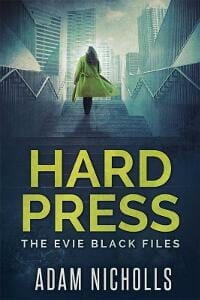
JF: Intriguing cover for an urban thriller with a female protagonist.
Dan Van Oss submitted Saucy Jacky designed by Dan Van Oss.

JF: The distressed type of the title perfectly matches the scary visuals on this horror title.
Dan Van Oss submitted Mind Park designed by Dan Van Oss.

JF: Classic—and effective—sci fi cover.
Darja DDD submitted The Kingdom designed by Milo from Deranged Doctor Design. “Urban fantasy book cover design, A Gripping Urban Fantasy: Berkeley Blackfriars Book One”

JF: A fascinating series design (see following two covers) that uses the isolation of the central figure and color palettes that add a noble atmosphere. Combined with the careful typography (although the kerning of “Power” is odd) they make a great effect.
Darja DDD submitted The Power designed by Milo from Deranged Doctor Design. “Urban fantasy book cover design, A Gripping Urban Fantasy: Berkeley Blackfriars Book Two”

Darja DDD submitted The Glory designed by Milo from Deranged Doctor Design. “Urban fantasy book cover design, A Gripping Urban Fantasy: Berkeley Blackfriars Book Three”

Darja DDD submitted The Amulet Thief designed by Milo from Deranged Doctor Design. “Paranormal & Urban Fantasy cover design, The Fitheach Trilogy Book 1”

JF: Another great 3-title series design that emphasizes its occult focus with expertly drawn titles, sensitive color shifts from cover to cover, and images that give story hints. Also note the very artful series branding on the floating “feather” on each cover.
Darja DDD submitted The Blood Thief designed by Milo from Deranged Doctor Design. “Paranormal & Urban Fantasy cover design, The Fitheach Trilogy Book 2”

Darja DDD submitted The Destiny Thief designed by Milo from Deranged Doctor Design. “Paranormal & Urban Fantasy cover design, The Fitheach Trilogy Book 3”

Darja DDD submitted Hidden Agenda designed by Marushka from Deranged Doctor Design. “Mystery, Thriller & Suspense book cover design, A Dan Roy Thriller ,The Dan Roy Series Book 1”

JF: This series design for suspense thrillers has everything going for it, until you hit cover #3, where the formula changes, for some unknown reason. The first two covers focus on an anonymous man with a gun and a strong color highlight, but on book 3 identities are revealed and we now have a couple. Although this may make sense from the way the story develops, it appears to the casual observer like inconsistency. Title uses a suitably strong font for this genre.
Darja DDD submitted Dark Water designed by Marushka from Deranged Doctor Design. “Mystery, Thriller & Suspense book cover design, A Dan Roy Thriller ,The Dan Roy Series Book 2”

Darja DDD submitted Scorpion Down designed by Marushka from Deranged Doctor Design. “Mystery, Thriller & Suspense book cover design, A Dan Roy Thriller ,The Dan Roy Series Book 7”

David E. Gates submitted The Wretched designed by David E. Gates & Aaron Jenkin “This image particularly summed up the feeling of a ghostly presence in a harbour, which features in the book. The lights of the nearby town in the background, giving resonance to the content in the story.”

JF: Funny, I don’t see any of that in this monochromatic, low-interest cover.
Debbi Mack submitted Least Wanted designed by Stewart Williams.

JF: A strong design that leverages its graphic layout with a carefully controlled color palette.
Deborah Coonts submitted The Lucky O’Toole Vegas Adventure Boxset 1 designed by Glendon of Streetlight Graphics.

JF: The hierarchy of information is getting lost in the visual confusion.
Desmond Ryan submitted 10-33 Assist Pc designed by Catherine Chow. “’10-33 Assist PC’ is a hard-boiled police procedural. The cover is stark. The blood splatters reflect a homicide. The sunflower seeds are a poignant reminder of one of the characteristics of the murder victim. This cover reflects the tone and the genre of the book perfectly.”

JF: Gritty and unmistakable.
DJ Martin submitted Transformation! Ogre’s Assistant Book 3 designed by Fiona Jayde. “Amy is an administrative assistant to an ogre. Along the way in this book, he gets turned into a bat. Her magical skills help get him back to himself.”

JF: I like the eerie tone of this cover, although it seems that the title should be a stronger element.
Dusty Grein submitted Abnormal designed by Dusty Grein “Though a little busy, this cover does project the Sci-Fi feel I was after. The story is a dystopian vision and with elements of telepathy and genetic brain mutations, so I thought the neuron was a fitting addition”

JF: Confusing and bit awkward.
Dusty Grein submitted Ladybird Adrift designed by Dusty Grein “In this cover, I wanted to create an impending sense of loss and loneliness, and the simplistic style helped to convey that mood.”

JF: A good idea, but it needs a stronger type treatment.
Ebook Launch submitted Prize and Prejudice designed by Ebook Launch.

JF: An amusing and right-on-the-money design for this series of cozy mysteries. We often see covers that use models without their faces, so here it’s interesting that the woman’s eyes do a lot of the work of attracting us to the cover.
Ebook Launch submitted Crime and Nourishment designed by Ebook Launch.

Geree McDermott submitted The Swirling Red Mist: A Tale of Murder designed by Fantasia Frog Designs. “The cover design was was a team effort of five independent women.”
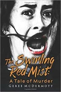
JF: Well, it does stop you, and that’s half the battle. Pro tip: Remove the colon after the title, it’s not needed and looks amateurish.
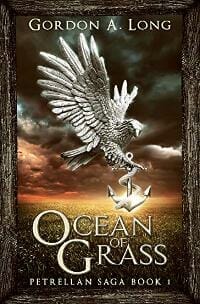
Gordon A. Long submitted Ocean of Grass designed by Mihaela Voicu “The first book in a 7-volume epic. The wooden surround will tie the first trilogy together, the title font will brand the whole series.”
Henry Blosfelds submitted The Thirst of Hank van Dorm designed by Henry Blosfelds.

JF: Yes, but what’s the book about? This cover gives us nothing to go on.
Ihor Tureha submitted Advent designed by MiblArt. “Fiction apocalyptic book cover design. The illustrated cover represents the scene of the composition when the main character tries to fight down the advent of trolls by himself. This is the first book in the series, and to be continued…”

JF: Captures the action pretty well.
Jacqueline Church Simonds Simonds submitted THE PRIESTESS OF CAMELOT designed by Vagabondae Press/Strange Fictions Press. “This is the prequel to my Heirs of Camelot series, which we’ve created a particular look for. But how to incorporate a visual that harmonized the main series look with something that is Arthurian Fantasy? I think they achieved it with this cover!”
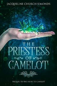
JF: Beautifully balanced, with a perfect font and a clear focus. Nicely done.
Jaka Tomc submitted 720 Heartbeats designed by Matic Lipar.

JF: An intriguing cover with a strong “brand” that uses the mirror images well.
James Bailey submitted The First World Problems of Jason Van Otterloo designed by Dane at Ebook Launch. “This is a humorous story of a teen whose great ambition is to save up enough money to move out and escape his parents. Over summer vacation, he takes any job he can get because he’s not quite 16 yet. One of his ill-fated jobs is as a dog walker, hence the dog taking a leak on his shoe.”

JF: Charming and well integrated, the hand lettering helps to create a unique look. ★
James Egan submitted Dungeon Lord: Abominable Creatures designed by James T. Egan of Bookfly Design.
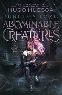
JF: Great illustration, but the stacks of type with different fonts and treatments dissipates the effect.
James Egan submitted The Iron Citadel designed by James T. Egan of Bookfly Design.

JF: Fantastic cover for an epic adventure. Everything is here, from the band of heroes to the dominating castle, it makes us want to jump right into the story. ★
Jean Gill submitted Life After Men designed by Jessica Bell.

JF: Cute and appropriate.
Jeff Bolinger submitted Shipwrecked: Dragon Island designed by Carey Fessler “Carey Fessler submitted Shipwrecked: Dragon Island designed by Carey Fessler and illustrated by Omar Aranda. Positioned the two protags in a ‘V’ shape to provide an additional eye-path that leads to the dragon.”

JF: Although I like the overall idea, the “dragon” looks more like a chubby lizard, not so threatening.
Jennifer Hotes submitted Four Tombstones designed by Jennifer Hotes “Book One in the Josie Jameson mystery series.”

JF: Although the yellow color is used well in this 3-title series design, overall the designs themselves are quite artless and don’t do much to help us understand the appeal of the books.
Jennifer Hotes submitted Stone Heart designed by Jennifer Hotes “Book Two in the Josie Jameson mystery series.”

Jennifer Hotes submitted Cornerstone designed by Jennifer Hotes “Book Three in the Josie Jameson mystery series.”

John Walters submitted Heirs of the Round Table: Reclaiming Camelot designed by Chaz Walters. “Al Ford is my pen name. The cover was designed by my 16 year old son.”

JF: Yes. Needs to take a course in typography.
Julia Maiola submitted The Red Flag designed by Julia Maiola.

JF: The low angle adds drama to this cover, but the author’s name could use a better font.
Karlie Lucas submitted Tarragon: Dragon Mage designed by Karlie Lucas. “This is the second book in a trilogy.”

JF: Using the same (or a very similar) font for all the type eliminates your ability to establish contrast between the elements.
Kate Danley submitted Olde Robin Hood designed by Story Wrappers.
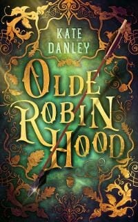
JF: A gorgeous cover helped by beautiful textures, creative type handling, and that dramatic arrow. ★
Kevin Chapman submitted Righteous Assassin designed by Bespoke Book Covers. “This crime thriller is set in New York City. We wanted a gritty image of the City and I took this photo on a misty evening looking up Sixth Avenue in Manhattan.”

JF: Looks just right, with dramatic type and a deep look into the story.
Kirsty Dallas submitted Stupid Love designed by Kirsty Dallas “Believe it or not, but my mum and I had to lengthen the skirt on this model as it was WAY too short to promote.”

JF: Sexy and sassy, although the title is disapearing a bit.
Linda Peno submitted Quiet Refuge designed by pro_ebookcovers (Angie from Fiverr). “Used CreateSpace and Kindle to self-publish. I wanted a better cover then what was offered. I found a great deal on Fiverr. I had a digital photo of a local forest, taken by and used with the permission of my granddaughter. I sent it to Angie and she made me the perfect cover.”

JF: A terrific choice. The atmosphere and powerful typography make an indelible impression.
M.J. Schiller submitted BLACKOUT designed by Francessca Wingfield. “This is a pretty angsty read so I wanted something to reflect that. I think the darker colors give it the right feel and I love what she did with the title.”

JF: Good genre cover with obvious appeal, although the font choice for the author’s name is a bit mystifying.
Mary Zisk submitted The Art of Being Remmy designed by Mary Zisk “The cover of my illustrated middle grade novel uses a picture frame to depict the characters and events that impact the main character’s dream of being an artist. I used bright primary colors to attract the tween audience.”

JF: Your cover and illustration have real charm, and the red could have been even brighter. ★
Patrick Samphire submitted A Spy in the Deep (The Casebook of Harriet George, Volume 2) designed by Patrick Samphire. “This is the second in a series of science fiction adventure novellas, with a steampunk flavour, this time set beneath the oceans of Mars. I always find designing covers for my own books much harder, because it’s difficult to be objective and see what others are seeing when it’s my own story.”

JF: The blue tone and simple font help set off a wonderful illustration. (For the same reasons I’ve been hiring designers to do covers for my recent books!)
Rein Ra submitted Crow’s Row designed by Reinra.
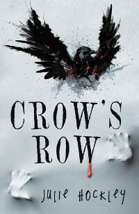
JF: Striking, and I love the handling of the type.
Robbie Mahair submitted Orc Road Trip designed by Annika Maar. “This is a cover for a comedy that explores how fun and absurd it would be if the classic fantasy races we all know and love were a reality in modern-day U.S.A.”

JF: Great Orc fun. (Is Orc a subgenre?) Stylistically right on the money.
Tam Francis submitted Swing Shorts: Stories and Wonders designed by Karen Phillips. “I commissioned original artwork, then sent to my designer. We tweaked sizes, borders, and colors until we both agreed this represented the novel and made the best use of the original artwork. Karen added the subtle writing on the shorts that give a subtle hint to the content.”

JF: Sweet with a sexy forties feel to it. Again, hand lettering creates a unique effect.
Tara Mayberry submitted The Depth of Beauty designed by Tara Mayberry.

JF: A competent, though static, cover, although it’s hard to see the relation between the two images.
Tara Mayberry submitted The War Years designed by Tara Mayberry.

JF: The “heroic” style is effective, but too much going on here.
Teddi Black submitted The Toymaker designed by Teddi Black.

JF: Terrifically creepy, the visual perfectly matched by the allusive title.
Tim Barber submitted Five Fathoms Beneath designed by Tim Barber @ DISSECT DESIGNS. “A story about a doctors adventure to discover themselves. I chose a night time scene beneath a star filled sky to add a sense of magic. I also wanted to show the doctor gazing out to sea, almost as though he’s searching, waiting, for answers.”
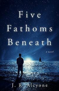
JF: It creates a strong atmosphere, and the choice of a “quiet” font helps set the tone.
Nonfiction Covers
ANA CHABRAND HERNANDEZ submitted The Pop Up Pastor designed by ANA CHABRAND HERNANDEZ.

JF: A very effective type-only cover that embodies some of the idea of the book in the apparent “movement” of the type.
BRUNO NUA submitted BUDDHA’S FAVOURITE WORDS designed by BRUNO NUA. “My own concept and design. Wonderful image created by American photographer JOSH BULRISS, emerges from the darkness thanks to Irish graphic layout artist JOHN MARSHALL. Simple Helvetica font on plain background.”

JF: Beautiful graphic, hopeless typography.
Carol Wagner submitted God Is Out to Get Us: From the Very Beginning designed by Elisabeth Bennett “The story of God and man begins with the intimate act of Creation.”

JF: Well executed. The title and subtitle lend themselves to some ironic interpretations.
Christian Schoen submitted The Maya Sites – Hidden Treasures of the Rain Forest designed by Christian Schoen “ebook and print cover are slightly different. For the ebook cover I rearranged some elements to allow better visibility.”

JF: Basic, gets the job done, although the design seems to depress the drama of this attraction.
Ebook Launch submitted The Software Engineer’s Guide to Freelance Consulting designed by Ebook Launch.

JF: Clear, graphically fun, and apt.
Elly Flippen submitted Penetration designed by Swann-Ryder Productions, LLC “Cover uses Ingo Swann’s painting Space Highways.”

JF: Lets you know what the book is about right away.
Elly Flippen submitted Reality Boxes designed by Swann-Ryder Productions, LLC “Cover uses Ingo Swann’s painting Existence.”

JF: An interesting cover that would be even better if the title had more contrast with the background.
Elly Flippen submitted The Great Apparitions of Mary designed by Swann-Ryder Productions, LLC “Cover uses Ingo Swann’s painting Madre Dolorosa.”

Janet Rowles submitted The Tell Me More Gesture designed by Sinem Erkas.

JF: A graphic cover that expresses the theme of the book while providing powerful branding at the same time. ★
John Paul Parrot submitted Dr. Parrot’s Guide to Becoming a Lean, Mean, Killing Machine designed by John Paul Parrot “I was looking for a simple way to communicate a satirical home fitness book that might be best described as a fun bathroom reader. Sought to portray an “old-school” feel with the parchment background and carnival-style typography.”

JF: Very cool, I think you succeeded, and that illustration is fantastic.
Kevin Tait submitted The plug up a story of a spiritual thinker and a quest for self transformation designed by Kevin Tait “Contemporary design skill with a urban feel. I am a trained designer and this was my first design of a book cover as my specialist is fashion.”

JF: Terminally boring. Why would anyone care?
Liz Hurley submitted Walking with Dogs between Truro and Fowey designed by Sally Mitchell.

JF: Strong design concept, even though you don’t show a dog on the cover. Since the map is largely decorative, the title could easily be made larger, to good effect. ★
Samuel Malachowsky submitted Project Team Leadership and Communication designed by Samuel Malachowsky.

JF: Solid technical design.
Stephen Krasner submitted A Broken System: Family Court in the United States, Volume 2 designed by Stephen Krasner “The idea behind the cover was to send a message to the readers that emulates the substance of the book itself.”

JF: Confusing and murky.
Wageedah Salie submitted Adoption Adventure: A Guide to Making Adoption Decisions: Infant Adoptions, Special Needs Adoptions, International Adoptions, Adoptive Parents, Foster Care Adoptions designed by Wageedah Salie.

JF: Well-presented instructional book with strong typography and visual appeal.
Well, that’s it for this month. I hope you found it interesting, and that you’ll share with other people interested in self-publishing.
Use the share buttons below to Tweet it, Share it on Facebook, Link to it!
Our next awards post will be on December 30, 2018. Deadline for submissions will be November 30, 2018. Don’t miss it! Here are all the links you’ll need:
- The original announcement post
- E-book Cover Design Awards web page
- Click here to submit your e-book cover (See New Submission limits)
- Follow @JFBookman on Twitter for news about the E-book Cover Design Awards
- Check out past e-Book Cover Design award winners on Pinterest
- Subscribe to The Book Designer Blog
- Badge design by Derek Murphy


