According to an interview with the Wall Street Journal, when writing, Anne Rice, the author of Interview With the Vampire, sets her font to 14 point Courier and double spaces the text on her 30-inch Mac computer monitor.
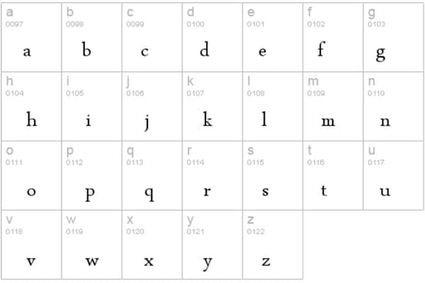
This piqued my curiosity: “so other people do this too?” As I write these words, my current font choice to pour my thoughts onto the computer screen is 19-point Arabic Typesetting. Why this strange choice? Why not a simple sans-serif option like Arial or Calibri? It’s because fonts have a psychological impact on the human mind.
When I use my favorite serif font, I feel like I’m crafting a story from One Thousand and One Nights, which is a good feeling.
Here’s what you need to know about the psychological impact of font choice:
Why Does Typography Matter?
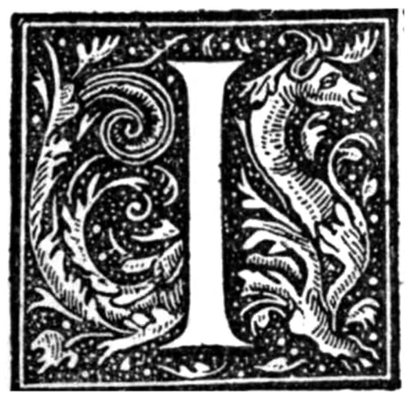
How does it make you feel when you pick up an old, hardcover tome, flip through its pages, and notice that there’s an ornamented drop cap (initial) at the beginning of each chapter? Perhaps it grabs your attention and fills you with admiration for the author and the publisher who took the time to turn a word into a piece of art.
The style of the font, its size, thickness, and even the spacing between words can all subtly influence our perception on an unconscious level.
In one research study, they served identical jelly beans to two groups of people, labeled “eat me,” but used a different font for each group. The first one was a smoothly flowing round typeface, while the other was a jagged monster of a font. The result? People from the first group claimed that jellies were palatable, while the other group described them as sour. This goes to show that there’s a subtle subliminal influence at work here.
Notice Fonts as You Go About Your Business
In one of the chapters of On Looking, a fascinating book by Alexandra Horowitz, the author walks around New York City with a typographer Paul Shaw, who helps her notice the abundance of letters about town.
Doors, shop signs, t-shirts, advertisements—they all carry messages conveyed not only by words but by the hidden story of fonts. The Art Deco and Art Moderne letters on buildings are as intertwined with the city’s history as the architecture itself, and if you look closely, you’ll realize that certain fonts are like fads that go out of vogue.

The Psychological Influence of Font Choice
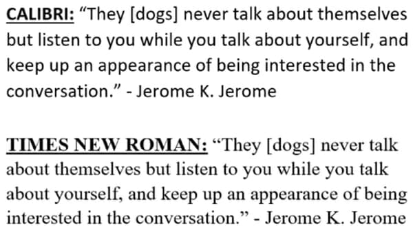
Every time you visit a website or open a book, you’re facing a conscious choice on the part of the author, publisher, or designer. What did they try to express with typesetting? Calibri, for instance, is a safe choice, as it’s inconspicuous and legible. This works well when you try to share information as fast as possible. Then you have something like Times New Roman that has this old-school, newspaper-ish feel to it.
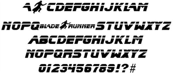
And how about the iconic Blade Runner font? It instantly puts you in a cyber noir mood. For my website, I chose the Source Sans Pro font designed in 2012 by Paul Hunt for Adobe Systems. It’s a humanist sans-serif font, meaning it’s inspired by traditional letterforms, which I thought would be the right pick for users who want to read fast but are nevertheless inspired by language and arts.
Next time you ship out a piece of writing, think about what subtle emotion or perception you’re trying to convey with the lettering for maximum impact.
You might be surprised to learn that size matters in the world of fonts too. One study proved that larger font items were easier to recall for students. That’s why we often use bold fonts to put our message across, knowing full well that many readers skim the text in search of crucial information. In this way, bold text and subheadings serve as a shortcut reading map for a busy reader.
On the other hand, fonts that are harder to read promote more recollection on the part of the readers because they require more focus time to engage with, and decipher.
Whichever font you pick, heed the words of the illustrator William Addison Dwiggins:
“If you don’t get your type warm it will be no use at all for setting down warm human ideas.”
This article was written by Rafal Reyzer.


