I still remember the first To Kill a Mockingbird book cover I saw. It was in eighth-grade English class and it was the mass-market paperback edition with the lavender border on the cover. As a 13-year-old kid I don’t think I entirely appreciated or even understood the full weight of the story within those pages.
When my class finished the book, we watched the 1962 movie starring Gregory Peck. It’s still one of the better movie adaptations of any novel, even 60+ years later.
To Kill a Mockingbird is an American classic and touches on themes of racism, injustice, and fighting for what’s right even if you know you likely won’t win. Atticus Finch is an unsung hero in the story, told through the eyes of his 6-year-old daughter, Scout.
When a novel has endured for as long as To Kill a Mockingbird has, it’s bound to have dozens of editions and reprints, each with their own unique book cover designs. And that’s what we’ll be covering (pun fully intended) in this article: the many amazing To Kill a Mockingbird book covers that have been released over the past six decades.
In this article, we’ll cover a variety of designs for To Kill a Mockingbird book covers:
To Kill a Mockingbird Vintage Paperback Covers
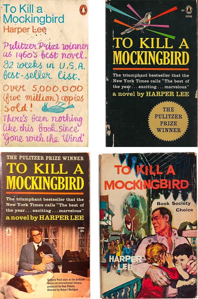
The vintage paperback editions of To Kill a Mockingbird are some of my favorite covers, partially because they have such distinct styles. These covers also include the first movie tie-in book cover for the novel, featuring Gregory Peck on the cover (on the lower left).
The handwritten version on the top left is an interesting deviation from every other cover I’ve found for To Kill a Mockingbird. It fits, though, as the book’s protagonist, Scout, is a young girl who might just be learning to write. The handwriting is childlike while highlighting the accolades To Kill a Mockingbird had received as of the publication date.
The mostly black cover in the upper right showcases some of the achievements the book had received including being a Pulitzer Prize winner and a blurb from the New York Times. The brightly colored lines over the mockingbird at the top adds visual interest.
The illustrated cover on the bottom right is another deviation from most of the other covers. It’s not a style that would do well in modern bookstores, but it was typical of covers in the 60s and 70s.
To Kill a Mockingbird Anniversary Book Covers
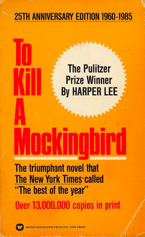
The 25th anniversary of the publication of To Kill a Mockingbird happened in 1985. The cover released to commemorate this milestone was bright orange with red lettering. It highlighted the number of copies sold, the fact that it had won the Pulitzer Prize, and a blurb from The New York Times. It was an eye-catching cover, even without any imagery from the book itself.
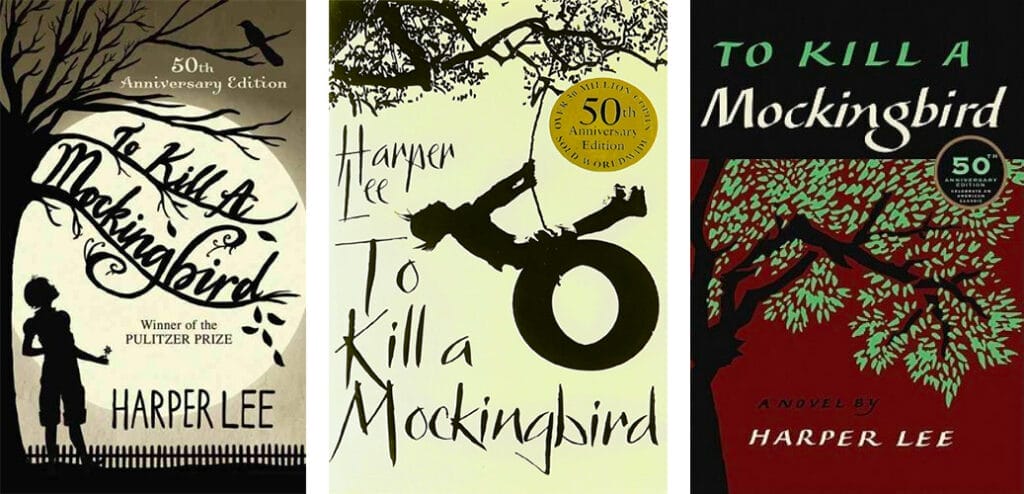
The 50th anniversary occurred in 2010. The To Kill a Mockingbird book covers here focused less on the accolades, probably because by 2010 virtually everyone already knew how celebrated the book was. Instead, the covers focused on the anniversary and sometimes the Pulitzer Prize-winning status. What’s interesting is that each version included tree imagery and two of the three also included a silhouette of Scout. The cover with the maroon background is actually the original hardcover design, just with an updated seal showcasing the 50th-anniversary status.
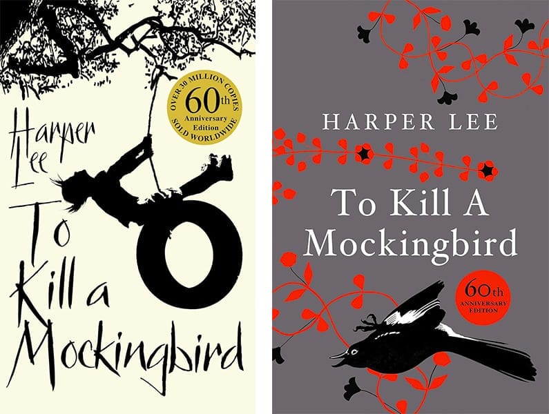
The 60th anniversary, in 2020, reused one of the covers from the 50th anniversary, simply updating the gold seal to showcase the new stats. The other cover was a much more modern take, with a striking black, gray, and red cover palette and an image of what appears to be a dead mockingbird.
To Kill a Mockingbird Hardcover Editions
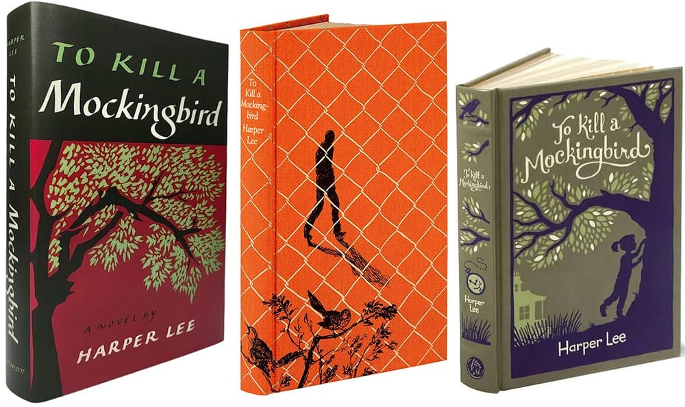
There have been numerous hardcover editions of To Kill a Mockingbird over the past six plus decades. The original cover had a dark maroon background and is still in use today. Under the dust jacket from one edition was what looked like a chainlink fence and a couple of mockingbirds in a bush, with the silhouette of a man walking behind the fence. And in a newer version, we see the familiar tree motif often used on other editions.
More To Kill a Mockingbird Book Covers
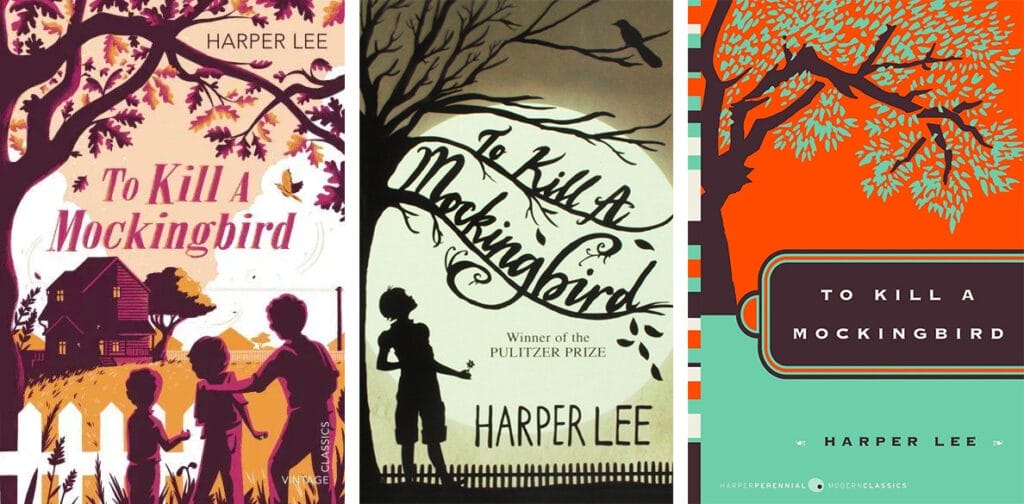
In the more than sixty years since To Kill a Mockingbird was published, there have been a wide variety of covers. Here are three more (one of which is the same as the one used for the 50th anniversary edition). All three have tree motifs, pulling from the motif on the original hardcover edition.
The differences in color palettes give each one a different mood. The purple and orange palette gives a vintage feel to the book. The sepia-toned cover does the same thing but creates a more somber tone. The orange and teal cover, in contrast, makes a striking visual statement but doesn’t necessarily fit the mood of the book very well.
What We Can Learn from These To Kill a Mockingbird Book Covers
Considering the number of titles that are published every year, it’s rare for a book to have the staying power of To Kill a Mockingbird, even when it’s a critically acclaimed award-winner. Looking back over the covers that To Kill a Mockingbird has had over the years, we see a few common motifs: trees, an image of Scout, and mockingbirds.
If you’re considering releasing a new version of your book’s cover, think about carrying over some of the motifs from the original cover to keep a semblance of continuity between editions. Remember, too, that some readers may want to purchase different cover versions of your book if it’s one of their favorites.
If your books are lucky enough to endure the way To Kill a Mockingbird has, consider how each new cover design can add to the legacy of your work. And carefully consider what information you include on each new interaction and how it may add to the success of your book.


