I recently came across the announcement of a new typeface with an unusual design.
A reader directed me to an article in the U.K.-based Mail Online:
The free ‘gravity’ font that could make reading online easier for dyslexia sufferers
Apparently there are other type designs that aim to help dyslexics read more easily. (For a version of this article optimized for accessibility, see What is Dyslexia)
Wikipedia calls dyslexia “…a very broad term defining a learning disability that impairs a person’s fluency or comprehension accuracy in being able to read,” and says it can affect as many as 5 – 10% of any given population.
In the United States, that would be somewhere between 15 and 31 million people. That’s a lot of people, and it seems that if there’s anything we as publishers can do to help them read more easily, it would be a great thing.
According to some sources, people with dyslexia include Tom Cruise, Whoopi Goldberg, Richard Branson, Orlando Bloom, Salma Hayek and many others.
Designer Abelardo Gonzalez says this about his design:
Letters have heavy weighted bottoms to add a kind of ‘gravity’ to each letter, helping to keep your brain from rotating them around in ways that can make them look like other letters. Consistently weighted bottoms can also help reinforce the line of text. The unique shapes of each letter can help prevent flipping and swapping.
Earlier studies had shown that special typefaces could make reading more accurate for people with dyslexia and, to his credit, Gonzalez decided to create a typeface that addressed these issues, and then make it available for free.
<h3?Samples of OpenDyslexic
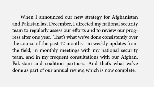
Here’s a paragraph set in Adobe Minion Pro, 11 point.

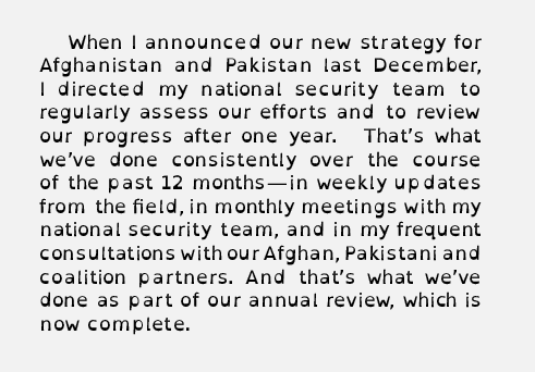
Here’s the same paragraph set in OpenDyslexic, 11 point.

Here’s a closer look at the design of the type.

No matter its ability to help those with dyslexia, this typeface won’t win any beauty contests, but of course that’s not the point. For people without dyslexia, this font looks like it would be very fatiguing to read.
It has no historical models, which is how typefaces are often designed, and the set widths seem odd to someone used to smooth spacing of letters on the type line.
In print books it seems impractical to make use of this typeface, since it definitely does not enhance reading for those of us without dyslexia, but in the ebook world it could be quite different.
Why wouldn’t all e-reader manufacturers make OpenDyslexic—or a similar font that has been shown to be helpful to people suffering from this disorder—available on all their readers?
It seems like the perfect way to use the flexibility of ereaders, with their ability—much to the chagrin of book designers—to change the font of any book in your library.
I bet that could potentially help a lot of those 15 – 30 million people.
If you’d like to try it out, you can download the font here: OpenDyslexia


