In celebration of Banned Books Week (running from October 1–7, 2023), we’ve put together this roundup of banned book covers to inspire your inner rebel. As authors, banned books can be a touchy subject—and rightfully so. The list of books that have been banned throughout history include a number of classics and books with definite literary merit.
Book banning is an outright form of censorship and has been used as a means of political and religious control for centuries. There have also been some books banned for completely ridiculous reasons. For example, the children’s poetry book Where the Sidewalk Ends was banned for “promoting cannibalism” and Harriet the Spy was banned because—wait for it—the title character spies on people.
Below we’ll go over some of the best banned book covers and related topics:
A Brief History of Banned Books
Book bans are nothing new. The first banned book in the United States, in fact, was banned in 1637 in what is now Quincy, Massachusetts. Thomas Morton came to the US with the Puritans in 1624, but he wasn’t necessarily a fan of their beliefs and rules. So when he published his book New English Canaan in 1637, the Puritans were quick to ban it because of its “heretical” viewpoints.
Historically, some books were banned on a national level, usually based on “obscene” content, based on the Comstock Laws. Lady Chatterley’s Lover is an example of a book that was banned and often confiscated by federal agents up until the late 1950s (as well as being blocked for import altogether), until it was deemed to have “redeeming social or literary value” as a defense against obscenity. It was published in the US by Grove Press after that landmark decision.
Other book bans, usually on a local level, have been called for based on religious or “moral” reasons. While school libraries are often the focus of these bans, there have been numerous calls for books to be banned from public libraries in general.
Amazing Banned Book Covers
The banned books in this section are primarily aimed at adult readers. They’ve ended up on banned book lists at both schools and public libraries.
The God of Small Things by Arundhati Roy
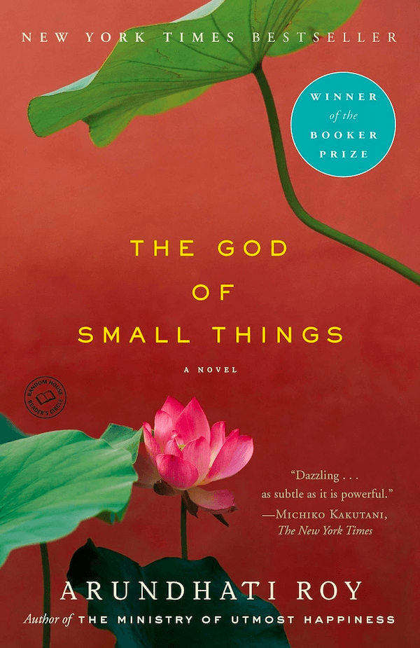
Why this cover works: The cover for The God of Small Things is fairly minimalist, but the textured red background (reminiscent of watercolors) makes the lotus leaves and flowers stand out. Adding a short endorsement of the book to the cover, a reference to the author’s prior work, and mentioned of awards rounds out the cover’s design nicely.
Burn the Page: A True Story of Torching Doubts, Blazing Trails, and Igniting Change by Danica Roem
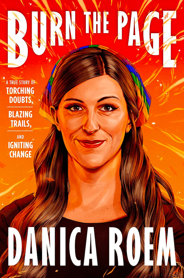
Why this cover works: The orange background and flame elements are striking in the cover for Burn the Page. The illustration of the author on the cover , with the orange light reflecting off of her hair and skin serves as the focal point. And the subtle inclusion of a rainbow hair scarf gives a hint to the book’s subject matter at a glance without being too obvious.
A Spark of Light by Jodi Picoult
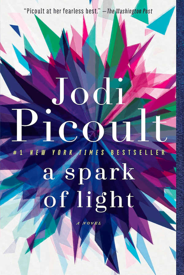
Why this cover works: The obvious choice for this cover would have been a literal spark in the darkness, but the cover designer went in an entirely different direction. The starburst-esque background is reminiscent of a spark without making things too literal. The graphic itself looks like a cross between a starburst, kaleidoscope, and a quilt block. The color palette is rich and eye-catching, too.
American Street by Ibi Zoboi
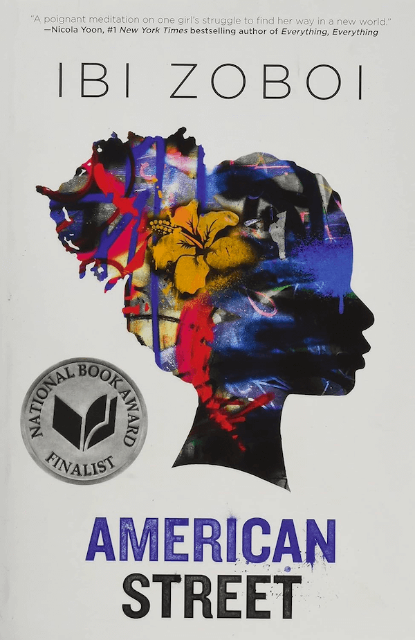
Why this cover works: The silhouette is the first thing that stands out on this cover, especially since it’s filled with graphic elements that resemble graffiti. The typography of the title also resembles spraypaint, while the rest of the cover is strikingly minimalist. Adding in the “National Book Award Finalist” badge and an endorsement from a NYT bestselling author are nice touches, too.
The Color Purple by Alice Walker

Why this cover works: The Color Purple is a well-known classic at this point, and there have been multiple editions released with various covers (the one I remember from school had a woman sitting in a rocking chair in front of a window). This cover version is a more modern take, with an illustration that looks like it was torn from paper and minimalist typography. It’s eye-catching while remaining understated.
Their Eyes Were Watching God by Zora Neale Hurston
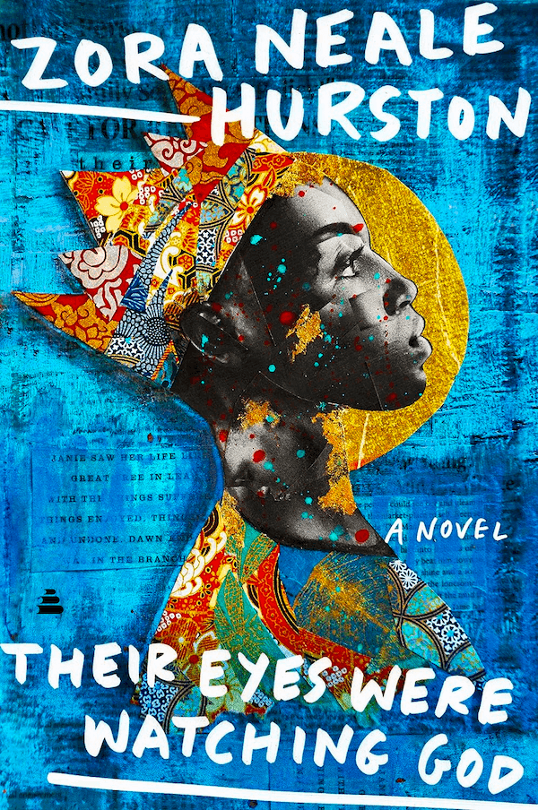
Why this cover works: The cover for the Kindle version of Their Eyes Were Watching God is striking. The collage-style image of a Black woman gazing upward while wearing a crown made of traditional African fabric patterns stands out against the blue collage background. The handwritten font complements the cover nicely and stands out against the background.
Hood Feminism: Notes from the Women That a Movement Forgot by Mikki Kendall
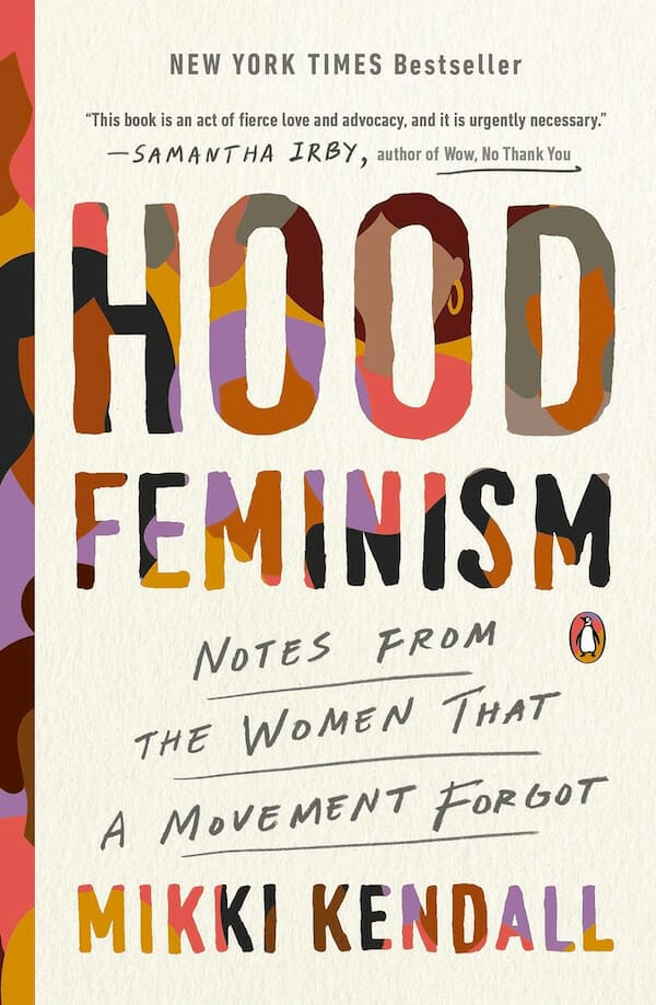
Why this cover works: I’m a big fan of text masking in typography to show an underlying image and this cover does it beautifully. The background illustration is simple, and the paper-textured foreground image looks as if it has been torn to reveal that background. It’s a striking contrast, and the subtitle written in what looks almost like pencil is a really nice touch.
Summer Sons by Lee Mandelo
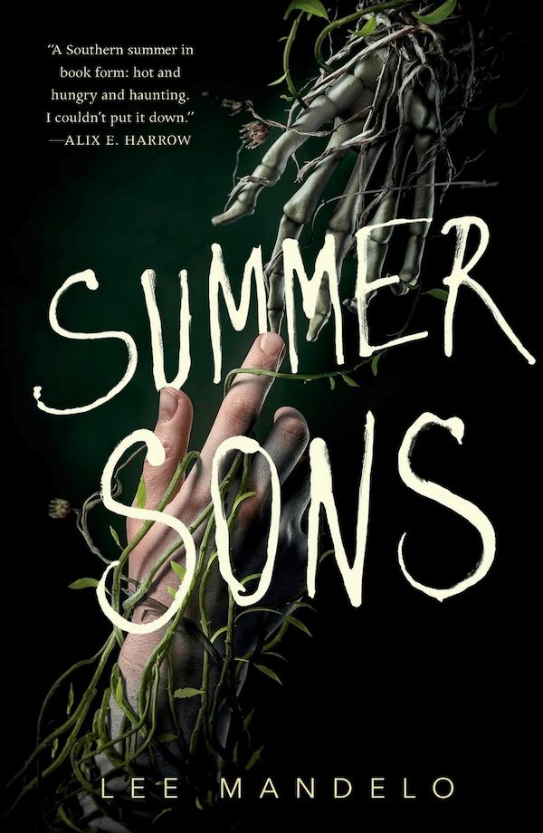
Why this cover works: The cover for Summer Sons is both striking and somewhat understated. You almost don’t notice that the hand on top is actually a skeleton, because your focus is drawn to the living hand below. This kind of depth is often hard to pull off within a cover design, especially in one so simple.
Tell Me How to Be by Neel Patel
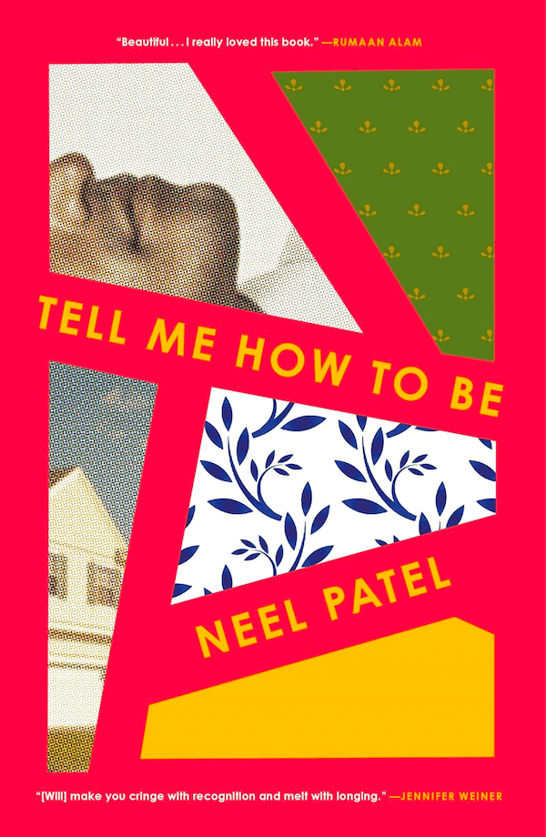
Why this cover works: The bold red background and patchwork-esque design of Tell Me How to Be gives it a slightly modern edge that is contrasted by the vintage images displayed within the cover. The obvious printing artifacts in the two photos within the cover harken back to the second half of the 20th century, while the rest of the cover is kept simple with just a couple of endorsements.
Girls Can Kiss Now: Essays by Jill Gutowitz
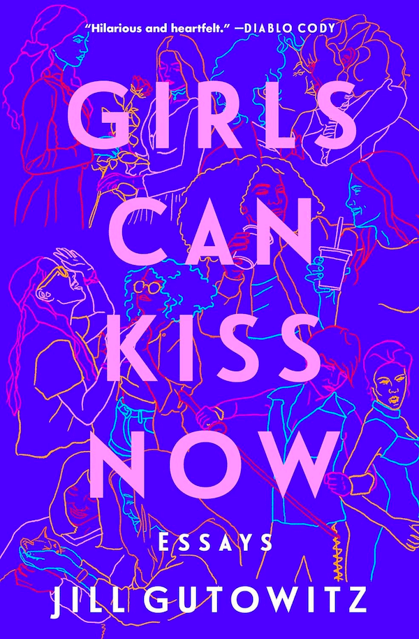
Why this cover works: The bright blue background of Girls Can Kiss Now would stand out on any bookshelf. The line drawings in electric blue, magenta, red, orange, and pink create a rich background for the title, set in bold pink type. And the endorsement from Diablo Cody at the top of the cover is a nice touch and well-targeted for the book’s audience.
Stamped from the Beginning: The Definitive History of Racist Ideas in America by Ibram X. Kendi

Why this cover works: The bold red accents on the cover of Stamped from the Beginning really stand out against the otherwise neutral cover. The typography harkens back to newspapers from the 18th and 19th centuries, which is also an excellent design choice considering the book’s subject matter. Making it all look slightly weathered and worn ties it all together.
The Sum of Us: What Racism Costs Everyone and How We Can Prosper Together by Heather McGhee

Why this cover works: The imagery here is almost abstract, and it might take you a moment to realize that it’s a swimming pool with two children. Mixed media illustrations can be difficult to pull off, either looking flat when printed or becoming overly complex. This one is an excellent example, though, and the way the typography is tied into the background image elevates the cover above similar examples.
When They Call You a Terrorist: A Black Lives Matter Memoir by Patrisse Cullors and Asha Bandele
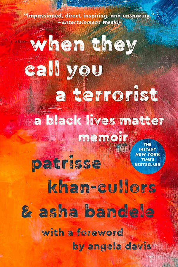
Why this cover works: This cover is striking, primarily due to the bold color palette and painted background. The distressed typography actually ties well with the subject of the book. And setting the circle with the NYT bestseller information in an inverted color palette makes it stand out without clashing.
How We Get Free: Black Feminism and the Combahee River Collective by Keeanga-Yamahtta Taylor

Why this cover works: When it comes to minimalist designs, the cover for How We Get Free should be held up as a shining example. A cream-colored background, a single black ink blot (or watercolor drop, depending on your perspective), and two typefaces are the epitome of perfect minimalist book cover design.
Banned Book Covers from YA Books
The reasons for YA books being banned run the gamut, but usually the refrain is something along the lines of “think of the children!” That said, these YA banned books have some amazing cover art worthy of taking notice.
Leah on the Offbeat by Becky Albertalli
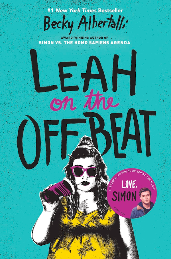
Why this cover works: Three colors (plus black and white) and a grunge, zine-esque design stand out on this YA book cover. The choice of teal for the background is sure to catch the target readers’ eye, while the dark fuschia and yellow accents really stand out. Plus, the image of Leah herself is sure to appeal to a lot of teenage girls who are fed up with, well, everything.
All Boys Aren’t Blue: A Memoir-Manifesto by George M. Johnson
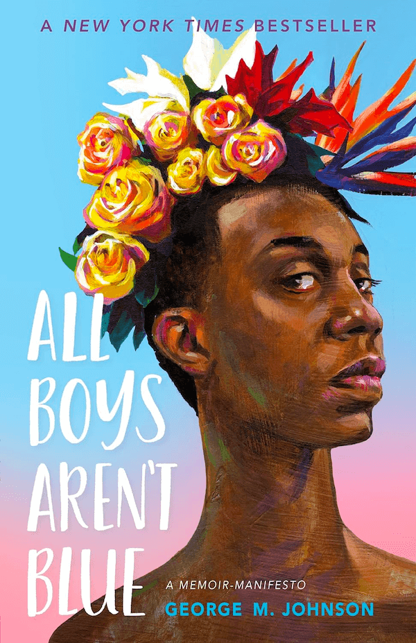
Why this cover works: The cover for All Boys Aren’t Blue is a true work of art. Showing a young Black man wearing a flower crown (including a Bird of Paradise!) displays a softness we unfortunately don’t see often enough, particularly in depictions of Black men. The background gradient fading from blue to pink is both on-point for the theme while also evoking a sunset.
Weird Girl and What’s His Name by Meagan Brothers
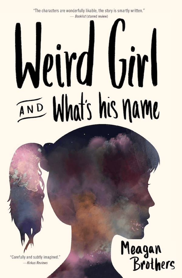
Why this cover works: This is another fairly minimalist cover, but what I love about it is the silhouette made up of a watercolor resembling a nebula. It creates a sort of “every girl” feel to it, or at least an “every weird girl” feel. It makes it easy for the reader to imagine herself as the main character—a win for a book with characters described as “wonderfully likable” according to the review also featured on the cover.
Damsel by Elana K. Arnold
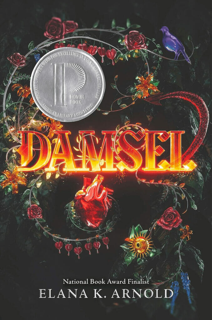
Why this cover works: While minimalist covers are great, there’s also something to be said for a maximalist cover—and Damsel certainly delivers on that. The mixture of vines and flowers, a dragon’s tail, a bird, and an anatomical human heart all play together to put the focus on the title.
The Absolutely True Diary of a Part-Time Indian by Sherman Alexie
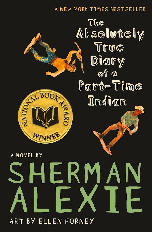
Why this cover works: Here’s another fun cover for a book aimed at the younger end of the “Young Adult” genre. The hand-drawn style typography, black background, and simple action figures on the cover are eye-catching without being overdone.
To Kill a Mockingbird by Harper Lee
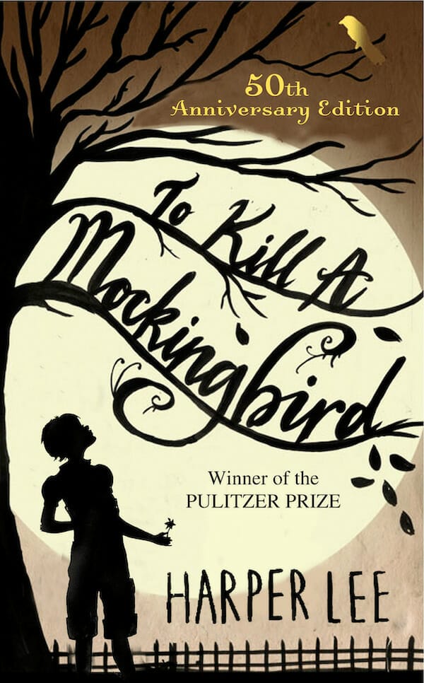
Why this cover works: The 50th Anniversary cover of To Kill a Mockingbird uses silhouettes of Scout, a tree, and a fence against the moonlit backdrop is strikingly simple yet striking. Having the typography with the title run along the branches is a nice design touch that shows real thought and care went into the composition.
Lord of the Flies by William Golding
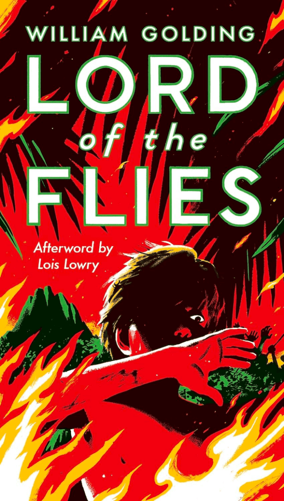
Why this cover works: This cover for the mass-market paperback of Lord of the Flies has a vintage feel to it that fits the subject and setting. The red, green, and yellow color palette is striking, especially with the black and white highlights. Outlining the typography in green is a nice touch that enhances readability.
Banned Book Covers from Children’s Books
Children’s books are often banned from school or public libraries due to “moral” issues or because they might tell a more balanced and accurate story of historical events.
Ivy Aberdeen’s Letter to the World by Ashley Herring Blake

Why this cover works: This cover is cute in a way that looks almost like a (very talented) child drew it. The cyclone of words and images coming up through the center stands out and provides the perfect backdrop to the title typography.
Fatty Legs by Margaret-Olemaun Pokiak-Fenton and Christy Jordan-Fenton, illustrated by Liz Amini-Holmes
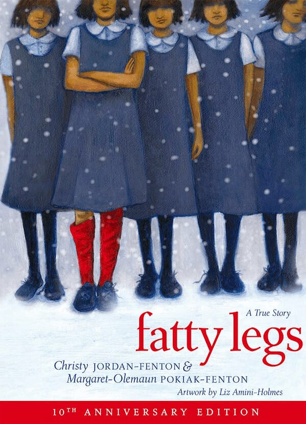
Why this cover works: The cover for Fatty Legs reminds me of the book covers for popular children’s books I read in the early 90s, giving it a nostalgic feeling. The bright red socks let us instantly know who the main character is and that she stands out from the other girls at the residential school.
A Family Is a Family Is a Family by Sara O’Leary, illustrated by Qin Leng
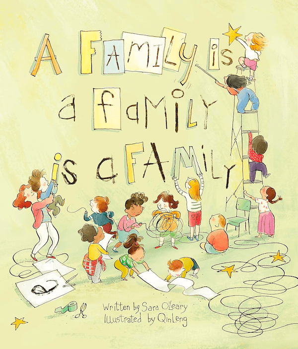
Why this cover works: Here’s another children’s book cover that almost looks like it was drawn by a very talented kid. The children all focusing on a project together (putting the title on the wall) speaks volumes about the book’s content and theme, as does the diversity in the children shown.
Banned Graphic Novel Covers
While there are countless graphic novels that have been banned, here are two with standout covers.
Grass by Keum Suk Gendry-Kim, translated by Janet Hong
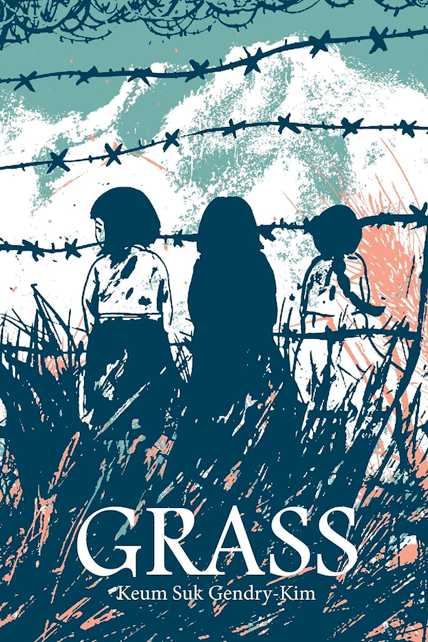
Why this cover works: Grass takes on some heartbreaking subject matter, and this cover highlights some of the main themes without being exploitative or offensive. The barbed wire gives insight into the fact that this is a graphic novel set in a war zone, while the three little girls show that it’s told from a child’s perspective. The muted color palette and slightly messy brushstrokes lend additional support to the theme.
1984: The Graphic Novel by George Orwell and Fido Nesti
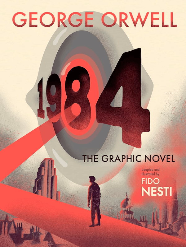
Why this cover works: The eye imagery is a popular one among novel versions of 1984, but the additional imagery in the graphic novel cover really elevates it. Showing the spotlight coming from the eye as well as a city in partial ruins in the background gives further insight into the dystopian society that serves as a setting for the book. And we can only assume that’s Winston in the foreground, staring up at the eye.
Taking Inspiration from Banned Book Covers
One thing you may notice about the books listed above is that their covers aren’t all that different from the covers of millions of other books that haven’t been banned. A book’s cover is rarely what gets it on a banned books list, so that’s not really surprising.
One thing to note is that the books in this list often cover some very sensitive topics. The way that their cover designers have hinted at the themes within the books without throwing those themes in your face (in most cases) is a testament to how a good cover can elevate a book’s position within a bookstore as well as within readers’ minds. If you’re writing a book on a subject that might be sensitive or controversial, consider how you can use your cover to convey the book’s content without being so blatant. Sometimes understated is more powerful than overt.


