Have you considered adding illustrations to your book? “But I’m writing a fiction book for adults,” you probably say, “not a children’s book, a guide to design, or a cookbook. Do such books even need pictures?”
Different people learn new things in different ways. You probably have heard of the VARK model, which stands for visual, auditory, reading, and kinesthetic learning styles. People prefer different means of perceiving information; many use more than one. Adding an extra presentation layer to your book can enhance the reading experience.
Book illustrations in fiction for adults can:
- Convey emotions and atmosphere. The visual medium is a powerful way to express a story’s feelings, tone, and mood. Book illustrations help readers connect more profoundly with the characters and the setting.
- Add visual information to complement the text. Diagrams, sketches, and maps can add a visual dimension to the story. Also, some things like geography or layouts of buildings are much easier to understand through images than through text.
- Tell a story visually. Graphic and illustrated novels offer a unique narrative style. You can provide a ready visual image to ensure readers can see things they have no experience with — that’s how movies work. But at the same time, like any other book, you can still spend time exploring the characters.
In this article featuring the best book illustration examples, we’ll examine the following designs:
A Monster Calls by Patrick Ness, illustrated by Jim Kay
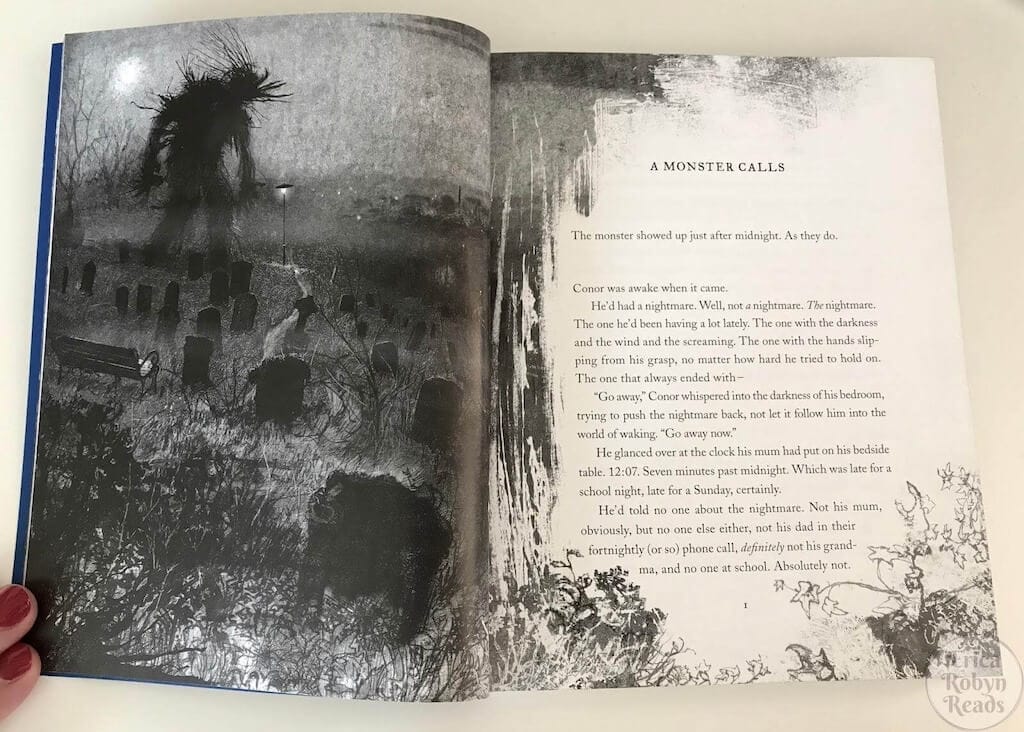
Connor isn’t doing great: his mom is ill with cancer, and he’s been seeing the same nightmare for a while. One night, a monster in the form of a yew tree shows up. He says he will tell Connor three stories, and then Connor should tell him about his nightmare.
Patrick Ness wrote this book based on the original idea of Siobhan Dowd, a British writer and activist. She died of cancer before she could finish the book. Ness’s book features haunting illustrations by Jim Kay. The black and white images help create the atmosphere of grief and reflect Conor’s pain, confusion, and eventual healing.
Persepolis by Marjane Satrapi (author & illustrator)
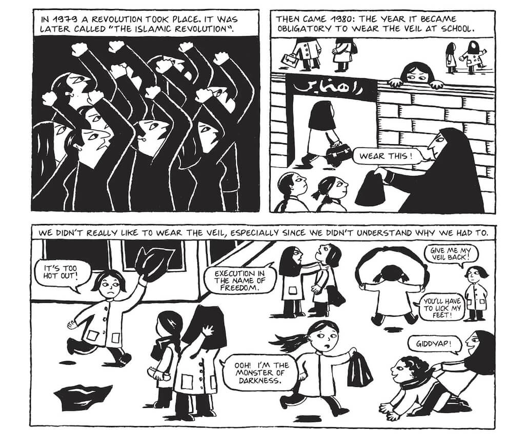
Persepolis is a graphic memoir illustrated by the author — Marjane Satrapi, who was born in Iran in the 1970s. Unable to cope with the consequences of the Islamic Revolution, she eventually immigrated to Europe. The book follows her journey from her childhood in Iran, growing up with Western culture, through the sociopolitical changes in Iranian society and Marjane’s personal journey.
Marjane’s book illustrations serve as a visual storytelling device. They humanize the characters and help the readers relate to them. One of Marjane’s struggles was that she didn’t feel she belonged in Europe, but after returning home, she felt like an outsider in Iran, too.
The simple comic style isn’t a random choice. In his book Understanding Comics: The Invisible Art, American cartoonist Scott McCloud argues that the simpler the drawing of the face is, the more likely readers are to relate to it. A face drawn with great detail can represent only one specific person, but a smiley face could be almost anyone. This helps Marjane’s intended audience — Westerners — better understand what Iranian people are like. Not extremists or radical Muslims, but peace-loving, creative, independently thinking people who have suffered greatly.
The Graveyard Book by Neil Gaiman, illustrated by Dave McKean
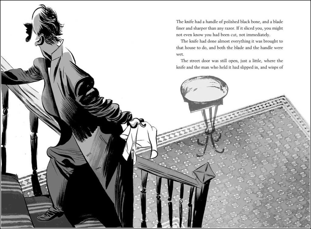
When a tragic event claims Bod’s family, he seeks refuge in a graveyard, where its resident ghosts adopt him. He learns their secrets, including the ability to fade and dream walk. Bod grows up in a world of his own — one that places him between the living and the dead. He will need all the skills he has acquired to face the challenges that await him outside.
The Graveyard Book is a tale of friendship, family, and how great it is to be alive, set in a supernatural setting. The book illustrations by Dave McKean create an eerie and enchanting ambiance to complement the story. They also help shape the ghosts and give readers a visual immersion into their world.
The Last Hero by Terry Pratchett, illustrated by Paul Kidby
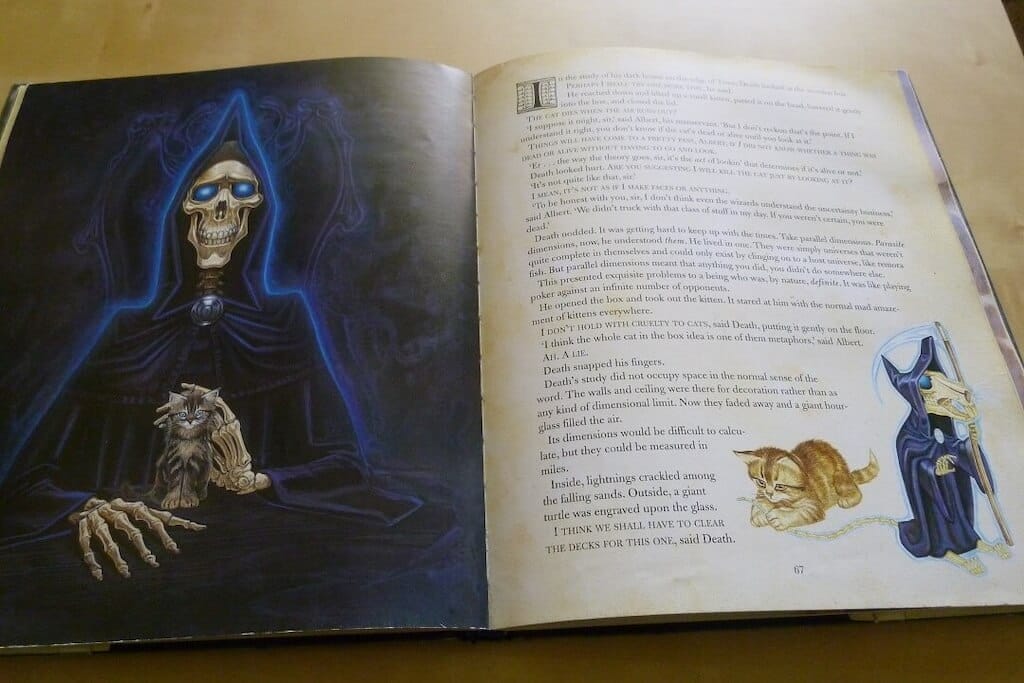
Terry Pratchett is famous for his Discworld series, often described as a satirical fantasy. In this book, a group of aging heroes led by Cohen the Barbarian embark on a journey to destroy the gods. The wizards, concerned about the impact of this action on the world’s magical stability, set out to stop the heroes. The conflict resolves unexpectedly, challenging traditional heroism and exploring themes of aging and the passage of time.
The Last Hero, illustrated by Paul Kidby, is the only novel in Terry Pratchett’s Discworld series created as a fully illustrated edition. It’s an extensive collaboration between the author and the illustrator with full-color book illustrations throughout the text. The images breathe life into eccentric characters and amplify the humor and absurdity of the story, making it even more immersive. Each picture complements the text, adding depth to the narrative.
The Principles of Uncertainty by Maira Kalman (author & illustrator)
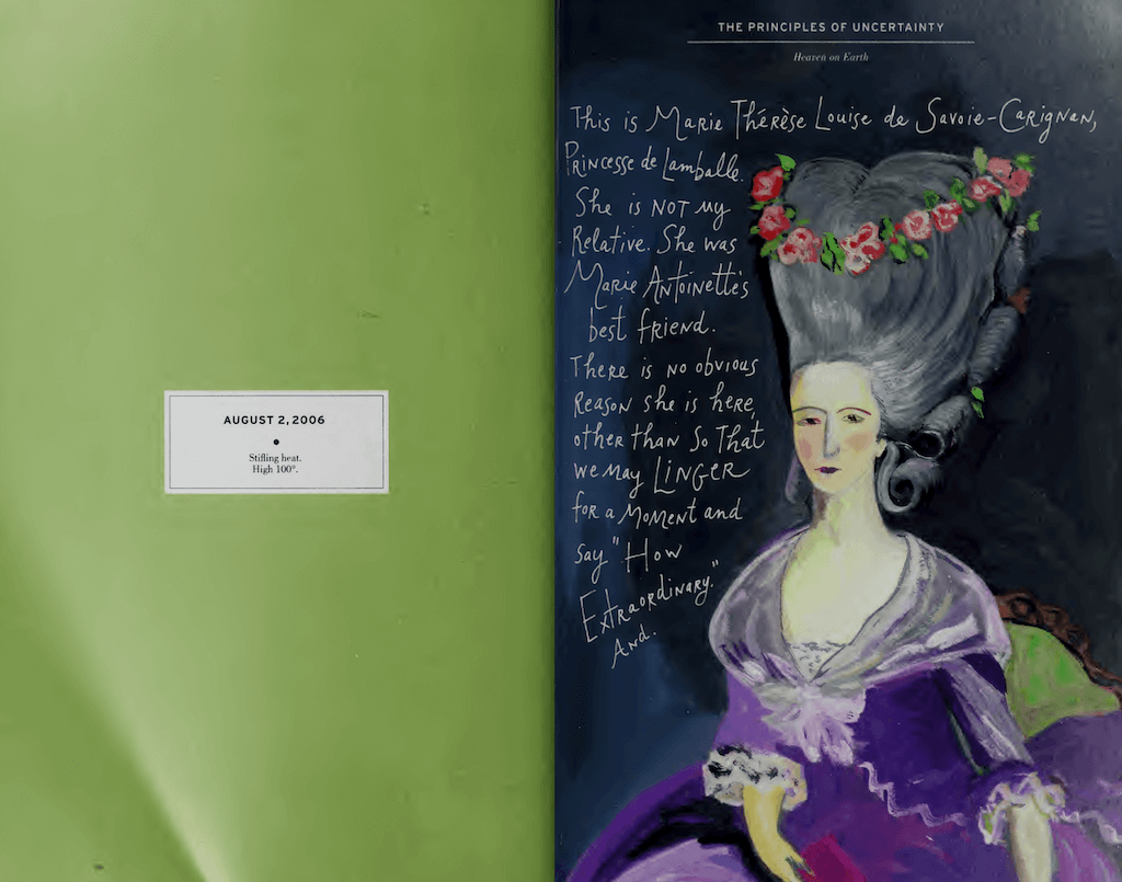
This book differs from others in its looks and structure. First, it looks like a handwritten journal with colorful sketches. It also doesn’t have a traditional format nor follow linear storytelling. Instead, it’s a series of vignettes, thoughts, and images on life, love, and art.
The visual elements aren’t just related to the text — in some cases, they are the text. The author’s vibrant colors help her show the readers the world as she sees it. Together, these elements create a sense of wonder, joy, and, at times, melancholy.
S. by J.J. Abrams and Doug Dorst (interactive marginal notes and book illustrations)
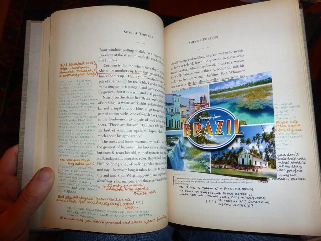
“S.” doesn’t have book illustrations in the regular meaning of the word. Rather, it’s an interactive experience created with interactive elements. This book hides a story within another story. The first layer is a novel titled “Ship of Theseus,” written by a fictional author named V.M. Straka. The book itself looks like and feels like an authentic old library copy, with the library stamps and worn-out-looking pages.
The second layer is the story of two readers who pass the book back and forth. They communicate through handwritten notes, margin illustrations, letters, newspaper clippings, or postcards. The second layer of the story makes the experience immersive, adds a tactile and visual dimension, and forces the reader to actively participate in the creative process. “S.” is a unique and experimental novel that blurs the lines between storytelling and reader interaction.
Adding visuals to your story can convey emotions, atmosphere, and essential information, creating a richer and more immersive narrative. Book illustrations can also forge a deeper connection between readers and the story. Not every book benefits from them, but it’s an idea worth considering.


