Text breaks—those places where the author wants to insert a space, but not a new chapter or section—lots of authors use them, and they often create problems for book layout. There are many ways the text break can be used:
- to give the reader a rest
- to change scene in the middle of a chapter
- to insert a story line outside the current narrative
- to flashback to an earlier event or
- to supply explanation or backstory to the main action.
The list could go on and on. Novelists seem to use text breaks more than other writers. They are probably common in memoir. But when the book gets to the book designer there are both problems and opportunities.
Designing for Text Breaks
The problems come from the enforced space on the page. As designers, we usually want to square the bottoms of all the pages, and your book will look a lot neater that way. But what if a text break comes right at the bottom of the page?
You have no choice but to leave the space there to signify the text break. And what about the text break that occurs at the top of the page? It would make for a very odd-looking book page to have a big space at the top of the type column.
How do designers get around these problems? By seizing the opportunity the text break presents. By putting just one character in the space of the text break, you can accomplish any number of things,
- give a graphic touch to relieve the gray columns of type
- add an element that affects the “color” of the type page, and therefore the overall reading experience
- amplify or illustrate a theme from the text with pictographic elements
8 Solutions to the Text Break Affair
The best way to see the effects of different treatments for text breaks is to take a look at them visually. Let’s have a look. (This text is from the newly-published The Andrew Street Mob by Brian Marais, Marais Media International.)
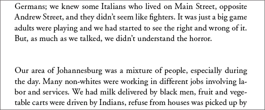
1. Space—Here’s your naked space, restful perhaps, but so wrong for making good-looking pages, for all the reasons discussed above.
2. Bullet—A single bullet can be very effective in breaking the space and adding a spot of color.
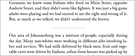
3. Rules—Using a decorative rule is an effective way to make a clean break between sections. This dotted rule adds a character to the page that’s all its own.
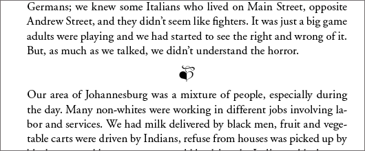
4. Decorative ornament—Here a decorative leaf from the Zapfino font strikes a graceful note with the Adobe Garamond Pro body text.
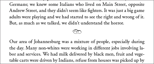
5. Printer’s ornament—Throughout the history of printing type designers have created typographic ornaments that printers use to add decorative touches when appropriate. We can draw on these historical forms for text breaks, too. This ornament is from the Adobe Wood Type font.
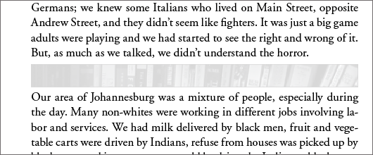
6. Photograph—A detail of a photograph, grayed out to keep it from overpowering the text, might be effective for the right book.
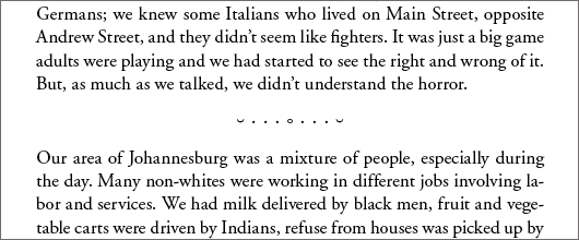
7. Type characters—Five hundred years before the emoticon designers used the common type characters in fanciful arrangements that were purely decorative. These characters are from the Open Type Adobe Garamond Pro.
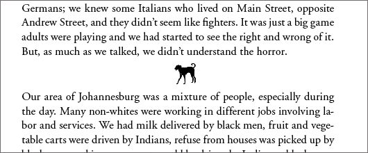
8. Pictographs—If done properly, this is one of my favorites. It has to be the right book, and just the right drawing, but I’ve used these in books about the outdoors, camping, dogs, and RV travel.
In each case, the design has to stay true to the mission that’s been set for the book. And each of these samples shows how a page of text can be influenced by the smallest addition, especially combined with white space that throws it into greater prominence.
But the text break is also a fun opportunity for you as a book designer to add something to the page, or choose to stay back quietly while the author tells her story.
Takeaway: Experiment with different ways to format text breaks and see how each influences the page differently.


