Sometimes things happen in waves, or some people say they happen in threes. But people also have the uncanny ability to see patterns—even where they don’t exist.
Whatever the case, recently I ended up designing two contemporary novels by women novelists, both from the San Francisco bay area, at exactly the same time.
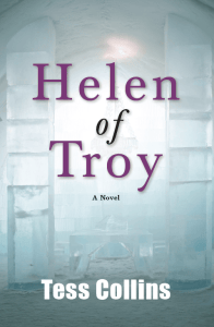
Helen of Troy by Tess Collins
Collins is the author of four previous books. Helen of Troy (Bear Cat Press) is a “quirky and lively retelling of the classic Greek legend set in small-town America,” in this case Troy, Tennessee.
The covers of novels are influenced more than anything else by the overall tone of the book. After looking at a lot of cover ideas, we hit on this one, inspired by a line in the book in which an “ice palace” plays a part. Here’s the cover:
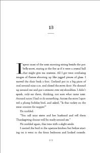
On the interior, the text typeface is Goudy Old Style, a font I haven’t used in some time. The chapter numbers and drop caps are Modern No. 20, a display face with a pronounced contrast in stroke weight. Here’s the chapter opener:
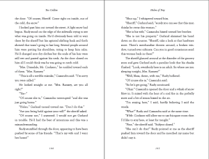
This is how the spreads look:
In the end Tess decided to also produce a hardcover version in addition to this 5.25″ x 8″ trade paperback, and having the hardcover review copies available was part of her launch strategy.
Tess Collins’ author website
Helen of Troy on Amazon
The Edge of Maybe by Ericka Lutz
Lutz, the author of eight previous books, all nonfiction, also teaches writing at the University of California. The Edge of Maybe (Last Light Studios), also a 5.25″ x 8″ trade paperback, is set in Berkeley. It puts us in the midst of crisis with a couple “entering middle age with politically correct values, an obsession with gourmet organic food, and no idea what has happened to their punk rock, adventurous youth.”
Although there are many amusing passages in the book, it deals with some pretty dark themes, and required quite a different approach.
The finished cover reflects some of these themes and introduces the eye of horus as a subtle symbol that plays a part in the book. I’ve written about the problem of including symbolism on book covers, but I think this one is subtle enough to work really well.
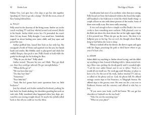
The story is told in the alternating voices of the three main characters, so the typography was required to create these “character tags” so the reader would know exactly which perspective was which.
The solution uses the same Fontin Sans font for the tags and the chapter titles, with the addition of a small ornamental leaf. The alternating viewpoints in this book are an integral part of the way the story is told, and the typography creates a break large enough to signal the change without overpowering the story itself.
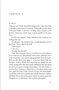
Here’s a chapter opening:
The text is set in one of the most useful book typefaces of modern types, Adobe Garamond Pro. Here’s a spread:
Ericka Lutz’s author website
Website for The Edge of Maybe and the book trailer
The Edge of Maybe on Amazon
Design Note
Designing novels is both fun and challenging. Because the interiors of most novels are unadorned continuous typography I think you have to take a lot of care to balance the elements of the page to get the best effect.
Margins, line leading, choice of fonts get more critical since the aim of the designer is to enable the reader to be carried along by the author’s story.
In these books, the solutions for both the cover designs and the interiors emerged from the books themselves, and that’s a very satisfying conclusion.
Ed: There’s a typographic anomaly involving the interior design of one of these books. A free copy of A Self-Publisher’s Companion to the first person to identify it. Are you game?


