Charles Dickens not only has some of the most famous books of all time, but the Charles Dickens book covers are also inspiring for authors looking to create their own.
Of course, with most famous books, they have been reprinted countless times so there have been multiple covers to look at and learn from.
However, there’s something to learn from looking at some of the most famous books to figure out how you should design yours.
In this article, we’ll be looking at some of the various Charles Dickens book covers out there and go over some tips for your own book covers.
Dive in to learn more about what makes these Charles Dickens book covers so great:
Charles Dickens Book Covers
We will be taking a look at seven different Charles Dickens book covers so you can get some inspiration for how to make a book cover that stands out.
1. Oliver Twist
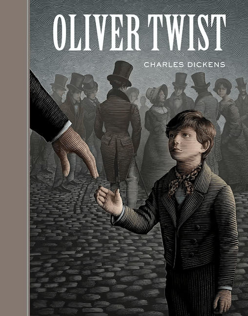
Oliver Twist is one of Dickens’ most famous books, which not only had countless covers, but has been turned into movies, too.
If you’ve never read the book, it’s a story about a poor orphan born into the streets of London.
When you first look at this cover, you will most likely feel something for Oliver, the main focus of the cover. You can see the people in the background turning their backs on him, with one helping hand reaching out. It says a lot about the storyline while giving enough intrigue to pull readers in.
If you are designing your book cover, you will want to think about how you can hint at what your story is about without giving the whole plot away.
2. Bleak House
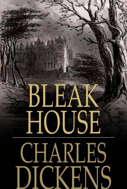
While Bleak House isn’t as well known as Oliver Twist, this cover is a standout.
Bleak House is one of his darker books since there is a murder mystery involved. Although the entire book doesn’t read like a true crime book or similar thriller, the cover pulls you in and makes you want to figure out what is going on in that house.
You will want to think about the use (or lack) of color in your book cover. The lack of color in this cover gives it a completely different feel compared to if a bright and happy home was featured on the cover.
3. A Tale of Two Cities (200th Anniversary Edition Cover)
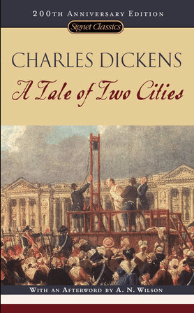
This version of A Tale of Two Cities is the 200th Anniversary Edition. If you take a look at it, there’s a lot of action happening on the cover.
Action can be a good way to grab attention. Of course, a scene with a guillotine would intrigue almost anyone and you would want to know what is going on and what led to this particular scene.
If you know about the book, you would know it takes place during the French Revolution, but if you didn’t, you would want to pick up the book to figure out what is happening in this book.
4. A Tale of Two Cities (Usual Cover)
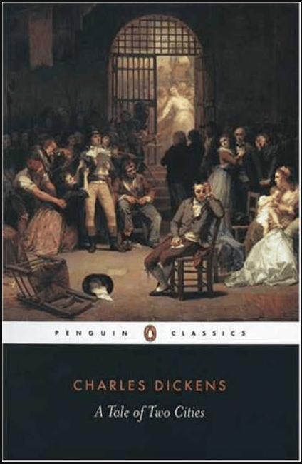
Here’s what the the usual version of the A Tale of Two Cities looks like. As you can see, there’s still a lot of action and intrigue on the cover.
This is to show you how you could use action to grab their eye at a bookstore. As you look at this cover, you are probably wondering why that man looks upset in the chair, why people are arguing in the background, why the one lady is falling over because she’s so upset, why the chair is flipped and the top hat has been left behind, and so on.
This cover gives people so much to unpack and look at, which is what you want as an author: giving them a reason to pick your book up.
When it comes to designing your cover, you need to be thinking about what would stand out on a shelf compared to other similar books. That could be the design, putting action on the cover, using certain colors, and so on.
5. Great Expectations
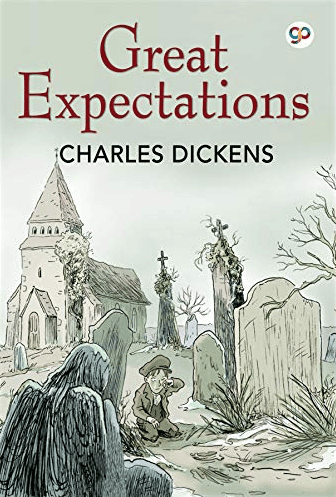
This cover for Great Expectations is different than some of the others, as it’s a little more cartoonish than others.
However, there’s something about the story that the cover is telling that makes you want to pick it up and read what the book is about.
You might want to try out various art designs and figure out which cover works best for your book. If you have an audience, you can poll them as well to get their take on which one works and why.
6. Hard Times
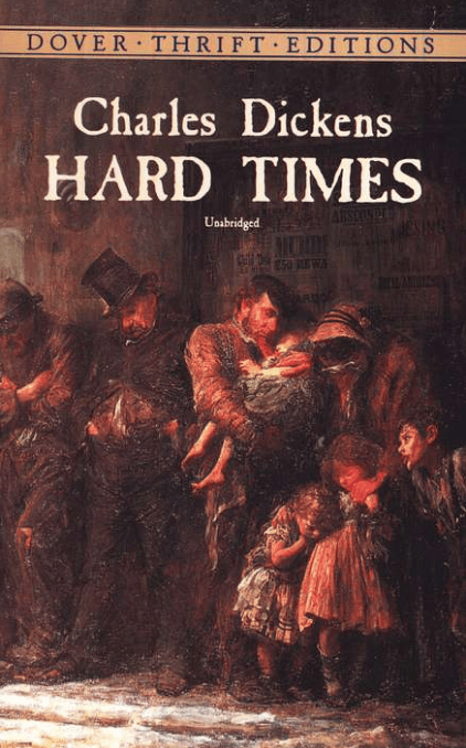
Charles Dickens was known for writing about poverty and the struggle of poor people, but this cover for Hard Times really makes you feel the struggle.
This cover alone looks like an art piece that should be in a museum as it is telling multiple stories at the same time.
If it helps give you context, Hard Times is a book about the lives of working people in northern England who are discouraged from having dreams and visions and instead are taught to focus simply on the facts of life.
Of course, it’s deeper and more complicated than a single summary could explain, but you can see how the main themes of the book are on the cover.
While you write your own story and design the cover, think of your main themes that are throughout your book. How can you display those themes in your cover art?
7. Three Ghost Stories
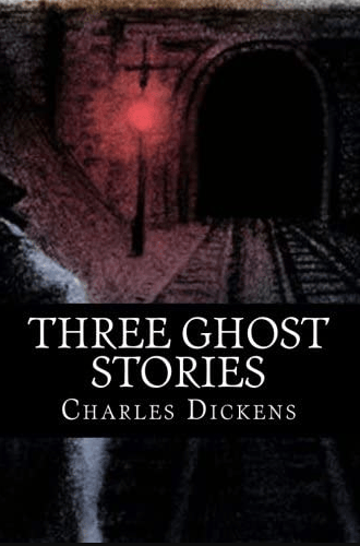
Out of all the Charles Dickens book covers we have gone over in this article, Three Ghost Stories has the creepiest cover of them all.
This is a collection of three different ghost stories he wrote: The Signal Man, The Haunted House, and The Trial for Murder.
The main point of looking at this cover is that you want to create a cover that falls in the same genre as the book you’ve written.
Imagine if this cover had a similar look to his other books, with the same style. You wouldn’t get that they’re scary stories at all. Even if most of your author branding has a particular type of look, it’s essential to make sure your book cover fits within its genre.
This mainly applies to people who write in various genres or want to create something outside of their usual style.
The Overall Lesson for Authors
Now that you’ve seen a wide variety of covers, you should have a good list of ideas for you to use for your own book covers.
You’ll want to explore various styles, art choices, fonts, and images in order to convey what you’re trying to say in your book.


