by Matthew Turner (@Turndog_Million)
Matthew, who is a frequent commenter here, is very interested in the ways authors use branding to enhance their marketing strategy. Here he looks at your book cover as an element of that branding.
You all know how important a book cover is, right?
After all, you’re on Joel’s site, and if there’s one thing he discusses in detail, it’s how to create a killer cover.
But let me tell you, it’s a tough world out there, and it’s tough to get noticed.
Amazon has opened up many doors, and not just for you; the same possibilities exist for everyone.
We all have a book in us, so they say; well, now we can publish it too!
A good book cover can help you stand out, as can an author platform, and a good author branding strategy, and everything else a modern author needs in their arsenal. My big question is:
How can you combine all of these different things into one consistent message?
Brand Identity, that’s how!
What Is Brand Identity?
Although I wrote an ebook on this topic, I won’t go into the whole process here. Instead, let’s focus on your book cover.
Simply put, Brand Identity looks at the aesthetics you create for your author platform. It focuses on:
- Colours
- Fonts
- Logos
- Images
- Layout
A good website should tell a consistent story, in fact scratch that, your entire author platform needs to tell a consistent story. Your aim is to be instantly recognisable.
People see your Site and know it’s you
They see a Guest Post and know it’s you
They see a book and know it’s you.
So, how consistent is your brand? Is it the same on your site, on Twitter, Facebook, etc?
Align Your Book Cover
I’m no expert on book covers, but I know branding and know what I like. Lets look at a few examples where a book cover aligns with more than just the book.
Brand and Cover
Joanna Penn (J.F Penn) is a good example of an author combining her overall brand with her book. Her personal website, www.joannapenn.com, has a similar feel to her two fiction books.
The font, colours, and general dark, rustic feel is seen in all three pictures. Is this by accident? I doubt it.


Book Series & Branding
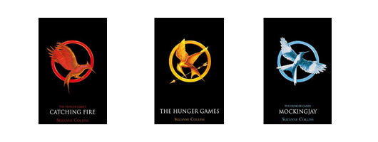
I recently read the Hunger Games series, and fell in love with the covers. Not because they are nice looking (which they are), but because of the consistency they create.
The decision to not call the books “Hunger Games 1,” “Hunger Games 2,” etc., created a branding dilemma. Your cover needs to stand out, and if you have a series, you want your fans to recognise the next book straight away.
The Hunger Games overcome this. Each book is unique, but each also follows the same style. In a second you can tell—without looking at the name—that Mockinjay is part of the series.

Why This is Important
People are affected by perception. You may not know it, but you are being “brainwashed” everyday. The reason you associate Coca Cola with a particular shade of red is because of brand manipulation.
You have the power to do the same with your own brand identity, and a clever book cover can help. You want people to recognise your work straight away. This is how you stand out from the crowd on Amazon.
That’s right, your covers can help your author platform. You can separate it from the process, or make it part of it. In my opinion, there’s only one answer.
What You Should Do
The biggest piece of advice I can offer is. . . Think.
Think about the bigger picture whenever you can. Consciously relate everything back to your brand identity, and if you haven’t got one, now’s a good time to start.
I’m not suggesting you get rid of your book cover just because it has a different font, but think about how your brand can align with it. It might mean altering the font, or changing one of the colours, or adding a simple touch of something to bring it all together.
It’s about combining your brand identity and your book into one coordinated package. Don’t separate them, let them be best friends and wear the same style.
A modern-day author needs modern-day thinking. Whatever your feelings are towards branding, you’ll be creating a brand of your own as soon as you release your book.
You either fight it or embrace it. I suggest embrace, and while you’re at it, align your book cover with your brand as best you can. Read the monthly eBook Cover Design Award posts here on The Book Designer for great book cover tips.
What about you? Leave a comment below and let me know: Does your book align with the rest of your author platform? Have you thought about branding your books?
 Matthew Turner (aka Turndog Millionaire) is a Strategic Marketing Consultant and author of both fiction and nonfiction. He provides a variety of services to help writers create an Author Platform, and strives to meet authors with a passion to succeed in today’s world. He explains his author platform-building ideas in a free ebook series, How To Build An Author House. For more information, check out his site at Turndog Millionaire.
Photo by chefranden


