Creative book cover design involves a tough balancing act. The design must communicate several things: what kind of book it is, its main themes, and what type of writer you are. At the same time, it also should grab potential readers’ attention.
You might be tempted to go against the flow—for example, use a white and light pink color palette for your mystery novel. The likely result is that the readers will be totally confused. People looking for a romance novel will be disappointed, and mystery lovers won’t even pick up your book because it doesn’t look like a traditional mystery book.
In this article, we’ll cover the most common genre design conventions and explore how you can fit those expectations while also being unique:
Romance Book Cover Design
Romance book covers are easily recognizable by warm colors like red and pink, images of couples, or symbols of love. Titles are often in elegant fonts, with the author’s name in a simpler typeface for readability.
To make your book stand out from the multitude of pink jackets, use less common visuals that still evoke the book’s emotional tone.
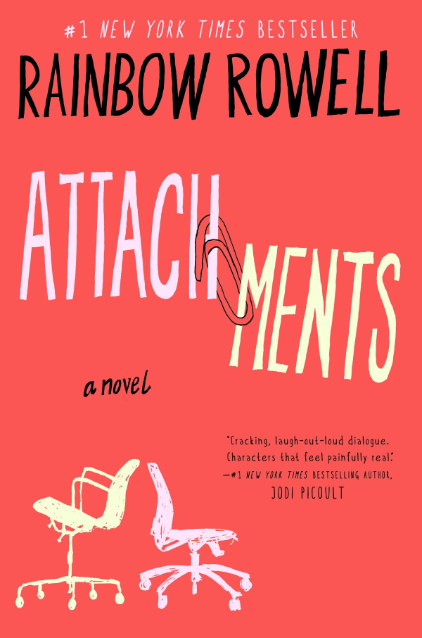
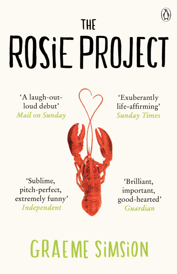
Attachments uses playful graphics suggesting a contemporary romance. One Day features silhouettes that reflect the story’s unfolding over time. The Rosie Project displays a quirky lobster, pointing to an unconventional romantic tale. Each cover respects genre standards but also promises a unique read.
Science Fiction and Fantasy Book Cover Design
Science fiction and fantasy book cover use deep blues, purples, and greens. The imagery often includes magical or sci-fi elements such as dragons or spaceships. The fonts are bold and can consist of special details that match the story’s theme.
Consider using elements central to your story’s world to create unique covers. For example, an enigmatic symbol or unusual landscape can offer a glimpse into the book’s heart while staying true to genre staples.
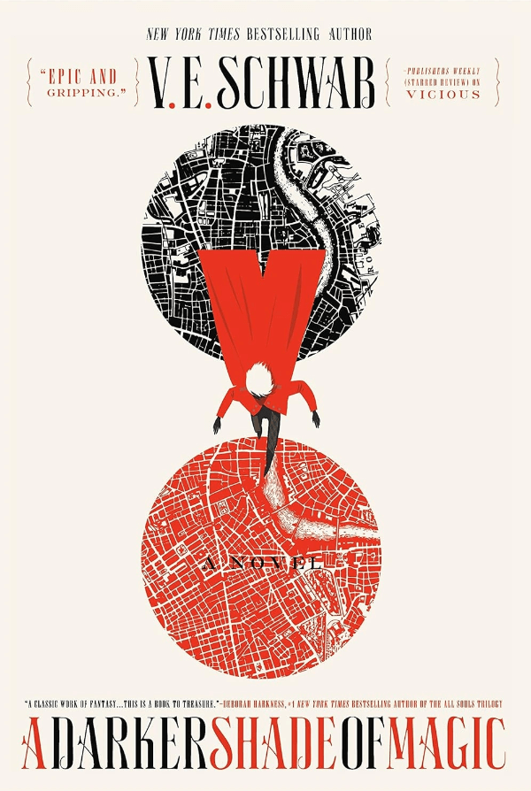
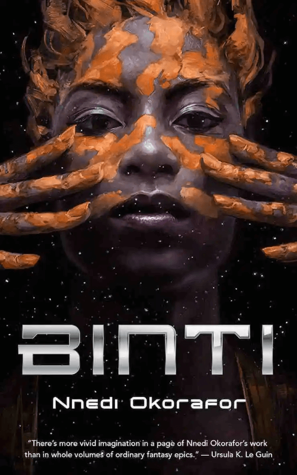
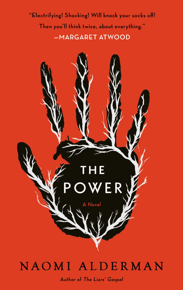
A Darker Shade of Magic leverages maps and color to hint at its tale of parallel Londons. Binti merges African symbols with space imagery, implying Afrofuturism. The Power’s simple handprint against a stark backdrop foreshadows a story where power is reimagined. These covers maintain genre integrity while promising fresh narratives.
Mystery, Thriller, and Horror Book Cover Design
Mystery, thriller, and horror book covers often use dark colors like deep blues, grays, and blacks to create suspense or a sense of foreboding. Imagery is key, with shadows, silhouettes, or incomplete images to pique curiosity and evoke unease. The right font adds to the tension, with titles that may appear splattered or sharply styled to match the story’s intensity.
To create a unique cover, balance classic elements that meet genre expectations with those special to your story. For example, you can subtly use a mysterious item or a location from your book in the cover design.
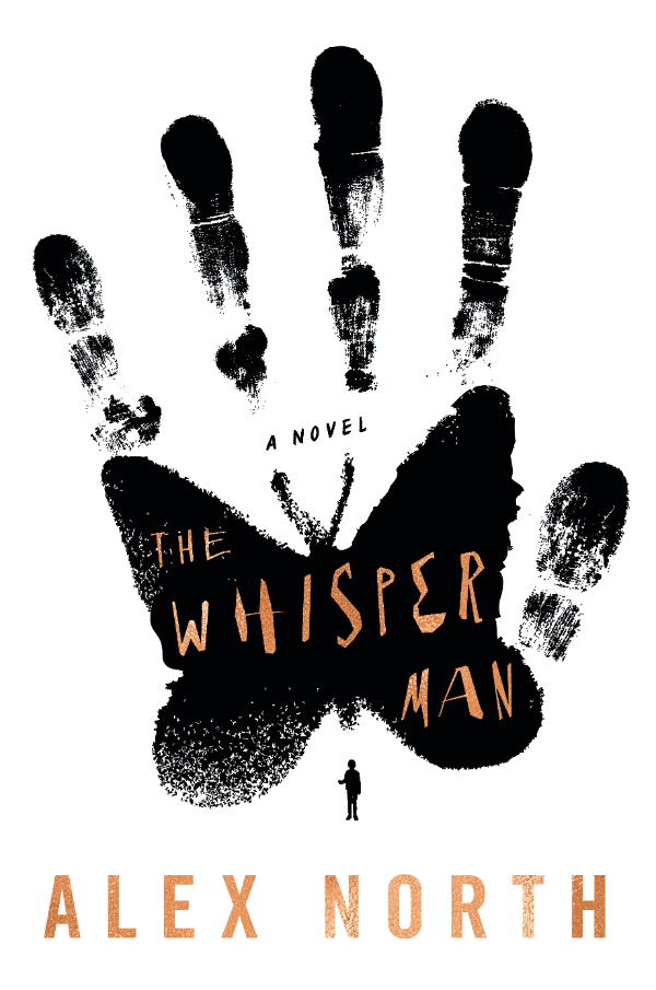
In the Woods captures the genre’s essence with its intricate branches suggesting complexity and depth. Night Film uses a partially hidden face to imply suspense, while The Whisper Man presents a fingerprint butterfly, combining the personal touch of a thriller with an eerie visual. Each cover is true to its genre but offers an unexpected twist that hints at the unique tales.
Historical Fiction Book Cover Design
Historical fiction covers blend colors and imagery to transport readers to the past. They use sepia or earthy tones and period-specific details like vintage photos or artifacts.
Choose unique historical elements related to the story’s specific time and place for a creative touch. It’s about capturing the era’s essence while offering a fresh angle.
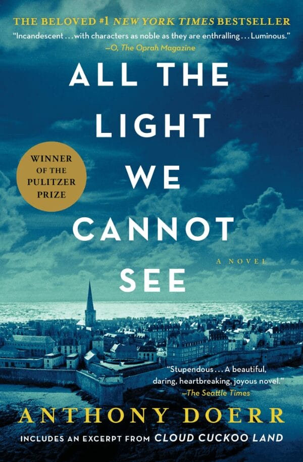
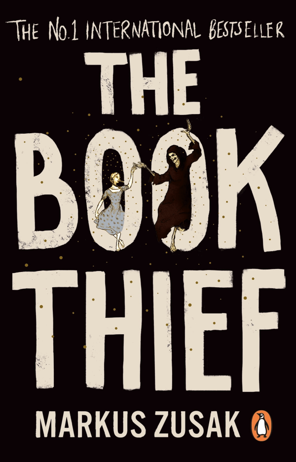
All the Light We Cannot See presents a tranquil blue sky contrasting its wartime drama. Atonement uses a solitary, contemplative figure to hint at the novel’s reflective nature. The Book Thief combines dark hues with white text, reflecting the harsh reality of its setting and the innocence of its young lead. Each cover is true to its genre yet stands out with its artistic expression, inviting readers to dive into the richness of the story.
Biography Cover Design
Biography covers often feature a central portrait that tells a personal story with a simple and elegant design. The colors are usually subdued, like black, white, or earth tones, which add a serious tone to the cover. The typography is clear and bold, with the subject’s name and the word ‘biography’ easy to see.
To make your book stand out, use symbolic items or settings linked to the person’s life instead of a traditional portrait. This adds uniqueness while staying true to the genre.

Biographies like Educated use a pencil and mountain range as a metaphor for the subject’s journey. Frida displays Frida Kahlo’s own artwork, reflecting her vibrant life and art. Into the Wild features a haunting Alaskan landscape, focusing on the environment rather than the person. These covers use symbols and scenes related to the subjects’ lives, offering a deeper glimpse into their lives than portraits could.
Self-Help and Business Book Cover Design
Self-help and business book covers are known for their clean, professional appearance. They often feature bright, bold colors like blue, green, or orange. Simple yet powerful graphics like ladders or lightbulbs can be used to symbolize personal and professional advancement. Titles are displayed in large, bold fonts, focusing the reader’s attention on the book’s message.
Aim for a balance of classic and inventive elements to make your cover design stand out. For example, think of ways to communicate your book’s main message with an unexpected color or graphic.
Atomic Habits, Drive, and The Lean Startup use strong typography and limited color schemes to show that they have useful, clear information. Atomic Habits features dots that form an arrow, illustrating progress through small changes. Drive presents its title in impactful red, capturing the essence of motivation. The Lean Startup has a simple blue circle that symbolizes the iterative cycles in business innovation.
Cookbooks Cover Design
Cookbook covers often have appealing food photos with bright colors matching recipes. For example, you can see reds for Italian food or warm colors for baked goods. Cookbooks’ titles are big and clear, using fonts that fit the book’s style, from playful for family recipes to sleek for professional cooking. Authors’ names are often highlighted, especially if they’re famous chefs. Simple decorative elements like borders or kitchen tools can add charm, but the focus is always on the delicious food.
Consider using hand-drawn pictures or interesting ways to show ingredients to add uniqueness to the design.
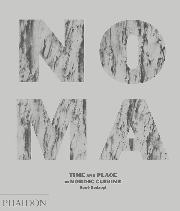
Noma’s marbled lettering reflects nature and fine dining. Plenty’s vibrant vegetable photos make it visually appealing. Salt, Fat, Acid, Heat uses fun drawings to explain the science of cooking. These covers combine simplicity with eye-catching details, hinting at culinary adventures.
Young Adult (YA) Book Cover Design
YA book covers typically feature vibrant colors and images of young characters, appealing to teen readers. These covers are designed to mirror the emotional depth and variety of experiences in youth. Imagery often includes characters in dynamic poses that hint at the story’s main challenges. The typography on YA covers is diverse and striking, chosen to match the book’s mood. Titles in genres like fantasy or dystopian often use fonts that convey a sense of urgency or adventure.
Consider using symbols or abstract artwork representing your narrative’s themes for a distinctive cover.
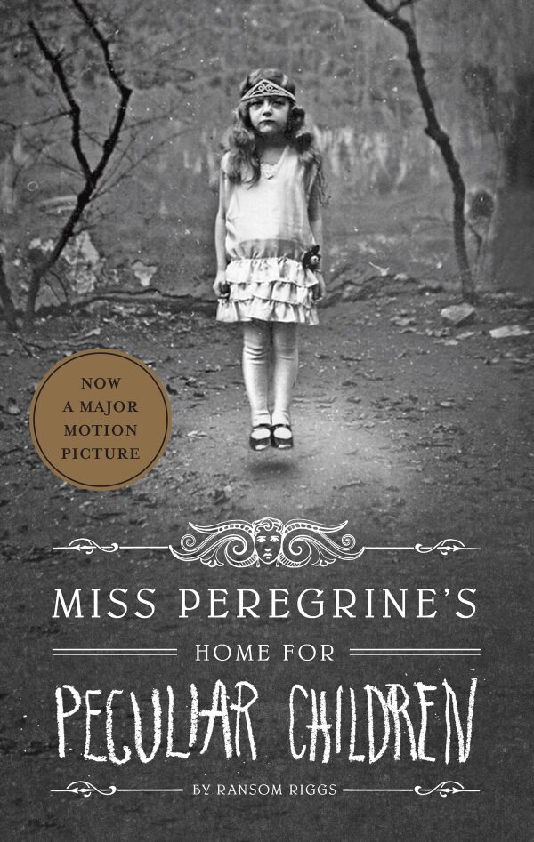
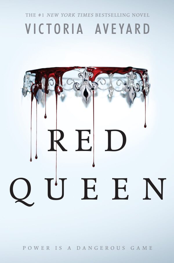
Miss Peregrine’s Home for Peculiar Children, Red Queen, and The Hate U Give stand out with central, vivid images that grab attention and set the tone. Miss Peregrine uses an intriguing vintage photo for a touch of the supernatural. Red Queen combines stark colors and symbols for a hint of conflict. The Hate U Give features relevant imagery to deliver a powerful message. Each cover fits the YA genre while adding something unique, inviting readers into new, exciting worlds.
The Key to Creative Book Cover Design
There are many ways to make your cover stand out while clearly signaling the book genre. Making a book cover is more than just picking colors and pictures—it’s about showing readers what your book is about at first glance.
When designing your book cover, consider what makes your story special and how you can convey that in your design. Start with the typical styles of your genre, but add your own twist—this could be a different kind of picture, a unique color, or a special font. Remember that your book cover is the first thing people see, so it should grab their attention and make them want to read more.


