By Joel Friedlander
Welcome to the e-Book Cover Design Awards. This edition is for submissions during April, 2018.
This month we received:
49 covers in the Fiction category
13 covers in the Nonfiction category
Guest Judge
 I’m very pleased to welcome Kit Foster to The Book Designer as a guest judge this month. Kit is an award winning graphic designer who specialises in book cover design. He lives with his fiancée and two daughters just outside Edinburgh, Scotland.
Kit draws on a wealth of experience gained working with a wide range of clients – from international publishing houses to self-publishing authors. To date, he has designed the covers for over 1500 published works for publishers worldwide, including Pearson Education, Edinburgh University Press, Financial Times, and Diversion Books; as well as Pulitzer Prize winners, several New York Times bestselling authors, and countless Amazon bestsellers.
Passionate and ever-excited about the art of cover design, he will always strive to offer friendly, helpful advice, and help you on your road to the best-seller lists. You can learn more about Kit and the services he offers here: Kit Foster Design.
Comments, Award Winners, and Gold Stars
I’ve added comments (KF: ) to many of the entries, but not all. Remember that the aim of these posts is educational, and by submitting you are inviting comments, commendations, and constructive criticism.
Thanks to everyone who participated. I hope you enjoy these as much as I did. Please leave a comment to let me know which are your favorites or, if you disagree, let me know why.
Although there is only winner in each category, other covers that were considered for the award or which stood out in some exemplary way, are indicated with a gold star: ★
Award winners and Gold-Starred covers also win the right to display our badges on their websites, so don’t forget to get your badge to get a little more attention for the work you’ve put into your book.
Also please note that we are now linking winning covers to their sales page on Amazon or Smashwords.
Now, without any further ado, here are the winners of this month’s e-Book Cover Design Awards.
e-Book Cover Design Award Winner for April 2018 in Fiction
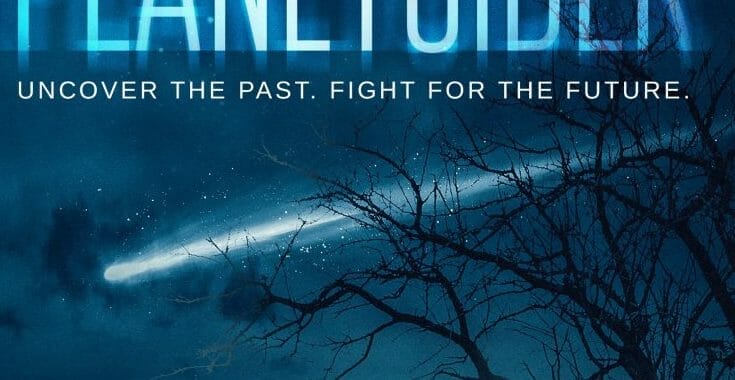
Gareth Ogden submitted The Planetsider designed by German Creative. “The cover is based on an important scene, early on in the book, where the protagonist is telling his nephew about the folklore regarding the lights they see in the night sky. It sets the main events of the book in motion, and is also an important part of building the world the novel is set in.”


KF: Just beautiful. The colours set the mood well, dramatic use of silhouettes, and your eyes are drawn into the comet soaring through the sky. Nice effects of the title – it adds interest without being distracting. I would certainly pick this one up!
e-Book Cover Design Award Winner for April 2018 in Nonfiction
Ebook Launch submitted Can Trump Make America Great Again?: Raging People in the Age of Automation, Offshoring, and Globalization designed by Ebook Launch.

KF: A really clever, strong, simple, graphic which is backed up by bold typography. Great colouring choice, too – using the US flag colours, and in a carefully thought out way. I don’t imagine it’s an accident that (Republican) Trump’s name is in red. Subtle details make all the difference, and when your design choices are deliberate like this, your cover will be all the better for it.
Fiction Covers
A.S. McGowan submitted The Ghosts of a Centaur designed by Clarise Tan.

KF: A Strong, bold cover with a good ‘series’ look. Putting the title in the middle is a good way to split two different graphic elements and give the cover two different focuses. The Series tag could do to be a little bigger, so it’s clearer at smaller sizes.
Andie Fessey submitted Comet designed by Andie J Fessey.

KF: This is certainly a clear and easily readable cover (which are big plus points when it comes to eBook covers), however, it lacks drama, and doesn’t give much incentive for the potential reader to pick it up. Why this image of a horse? Why this angle? What does it say about the story? Try to make all of your design decisions deliberate.
Bernard Jan submitted Look for Me Under the Rainbow designed by Mario Kozar MKM Media.

KF: I like the imagery in this one, The adorable seal pup, the crisp white snow, which beautifully contrasts the figure in red and the rainbow above. I think the text, however, could be a lot stronger. The title font, especially, could do to be re-thought. This is a tricky one, since the title contains six words, all of different lengths – it’s a lot to fit in and maintain a balanced design. I’m unsure what the reason for making the word ‘Me’ a different size to the rest of the words on the same line was, too.
Bree Moore submitted Woven designed by Vila Designs.
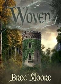
KF: A nice atmospheric cover that draws you in. I like how the image interacts with the title – this really helps to marry the text and graphics.
C. J. Darlington submitted Alison Henry and the Creatures of Torone designed by Kirk DouPonce. “Kirk designed this illustration for a class, and when I saw it I knew I wanted to write a story based on it. With his blessing, I did. I’ve always wanted to have a book cover designed by Mr. DouPonce, and now I do. His skill is amazing.”

KF: Wonderful stuff – the colour, lighting and contrast in the illustration are all fantastic – I can see how it would start story ideas brewing in your head! Notice how the low angle perspective gives the characters a powerful, heroic look, and the mist and the placement of the moon provide a really dramatic lighting effect. ★
Cailee Francis submitted Darkling Rose (The Succubus Moon Book 1) designed by Cailee Francis. “I’m the author and designed my own cover, as I also work as a graphic designer. I created it using images and fonts under license, and did a lot of hand-painting on the cover as well.”
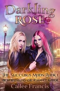
KF: An appropriate cover for the genre. Lots of nice things going on; the background graphics manage to say a lot without feeling to crowded. I think there is a bit too much going on with the typography, however. There are a few different fonts, text effects, swashes, and a shift between upper and lowercase and small caps. These are all good ways to make your typography stand out, but using too many at once can make the text seem a bit too frantic. The text placement is nice, though – and the subtle curve in the title is really lovely.
Carolyn Walker submitted Immortal Descent designed by Cora Graphics. “Thank you for the opportunity! Carolyn M. Walker”

KF: A Really interesting design that works well as a thumbnail, but also has a lot of nice detail in it that becomes more apparent as you look closer. The colours are bold and well balanced. Lovely. ★
Catherine Taylor submitted Master’s Legacy designed by Catherine Taylor. “The tower on the cover is the Invercargill Water Tower, an iconic landmark in the deep south of New Zealand, where the plot is partially set. Photographed by Marolyn Dudfield, a local photographer.”

KF: Whilst it’s bold and offers good contrast, this cover could use a little work. A few very minor changes would make it a lot better. First, I would get rid of all the text effects – the red outer glow just makes the words more muddy at thumbnail size. Also, there seems to be a dark patch in the middle of the title text and the author text – this is detracting from the crispness of the text. The tower and the streetlights are nice and dramatic – but I’d try to make sure that the image isn’t interfering with the title too much, as it affects readability.
Cathi Stevenson submitted The Boundary Stone designed by Cathi Stevenson. “I was very fortunate to be able to source an illustration from the period the book is set it, which I believe was also illustrated by a woman (as is the main character). I try to make the elements relevant to the story, even if the relevance is only known to me and few people with very keen eyes.”
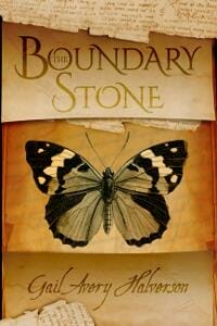
KF: The authenticity is a nice touch, and it comes together as a really nice cover.
Cheri Lasota submitted Paradisi Escape designed by Cheri Lasota. “This cover is for book one of a series set in a multi-author, open-source Sci-Fi Universe”

Cheri Lasota submitted Sideris Gate designed by Cheri Lasota. “This is book two in my Paradisi Exodus Near-Future Sci-Fi series. I redesigned all four covers of this series this week, combining elements of 3D renders, Photoshop brushes, 2D stock art, and from-scratch space art. Thanks again for your consideration.”

KF: These are both strong genre covers. Notice how everything about them both screams sci-fi – the fonts, the images and the colour palettes all tell you exactly what kind of book to expect.
Chris Norbury submitted Castle Danger designed by Todd Engel.

KF: This is a bold and interesting cover – the text is big, bright, and readable, but the moon bothers me – it looks a bit cut out and added in, with the dark fringing around it. If this cover was created using a layered application like Photoshop, try changing the ‘layer style’ to screen or lighten on the layer with the moon on it. This will get rid of the black, and integrate it better.
Craig Hart submitted The Beauty of Bucharest designed by Craig A. Hart.

KF: A nice thriller cover – mysterious fog and cobbled streets, with a nice reduced, dramatic palette, but I worry that the image will get a bit muddy and unclear when reduced to thumbnail. Perhaps brightening it up with a bit more fog would help define the elements better (a touch behind the silhouette would make her pop out a lot better). I like the combo of upper and lowercase in the title, too – it adds interest, and gives a lot of power to the word ‘Bucharest’.
Dan Van Oss submitted Stone in a Sling designed by Dan Van Oss.
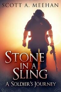
KF: Nice; good use of colour and light here. The near-silhouette with the lens flare is really dramatic. Also, a good choice to use an image of someone from behind – it doesn’t give away too many physical character features, and it also subtly puts the reader in the same perspective as the character (we see what he sees). Again, note the low camera angle, making the subject seem more powerful and heroic. Notice too, how the off-center title and the off-center figure compensate for one and other.
Darja DDD submitted King’s Reign designed by Kitten from Deranged Doctor Design. “Thriller & Suspense cover design by Kitten from Deranged Doctor Design, The Xander King Series Book 4”

KF: Beautiful colours – they really draw you in.
Deborah Coonts submitted Lucky Score designed by Glendon of Streetlight Graphics.

KF: Another lovely addition to the ‘Lucky Vegas’ covers. A simple, bold design; yet clever and effective. Perfect design for series branding.
Denise Lammi submitted LUCID WORLD designed by Diane Feught. “15 year-old Morgan is contacted by the advanced civilization of Lucid World. She travels via avatar into a remote, and hidden technologically-advanced society housed inside a vast mountain cavern. Her new friends in Lucid World live under a dome beneath an ice cap…”

KF: There’s a lot to like here; the colours and the landscape, but the character feels a bit out of place. I think it might be the casual leaning pose – there’s very little drama to it. Perhaps focusing on the landscape behind might have more impact?
Ebook Launch submitted The Merchant’s Pearl designed by Ebook Launch.

KF: Muted colours, carefully thought-out typography, and subtle design flourishes come together here to make a really nice historical fiction cover.
Ebook Launch submitted A Divided Inheritance designed by Ebook Launch.
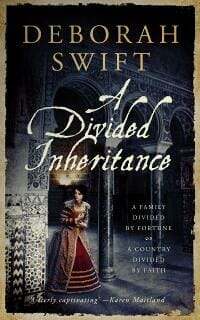
KF: Notice how your eye is drawn to the character on the cover – that’s no accident. Here the designer has used light and colour-saturation to draw your eye to the spot they choose (it gets darker and less colourful as it moves out from the figure) – an effective way to give your cover real focus. Whilst the title font is perhaps slightly too fussy for my tastes – it really says ‘historical’. Notice, too, how the designer hasn’t tried to use this font for every element – a nice clear serif font has been used elsewhere.
Elisabeth Grace Foley submitted A Sidekick’s Tale designed by Jennifer Zemanek. “”A Sidekick’s Tale” is a screwball comedy that also happens to be a Western—a tricky combination, but I wanted a cover that could signal both those elements clearly. I was delighted with the design Jenny came up with.”
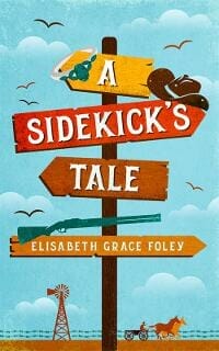
KF: This cover works well. Although it may sound simple, I’ve found that putting the title at an angle (or several angles in the case of this cover), really helps to tell the reader it’s a comedy. It certainly works to good effect here. This, and the bright palette, let you know the tone, whilst the imagery and font let you know the setting. Nice work.
Ellie Douglas submitted The Dead Wake Anthology designed by Michelle Douglas.

KF: Very (appropriately) creepy imagery, but the text could do with some refining to really grab the audience you’re marketing to.
Eva Talia submitted Startup Fiancé designed by Eva Talia. “A sweet contemporary, billionaire romance. Both protagonists are successful entrepreneurs and rivals but are arranged to marry.”

KF: A nice cover for the genre with well thought out typography. Simple, yet elegant.
Jonathan LaPoma submitted The Summer of Crud designed by Cinyee Chiu. “On the cover, the protagonist, a troubled songwriter, is alone in a bleak mountainous area, the colors inside of him connecting with the colorful sunset, and original song lyrics are written in the dirt and sky. On a faraway mountain, a lone tree also shares the same colors.”
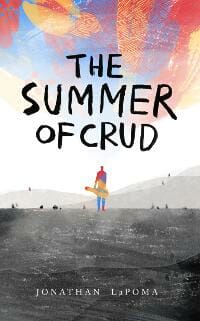
KF: A really cool idea, but I think the details are too small for an eBook cover. I’d love to see the character a bit bigger, (perhaps by lowering the horizon slightly, so he doesn’t interfere with the title), and the song lyrics a bit clearer (not necessarily legible, but more obviously text). The hand-lettered title is great and fits beautifully with the style, and I love the way the stark landscape contrasts with the colourful sky and character. As it is, I think this would make a cracking print cover, but could do with a little bit of reconfiguration for eBook.
Kent LeFevre submitted The Prisoner of Zurenda designed by Robin Vuchnich.
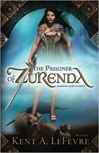
KF: I like the framing effect employed by this cover. The design in the corners adds to a good sense of the genre, and frames the scene well. The gold and blue colours complement each other nicely. I feel like the positioning of the word ‘of’, and the swash on the ‘A’ of ‘Zurenda’ are throwing the symmetry off slightly, however. I would be inclined to move the ‘of’ next to ‘The Prisoner’. Also, the text underneath the title and above the author name is so small that it is unreadable. I’d either bump up the size slightly, or leave them off altogether.
Kimbra Swain submitted Bailout designed by Hampton Lemoureux. “In this Romantic Suspense book, Hampton and I used the elements of a stock market ticker and the city of Atlanta to compliment the central image of the couple. We hoped to touch a bit of the romantic vibe, but avoid the implication that the book was a contemporary romance.”
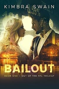
KF: This cover is a nice lesson in effective composition. There are three or four separate images all occupying the same space here, but they are not competing with one another, in fact they are complimenting one another. They each allude to a different story element, and are tied together skilfully using layer styles, colour and texture. ★
Laurel Ostiguy submitted Last Goodbye designed by RBA Designs | Romantic Book Affairs. “Appreciate your time and consideration! Laurel”

KF: Great – the first thing that jumps out here is the text. I love the messy, hand lettered title that sits at an angle, juxtaposed with the super straight and clear font for the author tag. I love how the designer has kept the face of the character indistinct – this adds some mystery, whilst permitting the reader to form their own image of the character based on the text inside. I’d say the subtitle is a touch too small for eBook, again, however.
Leon Cameron submitted The Greatest Humans designed by RebecaCovers from Fiverr. “This novel is about the intersection of high finance and artificial intelligence.”

KF: Slightly unsettling, but I think that’s the point! A clever idea and well executed.
Magdalene Sullivan submitted The Lightning Stenography Device designed by Nuno Moreira. “In an incredible synchronicity, Nuno already had this beautiful collage in his portfolio when I came to him, trying to get across the abstract feeling of a psychedelic novel. Not only was his final product appropriate in feeling; it resembles, a collage of two distinct events in the plot. Magic!”

KF: This is a cool collage, similar to the sort of thing you might see on a William S. Burroughs cover, bizarre and almost indecipherable – so that hits the right mark! I think the colours and contrast could do with a fair bit of tweaking to make it pop a bit more. It’s a bit muddy at thumbnail at present.
Maggs Salad submitted Barry Bodega designed by Maggs Salad.

KF: This cover doesn’t really work for me, I’m afraid. Whilst it is bold, the background colour is a bit too overpowering, and draws attention away from the subject. I would use a slightly less saturated blue, and add a bit of interest to the background (some clouds, or some sort of texture?). It might be helpful to check out some benchmark covers in your genre and compare them for strengths and weaknesses.
Mark Reid submitted Taking Chances designed by Mark at AuthorPackages. “We were asked to create a new cover for an existing book and make it more in keeping with the romance genre”

KF: A nice romance genre cover, well composed and suited to the genre. A small point to note: when compositing two images together, make sure that the light source is coming from roughly the same direction. Notice here that the buildings and trees in the background are mostly in silhouette, and there is a lens flare in the top right, which signals that the sun in the background image is ahead, and to the right. In the foreground (the couple on the bench), highlights are hitting their backs and necks, while their faces are in shadow, which signals that the sun should be behind them. You may not consciously notice it, but it will give you the feeling that something isn’t right. I don’t think it’s too problematic here, but something worth thinking about if you are compositing images.
Mark Reid submitted Over the Mountain designed by Mark at AuthorPackages. “As this was the third book in the story of Harriet, we thought it best to adhere to the same aged, abstract style and typography that Katherine’s previous designer used. The cover now fits seamlessly with the others. We opted for the crop of the Beetle as the car plays a major part of the tale.”

KF: This fits well with the series, and I really like how the image is cropped. I’d rather the title was a bit clearer, but it follows the design style prescribed by earlier covers, and a different designer.
Mark Reid submitted Piercing the Big Bang designed by Mark at AuthorPackages. “Steven was very specific in what he wanted, and provided the source image which would depict the use of dark matter as a means of escape. Minor adjustments were made, some elements added, and the contrast/colour altered to make it more aesthetically pleasing.”

KF: A cool image, but I feel like there could be a better use of the space on this cover. The bulk of the text and images are in the top third and bottom third of the cover, leaving a big chunk of nothingness in the middle. Perhaps having the tagline over 2 or three lines in the middle left might balance it better?
Mary Knapke submitted The Sacred Heart designed by Mary Caffrey Knapke. “Women’s fiction set in Ireland.”

KF: This cover works well for the genre – make sure the text isn’t getting overpowered by the image behind, causing readability problems. Perhaps darkening the wood texture a bit would help this? A nice cover though; simple and striking.
Mason Malone submitted The Polyandrist designed by Jeanne Smith. “We chose symbolism to represent The Polyandrist. Polyandrist: A woman who has two or more husbands or male sexual partners at the same time. Oxford English Dictionary”

KF: I’m glad the tagline tells us that there will be murder, mystery, and romance, because there’s no indication of that in the cover art. Thematically, the cover gets the idea across with the use of the gender symbols, but I’m not sure why they are floating in the sea. I really do like the idea of using the symbolism on the cover, but I think it needs to be a bit better thought out – is there a way to incorporate the murder and romance elements and bring a bit of drama to it? Take a look at some other covers in the romantic mystery genre and try to get some pointers.
Michele Brouder submitted Claire Daly: Marked for Collection designed by Scarlett Rugers.

KF: Nice colours and textures, and I like the subtle frame around it (although it looks slightly cropped at the bottom in this version). There are a few too many font styles going on for my taste, which could be simplified a bit, but aside from that, a nice, dramatic cover.
Norman Whaler submitted Tiny Tim and The Ghost of Ebenezer Scrooge: The sequel to A Christmas Carol designed by Nino Carlo Suico. “The Cover Art is from Stewart Sherwood, internationally know. Stewart Sherwood is acclaimed by critics to be today s pre-eminent Canadian realist painter and illustrator.”

KF: Wow, I certainly can’t fault the illustration –a beautiful piece. If I had one tiny complaint (and it’s a small one!), it’s that the brain has to work a little too hard to read the title, due to the placement of the word ‘the’. Moving it up beneath the ‘and’ may solve this.
Patrick Delaney submitted Dante’s Town of Terror designed by Damonza.

KF: Nice stuff. Damonza always deliver the goods. Lots of atmosphere, and in the appropriate colours. I love the Stephen King / Stranger Things style lettering. That 1980s horror anthology look is sure to grab a few eyeballs.
Patrick Samphire submitted The Underwater Ballroom Society designed by Patrick Samphire. “This is an anthology of stories all featuring an underwater ballroom. Because the stories are so diverse in terms of settings, time periods, and characters, I went for a cover that gave the feel of the anthology rather than representing any individual story.”

KF: I love this cover – it’s elegant but surreal, which makes me want to know more! The colours are great, and I love the hint of menace with the open-jawed sea creature seemingly about to pounce. An anthology cover is a tricky thing, given the sheer number of variables, but this was executed beautifully. ★
Princess Gooden submitted Burning Brydges designed by Princess F. L. Gooden.

KF: I love the colours and the typography, but the composition needs work. The elements aren’t blended together as nicely as they could be, and the floating face at the top should probably be left out. A bit of simplifying and refining could make this a lovely cover.
Rebecca Weeks submitted Midnight Moss designed by Rebecca Weeks. “YA Fantasy book about monsters and a girl and a boy fighting them in a secret world.”

KF: A nice YA cover; well laid out. I like how the author tags follow the line of the bench. This helps to marry the text and images. The playful but well thought out typography in the title should really appeal to the intended audience.
Richard Burke submitted The Colour of the Soul designed by Michelle Arzu. “The book is a crime thriller where the main protagonist wakes from a coma with the ability to sense auras. I was trying to convey a mysterious element but with a sense of threat.”
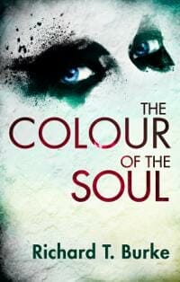
KF: It’s very unsettling – those eyes staring out at you! The use of eye contact is very powerful, and can draw the reader in. It breaks the ‘fourth wall’ and makes a direct connection (eye-contact!) with the potential reader. I like the sporadic use of colour here. The distinct patches of red, green and blue are given lots of power by their stark surroundings. The deep, muddy red of the title subtly reminds us of blood, upping the sense of threat even more. ★
Roger Bray submitted The Picture designed by Deranged Doctors. “I came up with a basic idea, linked in with the cover concept of a previous novel. The designer worked really well with what I had in mind and came up with a cover which nicely reflected my idea of disaster, hope but with a melancholy feel to it. Exactly what I wanted.”
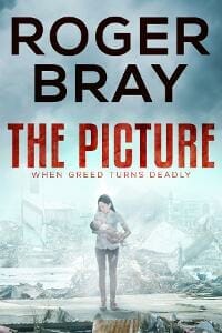
KF: Really strong author branding, and dramatic imagery. It works well. The texture in the title helps tie it to the debris below, making the cover that little bit more cohesive.
Sean Deason submitted Of Flesh & Blush designed by Sean Deason.
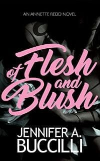
KF: I adore the typography on this – the colour, the fonts and the placement are all really cool. Notice how the ‘fussy’ font and the ‘normal’ font balance each other out. I’m a bit unsure what the image in the background is, however. It gets lost behind the text – perhaps a more indistinct texture would work better in its place?
Sheila M Cronin submitted Best of All Gifts designed by pro_designer123. “Best is suggest by the illumination around the gift box and the gold ribbon. The gift box floating down from heaven signifies a spiritual aspect to the story. The title pops, is easy to read, and works well on bookstore websites.”

KF: A bold, readable cover, for sure; however there doesn’t seem to be any dramatic element to it, just a literal graphic translation of the title. What are the conflicts is the story? What genre(s) does it fall into? Where is it set? Who is it about? Obviously you don’t necessarily have to answer all of this on the cover, but some indication of the contents would be helpful to a browsing reader. Perhaps even a well thought out tagline would help?
Sherry Soule submitted Lost in Starlight designed by SwoonWorthy Book Covers. “Re-branding of cover design (YA Sci-Fi)”

KF: This cover hits all the right marks for YA / Sci-Fi. I love the way that the graphics and title are at a slight angle – it’s a simple touch that makes the cover that bit more interesting, and gives it a slight sense of motion. Notice how the author and series tag are not at an angle, which helps to frame the cover nicely.
Sudhir Singh submitted Frailty And Valour designed by Sudhir Singh. “Anamika was married to Satyendra but on the 20th day of their marriage, the latter was found hanged. Anamika is the epitome of courage, conviction and congruity, her motto being ‘resolve to logical conclusion’. Anamika took revenge by becoming police officer and shot the culprit in an encounter.”

KF: The typography is nice and strong here, but I think the image composition needs some work. I would try to simplify it and use just one of the graphic elements (the officer pointing the gun would be the clear choice for me, given the plot outline above), or enlist the help of a graphic designer to assist you in composing them more professionally.
Teddi Black submitted Pressing Flowers designed by Teddi Black.
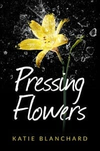
KF: I love how the colour of the author tag matches the graphic – it really ties everything together nicely. Notice too how the stem of the flower and the text subtly interact at the ‘e’ in ‘flowers’; a nice touch that makes the text not seem pasted on top.
Wendy Anne Darling submitted The Heart Stone Chronicles – Book 1 – Swamp Fairy designed by Wendy Anne Darling / Bookxeedo. “This cover was designed using an original photograph of a Florida swamp taken by the author, Colleen M Chesebro and illustration by Wendy Anne Darling. The Heart Stone on which the fairy sits has a role to play within the story.”

KF: I think this cover could do to be reimagined from scratch. It’s murky, the images don’t harmonise well, and the typography feels a bit like an afterthought. Heart Stones, fairies, and swamps conjure up all kinds of cool, misty, lush green images, none of which are on this cover. Take a look at some of the popular covers in your genre that you like. See the types of fonts and imagery they use, and try to make your cover feel similar. Browse the stock image libraries on the net, and I’m sure that you will find something that will be a better starting point.
Nonfiction Covers
Dr.Harun Yilmaz submitted Marketing in the Post-Truth Era: Group Marketing designed by Rusudan Kipiani.

KF: Certainly an amusing image, but I’m not sure what it means (this might be enough to make me want to pick it up and find out more, however). The text is well balanced with the image, and I like the switch between title case and uppercase in the author names. Remember to not make backgrounds totally white, or the edges will seem undefined on a white web background. A thin grey border or a slightly off-white background would fix this.
Ebook Launch submitted Living in Dreamtime: Twenty-Five Simple Practices for Restoring our Lost Sense of Enchantment designed by Ebook Launch.

KF: Strong, clear, and beautifully balanced.
Ebook Launch submitted The Art of the Very Short Story: A Guide for Readers and Writers designed by Ebook Launch.
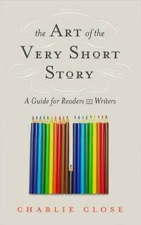
KF: A really clever graphic idea that comes together with the carefully thought-out text to form a great cover. I love it when a designer can encapsulate the whole theme of the book in one simple graphic like this. Ebook launch have a really good grasp of the skills required for Nonfiction covers. ★
Edward C. Larson submitted Leaves from the Autumns of Yesterday designed by Sheila Setter. “An iPhone was used to photograph elements in a bonsai garden and then the cover image was modified in Photoshop, first eliminating background and extraneous elements, then stripping out colors and applying filters; the leaves were then “gilded” for added effect to compliment the title of the book.”

KF: A nice, skilfully edited graphic, but the text could use a little work. I’d increase the size of the title considerably, and use a less fussy, more readable font. At present the text is practically unreadable at thumbnail.
Glyn Haynie submitted Soldiering After the Vietnam War designed by Glyn Edwin Haynie. “The cover pictures are of me as a 19-year-old soldier in Vietnam and a 38-year-old right before retirement, which contrast the start of my Army career to the end of my Army career.”

KF: A Nice autobiography cover, which ticks all the boxes. You may consider increasing the size and contrast of the subtitle, however, to make it readable at thumbnail size.
James McInerney submitted RED designed by James McInerney.

KF: I have no idea what this book will be about; but do you know what? I’d pick it up. I’d like to find out more, based on the interesting, artistic design. Very cool, and if it makes you pick up the book to find more, the cover has done its job.
Jean Gill submitted From bedtime On designed by Jessica Bell.

KF: A really cool, bold image, and well placed. The title text could use a bit of tweaking to make it 100%.
Jillianne Hamilton submitted The Lazy Historian’s Guide to the Wives of Henry VIII designed by Jillianne Hamilton. “I wanted to create a cover with a lot of texture and something that would stand out among the piles of Henry VIII-related books on Amazon while also hinting at the lighter tone of the book.”

KF: It’s clear, era-appropriate, and the slightly playful typeface used in the title does hint at the lighter tone of the work. The colours work well together, too. Regal yet playful. If I was going to nit-pick, I’d like to see the subtitle a bit bigger, as it’s pretty much unreadable at thumbnail size, but overall a lovely cover. ★
Mark Reid submitted Overcoming Menieres designed by Mark at AuthorPackages. “This was interesting, because Mark Knoblauch wanted to try and convey the effects of vertigo on his cover, but also show that there was a way out from it. As someone who has suffered BPPV for more than twenty years, I knew exactly what it felt like and how it would feel to be free from it.”

KF: Wow, the image in this cover is really unsettling. I can’t look at it for too long without feeling a bit dizzy – (but of course in this case, that’s a plus point!). This cover beautifully illustrates the journey described in the title – from the dark, dizzy confines of Meniere’s at the bottom, to the bright, clear freedom at the top. In this graphic metaphor, the ladder represents the book, guiding you out of the darkness. Very cool.
Ogaga Eruteya submitted Cistern of Treasures designed by xplosio. “The book is a collection of valuable life nuggets in varying poetic forms. It is thus conceived as a cistern containing different treasures”

KF: A clear cover with good contrast; but I’d increase the size of the subtitle, as it’s getting lost at thumbnail.
Paul Michaels submitted Champions designed by Cal Sharp. “Margie passed away in 2012. Her actual image appears on the cover. The railroad played an important part in the lives of everyone who lived in that small town, especially Margie in those days of her life.”

KF: A nice cover, and a beautiful tribute to Margie. The colours are vibrant, and the image of the railway tracks disappearing into the horizon is very stirring. The typography is a wee bit dull, however; but a bit of tweaking of the fonts and placement would bring it all together nicely. (I’d also nudge the image slightly over to the left so that the tracks disappeared into the exact center point to get that perfect one-point perspective, but that’s nit-picking).
Teddi Black submitted Temple and Tomb designed by Teddi Black.

KF: A really strong, well balanced cover. Nice textures, colours, and strong, authoritative text. Fantastic stuff.
Well, that’s it for this month. I hope you found it interesting, and that you’ll share with other people interested in self-publishing.
Use the share buttons below to Tweet it, Share it on Facebook, Plus-1 it on Google+, Link to it!
Our next awards post will be on June 18, 2018. Deadline for submissions will be May 31, 2018. Don’t miss it! Here are all the links you’ll need:
- The original announcement post
- E-book Cover Design Awards web page
- Click here to submit your e-book cover (See New Submission limits)
- Follow @JFBookman on Twitter for news about the E-book Cover Design Awards
- Check out past e-Book Cover Design award winners on Pinterest
- Subscribe to The Book Designer Blog
- Badge design by Derek Murphy


