Ed. note: We have new badges! Monthly Award winners and Gold-Starred entries get to display our badges on their blog sidebars or book websites, and get a little welcome attention to their books. Now we’ll have nifty new badges for you. But which one to choose from the entries in our competition? On Wednesday we’ll publish all the entries and ask you to vote to pick the new Awards badges.
Welcome to this edition of the e-Book Cover Design Awards. This edition is for submissions during February, 2013.
Here’s what we received:
68 covers in the Fiction category
20 covers in the Nonfiction category
Comments, Award Winners, and Gold Stars
I’ve added comments (JF: ) to many of the entries, but not all. Remember that the aim of these posts is educational, and by submitting you are inviting comments, commendations, and constructive criticism.
Thanks to everyone who participated. I hope you enjoy these as much as I did. Please leave a comment to let me know which are your favorites or, if you disagree, let me know why.
Although there is only winner in each category, other covers that were considered for the award or which stood out in some exemplary way, are indicated with a gold star: ★
Award winners and Gold-Starred covers also win the right to display our badges on their websites, so don’t forget to get your badge to get a little more attention for the work you’ve put into your book.
Now, without any further ado, here are the winners of this month’s e-Book Cover Design Awards.
e-Book Cover Design Award Winner for February 2013 in Fiction
Vardan Partamyan submitted The After/Life designed by Vardan Partamyan. “This is the cover for my post-apocalyptic novel.”

JF: Fantastic and unique. I keep looking for designers who are willing to step out of the confines of “book” and this one delivers. Combined with a unique visual approach and tasteful typography, the branding of this cover is so strong it can’t be mistaken for any other.
e-Book Cover Design Award Winner for February 2013 in Nonfiction
Kit Foster submitted Six Seconds designed by Kit Foster.

JF: Fantastic. What a great combination of illustration and typography, where the two are converging into a unified whole. Kit Foster hits it out of the park with this cover.
Fiction Covers
A. Wrighton submitted Defiance: Dragonics & Runics Part I designed by Anabel Martinez.

JF: Dynamic idea, but very confused result with meaningless shapes and effects bumping up against each other and type that’s impossible to read.
Aimery Thomas submitted Primae Noctis designed by Aimery Thomas.

JF: Gets the job done cleanly.
Amber Butler submitted The Burning of Cherry Hill designed by Amber Butler. “I don’t know what I’m doing…I bought some stock images and played around with Photoshop. I’m all for hiring an actual graphic designer to do stuff, I just couldn’t afford it and this was my best attempt lol.”

JF: Amber, you did a terrific job, and ended up with an intriguing cover that isn’t just like every other ebook cover, either.
Amy Kathleen Robinson submitted Devolution designed by Amy Kathleen Robinson.

JF: Although this cover has some good things going for it, much more could have been made from the same materials by employing better typography and cropping this shot much tighter than what we see here.
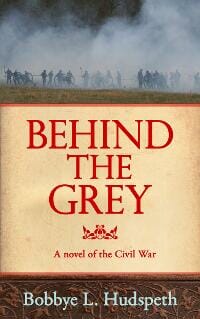
Arliss Paddock submitted Behind the Grey designed by Arliss Paddock.
Ashley Farley submitted Saving Ben designed by Damonza.
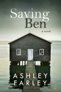
JF: All the hallmarks of this talented artist: a limited palette, careful typography, and complete control of the browser’s eye path.
Bede Moloney submitted Screwtape Lost and Found – War in the Demon’s Eye designed by Bede Moloney. “This entry is an example of the ecovers that I do myself using Kodak Easyshare and found objects and surfaces from home.”

JF: While I admire the do-it-yourself ethos, this cover shows why a professional designer is often the better solution. Unmistakably amateur, the first way to get better at these covers is to study typography.
Charles Ray submitted Buffalo Soldier: Peacekeepers designed by Charles Ray. “This is the fourth in my Buffalo Soldier historical series for young adults. The cover is a watercolor painting of three Ninth Cavalry Buffalo Soldiers involved in a mission to assist local law enforcement. I kept it light and semi-transparent so the main focus would be on the title. The basic cover format is the same for the entire series. For previous titles I used photos, but decided to change up and go to painting to convey a sense of the Old West.”

JF: Ineffective, and obscuring the faces with the ghosted box and title doesn’t help.
Charles Ray submitted Death From Unnatural Causes designed by Charles Ray. “The cover is an acrylic painting, in dark, somber colors, to set the mood for the story. The original colors were muted to an almost monotone, with light areas framing the key elements.”

Chris Todd Miller submitted By Blood Bequeathed designed by Paul Beely.
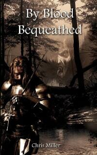
JF: Confused and indecipherable.
Christopher Hayes-Kossmann submitted Black Market: An Olesia Anderson Thriller designed by Madeline Ryan. “Madeline took to the task of redesigning the covers to my ongoing spy-fiction series with serious enthusiasm, and despite her claiming to not have much experience with book cover design, I think her artwork is bold, punchy and absolutely appropriate to the series. Her gallery of work is available at https://larkles.deviantart.com/.”

JF: I agree, nice job with this genre, although the color palette needs some perking up.
Curtis Edmonds submitted Rain on Your Wedding Day designed by Anita Bezanson. “Thanks so much for the opportunity to share the great cover. My website is https://www.curtisedmonds.com/. The designer’s website is https://www.flowersandmachinery.com/.”

JF: Nicely atmospheric.
Dane Low submitted Suicide City designed by Ebook Launch.

Doug Glener submitted The Reluctant Knight designed by Jodee Taylah.

JF: I like the unusual illustration style, and the layout works well.
Erin Keyser Horn submitted Eyes of Lightning designed by Rod Karmenzind. “Rod Karmenzind has won national awards for his digital illustrations. I was so excited to get the chance to work with him. I told him my ideas for Eyes of Lightning, and he adapted my ideas into a cover so much better than anything I’d imagined. Hiring him was the best marketing decision I’ve made. People I talk to always compliment the cover.”
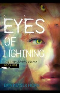
JF: Very effective and spot on for your genre.
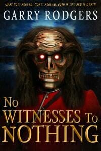
Garry Rodgers submitted No Witnesses To Nothing designed by Derek Murphy CreativeIndie Covers.
Genese Davis submitted The Holder’s Dominion designed by Fabio Barretta Zungrone, Ryan Scheife. “This book cover was hand painted by award winning painter Fabio Barretta Zungrone and text layout designed by Ryan Scheife.

JF: It’s difficult to do a lot of storytelling on an ebook cover, but here the artist carries it off beautifully. With good typography it makes a strong cover.
Hannah Kane submitted At Her Boss’s Command designed by Hannah Kane. “My book is romantic suspense so I wanted a cover that reflected both sides. It has softness of romance with some edge and mystery too.”

JF: Many things come together really well here, but I think you’re still missing a bit because I don’t see the suspense element at all.
Helen Sedwick submitted Coyote Winds designed by Howard Klepper.

Ian Hall submitted vampire High School Book 1: Gregor Academy designed by Ian Hall (me). “Hi”

JF: Hi!
Intisar Khanani submitted Thorn designed by T.L. Shreffler of Runaway Book Designs. “A retelling of the Grimms’ classic fairy tale “The Goose Girl”

JF: Nice job, would be stronger without quite so many floral elements and more focus on the girl.
j Michaels submitted The Bird designed by Jo Michaels. “Cover designed by the author. I held online voting for this title and the readers chose this cover out of the three I presented. I used Adobe Photoshop CS5 for the design. The bird is a digital painting but I wanted strong typography that really stood out for the title. Thanks for the opportunity and I look forward to hearing your comments on The Bird.”

JF: I laughed when I saw this cover, it’s delightful, and the large title and brilliant cardinal help it stand out.
J. Mark Miller submitted The Foundlings designed by Jeff Miller – fivejsdesign.com. “This is my debut novel. My wife and I worked on the design together. We design book covers and provide other ebook and print services as well.”

JF: Shockingly good, a superb ebook cover. A highly-focused and genre-specific illustration along with careful typography and a unique series “look” help propel this cover to the top. ★
James Schannep submitted INFECTED designed by Nikki Jansen. “Thanks for hosting a neat contest! This is my first self-published book, INFECTED.”

Jennie Coughlin submitted All That Is Necessary designed by Jennie Coughlin.

Jordan Castillo Price submitted Turbulence 2: Autopilot Engaged designed by Jordan Castillo Price.

Jordan Castillo Price submitted Turbulence 7: Radio Silence designed by Jordan Castillo Price.

JF: Jordan, your covers just keep getting better. Here we have three of the series titles as well as the cover for the entire series. They are well-matched, recognizable because of the strong branding, and they draw us into the story. ★
Jordan Castillo Price submitted Turbulence 8: Final Boarding designed by Jordan Castillo Price.

Jordan Castillo Price submitted Turbulence Collection designed by Jordan Castillo Price. “Turbulence was a serialized novel published in eight installments. For the individual episodes I featured one character alone on a cover, and for the collection I grouped the three point-of-view characters to visually underscore that the omnibus contained multiple episodes. I looked to movie posters for inspiration.”

Karen Bryson submitted A Taste of Reality designed by Tony Bryson.

Kathryn Lang submitted WATCH designed by Kathryn C. Lang. “WATCH – they are watching you.I entered the cover for the first novel in the series and appreciated the feedback you offer. This cover reflects the suggestions that you provided for RUN (and I also went back and tweaked the cover for RUN as well). Thanks for taking the time.”

Kayla Al-Shamma-Jones submitted Black Hat designed by Ravven. “The wonderful Ravven (www.ravven.com) designed this cover for my debut horror novella. She did a wonderful grown-up, sexy rendition of a Black Eyed Kid. Love it!”

JF: Beautiful. Interesting to compare this cover with the one directly above it. They are similar in many ways, but not in the effect they make. Although Kathryn is working on making her cover better, Ravven, a talented artist and designer, creates an arresting image that will help sell this book. What a difference.
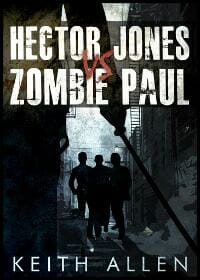
Keith Allen submitted Hector Jones vs. Zombie Paul designed by Janiel Escueta.
Kenneth Gorden submitted Forgotten Love: An Action-Packed Adventure Romance designed by Kenneth Gorden and Alice Catrinel. “A very special thank you to Damon Za for designing the original font combination and text layout that will be used throughout the Forgotten Chronicles series.”

JF: But did Damonza use that heavy text effect? Not sure what the colors in this cover are supposed to communicate.
Kit Foster submitted Working for Charlie designed by Kit Foster.

L. Sengul submitted The Danfians Prophecy designed by James Godfrey. “Hi There! I would like to submit my book cover for the e-book design awards for February 2013. Many thanks, L. Sengul”

JF: The subtitle seems to be disappearing into the latticework of the illustration. And I wonder how effective a question like this is for people who have never read the book?
Lars Hedbor submitted The Prize: Tales From a Revolution – Vermont designed by Lars D. H. Hedbor. “Although I had the services of a designer available to me, I had a very specific vision for the look and feel and content of my cover. My publisher made a number of suggestions, and in the end, we were very happy with the results. I started from a photograph the I’d taken of the historical site at the center of my novel’s story, and added some details, adjusting the image to match the mood and tone of the story. Adding the textual elements, with careful font selection and layout, so that the cover works both as a thumbnail and as a full-sized image, and then adjusting the colors to ensure readability, just about finished the job. I added a ribbon device to tie this volume together with planned future novels, and the cover was finished. I look forward to hearing your feedback on my work!”

JF: Although it shows promise, the cover is visually weak and lacks any particular emphasis.
Laurie Boris submitted Don’t Tell Anyone designed by Paul Blumstein.

Lori Perkins submitted 50 Shades of Gay designed by Scott Carpenter.

JF: Contender for “title of the month.”
Lori Perkins submitted THE CIRCLET TREASURY OF LESBIAN EROTIC SCIENCE FICTION AND FANTASY designed by Insatiable Fantasy Designs. “Thanks!”

JF: Here, the odd colors make perfect sense, unlike the colors on “Forgotten Love” above. Bizarre, but with a kind of primitive charm.
Marion Altena submitted Ontworteling designed by Marion Altena. “Ontworteling (‘Unearth’ in English) is a Dutch psychological thriller.”

Martin Crosbie submitted My Name Is Hardly designed by Jun Ares. “This is book two of the “My Temporary Life Trilogy”. I gave Jun a vague description of what I wanted and a short synopsis of the novel and he absolutely nailed it. I’m very happy with the results. I used Createspace for my first cover and it worked out well, the novel has done very well but from now on I’ll always use a pro, and probably always use Jun if he’s available. Thanks for considering my cover, Martin”

JF: I like the layering of these images, which produces some tangible curiosity about the story.
mary munoz submitted PRIDE, PREJUDICE, AND CHEESE GRITS designed by myself.

Michela Pasquali submitted I Don’t Want To Be Famous designed by Kevin Sczepanski. “I Don’t Want To Be Famous is a collection of seven short stories that examines a point in time in the lives of seven very different people.”
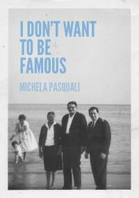
JF: A clever photo and good font, but the overall effect is weak. This is likely due to the layout and colors chosen by the designer, although it could work well for a paperback.
Michelle Ann King submitted Transient Tales Volumes 2 designed by Michelle Ann King.

JF: I think these covers (this and below) work okay for their genre, but this one bothers me. I spent a few minutes staring at the illustration trying to work out what it is.
Michelle Ann King submitted Transient Tales Volumes 1 designed by Michelle Ann King. “This is a series of SF/fantasy/horror short story collections, so I was aiming for layout similarity to create a branded effect.”

Niki Savage submitted Lily’s Reprieve designed by Niki Savage.

JF: What am I supposed to get from this cover? I have no idea.
Peta Love submitted Beef Casserole for the Dog’s Soul designed by Flora Kennedy. “Thank you for the opportunity!”

JF: “Contains 19 barkalicious story treats,” another contender for title of the month. Needs a rule around it to prevent “bleeding” into the white page.
Priya Kanaparti submitted Dracian Legacy designed by Regina Wamba.

Rene Folsom submitted The Dark designed by Rene Folsom.

JF: This is a fantastic piece of art for an ebook cover, and the whole thing comes together to great effect. Dynamic and captivating. ★
Renee Barratt submitted Click designed by Renee Barratt – The Cover Counts. “Click is a romance novella that is being produces as a part of Alexandria Publishing Group’s new “Breaktime Bites” series (stories that can be read over the course of a lunch hour), but we wanted the cover to make it stand out more than a typical short story.”

Rick Wiedeman submitted 300 Miles to Galveston designed by Evan Ballinger. “Evan Ballinger teaches design at Long Beach City College.”

JF: Although I admire this sophisticated typography, it looks like a nonfiction cover to me, but maybe that’s just me.
Rinelle Grey submitted Reckless Rescue designed by Hidesy’s Designs. “My talented sister at Hidesy’s Designs helped me design the cover for Reckless Rescue. I wanted the cover to look like a romance book, hence the soft colours and couple holding hands, but also hint at the science fiction elements of the story. I’m really happy with how it turned out.”
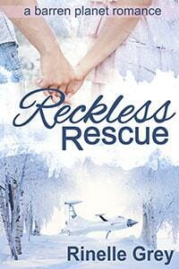
JF: I think you hit all the bases, nice job.
Robyn Roze submitted Find Her Free Her designed by Patricia Schmitt (aka PickyMe). “This is the third book in the Keeper Trilogy. I used the same cover artist for all three books, but this one is my favorite.”

JF: Very magnetic. Wow.
Ryan Casey submitted What We Saw designed by Lloyd Lelina. “The cover for my debut novel, What We Saw. I met my designer, Lloyd, through 99Designs, and have found myself a designer for life.”
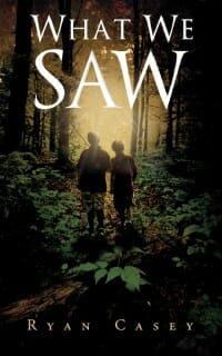
JF: Beautiful, evocative, atmospheric. Can’t ask much more than that. ★
Samuel Lee submitted Crisis on the Far Side (The Maurice Series) designed by Dusan Pajantic. “Crisis on the Far Side is the third of a 3-book scifi adventure series for 5th-8th graders.”

Shawn Bailey submitted Sorry, Charlie designed by Jerson Campos @ https://www.jersoncampos.com/. “My book has been out since last March. I’m doing a Kickstarter project to raise money for the graphic designer, Jerson, and the editor, Bonnie Roberts. The project explains everything, if that matters.”

JF: Well, I don’t really understand the typography, or where the emphasis is, and you may be trying to work in too many plot elements, which usually results in a bit of a muddle for the casual observer. Love the background texture, good luck with the project.
Sherrie Cronin submitted x0 designed by Jennifer FitzGerald of www.MotherSpider.com. “This book was first published just under a year ago with a very similar cover that I designed myself. When I sought out Jennifer FitzGerald to design the cover for my second book, she offered to redo the cover for this first book as well. She managed to keep everything I liked about my own design, while (in her own words) “making it pop”. I credit her with the design, but could not have been more pleased with the collaboration.”

JF: You’re lucky, you ended up with a great cover that tells a story and creates a ‘brand’ at the same time.
Shireen Jeejeebhoy submitted She designed by Shireen Jeejeebhoy. “I wanted this cover to convey the sense of menace in this story of a young woman whose identity has been stripped from her, as well as show that this is a story set in Toronto, which becomes almost like a character in “She.””

JF: It has menace and nice composition, but you might try some different fonts.
Stan Kowalski submitted A Way Back Home designed by S.L. Kowalski.
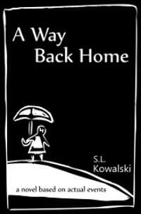
JF: With a different approach to color this could be charming.
Stephen Knight submitted EARTHFALL designed by Jeroen ten Berge. “Cover for EARTHFALL, a post-apocalyptic science fiction adventure novel.”

JF: Another great cover from the talented Jeroen ten Berge. Everything you want in a cover. It’s attention-grabbing, with an air of mystery and overhanging threat. The stylized title type stamps it as an original. ★
Steve Trotter submitted HEAVEN’S ON HOLD: An Adam Wolf Thriller designed by Jeroen ten Berge. “HEAVEN’S ON HOLD is book #2 in the Adam Wolf Thriller series, the follow-up to RESURRECTED (the cover of which Jeroen also designed). I feel Jeroen did a terrific job in creating a cover that captures the tone and content of the story while maintaining the branding elements.”

JF: Yep, right you are. Love the big “W” for the Wolf series. Another winner.
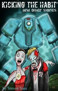
Steven Saus submitted Kicking the Habit and Other Stories designed by Len Peralta. “This is a single-author collection of short stories.”
Tam Linsey submitted Botanicaust designed by Tam Linsey. “Many science fiction titles use artwork rather than photos, but I couldn’t afford a good artist. I created this cover using GIMP and stock photos.”

JF: Incomprehensible. Perhaps I’m not the demographic.
Tam Linsey submitted Taking the Knife designed by Tam Linsey.

JF: I much prefer this one, Tam. Nicely menacing and it all hangs together so well.
Taylor Fulks submitted My Prison Without Bars:The Journey of a Damaged Woman to Someplace Normal designed by Taylor Fulks/Createspace. “I wanted my cover to say what the book was about without actually spelling it out…when working with a taboo subject no matter how little is mentioned in your story, you don’t want to be misleading.”

JF: You succeeded, and in giving me the creeps.
TK Hunter submitted Winter Wolf designed by TK Hunter.

JF: Very nice, I love the simplicity of this cover and how attractive it is.
Nonfiction Covers
Ayala Homossany submitted Enchanted Wonders – Gateway (Draw) designed by Dikla Calo’ Henkin. “Hi there! This book is the second book in the Enchanted Wonders series. The books in the series are designed for children and parents to explore the world around them together through joint activities between adult and child. The activities in the book are aimed to encourage children to question the world around them, explore it and give it their own interpretation. The idea is to use the screen as a springboard to engage the children with the real and physical world around them. Dikla Calo’ Henkin, the illustrator, tried to convey all of that in the cover design for the books. The free spirit of the child, the relaxed posture and the natural touches on the cover, as well as use of colors meant to make the book shine on the shelf. She also had to maintain a certain design which is used on all books in the series such as the question mark, the ‘INTERACTIVE’ nature of the book, the fonts and the placements.
Looking forward to hearing your thoughts. Ayala.”

JF: I think it’s charming, and I wish the title was more prominent in the design.
Daniel Okoro submitted Surviving a war by God’s Grace designed by James Hamilton – Guru.com.

Denise Gaskins submitted Let’s Play Math designed by myself. “I published this book last fall but was never quite happy with the original (hired) cover, so I decided to try putting one together on my own. I’m not sure whether Architect’s Daughter is a good choice for the subtitle font. I was aiming for an informal, playful feel without being cutesy.”

JF: Good job. I don’t see anything wrong with the subtitle font, it lends some informality that’s quite appropriate. I can’t read the type at the bottom of the cover, but overall it works well.
Jaye Manus submitted Spirituality for America: Earth-Saving Wisdom From the Indigenous designed by Jayne Smith. “Jayne Smith and I collaborated on designing the ebook. I did the interior design and Jayne did the cover. Jayne used a photograph belonging to the author, Ed McGaa, and an image of a necklace made by Mr. McGaa. Our goal with the cover was to make it “pop” on the product page and to make sure there is no question concerning what the book is about.”

JF: It does a good job of signaling its subject matter.
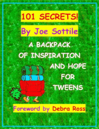
Joe Sottile submitted 101 SECRETS! A Backpack of Inspiration and Hope for Tweens designed by Joe Sottile.
Laura Baugh submitted Fired Up, Frantic, and Freaked Out: Training Crazy Dogs from Over-the-Top to Under Control designed by Laura VanArendonk Baugh & Alena Van Arendonk. “I had an outline for layout and palette, and my sister with the art degree and Photoshop made it real, including “shredding” the edge of the notepaper and such. Book has been doing very well, but I’d love to hear any suggestions. Thank you for this really useful site which was consulted frequently during production!”

JF: I love it. Great title, nice type treatment, good looking pooch. What’s not to like? I think the orange background may be stealing a bit of your pop.
Laura Roberts submitted Haiku For Lovers: An Anthology of Love and Lust designed by Joleene Naylor. “I released this collection of love-themed haiku for Valentine’s Day, with cover design by Joleene Naylor.”

JF: Beautiful job, another blend of artful illustration with just-right typography. Can’t miss. ★
Lene Andersen submitted Your Life with Rheumatoid Arthritis: Tools for Managing Treatment, Side Effects and Pain designed by Daniel Handler. “This is the cover for the first book in a series of three designed to help people live well with rheumatoid arthritis, a chronic and at times debilitating autoimmune disease. I told my designer the basic idea was a journey to empowerment, to a place where your life is first and the disease mutters on the back burner. He sent me a selection of images and when I saw this one, I knew instantly it was perfect.”

JF: I like the concept, but the type could be much stronger, particularly the title!
Leonard Rattini submitted Accidental Ambassador designed by Cathi Stevenson.

JF: Great cover from pro designer Cathi Stevenson, whose careful layout and nice polish produce a real winner. ★
Mark Swain submitted Long Road, Hard Lessons designed by Caleb Simmons.

JF: Man, that’s a long ride, isn’t it? A little rough, but I like the overall layout and simplicity.
Minna Sithep submitted Happier Bride: A Guide to Happiness and Planning Your Wedding designed by Minna Sithep (author). “I’m a graphic designer turned self-published author. I wanted it to be happy, inviting and beautiful (wedding-like), but clean and organized. I used the polaroids so I could include multiple photos and that’s my an ode to the “highlighter” on the subtitle.”

JF: Minna, both your skill as a graphic artist and your lack of experience with book covers show up here. In order to be seen and comprehended in the ebook environment, you might think about (at least for the ebook version) simplifying the cover and using a lot more contrast so that browsers know right away exactly what the book is about.
Paul Ellis submitted The Gospel in Ten Words designed by the author. “This cover was a complete fluke. I was fooling around with some Bananagram tiles, threw them down like you see, and snapped a pic. I decided I liked it and tried to redo it with better lighting, higher-res., etc. But no matter how hard I tried, I just couldn’t capture the spontaneity of the unplanned shot. This isn’t a great shot when viewed close up, but for thumbnails in the Kindle store it’s reasonably eye-catching. Incidentally, the chapter titles are also done with the Bananagram tiles.”

JF: Inspired, a graphic that’s in complete congruence with the title and subject of the book. Just perfect. ★
Rachel Thompson submitted Broken Pieces designed by Natasha Brown. “Natasha did an AMAZING JOB with this cover. I couldn’t be happier and the comments from people have reinforced what an effective cover it is. It represents my essays, poetry, and prose perfectly!”

JF: It’s very arresting and quite compelling. Nice job. ★
Rebecca Bielawski submitted Alphabeti-cool designed by Rebecca Bielawski. “Made with Artrage.”

JF: Terrific, well done. A perfect expression of the book’s “offer.”
Rich Meyer submitted The Music Trivia Quiz Book designed by Rich Meyer. “Created with a combination of Microsoft Word and Publisher.”

JF: Headache-inducing, at least for me. I keep wanting to tell it to “calm down.”
Stephanie Small submitted Don’t Let The White Girl Win: Dating, Relationship & Self-Help for Single Sisters designed by Tammy Luke & Stephanie Small.

JF: A provocative title combined with a compelling image makes this cover work.
Stephen Arnott submitted The Writers’ Guide designed by Andrew Brown at Design for Writers. “This cover is by Andrew Brown of ‘Design for Writers’, a company that’s featured a number of times in your competition pages. Andrew’s brief was to come up with a cover for a general writing guide (covering a range of writing forms) that didn’t fall for the usual stereotypes (quill pen, typewriter etc). I specifically asked for a simple ebook cover that would be strong enough to stand out as a thumbnail. The wording in the red banner is large enough to be read on the Amazon product page.”

JF: I like the concept, and it looks much better on the Amazon page since there’s a rule around it. Try to include that if you use this elsewhere. The execution is a bit rough, and I find the very fine type in the red box quite difficult to read.
Wolf Pascoe submitted Breathing for Two designed by Jeff Smith (www.tornadodesign.la). “Jeff designed the cover incorporating the drawing by artist Lorraine Bubar. The book tells the story of breathing from the point of view of an anesthesiologist, who looks on a sleeping patient the way the woman is depicted — upside down.”

JF: Clever, simple, and effective. Might be even a little over simplified, and I know I would have appreciated a subtitle because without your note I would not have a clue what the book is about.
Well, that’s it for this month. I hope you found it interesting, and let other people interested in self-publishing know about the Awards. —Use the share buttons below to Tweet it, Share it on Facebook, Plus-1 it on Google+, Link to it! The next issue is April 15, 2013 and the deadline for submissions will be March 31, 2013. Don’t miss it! Here are all the links you’ll need:
The original announcement post
E-book Cover Design Awards web page
Submit your e-book cover here
Follow @JFBookman on Twitter for news about the E-book Cover Design Awards
Subscribe to The Book Designer Blog


