Welcome to the e-Book Cover Design Awards. This edition is for submissions during May, 2014.
This month we received:
97 covers in the Fiction category
22 covers in the Nonfiction category
Comments, Award Winners, and Gold Stars
I’ve added comments (JF: ) to many of the entries, but not all. Remember that the aim of these posts is educational, and by submitting you are inviting comments, commendations, and constructive criticism.
Thanks to everyone who participated. I hope you enjoy these as much as I did. Please leave a comment to let me know which are your favorites or, if you disagree, let me know why.
Although there is only winner in eacvoiceh category, other covers that were considered for the award or which stood out in some exemplary way, are indicated with a gold star: ★
Award winners and Gold-Starred covers also win the right to display our badges on their websites, so don’t forget to get your badge to get a little more attention for the work you’ve put into your book.
Also please note that we are now linking winning covers to their sales page on Amazon or Smashwords.
Now, without any further ado, here are the winners of this month’s e-Book Cover Design Awards.
e-Book Cover Design Award Winner for May 2014 in Fiction
James Egan submitted White Sea Rising designed by James T. Egan of Bookfly Design.
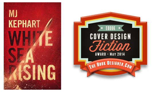
JF: An exciting and nearly perfect cover for this thriller. Energy, interest, focus all come together to create a real winner.
e-Book Cover Design Award Winner for May 2014 in Nonfiction
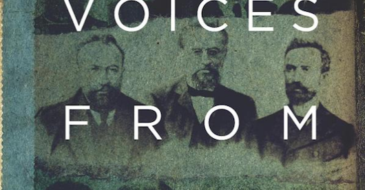
Damon Za submitted Voices From The Past designed by Damonza.com.
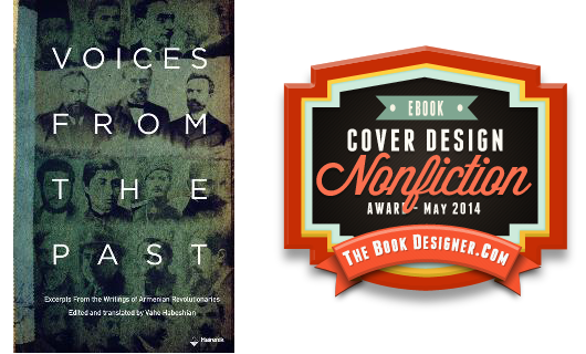
JF: Beautiful and evocative, perfectly combining content with the graphic representation of that content.
Fiction Covers
Adam Bender submitted Divided We Fall designed by Belinda Pepper, Red Swallow Design. “The cover for my dystopian novel Divided We Fall was designed by the brilliant Belinda Pepper. The graffiti image of the face with fiery eyes was an element from the cover of my previous book in the series, but now we pull out and see the larger world and the approaching war.”

JF: Interesting, but I’m not a fan of the brush stroke title type.
Alexandre Rito submitted El Amo del Fuego designed by Alexandre Rito – designbookcover.pt. “El Amo del Fuego by Enrique Osuna (Spanish Edition)”

JF: Nice composition, and in this case the flaming type effects on the cover serve the larger purpose.
Alexandre Rito submitted Issac’s List designed by Alexandre Rito – designbookcover.pt. “Thank you Logan Carrigton for this opportunity! This book is a story of love and seduction. Highly recommended.”
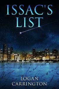
JF: Artful and attractive.
Alexandre Rito submitted Soliloquy designed by Alexandre Rito – designbookcover.pt. “Intrigue Budding Romances Strong Heroism Thrills, Chills & Mystery You want to be the one telling your friends about this book…Not the one being told. This is Young Adult Fiction at its Best!”
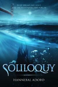
JF: Despite the rave, this one’s a bit too monochromatic for me.
Arlene Graziano submitted Russell Rides the Range designed by Arlene Graziano. “This a children’s picture book. I did the artwork digitally in Photoshop, but it is essentially all “hand-painted”. That is, I sketch and then paint directly in Photoshop using the brush tools. I designed the cover and book specifically for the Kindle Fire fixed format with region magnification.”
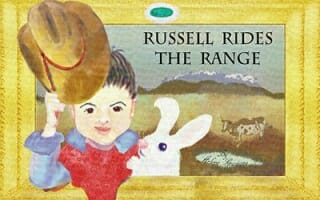
JF: Nice job in creating a cover that works both for your genre and a specific device. Could be improved with better typography.
Arlene Morgan submitted Roots of the Vines designed by Arlene Morgan and Ronald Krivosha with Debbie O’Byrne. “The Sangiovese grapevines were inspiration for the backstory of “Roots of the Vines”. The cover invites the reader to take a journey with the couple walking down the pathway between the vines.”

JF: Yes, the appeal of the couple and the landscape is the strongest part, but the dark areas add a sense of foreboding that I’m not sure is intentional.
Aurora Springer submitted The Lady is Blue designed by Irene Weber & Robert Harrison. “The original painting of the woman is by Hans Makart with modifications by Irene. The planet Earth is from NASA. Rob designed the cover arrangement.”

JF: Not very good, I’m afraid. Needs lots of help.
Avril Sabine submitted Demon Hunters 1: Blood Sacrifice designed by Caitlyn Petersen. “Caitlyn took numerous photos, setting up the props I provided in different ways, until she took a photo we were both happy with. The props are items relevant to the story. The sword and necklace will be used on all the books in the series with the other prop changing to suit each book.”

JF: The photo doesn’t convey much drama, and the type is unnecessarily difficult to read.
B.C. Kowalski submitted Robot Awareness: Part I designed by Sara Miyanaka. “I gave Sara Miyanaka, a graphic design exchange student from Japan, a jumble of ideas related to my book, Robot Awareness, and one day this brilliant cover was in my inbox. One of the first things people say about my book is to compliment the cover. This could easily be her career.”

JF: I love the design and illustration, but for ebooks, the type needs to be stronger to survive big reductions in size.
Becky Wicks submitted Before He Was Famous designed by Jeanine Henning. “I’m submitting this cover because my designer Jeanine did a great job and really understood my brief, which was to create something sexy yet strikingly different for the new adult genre, with a focus on celebrity and fame.”

JF: Nice job!
C. J. Darlington submitted Jupiter Winds designed by C. J. Darlington. “This novel is a YA/space adventure/dystopian, our first in the genre at Mountainview Books, LLC. We were striving to create the right atmosphere while maintaining something that would be an eye-catcher. We hope we succeeded!”

JF: Terrific. Talk about a hook: I love the way the illustration implies action and adventure, drawing us into the story.
C.S.R. Calloway submitted Lost: a Never novella designed by Shauday Smith. “I told Shauday that I was on a time limit – working to raise funds for typhoon relief – and she was excellent with the communication and the ideas and I got the finalized files on time! She was willing to tweak any details I asked, but the majority of this was all her doing.”
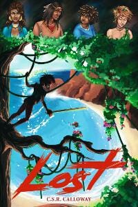
JF: Well, I’m a bit lost. A talented illustrator, but what are we (who haven’t read the book) supposed to make of all those people at the top?
Cate Baum submitted North of Sunset designed by Cate Baum.

JF: Strong concept that needs the title to “pop” more, separating itself from the background. And try to think of a way to contain the bottom of the cover so it doesn’t “bleed” onto the page the way it does here.
Charles Barouch submitted Tiago and the Masterless (Interrogative Book 1) designed by Juan Ochoa. “In this scene, you see Tiago, in his traditional garb, sitting on the bridge of his stolen spaceship, watching the computer build a body for his “virtual” friend. He’s been in space for nearly two years and the loneliness is driving him mad.”

JF: A weak cover without a dramatic point of focus.
Claudette Melanson submitted Rising Tide: Dark Innocence designed by Daniel Chon. “This cover was designed by my good friend of many years, and very talented artist, Daniel Chon. My book is a YA novel about a girl who is turning into a vampire–she doesn’t know it–so I wanted the cover to be dark, yet reflect her innocence. I believe he did a perfect job!”
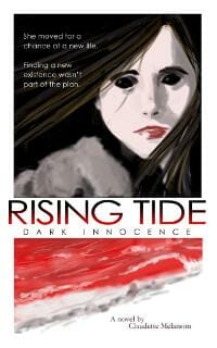
JF: Nice illustration, but the cover seems a bit chopped up, and it’s hard to tell where it ends. A border would help.
Damon Za submitted Chasing Prophecy designed by Damonza.com.
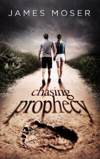
JF: Unlike all the covers above, this one combines art, typography, concept into one cohesive whole, and delivers a strong message to potential readers. Great stuff. ★
Damon Za submitted Nine Years Gone designed by Damonza.com.

JF: A literary look for this crime fiction.
Damon Za submitted Numb designed by Damonza.com.
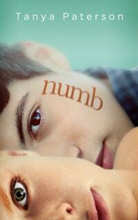
JF: Once again the designer is in complete control, making the cover of this YA novel attractive for all the right reasons.
Damon Za submitted Viscoid designed by Damonza.com.

Dane Low submitted Hey Mr. Right, Where Are You? designed by Dane at Ebook Launch. “The illustration was used to set the tone for humour. The woman is sexy and confident, but feeling a little bewildered – she can’t seem to find Mr. Right. Her dream guy is off in the distance. The script options are both feminine and casual – yet very legible, even as a thumbnail.”

JF: Delightful, beautifully composed and carried through with just the right tone. ★
Dane Low submitted Laila and the Witches of Kalazar designed by Dane at Ebook Launch. “I’ve overlaid blue smoke with the scarf of a beautiful young Pakistani woman – as if she is being wrapped in the smoke (a metaphor for the allure of witchcraft). The fonts are both exotic and adventurous while retaining a certain maturity and romance.”

JF: I find it hard to “read” as to the combined images, and the title is overworked.
Dave Cornford submitted Warm Honey designed by James Stewart, Dave Cornford. “Warm Honey is literary fiction.”

JF: A simple approach that’s quite effective.
David Germain submitted Censor Monkeys Have No Class designed by David Germain. “Pretty much the entire story inside the book is right there on the front cover to prevent any ambiguity.”

JF: Yeah, and that’s exactly the problem. Putting “the entire story” on the cover does your readers no favors, and robs the cover of any compelling message, unless you’re simply selling chaos.
David Jones submitted Dialect: Short Stories designed by David Jones. “Reading the stories triggered memories of pounding out cross-country drives with various people going to various destinations. Tyner’s foreword, too, is set in the context of driving. The cover had to capture that aura: lights and spinning stars blurring over a constant highway.”

JF: I like the idea but the various elements seem to be competing with each other.
David Monette submitted The Zombie Axiom designed by David Monette. “I am both the author and the illustrator for this, my first novel.”
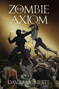
JF: A talented man. Although this is carefully composed, I find it a bit murky.
Devashish Donald Acosta submitted The Jazz Master designed by Devashish. “The image on my website has drop shadow added. I hope that is okay.”

JF: It looks like the kind of cover you end up with when you have no idea what to do. I suggest hiring one of the awesome professionals whose covers you see here.
e a lake submitted WWIV – In The Beginning designed by Laura LaRoche – LLPix Design. “Standing field corn plays a major role in the protagonists evading of trouble. We then darkened the image to give it the dystopian feel required. The lettering is maize – the color of mature corn.”
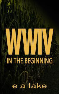
JF: Very strong design, but I think you darkened the background image too much (IMHO).
Elizabeth Barone submitted Raising Dad designed by Elizabeth Campbell. “In my last life, I was a web and graphic designer. I hated it. When I started treating my writing as a job, everything I learned finally came in handy. I knew the cover would have to be green. I also wanted a cover that would stand out in the New Adult genre, but would also be simple and clean.”

JF: Well done, and perfectly appropriate.
Gary Ludlam submitted Aachen designed by Ana Ristovska. “I had a vision for the cover of Aachen, and Ana blew me away by proposing something completely different. She took the time to understand my book and summarize it in a simple yet powerful image that perfectly captures the genre, medieval historical fiction. The juxtaposition of sword, scarf, and background manuscript captures the central conflicts of Aachen without being busy.”

JF: Gee, I find it dull, with type that’s been tortured into submission.
Gina Fava submitted The Race: A HELL Ranger Thriller designed by Bruce Skinner, Hyperion Photography. “Rome, Italy, figures as prominently as a character. The Vatican is critical to the story premise, and to the antagonist’s goal. The protagonist is a car racing covert agent, and his most important “race” of his life is centered around the Vatican and disabling the nukes within it.”

JF: So… I guess it just doesn’t have to make any sense? A very weird composite.
Gina Fava submitted The Sculptor designed by Bruce Skinner, Hyperion Photography. “The grim reaper sculpture stands in the St Peter of Vincoli Church in Rome, Italy, the city in which the novel is set. It represents the story’s serial killer that preys on victims at Rome’s universities. The fuchsia silk ribbon, is a vital clue, and the villain’s call sign.”
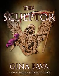
JF: No, not making it.
H.B. Bolton submitted The Dragon’s Egg designed by Elisabeth Alba. “Thanks to my amazing cover artist, Elisabeth Alba, my characters have been brought to life, fighting against their worst nightmares inside the Dungeon of Dreadful Dreams.”

JF: Interesting design and a strong illustration, but if it had more contrast the figures would stand out better.
Heather Maddalozzo submitted Unbridled designed by Heather Maddalozzo.
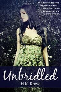
JF: She looks pretty bridled to me, making for an emotionally “flat” effect.
Hubert Wiest submitted Ich, Bakoo (I, Bakoo) designed by Mo Büdinger. “”Ich, Bakoo” is a dystopic novel for middle grade readers. The story takes place in a high tech city located in the desert.”

JF: Simple and effective.
Ian Andrew submitted A Time To Every Purpose designed by Ryan Maton. “Ryan is a young grad student and this is his first book cover. We wanted it simple, stark yet obviously eye-catching. We think we achieved it! He cleverly combined both symbols central to the story and put them in position atop the earth to suggest their global dominance.”

JF: Maybe it’s me, but the whole smoke and fire effect in outer space is problematic, and the title could be much stronger.
J. A. Charnov submitted Cascadia’s Curse designed by J. A. Charnov. “Created by the author using GIMP and MS Word, based on a stock photo of an ocean wave (modified to convey menace as well as beauty) by Shannon Stent via iStock/Getty Images, Inc.”
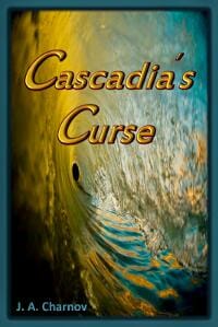
JF: I wonder what the book is about? Can’t tell from the cover, and better typography would eliminate the need for the “big emboss” look.
J.B. North submitted Spark (Legends of the Shifters) designed by Widhi Saputro. “I worked with this designer from Indonesia on 99Designs. It is an original painting and matches my story to the tee. If you look closely, you can see a phoenix in the background, which is the second form of my main character. I requested that the designer add it as a bonus for readers who spot it.”
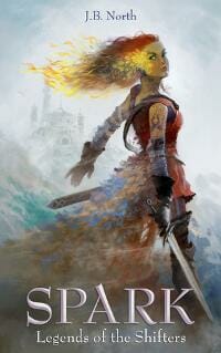
JF: Love that illustration, can’t tell if her “hair is on fire.”
J.F. Penn submitted Day of the Vikings designed by Derek Murphy Creativindie.
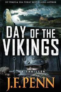
JF: Well thought out and executed, and I like the “Thriller” line just under the man’s eyes.
J.Z. O’Brien submitted SURVIVING ABE A Climate Fiction Novel designed by Kat at Aeternum Designs. “Kat exhibited endless patience working with me to come up with a cover representative of an, as yet, obscure genre. Hats off to Kat for stepping out of her genre comfort zones and still giving a winning effort at a reasonable price.”

JF: Regardless of the genre, the elements of story that attract us are well known, and I’m not sure a weather map is the best way to express that.
Jacqueline Patricks submitted Nightmares of the Queen designed by Jacqueline Patricks of Crazy Bird Publishing. “Scifi/action/adventure/metaphysical Second book in The Brajj Trilogy. I wanted to represent a scene from the story as well as metaphorically representing the changes most of the characters experience without giving away details.”

James Egan submitted 2020: Emergency Exit designed by James T. Egan of Bookfly Design.

JF: I like the way the type elements play off each other and the background illustration. Nice.
James Egan submitted Zymogen designed by James T. Egan of Bookfly Design.

James Willis submitted Alicia designed by Spiffing Covers. “A dark, semi-superhero adventure. Set in an urban environment.”

JF: Isolating the subtitle graphically is an interesting approach, even though it distracts a bit from an otherwise excellent and atmospheric cover.
James Willis submitted Sonny Starr designed by Spiffing Covers. “Space adventure for young adults”

JF: A good and attractive cover that might benefit (for this audience) from a bit more color.
James Willis submitted The Psychotropic Cinema designed by Spiffing Covers. “Surreal war adventure.”

JF: And a surreal but believable cover that really stands out with a cool use of “cut” type. ★
Jane Davis submitted An Unchoreographed Life designed by Andrew Candy. “The books title references Margot Fonteyn’s description of her tumultuous off-stage life. I was looking for an image that conveyed a woman with a past that she couldn’t leave behind, one who was wearing a mask. Andrew Candy and I created this from 5 seperate photos.”
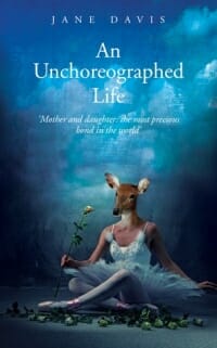
JF: Here the surreal image contrasts strongly with the classic, if somewhat weak, typography.
Jason A. Holt submitted The Artificer of Dupho designed by Kristina Gehrmann. “Kristina created an illustration that fully captures this novel’s unusual setting.”
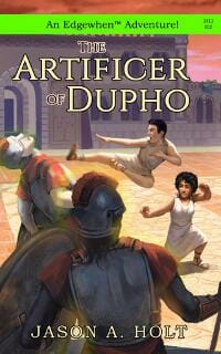
JF: Maybe it’s me but I find the lime green stripe very distracting, but the illustration is interesting.
JC Warren submitted California Paranormal Group designed by Create Space. “A model in front of a canvas; the pic is off the charts. Thanks, JC”

JF: It’s a little hard to make out, but nicely creepy.
Jennifer Geoghan submitted Purity Lost The Purity of Blood Volume II designed by Jennifer Geoghan. “Searching for an image that conveyed the spirit of the book in a single item was a difficult task but necessary to keep in line with the other covers in the series. In its simplicity, I think the tainted center of the extinguished candle stands out perfectly against the black backdrop.”

JF: It would be nice if the type also stood out, which it doesn’t.
Jennifer Gilby Roberts submitted The Dr Pepper Prophecies designed by JelenaM at 99 Designs. “The cover stands out nicely as a thumbnail, is perfect for the chick lit genre and reflects the book. I’m often asked about it in my author interviews and was recently told by one book blogger that she is “in love with it.””

JF: Well done, perfectly on point for readers of this genre.
Jess C Scott submitted Bedmates designed by Jess C Scott. “Cover image depicts the theme of the book, the second installment in a psychological thriller series.”

JF: Very effective and dramatic use of silhouettes.
Jess C Scott submitted Owned designed by Jess C Scott. “I wanted an eye-catching cover which suited the genre (short crime fiction centered around the theme of murder). One of the stories features a “gun-toting female,” which the cover represents (the title of that story is also the title of the short story collection).”
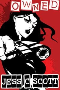
JF: I love the energy this cover expresses and the way the type treatment works so well with the illustration.
Jess C Scott submitted Zombie Mania designed by Jess C Scott. “Something spooky and horror-related for a parody short story.”

Jo Michaels submitted Tbinkerknese 101 – Book One designed by Jo Michaels. “This is a book of poetry for teens written by E. L. Thomas Sr. I designed the cover for. Word clouds were created from the poem titles and used as the borders and the 0 fill, and the background is meant to depict the golden nuggets of information found inside. Enjoy!”

JF: A challenging assignment, and it’s difficult to keep all the words from intruding on the message, combined with a difficult title. Not sure if the border of words is actually adding anything, since you’ve already got the word cloud inside the “O”.
John Dodds submitted The Mechanikals designed by John Dodds and Jane Watson. “I’m not sure if this is the world’s first embroidered cover for an e-book, but I hope so. Jane Watson embroidered the steampunk seahorse, as well as some other images for future books in the series, and I photographed it and did the typography and layout.”

JF: Let’s call it the first! Even with that, I’m not sure I’d let the illustration be quite so dominant, and as you can see this cover needs a border when it’s going to be on a white web page.
Julia Barrett submitted Winnerland designed by Julia Barrett and Winterheart Design. “The story is stark. I wanted to create a stark cover. Thank you. Julia”

JF: You’ve definitely achieved “stark” but it might be so stark that it’s not providing us with much information about the book.
Kim DDD submitted Burnouts, Geeks and Jesus Freaks: a love story designed by Kitten from Deranged Doctor Design. “Author Karen Gordon wanted extremely eye-catchy book cover that will stand out in Amazon YA genre lists. Also, her request was to make the cover different than usual YA book covers. We decided to feature main heroine who is a rebel, and make the contrast with screaming pink background and title.”

JF: Very cool and just right. ★
Kim DDD submitted Sunday designed by Marushka from Deranged Doctor Design. “Kaia Bennett wanted her old cover for erotic romance redesigned. With our design, we tried to suggest the genre, but without being too open. Also, we tried to stay away from cliches used Interracial erotica cover designs. For catching readers eye, we used strong neon blue and powerful font.”

JF: Could be improved by letting your strong font be strong, and get rid of the gratuitous distressed effect.
Kjetil Hestvedt submitted Low Rider designed by Risa Rodil.

Kjetil Hestvedt submitted The Shooting Gallery designed by Risa Rodil.

JF: Nice use of simple graphics to make a “point” and it’s a very effective approach.
Lara O’Brien submitted Chesca and the Spirit of Grace designed by Chris Beatrice. “I asked Chris for a cover that spelled Irish, wild, and spirited. I got it!”

JF: Yes, you did, but it would be nice if the title/subtitle weren’t disappearing into the art.
Laura Newman submitted NACHTSONNE – Der Weg des Widerstands designed by Laura Newman. “The second part of my Distopy. The Cover describes the disturbing situation of Nova & Joaquim, standing in the middle of nowhere. The land of fire quakes, the same the regime. Everything is uncertain and they have to fight for their freedom, while the sun dies.”

JF: Just as strong and effective as the first in this series, which appeared last month.
Luke Prochnow submitted A Far Cry from Living designed by Caleb Prochnow. “My brother, an art professor, did this cover for me. He added a lot of intricate details that can really only be spotted and understood when you know the story and its ending.”

JF: Yes, well, see, that’s one of the problems with adding lots of stuff that nobody understands. You get confusion. Combined with an odd color combination, I’m afraid this doesn’t work very well.
Mallory Rock submitted Touched With Fire designed by Mallory Rock.

JF: Quite effective, with carefully composed and combined images.
Mary Evans submitted Who Let the Gods Out? designed by Silent Deer (Illustrations by Mark Beech). “Hi Joel, Many thanks for a great opportunity and for your excellent blog. Please find attached my submission to your competition – all the very best with your many exciting projects, please do let me know if I can do anything to help your efforts. All best, Mary Evans”

JF: Sweet and amusing with an obvious appeal.
Mary Gottschalk submitted A Fitting Place designed by Wendy Musgrave. “The book title works off of three separate metaphors, one of which is the concept of getting the pieces of your life to fit together … like the pieces of a puzzle. The photographer painted an ordinary puzzle white, and placed it on a blue background with some pieces missing.”

JF: The kind of symbolism that works well on covers, and typography that complements it well.
Matt Tomerlin submitted The Devil’s Fire designed by Matt Tomerlin. “One of three covers in a series of novels, each featuring a distinctive background color and piratey item.”

JF: Very nice, I particularly liked the subtle coloring on the background image and the careful type.
Matthew Pallamary submitted A Short Walk to the Other Side designed by Matthew Pallamary.

JF: Although the illustration has promise, the typography almost screams “self-published.”
Michael Allan Scott submitted Flight of the Tarantula Hawk designed by Michael Allan Scott/Michael Duff/Denice Duff. “Our graphic designer, Michael Duff and his photographer wife, Denice assisted with every aspect of this process with only minor direction from me.”

JF: Obviously done by professionals, but I wonder about the decision to allow the type to squeeze the image to this extent.
Michael La Ronn submitted Festival of Shadows designed by Kip Ayers. “I wanted a cover that conveyed a dark fantasy for young adults, and since the novel has unusual characters (toys), I thought it would be best to go the illustration route. My cover artist did an awesome job conveying the genre and setting the tone of the novel.”

JF: Nice approach, and a good shock from seeing a normally innocent object in the role of aggressor.
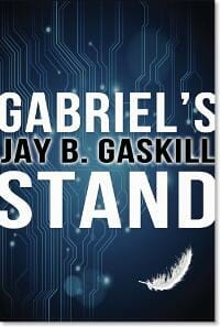
Michelle Halket submitted Gabriel’s Stand designed by Michelle Halket.
Mike Reeves-McMillan submitted Hope and the Clever Man designed by Chris Howard (saltwaterwitch.com). “I gave Chris a detailed brief which included “a man and a woman collaborating on a steampunk device”. I love the result.”

JF: Works quite nicely for this genre, and the way the typography has been used to “brand” the books is good.
Mike Reeves-McMillan submitted Hope and the Patient Man designed by Chris Howard (saltwaterwitch.com). “Chris has helped me cultivate a consistent look for my series.”
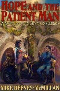
JF: Here the same elements as the cover above don’t work as well, as the title is allowed to be disrupted by the background.
N.E. Lasater submitted Farmer’s Son designed by Elizabeth Lasater-Guttmann. “Set on a remote family farm, Farmer’s Son is the victorious coming-of-age of a grown dyslexic man long isolated by his abusive father. The cover conveys this small world, yet one with hope (the golds & blue) and the rustling winds of change. Font is Century Schoolbook. E. L-G is only 19 yrs. old.”

JF: An ineffective cover with no point of interest for the reader.
Nate Fleming submitted Thimblerig’s Ark designed by Burton Booz. “Only seventeen years old when I commissioned him, Burton Booz did a fantastic job studying the qualities of a good young adult book cover and took my suggestions and made them a reality. I’m thrilled with the finished result, and look forward to seeing where Burton’s talents take him.”
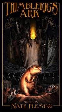
JF: The overall style is interesting and shows talent, but the illustration is a bit dark and indistinct, making it difficult to “read.”
Nowick Gray submitted Strange Love / Romance Not For Sale designed by SelfPubBookCovers.com/Aaron. “I picked this cover template off the shelf – or rather, it grabbed me, as I browsed at SelfPubBookCovers.com. I liked the simple focus of the compelling eyes and alluring face; the mysterious background texture; the equal parts “romance” and “strangeness.” Thanks to Aaron for a good match.”

JF: Another example of an interesting visual completely undone by poor typography and a lack of compositional ideas.
Olivia Rivers submitted Counting Shadows designed by Olivia Rivers. “Creating the cover for “Counting Shadows” was a very difficult task. It had to be elegant to match the theme of royalty, but also dark enough to elude to the themes of murder and reincarnation. And all this while sticking to a YA feel. Making this cover near killed me!”

JF: Glad to know you’re still with us. Not a bad job, but I find the color shift between the top and bottom of the cover a bit disturbing since they seem unrelated.
PATRICIA “PAT” KRAPF submitted BRAINWASH designed by FIONA RAVEN. “Fiona did an excellent job on the first book in my thriller series, capturing all of the elements pertinent to the storyline, yet leaving the images to the imagination of the reader. Intriguing, colorful, a standout; are some of the compliments I have received.”

JF: Clever, and it works.
Rachael Isaacson submitted Stolen Daisy: A Novel designed by Rachael Isaacson. “I needed the book cover for Stolen Daisy to reflect tension and danger. As an unknown self-published author, my budget was nonexistent for outsourced help. I taught myself the basics of graphic design (and programs) and this is the final result. It depicts an integral scene in the novel.”

JF: Pretty impressive for a first effort.
Rachel Cole submitted And the Winner Is… designed by Littera Designs.

JF: These three covers are great examples of branding a series, combining a distinctive font and layout with the truncated figure of a woman in various activities. Anyone would instantly see the connection, and know exactly who they are written for. Nice job.
Rachel Cole submitted The Holiday Gig designed by Littera Designs.

Rachel Cole submitted The Shopping Swap designed by Littera Designs.

S. A. Hunt submitted Law of the Wolf designed by S. A. Hunt. “The OUTLAW KING series is a fantasy-western epic with scifi elements, inspired by THE DARK TOWER. The character depicted in the cover is one of a type of creature called a “Wilder”. Wilders are the cybernetically-resurrected protectors of the post-apocalyptic Bemo-Epneme tribe.”
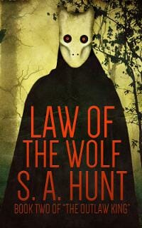
JF: Really strong, with a good title treatment and a unified, direct message for readers of this genre. ★
S. L. Saboviec submitted Guarding Angel designed by Regina Wamba of Mae I Design.

JF: Not sure all the ornamentation on the type is actually adding anything to an otherwise compelling cover.
S.C. Barrus submitted Discovering Aberration designed by Ian Koviak & Alen Hebel. “Working with Ian and Alen was an excellent experience for me and the cover speaks for itself. Not only is it beautiful, but it does a great job of breaking down major plot elements into thematic aberrations. Excellent!”
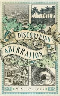
JF: A really interesting and attractive cover for a steampunk novel, clearly not a “cookie cutter” type of design. Fascinating, and clearly the title of the month. ★
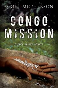
Scott McPherson submitted Congo Mission designed by Jeff Beckenbach. “As the second book in a series, the hand has become part of my cover theme. On this cover the African hand and diamonds lend an immediate interest in where the story will lead. The background comes from my own photos of Africa.”
Serena Clarke submitted All Over the Place designed by Serena Clarke. “Designing this cover was a lot of fun. I wanted something that was contemporary and appealing, and reflected the book’s fun romance/women’s fiction tone, with strong author branding. My inspiration was imagining what the poster might look like, if the book was ever made into a movie!”

JF: I hope you sell that screenplay! I like the energy and playfulness of this cover, and the way the type reinforces the angle of the girl’s body.
Shannon Cate submitted Jump designed by Shannon LC Cate. “The opening line of this short story is a child of seven stumbling to learn to read the nursery rhyme, “Jack be nimble, Jack be quick, Jack jump over the candlestick.” At the end of the story, that child, the main character, takes a major leap/risk. I used my own original photography and GIMP.”
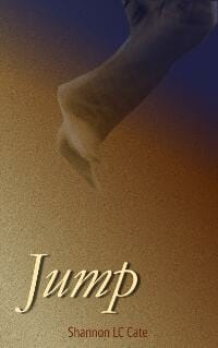
JF: It doesn’t work for me because the colors are very dull, and there’s basically no information whatever about the book.
Sharon Cathcart submitted In The Eye of The Storm designed by James Courtney. “When we planned our latest cover, James and I spent a lot of time photographing the props so that we could see how our concepts worked. This original artwork was the result.”

JF: The color alone should help this carefully-made cover stand out.
Shauna Bickley submitted Lies of the Dead designed by Andrew Brown – Design for Writers. “The image is a Cornish coast landscape, processed with filters to increase the feeling of tension. It makes a thriller/mystery statement without moving into hard boiled territory, and links with the main setting of the novel and the opening scene of suspected suicide by drowning.”

JF: Nice, the treatment of the image really complements the title and promise of the book.
Skye Lotus submitted Aim designed by Maja Majetic. “The cover for Aim was created by a local Melbourne, Australia artist especially for the book. Maja did a fantastic job of capturing the details in the brief we gave her for the cover.”
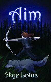
JF: I agree, but it would be nice to be able to see the great artwork a bit better.
Starla Huchton submitted Evolution: ANGEL designed by Starla Huchton. “While this series is Science Fiction Romance, I didn’t want the Romance factor to be a detractor to some audiences. I’m not much of a fan for the almost-kissing or embracing couple trend so prevalent with the Romance genre currently, so the goal was to put more focus on the story.”

JF: I think it works well for sci-fi, with a limited palette and appropriate typography.
Stephen Paul submitted The Perfect Game designed by Kit Foster. “The Perfect Game is a supernatural suspense thriller. Thanks! Steve”

JF: Nice. It’s amazing how much can be communicated with a minimum number of elements.
Steven Whibley submitted Relic (The Dean Curse chronicles: Book 2) designed by Pintado. “I asked the designer (Pintado) to create something dynamic and appropriate for the middle-grade/audience in the action/adventure genre.”
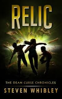
JF: Slick and exciting, with typography by a designer who knows exactly what he’s doing. Personally, I’d love to be able to make out the faces of the people here, even if just a little bit.
Vinspire Publishing submitted A Portal in Time designed by Elaina Lee.
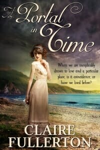
JF: Intriguing.
Wendy Dewar Hughes submitted Picking up the Pieces designed by Wendy Dewar Hughes. “Picking up the Pieces is an archaeological adventure. The story takes place in locations such as Europe and North and Central America, including the Mayan ruins in Mexico.”

JF: Unfortunately, it ends up looking like 2 different books, one about Mayan ruins, the other about shark attacks.
Nonfiction Covers
Claire Noble submitted State-Sponsored Sex and Other Tales of International Misadventure designed by Jane Dixon-Smith. “I wanted a fun, but somewhat frenetic cover for my humorous memoir about an inadvertant decade living in Asia.”

JF: I love the lighthearted approach, but would have emphasized the title more by perhaps getting rid of the “postcard” conceit.
Courtney Logan submitted Shaped by Fire: My Escape from Poverty’s Pit designed by Alvin Narag. “Print and E-Book same cover. Thanks.”

JF: Unless the author is famous and/or instantly recognizable, I’m not sure I would take this approach.
Dane Low submitted Seeking Ultra designed by Dane at Ebook Launch. “I chose photos where the runner is featured in a wilderness setting since a big appeal of Ultramarathons is getting outside and experiencing nature. The images of just legs so that readers can imagine it being the author. The font is bold and sporty and the the italicized one simulates movement.”

JF: And it really works. But I would also encourage you to put more copy on the cover so readers know more about approach and the scope of the material.
Dane Low submitted The F**ket List – Things I Will NOT Be Doing Before I Die designed by Dane at Ebook Launch. “For this concept I chose a bucket that has been knocked over, with the contents spilling out. The background I chose is a bit grungy, to imply age. The font is contemporary and fun, which indicates that there is a comedic aspect to the story.”

JF: Funny, and it gets the point across well. Actually, I’d like to read it.
Dean Miller submitted And Then I Smiled: Reflections on a Life Not Yet Complete designed by Dean Miller/Kerrie Flanagan: Hot Chocolate Press. “Cover is a purchased stock photo manipulated/tinted to create softer hues Back cover is continuation of entire photo selected to draw the reader into an organic and open frame of mind.”

JF: An example of the “no-hook” book cover. You haven’t given us any reason to care.
Debby Gies submitted Conflicted Hearts designed by JDSmith-design.com. “I worked with my cover artist in choosing the picture element to portray the context of the book.”

JF: Commercially effective and right on the money. Nice combines form (in the illustration) with function (content).
Gin Getz submitted The Color of the Wild designed by Kiryl Lysenka. “I’ve been pouring through your past posts of all these incredible covers, noting your comments, all in the hopes of learning how to make my next cover really remarkable. I think this first cover was really well done. It brought tears to my eyes, the designer captured the mood of the book.”

JF: Nicely composed, with elegant typography. But for a book with “wild” and “untamed” in the title/subtitle, it’s very sedate and the wild element is not evident at all in the photo you chose.
Greg Strandberg submitted Braves and Businessmen: A History of Montana, Volume Three designed by Freelancer Contest. “This image is The Custer Fight by Charles Marion and it’s from 1903. All I really needed was someone to use the same design as my first two books, so I just did a simple contest onfreelancer.com for about $20. For cash-strapped authors its not a bad option.”

JF: In this case it seems to have worked out pretty well, and it matches your other covers nicely.
James Pinnick submitted The Last Seven Pages: Two Days To Live. What Would You Write? A Memoir of Hope designed by Brian Ring. “Hello, Thanks for the invitation. James Pinnick”
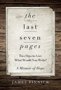
JF: Another great example of a cover that expresses the essence of the book, here with a quiet simplicity. ★
Jess C Scott submitted The Art of Erotic Writing designed by Jess C Scott. “Cover for an eBook on quality sexual literature. The “artistic nudity” reflects the content’s emphasis on the differentiation between erotica and pornography.”

JF: The erotic part is fine, but I’d watch out for your type elements inadvertently running into each other.
Joel Horn submitted Impossible Beyond This Point designed by Karen Horn. “Cover uses photos of our original ‘home’ and the sign at the trailhead when my family moved to the wilderness in 1967.”

JF: A charming idea for a cover, with suitable type, but I really don’t like the way the words in the title are floating away from each other.
Julie Alexander submitted Citizens And Assassins designed by Tatiana Villa. “Tatiana Villa did a wonderful job designing my ebook cover, especially considering the difficult photo I gave her to work with. The photo used is over 100 years old. I had my heart set on using this particular photo because it shows the actual citizens living at the time the story took place.”

JF: Agreed, she did a great job, and the way she’s handled the colors certainly helps. ★
Karla Locke submitted The Good News Chair designed by Armchair ePublishing – Designer Tony Locke. “Finally a good reason to go to the Principle’s office. The author of this book wanted a lot of white space, a simple design and something colorful to match the chair. The challenge was to make it look fun and yet not childlike. The book is meant for parents and educators to read.”

JF: It really comes off at first as being aimed at children.
Kim DDD submitted Her name was bitter designed by Kitten from Deranged Doctor Design. “Author Mara Johnson wanted cover for her memoir that will show suffering of a young girl who went trough hell before finally getting over the tragedy and exiting the darkness. Hence the title Her name WAS bitter. We tried to catch the feel with dark hallway behind and light in front the girl.”

JF: A very “novelistic” approach for a memoir, and maybe too much so. Also a little problem with the “B” that reads like a “3”, for no apparent reason.
Mario Rizzi submitted Real Havana: Explore Cuba Like A Local And Save Money designed by Eric Jean-Louis, from Canada.. “The 7° angle helps make the guide seem a little more off the cuff / beaten path while the strong color block and fonts anchor the guide as being an authority. The image area is clear of text overlay for ease of image swapping for future covers. A cute girl is always good too.”

JF: Yes, a cute girl works every time. I like this series idea, it’s uncluttered and emphasizes the fun aspect of travel.
Marion Jaide submitted Chakra Healing with Meditation designed by Marion Jaide. “It was my hope that by using a real person meditating on this cover it will reach out to a wider audience than regular “chakra” diagrammatic based covers.”

JF: A good idea to emphasize the human element. Keeping the color palette simple also helps the effect. Not sure I would go with all the font changes, though, they are distracting a bit from your main message.
Michael N. Marcus submitted Anthology of Third-World Email Scams designed by Michael N. Marcus. “My first cover with variations of one face: Nyala. It’s distinctive in subtle ways and I somehow sensed that it’s right for an African-themed cover. I was pleased to find that Nyala is named for an African antelope. The main pic suggests Africa and the ghostly image is perfect for an elusive scammer”

JF: Really hard to figure out the audience for this book, and I’m not a fan of the “pasted-on” look, but the type works well despite the extraneous and unnecessary quotation marks on the subtitle.
Rae Shagalov submitted The Secret Art of Talking to G-d designed by Rae Shagalov. “This book features the calligraphy Artnotes of Rae Shagalov, so the cover “font” is handwritten and bordered by one of Rae’s layered watercolor frames. This gives the potential reader the flavor of the experience of the book.”

JF: I love calligraphy and hand lettering, but this cover is one hot mess. Why have an illustration if you’ve covered 90% of it? And the crossing text boxes aren’t making things any better.
Tambra Nicole Kendall submitted The Scottish-English Texan: 56 Teatime Recipes designed by Tambra Nicole Kendall. “I used a CreateSpace template. I wanted the color scheme to be soft and elegant, to fit with the topic. With limited choices on font, I chose the one most suited for the book. I pulled the teatime books from my shelf to see what fonts, colors and photography was used. Thank you!”

JF: An example of how templates sometimes don’t work. You have every element you need, and your color and font choices are suitable, but compositionally it’s a disaster. These same elements could be re-configured by a professional designer into something that would work much, much better.
Teresa Blondo submitted Anchored: Pressing On by Pressing Into the Savior designed by Logan Pyle.

JF: Simple and effective. Without taking on too much, the author gets the point across.
Vikk Simmons submitted Bonding with your Rescue Dog: Decoding and Influencing Dog Behavior designed by Peter Arnott.

JF: A very solid and attractive nonfiction cover emphasizing the big sell: communicating lovingly with your dog.
Well, that’s it for this month. I hope you found it interesting, and that you’ll share with other people interested in self-publishing.
Use the share buttons below to Tweet it, Share it on Facebook, Plus-1 it on Google+, Link to it!
Our next awards post will be on July 14, 2014. Deadline for submissions will be June 30, 2014. Don’t miss it! Here are all the links you’ll need:
The original announcement post
E-book Cover Design Awards web page
Click here to submit your e-book cover
Follow @JFBookman on Twitter for news about the E-book Cover Design Awards
Subscribe to The Book Designer Blog
Badge design by Derek Murphy


