Welcome to the e-Book Cover Design Awards. This edition is for submissions during September, 2014.
This month we received:
142 covers in the Fiction category
25 covers in the Nonfiction category
Comments, Award Winners, and Gold Stars
I’ve added comments (JF: ) to many of the entries, but not all. Remember that the aim of these posts is educational, and by submitting you are inviting comments, commendations, and constructive criticism.
Thanks to everyone who participated. I hope you enjoy these as much as I did. Please leave a comment to let me know which are your favorites or, if you disagree, let me know why.
Although there is only winner in each category, other covers that were considered for the award or which stood out in some exemplary way, are indicated with a gold star: ★
Award winners and Gold-Starred covers also win the right to display our badges on their websites, so don’t forget to get your badge to get a little more attention for the work you’ve put into your book.
Also please note that we are now linking winning covers to their sales page on Amazon or Smashwords.
Now, without any further ado, here are the winners of this month’s e-Book Cover Design Awards.
e-Book Cover Design Award Winner for September 2014 in Fiction
Damon Za submitted Field of Fire designed by Momir from Damonza.com.
JF: If possible, even better than the other submission from the same artist. Here, the hot and violent atmosphere is captured perfectly, strongly implying the tension to be found inside. Almost demands to be opened by a fan of thrillers, and in this one a series of bombings play a crucial role.
e-Book Cover Design Award Winner for September 2014 in Nonfiction
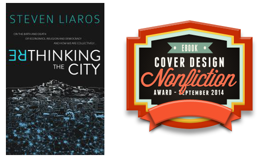
Steven Liaros submitted Rethinking the City designed by Scarlett Rugers Design. “The cover captures the key themes of the book. Inverting the ‘RE’ in ‘Rethinking’ indicates that the book turns conventional thinking on its head. It also shows how the internet is transforming the City from the centralised “capital on the hill” to a decentralised network of villages.”
JF: Excellent congruence between the subject matter, the imagery used, and the typographic creativity of the title. A real winner.
Fiction Covers
Alex Villavasso submitted The Dreamer and the Deceiver designed by Scarlett Rugers and Michelle Lockamy.

JF: A genre cover full of excitement and story, would like the type to show a bit better.
Ali Harper submitted Beautiful Bedlam designed by Melody Simmons. “”Beautiful Bedlam” is a debut YA novel, contemporary romance with elements of paranormal due to mental illness and hallucinations.”

JF: Nicely atmospheric, with appropriate type flourishes. The woman’s figure might have filled more of the space, though.
Andrew Hall submitted Tabitha designed by Self designed. “I tried to come up with a cover for my superhero/post-apocalyptic novel that would tick three boxes: stand out as modern and unique for the genre; suggest invasion or overgrowth; and have visual impact as a thumbnail on Amazon. Then again, maybe none of that comes across and all people see is moss!”

JF: Look at other post-apocalyptic thrillers, you won’t find any moss. Misses all the boxes, sorry.
Andrew Irvine submitted Affliction designed by Andrew Irvine.

JF: Awkward and ill-conceived.,
Andrew Luther submitted The Severed Oath designed by Andrew J. Luther. “The story is an action-adventure with sword & sorcery trappings. The cover was designed by the author, and the photo was purchased from Thinkstock and manipulated in Photoshop.”

Andrew Luther submitted The Tower of Dust designed by Andrew J. Luther. “The book is a combination of gumshoe detective style with sword & sorcery trappings. This cover was designed by the author, using photos purchased from Thinkstock and combined and manipulated in Photoshop to give it a painted look.”

JF: These 2 covers are an interesting change from the fully illustrated designs we usually see in this genre, and the series stands out with its “wavy window” design.
Andrew Stillman submitted Immortality Awaits designed by Richard Vasquez.

JF: Way too murky and hard to decipher, and the weak type isn’t helping.
Andrew Thompson submitted East: The Conspiracy Starts (West Series, Book 1) designed by Andrew Thompson. “The cover includes elements from the story that reflect our heroine, her photography activity when she gets involved in the conspiracy, and the aircraft and people that might save her.”

JF: A bit too pasted together for my taste. The heroine’s face might be a better draw than her camera lens.
Angeline Janeiro submitted Magic Resistant (Enforcers and Coterie #1) designed by Angeline Janeiro. “The author Veronica Del Rosa wanted a cover for the first book in her Urban Fantasy/Paranormal Romance book series to feature the main leads – Jackson and Julia. She requested that the cover art emote dark magic, a sexy edge, action and romance while remaining easily recognizable as a UF/PNR novel.”

JF: (UF/PNR = urban fantasy/paranormal romance.) The title treatment and overall look of the cover work well, but the images don’t really make much sense.
April Brown submitted Trails Through the Fault Lines designed by April Brown. “The photo used is a rock wall that may, or may not, display mini quake fault lines. Basic font and transparency are used to intensify the sense of danger.”

JF: Off-base and an exemplar of the “self-published” cover look.
Autumn Macarthur submitted The Wedding List designed by Autumn Macarthur. “My first attempt at cover design for Book 1 of my London set Christian romance series. Well, “first attempt” if you don’t count the fifteen other variations I tried first!”

JF: Pretty good for a first attempt, Autumn. The top and bottom panels look like they are uncomfortably crammed full of type and graphic elements, sacrificed to the stock shot.
Ava Armstrong submitted A Sense of Duty designed by JGR Dev. “”A Sense of Duty” is a contemporary romance and a thriller. The cover design needed to portray the main character, Lieutenant Ben Keegan and his service, duty, honor, sacrifice.”

JF: I feel sorry for Ben because he has to encounter evil without any clothes on. Graphically these are well laid out, but the beefcake strongly implies more of a romance than a thriller.
Ava Armstrong submitted Encountering Evil – Dark Horse Guardians Book 2 designed by JGR Dev. “”Encountering Evil” is a contemporary romance and a thriller. The cover design portrays the main character, Lieutenant Ben Keegan and his service, duty, honor and sacrifice as a private black-op consultant.”

B.W. DeCaro submitted Grown Men Don’t Cry designed by K. Vossen. “I asked K. Vossen to design a cover depicting a man searching for inner peace as he battles mental illness. Her cover design was perfect. Thank you for considering. Cheers, B.W. DeCaro”

JF: Restrained and very effective.
Barbara Loos submitted Unidentified person In Italy designed by Scarlett Rugers. “The main location of the novel is in Florence Italy, hence the bottom of the cover is an image of Florence Italy. The hand in the air represents the unidentified person who only at the end of the book is identified. The shadowy hand is a very important image for the book and the meaning of the story”

JF: The combination of images is very effective, and would be more so without the overworked title type.
Becca Price submitted Child of Promise designed by Todd Cameron Hamilton.

JF: Matches the other titles from this author with a lovely and inviting illustration.
Brendan Ball submitted Thieves in the Night designed by Kit Foster.
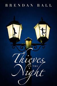
JF: Clever and intriguing.
Carlos Daniel Marchio submitted El Salto Cuántico designed by Federico Combi. “I´m the author of the book. The idea of the cover was mine but I worked with a designer to materialize it. This is a science fiction story that includes a manned trip to the far reaches of the solar system, in which the astronauts have to pass through a black hole to reach Feeria, a new world.”

JF: An interesting illustration (I suppose we are looking at reflections in the helmets?) that really deserves much better typography.
Carrie Beckort submitted Kingston’s Project designed by Scarlett Rugers of Scarlett Rugers Design.

JF: Strong concept and lovely execution, especially the beautiful color palette used here.
Cassia Leo submitted Parallel Spirits designed by Sarah Hansen of Okay Creations. “Since January ’13, Sarah has done 14 book covers for me. She is the only cover artist who always surprises me, in a good way. When Sarah re-did this cover, she hunted down the perfect stock image, which had never been used, and transformed it into an ethereal piece of art with movement and emotion.”

JF: Beautiful work.
Cat Lavoie submitted Zoey & The Moment of Zen designed by Scarlett Rugers. “This cover design tells readers that this is a fun, vibrant chick lit book with a tropical setting.”

JF: Nice concept and illustration, but the title seems to be fighting with the background.
Catherine MacDonald submitted Romancing the Vines designed by Scarlett Rugers. “Romancing the Vines: A Tale of Love, Lust, and Revenge.
The grapes and ethereal elements symbolize the past lives the three characters endured through time.”

JF: The designer obviously knows typography, but the image here is so ghosted out as to be missing in action, and yet the title still doesn’t show very well.
Charlene Carr submitted Skinny Me designed by Kari Ayasha. “The story depicts an overweight woman struggling to find happiness and self-acceptance in who she is rather than in a number on the scale: I believe my designer did a wonderful job finding an image that reflects the beauty and contemplation needed to represent the protagonist in an engaging light.”

JF: Love the image, not so much the way these two typefaces are combined in the title.
Christine Duval submitted POSITIVELY MINE designed by Jessica Cantor. “POSITIVELY MINE is about a pregnancy hidden at college during a girl’s freshman year. I think that my book designer, Jess Cantor, nailed the theme of isolation, contemplation & the coming of age nature of the story with this cover. It’s reflective with the hint of a college campus in the background.”

JF: No one would read “college campus” in the background, but that’s okay, the girl looks college age anyway. Although this font combination is better than the one immediately above, the fonts are still awkward together.
Christopher Geoffrey McPherson submitted The James Murray Mysteries: The First Three Novels designed by Matt Hinrichs. “I asked my designer to create a cover for the trilogy of the first three novels. I wanted something that evoked the period (the 1930s) but that was different from the covers he created for the individual novels. I think he did a great job capturing the mood, but still doing something modern and appealing.”

JF: I love the strong effect of the script type, and the overall economy of this cover.
D. K. Argent submitted Mylphire designed by Scarlett Rugers. “Scarlett did a great job on this cover for me. Lambert, a wizard is shown with Andrew the son of Mirea when he is threatened by the orange moon in a dream.”

Damon Za submitted Beautiful Revenge designed by Damonza.com.

JF: Notice how the legs act as a device to focus our attention on the title, while arousing our curiousity.
Damon Za submitted Decoy designed by Damonza.com.

JF: A few too many elements and shapes that inevitably confuse our attention, but a strong cover nonetheless.
Damon Za submitted Escape Clause designed by Momir from Damonza.com.

JF: A powerful cover combining strong typography, just enough illustration, and symbolism that really works.
Damon Za submitted The Illusion of Being Here designed by Kate from Damonza.com.

JF: Elegant and mysterious, showing that even what we consider “text” typefaces can be used to great effect by a good designer.
Damon Za submitted The Valley of Dry Bones: Book Two of The Children of Necropolis Series designed by Momir from Damonza.com.

JF: Great and attractive cover for this fantasy, although I really dislike the little round yellow “sticker.”
Damon Za submitted You Come When I Call You designed by Momir from Damonza.com.
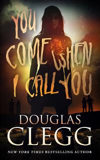
JF: Exactly right place to use hand lettering.
Dane Low submitted Better Lost Than Ever Found designed by Dane at Ebook Launch. “I kept this cover simple, but with a clear science fiction theme.”

JF: Works very well as a sci-fi cover with strong and confident type handling.
Dane Low submitted Silent Waters designed by Dane at Ebook Launch.

JF: Another strong cover with a great hook into the story and deft typography.
Danielle Broussard submitted Fall designed by Danielle Broussard. “It’s an urban fantasy with biblical undertones, dealing with angels and demons (fallen angels to be specific)”

JF: A nice concept and focused execution make it stand out.
David VanBergen submitted Sword of Spirit designed by David Ogilvie. “This is book 1 in my series. The covers were created by the super talented David Ogilvie. The cover image I provided is the new cover which has a different font than what currently shows on Amazon. Amazon should show the new cover soon.”

JF: Fantastic illustration with real pull, and the type matches nicely with the setting.
Davonna Juroe submitted Scarlette designed by Scarlett Rugers.

JF: An eerily effective image composite that’s weakened somewhat by the distracting red shape at the top. The attractive title adds to the effect.
Dennis Badeau submitted An End To Eternity designed by Dennis Badeau. “My book is set in the 1920’s and I wanted a vintage, old world feel that would stand out on the digital bookshelf.”

JF: Terrific job. Impact that’s hard to match, and the style and font choice clearly allude to the 1920’s. ★
Dennis Sharpe submitted Wednesday designed by S.K. Whiteside. “This cover was designed by S.K. Whiteside from a photo of actress Hayley Mortimer, patterned after the lead character of the book.”

JF: Simple but it works.
Devoni Kinney submitted The Rosecliff Rankings designed by Kit Foster.

JF: Amusing, economical use of color, and well-handled type make this cover pop.
Diogenes Ruiz submitted Persistent Evil, The Demon Slayer designed by Diogenes Ruiz. “Fr. Oliver has the unique ability to see evil as it is present in an individual. Once a person has completely surrendered to the demon, beheading is the only way to destroy the creature, thus the blue mark over the author’s name. I wanted to hint to this without giving it away.”

JF: I don’t think anyone will get the hint embodied in the blue accent, but the cover scores with the great image.
Dorothy Johnston submitted Eight Pieces On Prostitution designed by Scarlett Rugers. “The cover design is based on a painting by Bartolome Esteban Murillo, held in the National Gallery of Art, Washington DC”

JF: It can be challenging to use classic artworks on an ebook cover, but the designer handles this beautifully and I really like the typography and small ornamental touches.
Eleni Mamalis submitted The Pigs Speak Greek designed by Scarlett Rugers. “The Pigs Speak Greek design cover pulls you in, as does the story behind it. It was so key for me to have a cover designed that would depict all the emotion, tragedy, and hurt that starts with the story that is based on true events, that as soon as I saw this cover, I knew it was the one.”

JF: The suffering communicated by the woman’s body speaks loudly, creating an arresting design.
Elisa Fraser submitted GO NATIVE designed by AUTHOR.

JF: The image is interesting and grabs our attention, but the type here needs the touch of a professional.
Eric Lorenzen submitted Road of Waters designed by Public Author. “An Arthurian fantasy. Photo copyright by Unholyvault/ Dreamstime.com. This is Book 2 in my Ways of Camelot series, so certain elements of the series “brand” were brought forward from Road of Leaves: font, title placement, and encircled series name at the top right.”

JF: A beautiful and atmospheric design that draws us into the story. (Who is “public author” anyway?)
Eve Wallinga submitted The Voodoo Breast: A Novel of Healing designed by Eve/Gary Wallinga. “Tried to portray a novel primarily targeted to women, possibly breast cancer survivors, with a healing theme, yet also paranormal. Mysterious and magical, yet not scary.”

JF: A strong title, but this cover simply doesn’t work. Too many elements, too much visual confusion, no clear message, and a title that’s made too hard to read.
Fiza Pathan submitted NIRMALA: The Mud Blossom designed by LLPix Photography & Design. “This story is about Nirmala the Mud Blossom, who had the misfortune to be born a female in Mumbai. It graphically depicts the travails, discrimination, abuse faced by women”

JF: Your basic type-on-photo ebook cover.
Gabrielle Prendergast submitted A Queer Kind of Justice: Prison Tales Across Time designed by Gabrielle Prendergast. “This was a redesign based on a clearer brief from the author. Far superior to the original cover IMO. There’s something so bleak about it that I love.”

JF: The image is bleak indeed, but that “Q” in the title is a bit odd, and I’m not sure that the tilted subtitle is adding anything useful.
Geoff Brown submitted SNAFU: An Anthology of Military Horror designed by Geoff Brown.

JF: Good image, but the title should pop off the background more, and that’s not accomplished by simply adding more “effects.”
Grace Chan submitted Blackthorns of the Forgotten designed by Elizabeth Lang. “The author was looking for a cover that did not suggest romance of any kind. He wanted a rocker with a guitar, a indistinct angelic figure and a specific type of tree.”

JF: Proof yet again that authors are rarely the best source for design concepts. Completely forgettable.
Grace Lang submitted Against the Elements designed by Elizabeth Lang. “I wanted a haunting look with a female heroine against a fantasy backdrop.”

JF: Combining images like this takes a skillful hand, nowhere in evidence here. What exactly is that halation around the woman supposed to be?
Greg Lenthen submitted Late Final Extra designed by Scarlett Rugers. “Scarlett is the consummate professional, able to take the best of a brief and turn it into the cover you’ve dreamed of.”

JF: I like how emphatic this cover is, while communicating important details that let us know what kind of book it is.
Harry Patz submitted The Naive Guys: A Memoir of Friendship, Love and Tech in the Early 1990s designed by Justin Jenkins. “Based upon the concept by author Harry Patz, artist and designer Justin Jenkins developed a magnificent eye-popping cover evocative of a unique, coming-of-age experience in the New York City of the early 1990s. The protagonist lingers in his boyhood comfort, but the excitement of the city awaits.”

JF: An incomprehensible and confusing image combined with type that doesn’t make much sense.
Hattie Holden Edmonds submitted Cinema Lumière designed by Scarlett Rugers. “Scarlett Rugers was a joy to work with. Endlessly patient (around 15 revisions), incredibly generous – and with brilliant ideas.”
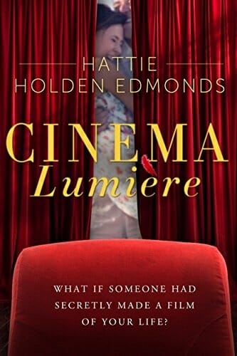
JF: Nice concept, lovely color palette and strong type, but way too much curtain and not enough of the people for me.
Heather Wardell submitted Go Small or Go Home designed by Scarlett Rugers. “This book is about a massage therapist who makes miniature dioramas and takes care of a hockey player. I think Scarlett Rugers did a fantastic job with this cover!”

JF: Amusing and very effective as a cover.
Ilaria Tomasini submitted Il Cielo Oscuro di Roma designed by Ilaria Tomasini. “The book is a horror story for teenagers. The title means “The dark sky of Rome” in Italian. I chose a city skyline for the cover, with the outline of a demon sitting on a building. The title has a squared paper pattern because the novel is set in a school and that is the kind of paper that is usually used in math notebooks.”

JF: The skyline, demon, and stars work really well together, but I wish the author’s name had been treated better. Just a smaller size of the title font or a plain sans serif would do the trick.
J C Warren submitted California Paranormal Group designed by Create Space. “Model in front of a canvas. Pic is off the charts and it was perfect for this story.”

Jaime McDougall submitted Dark Echoes designed by Cohesion Editing and Proofreading.

JF: A simple but effective ebook cover (hint: she’s a werewolf).
James Alexander submitted Are You Alright Mister Lawrence? designed by James Alexander.

JF: An interesting approach, but there’s no good reason that the subtitle is so much larger and more emphatic than the title.
James Egan submitted Detective Lessons designed by James T. Egan of Bookfly Design.
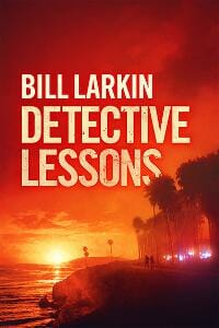
JF: A beautifully atmospheric cover with perhaps an excess of “negative” space.
James Egan submitted Spirit Prophecy designed by James T. Egan of Bookfly Design.

JF: Haunting with a real air of excitement and some lovely typographic details. ★
James Egan submitted The Regenerates designed by James T. Egan of Bookfly Design.

JF: A designer in complete control of his tools, this cover really stands out for the masterful integration of a great image with terrific typography. It just works well on every level, and the longer you look at it the better it gets. ★
James Litherland submitted Certain Hypothetical designed by James Litherland.

JF: I like how clean and controlled these two covers are, and how effortlessly they relate to each other.
James Litherland submitted Threat Multiplication designed by James Litherland.

James Messer submitted Pocketful of Poesies designed by James Messer. “Pocketful of Poesies is an astonishing array of very short but dark stories that take alliteration to a completely new level. The cover reflects that. It looks like a children’s book but on closer inspection you can see that the children on the cover are actually being consumed by an Anaconda.”

JF: Definitely a diabolical design destined to deliver. Nice job.
Janet Holmes submitted Murder Al Dente designed by Janet Holmes. “Designed the cover and made the one of a kind “derivative illustration” using vector art from Shutterstock. Thank you for your consideration! :-) Janet”

JF: This could be very attractive if some of the visual “noise” was removed. Just too much: too many swirls, curlicues, guns, cross hatching, swashes, dots to really make a clear statement.
Jayne Kennett submitted Pirawolf;The Curse designed by Scarlett Rugers. “My cover design relates to one of the main characters in my novel named Tarlos. A Brazil model, Ed Marquezini, did the honour in portraying Tarlos and what a ‘Pirawolf’ looks like.”

JF: Very nice, with great atmosphere, but I think the sword-like “P” in the title would have been better deleted. Even though it’s clever, it takes away from the sword Ed is holding.
Jeffrey Mays submitted The Former Hero designed by Scarlett Rugers. “The heavenly bodies are a motif on the book. The warm clouds and the man walking alone indicate the title character and his quest for purpose and meaning in a world of powerful villains.”

JF: Great balance and spot-on focus, really memorable.
Jenna Leigh Evans submitted Prosperity, a Novel designed by Suzanne Rush.

JF: The evocative symbolism tells the whole story. Nice.
Jennifer Tzivia MacLeod submitted Elijah and the Priests of Baal designed by self. “I loved Macedonian artist Goce Ilievski’s paintings for this book so much that I just handed the image over to a fiverr cover designer I trust, and I’m very proud of the result.”

JF: Great, idiosyncratic illustration style, you ended up with a winner.
Jennifer Tzivia MacLeod submitted Penguin Rosh Hashanah designed by fiverr cover designer. “There are a few simple elements here. I loved the absurdity of the book’s premise – at first glance, penguins have absolutely nothing to do with the Jewish New Year of Rosh Hashanah.”

JF: Definitely in the running for title of the month, but there really needs to be a lot of art behind the “artless” look and I don’t see it here.
Jennifer Tzivia MacLeod submitted Shabbat Monsters designed by fiverr cover designer. “This is another kids’ book where the illustrations are so delicious they speak for themselves. The designer has added text in a basic childish font and a colourful “splash” backdrop. ”

JF: The background really detracts from where our focus ought to be: on the monsters.
Jessica Bell submitted White Lady designed by Jessica Bell. “Thought you might like to know that I’m completely self-taught. :)”

JF: I’m impressed, because this cover is completely satisfying, with an impressive skill level in the combination of images, handling of the type, and the quality of storytelling. Great tension and anticipation, too, a winner. ★
John Kramer submitted Julius Gray Part One: Fire Start designed by Victoria Dahn.

JF: The image is meaningless, the type almost impossible to read.
Johnny Walker submitted EKKO White Limousine designed by CIC Publishing designed the cover using some artwork purchased from Josepfhanus, and Hypermania37.. “Thank you for your consideration.”

JF: The design doesn’t make clear the relationship of the two titles, and the background is very distracting, leading to a disjointed design.
Joshua Danker-Dake submitted THE SPARE ROOM AND OTHER STORIES designed by Sean Danker-Smith. “Horror/thriller anthology.”

JF: Great concept, but it almost looks like a sketch for the finished cover, not the final itself.
Joshua Mowll submitted Beautiful Titan designed by Joshua Mowll. “This novel is for a YA audience, and I wanted to break out of the usual genre stereotypes. The idea was to create a ying/yang, love/war, symbol to represent the central story themes. It also needed an industrial edge to match the feel of the book. Created in CGI 3d software by the author.”

JF: Many cool things about this cover, including the color palette and the subtle and skillful graphics. I’m not sure that symbol isn’t much too strong for the title type, though, and it might look a lot better with a “meaty” semi serif or sans serif face.
Judith Glynn submitted A Collector of Affections: Tales from a Woman’s Heart designed by Sophie Kelle, Infinitum Limited. “My novel’s protagonist is a seasoned middle-aged woman who unexpectedly begins an affair with a charming seatmate when they land in Spain. Cover designer Sophie Kelle captured the intimacy I wanted to evoke travel, romance, mystery and a well-traveled path.”

JF: The street scene says travel, and the type is lovely and restrained, but the ghosted-out heart shape doesn’t work for me.
K.V. Flynn submitted On The Move designed by Book Beautiful. “This designer really captured the teen skate energy of of this YA novel: fun mixed with some action-adventure danger!”

JF: Very neat, should do well with your audience.
Kep Lagrange submitted Yellow Tag designed by Adrenaline Design. “I wanted an awesome science fiction book cover that brought to life the intense heat, radiation, and danger of being close to a star. Adrenaline Design delivered.”

JF: Great sci-fi genre cover with the promise of an exciting story. ★
Khloe Adams submitted HOT & GLAZED (Donut Shop Diva Serial Book 1) designed by Danielle Maait of.littlebookdesigner.com. “I chose Danielle Maait as my designer after spending hours on your site analyzing contest covers and your feedback. My book, HOT & GLAZED, is the first in a four book spicy romance serial. The goals of my cover included instant genre recognition, a touch of humor, name branding and serial branding.”

JF: As usual, Danielle delivers the goods for this genre’s readers, although the title/author relation here seems a bit strained.
Kim DDD submitted Burdened designed by Kitten from Deranged Doctor Design. “This was a re-design of old cover for PNR YA novel Burdened. The idea was to provide design that has a bit dark feel, but with keeping the rose flower that was the element of the old cover.”

JF: Nicely done, but might improve with a title that contrasts better with the background and by bringing the woman more into the foreground.
Kim DDD submitted Killer designed by Kitten from Deranged Doctor Design. “Design for book 1 in in British mystery series The Summerfield Murders, very dark murder thriller.”

JF: Hits the nail on the head. Atmosphere, tension, and dread with only one bright spot on the cover.
Kim DDD submitted On The Mountain designed by Marushka from Deranged Doctor Design. “Book cover designed for Peggy’s historical romance set on Rocky Mountain ranch. The customer said that she prefers earth color tones, so we tried to fulfill that wish.”

JF: This one doesn’t work for me—the mountains seem very heavy hanging about the woman’s delicate face, and my eye keeps wanting to read the cap “M” with the lowercase “on.”
Kim DDD submitted Proclaim Liberty designed by Kitten from Deranged Doctor Design. “Very special design created for Proclaim Liberty- political thriller set in present, but with characters that dress up as 18th and 19th century people. Rather than creating cover that will remind readers of (usually boring) school history textbook, we went with modern concept with comic book.”

JF: A fun and successful concept, but I wonder if it would look better if the bell graphic was distinguished from the type.
Kim DDD submitted Storm on the horizon designed by Milo from Deranged Doctor Design. “Cover designed to attract fans of Military/Political fast paced thrillers.”

JF: Another really strong genre cover that gives readers everything they want to know.
L.L. Sanders submitted The After: Odd Tales of the Afterlife designed by Karri Klawiter.

JF: The designer here has beautifully matched the artwork, the fonts, and the whole atmosphere of the cover with what readers of this genre are looking for. Well done.
Laura VanArendonk Baugh submitted Con Job designed by Kristie Good, of Crash Bang Labs. “I wanted a graphic novel feel for this geeky murder mystery, so I turned to comic artist Kristie Good of Crash Bang Labs. She did both front and back covers with so much individual characterization — a couple of readers even said they’d like to cosplay the characters as depicted.”

Laurie Boris submitted Playing Charlie Cool designed by Paul Blumstein. “Once I gave Paul the gist of the story, it didn’t take too long before we had the basic elements and the retro, nighttime “feel” of the design. I love the tone of it and the way the headline pops.”

JF: It’s well done, but I keep getting distracted by the “curtain” effect instead of being focused on the figures, where you probably want people to focus.
Lesley Smith submitted The Whispers in the Desert designed by Scarlett Rugers.

JF: Beautiful concept, weakened a bit by the execution since some of the type is disappearing into the sand and the illogic of some letters having shadows while others don’t seems odd.
Leslie Lee Sanders submitted Wounded Beacon designed by Karri Klawiter.
![]()
JF: A successful ebook cover with outstanding focus. There’s no doubt where our attention is directed here, and the illustration is good enough to carry the weight.
Linda Lee Graham submitted Voices Echo designed by Amanda Kelsey (image by Jeff Wickham). “The book takes place on an 18th-century sugar plantation in the West Indies.”

JF: I like the window/frame effect, you just want to peek in there. On the other hand, cramming the frame detail into the top left corner creates distracting visual tension, and the title could contrast more forecefully with the background.
Lynne Scott submitted Protecting Parker designed by Dean Newman, Liquid Reality Studios.

JF: Strong idea nicely realized, but notice how the bottom tag, with the greater contrast between the type and background, naturally draws our attention much more than the upper tag.
Madison Keller submitted Flower’s Fang designed by Johnny Atomic.

JF: Exciting and effective. Great illustration with a unique title treatment.
Mallory Rock submitted Flamenco Sketches designed by Mallory Rock.

JF: A lovely, if fairly quiet, cover.
Marie Story submitted In the Days: A Tale of the Forgotten Continent designed by Marie Story.

JF: Although this is a well laid out cover, I’m not sure what browsers are supposed to make of the logo-looking main element.
Mark Polino submitted Death From Above designed by Mark Polino. “The book is about a stolen Mayan codex leading to mysterious airplane crashes. I chose to focus the cover on crashing planes to simplify the look. I intentionally left out out other story elements to try to keep it clean.”

JF: A good choice, and an appropriate font too, although the color combination makes me a little uneasy.
Marty Dalton submitted Captain Tomahawk and the Sky-Lion designed by Olin Kidd. “Couldn’t be happier with Olin’s illustration, he perfectly matched my heroine’s personality. Joel, thanks for all you do. I love your website, been visiting for years.”

JF: Thanks, Marty, and good luck with your book. The cover seems just right, and I love that wink.
Mary Anne Benedetto submitted Never Say Perfect designed by Billy Melton of xtremegraphicsaz.com. “The cover depicts a romantic scene with a couple viewing a spectacular sunset. I wanted an example that appears to be a perfect setting that appropriately contrasts with the title Never Say Perfect. Available in e-book and paperback formats.”

JF: I’ve somewhat ruined images like this for myself by watching too many male-enhancement commercials.
Mauricio Diaz submitted Vapor designed by Mauricio Diaz.

Michele Orwin submitted Identity Thief designed by Alan Pranke. “For this psychological thriller, the author wanted black and white with maybe a broken mirror or a shadowy face. The designer came up with something even better.”

JF: Great integration between the image and the story, with a title that also contributes to the whole, although I still don’t like the red-type-on-the-black-background.
Misty M. Beller submitted The Lady and the Mountain Man designed by Misty M. Beller.

Neil Russell submitted Beverly Hills is Burning designed by Paula Johnson. “My book is a two-part story and the font is indicative of the era in which the major part of the novel is set. The arrow evokes the MacGuffin of the story.”

JF: Clever, verging on oversimplified.
Olivia Andem submitted Patience Betrayed: The Hawthorne Diaries v2 designed by Adazing Design. “Combining feminine style, the Regency era, with the drama of the word ‘betrayed’ was the challenge presented to the cover designer.”

JF: Beautiful combination of a subdued but meaningful background for the lovely typography.
Olivia Cole submitted Panther in the Hive designed by Scarlett Rugers.

JF: A well thought out cover that’s got great balance, not sure about the addition of that eye image, which adds a bit of messiness to an otherwise immaculate design.
Pallas Ziporyn submitted A Cappella Drug Lord designed by Sophia Feddersen. “Thank you for your consideration! -Pallas”

JF: You can see the designer’s terrific range, from the cover just above in a completely different style. This one is fun, energetic, and fine-tuned.
Pamela DuMond submitted Part-time Princess (Ladies in Waiting, #1) designed by Regina Wamba at Mae I Design. “Part-time Princess is a NA, contemporary romantic-comedy. I wanted to the cover to have a playful feel.”

JF: Pretty AND playful.
Paul Gilmour submitted Jeremiah’s Codes designed by Author.

Phil Pauley submitted Moral Order: The Rise of Luca C. Mariner designed by PAULEY. “With the cover of my YA sci-fi book, I wanted to bring together the worlds of space and undersea that thread the narrative. We drew from the opening sequence of the book, where the hero, Luca, is flying through a futuristic, virtual reality game.”

JF: Cool. I think you have the gamer audience hooked with this one.
Phillip Winberry submitted Falling From The Sky designed by Diseree Kern – Greyscale Studios.

JF: A good cover could be made from this art, but it would need much better typography.
Piper Huguley submitted The Preacher’s Promise designed by JShan. “This submission was a winner in a Designcrowd.com contest. The designer lives in Sri Lanka”

JF: I can see why. The cinematic look could be used for a film poster or miniseries promotion. Characters that speak to us from the story, style, and a fully-controlled layout make this shine. ★
Pippa DaCosta submitted Beyond The Veil designed by Celairen Art. “As the first book in an urban fantasy series, it has a huge role to play in capturing readers, and informing them about the type of book they’re buying (and the series to follow). We wanted the cover to inspire questions in the reader. Why does she only have one wing? What’s with the snow & fire?”

JF: The most prominent spot on the cover, to me, is the woman’s face.
Priscila Santa Rosa submitted Those Who Remain: A Zombie Novel designed by Priscila Santa Rosa with illustration by Alteya of deviantart.com. “The goal was to blend thriller and zombies/horror while presenting the large cast of main characters.”

JF: I guess it’s distinctive, but that title gives me a bit of vertigo.
Ramona Flightner submitted Reclaimed Love (Banished Saga, Book Two) designed by Derek Murphy.

JF: Does a really good job of incorporating lots of elements without undue distraction.
Richard Alvarez submitted The Christmas Closet designed by R P Alvarez. “The cover photo is of the crystal doorknob to the mysterious closet where Christmas goes the rest of the year. The mysteries of the universe are represented by a Hubble image floating within the crystal.”

JF: Way too subtle to overcome the homemade look.
Richard Dela Cruz submitted Stark Raving Maddie designed by Stephanie Mooney at Mooney Designs.

JF: Even though she looks sullen, this is a well put together cover that hits all the bases.
Richard Watt submitted Going Back designed by Scarlett Rugers. “I contracted Scarlett to create a cover for my debut novel. The key elements of the story – the main character at two points in his life, as well as an echo of the two boys who are the jumping-off point for the story are present, as well as the oppressive nature of the Iron Curtain.”

JF: Very evocative, with the typography nicely mirroring the visual element of the cloudy sky.
Ripley Patton submitted Ghost Hold designed by Scarlett Rugers. “Second book of my YA paranormal thriller series, The PSS Chronicles, and I love it. Scarlett gave me exactly what I wanted.”

Rita Carla Francesca Monticelli submitted Red Desert – People of Mars designed by Rita Carla Francesca Monticelli.

JF: As is often the case with author/designers, a good image fails to generate much excitement due to the weak typography.
Rita Mack submitted A Touch of Paradise designed by Author.

JF: Not very interesting, I’m afraid.
Robert Benson submitted The Scarlet Kingfisher designed by Robert Benson. “Of course there are no real Scarlet Kingfishers. To create this image, I found a photo of a Rufous-backed Kingfisher (from Asia). I chopped out the background, rendered it in 16 colors & changed non-red colors to red. Looks like a painting now,don’t you think?”

JF: Yes, it does. Personally, I don’t find the background very attractive, and would have been tempted to make the bird much larger.
Roberto Bonfanti submitted Come un granello di sabbia e altre storie designed by Roberto Bonfanti. “The book is a collection of my old short novels. The cover is a photo I made and drawn with photoshop.”

JF: “Like a Grain of Sand and other stories” is the translation I got. A nice literary look with a title that speaks very softly.
Rosalind Minett submitted A Relative Invasion: Intrusion designed by “Neil”. “Cover designer worked from author’s concepts and preferences. This is a coming-of-age trilogy about boyhood rivalry in WWII. A Cossack sabre becomes an icon that sustains the protagonist through bullying, disruption, evacuation and the shock of war.”

JF: Proof yet again that simply assembling images will not create a very good ebook cover.
Sally Bradley submitted Kept designed by J-shan Art Studio. “Kept is a contemporary, character-driven romance for the Christian market set in Chicago’s Grant Park. The setting is crucial to the story and the heroine, so I wanted to showcase the area along with something that hinted at a gripping, emotional read. The woman, I feel, accomplishes that.”

JF: It’s very clean and the woman’s hesitance combined with the title, creates the right kind of expectancy.
Sam Neumann submitted Emails from Heaven designed by Sam Neumann.

JF: Negative space is well used here to focus us on the ironic cigarette butt image.
Samantha March submitted A Questionable Friendship designed by Scarlett Rugers. “This cover design is simple yet relevant to the story of friendship between two women”

Scott Pinsker submitted The Second Coming: A Love Story designed by Scott Pinsker. “I was dissatisfied with the “professional” artist renderings of the cover, so I took my (very dusty!) paintbrush, purchased a canvas & acrylic paint, and painted it myself. One of the themes of my new novel, The Second Coming: A Love Story, is duality (who is God & who is Satan)…”

JF: I think you had the right idea, and the resulting image has a raw power that’s very attractive. At that point you should have turned it over to a designer for some typography that would do it justice, because what you have here is a bit of a train wreck. You can still do it, however, and end up with something great.
Scott Rezer submitted The Leper King: Book One of the Magdalen Cycle designed by Tamian Wood. “When I updated the cover for the release of my 2009 book, I had Tamian Wood at Beyond Design International do the design. I told her to surprise me… and WOW did she ever! It is hard to look at that image of the king and not be drawn in by those haunting eyes.”

JF: Yep, it’s really good, with well-integrated type, a limited range of colors, and an introduction into your story.
Shawn King submitted Chelsea Avenue designed by Shawn T. King. “The entities involved in this story are related to the four elements, so that’s why I have included the elemental symbols in the four corners. Other than that, my only direction was to make something dark and attractive.”

JF: Nicely done, and you could have even increased the size of the title another 10% for even greater impact.
Shawn King submitted Lycan Fallout: Rise of the Werewolf designed by Shawn T. King.

JF: Your basic type-on-image cover.
Shawn King submitted Scavenger, Part 1: Red Sands designed by Shawn T. King. “I was approached to design the covers for Tim Ward’s “Scavenger” series, which will consist of 5 parts (5 covers), culminating in a printed omnibus. The story is set in the world Hugh Howey created in his novel “Sand”.”

Susan Illene submitted Darkness Clashes designed by Claudia at Phat Puppy Art. “Claudia McKinney designed this cover using a modified stock background along with custom exclusive model photography by Teresa Yeh. Ashley at Bookish Brunette handled the typography. This is for an urban fantasy novel with romantic elements.”

JF: Very stylish and atmospheric.
Tanya von Ness submitted Diamond Geezer designed by Tanya von Ness.

JF: Deft image manipulation and a strong but simple type treatment work well in this cover.
Tiana Warner submitted Ice Massacre designed by Slobodan Cedic. “I liked this design because of the eye-catching colours, minimalism, and the way it conveys the tone of the novel. It opens the right question: why is the mermaid dripping blood?”

JF: Lovely and evocative.
Todd Hodges submitted The Never Hero designed by T Ellery Hodges. “I went through a lot of ‘beta’ covers before this. A friend of mine was nice enough to pose for the image. I enjoyed creating this (most of the time) and it was a wonderful excuse to learn more about Photoshop.”

JF: Not sure about the decision to go black and white. What’s better about it for this cover?
Ty Strange submitted The Hunt for Wolf_Eyes (Vigilante Hacker Extraordinaire) designed by Peter O’Connor. “The book cover designer, Peter O’Connor, really captured the tone and essence of the novel. Regards, Ty”

JF: In this black-and-white type of treatment, the designer uses color to direct our attention. With the texture in the background, it creates just the right effect.
Valerie Comer submitted Snowflake Tiara designed by Hanna Sandvig at Book Cover Bakery. “Snowflake Tiara contains 2 romance novellas, both with a Christmas pageant theme, set 125 years apart.This seemed a lot to portray on one simple, clean cover, but I believe Hanna Sandvig captured the essence well.”

JF: Love it, from the anonymity of the women to the small but significant gesture at the center of the cover, where the tiara passes from one to the other.
Van Wolverton submitted The Hidalgo Trust designed by Van W Wolverton. “The major event in this thriller is an attack on an offshore oil rig in the Gulf of Mexico by terrorists who were sacrificial pawns for a nation state.”

JF: The title could use more contrast with the mid-tone background, and the subtitle looks an awful lot like a warning label, but overall it works.
Waverly Fitzgerald submitted Leap of Faith designed by Aaron Weholt. “New publisher (my first book) working with a new author (her first book published) and a graphic designer who was designing a book cover for the first time.”

JF: I think you’re on the right track.
William Stacey submitted Black Monastery designed by Scarlett Rugers.

JF: Classy, with an emboss technique that actually works, but would still like to see more contrast.
Yoly Cortez submitted Wild Night Road designed by Yoly Cortez @ Cormar Covers.

JF: A solid ebook cover with confident and effective typography.
Nonfiction Covers
Adam Starks submitted Broken Child Mended Man designed by Adam Starks. “This image came to me while dreaming one night. The broken child in the picture has clearly been through a lot in his early life. The water symbolizes a cleansing or letting go of the past to become mended.”

JF: It does look like an image that would spring from the unconscious but, unfortunately, this cover is lacking in impact and sophistication.
Alexander von Ness submitted Heroes Alongside Us designed by Alexander von Ness.

JF: The extremely dynamic image balances well with the title type, but I don’t see any reason to change the color of every word in the title, it’s distracting and basically visual “noise.”
Ali Kingston submitted Motorhome Life…A Few Tips and Ideas designed by Mark Kennelly. “An eye catching cover to convey the subject – living in a motorhome. This category usually displays a motorhome or a cartoon and I wanted mine to stand out from the crowd. I refer to a motorhome as a house on wheels and purchased the image from Shutterstock. Mark created the design for me.”

JF: Ali, it may be that the picture of an RV on the cover is what signals buyers that they might be interested in the book. This is okay, but would have been much more effective as an image that showed an RV as a house, instead of a house on wheels. Also the panels top and bottom aren’t helping much, and the overall look would be better if the map texture had been full-bleed, just my opinion.
Brian Magrath submitted Distress – A Weapon of Mass Destruction designed by Author.

JF: Interesting example of a cover with fairly good type and layout, but which doesn’t really communicate what the book is about. Does it solve a problem? What’s all that black on the cover for? I have no idea.
Cindy Campopiano submitted Other designed by Cindy Campopiano. “Cover photo by Vincent Xarya.”

JF: Strong concept rescues an otherwise so-so image.
Colin Pembury submitted Wing It: 101 Educational Language Games and Activities For Students designed by Colin Pembury.

JF: Not a bad idea, but held back by the lack of any visual hierarchy between the title and subtitle, and the obvious non-proportional and unattractive “squeezing” of the image.
Damon Za submitted God and Elephants: A Worshipper’s Guide to Raising Support designed by Momir from Damonza.com.

JF: A lovely and beautifully integrated title and image concept makes this cover stand out, and the luscious background helps too. ★
Dane Low submitted A glaswegian in new york designed by Dane at Ebook Launch. “This design for a travel book uses the New York skyline in a playful way, curved like the earth, and the friendly text curves with it.”

JF: Very nicely suited to its purpose, well suited to a travel book with humor.
Dane Low submitted European Disposal Operations designed by Dane at Ebook Launch. “I thought it was important for this cover to evoke emotion because of the seriousness of the issue. So I chose an image of an intense looking army officer in a gasmask. The uniform is instantly recognizable as military, and the gasmask implies the toxicity of chemical weapons.”

JF: Powerful and perfectly positioned, with a great balance between the words and the image. ★
Daniel Perry submitted 1000 Days Between: From Corporate America To South America designed by Patrick Kerkhof. “The book is a travelogue about the author’s travels in South America. The cover uses a compass to represent travel. The story of the book is drawn around the compass.”

JF: Interesting idea, the image requires a bit of a look before its details become clear, but very tidy overall.
Gene Brignola submitted RIGHT UNDER YOUR NOSE, Sex, Drugs, rock and Roll designed by M. Hancock/Gene Brignola. “The cover reflects the story hidden in the book. Images contained throughout the book are represented in QR Code format.”

JF: A well designed cover, but I’m not sure the imagery matches the content. Given everything that could visually arise from the subjects of sex, drugs, and rock and roll, baffled how you ended up with some wisps of smoke.
Gert Loveday submitted Writing is Easy designed by Lisa Reidy. “The book is about writing, ego and gourmandism. We asked for a cover with a sense of fun that would arouse readers’ curiosity.”

JF: It’s a challenge to design a cover for a book with an ironic title, and although there are some fun elements here, I’m not convinced this was the best approach.
Isham Cook submitted Massage and the Writer designed by Scarlett Rugers Design. “The design mimics a daguerreotype, the first photographic process that was invented in the 1830s. Scarlett Rugers (the designer) and I collaborated on it, but the concept was mine (the hand in the image is mine as well). The concept is explained in more detail in the book’s preface.”

JF: Clearly a miss. Scarlett’s prodigious skills rescue it to some extent, but explanations in the preface are of absolutely no use to the cover as an advertisement for your book, probably its principal function. Too many authors consider the book cover as an extension of their ideas or as a place to offload the symbolism that’s in the text of the book. This image is indecipherable, the hand is unattractive (sorry) and the whole thing makes virtually no impact whatsoever. Very odd choice for a book that’s supposed to be about “radical sexuality.” I like the cut corner look, though.
Jennifer Tzivia MacLeod submitted The Seven Day Manuscript Machine designed by fiverr cover designer. “In this case, I requested something “steampunk,” because for me, that’s a huge connotation with the word “machine.” I didn’t want something that looked like a boring writing textbook, and needed to get the message of the book across in a fun way. I think this designer did a great job.”

Jill Timbs submitted The Will To Live designed by Author.

JF: I believe the credit for this cover should be to “self-publishing company” not “author.” Suited to an autobiography, but wouldn’t you like to see the person who wrote it on the cover?
KEVIN MEREDITH submitted Heirloom of Agony designed by KEVIN E MEREDITH.

JF: Interesting and attractive.
Kim McGillivray submitted Growling in the Kennel of Justice designed by Kim McGillivray. “Illustration and design for a hardback and ebook publication, produced by an independent author-publisher. The cover reflects how a biographical portrait of Robert Burns was created after research into archived legal records.”

JF: The overlay creates an interesting effect, and overall it’s well balanced, but I would have liked to see the title a bit stronger.
Lana Fox submitted Paws Off My Bone! An Assertiveness Guide for Dogs and Their Humans designed by Angela Tavares at Here Booky Booky. “I feel Angela listened to the mood of the book – I’m grateful for the sense of play that comes across in the cover!”

JF: Love it. Strong and straight to the point, with a big dose of fun. ★
Liisa Vexler submitted The Family Freedom Project: A Step-by-Step Guide to Living Abroad with Kids. From Dream to Plan to Reality designed by Rachaela Brisindi.

JF: Well laid out with great use of type, but although the image says “family fun” there’s no connection to the key idea of the book: living abroad.
Mauricio Diaz submitted The Waterfront Journals designed by Mauricio Diaz.

JF: I really like the style and discipline in this cover, and it immediately says that this book could well be worth a look.
Taillefer Long submitted The French Foreign Legion: David King’s Ten Thousand Shall Fall designed by Taillefer Long. “The images are an adapted rotogravure and an actual medal awarded to the author to create a feeling that is both heroic and nostalgic, without being too much of either.”

JF: Both exciting and restrained, everything is in perfect balance. The intensity of the photo comes through clearly.
Todd Shuler submitted The Well-Watered Life designed by Tri Widyamata. “Really wanted a cover that matched my actual desert experience in Saudi Arabia.”

JF: Evocative of the desert environment, with strong title typography.
Trish Kaye Lleone submitted Finding Anna: A True Story of Child Sexual Abuse designed by Trish Kaye Lleone/Gracey TR. “The author wanted a faceless photograph that would express the dark and complex emotions (often lonely, confused, pained and tortured) that haunt sex and domestic abuse victims. The faceless feature represents countless individuals who are victims and survivors of abuse.”

JF: Not working well for me. Light blue script type doesn’t really communicate “dark and complex emotions,” the figure is so shadowy, indistinct and remote it’s hard to make out at first glance. But it’s not an easy task to design a cover for a book with this subject, and the basic concept is a good one.
Yong Kang Chan submitted Fearless Passion: Find the Courage to Do What You Love designed by Yong Kang Chan. “I choose a child in a cannon photo for my book cover because I feel it represents being fearless. I use this photo to give a sense of fun and light-heartedness which is what I wanted to portray for my book.”

JF: Great job. The image says it all, and the colors integrate the photo with the typography. Simple and very effective. ★
Well, that’s it for this month. I hope you found it interesting, and that you’ll share with other people interested in self-publishing.
Use the share buttons below to Tweet it, Share it on Facebook, Plus-1 it on Google+, Link to it!
Our next awards post will be on November 17, 2014. Deadline for submissions will be October 31, 2014. Don’t miss it! Here are all the links you’ll need:
The original announcement post
E-book Cover Design Awards web page
Click here to submit your e-book cover
Follow @JFBookman on Twitter for news about the E-book Cover Design Awards
Subscribe to The Book Designer Blog
Badge design by Derek Murphy


