What makes a great book cover? It depends on who you ask but most will agree that you just know a great cover when you see it. Love them or hate them, every great book cover design evokes a feeling.
Learning how to design your own book cover that sells is more than a skill set or good taste. It’s also developing a listening ear to the needs of your reader.
The standout qualities of an engaging book cover include:
- Attention to detail
- Cohesiveness of elements
- The feeling it evokes
- The ability to tell a great story visually
- Piques curiosity
When it comes to book design, as the author, your opinion matters but it’s not the most important one.
Book buyers have cover expectations and will bypass your book if it doesn’t fit into their framework or grab their attention in some other way.
You can have the best content in the world inside of your book. But if your book cover doesn’t attract the right audience, or your ideal customer, then it’s not going to get the sales that it deserves.
In the following 7 steps, we’ll look at how to design a book cover that gets buy-in from potential readers:
1. Do the Unexpected
Playing it safe means blending into the crowd. Before you publish your book, you have an opportunity to explore all of the possibilities of great cover design (regardless of budget) to uncover what could make your book a bit more special than the next.
In this article, we touched on how and when to break the rules of genre-based cover design to create something engaging and unexpected. It’s possible to honor the expectations of the genre and still engage your reader in a surprising way. This can be done by reinterpreting the conventions of the genre by putting a creative spin on it.

Stay within the basic genre guidelines, whether fantasy, romance, business, or historical. Be open to breaking the rules when you have a good grasp of the whys behind them.
2. Select the Right Fonts
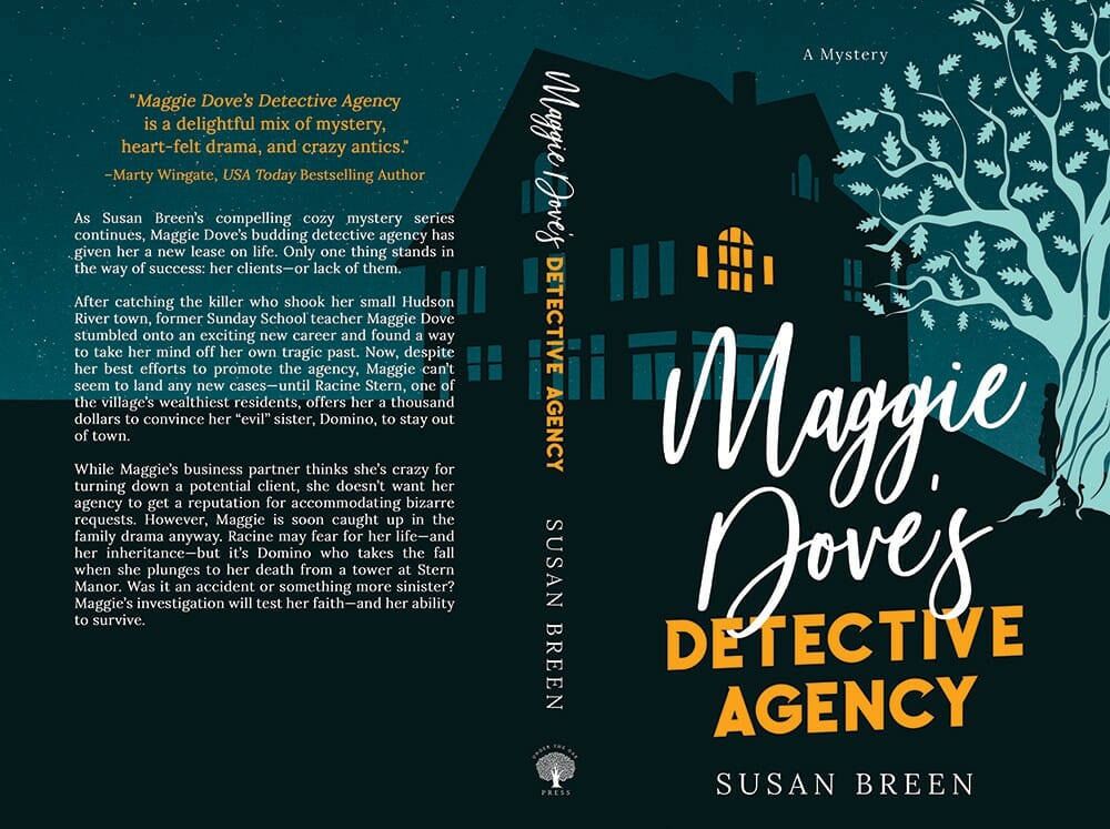
In most cases, you’ll want to use a maximum of two or three fonts. The right typography can be the difference between a cover that looks sharp and professional and one that looks cheap and homemade, so choose wisely.
3. Select the Right Imagery
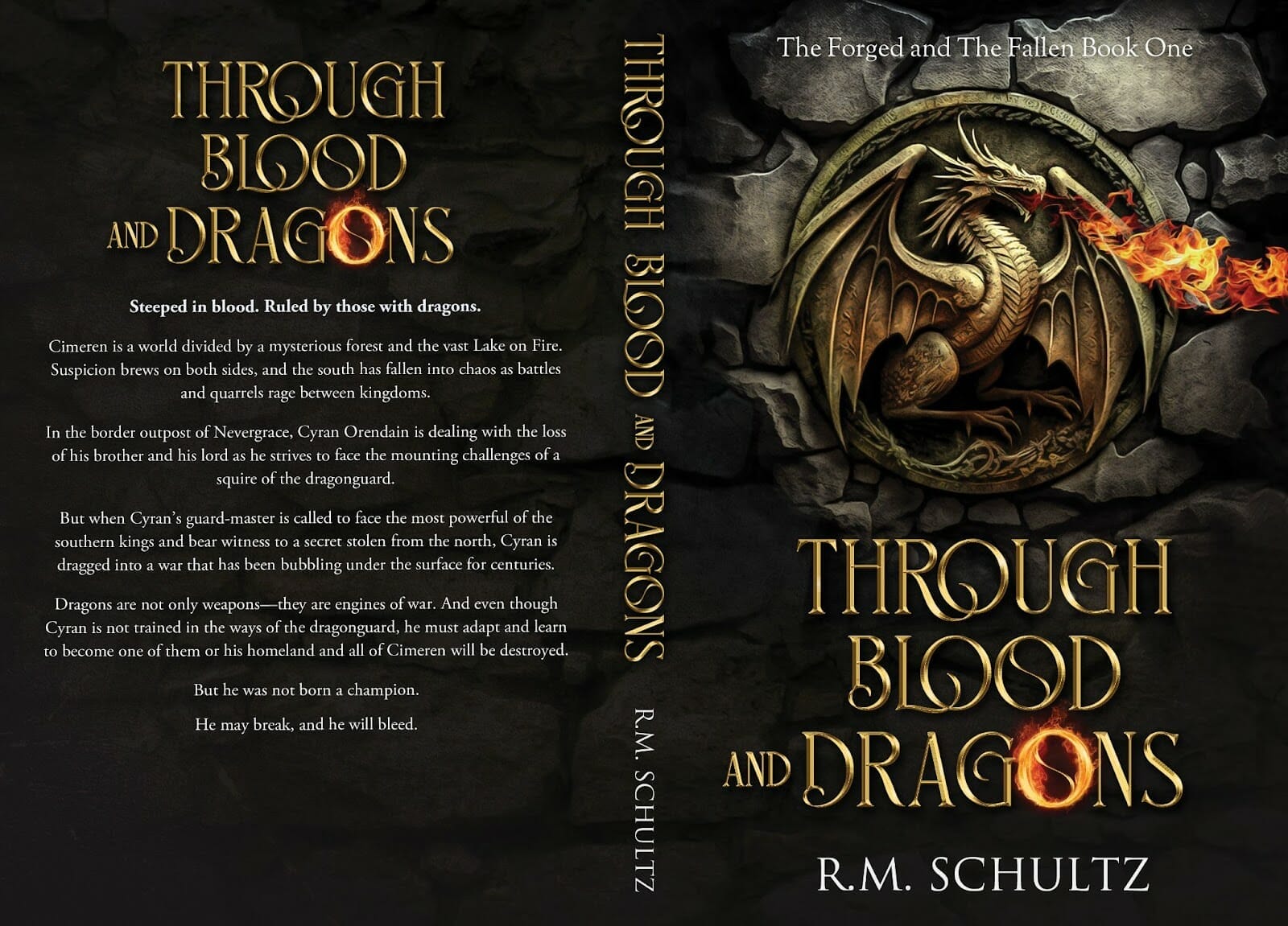
When adding imagery to your cover, you can choose between original photography, illustrations, stock photos, or AI-generated artwork. The key is to find an image that reflects the theme of your book and fits the genre.

The Secret Soldier Source
Economics Source
Genesis Awakens Source
4. Create a Hierarchy of Elements
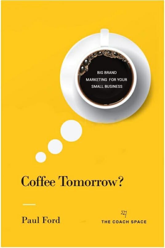
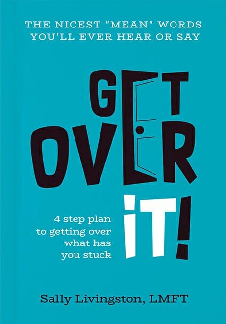
Move the reader’s eye to where you want it to go by increasing the size of the element you want to stand out the most (e.g., author name, book title, or imagery). Alternative elements to utilize for creating visual hierarchy include contrast and color.
5. Colors Matter
In color theory, which colors we select and the combinations we choose can have a strong effect on emotions. When learning how to design a book cover, don’t forget that colors can affect sales. For example, using yellow often creates a feeling of optimism while red can generate feelings of passion or aggression. Get the colors confused and you may not get the right response.
According to the University of Winnipeg,
Color is ubiquitous and is a source of information. People make up their minds within 90 seconds of their initial interactions with either people or products. About 62-90% of the assessment is based on colors alone. So, prudent use of colors can contribute not only to differentiating products from competitors but also to influencing moods and feelings—positively or negatively—and therefore, to attitudes towards certain products.

6. Tell a story
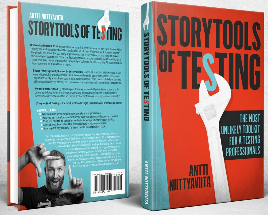
Consider the book cover your blank canvas. Before you go small, go big and see if it works. You can always remove elements if the design gets too cluttered. Think of your book as a gateway to your world. How will you engage potential readers at first so their curiosity is piqued and they open to the first page?

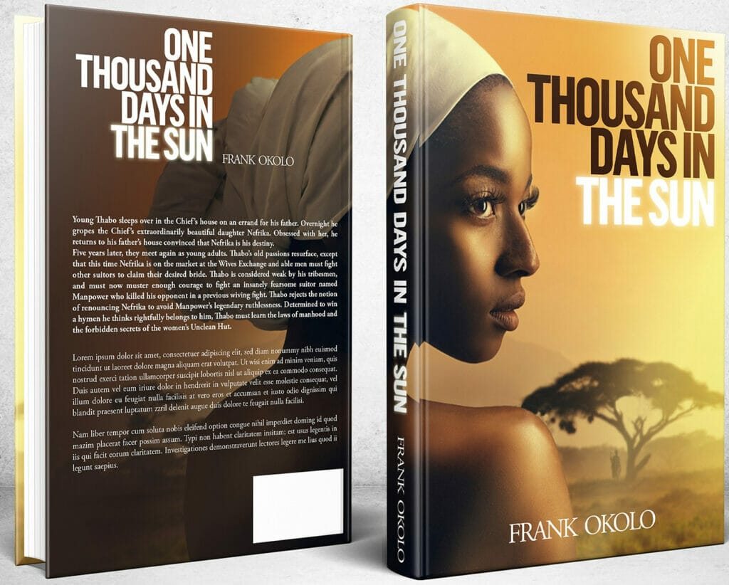
7. Show Sensitivity to the Subject Matter
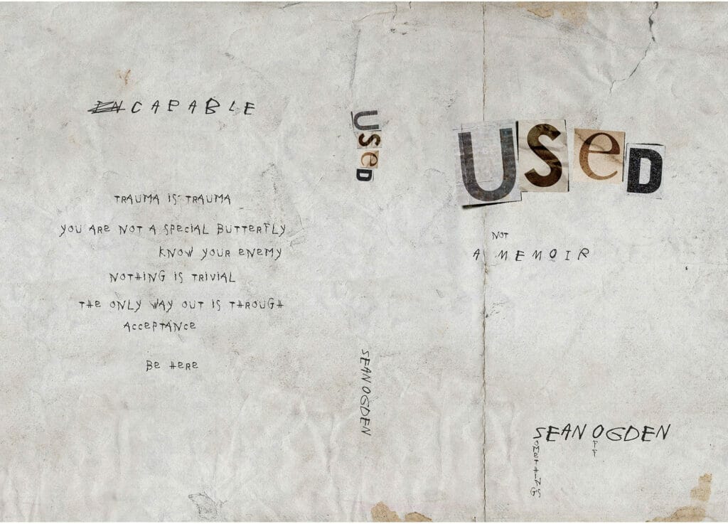
Using shock value doesn’t work for every book cover, especially when the subject matter is weighty (e.g., memoirs, autobiographies). Sometimes the most understated cover design can have the greatest impact.

When it comes to book sales, it’s all about developing a partnership with the audience. There has to be something to bridge the gap between a potential reader and the story you want them to read like great cover design.
Learning how to design a book cover doesn’t mean you have to physically fire up Adobe Illustrator or Affinity Designer and do the work yourself, but if you’re a self-published author, learning everything about the process will give you more creative control over your book’s final outcome.
While most book designers relish the opportunity to stretch their creative genius, it’s often easier to partner with an author who knows what they want than one who waits until the job is finished and points out all the stuff they don’t want.
Studying great cover design will help you figure out your design aesthetic and what you want your book’s cover to say to the world. You can check out book covers here and here, but don’t stop there. Search graphic design, typography, and color theory sites to see what’s out there and if anything might be worth considering for your book’s design.
Find inspiration but don’t abuse it. Design based solely on what others are doing creates more of the same, but taking the books you love and deconstructing them offers a springboard for your own design.
Hands down, the ultimate goal in the book development process is to produce a quality book that represents your book’s story or message. You don’t have to jump through hoops to make that happen. A well-designed, pre-made cover can do the trick, but if you have an opportunity to take it up a notch, don’t shy away from adding a bit of sparkle and spark to get noticed.
Think like a designer. Before beginning the design process, consider your book’s theme and how you want the book to make your reader feel. Chapter One is not the beginning of your book. The cover is. Start your story there.


