by Will Entrekin
I met Will Entrekin on Twitter, and here on my blog where he comments. Will is a novelist and has self-published a number of books. He sent me the cover of a recent collaboration and I asked if he would write about the experience of designing book covers for his own books. Here’s his story.
In late 2006, I decided to publish my first collection via Lulu. I’d been blogging on MySpace for more than a year by then and had established blog with a decent enough following I thought I might be able to carry it off pretty well. Not long after, however, I got a fellowship from USC, and, given that I was going to be a teacher, basically withdrew from both MySpace and marketing my book. I was just learning how to teach and what being a professor meant, and I wanted to dedicate myself to it.
Over the course of the following two years, I finished my master’s in fiction and screenwriting from USC and then began an MBA in marketing. During that time, I completed a novel as my thesis at USC and then, after graduation and after moving to Manhattan, completed a second.
Whenever I finish a book, my revision process includes reading it in multiple formats. After reading it on a screen for so long, my ability to catch errors or even problem spots degrades. This is what I have an editor for, yes, but I like the copy I give my editor to be as clean as possible.
In the spirit of that, I mocked up a copy of my novel, MEETS GIRL, using Lulu. On getting it in my hands, however, I realized I wanted to go forward with it. Edits and revisions later, I had a book I liked, and often, I’ve found, what makes a book real is its cover.
I went to school first for fiction and then for marketing. While an undergrad, I studied literature and science. You’ll notice neither art nor design is on either list.
However, I’ve worked with graphic designers before, for various reasons in various professions. I worked as a commercial production assistant at a Madison Avenue agency (I was a Mad Boy, basically), and edited two clinical nursing journals, one of which had a consumer-centric feel. Which basically meant it was published to look like a magazine one might find on a newsstand.
Over three years and three books (a self-titled debut collection, a novel, and a short story collection), I think I’ve learned a lot about design. Designing for print is different from designing for, say, Kindle. When Joel asked if I’d like to write a guest post here, I thought it would be a good opportunity to discuss the mindset of, basically, a layman approaching the design process.
First Efforts

My first book was a self-titled collection of short stories, essays, and poetry. I’d published some of the essays on my MySpace blog, and my experience on that site definitely influenced my design choices. If you think back to MySpace, there were always a lot of profile pictures, a lot of comments, a lot of kudos. Blogging often focused more on ranking than on writing, and Tila Tequila was the most popular blogger on the site. If I thought that was my target audience, I wanted to figure out a way to appeal to it that wouldn’t include taking off my shirt. I mean, I’d taken off my shirt before, but this was different. This was writing I believed in.
There were a couple elements I often played with on MySpace, the first being a fedora I wore pretty constantly, the second the fact that I’m from New Jersey. Putting on a fedora was easy, but I wasn’t sure how to capture other elements.
However, when I was choosing a title and decided to go, simply, with ENTREKIN, I did so as an homage to the self-titled albums many musical artists release, and with that thought in mind, I started thinking about musicians from Jersey. The big two that came to mind were Springsteen and Sinatra, and I aimed at a sort of combination of the two, particularly the former’s “Born in the USA,” which is a great disc. Where the Boss had a bandana, I stuck my pens.
It could definitely use some improvement, though I’m not sure how I’d change it. The writing was personal for me, not least in that the essay that forms the core of the collection is “What I Saw That Day (9/11/01).” Then again, I think it stands as a snapshot of where I was, as a writer, at that time, and I like that aspect, at least.
Meets Girl
Two years later, I had a novel, MEETS GIRL. MEETS GIRL is the story of a boy who falls in love with a girl who doesn’t love him in return, and it’s also a story about telling stories. It’s very meta: think Faust meets ADAPTATION.
When I did the mock-up of the cover, I went with three simple elements. The first was a repeating “Boy meets girl,” over and over; the opening of the story mentions Faulkner’s reminder to hiimself about what makes a good story great, and I wanted to incorporate that.
I also wanted to incorporate a typewriter. Now, I’ve never really used a classic Underwood to compose anything, but a lot of the novel addresses the idea that we romanticize certain things, and I can’t think of any more romantic an image of a writer than one hunkered down over a typewriter. Probably smoking. With a glass of bourbon by his hand. What I hit on doing was incorporating the keys as an elemental strip to break the background (and continue across the back of the book), and then changing the letters on the keys to be the title.
Finally, the narrator spends a lot of time fretting over whether he can tell the story successfully, and what I kept thinking was that every time that romantic writer at his romantic typewriter failed, there’d be another page he’d rip from the machine. Rip rip rip. Hence the rip at the bottom of the cover (which also continues across the back).
I used two basic fonts, Orator STD for the title, which I liked for its boldness, and then Bookman Old Style for my name. I think I like Bookman Old Style for its name even moreso than for its look. This will come up again in a moment.
I’m really proud of this cover. Especially given my complete lack of a design background. It’s gotten positive reactions from readers and even a designer. Which makes me happy.
Sparks
SPARKS was more problematic. Not only is it four short stories, but it’s also a collection with a co-author. However, the central idea was that we wanted to go Kindle specific. The title came from the idea that, when I was a scout, we used to use kindling to start our bonfires, but in order to do so, everyone knew, we needed sparks. The conceit, then, was that every Amazon Kindle needed SPARKS, too.
When seeking design elements, I go to Flickr and Google and use the advanced search function to find images licensed under Creative Commons. That means that the authors of said images allow for reuse and redistribution with commercial purposes so long as they are attributed (there are different licenses, it’s worth noting. Some hunting is required to find images one can “remix” and use commercially; some authors choose to allow people to use images so long as those people don’t use them commercially. It varies).
Given that we were going Kindle exclusive, though, I wanted it to be simple, stark, and perhaps even black-and-white.
Our first cover was of a sparkler, with our names, and the title:
It sucked. The image was merely okay. The appeal of Kindle is that it’s cross platform, so it wasn’t going to be solely on Kindle’s; some people have been buying it on their phones, others have read it on their laptops. It’s only exclusively digital, for the most part.
So we had to rethink it. And Simon mention the fonts. He liked the title, but feared the author names–which were both Bookman Old Style–maybe looked too “Microsoft Word.”
I went back to Flickr and started searching again.
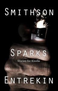
That was when I found the fist with the lighter. Sparking. As soon as I saw it, I thought back to my days as a scout, and remembered something I’d forgotten; we’d always liked to try, for hours, to light the kindling using flint and steel. We’d never get the fire started until a grown up came along with a lighter.
So I used the fist. It was a little dark, but it looks good on the Kindle and is recognizable on a screen. In addition, I just used the same font, in roughly the same size, for both title and author names. Looked more cohesive:
Finally, just under SPARKS, we put “Stories for Kindle” in Caecilia, or as near as I could find, which is the default font displayed on the platform. I’m not sure how many people would notice that, but I liked the idea of subtly tying the whole thing together using small design elements.
Which is the important part of what I’ve learned, in terms of graphic design and covers: one needs something eye-catching, and the simpler the better. That doesn’t necessarily mean austere, or plain; for me, it means choosing no more than three elements that work well off each other. MEETS GIRL’s cover, with its “Boy meets girl” background, keys, and rip might make someone fear it’s busy, but I think what works is that each element is related to the others: the rip makes it look like that particular page is actually torn, and the keys could very well be the typewriter that printed the page.
I wish I had more examples of what I threw away, but the truth is I tend not to; I use Photoshop, and I work from one document, for the most part.
Though that’s not the case with my next novel, THE PRODIGAL HOUR. Maybe Joel will be kind enough to let me return to discuss that one when it comes out.
I guess I should offer some advice, but then again, you come here for Joel’s, which is fantastic and comprehensive. I will say I learned a lot solely by looking at a lot, like they say you learn to be a good writer by reading more. The same can be said here: when first opening that PSD and considering what elements to put where, and how, consider what your story is about, what genre it’s in, and how books in that genre look. Go to a bookstore, and Amazon, and browse. Look at hundreds, if not thousands, of images. Get a good feel for them, and consider, if your book were among those others on those shelves, what would you want it to look like, and how would you want it to stand out?
Thanks for reading. Hope you like the covers, and hope you’ll check out the books in question. The words between them, after all, are the part I’m actually good at.
Data
Will Entrekin’s author website
Buy Entrekin on Amazon
Buy Meets Girl on Amazon
Amazon links are affiliates links.


