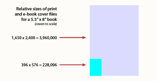
One of the regular tasks of a book cover designer is preparing cover images for a client’s use in promotions, website design, a whole host of things.
Today that was one of the things on my to-do list, and I prepared two JPGs, one for print and one for web use.
The book is 5.5″ x 8″, a book size I’ve been using a lot recently. I ended up with two files:
-
- Hi-res—This file was 5.5″ x 8″ with 300 dots per inch (dpi, can also be considered pixels for the purpose of file size). This is the resolution that’s needed for high-quality printing.
This gives us these dimensions for our image file:
5.5 x 300 = 1,650 pixels
8 x 300 = 2,400 pixelsSo the resulting file is 1,650 x 2,400 pixels, or a total of 3,960,000 pieces of data.
- Hi-res—This file was 5.5″ x 8″ with 300 dots per inch (dpi, can also be considered pixels for the purpose of file size). This is the resolution that’s needed for high-quality printing.
- Lo-res—This file was also 5.5″ x 8″ but it had 72 dpi, which is the resolution used for images on computer screens.
This gives us these dimensions for our image file:
5.5 x 72 = 396 pixels
8 x 72 = 576 pixelsSo the resulting file is 396 x 576 pixels, or a total of 228,096 pieces of data.
What The Figures Show
What I’m getting at is this: the print-resolution file has over 17 times more image data in it than the screen-resolution version.
I can’t think of a clearer example of what direction designers need to be thinking when coming up with covers for e-books. Browsers will be looking at 1/17th the image information available on the printed book.
Don’t fall in love with those big images you’re looking at on your monitor. Keep it simple, direct, clear. You’ll be way ahead.
Photo by comedynose


