 Despite the explosive growth of audio and video on the internet, content on the web is still largely text. And reading online can be a difficult experience.
I don’t know about you, but some of the sites I read online—blogs, content sites, news sites, article sites—are really difficult. Small san serif type in grey on an endless white background gets very tiring after a few minutes.
How about forums, where the lines are allowed to run and run and run the full width of your screen. It’s fatiguing.
On top of that is the built-in conflict between the screens we use—the widescreens we use, more and more—and the traditional text block. From a lifetime of reading we’re used to tall columns of type with a convenient number of words on a line, and a comfy amount of space between the lines.
We have Conventions, Don’t We?
Forms that match the conventions we’re used to are easy for us to read. The more you depart from the convention, the more difficult you make it for the reader. The habits are so entrenched that the design of books has barely changed in over 500 years.
Add to all these problems the commercial nature of our online life. Most blogs and websites are fully monetized now, and people try to make money through advertising. Lots of blogs and websites look like spreads from print magazines.
The result is a lot of clutter, with opt-in boxes, “Welcome”s to new visitors, page navigation, videos, special offers, posts of the day, banner ads and text link ads all competing for the reader’s attention. (And yes, I’m watching my Twitter widget cascade text mindlessly as I write this.)
Readability, from the mad scientists in the lab at Arc90
Editor’s Note: Readability was taken down in 2016. (See https://www.readability.com/.) They recommend this solution instead: Mercury Reader for Chrome.
On their site, Arc90 describes itself as “an R&D shop, a strategic consulting firm, a Web design/ development company, and a product company.” They addressed the problem of readability directly:
Reading anything on the Internet has become a full-on nightmare. As media outlets attempt to eke out as much advertising revenue as possible, we’re left trying to put blinders on to mask away all the insanity that surrounds the content we’re trying to read. It’s almost like listening to talk radio, except the commercials play during the program in the background.
Their answer was to release Readability, a browser add-on that lets you eliminate everything on a web page but the text, which is rendered in a pleasing serif typeface suitable for actual human reading. It eliminates any effect of design, headshots, videos, hit counters, or floating sign-up boxes, and leaves you alone with the content: pure text.
Will It Pass a Real-Life Test?
 Okay, I admit it: I love text, I love typography. I’ve worked in the advertising business, I’ve done commercial graphics, but books—temples of text—make my heart beat faster. What’s a fella to do?
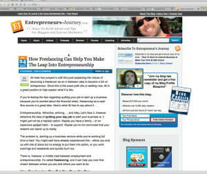
I decided to try Readability on the site of super-blogger Yaro Starak, who also runs Blog Mastermind. After visiting the Readability website, I was able to drag their little “bookmarklet” whatever that means, to my Firefox toolbar. Here’s what Yaro’s site looks like today:
Yaro’s blog, true to his profession, is fully monetized and accessorized. Yaro, an experienced webmaster, studies tracking models and heat maps to make his site more and more effective.
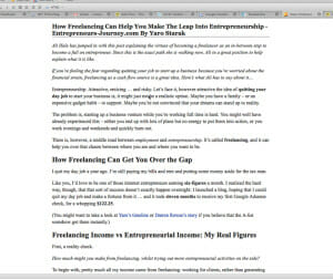
I hit the little Readability button, and this is what my screen looked like after a moment’s thought:
Notice that the translator has picked up all the local formatting of heads, subheads, bold, italics, as well as all the links. The text is intact, and everything else is history.
Here’s the lesson I promised you
Well, I’m making an assumption here. I find the page of plain text much more readable than the original, and I’m assuming that you do, too. Maybe that’s wrong.
But when I read the second version the text takes on much more weight—there’s nothing else there. I feel like I’m getting the author’s thought better, more directly.
The lesson is about decoration. The primary problem I see in book interiors done by new DIY authors is the desire to decorate the pages, as if the type itself isn’t enough. (If you get used to type that’s typeset well, you may need to upgrade from a word processor to typesetting software.
Have an Intention for Added Elements
Besides text and page numbers—and running heads in nonfiction books—all other page elements are unnecessary. Sidebars, pull quotes, designs bleeding off the outside margins, decorative typography on every page, aggressively-decorated folios.
Books are so varied that you can’t say these elements don’t have their place, because they do. But when we use them we have to have a pretty good reason. Know why you are interrupting the flow of the reader’s attention, and what you hope to gain from it.
This is also why the more we learn about typography the better we will be able to create text that suits its purpose, and makes reading a delight.
What do you think?


